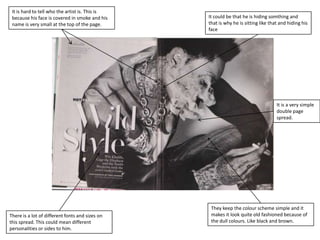
1. It is hard to tell who the artist is. This is
because his face is covered in smoke and his It could be that he is hiding somthing and
name is very small at the top of the page. that is why he is sitting like that and hiding his
face
It is a very simple
double page
spread.
They keep the colour scheme simple and it
There is a lot of different fonts and sizes on makes it look quite old fashioned because of
this spread. This could mean different the dull colours. Like black and brown.
personalities or sides to him.
2. They have kept the colour They have stayed true to their
scheme on this page as well as logo but have changed it to the
the front cover and contents first letter of Cheryl's name
page instead. This shows
importance.
There are two pictures on this
page and a quote from the
text. This could be something
of importance or interest