SlideShare a Scribd company logo
The Masthead –   NME stands out clearly in the top left hand corner, with the use of capital letters. The use of red, black and white fit in with the colour scheme that appears throughout the magazine, and suggests that the magazine will be fun and entertaining. The Header  – The header summaries the magazine, and tells the audience what they can expect from the rest of the magazine, in this case, an Autumn Tour Special.  The use of the word ‘starring’ gives the magazine a showbiz feel, and suggests that the artists it talks about are popular. The Main Image/Background  – The image is at a canted angle, as if the camera has toppled over, and he is crouched down. He looks straight at the camera, and his facial expressions suggest that he is having fun, and is happy, which reflects the style of his music, and the genre of music that NME promotes. The background of the image is vibrant and loud, which gives a sense of rebellion.  The Main Sell Line/Cover Lines  – The use of capital letters catches the eyes of readers, and allows them to see who the artist is, in this case Dizzee Rascal. The use of bold letters and drop shadows make it stand out.  The Footer –  The footer, at the bottom of the page lists other bands that are featured in the magazine, such as Paramore & Jay –Z, and suggests that there is a lot featured in the magazine. Pull Quote –  The Pull Quote gives the reader an insight into what is said in the interview. In this case, Dizzee comes across as happy and friendly, the use of the word ‘man!’ shows that he is addressing and connecting to the audience. The Use of a Flasher – The Flasher is used to offer something extra to the target audience, on top of the information already given. It gives the idea that the magazine is packed full of information, with the use of words such as  “Wowee Zowee”  make the information seem exciting and fun, which relates to the target audience, and is what you expect from a magazine such as NME. The Barcode  – The use of a barcode is an essential feature of any magazine. The barcode tells the company how many magazines they’ve sold, and also gives the audience the issue number and price, so that they are able to buy the copies in order The Rule of Thirds –  On this magazine, the image and cover lines mainly stay in the left third of the page. The image dominates the cover, and, with the background, can seem cluttered. This suggests that the magazine is busy, and filled with content.
The Header –  In the case of Q magazine, the header tells the reader that this issue  is a Collector’s Edition celebrating 25 years of the magazine. From this, the reader tell that the magazine is good quality, as it has been running for a long time. As well as this, they can expect extra content, which may not be found in a normal issue.  Main Image –  The image used for the magazine cover is a long shot of Florence Welch, lead singer of the band Florence & the Machine. Florence is looking directly at the camera, and is clearly posing, as shown by the position of her hands & body. This shows the reader that she is professional, and takes her work seriously. The background of the image is completely plain, giving more attention to the sell lines, and the image & outfit Florence is wearing. The dress Florence has on is more edgy, and would be suited for a party; reflecting the style of her music, and reinforces that the issue is for an Anniversary, and is therefore a special occasion.  The Masthead –  The masthead clearly stands out in the red box, against the plain background. It takes up a sixth of the page, and is easily visible to anyone walking past.  Main Sell Line –  The sell line anchors the image of Florence, and allows anyone who is unsure of who she is to find out. The  use of capital letters makes the Sell Line stand out to the audience. The style of the text is similar to a persons handwriting, and suggests that the magazine takes a laid back approach to it’s content. The pink colour used  fits with the colour scheme of this issue Footer –  Found at the bottom of the page, the footer tells the reader about additional information they will receive by reading the magazine. This is shown through the use of the word ‘Plus’. In this case, they can discover 145 new albums. This is used to appeal to the target audience, who will all be interested in different genres of music.  Barcode –  The barcode, date, issue number & price are all important features to a magazine if they are to sell copies. Flasher –  In most cases, a flasher is used to give the reader an insight as to what is inside the magazine. However, on this issue of Q magazine, it informs the audience of the issue number, as the Collector’s Edition has 25 different covers.   Rule of Thirds –  The rule of thirds is used on magazine covers to interest the target audience. For the Q magazine cover, the  sell lines & image are predominately in the right third of the page, making this part seem cluttered. However, despite this, the magazine seems quite minimal, which suggests that the magazine  is laid back in it’s approach to music, unlike magazines such a s Kerrang, which packs a lot onto the cover
The Masthead -  The name of the magazine clearly stands out at the top of the page,  and makes the audience imagine the sound an electric guitar would make. The style of text used creates the image of broken glass, and suggests that  rock music is rebellious, and breaks rules set by other genres. The  exclamation mark makes the title sound more dramatic, and stresses the sounds of ‘Kerrang’. The Header –  Usually, the header of a magazine is used to advertise what else will be featured in the magazine, such as interviews & reviews from bands that fit with the genre of the magazine. However, in this case, the header is promoting a competition to w in  tickets to an award ceremony organised by the magazine. This will attract readers, as it gives them the opportunity to meet their favourite artists. The Main Image –  The image of Billy Joe, the lead singer of Green Day, is a mid shot. He is looking directly into the camera, with his head held high, giving the impression that he is slightly arrogant. He is wearing a leather jacket, an item that is linked to rock bands & music. The background of the image is plain black, making Billy’s facial expressions, and the sell lines stand out The Main Sell/Cover Lines –  The sell line on this cover anchors the image, and informs the reader who the man is. The use of colour fits in with the colour scheme used  on the rest of the cover.  The word ‘Exclusive’ suggests that the interview contains never revealed information on the band and what they are doing, as well as their personal lives.  Barcode, Issue & Price -  The use of a barcode is an essential feature of any magazine. The barcode tells the company how many magazines they’ve sold, and also gives the audience the issue number and price, so that they are able to buy the copies in order The Footer –  Found at the bottom of the page, the footer lists other artists that will feature in the magazine. The use of the word ‘Plus’ suggests that the magazine is already full of information, but the magazine is providing extra. Rule of Thirds –  The cover is dominated by images, making it feel very cluttered and messy. This reflects the idea that rock music is unconventional,  and also suggests that the magazine will be filled with content

More Related Content

More from gracepeutherer

Stages of development double page spread
Stages of development   double page spreadStages of development   double page spread
Stages of development double page spread
gracepeutherer
 
Stages of development contents page
Stages of development   contents pageStages of development   contents page
Stages of development contents page
gracepeutherer
 
Stages of development front cover
Stages of development   front coverStages of development   front cover
Stages of development front cover
gracepeutherer
 
Style Model for Magazine - NME
Style Model for Magazine - NMEStyle Model for Magazine - NME
Style Model for Magazine - NME
gracepeutherer
 
Analysing Content Pages
Analysing Content PagesAnalysing Content Pages
Analysing Content Pages
gracepeutherer
 
Analysing Double Page Spreads
Analysing Double Page SpreadsAnalysing Double Page Spreads
Analysing Double Page Spreads
gracepeutherer
 

More from gracepeutherer (8)

Question 7
Question 7Question 7
Question 7
 
Stages of development double page spread
Stages of development   double page spreadStages of development   double page spread
Stages of development double page spread
 
Stages of development contents page
Stages of development   contents pageStages of development   contents page
Stages of development contents page
 
Stages of development front cover
Stages of development   front coverStages of development   front cover
Stages of development front cover
 
Style Model for Magazine - NME
Style Model for Magazine - NMEStyle Model for Magazine - NME
Style Model for Magazine - NME
 
Analysing Content Pages
Analysing Content PagesAnalysing Content Pages
Analysing Content Pages
 
Analysing Double Page Spreads
Analysing Double Page SpreadsAnalysing Double Page Spreads
Analysing Double Page Spreads
 
NME Dizzee Mag ppt
NME Dizzee Mag pptNME Dizzee Mag ppt
NME Dizzee Mag ppt
 

Recently uploaded

PEACE BETWEEN ISRAEL AND PALESTINE REQUIRES EXTREMISTS OUT OF POWER AND RESTR...
PEACE BETWEEN ISRAEL AND PALESTINE REQUIRES EXTREMISTS OUT OF POWER AND RESTR...PEACE BETWEEN ISRAEL AND PALESTINE REQUIRES EXTREMISTS OUT OF POWER AND RESTR...
PEACE BETWEEN ISRAEL AND PALESTINE REQUIRES EXTREMISTS OUT OF POWER AND RESTR...
Faga1939
 
R$ 78 milhões: Estado aprova 593 propostas para acordos diretos de precatórios
R$ 78 milhões: Estado aprova 593 propostas para acordos diretos de precatóriosR$ 78 milhões: Estado aprova 593 propostas para acordos diretos de precatórios
R$ 78 milhões: Estado aprova 593 propostas para acordos diretos de precatórios
Maurílio Júnior
 

Recently uploaded (20)

21052024_First India Newspaper Jaipur.pdf
21052024_First India Newspaper Jaipur.pdf21052024_First India Newspaper Jaipur.pdf
21052024_First India Newspaper Jaipur.pdf
 
Embed-4-3 (1).pdf cvxx'f['df[p'lf][l][fl][fl][][l[
Embed-4-3 (1).pdf cvxx'f['df[p'lf][l][fl][fl][][l[Embed-4-3 (1).pdf cvxx'f['df[p'lf][l][fl][fl][][l[
Embed-4-3 (1).pdf cvxx'f['df[p'lf][l][fl][fl][][l[
 
PEACE BETWEEN ISRAEL AND PALESTINE REQUIRES EXTREMISTS OUT OF POWER AND RESTR...
PEACE BETWEEN ISRAEL AND PALESTINE REQUIRES EXTREMISTS OUT OF POWER AND RESTR...PEACE BETWEEN ISRAEL AND PALESTINE REQUIRES EXTREMISTS OUT OF POWER AND RESTR...
PEACE BETWEEN ISRAEL AND PALESTINE REQUIRES EXTREMISTS OUT OF POWER AND RESTR...
 
Textile Waste In India | Textile Waste Management
Textile Waste In India | Textile Waste ManagementTextile Waste In India | Textile Waste Management
Textile Waste In India | Textile Waste Management
 
R$ 78 milhões: Estado aprova 593 propostas para acordos diretos de precatórios
R$ 78 milhões: Estado aprova 593 propostas para acordos diretos de precatóriosR$ 78 milhões: Estado aprova 593 propostas para acordos diretos de precatórios
R$ 78 milhões: Estado aprova 593 propostas para acordos diretos de precatórios
 
Meta_AI_ads_investigation.pdfldoljjwejolejolol
Meta_AI_ads_investigation.pdfldoljjwejolejololMeta_AI_ads_investigation.pdfldoljjwejolejolol
Meta_AI_ads_investigation.pdfldoljjwejolejolol
 
Have A Complimentary Cheat Sheet, On Us!!!
Have A Complimentary Cheat Sheet, On Us!!!Have A Complimentary Cheat Sheet, On Us!!!
Have A Complimentary Cheat Sheet, On Us!!!
 
Minnesota Timberwolves Bring Ya Ass T Shirt
Minnesota Timberwolves Bring Ya Ass T ShirtMinnesota Timberwolves Bring Ya Ass T Shirt
Minnesota Timberwolves Bring Ya Ass T Shirt
 
25052024_First India Newspaper Jaipur.pdf
25052024_First India Newspaper Jaipur.pdf25052024_First India Newspaper Jaipur.pdf
25052024_First India Newspaper Jaipur.pdf
 
Embed-4-1-1.pdf vm ;sdkp[kdp[kpdkpodp;p;j
Embed-4-1-1.pdf vm ;sdkp[kdp[kpdkpodp;p;jEmbed-4-1-1.pdf vm ;sdkp[kdp[kpdkpodp;p;j
Embed-4-1-1.pdf vm ;sdkp[kdp[kpdkpodp;p;j
 
Mizzima Weekly Analysis & Insight Issue 1
Mizzima Weekly Analysis & Insight Issue 1Mizzima Weekly Analysis & Insight Issue 1
Mizzima Weekly Analysis & Insight Issue 1
 
23052024_First India Newspaper Jaipur.pdf
23052024_First India Newspaper Jaipur.pdf23052024_First India Newspaper Jaipur.pdf
23052024_First India Newspaper Jaipur.pdf
 
Embed-3-1-1.pdf The ECI direction on April 2, 2024 can be read here:
Embed-3-1-1.pdf  The ECI direction on April 2, 2024 can be read here:Embed-3-1-1.pdf  The ECI direction on April 2, 2024 can be read here:
Embed-3-1-1.pdf The ECI direction on April 2, 2024 can be read here:
 
role of women and girls in various terror groups
role of women and girls in various terror groupsrole of women and girls in various terror groups
role of women and girls in various terror groups
 
2024 - Love and Madness - a book about love, madness, heartbreak and politics
2024 - Love and Madness - a book about love, madness, heartbreak and politics2024 - Love and Madness - a book about love, madness, heartbreak and politics
2024 - Love and Madness - a book about love, madness, heartbreak and politics
 
May 2024 - Crypto Market Report_FINAL.pdf
May 2024 - Crypto Market Report_FINAL.pdfMay 2024 - Crypto Market Report_FINAL.pdf
May 2024 - Crypto Market Report_FINAL.pdf
 
Dominican American Coalition PAC Executive Summary
Dominican American Coalition PAC Executive SummaryDominican American Coalition PAC Executive Summary
Dominican American Coalition PAC Executive Summary
 
24052024_First India Newspaper Jaipur.pdf
24052024_First India Newspaper Jaipur.pdf24052024_First India Newspaper Jaipur.pdf
24052024_First India Newspaper Jaipur.pdf
 
27052024_First India Newspaper Jaipur.pdf
27052024_First India Newspaper Jaipur.pdf27052024_First India Newspaper Jaipur.pdf
27052024_First India Newspaper Jaipur.pdf
 
Nika Muhl Visa Approval Shirt, Nika Muhl Visa Approval T-Shirt
Nika Muhl Visa Approval Shirt, Nika Muhl Visa Approval T-ShirtNika Muhl Visa Approval Shirt, Nika Muhl Visa Approval T-Shirt
Nika Muhl Visa Approval Shirt, Nika Muhl Visa Approval T-Shirt
 

Analysing nme dizzee cover prep for blog ppt

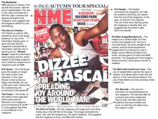
  • 1. The Masthead – NME stands out clearly in the top left hand corner, with the use of capital letters. The use of red, black and white fit in with the colour scheme that appears throughout the magazine, and suggests that the magazine will be fun and entertaining. The Header – The header summaries the magazine, and tells the audience what they can expect from the rest of the magazine, in this case, an Autumn Tour Special. The use of the word ‘starring’ gives the magazine a showbiz feel, and suggests that the artists it talks about are popular. The Main Image/Background – The image is at a canted angle, as if the camera has toppled over, and he is crouched down. He looks straight at the camera, and his facial expressions suggest that he is having fun, and is happy, which reflects the style of his music, and the genre of music that NME promotes. The background of the image is vibrant and loud, which gives a sense of rebellion. The Main Sell Line/Cover Lines – The use of capital letters catches the eyes of readers, and allows them to see who the artist is, in this case Dizzee Rascal. The use of bold letters and drop shadows make it stand out. The Footer – The footer, at the bottom of the page lists other bands that are featured in the magazine, such as Paramore & Jay –Z, and suggests that there is a lot featured in the magazine. Pull Quote – The Pull Quote gives the reader an insight into what is said in the interview. In this case, Dizzee comes across as happy and friendly, the use of the word ‘man!’ shows that he is addressing and connecting to the audience. The Use of a Flasher – The Flasher is used to offer something extra to the target audience, on top of the information already given. It gives the idea that the magazine is packed full of information, with the use of words such as “Wowee Zowee” make the information seem exciting and fun, which relates to the target audience, and is what you expect from a magazine such as NME. The Barcode – The use of a barcode is an essential feature of any magazine. The barcode tells the company how many magazines they’ve sold, and also gives the audience the issue number and price, so that they are able to buy the copies in order The Rule of Thirds – On this magazine, the image and cover lines mainly stay in the left third of the page. The image dominates the cover, and, with the background, can seem cluttered. This suggests that the magazine is busy, and filled with content.
  • 2. The Header – In the case of Q magazine, the header tells the reader that this issue is a Collector’s Edition celebrating 25 years of the magazine. From this, the reader tell that the magazine is good quality, as it has been running for a long time. As well as this, they can expect extra content, which may not be found in a normal issue. Main Image – The image used for the magazine cover is a long shot of Florence Welch, lead singer of the band Florence & the Machine. Florence is looking directly at the camera, and is clearly posing, as shown by the position of her hands & body. This shows the reader that she is professional, and takes her work seriously. The background of the image is completely plain, giving more attention to the sell lines, and the image & outfit Florence is wearing. The dress Florence has on is more edgy, and would be suited for a party; reflecting the style of her music, and reinforces that the issue is for an Anniversary, and is therefore a special occasion. The Masthead – The masthead clearly stands out in the red box, against the plain background. It takes up a sixth of the page, and is easily visible to anyone walking past. Main Sell Line – The sell line anchors the image of Florence, and allows anyone who is unsure of who she is to find out. The use of capital letters makes the Sell Line stand out to the audience. The style of the text is similar to a persons handwriting, and suggests that the magazine takes a laid back approach to it’s content. The pink colour used fits with the colour scheme of this issue Footer – Found at the bottom of the page, the footer tells the reader about additional information they will receive by reading the magazine. This is shown through the use of the word ‘Plus’. In this case, they can discover 145 new albums. This is used to appeal to the target audience, who will all be interested in different genres of music. Barcode – The barcode, date, issue number & price are all important features to a magazine if they are to sell copies. Flasher – In most cases, a flasher is used to give the reader an insight as to what is inside the magazine. However, on this issue of Q magazine, it informs the audience of the issue number, as the Collector’s Edition has 25 different covers. Rule of Thirds – The rule of thirds is used on magazine covers to interest the target audience. For the Q magazine cover, the sell lines & image are predominately in the right third of the page, making this part seem cluttered. However, despite this, the magazine seems quite minimal, which suggests that the magazine is laid back in it’s approach to music, unlike magazines such a s Kerrang, which packs a lot onto the cover
  • 3. The Masthead - The name of the magazine clearly stands out at the top of the page, and makes the audience imagine the sound an electric guitar would make. The style of text used creates the image of broken glass, and suggests that rock music is rebellious, and breaks rules set by other genres. The exclamation mark makes the title sound more dramatic, and stresses the sounds of ‘Kerrang’. The Header – Usually, the header of a magazine is used to advertise what else will be featured in the magazine, such as interviews & reviews from bands that fit with the genre of the magazine. However, in this case, the header is promoting a competition to w in tickets to an award ceremony organised by the magazine. This will attract readers, as it gives them the opportunity to meet their favourite artists. The Main Image – The image of Billy Joe, the lead singer of Green Day, is a mid shot. He is looking directly into the camera, with his head held high, giving the impression that he is slightly arrogant. He is wearing a leather jacket, an item that is linked to rock bands & music. The background of the image is plain black, making Billy’s facial expressions, and the sell lines stand out The Main Sell/Cover Lines – The sell line on this cover anchors the image, and informs the reader who the man is. The use of colour fits in with the colour scheme used on the rest of the cover. The word ‘Exclusive’ suggests that the interview contains never revealed information on the band and what they are doing, as well as their personal lives. Barcode, Issue & Price - The use of a barcode is an essential feature of any magazine. The barcode tells the company how many magazines they’ve sold, and also gives the audience the issue number and price, so that they are able to buy the copies in order The Footer – Found at the bottom of the page, the footer lists other artists that will feature in the magazine. The use of the word ‘Plus’ suggests that the magazine is already full of information, but the magazine is providing extra. Rule of Thirds – The cover is dominated by images, making it feel very cluttered and messy. This reflects the idea that rock music is unconventional, and also suggests that the magazine will be filled with content