1. FONTS:
Masthead
Font: Britannic Bold
Size:72pt
PANDEMONIUM
Headlines
Font: Felix titling
Size: 26pt
FX: Bold
IndieSolohitsNo.1
Subheadings
Font: Georgia pro light
Size: 18pt
FX: Italics
New Indie singer drops first single
Coverlines
Font: Stencil STD
Size: 22pt
A DAY IN THE LIFE OF AM
Text
Font: Georgia
Size: 12pt
‘Her first ever single blew the chart up just last week’
Text (Pull quote)
Font: Bodoni MT
Size: 24pt
FX: Italics
‘An amazing song from an amazing artist’
Style sheet
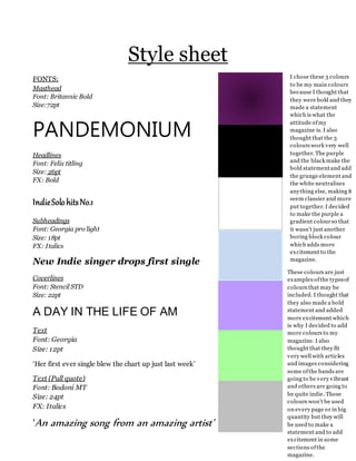
I chose these 3 colours
to be my main colours
because I thought that
they were bold and they
made a statement
which is what the
attitude ofmy
magazine is. I also
thought that the 3
colours work very well
together. The purple
and the black make the
bold statementand add
the grunge element and
the white neutralises
anything else, making it
seem classier and more
put together. I decided
to make the purple a
gradient colourso that
it wasn’t just another
boring block colour
which adds more
excitement to the
magazine.
These colours are just
examples ofthe typesof
colours that may be
included. I thought that
they also made a bold
statement and added
more excitement which
is why I decided to add
more colours to my
magazine. I also
thought that they fit
very well with articles
and images considering
some ofthe bands are
going to be very vibrant
and others are going to
be quite indie. These
colours won’t be used
on every page or in big
quantity but they will
be used to make a
statement and to add
excitement in some
sections ofthe
magazine.