Vector Coca-Cola Poster Analysis
•
1 like•498 views

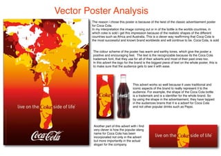
This poster analyzes a vector poster for Coca-Cola that depicts the shapes of various countries emerging from the recognizable Coke bottle. It interprets this as representing that Coke is sold worldwide. The poster uses warm, earthy colors and the trademark Coke font to positively promote the brand. The large Coke logo ensures viewers easily recognize it as an ad for the iconic brand, tapping into audience association of the bottle shape with Coca-Cola. The poster cleverly incorporates the popular nickname for Coke into its slogan.

Recommended
More Related Content
What's hot
Similar to Vector Coca-Cola Poster Analysis
Similar to Vector Coca-Cola Poster Analysis (20)
More from Lucy Taylor
More from Lucy Taylor (20)
Vector Coca-Cola Poster Analysis
- 1. Vector Poster Analysis The reason i chose this poster is because of the twist of the classic advertisement poster for Coca Cola. In my interpretation the image coming out or in of the bottle is the worlds countries, in which coke is sold i get this impression because of the realistic shapes of the different countries such as Africa and Australia. This is a clever way reaffirming that Coca Cola is the most successful and known brand worldwide and will continue to be. Coca Cola, is sold The colour scheme of the poster has warm and earthy tones, which give the poster a positive and encouraging feel. The text is the recognizable because its the Coca Cola trademark font, that they use for all of their adverts and most of their past ones too. In this advert the logo for the brand is the biggest piece of text on the whole poster, this is to make sure that the audience gets to see it with ease. This advert works so well because it uses traditional and iconic aspects of the brand to really represent it to the audience. For example, the shape of the Coca Cola bottle is a trademark and is a identifier for the whole brand. So by using the shape in the advertisement, they have tapped in the audiences brains that it is a advert for Coca Cola and not other popular drinks such as Pepsi. Another part of this advert with i find very clever is how the popular slang name for Coca Cola has been incorporated not only in the advert but more importantly in the actual slogan for the company.