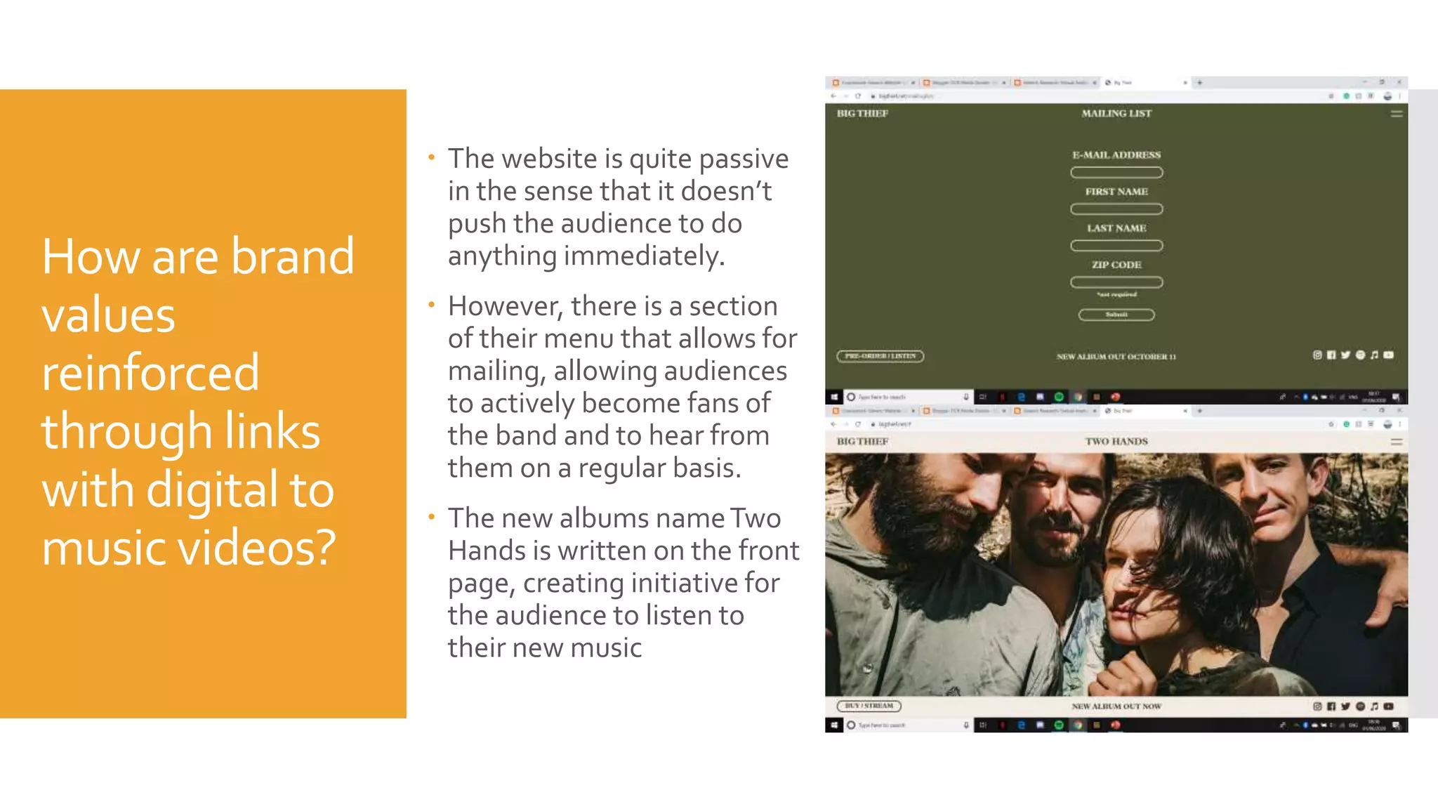
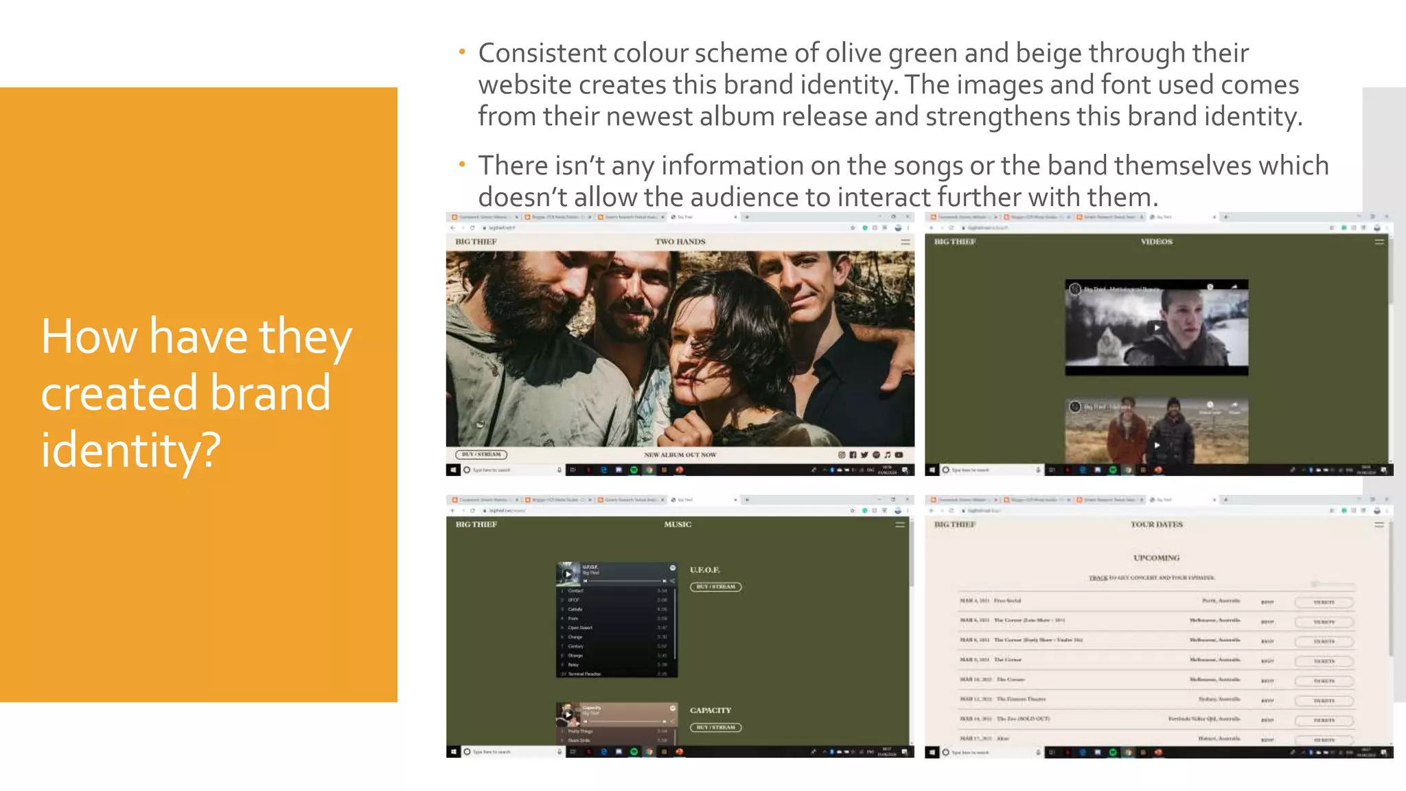
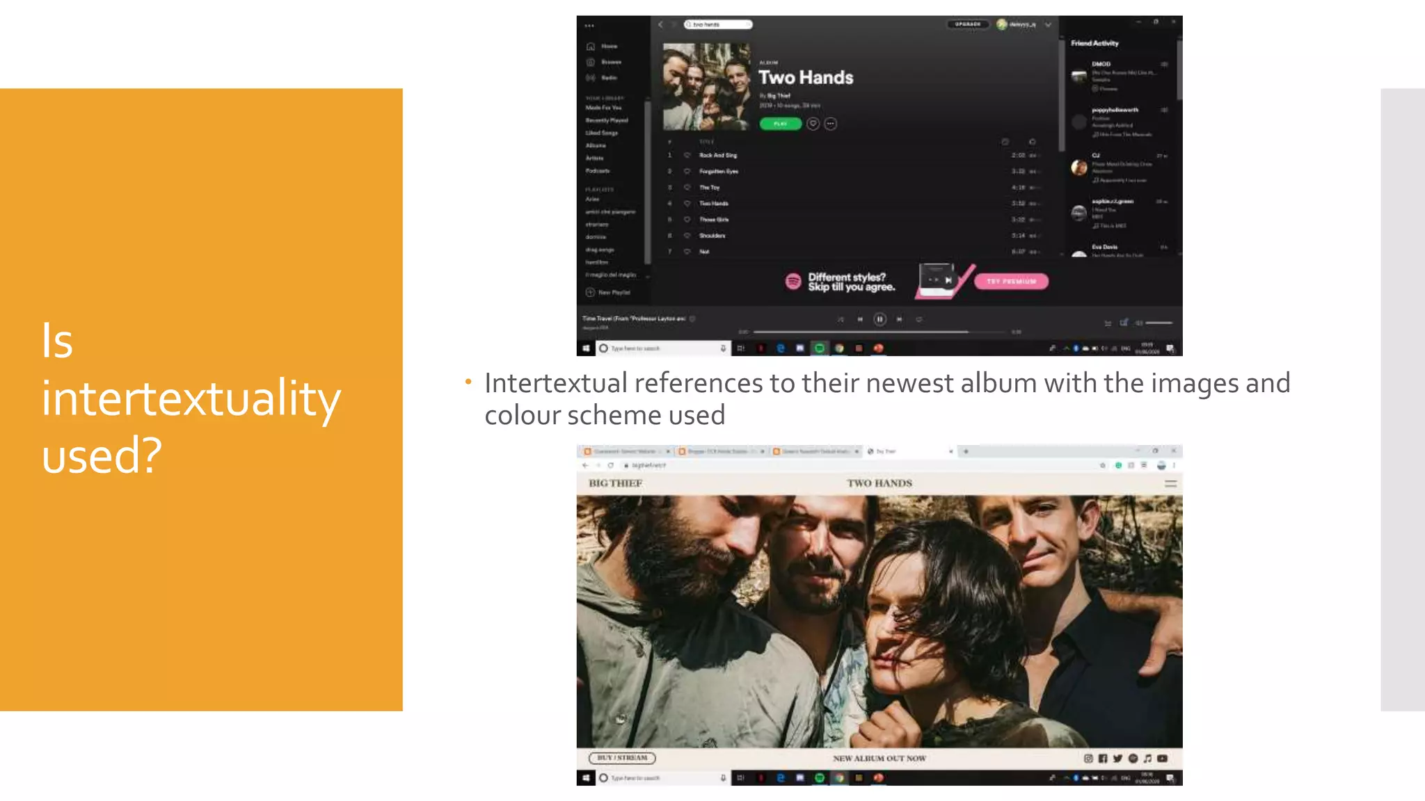
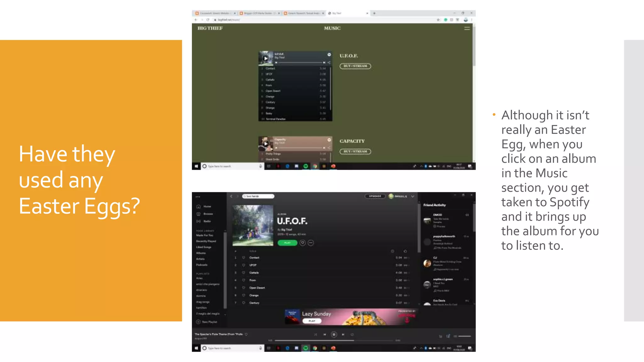
TextualAnalysis of Big
Thief’s website
https://bigthief.net/
How are brand
values
reinforced
through links
with digital to
music videos?
 The website is quite passive
in the sense that it doesn’t
push the audience to do
anything immediately.
 However, there is a section
of their menu that allows for
mailing, allowing audiences
to actively become fans of
the band and to hear from
them on a regular basis.
 The new albums nameTwo
Hands is written on the front
page, creating initiative for
the audience to listen to
their new music
How have they
created brand
identity?
 Consistent colour scheme of olive green and beige through their
website creates this brand identity.The images and font used comes
from their newest album release and strengthens this brand identity.
 There isn’t any information on the songs or the band themselves which
doesn’t allow the audience to interact further with them.
Is
intertextuality
used?
 Intertextual references to their newest album with the images and
colour scheme used
Have they
used any
Easter Eggs?
 Although it isn’t
really an Easter
Egg, when you
click on an album
in the Music
section, you get
taken to Spotify
and it brings up
the album for you
to listen to.
What values,
attitudes and
beliefs have
been used?
 BigThief are known to be a band that just plays music for the sake
of playing music. Having formed the band after the four of them
completed university, they strive to create a simple aesthetic
which people can relate to through their music and videos.
 However, despite their simplistic nature, BigThief does also delve
into more serious topics such as their song Coma which sings
about sexual assault and how women use a coma to protect
themselves from abusers: not fighting back, being passive, etc.

Textual Analysis of Big Thief's website

  • 1.
    TextualAnalysis of Big Thief’swebsite https://bigthief.net/
  • 2.
    How are brand values reinforced throughlinks with digital to music videos?  The website is quite passive in the sense that it doesn’t push the audience to do anything immediately.  However, there is a section of their menu that allows for mailing, allowing audiences to actively become fans of the band and to hear from them on a regular basis.  The new albums nameTwo Hands is written on the front page, creating initiative for the audience to listen to their new music
  • 3.
    How have they createdbrand identity?  Consistent colour scheme of olive green and beige through their website creates this brand identity.The images and font used comes from their newest album release and strengthens this brand identity.  There isn’t any information on the songs or the band themselves which doesn’t allow the audience to interact further with them.
  • 4.
    Is intertextuality used?  Intertextual referencesto their newest album with the images and colour scheme used
  • 5.
    Have they used any EasterEggs?  Although it isn’t really an Easter Egg, when you click on an album in the Music section, you get taken to Spotify and it brings up the album for you to listen to.
  • 6.
    What values, attitudes and beliefshave been used?  BigThief are known to be a band that just plays music for the sake of playing music. Having formed the band after the four of them completed university, they strive to create a simple aesthetic which people can relate to through their music and videos.  However, despite their simplistic nature, BigThief does also delve into more serious topics such as their song Coma which sings about sexual assault and how women use a coma to protect themselves from abusers: not fighting back, being passive, etc.