
Recommended
More Related Content
Viewers also liked
Viewers also liked (9)
Similar to Del monte observations
Similar to Del monte observations (20)
Recently uploaded
Recently uploaded (20)
Del monte observations
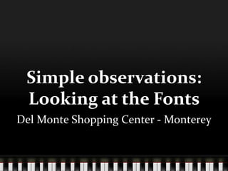
- 1. Simple observations: Looking at the Fonts Del Monte Shopping Center - Monterey
- 2. The Big Idea • Wanted to focus on one thing more in depth • Got the idea from looking at instructions • Focused on font and images of signs outside
- 3. Apple Store Probably my most favorite store in the mall Image is very modern Almost avantgarde How many people notice the bite out of the apple?
- 4. Apple Store Even from a distance you can tell it is the Apple store
- 5. Apple Store Never been to the store when it wasn’t busy People want Apple Variety of people but most fit an innovation psychographic
- 6. See’s Candies Antithesis of Apple As old fashioned as Apple is hip
- 7. See’s Candies Looks like it could be an old time post card in black and white Never notices that See’s only has first letter in caps and CANDIES is all caps but same size as See’s lowercase
- 8. LALLAgrile Weird variety of fonts – block caps in yellow for LALLA, aqua script for grille Little blocks of solid glass for windows Feels LA hip
- 9. LALLA grille Aqua color scheme inside Behind the bar looks like the window
- 10. LALLA grille Even servings look kind of LA hip
- 11. Men’s Wearhouse Logo is contradiction in terms Sort of looks like a combination of European hip – the MW – and old-fashioned warehouse
- 12. Whole Foods My grandfather used to own a fruit stand in the 1920’s. This picture makes me think of him and a family picture we have. Never thought of it that way
- 13. Whole Foods Oranges, what else is there to say