The Living, Speaking Hand: Typography in Language Arts
Typography homework
1. Charlie-RayMitchell MediaH/w 29/09/2015
Typography
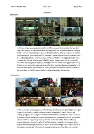
In thisopeningsequence yousee thatthe textfontandpositioningmakesthe textitself
looklike itisa part of the infrastructure andthe style of the fontalsomakesthe textlook
like the surroundingbuildingsbecauseeachletterlookslike ithasbeenchiselled like the
buildings locatedinthe background.Itisalsoveryboldand has 3 dimensionswhichmake
the textstandout to the viewer.Because of the waythe textisbeingpositioneditmakes
it appearlike the textisbeingwatched which,us the viewer,questions(e.g.doesthis
meanthat the protagonistsisbeingwatchedorfollowed?Whatwill happeninthe film?)
Anotherwayin whichthe typographyhaseffectisby itscolour,because it’sadull greyit
blendsinwiththe backgroundandthe colourgrey alsoindicatesanunhappyvibe which
can contribute tothe effectivenessof the typographyusedinthe opening.
In thisopeningsequence youcansee thatthe textis redrepresentingblood or/andanger
(violence) andthe textitself iscanbe destroyed/movedwhichmakesitlinktothe
footage goingonin the back ground.The textseemslike it’sapartof the story andshows
us that the zombie apocalypse is causinghuge amountsof devastationinthe surrounding
area where thisishappening. Because the textcanbe moveditis thenclassifiedas
kinetictypographywhichisauseful effectforthe editorstoaddin,thisbecause itthen
helpsmake the openingrunsmootherandit’smore interestingtoview forthe viewersas
it showsthe appropriate informationbutdoesnotdisruptthe flow of the introduction.
Zombieland
Panicroom