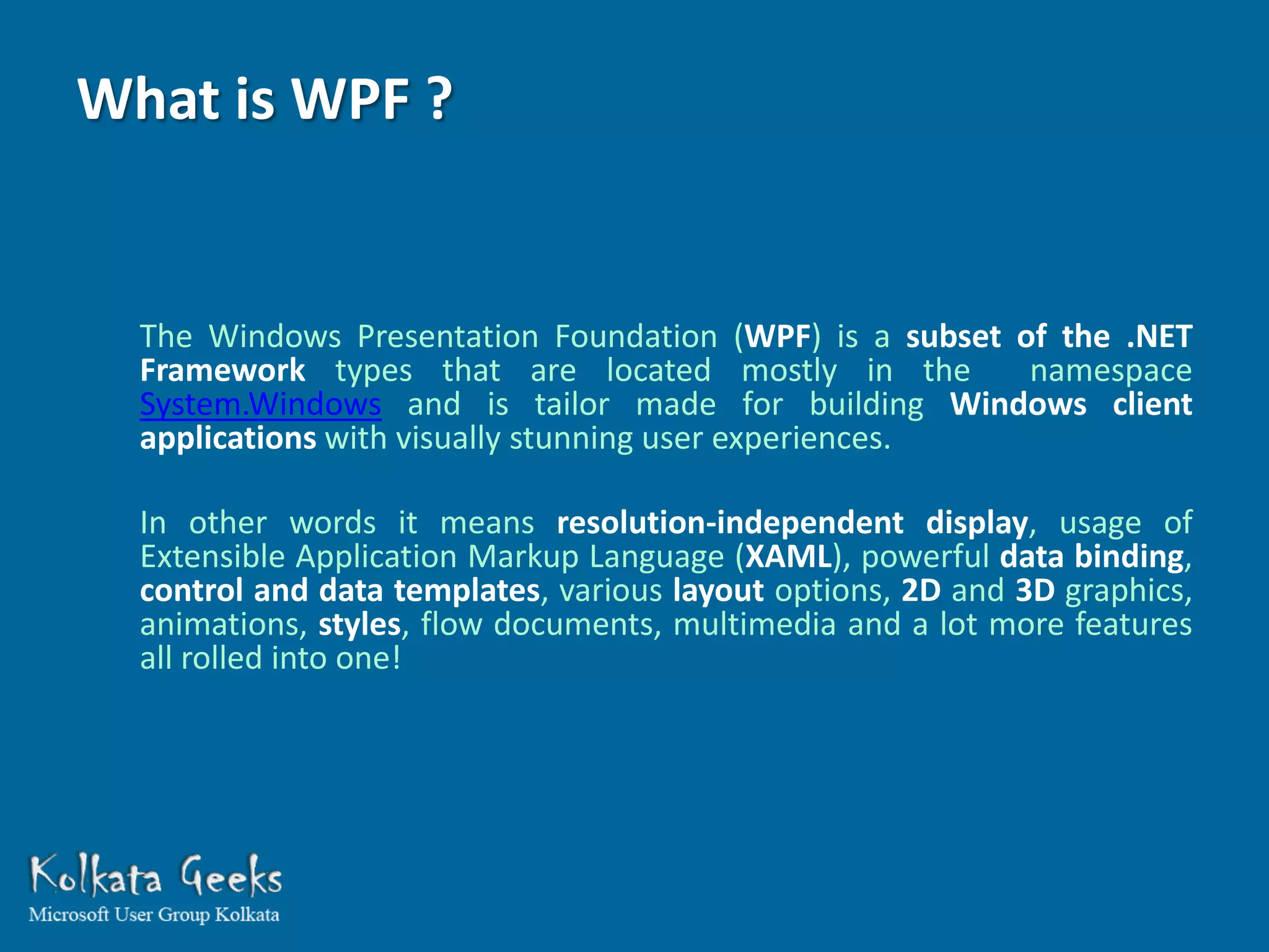
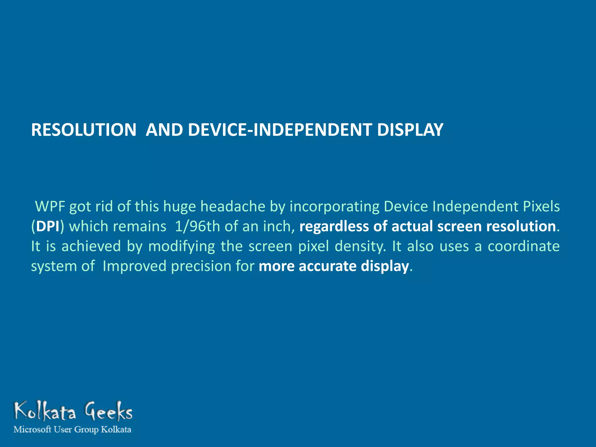
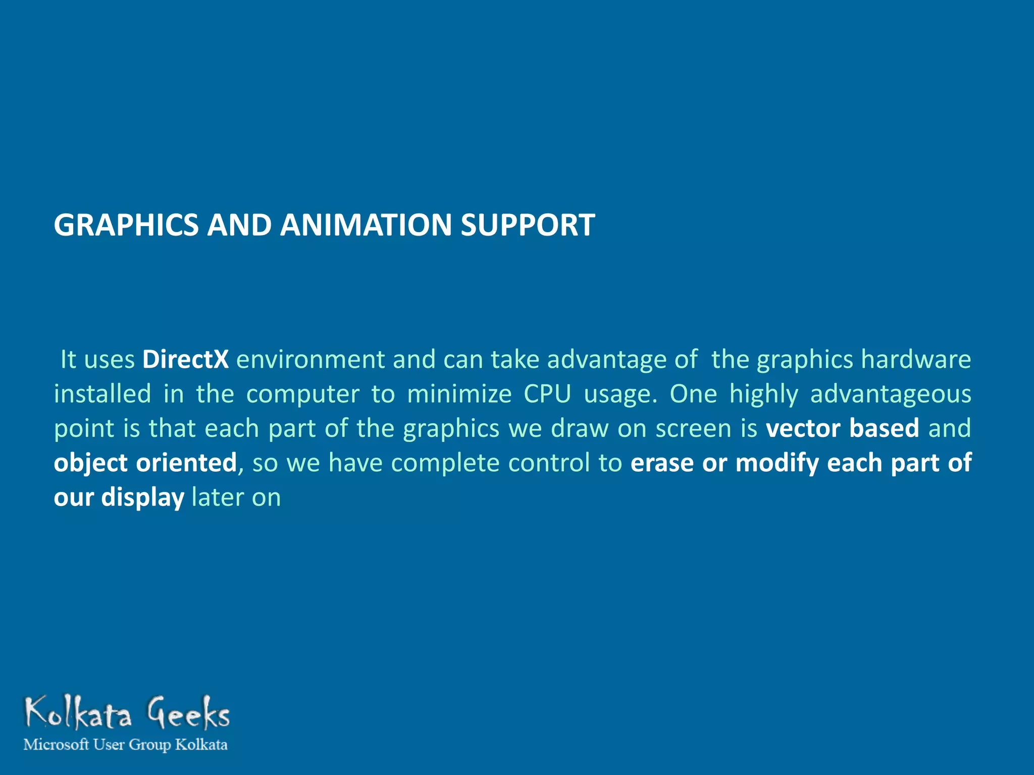
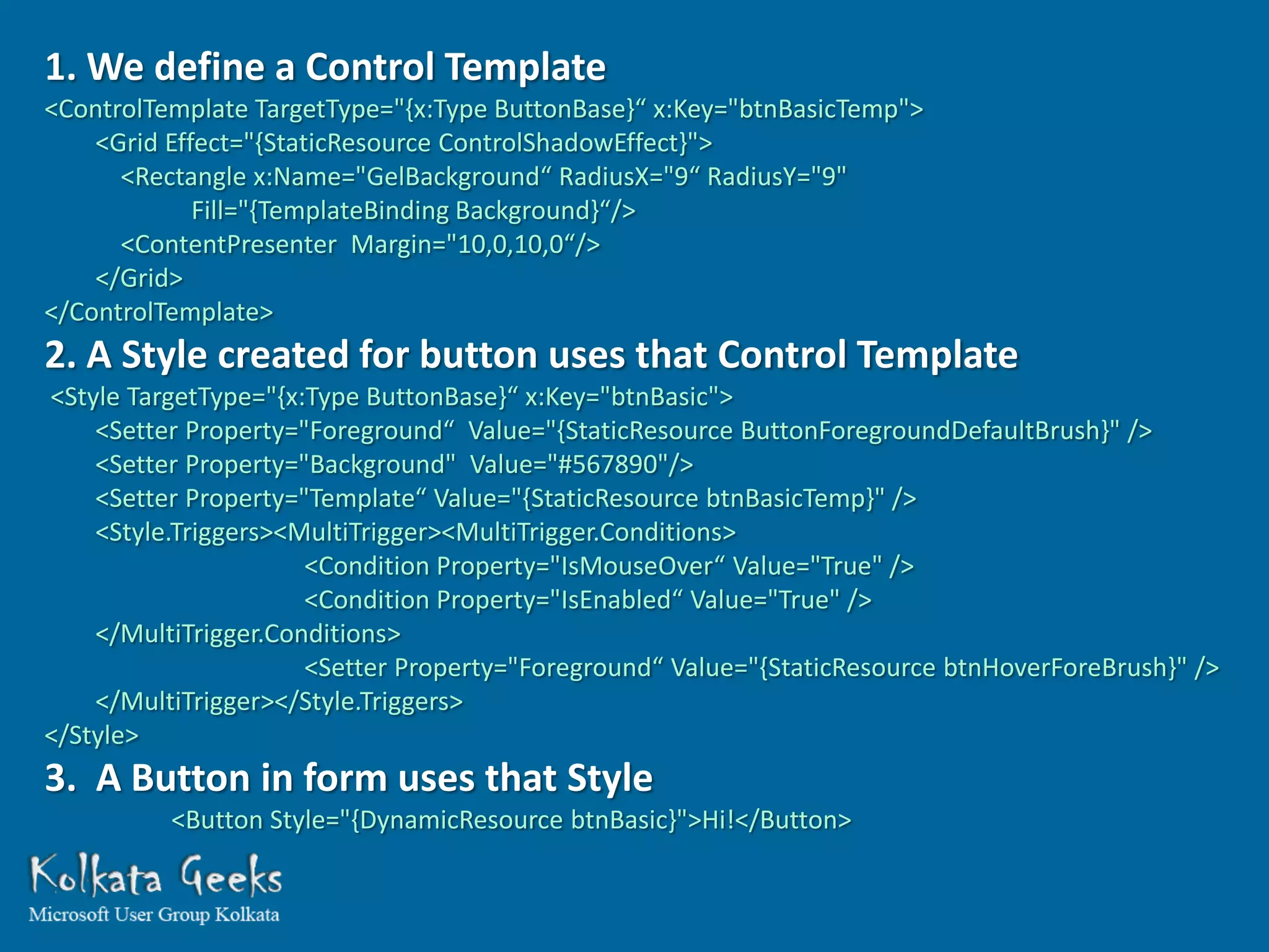
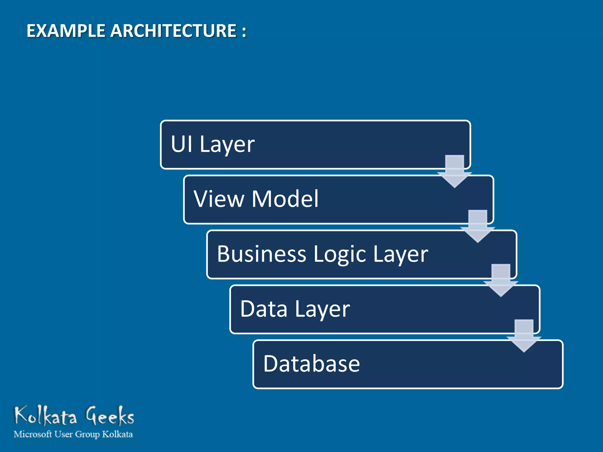
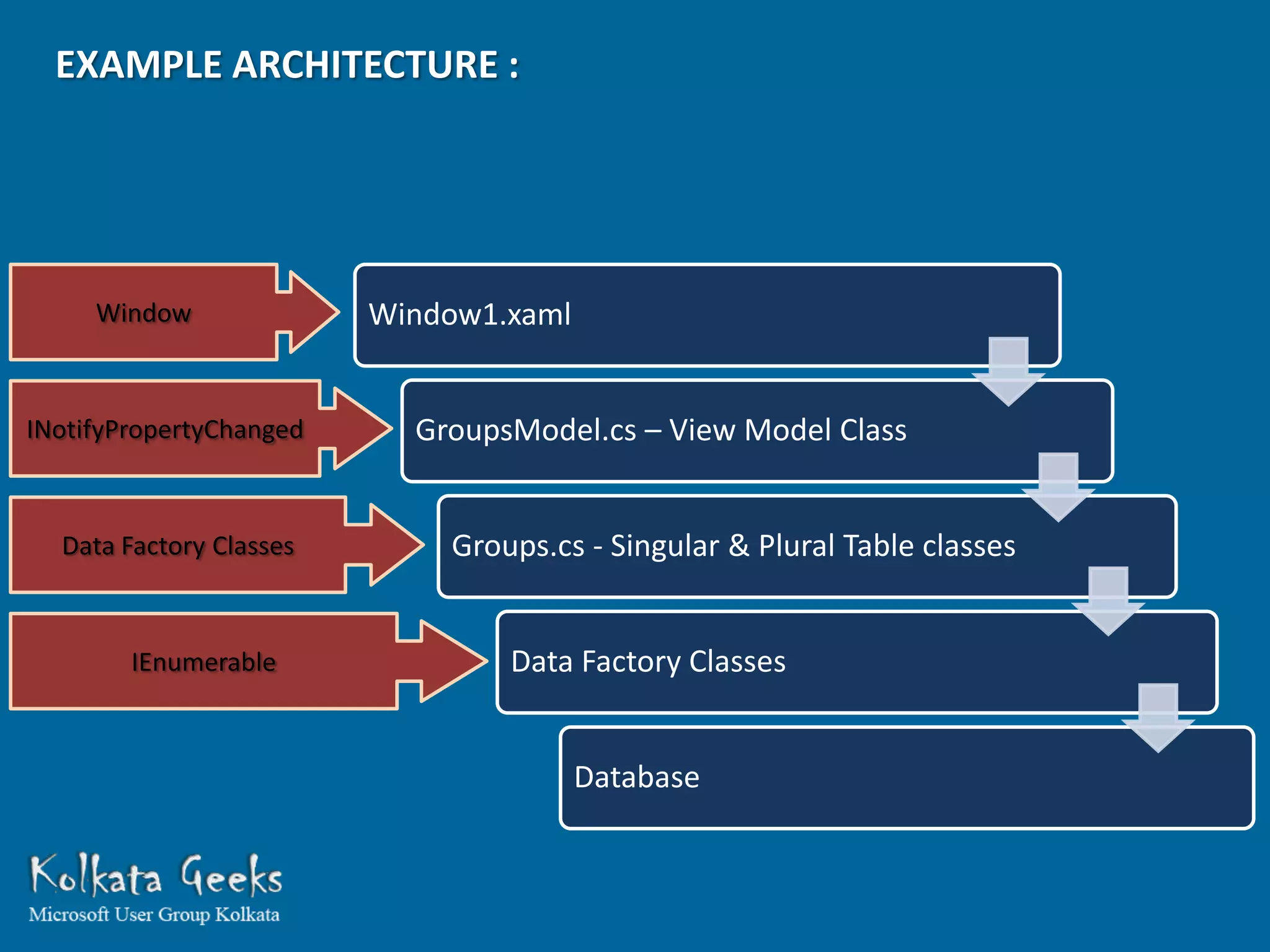
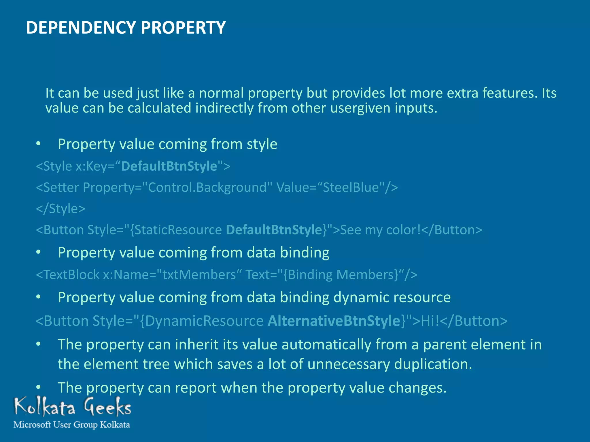
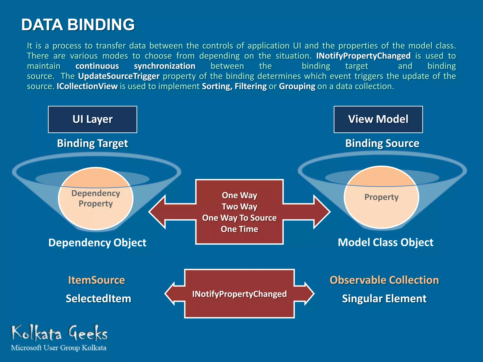
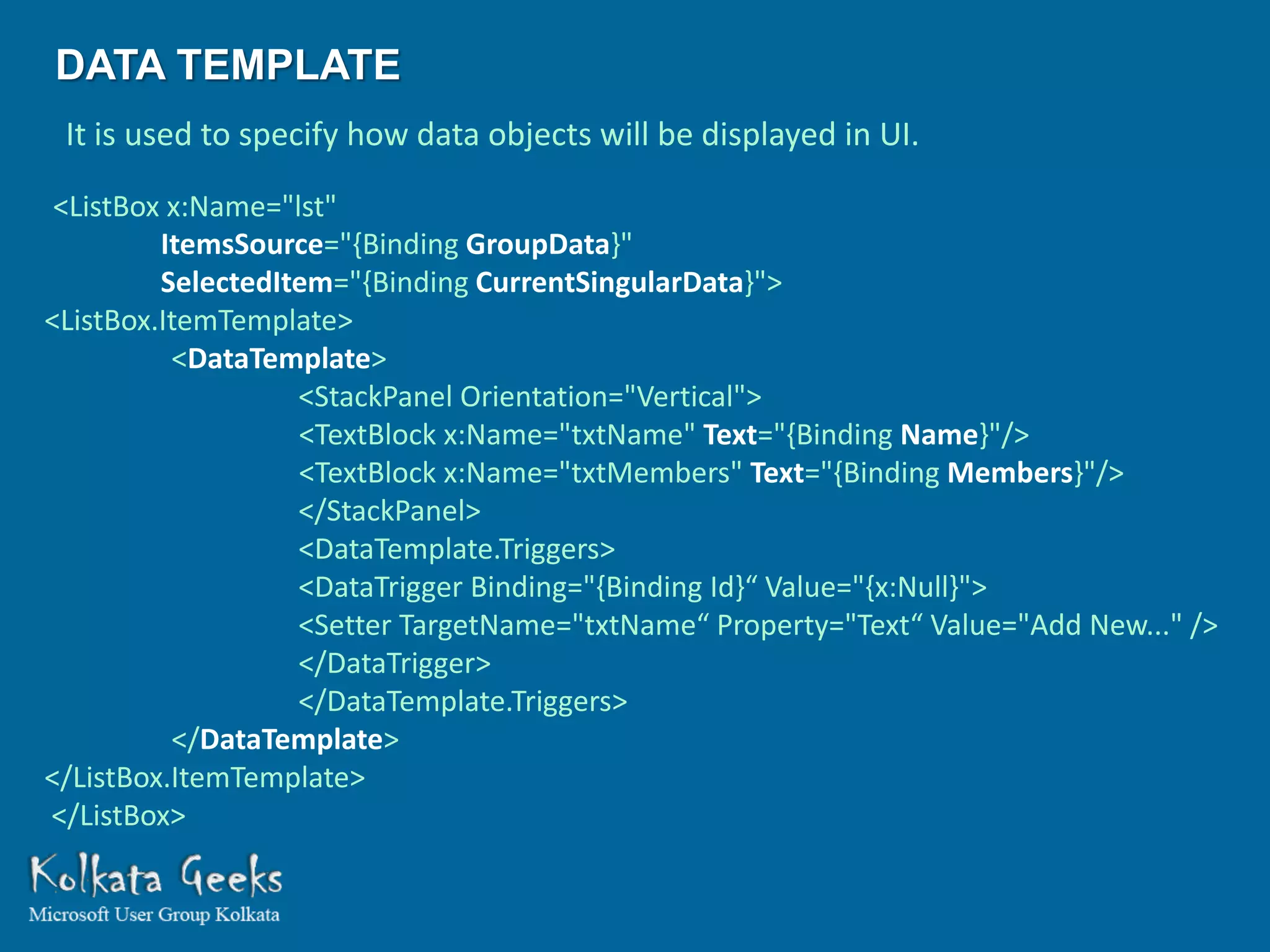
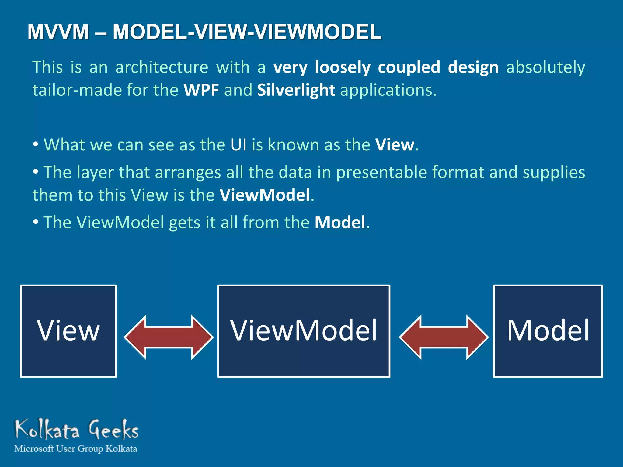
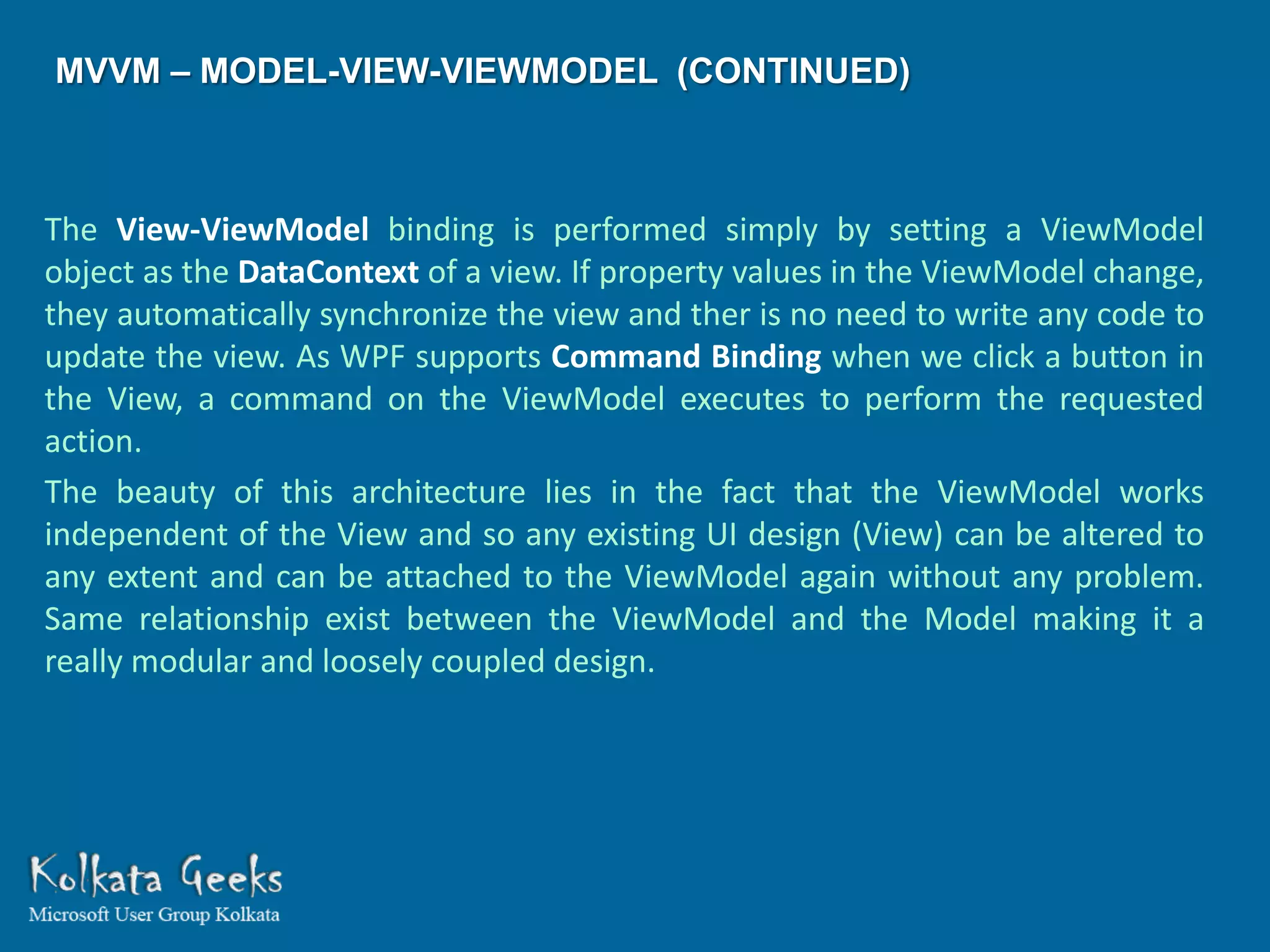
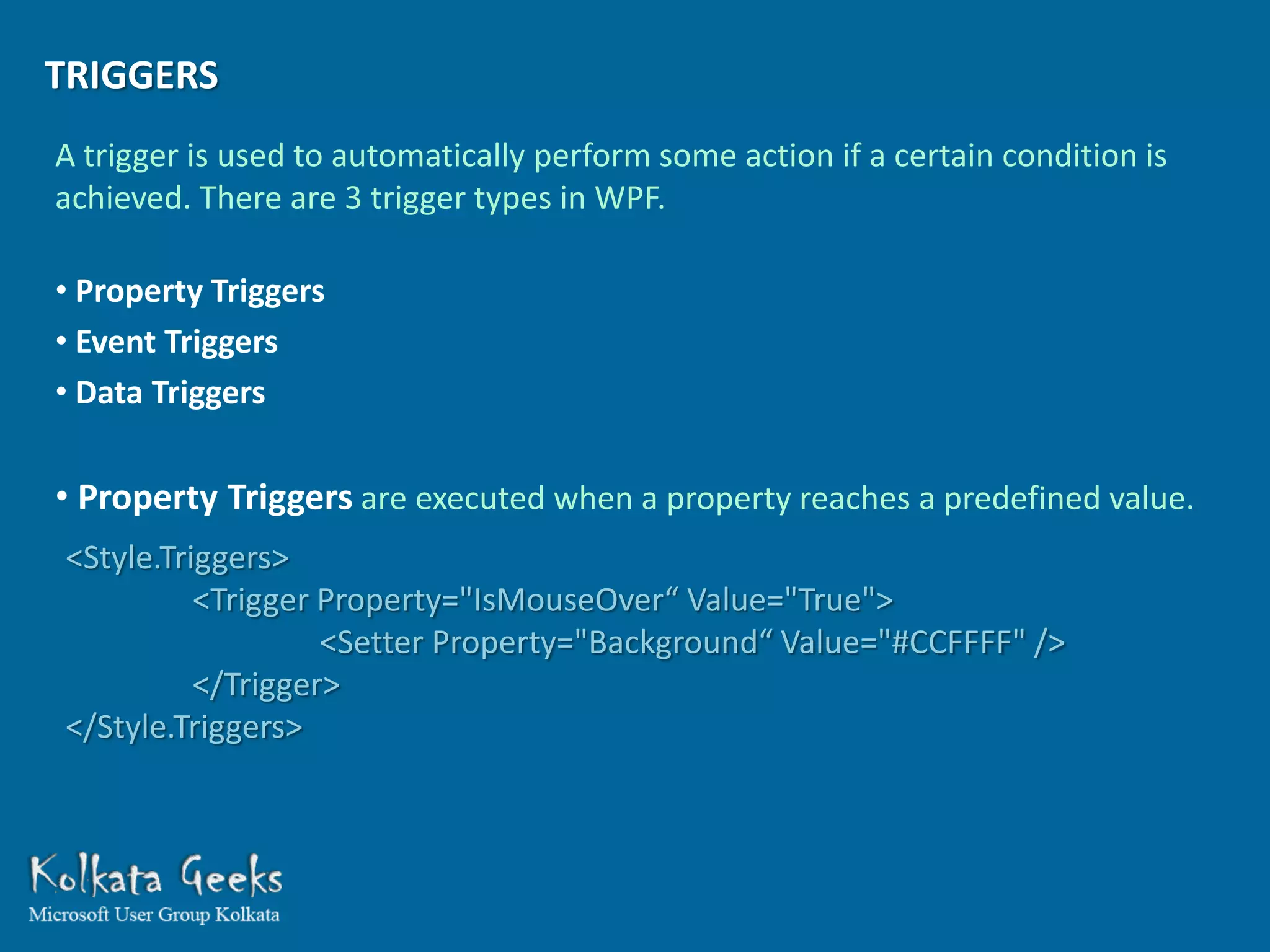
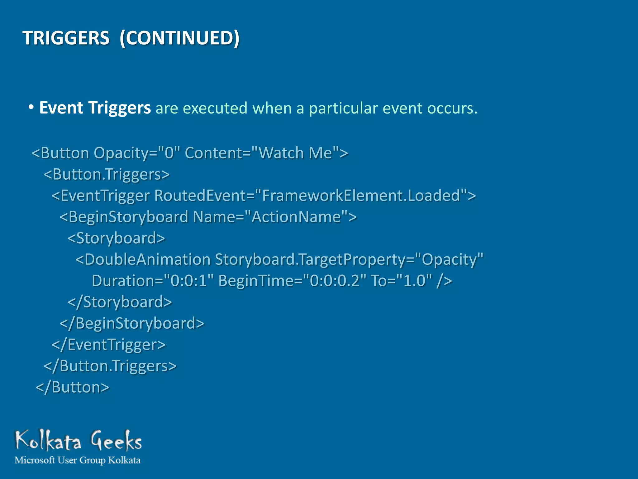
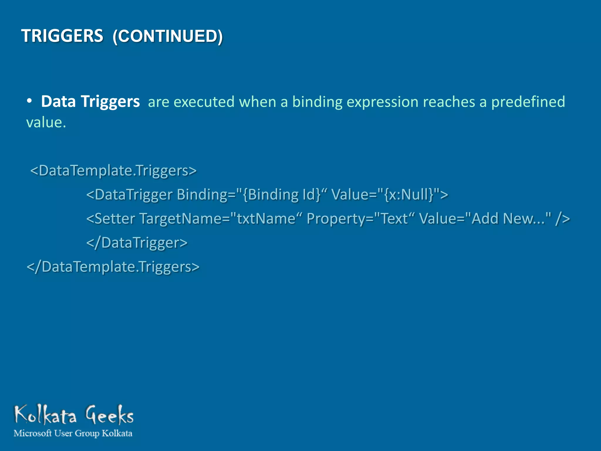
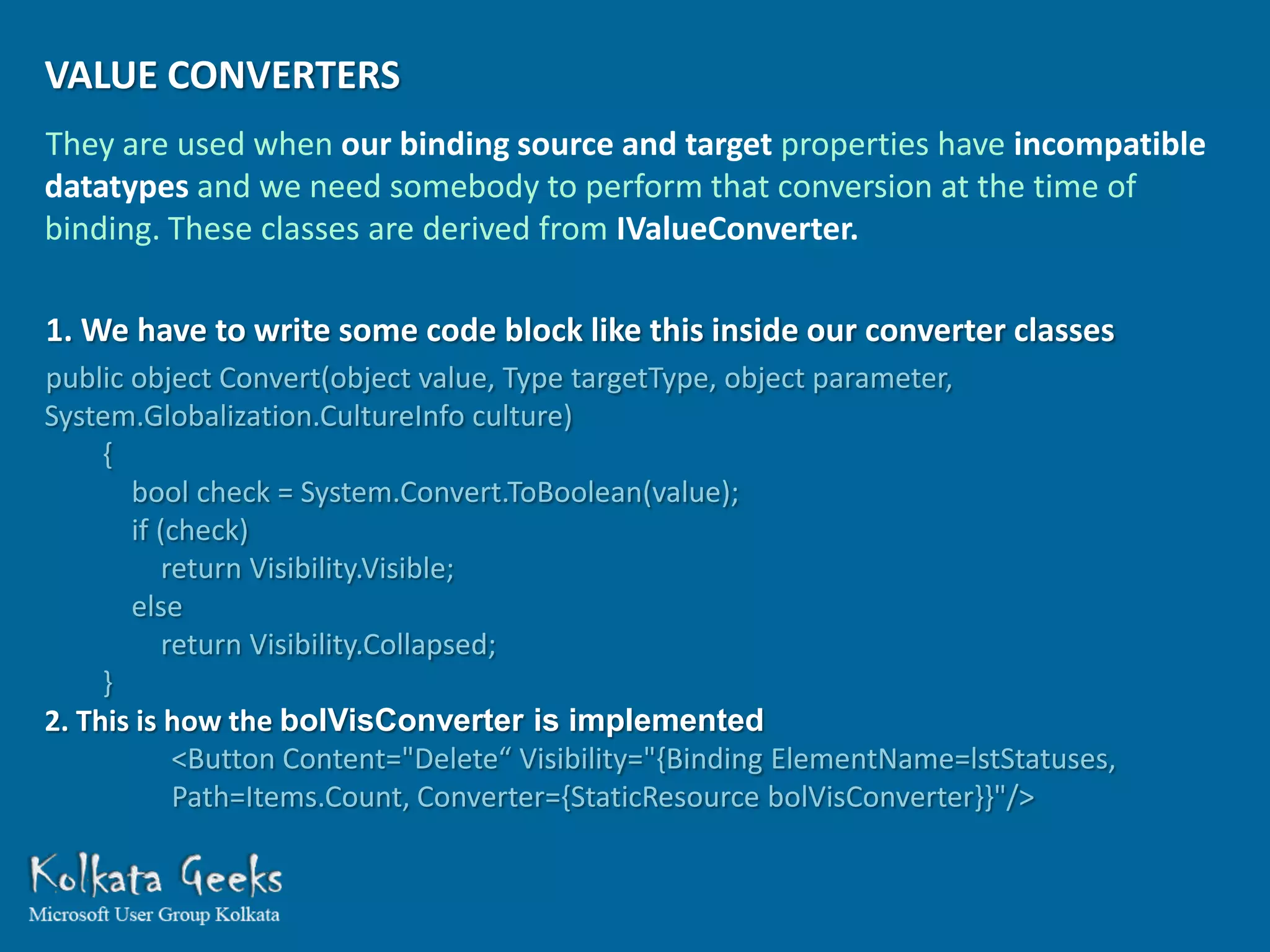
WEBCAST
              ON
HANDS ON TO MAGICAL COMBINATION
 OF WPF AND MVVM ARCHITECTURE

              PRESENTED
                  BY
           SHIBATOSH SINHA

            shibatosh@rediffmail.com
   http://www.facebook.com/Shibatosh.Sinha
A little ‘bit’e of   WPF
What is WPF ?


  The Windows Presentation Foundation (WPF) is a subset of the .NET
  Framework types that are located mostly in the         namespace
  System.Windows and is tailor made for building Windows client
  applications with visually stunning user experiences.

  In other words it means resolution-independent display, usage of
  Extensible Application Markup Language (XAML), powerful data binding,
  control and data templates, various layout options, 2D and 3D graphics,
  animations, styles, flow documents, multimedia and a lot more features
  all rolled into one!
SOME OF THE KEY FEATURES WE MIGHT LIKE TO
SAIL THROUGH FOR TODAY’S SESSION ARE :
RESOLUTION AND DEVICE-INDEPENDENT DISPLAY


 WPF got rid of this huge headache by incorporating Device Independent Pixels
(DPI) which remains 1/96th of an inch, regardless of actual screen resolution.
It is achieved by modifying the screen pixel density. It also uses a coordinate
system of Improved precision for more accurate display.
GRAPHICS AND ANIMATION SUPPORT


 It uses DirectX environment and can take advantage of the graphics hardware
installed in the computer to minimize CPU usage. One highly advantageous
point is that each part of the graphics we draw on screen is vector based and
object oriented, so we have complete control to erase or modify each part of
our display later on
CONTROL TEMPLATES


Wow! Another dream comes true for a developer. Now we can completely
redesign the look of a control as per our wish. For example now each
listboxitem in our listbox can have dynamic images, checkboxes, textboxes,
dropdowns and whatever control we require to display that record. That’s
what you call freedom! It also does one very important thing that is the XAML
which takes care of the appearance and the model class which controls the
behavior now becomes loosely coupled.
1. We define a Control Template
<ControlTemplate TargetType="{x:Type ButtonBase}“ x:Key="btnBasicTemp">
    <Grid Effect="{StaticResource ControlShadowEffect}">
      <Rectangle x:Name="GelBackground“ RadiusX="9“ RadiusY="9"
             Fill="{TemplateBinding Background}“/>
      <ContentPresenter Margin="10,0,10,0“/>
    </Grid>
</ControlTemplate>
2. A Style created for button uses that Control Template
<Style TargetType="{x:Type ButtonBase}“ x:Key="btnBasic">
    <Setter Property="Foreground“ Value="{StaticResource ButtonForegroundDefaultBrush}" />
    <Setter Property="Background" Value="#567890"/>
    <Setter Property="Template“ Value="{StaticResource btnBasicTemp}" />
    <Style.Triggers><MultiTrigger><MultiTrigger.Conditions>
                      <Condition Property="IsMouseOver“ Value="True" />
                      <Condition Property="IsEnabled“ Value="True" />
    </MultiTrigger.Conditions>
                      <Setter Property="Foreground“ Value="{StaticResource btnHoverForeBrush}" />
    </MultiTrigger></Style.Triggers>
</Style>
3. A Button in form uses that Style
          <Button Style="{DynamicResource btnBasic}">Hi!</Button>
EXAMPLE ARCHITECTURE :


              UI Layer

                View Model

                  Business Logic Layer

                     Data Layer

                         Database
EXAMPLE ARCHITECTURE :


     Window              Window1.xaml


INotifyPropertyChanged     GroupsModel.cs – View Model Class


  Data Factory Classes       Groups.cs - Singular & Plural Table classes


        IEnumerable              Data Factory Classes


                                        Database
DEPENDENCY PROPERTY


 It can be used just like a normal property but provides lot more extra features. Its
 value can be calculated indirectly from other usergiven inputs.

• Property value coming from style
<Style x:Key=“DefaultBtnStyle">
<Setter Property="Control.Background" Value=“SteelBlue"/>
</Style>
<Button Style="{StaticResource DefaultBtnStyle}">See my color!</Button>
• Property value coming from data binding
<TextBlock x:Name="txtMembers“ Text="{Binding Members}“/>
• Property value coming from data binding dynamic resource
<Button Style="{DynamicResource AlternativeBtnStyle}">Hi!</Button>
• The property can inherit its value automatically from a parent element in
   the element tree which saves a lot of unnecessary duplication.
• The property can report when the property value changes.
DATA BINDING
It is a process to transfer data between the controls of application UI and the properties of the model class.
There are various modes to choose from depending on the situation. INotifyPropertyChanged is used to
maintain     continuous      synchronization   between       the        binding    target         and binding
source. The UpdateSourceTrigger property of the binding determines which event triggers the update of the
source. ICollectionView is used to implement Sorting, Filtering or Grouping on a data collection.


           UI Layer                                                               View Model
       Binding Target                                                            Binding Source


           Dependency                           One Way                               Property
            Property                            Two Way
                                            One Way To Source
                                                One Time
     Dependency Object                                                         Model Class Object


          ItemSource                                                         Observable Collection
                                          INotifyPropertyChanged
         SelectedItem                                                           Singular Element
DATA TEMPLATE
 It is used to specify how data objects will be displayed in UI.

 <ListBox x:Name="lst"
         ItemsSource="{Binding GroupData}"
         SelectedItem="{Binding CurrentSingularData}">
<ListBox.ItemTemplate>
          <DataTemplate>
                   <StackPanel Orientation="Vertical">
                   <TextBlock x:Name="txtName" Text="{Binding Name}"/>
                   <TextBlock x:Name="txtMembers" Text="{Binding Members}"/>
                   </StackPanel>
                   <DataTemplate.Triggers>
                   <DataTrigger Binding="{Binding Id}“ Value="{x:Null}">
                   <Setter TargetName="txtName“ Property="Text“ Value="Add New..." />
                   </DataTrigger>
                   </DataTemplate.Triggers>
          </DataTemplate>
</ListBox.ItemTemplate>
</ListBox>
MVVM – MODEL-VIEW-VIEWMODEL
This is an architecture with a very loosely coupled design absolutely
tailor-made for the WPF and Silverlight applications.

• What we can see as the UI is known as the View.
• The layer that arranges all the data in presentable format and supplies
them to this View is the ViewModel.
• The ViewModel gets it all from the Model.


View                      ViewModel                           Model
MVVM – MODEL-VIEW-VIEWMODEL (CONTINUED)


The View-ViewModel binding is performed simply by setting a ViewModel
object as the DataContext of a view. If property values in the ViewModel change,
they automatically synchronize the view and ther is no need to write any code to
update the view. As WPF supports Command Binding when we click a button in
the View, a command on the ViewModel executes to perform the requested
action.
The beauty of this architecture lies in the fact that the ViewModel works
independent of the View and so any existing UI design (View) can be altered to
any extent and can be attached to the ViewModel again without any problem.
Same relationship exist between the ViewModel and the Model making it a
really modular and loosely coupled design.
TRIGGERS
A trigger is used to automatically perform some action if a certain condition is
achieved. There are 3 trigger types in WPF.

• Property Triggers
• Event Triggers
• Data Triggers

• Property Triggers are executed when a property reaches a predefined value.
<Style.Triggers>
          <Trigger Property="IsMouseOver“ Value="True">
                   <Setter Property="Background“ Value="#CCFFFF" />
          </Trigger>
</Style.Triggers>
TRIGGERS (CONTINUED)


• Event Triggers are executed when a particular event occurs.

<Button Opacity="0" Content="Watch Me">
 <Button.Triggers>
  <EventTrigger RoutedEvent="FrameworkElement.Loaded">
   <BeginStoryboard Name="ActionName">
    <Storyboard>
     <DoubleAnimation Storyboard.TargetProperty="Opacity"
       Duration="0:0:1" BeginTime="0:0:0.2" To="1.0" />
    </Storyboard>
   </BeginStoryboard>
  </EventTrigger>
 </Button.Triggers>
</Button>
TRIGGERS (CONTINUED)


• Data Triggers are executed when a binding expression reaches a predefined
value.

<DataTemplate.Triggers>
        <DataTrigger Binding="{Binding Id}“ Value="{x:Null}">
        <Setter TargetName="txtName“ Property="Text“ Value="Add New..." />
        </DataTrigger>
</DataTemplate.Triggers>
VALUE CONVERTERS
They are used when our binding source and target properties have incompatible
datatypes and we need somebody to perform that conversion at the time of
binding. These classes are derived from IValueConverter.

1. We have to write some code block like this inside our converter classes
public object Convert(object value, Type targetType, object parameter,
System.Globalization.CultureInfo culture)
     {
       bool check = System.Convert.ToBoolean(value);
       if (check)
           return Visibility.Visible;
       else
           return Visibility.Collapsed;
     }
2. This is how the bolVisConverter is implemented
            <Button Content="Delete“ Visibility="{Binding ElementName=lstStatuses,
            Path=Items.Count, Converter={StaticResource bolVisConverter}}"/>

The Magic of WPF & MVVM

  • 1.
    WEBCAST ON HANDS ON TO MAGICAL COMBINATION OF WPF AND MVVM ARCHITECTURE PRESENTED BY SHIBATOSH SINHA shibatosh@rediffmail.com http://www.facebook.com/Shibatosh.Sinha
  • 2.
  • 3.
    What is WPF? The Windows Presentation Foundation (WPF) is a subset of the .NET Framework types that are located mostly in the namespace System.Windows and is tailor made for building Windows client applications with visually stunning user experiences. In other words it means resolution-independent display, usage of Extensible Application Markup Language (XAML), powerful data binding, control and data templates, various layout options, 2D and 3D graphics, animations, styles, flow documents, multimedia and a lot more features all rolled into one!
  • 4.
    SOME OF THEKEY FEATURES WE MIGHT LIKE TO SAIL THROUGH FOR TODAY’S SESSION ARE :
  • 5.
    RESOLUTION AND DEVICE-INDEPENDENTDISPLAY WPF got rid of this huge headache by incorporating Device Independent Pixels (DPI) which remains 1/96th of an inch, regardless of actual screen resolution. It is achieved by modifying the screen pixel density. It also uses a coordinate system of Improved precision for more accurate display.
  • 6.
    GRAPHICS AND ANIMATIONSUPPORT It uses DirectX environment and can take advantage of the graphics hardware installed in the computer to minimize CPU usage. One highly advantageous point is that each part of the graphics we draw on screen is vector based and object oriented, so we have complete control to erase or modify each part of our display later on
  • 7.
    CONTROL TEMPLATES Wow! Anotherdream comes true for a developer. Now we can completely redesign the look of a control as per our wish. For example now each listboxitem in our listbox can have dynamic images, checkboxes, textboxes, dropdowns and whatever control we require to display that record. That’s what you call freedom! It also does one very important thing that is the XAML which takes care of the appearance and the model class which controls the behavior now becomes loosely coupled.
  • 8.
    1. We definea Control Template <ControlTemplate TargetType="{x:Type ButtonBase}“ x:Key="btnBasicTemp"> <Grid Effect="{StaticResource ControlShadowEffect}"> <Rectangle x:Name="GelBackground“ RadiusX="9“ RadiusY="9" Fill="{TemplateBinding Background}“/> <ContentPresenter Margin="10,0,10,0“/> </Grid> </ControlTemplate> 2. A Style created for button uses that Control Template <Style TargetType="{x:Type ButtonBase}“ x:Key="btnBasic"> <Setter Property="Foreground“ Value="{StaticResource ButtonForegroundDefaultBrush}" /> <Setter Property="Background" Value="#567890"/> <Setter Property="Template“ Value="{StaticResource btnBasicTemp}" /> <Style.Triggers><MultiTrigger><MultiTrigger.Conditions> <Condition Property="IsMouseOver“ Value="True" /> <Condition Property="IsEnabled“ Value="True" /> </MultiTrigger.Conditions> <Setter Property="Foreground“ Value="{StaticResource btnHoverForeBrush}" /> </MultiTrigger></Style.Triggers> </Style> 3. A Button in form uses that Style <Button Style="{DynamicResource btnBasic}">Hi!</Button>
  • 9.
    EXAMPLE ARCHITECTURE : UI Layer View Model Business Logic Layer Data Layer Database
  • 10.
    EXAMPLE ARCHITECTURE : Window Window1.xaml INotifyPropertyChanged GroupsModel.cs – View Model Class Data Factory Classes Groups.cs - Singular & Plural Table classes IEnumerable Data Factory Classes Database
  • 11.
    DEPENDENCY PROPERTY Itcan be used just like a normal property but provides lot more extra features. Its value can be calculated indirectly from other usergiven inputs. • Property value coming from style <Style x:Key=“DefaultBtnStyle"> <Setter Property="Control.Background" Value=“SteelBlue"/> </Style> <Button Style="{StaticResource DefaultBtnStyle}">See my color!</Button> • Property value coming from data binding <TextBlock x:Name="txtMembers“ Text="{Binding Members}“/> • Property value coming from data binding dynamic resource <Button Style="{DynamicResource AlternativeBtnStyle}">Hi!</Button> • The property can inherit its value automatically from a parent element in the element tree which saves a lot of unnecessary duplication. • The property can report when the property value changes.
  • 12.
    DATA BINDING It isa process to transfer data between the controls of application UI and the properties of the model class. There are various modes to choose from depending on the situation. INotifyPropertyChanged is used to maintain continuous synchronization between the binding target and binding source. The UpdateSourceTrigger property of the binding determines which event triggers the update of the source. ICollectionView is used to implement Sorting, Filtering or Grouping on a data collection. UI Layer View Model Binding Target Binding Source Dependency One Way Property Property Two Way One Way To Source One Time Dependency Object Model Class Object ItemSource Observable Collection INotifyPropertyChanged SelectedItem Singular Element
  • 13.
    DATA TEMPLATE Itis used to specify how data objects will be displayed in UI. <ListBox x:Name="lst" ItemsSource="{Binding GroupData}" SelectedItem="{Binding CurrentSingularData}"> <ListBox.ItemTemplate> <DataTemplate> <StackPanel Orientation="Vertical"> <TextBlock x:Name="txtName" Text="{Binding Name}"/> <TextBlock x:Name="txtMembers" Text="{Binding Members}"/> </StackPanel> <DataTemplate.Triggers> <DataTrigger Binding="{Binding Id}“ Value="{x:Null}"> <Setter TargetName="txtName“ Property="Text“ Value="Add New..." /> </DataTrigger> </DataTemplate.Triggers> </DataTemplate> </ListBox.ItemTemplate> </ListBox>
  • 14.
    MVVM – MODEL-VIEW-VIEWMODEL Thisis an architecture with a very loosely coupled design absolutely tailor-made for the WPF and Silverlight applications. • What we can see as the UI is known as the View. • The layer that arranges all the data in presentable format and supplies them to this View is the ViewModel. • The ViewModel gets it all from the Model. View ViewModel Model
  • 15.
    MVVM – MODEL-VIEW-VIEWMODEL(CONTINUED) The View-ViewModel binding is performed simply by setting a ViewModel object as the DataContext of a view. If property values in the ViewModel change, they automatically synchronize the view and ther is no need to write any code to update the view. As WPF supports Command Binding when we click a button in the View, a command on the ViewModel executes to perform the requested action. The beauty of this architecture lies in the fact that the ViewModel works independent of the View and so any existing UI design (View) can be altered to any extent and can be attached to the ViewModel again without any problem. Same relationship exist between the ViewModel and the Model making it a really modular and loosely coupled design.
  • 16.
    TRIGGERS A trigger isused to automatically perform some action if a certain condition is achieved. There are 3 trigger types in WPF. • Property Triggers • Event Triggers • Data Triggers • Property Triggers are executed when a property reaches a predefined value. <Style.Triggers> <Trigger Property="IsMouseOver“ Value="True"> <Setter Property="Background“ Value="#CCFFFF" /> </Trigger> </Style.Triggers>
  • 17.
    TRIGGERS (CONTINUED) • EventTriggers are executed when a particular event occurs. <Button Opacity="0" Content="Watch Me"> <Button.Triggers> <EventTrigger RoutedEvent="FrameworkElement.Loaded"> <BeginStoryboard Name="ActionName"> <Storyboard> <DoubleAnimation Storyboard.TargetProperty="Opacity" Duration="0:0:1" BeginTime="0:0:0.2" To="1.0" /> </Storyboard> </BeginStoryboard> </EventTrigger> </Button.Triggers> </Button>
  • 18.
    TRIGGERS (CONTINUED) • DataTriggers are executed when a binding expression reaches a predefined value. <DataTemplate.Triggers> <DataTrigger Binding="{Binding Id}“ Value="{x:Null}"> <Setter TargetName="txtName“ Property="Text“ Value="Add New..." /> </DataTrigger> </DataTemplate.Triggers>
  • 19.
    VALUE CONVERTERS They areused when our binding source and target properties have incompatible datatypes and we need somebody to perform that conversion at the time of binding. These classes are derived from IValueConverter. 1. We have to write some code block like this inside our converter classes public object Convert(object value, Type targetType, object parameter, System.Globalization.CultureInfo culture) { bool check = System.Convert.ToBoolean(value); if (check) return Visibility.Visible; else return Visibility.Collapsed; } 2. This is how the bolVisConverter is implemented <Button Content="Delete“ Visibility="{Binding ElementName=lstStatuses, Path=Items.Count, Converter={StaticResource bolVisConverter}}"/>