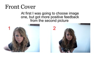
1. Front Cover At first I was going to choose image one, but got more positive feedback from the second picture 1 2
2. I then added my chosen Image to a dark grey background to match her dark coloured top and choose the colour scheme to clash with white writing
3. Following my colour scheme I added more text, listing artists from different genre’s of music to show what kind of magazine it is and who it is aimed for.
4. For my finished product , i changed the colour scheme to also match her eye shadow so I could inject more colour into it, making it appeal more to the audience. For my texts I have used two different font types and added even more variety of genre’s.