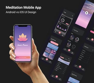
2. Objective:
This project is about how to design a native app into a specific platform such as iOS and Android. Therefore, able to take
advantage of all of that platform's features through its native operating system, generally providing a better experience. The
theme is meditation, which helps users to meditate, relieve anxiety, and stress.
Users:
This application is for users who want to calm down, clear their minds, or stay alone and spend some time on their own.
The application allows users to listen to selected meditation. They can set a reminder for each course and check their
improvements via charts. Users don’t need to have an account for listening to the sessions. But registering helps users share
their experiences, create a list of favorite sessions, and download the courses they like.
Key Features:
Problem:
There are several similar applications, such as Headspace, Meditopia, or Calm. However, these are complex and expensive
applications. They provide meditation sessions, some stories for sleeping, and background music for relaxation.
Solution:
‘Inner Peace’ app focuses only on meditation and it is easy to use. So it will be cheaper than other meditation apps on the
market.
3. User Flow Diagram
Based on several user stories from the brief, a user flow is created.
Mindful Meter
My Journey
Settings Edit Profil
Profil
Downloads
Share
Meditation
Selections
(Mindfulness /
Sleep…)
Home
Welcome
Story 3
As a new customer, I want to access the sessions
without having the registration so that I can do a
meditation before having to create an account.
Story 2
As a new customer, I want to see my progress so that I
have the motivation to continue meditation.
Story 1
As a new customer, I want to create my favorite
session list so that I can repeat what I like before.
4. Wireframing
After analyzing several similar apps and identifying design principles, both iOS and Android, it’s time to move
onto to the wireframes.
iOS Version Android Version
5. H4 SF Pro Text Regular, 15px
H1 SF Pro Text Bold, 24px
H2 SF Pro Text Regular, 21px
H3 SF Pro Text Semi Bold, 18px
iOS Typeface: SF Pro Text
H1 Cherry Angela, 50px
Design Purpose: Cherry Angela
H4 Roboto Regular, 15px
H1 Roboto Bold, 24px
H2 Roboto Regular, 21px
H3 Roboto Bold, 18px
Android Typeface: Roboto
Style Guide Typography
For the native app project, I chose, both iOS and Android default typefaces. For design purposes, I selected
Cherry Angela to reflect a spiritual feeling to the app.
6. HEF: #1E1E1E HEF: #2C2C2C HEF: #6B646B HEF: #FFFFFF
Style Guide Color Palette
My purpose in picking the gradient colors is creating a sunrise and sunset effect. The dark background shows
the gradients better, and it gives the peacefull and calm feelings to the app.
7. Prototyping and Testing
Before finalizing my designs, I tested my high fidelity wireframes on several users to identify pain points,
gather feedback and improve my designs.
The design and the feel of the
app fit very well with the
meditation design theme. I like
the calmness of the design,
and the use of colors and
gradients is done beautifully.
1
Really like the use of images
on the home page and the
blueish filter over them, they
suit the app well.
2
I find the logo beautiful. I think
it is very elegantly designed
with the gradients, shadows
and I love the circle it makes in
the water.
4
Love the simplicity and clean
layout of Home page.
3
Positive
A dark filter is used on the
pictures of the cards, therefore
increasing the contrast.
1
The button is the dominant
object and a primary action
button so that the playback
button set in the middle of the
page.
2
Solution
I would just watch out on the
font readability on some of
these cards.
1
The playback controls could
be a little lower down on the
page, that way they would be
easier to access, and also fill
the space at the bottom, which
feels a bit empty to me at the
moment.
2
Pain Points
iOS Design
8. Prototyping and Testing
I tested Android design on android users and iOS design on iOS users so that the user can identify
whether the elements fit the platform.
The colors introduces the
feeling of calm and peace. The
fonts are easy to read, nicely
alligned. Well done!!
1
Nice clean layout with easy to
read text and navigation
elements.
2
Like the use of a color gradient
banner to highlight the play
functions as well as make the
time slider, like button and
share button, stand out.
4
Straight forward to click on the
music. The like button is
pronounced and clear to find.
3
Positive
The images of the cards are
changed. I try to give different
feelings with the various
pictures to the design.
1
The Inner Peace title is moved
lower so that the title has more
space to increase readability.
2
The titles are changed into
friendly and positively
language.
3
The italic font is eliminated for
consistency.
4
Solution
The images on the meditations
are all very similar.
1
I'd move the Inner Peace a
little lower. It's very close to
the ripple lines.
2
When the title is just "Stress"
or "Anxiety" these appear
negative.
3
I would get rid of the italic font
on my journey page.
4
Pain Points
Android Design
9. Inner Peace
The logo got influenced by a Lotus flower. The shadow of the flower shows our sad,
depressing feelings on the bottom with a dark purple color. The flower is getting
brighter from the bottom to the top, which represents relaxation.