Strategies for Unlocking Knowledge Management in Microsoft 365 in the Copilot...
CSS gradients
1. CSS gradients let you display smooth transitions between two or more
specified colors.
CSS defines two types of gradients:
Linear Gradients (goes down/up/left/right/diagonally)
Radial Gradients (defined by their center)
CSS Linear Gradients
To create a linear gradient you must define at least two color
stops. Color stops are the colors you want to render smooth
transitions among. You can also set a starting point and a
direction (or an angle) along with the gradient effect.
Syntax
background-image: linear-gradient(direction, color-stop1, color-
stop2, ...);
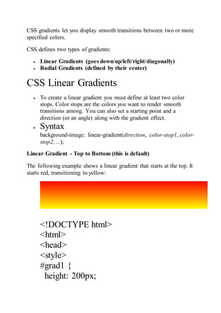
Linear Gradient - Top to Bottom (this is default)
The following example shows a linear gradient that starts at the top. It
starts red, transitioning to yellow:
<!DOCTYPE html>
<html>
<head>
<style>
#grad1 {
height: 200px;
2. background-color: red; /* For browsers
that do not support gradients */
background-image: linear-gradient(red,
yellow); /* Standard syntax (must be last)
*/
}
</style>
</head>
<body>
<h1>Linear Gradient - Top to
Bottom</h1>
<p>This linear gradient starts at the top. It
starts red, transitioning to yellow:</p>
<div id="grad1"></div>
<p><strong>Note:</strong> Internet
Explorer 9 and earlier versions do not
support gradients.</p>
</body>
</html>
3. Linear Gradient - Left to Right
The following example shows a linear gradient that starts from the
left. It starts red, transitioning to yellow:
<!DOCTYPE html>
<html>
<head>
<style>
#grad1 {
height: 200px;
background-color: red; /* For browsers that do not support gradients
*/
background-image: linear-gradient(to right, red , yellow); /*
Standard syntax (must be last) */
}
</style>
</head>
<body>
<h1>Linear Gradient - Left to Right</h1>
<p>This linear gradient starts at the left. It starts red, transitioning to
yellow:</p>
<div id="grad1"></div>
4. <p><strong>Note:</strong> Internet Explorer 9 and earlier versions
do not support gradients.</p>
</body>
</html>
Linear Gradient - Diagonal
You can make a gradient diagonally by specifying both the horizontal
and vertical starting positions.
The following example shows a linear gradient that starts at top left
(and goes to bottom right). It starts red, transitioning to yellow:
<!DOCTYPE html>
<html>
<head>
<style>
#grad1 {
height: 200px;
background-color: red; /* For browsers that do not support gradients
*/
background-image: linear-gradient(to bottom right, red, yellow); /*
Standard syntax (must be last) */
}
5. </style>
</head>
<body>
<h1>Linear Gradient - Diagonal</h1>
<p>This linear gradient starts at top left. It starts red, transitioning to
yellow:</p>
<div id="grad1"></div>
<p><strong>Note:</strong> Internet Explorer 9 and earlier versions
do not support gradients.</p>
</body>
</html>
Using Angles
If you want more control over the direction of the gradient, you can
define an angle, instead of the predefined directions (to bottom, to
top, to right, to left, to bottom right, etc.).
Syntax
background-image: linear-gradient(angle, color-stop1, color-
stop2);
The angle is specified as an angle between a horizontal line and the
gradient line.
6. The following example shows how to use angles on linear gradients:
<!DOCTYPE html>
<html>
<head>
<style>
#grad1 {
height: 100px;
background-color: red; /* For browsers that do not support gradients
*/
background-image: linear-gradient(0deg, red, yellow); /* Standard
syntax (must be last) */
}
#grad2 {
height: 100px;
background-color: red; /* For browsers that do not support gradients
*/
background-image: linear-gradient(90deg, red, yellow); /* Standard
syntax (must be last) */
}
#grad3 {
height: 100px;
7. background-color: red; /* For browsers that do not support gradients
*/
background-image: linear-gradient(180deg, red, yellow); /* Standard
syntax (must be last) */
}
#grad4 {
height: 100px;
background-color: red; /* For browsers that do not support gradients
*/
background-image: linear-gradient(-90deg, red, yellow); /* Standard
syntax (must be last) */
}
</style>
</head>
<body>
<h1>Linear Gradients - Using Different Angles</h1>
<div id="grad1" style="text-align:center;">0deg</div><br>
<div id="grad2" style="text-align:center;">90deg</div><br>
<div id="grad3" style="text-align:center;">180deg</div><br>
<div id="grad4" style="text-align:center;">-90deg</div>
<p><strong>Note:</strong> Internet Explorer 9 and earlier versions
do not support gradients.</p>
8. </body>
</html>
Using Multiple Color Stops
The following example shows a linear gradient (from top to bottom)
with multiple color stops:
<!DOCTYPE html>
9. <html>
<head>
<style>
#grad1 {
height: 200px;
background-color: red; /* For browsers that do not support gradients
*/
background-image: linear-gradient(red, yellow, green); /* Standard
syntax (must be last) */
}
#grad2 {
height: 200px;
background-color: red; /* For browsers that do not support gradients
*/
background-image: linear-gradient(red, orange, yellow, green, blue,
indigo, violet); /* Standard syntax (must be last) */
}
#grad3 {
height: 200px;
background-color: red; /* For browsers that do not support gradients
*/
background-image: linear-gradient(red 10%, green 85%, blue 90%);
/* Standard syntax (must be last) */
}
</style>
10. </head>
<body>
The following example shows how to create a linear gradient (from
left to right) with the color of the rainbow and some text:
<!DOCTYPE html>
<html>
<head>
<style>
#grad1 {
height: 55px;
background-color: red; /* For browsers that do not support gradients
*/
background-image: linear-gradient(to right, red, orange, yellow,
green, blue, indigo, violet); /* Standard syntax (must be last) */
}
</style>
</head>
<body>
<div id="grad1" style="text-
align:center;margin:auto;color:#888888;font-size:40px;font-
weight:bold">
11. Gradient Background
</div>
<p><strong>Note:</strong> Internet Explorer 9 and earlier versions
do not support gradients.</p>
</body>
</html>
Using Transparency
CSS gradients also support transparency, which can be used to create
fading effects.
To add transparency, we use the rgba() function to define the color
stops. The last parameter in the rgba() function can be a value from 0
to 1, and it defines the transparency of the color: 0 indicates full
transparency, 1 indicates full color (no transparency).
The following example shows a linear gradient that starts from the
left. It starts fully transparent, transitioning to full color red:
<!DOCTYPE html>
<html>
<head>
<style>
#grad1 {
12. height: 200px;
background-image: linear-gradient(to right, rgba(255,0,0,0),
rgba(255,0,0,1)); /* Standard syntax (must be last) */
}
</style>
</head>
<body>
<h1>Linear Gradient - Transparency</h1>
<p>To add transparency, we use the rgba() function to define the
color stops. The last parameter in the rgba() function can be a value
from 0 to 1, and it defines the transparency of the color: 0 indicates
full transparency, 1 indicates full color (no transparency).</p>
<div id="grad1"></div>
<p><strong>Note:</strong> Internet Explorer 9 and earlier versions
do not support gradients.</p>
</body>
</html>
13. Repeating a linear-gradient
The repeating-linear-gradient() function is used to repeat linear
gradients:
<!DOCTYPE html>
<html>
<head>
<style>
#grad1 {
height: 200px;
background-color: red; /* For browsers that do not support gradients
*/
background-image: repeating-linear-gradient(red, yellow 10%, green
20%); /* Standard syntax (must be last) */
}
#grad2 {
height: 200px;
background-color: red; /* For browsers that do not support gradients
*/
background-image: repeating-linear-gradient(45deg,red,yellow
7%,green 10%); /* Standard syntax (must be last) */
}
14. #grad3 {
height: 200px;
background-color: red; /* For browsers that do not support gradients
*/
background-image: repeating-linear-gradient(190deg,red,yellow
7%,green 10%); /* Standard syntax (must be last) */
}
#grad4 {
height: 200px;
background-color: red; /* For browsers that do not support gradients
*/
background-image: repeating-linear-gradient(90deg,red,yellow
7%,green 10%); /* Standard syntax (must be last) */
}
</style>
</head>
<body>
<h1>Repeating Linear Gradient</h1>
<div id="grad1"></div>
<p>A repeating gradient on 45deg axe starting red and finishing
green:</p>
15. <div id="grad2"></div>
<p>A repeating gradient on 190deg axe starting red and finishing
green:</p>
<div id="grad3"></div>
<p>A repeating gradient on 90deg axe starting red and finishing
green:</p>
<div id="grad4"></div>
<p><strong>Note:</strong> Internet Explorer 9 and earlier versions
do not support gradients.</p>
</body>
</html>
16. CSS Radial Gradients
A radial gradient is defined by its center.
To create a radial gradient you must also define at least two color
stops.
17. Syntax
background-image: radial-gradient(shape size at position,
start-color, ..., last-color);
By default, shape is ellipse, size is farthest-corner, and position is
center.
Radial Gradient - Evenly Spaced Color Stops (this is default)
The following example shows a radial gradient with evenly spaced
color stops:
<!DOCTYPE html>
<html>
<head>
<style>
#grad1 {
height: 150px;
width: 200px;
background-color: red; /* For browsers that do not support gradients
*/
background-image: radial-gradient(red, yellow, green); /* Standard
syntax (must be last) */
}
</style>
</head>
18. <body>
<h1>Radial Gradient - Evenly Spaced Color Stops</h1>
<div id="grad1"></div>
<p><strong>Note:</strong> Internet Explorer 9 and earlier versions
do not support gradients.</p>
</body>
</html>
Radial Gradient - Differently Spaced Color Stops
The following example shows a radial gradient with differently
spaced color stops:
<!DOCTYPE html>
<html>
<head>
<style>
#grad1 {
19. height: 150px;
width: 200px;
background-color: red; /* For browsers that do not support gradients
*/
background-image: radial-gradient(red 5%, yellow 15%, green
60%); /* Standard syntax (must be last) */
}
</style>
</head>
<body>
<h1>Radial Gradient - Differently Spaced Color Stops</h1>
<div id="grad1"></div>
<p><strong>Note:</strong> Internet Explorer 9 and earlier versions
do not support gradients.</p>
</body>
</html>
Set Shape
20. The shape parameter defines the shape. It can take the value circle or
ellipse. The default value is ellipse.
The following example shows a radial gradient with the shape of a
circle:
<!DOCTYPE html>
<html>
<head>
<style>
#grad1 {
height: 150px;
width: 200px;
background-color: red; /* For browsers that do not support gradients
*/
background-image: radial-gradient(red, yellow, green); /* Standard
syntax (must be last) */
}
21. #grad2 {
height: 150px;
width: 200px;
background-color: red; /* For browsers that do not support gradients
*/
background-image: radial-gradient(circle, red, yellow, green); /*
Standard syntax (must be last) */
}
</style>
</head>
<body>
<h1>Radial Gradient - Shapes</h1>
<h2>Ellipse (this is default):</h2>
<div id="grad1"></div>
<h2><strong>Circle:</strong></h2>
<div id="grad2"></div>
<p><strong>Note:</strong> Internet Explorer 9 and earlier versions
do not support gradients.</p>
</body>
</html>
22. Use of Different Size Keywords
The size parameter defines the size of the gradient. It can take four
values:
closest-side
farthest-side
closest-corner
farthest-corner
Example
A radial gradient with different size keywords:
#grad1 {
background-image: radial-gradient(closest-side at 60% 55%, red,
23. yellow, black);
}
#grad2 {
background-image: radial-gradient(farthest-side at 60% 55%, red,
yellow, black);
}
<!DOCTYPE html>
<html>
<head>
<style>
#grad1 {
height: 150px;
width: 150px;
background-color: red; /* For browsers that do not support gradients
*/
background-image: radial-gradient(closest-side at 60% 55%, red,
yellow, black); /* Standard syntax (must be last) */
}
#grad2 {
height: 150px;
width: 150px;
background-color: red; /* For browsers that do not support gradients
*/
background-image: radial-gradient(farthest-side at 60% 55%, red,
yellow, black); /* Standard syntax (must be last) */
}
24. #grad3 {
height: 150px;
width: 150px;
background-color: red; /* For browsers that do not support gradients
*/
background-image: radial-gradient(closest-corner at 60% 55%, red,
yellow, black); /* Standard syntax (must be last) */
}
#grad4 {
height: 150px;
width: 150px;
background-color: red; /* For browsers that do not support gradients
*/
background-image: radial-gradient(farthest-corner at 60% 55%, red,
yellow, black); /* Standard syntax (must be last) */
}
</style>
</head>
<body>
<h1>Radial Gradients - Different size keywords</h1>
<h2>closest-side:</h2>
<div id="grad1"></div>
27. Repeating a radial-gradient
The repeating-radial-gradient() function is used to repeat radial
gradients:
<!DOCTYPE html>
<html>
<head>
<style>
#grad1 {
height: 150px;
width: 200px;
background-color: red; /* For browsers that do not support gradients
*/
background-image: repeating-radial-gradient(red, yellow 10%, green
15%); /* Standard syntax (must be last) */
}
</style>
</head>
<body>
<h1>Repeating Radial Gradient</h1>
28. <div id="grad1"></div>
<p><strong>Note:</strong> Internet Explorer 9 and earlier versions
do not support gradients.</p>
</body>
</html>
Set a linear gradient background for the <div> element, going from
the top left to the bottom right, transitioning from "white" to "green".
<!DOCTYPE html>
<html>
<head>
<style>
div {
background-image: linear-gradient(white, green);
}
</style>
</head>
29. <body>
<div style="height:200px"></div>
</body>
</html>
CSS Text Effects
CSS Text Overflow, Word Wrap, Line Breaking
Rules, and Writing Modes
text-overflow
word-wrap
word-break
writing-mode
CSS Text Overflow
The CSS text-overflow property specifies how overflowed content that is
not displayed should be signaled to the user.
It can be clipped:
This is some long text that will not fit in the box
or it can be rendered as an ellipsis (...):
30. This is some long text that will not fit in the box
The CSS code is as follows:
<!DOCTYPE html>
<html>
<head>
<style>
p.test1 {
white-space: nowrap;
width: 200px;
border: 1px solid #000000;
overflow: hidden;
text-overflow: clip;
}
p.test2 {
white-space: nowrap;
width: 200px;
border: 1px solid #000000;
overflow: hidden;
text-overflow: ellipsis;
}
</style>
</head>
<body>
31. <h1>The text-overflow Property</h1>
<p>The following two paragraphs contains a long text that will not fit in the
box.</p>
<h2>text-overflow: clip:</h2>
<p class="test1">This is some long text that will not fit in the box</p>
<h2>text-overflow: ellipsis:</h2>
<p class="test2">This is some long text that will not fit in the box</p>
</body>
</html>
The text-overflow Property
The following two paragraphs contains a long text that will not fit in the box.
text-overflow: clip:
This is some long text that will not fit in the box
text-overflow: ellipsis:
This is some long text that
CSS Word Wrapping
The CSS word-wrap property allows long words to be able to be broken and
wrap onto the next line.
If a word is too long to fit within an area, it expands outside:
If a word is too long to fit within an area, it expands outside:
32. The word-wrap property allows you to force the text to wrap - even if it
means splitting it in the middle of a word:
This paragraph contains a very long word:
thisisaveryveryveryveryveryverylongword. The long word will break and wrap
to the next line.
The CSS code is as follows:
<!DOCTYPE html>
<html>
<head>
<style>
p.test {
width: 11em;
border: 1px solid #000000;
word-wrap: break-word;
}
</style>
</head>
<body>
<h1>The word-wrap Property</h1>
33. <p class="test"> This paragraph contains a very long word:
thisisaveryveryveryveryveryverylongword. The long word will break and wrap
to the next line.</p>
</body>
</html>
CSS Word Breaking
The CSS word-break property specifies line breaking rules.
<!DOCTYPE html>
<html>
<head>
34. <style>
p.test1 {
width: 140px;
border: 1px solid #000000;
word-break: keep-all;
}
p.test2 {
width: 140px;
border: 1px solid #000000;
word-break: break-all;
}
</style>
</head>
<body>
<h1>The word-break Property</h1>
<p class="test1">This paragraph contains some text. This line will-break-at-
hyphens.</p>
<p class="test2">This paragraph contains some text. The lines will break at
any character.</p>
<p><b>Note:</b> The word-break property is not supported in Opera 12
and earlier versions.</p>
35. </body>
</html>
CSS Writing Mode
The CSS writing-mode property specifies whether lines of text are laid out
horizontally or vertically.
Some text with a span element with a vertical-rl writing-mode.
The following example shows some different writing modes:
<!DOCTYPE html>
<html>
<head>
<style>
p.test1 {
writing-mode: horizontal-tb;
}
span.test2 {
36. writing-mode: vertical-rl;
}
p.test2 {
writing-mode: vertical-rl;
}
</style>
</head>
<body>
<h1>The writing-mode Property</h1>
<p class="test1">Some text with default writing-mode.</p>
<p>Some text with a span element with a <span class="test2">vertical-
rl</span> writing-mode.</p>
<p class="test2">Some text with writing-mode: vertical-rl.</p>
</body>
</html>
37. CSS Text Effect Properties
The following table lists the CSS text effect properties:
Property Description
text-align-last Specifies how to align the last line of a text
text-justify Specifies how justified text should be aligned and
spaced
38. text-overflow Specifies how overflowed content that is not displayed
should be signaled to the user
word-break Specifies line breaking rules for non-CJK scripts
word-wrap Allows long words to be able to be broken and wrap
onto the next line
writing-mode Specifies whether lines of text are laid out horizontally
or vertically
CSS 2D Transforms
CSS transforms allow you to move, rotate, scale, and skew elements.
Mouse over the element below to see a 2D transformation:
<!DOCTYPE html>
<html>
<head>
<style>
div {
width: 300px;
39. height: 100px;
background-color: yellow;
border: 1px solid black;
}
div#myDiv {
-ms-transform: rotate(20deg); /* IE 9 */
-webkit-transform: rotate(20deg); /* Safari prior 9.0 */
transform: rotate(20deg); /* Standard syntax */
}
</style>
</head>
<body>
<h1>The rotate() Method</h1>
<p>The rotate() method rotates an element clockwise or counter-
clockwise.</p>
<div>
This a normal div element.
</div>
<div id="myDiv">
This div element is rotated clockwise 20 degrees.
</div>
40. </body>
</html>
CSS 2D Transforms Methods
With the CSS transform property you can use the following 2D
transformation methods:
translate()
rotate()
scaleX()
scaleY()
scale()
skewX()
skewY()
skew()
matrix()
The translate() Method
41. The translate() method moves an element from its current position
(according to the parameters given for the X-axis and the Y-axis).
The following example moves the <div> element 50 pixels to the right, and
100 pixels down from its current position:
div {
transform: translate(50px, 100px);
}
The rotate() Method
The rotate() method rotates an element clockwise or counter-clockwise
according to a given degree.
The following example rotates the <div> element clockwise with 20 degrees:
Example
div {
transform: rotate(20deg);
}
Using negative values will rotate the element counter-clockwise.
The following example rotates the <div> element counter-clockwise with 20
degrees:
Example
42. div {
transform: rotate(-20deg);
}
The scale() Method
The scale() method increases or decreases the size of an element
(according to the parameters given for the width and height).
The following example increases the <div> element to be two times of its
original width, and three times of its original height:
Example
div {
transform: scale(2, 3);
}
The following example decreases the <div> element to be half of its original
width and height:
Example
div {
transform: scale(0.5, 0.5);
}
The scaleX() Method
The scaleX() method increases or decreases the width of an element.
The following example increases the <div> element to be two times of its
original width:
Example
43. div {
transform: scaleX(2);
}
The following example decreases the <div> element to be half of its original
width:
Example
div {
transform: scaleX(0.5);
}
The scaleY() Method
The scaleY() method increases or decreases the height of an element.
The following example increases the <div> element to be three times of its
original height:
Example
div {
transform: scaleY(3);
}
The following example decreases the <div> element to be half of its original
height:
Example
div {
transform: scaleY(0.5);
}
The skewX() Method
The skewX() method skews an element along the X-axis by the given angle.
The following example skews the <div> element 20 degrees along the X-
axis:
Example
div {
transform: skewX(20deg);
}
44. The skewY() Method
The skewY() method skews an element along the Y-axis by the given angle.
The following example skews the <div> element 20 degrees along the Y-
axis:
Example
div {
transform: skewY(20deg);
}
The skew() Method
The skew() method skews an element along the X and Y-axis by the given
angles.
The following example skews the <div> element 20 degrees along the X-
axis, and 10 degrees along the Y-axis:
Example
div {
transform: skew(20deg, 10deg);
}
If the second parameter is not specified, it has a zero value. So, the following
example skews the <div> element 20 degrees along the X-axis:
Example
div {
transform: skew(20deg);
}
The matrix() Method
The matrix() method combines all the 2D transform methods into one.
45. The matrix() method take six parameters, containing mathematic functions,
which allows you to rotate, scale, move (translate), and skew elements.
The parameters are as follow:
matrix(scaleX(),skewY(),skewX(),scaleY(),translateX(),translateY())
Example
div {
transform: matrix(1, -0.3, 0, 1, 0, 0);
}
CSS Transform Properties
The following table lists all the 2D transform properties:
Property Description
transform Applies a 2D or 3D transformation to an element
transform-origin Allows you to change the position on transformed elements
CSS 2D Transform Methods
Function Description
matrix(n,n,n,n,n,n) Defines a 2D transformation, using a matrix of six values
translate(x,y) Defines a 2D translation, moving the element along the X- and t
translateX(n) Defines a 2D translation, moving the element along the X-axis
46. translateY(n) Defines a 2D translation, moving the element along the Y-axis
scale(x,y) Defines a 2D scale transformation, changing the elements width
scaleX(n) Defines a 2D scale transformation, changing the element's width
scaleY(n) Defines a 2D scale transformation, changing the element's height
rotate(angle) Defines a 2D rotation, the angle is specified in the parameter
skew(x-angle,y-angle) Defines a 2D skew transformation along the X- and the Y-axis
skewX(angle) Defines a 2D skew transformation along the X-axis
skewY(angle) Defines a 2D skew transformation along the Y-axis
CSS 3D Transforms
CSS also supports 3D transformations.
Mouse over the elements below to see the difference between a 2D and a 3D
transformation:
<!DOCTYPE html>
<html>
<head>
<style>
div {
47. width: 300px;
height: 100px;
background-color: yellow;
border: 1px solid black;
}
#myDiv {
-webkit-transform: rotateY(150deg); /* Safari prior 9.0 */
transform: rotateY(150deg); /* Standard syntax */
}
</style>
</head>
<body>
<h1>The rotateY() Method</h1>
<p>The rotateY() method rotates an element around its Y-axis at a given
degree.</p>
<div>
This a normal div element.
</div>
48. CSS 3D Transforms Methods
With the CSS transform property you can use the following 3D
transformation methods:
rotateX()
rotateY()
rotateZ()
The rotateX() Method
The rotateX() method rotates an element around its X-axis at a given
degree:
Example
#myDiv {
transform: rotateX(150deg);
}
49. The rotateY() Method
The rotateY() method rotates an element around its Y-axis at a given
degree:
Example
#myDiv {
transform: rotateY(130deg);
}
The rotateZ() Method
The rotateZ() method rotates an element around its Z-axis at a given
degree:
Example
#myDiv {
transform: rotateZ(90deg);
}
CSS Transitions
CSS transitions allows you to change property values smoothly, over a given
duration.
Mouse over the element below to see a CSS transition effect:
<!DOCTYPE html>
<html>
<head>
<style>
div {
50. width: 100px;
height: 100px;
background: red;
-webkit-transition: width 2s; /* For Safari 3.1 to 6.0 */
transition: width 2s;
}
div:hover {
width: 300px;
}
</style>
</head>
<body>
<h1>The transition Property</h1>
<p>Hover over the div element below, to see the transition effect:</p>
<div></div>
<p><b>Note:</b> This example does not work in Internet Explorer 9 and
earlier versions.</p>
</body>
</html>
51. How to Use CSS Transitions?
To create a transition effect, you must specify two things:
the CSS property you want to add an effect to
the duration of the effect
Note: If the duration part is not specified, the transition will have no effect,
because the default value is 0.
The following example shows a 100px * 100px red <div> element. The
<div> element has also specified a transition effect for the width property,
with a duration of 2 seconds:
Example
div {
width: 100px;
height: 100px;
background: red;
transition: width 2s;
}
The transition effect will start when the specified CSS property (width)
changes value.
Now, let us specify a new value for the width property when a user mouses
over the <div> element:
Example
52. div:hover {
width: 300px;
}
Notice that when the cursor mouses out of the element, it will gradually
change back to its original style.
Change Several Property Values
The following example adds a transition effect for both the width and height
property, with a duration of 2 seconds for the width and 4 seconds for the
height:
Example
div {
transition: width 2s, height 4s;
}
Specify the Speed Curve of the Transition
The transition-timing-function property specifies the speed curve of the
transition effect.
The transition-timing-function property can have the following values:
ease - specifies a transition effect with a slow start, then fast, then end
slowly (this is default)
linear - specifies a transition effect with the same speed from start to
end
ease-in - specifies a transition effect with a slow start
ease-out - specifies a transition effect with a slow end
ease-in-out - specifies a transition effect with a slow start and end
cubic-bezier(n,n,n,n) - lets you define your own values in a cubic-
bezier function
The following example shows the some of the different speed curves that can
be used:
53. Example
#div1 {transition-timing-function: linear;}
#div2 {transition-timing-function: ease;}
#div3 {transition-timing-function: ease-in;}
#div4 {transition-timing-function: ease-out;}
#div5 {transition-timing-function: ease-in-out;}
Delay the Transition Effect
The transition-delay property specifies a delay (in seconds) for the
transition effect.
The following example has a 1 second delay before starting:
Example
div {
transition-delay: 1s;
}
Transition + Transformation
The following example adds a transition effect to the transformation:
Example
div {
transition: width 2s, height 2s, transform 2s;
}
More Transition Examples
The CSS transition properties can be specified one by one, like this:
54. Example
div {
transition-property: width;
transition-duration: 2s;
transition-timing-function: linear;
transition-delay: 1s;
}
or by using the shorthand property transition:
Example
div {
transition: width 2s linear 1s;
}
CSS Transition Program
<!DOCTYPE html>
<html>
<head>
<style>
div {
width: 100px;
height: 100px;
background: red;
-webkit-transition: width 2s; /* For Safari 3.1 to 6.0 */
transition: width 2s;
}
55. div:hover {
width: 300px;
}
</style>
</head>
<body>
<h1>The transition Property</h1>
<p>Hover over the div element below, to see the transition
effect:</p>
<div></div>
<p><b>Note:</b> This example does not work in Internet Explorer 9
and earlier versions.</p>
</body>
</html>
56. CSS Animations
CSS allows animation of HTML elements without using JavaScript or Flash!
CSS
@keyframes
animation-name
animation-duration
animation-delay
animation-iteration-count
animation-direction
animation-timing-function
animation-fill-mode
animation
Example:
<!DOCTYPE html>
<html>
<head>
<style>
div {
width: 100px;
height: 100px;
background-color: red;
-webkit-animation-name: example; /* Safari 4.0 - 8.0 */
-webkit-animation-duration: 4s; /* Safari 4.0 - 8.0 */
animation-name: example;
animation-duration: 4s;
}
57. /* Safari 4.0 - 8.0 */
@-webkit-keyframes example {
from {background-color: red;}
to {background-color: yellow;}
}
/* Standard syntax */
@keyframes example {
from {background-color: red;}
to {background-color: yellow;}
}
</style>
</head>
<body>
<p><b>Note:</b> This example does not work in Internet Explorer 9 and
earlier versions.</p>
<div></div>
<p><b>Note:</b> When an animation is finished, it changes back to its
original style.</p>
</body>
</html>
58. What are CSS Animations?
An animation lets an element gradually change from one style to another.
You can change as many CSS properties you want, as many times you want.
To use CSS animation, you must first specify some keyframes for the
animation.
Keyframes hold what styles the element will have at certain times.
The @keyframes Rule
When you specify CSS styles inside the @keyframes rule, the animation will
gradually change from the current style to the new style at certain times.
To get an animation to work, you must bind the animation to an element.
The following example binds the "example" animation to the <div> element.
The animation will last for 4 seconds, and it will gradually change the
background-color of the <div> element from "red" to "yellow":
<!DOCTYPE html>
<html>
<head>
<style>
div {
width: 100px;
height: 100px;
background-color: red;
-webkit-animation-name: example; /* Safari 4.0 - 8.0 */
-webkit-animation-duration: 4s; /* Safari 4.0 - 8.0 */
animation-name: example;
animation-duration: 4s;
59. }
/* Safari 4.0 - 8.0 */
@-webkit-keyframes example {
from {background-color: red;}
to {background-color: yellow;}
}
/* Standard syntax */
@keyframes example {
from {background-color: red;}
to {background-color: yellow;}
}
</style>
</head>
<body>
<p><b>Note:</b> This example does not work in Internet Explorer 9 and
earlier versions.</p>
<div></div>
<p><b>Note:</b> When an animation is finished, it changes back to its
original style.</p>
</body>
</html>
60. In the example above we have specified when the style will change by using
the keywords "from" and "to" (which represents 0% (start) and 100%
(complete)).
It is also possible to use percent. By using percent, you can add as many
style changes as you like.
The following example will change the background-color of the <div>
element when the animation is 25% complete, 50% complete, and again
when the animation is 100% complete:
<!DOCTYPE html>
<html>
<head>
<style>
div {
width: 100px;
height: 100px;
background-color: red;
-webkit-animation-name: example; /* Safari 4.0 - 8.0 */
-webkit-animation-duration: 4s; /* Safari 4.0 - 8.0 */
animation-name: example;
animation-duration: 4s;
}
/* Safari 4.0 - 8.0 */
@-webkit-keyframes example {
0% {background-color: red;}
25% {background-color: yellow;}
50% {background-color: blue;}
61. 100% {background-color: green;}
}
/* Standard syntax */
@keyframes example {
0% {background-color: red;}
25% {background-color: yellow;}
50% {background-color: blue;}
100% {background-color: green;}
}
</style>
</head>
<body>
<p><b>Note:</b> This example does not work in Internet Explorer 9 and
earlier versions.</p>
<div></div>
</body>
</html>
The following example will change both the background-color and the
position of the <div> element when the animation is 25% complete, 50%
complete, and again when the animation is 100% complete:
<!DOCTYPE html>
<html>
<head>
<style>
div {
63. </style>
</head>
<body>
<p><b>Note:</b> This example does not work in Internet Explorer 9 and
earlier versions.</p>
<div></div>
</body>
</html>
Delay an Animation
The animation-delay property specifies a delay for the start of an
animation.
The following example has a 2 seconds delay before starting the animation:
<!DOCTYPE html>
<html>
<head>
<style>
div {
width: 100px;
height: 100px;
background-color: red;
position: relative;
-webkit-animation-name: example; /* Safari 4.0 - 8.0 */
-webkit-animation-duration: 4s; /* Safari 4.0 - 8.0 */
-webkit-animation-delay: 2s; /* Safari 4.0 - 8.0 */
65. <p><b>Note:</b> This example does not work in Internet Explorer 9 and
earlier versions.</p>
<div></div>
</body>
</html>
Negative values are also allowed. If using negative values, the animation will
start as if it had already been playing for N seconds.
In the following example, the animation will start as if it had already been
playing for 2 seconds:
<!DOCTYPE html>
<html>
<head>
<style>
div {
width: 100px;
height: 100px;
background-color: red;
position: relative;
-webkit-animation-name: example; /* Safari 4.0 - 8.0 */
-webkit-animation-duration: 4s; /* Safari 4.0 - 8.0 */
-webkit-animation-delay: 2s; /* Safari 4.0 - 8.0 */
animation-name: example;
animation-duration: 4s;
67. <p>Using negative values: Here, the animation will start as if it had already
been playing for 2 seconds:</p>
<div></div>
<p><b>Note:</b> This example does not work in Internet Explorer 9 and
earlier versions.</p>
</body>
</html>
Set How Many Times an Animation Should
Run
The animation-iteration-count property specifies the number of times an
animation should run.
The following example will run the animation 3 times before it stops:
<!DOCTYPE html>
<html>
<head>
<style>
div {
width: 100px;
height: 100px;
background-color: red;
position: relative;
-webkit-animation-name: example; /* Safari 4.0 - 8.0 */
-webkit-animation-duration: 4s; /* Safari 4.0 - 8.0 */
69. <body>
<p><b>Note:</b> This example does not work in Internet Explorer 9 and
earlier versions.</p>
<div></div>
</body>
</html>
The following example uses the value "infinite" to make the animation
continue for ever:
<!DOCTYPE html>
<html>
<head>
<style>
div {
width: 100px;
height: 100px;
background-color: red;
position: relative;
-webkit-animation-name: example; /* Safari 4.0 - 8.0 */
-webkit-animation-duration: 4s; /* Safari 4.0 - 8.0 */
-webkit-animation-iteration-count: infinite; /* Safari 4.0 - 8.0 */
animation-name: example;
animation-duration: 4s;
71. <p><b>Note:</b> This example does not work in Internet Explorer 9 and
earlier versions.</p>
<div></div>
</body>
</html>
Run Animation in Reverse Direction or
Alternate Cycles
The animation-direction property specifies whether an animation should
be played forwards, backwards or in alternate cycles.
The animation-direction property can have the following values:
normal - The animation is played as normal (forwards). This is default
reverse - The animation is played in reverse direction (backwards)
alternate - The animation is played forwards first, then backwards
alternate-reverse - The animation is played backwards first, then
forwards
The following example will run the animation in reverse direction
(backwards):
<!DOCTYPE html>
<html>
<head>
<style>
div {
width: 100px;
height: 100px;
background-color: red;
position: relative;
-webkit-animation-name: example; /* Safari 4.0 - 8.0 */
-webkit-animation-duration: 4s; /* Safari 4.0 - 8.0 */
73. <p><b>Note:</b> This example does not work in Internet Explorer 9 and
earlier versions.</p>
<div></div>
</body>
</html>
The following example uses the value "alternate" to make the animation run
forwards first, then backwards:
<!DOCTYPE html>
<html>
<head>
<style>
div {
width: 100px;
height: 100px;
background-color: red;
position: relative;
-webkit-animation-name: example; /* Safari 4.0 - 8.0 */
-webkit-animation-duration: 4s; /* Safari 4.0 - 8.0 */
-webkit-animation-iteration-count: 2; /* Safari 4.0 - 8.0 */
-webkit-animation-direction: alternate; /* Safari 4.0 - 8.0 */
animation-name: example;
animation-duration: 4s;
animation-iteration-count: 2;
animation-direction: alternate;
74. }
/* Safari 4.0 - 8.0 */
@-webkit-keyframes example {
0% {background-color:red; left:0px; top:0px;}
25% {background-color:yellow; left:200px; top:0px;}
50% {background-color:blue; left:200px; top:200px;}
75% {background-color:green; left:0px; top:200px;}
100% {background-color:red; left:0px; top:0px;}
}
/* Standard syntax */
@keyframes example {
0% {background-color:red; left:0px; top:0px;}
25% {background-color:yellow; left:200px; top:0px;}
50% {background-color:blue; left:200px; top:200px;}
75% {background-color:green; left:0px; top:200px;}
100% {background-color:red; left:0px; top:0px;}
}
</style>
</head>
<body>
<p><b>Note:</b> This example does not work in Internet Explorer 9 and
earlier versions.</p>
75. <div></div>
</body>
</html>
The following example uses the value "alternate-reverse" to make the
animation run backwards first, then forwards:
<!DOCTYPE html>
<html>
<head>
<style>
div {
width: 100px;
height: 100px;
background-color: red;
position: relative;
-webkit-animation-name: example; /* Safari 4.0 - 8.0 */
-webkit-animation-duration: 4s; /* Safari 4.0 - 8.0 */
-webkit-animation-iteration-count: 2; /* Safari 4.0 - 8.0 */
-webkit-animation-direction: alternate-reverse; /* Safari 4.0 - 8.0 */
animation-name: example;
animation-duration: 4s;
animation-iteration-count: 2;
animation-direction: alternate-reverse;
}
76. /* Safari 4.0 - 8.0 */
@-webkit-keyframes example {
0% {background-color:red; left:0px; top:0px;}
25% {background-color:yellow; left:200px; top:0px;}
50% {background-color:blue; left:200px; top:200px;}
75% {background-color:green; left:0px; top:200px;}
100% {background-color:red; left:0px; top:0px;}
}
/* Standard syntax */
@keyframes example {
0% {background-color:red; left:0px; top:0px;}
25% {background-color:yellow; left:200px; top:0px;}
50% {background-color:blue; left:200px; top:200px;}
75% {background-color:green; left:0px; top:200px;}
100% {background-color:red; left:0px; top:0px;}
}
</style>
</head>
<body>
<p><b>Note:</b> This example does not work in Internet Explorer 9 and
earlier versions.</p>
<div></div>
</body>
</html>
77. Specify the Speed Curve of the Animation
The animation-timing-function property specifies the speed curve of the
animation.
The animation-timing-function property can have the following values:
ease - Specifies an animation with a slow start, then fast, then end
slowly (this is default)
linear - Specifies an animation with the same speed from start to end
ease-in - Specifies an animation with a slow start
ease-out - Specifies an animation with a slow end
ease-in-out - Specifies an animation with a slow start and end
cubic-bezier(n,n,n,n) - Lets you define your own values in a cubic-
bezier function
<!DOCTYPE html>
<html>
<head>
<style>
div {
width: 100px;
height: 50px;
background-color: red;
font-weight: bold;
position: relative;
-webkit-animation: mymove 5s infinite; /* Safari 4.0 - 8.0 */
animation: mymove 5s infinite;
}
/* Safari 4.0 - 8.0 */
79. </head>
<body>
<p><strong>Note:</strong> The animation-timing-funtion property is not
supported in Internet Explorer 9 and earlier versions.</p>
<div id="div1">linear</div>
<div id="div2">ease</div>
<div id="div3">ease-in</div>
<div id="div4">ease-out</div>
<div id="div5">ease-in-out</div>
</body>
</html>
Specify the fill-mode For an Animation
CSS animations do not affect an element before the first keyframe is played
or after the last keyframe is played. The animation-fill-mode property can
override this behavior.
The animation-fill-mode property specifies a style for the target element
when the animation is not playing (before it starts, after it ends, or both).
The animation-fill-mode property can have the following values:
none - Default value. Animation will not apply any styles to the
element before or after it is executing
forwards - The element will retain the style values that is set by the
last keyframe (depends on animation-direction and animation-
iteration-count)
backwards - The element will get the style values that is set by the
first keyframe (depends on animation-direction), and retain this during
the animation-delay period
80. both - The animation will follow the rules for both forwards and
backwards, extending the animation properties in both directions
The following example lets the <div> element retain the style values from
the last keyframe when the animation ends:
<!DOCTYPE html>
<html>
<head>
<style>
div {
width: 100px;
height: 100px;
background: red;
position: relative;
-webkit-animation-name: example; /* Safari 4.0 - 8.0 */
-webkit-animation-duration: 3s; /* Safari 4.0 - 8.0 */
-webkit-animation-fill-mode: forwards; /* Safari 4.0 - 8.0 */
animation-name: example;
animation-duration: 3s;
animation-fill-mode: forwards;
}
/* Safari 4.0 - 8.0 */
@-webkit-keyframes example {
from {top: 0px;}
to {top: 200px; background-color: blue;}
}
81. @keyframes example {
from {top: 0px;}
to {top: 200px; background-color: blue;}
}
</style>
</head>
<body>
<p>Let the div element retain the style values from the last keyframe when
the animation ends:</p>
<div></div>
<p><strong>Note:</strong> The animation-fill-mode property is not
supported in Internet Explorer 9 and earlier versions.</p>
</body>
</html>
CSS Multiple Columns
CSS Multi-column Layout
82. The CSS multi-column layout allows easy definition of multiple columns of
text - just like in newspapers:
CSS Multi-column Properties
In this chapter you will learn about the following multi-column properties:
column-count
column-gap
column-rule-style
column-rule-width
column-rule-color
column-rule
column-span
column-width
CSS Create Multiple Columns
The column-count property specifies the number of columns an element
should be divided into.
The following example will divide the text in the <div> element into 3
columns:
<!DOCTYPE html>
<html>
<head>
<style>
.newspaper {
83. -webkit-column-count: 3; /* Old Chrome, Safari and Opera */
-moz-column-count: 3; /* Old Firefox */
column-count: 3;
}
</style>
</head>
<body>
<p><b>Note:</b> Internet Explorer 9, and earlier versions, does not
support the column-count property.</p>
<div class="newspaper">
Lorem ipsum dolor sit amet, consectetuer adipiscing elit, sed diam nonummy
nibh euismod tincidunt ut laoreet dolore magna aliquam erat volutpat. Ut wisi
enim ad minim veniam, quis nostrud exerci tation ullamcorper suscipit
lobortis nisl ut aliquip ex ea commodo consequat. Duis autem vel eum iriure
dolor in hendrerit in vulputate velit esse molestie consequat, vel illum dolore
eu feugiat nulla facilisis at vero eros et accumsan et iusto odio dignissim qui
blandit praesent luptatum zzril delenit augue duis dolore te feugait nulla
facilisi. Nam liber tempor cum soluta nobis eleifend option congue nihil
imperdiet doming id quod mazim placerat facer possim assum.
</div>
</body>
</html>
84. CSS Specify the Gap Between Columns
The column-gap property specifies the gap between the columns.
The following example specifies a 40 pixels gap between the columns:
Example
div {
column-gap: 40px;
}
CSS Column Rules
The column-rule-style property specifies the style of the rule between
columns:
Example
div {
column-rule-style: solid;
}
85. The column-rule-width property specifies the width of the rule between
columns:
Example
div {
column-rule-width: 1px;
}
The column-rule-color property specifies the color of the rule between
columns:
Example
div {
column-rule-color: lightblue;
}
86. The column-rule property is a shorthand property for setting all the column-
rule-* properties above.
The following example sets the width, style, and color of the rule between
columns:
Example
div {
column-rule: 1px solid lightblue;
}
Specify How Many Columns an Element
Should Span
The column-span property specifies how many columns an element should
span across.
The following example specifies that the <h2> element should span across
all columns:
Example
h2 {
column-span: all;
}
87. Specify The Column Width
The column-width property specifies a suggested, optimal width for the
columns.
The following example specifies that the suggested, optimal width for the
columns should be 100px:
Example
div {
column-width: 100px;
}
CSS Multi-columns Properties
The following table lists all the multi-columns properties:
Property Description
column-count Specifies the number of columns an element should be divi
88. column-fill Specifies how to fill columns
column-gap Specifies the gap between the columns
column-rule A shorthand property for setting all the column-rule-* prop
column-rule-color Specifies the color of the rule between columns
column-rule-style Specifies the style of the rule between columns
column-rule-width Specifies the width of the rule between columns
column-span Specifies how many columns an element should span acros
column-width Specifies a suggested, optimal width for the columns
columns A shorthand property for setting column-width and column
jQuery Tutorial
jQuery is a JavaScript Library.
89. jQuery greatly simplifies JavaScript programming.
jQuery is easy to learn.
Example
<!DOCTYPE html>
<html>
<head>
<script
src="https://ajax.googleapis.com/ajax/libs/jquery/3.4.1/jquery.min.js"
></script>
<script>
$(document).ready(function(){
$("p").click(function(){
$(this).hide();
});
});
</script>
</head>
<body>
<p>If you click on me, I will disappear.</p>
<p>Click me away!</p>
<p>Click me too!</p>
</body>
90. </html>
The purpose of jQuery is to make it much easier to use JavaScript on your
website.
What You Should Already Know
Before you start studying jQuery, you should have a basic knowledge of:
HTML
CSS
JavaScript
What is jQuery?
jQuery is a lightweight, "write less, do more", JavaScript library.
The purpose of jQuery is to make it much easier to use JavaScript on your
website.
jQuery takes a lot of common tasks that require many lines of JavaScript
code to accomplish, and wraps them into methods that you can call with a
single line of code.
jQuery also simplifies a lot of the complicated things from JavaScript, like
AJAX calls and DOM manipulation.
The jQuery library contains the following features:
HTML/DOM manipulation
CSS manipulation
HTML event methods
Effects and animations
AJAX
Utilities
Why jQuery?
There are lots of other JavaScript frameworks out there, but jQuery seems to
be the most popular, and also the most extendable.
Many of the biggest companies on the Web use jQuery, such as:
91. Google
Microsoft
IBM
Netflix
Adding jQuery to Your Web Pages
There are several ways to start using jQuery on your web site. You can:
Download the jQuery library from jQuery.com
Include jQuery from a CDN, like Google
Downloading jQuery
There are two versions of jQuery available for downloading:
Production version - this is for your live website because it has been
minified and compressed
Development version - this is for testing and development
(uncompressed and readable code)
Both versions can be downloaded from jQuery.com.
The jQuery library is a single JavaScript file, and you reference it with the
HTML <script> tag (notice that the <script> tag should be inside
the <head> section):
<head>
<script src="jquery-3.4.1.min.js"></script>
</head>
jQuery CDN
If you don't want to download and host jQuery yourself, you can include it
from a CDN (Content Delivery Network).
Both Google and Microsoft host jQuery.
To use jQuery from Google or Microsoft, use one of the following:
Google CDN:
<head>
<script src="https://ajax.googleapis.com/ajax/libs/jquery/3.4.1/jquery.min
.js"></script>
</head>
92. Microsoft CDN:
<head>
<script src="https://ajax.aspnetcdn.com/ajax/jQuery/jquery-
3.4.1.min.js"></script>
</head>
jQuery Syntax
The jQuery syntax is tailor-made for selecting HTML elements and
performing some action on the element(s).
Basic syntax is: $(selector).action()
A $ sign to define/access jQuery
A (selector) to "query (or find)" HTML elements
A jQuery action() to be performed on the element(s)
Examples:
$(this).hide() - hides the current element.
$("p").hide() - hides all <p> elements.
$(".test").hide() - hides all elements with class="test".
$("#test").hide() - hides the element with id="test".
The Document Ready Event
You might have noticed that all jQuery methods in our examples, are inside a
document ready event:
$(document).ready(function(){
// jQuery methods go here...
});
This is to prevent any jQuery code from running before the document is
finished loading (is ready).
It is good practice to wait for the document to be fully loaded and ready
before working with it. This also allows you to have your JavaScript code
before the body of your document, in the head section.
93. Here are some examples of actions that can fail if methods are run before
the document is fully loaded:
Trying to hide an element that is not created yet
Trying to get the size of an image that is not loaded yet
jQuery Selectors
jQuery selectors allow you to select and manipulate HTML element(s).
jQuery selectors are used to "find" (or select) HTML elements based on their
name, id, classes, types, attributes, values of attributes and much more. It's
based on the existing CSS Selectors, and in addition, it has some own
custom selectors.
All selectors in jQuery start with the dollar sign and parentheses: $().
The element Selector
The jQuery element selector selects elements based on the element name.
You can select all <p> elements on a page like this:
$("p")
Example
When a user clicks on a button, all <p> elements will be hidden:
Example
$(document).ready(function(){
$("button").click(function(){
$("p").hide();
});
});
<!DOCTYPE html>
<html>
<head>
95. An id should be unique within a page, so you should use the #id selector
when you want to find a single, unique element.
To find an element with a specific id, write a hash character, followed by the
id of the HTML element:
$("#test")
Example
When a user clicks on a button, the element with id="test" will be hidden:
Example
$(document).ready(function(){
$("button").click(function(){
$("#test").hide();
});
});
<!DOCTYPE html>
<html>
<head>
<script
src="https://ajax.googleapis.com/ajax/libs/jquery/3.4.1/jquery.min.js"
></script>
<script>
$(document).ready(function(){
$("button").click(function(){
$("#test").hide();
});
});
</script>
</head>
<body>
96. <h2>This is a heading</h2>
<p>This is a paragraph.</p>
<p id="test">This is another paragraph.</p>
<button>Click me</button>
</body>
</html>
The .class Selector
The jQuery .class selector finds elements with a specific class.
To find elements with a specific class, write a period character, followed by
the name of the class:
$(".test")
Example
When a user clicks on a button, the elements with class="test" will be
hidden:
Example
$(document).ready(function(){
$("button").click(function(){
$(".test").hide();
});
});
<!DOCTYPE html>
<html>
<head>
98. <button>Click me</button>
</body>
</html>
What are Events?
$("p:first") Selectsthe first<p> element
$("ul li:first") Selectsthe first<li>elementof the first<ul>
$("ul li:first-child") Selectsthe first<li>elementof every<ul>
$("[href]") Selectsall elementswithanhref attribute
$("a[target='_blank']") Selectsall <a> elementswithatargetattribute value equal to"_blank"
$("a[target!='_blank']") Selectsall <a> elementswithatargetattribute value NOTequal to"_blank"
$(":button") Selectsall <button>elementsand<input>elementsof type="button"
$("tr:even") Selectsall even<tr>elements
$("tr:odd") Selectsall odd<tr> elements
99. All the different visitors' actions that a web page can respond to are called
events.
An event represents the precise moment when something happens.
Examples:
moving a mouse over an element
selecting a radio button
clicking on an element
The term "fires/fired" is often used with events. Example: "The keypress
event is fired, the moment you press a key".
Here are some common DOM events:
Mouse Events Keyboard Events Form Events Documen
click keypress submit load
dblclick keydown change resize
mouseenter keyup focus scroll
mouseleave blur unload
jQuery Syntax For Event Methods
In jQuery, most DOM events have an equivalent jQuery method.
To assign a click event to all paragraphs on a page, you can do this:
$("p").click();
The next step is to define what should happen when the event fires. You
must pass a function to the event:
100. $("p").click(function(){
// action goes here!!
});
Commonly Used jQuery Event Methods
$(document).ready()
The $(document).ready() method allows us to execute a function when the
document is fully loaded. This event is already explained in the jQuery
Syntax chapter.
click()
The click() method attaches an event handler function to an HTML
element.
The function is executed when the user clicks on the HTML element.
The following example says: When a click event fires on a <p> element; hide
the current <p> element:
Example
<!DOCTYPE html>
<html>
<head>
<script
src="https://ajax.googleapis.com/ajax/libs/jquery/3.4.1/jquery.min.j
s"></script>
<script>
$(document).ready(function(){
$("p").click(function(){
$(this).hide();
});
});
</script>
</head>
<body>
101. <p>If you click on me, I will disappear.</p>
<p>Click me away!</p>
<p>Click me too!</p>
</body>
</html>
dblclick()
The dblclick() method attaches an event handler function to an HTML
element.
The function is executed when the user double-clicks on the HTML element:
Example
$("p").dblclick(function(){
$(this).hide();
});
<!DOCTYPE html>
<html>
<head>
<script
src="https://ajax.googleapis.com/ajax/libs/jquery/3.4.1/jquery.min.j
s"></script>
<script>
$(document).ready(function(){
$("p").dblclick(function(){
$(this).hide();
});
});
</script>
</head>
102. <body>
<p>If you double-click on me, I will disappear.</p>
<p>Click me away!</p>
<p>Click me too!</p>
</body>
</html>
mouseenter()
The mouseenter() method attaches an event handler function to an HTML
element.
The function is executed when the mouse pointer enters the HTML element:
Example
$("#p1").mouseenter(function(){
alert("You entered p1!");
});
<!DOCTYPE html>
<html>
<head>
<script
src="https://ajax.googleapis.com/ajax/libs/jquery/3.4.1/jquery.min.j
s"></script>
<script>
$(document).ready(function(){
$("#p1").mouseenter(function(){
alert("You entered p1!");
});
});
</script>
</head>