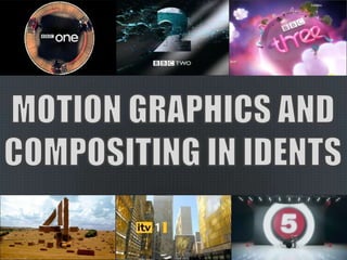
2. Idents have a long and colourful history, almost as much as television itself. Idents
were first used as a means to identify channels, hence the name, and were
relatively simple in their design and execution. The first idents were aired on
BBC1 and simply showed the station’s name and early logo.
Today idents are used for much the same purpose, but have taken on another role
as well. Idents on modern television have much more artistic merit than in the
early days of broadcasting, for several reasons. One of the largest is the
widespread branding of modern channels and the emergence of hundreds of
independent channels creating a need for recognition beyond mere identification.
For this reason, modern idents are created not merely to identify a station but to
give it character and popularise it’s image.
3. In recent years television channels have made wide use of motion graphics
and compositing in idents to capture an audience, declare their channel’s
brand and identify themselves on television.
Motion graphics, especially if they are animated, are mostly used to draw
attention to the channel’s name or logo within the ident. The emblem is
usually designed to be overly bright or otherwise contrast the rest of the
scene in some way, to help identification, but in some cases blends into the
ident and reacts to action within the scene itself.
Occasionally idents will react to the content of the channel or television
show they advertise or preface.
4. The ‘Paint’ ident became one of the BBC’s most famous after it’s introduction
in the early nineties. It’s powerfully symbolic yet minimalist and simple
approach to channel identification was revolutionary for the time and marked
the beginning of idents as a form of creative expression, rather than merely a
way for viewers to be reminded of which channel they were watching.
The ‘Paint’ ident was widely praised for it’s simple concept and use of colour
changed the identity of the channel considerably, a distinction that can still be
seen today in the separation of BBC1 and BBC2. The fact that the ‘Paint’
ident was only one of many in a series created for the BBC was, while
commonplace now, a new and innovative idea at the time and allowed idents
to become dynamic to the programme or content they prefaced.
5. In 2004, Channel 4 completely redesigned their channel’s style and created a
library of idents to match their channel’s variety of programming; Channel 4
work hard to maintain their image as a broadcaster of popular
entertainment, and the new idents were designed to reflect this with an
eclectic mix of styles and content distinguished with a simple yet effective
motif: for a moment, objects and scenery come together to create the channel
4 logo when viewed from the right angle and perspective, only to dissipate into
abstract shapes once more.
The ‘Angles’ idents are interesting as a fundamental part of their design
counteracts their role in channel identification; as the Channel 4 logo is only
on screen for a split second, it is not immediately apparent which channel is
being shown on the screen. The Channel 4 idents are definitely designed for
visual appeal and creative and artistic merit than for functionality, yet remain
some of the most widely-known and best-received idents in television history.
6. Colour can be used in an ident to help with immediate
visual identification of a channel. If a channel has a
logo or emblem of a specific colour, it is often that it’s
idents will match, or in some cases contrast to make
the channel more visible.
Colour can also be used to reflect a channel’s content;
a large variety of colours and textures can be used
dynamically to interact with a programme being shown
and different colours can be used at different times in
the day.
7. Graphics are used in idents to reinforce the visual aspect of
channel identification; shapes and colours associated with a
channel can be incorporated into an ident for immediate clarity
and can associate the ident with the channel.
For example, BBC1 and 2 both use live-action and CG scenes
heavily in their idents, while channels such as BBC3 and E4
prefer to use a heavily stylised and artistic look. Graphics are
used in the BBC1 and 2 idents to break up the live action and
tie it to the channel with familiar shapes and colours; for
example BBC1’s red ribbons.
8. Similar to colour and graphics, movement is mostly used to
reflect a channel’s content or maintain a visual style across
the channel. There is a trend among more popular
entertainment channels such as E4 and BBC3 to use
complicated idents with many different objects and assets
on screen to demonstrate the channel’s busy, fun
identity, while other channels such as BBC1 and Channel 4
use movement less artistically and more functionally to
visually identify themselves.