80 ĐỀ THI THỬ TUYỂN SINH TIẾNG ANH VÀO 10 SỞ GD – ĐT THÀNH PHỐ HỒ CHÍ MINH NĂ...
Contents page research
1. Contents Page Research
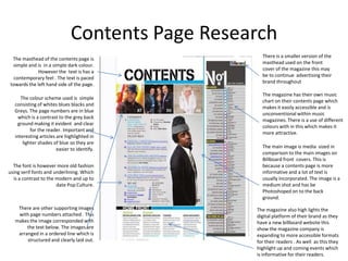
There is a smaller version of the
The masthead of the contents page is
masthead used on the front
simple and is in a simple dark colour.
cover of the magazine this may
However the text is has a
be to continue advertising their
contemporary feel . The text is paced
brand throughout
towards the left hand side of the page.
The magazine has their own music
The colour scheme used is simple
chart on their contents page which
consisting of whites blues blacks and
makes it easily accessible and is
Greys. The page numbers are in blue
unconventional within music
which is a contrast to the grey back
magazines. There is a use of different
ground making it evident and clear
colours with in this which makes it
for the reader. Important and
more attractive.
interesting articles are highlighted in
lighter shades of blue so they are
easier to identify. The main image is media sized in
comparison to the main images on
Billboard front covers. This is
The font is however more old fashion because a contents page is more
using serif fonts and underlining. Which informative and a lot of text is
is a contrast to the modern and up to usually incorporated. The image is a
date Pop Culture. medium shot and has be
Photoshoped on to the back
ground.
There are other supporting images The magazine also high lights the
with page numbers attached . This digital platform of their brand as they
makes the image corresponded with have a new billboard website this
the text below. The images are show the magazine company is
arranged in a ordered line which is expanding to more accessible formats
structured and clearly laid out. for their readers . As well as this they
highlight up and coming events which
is informative for their readers.
2. Contents Page Research
The colour scheme is minimalistic and uses
Similar to the front cover of Blender the
mild colours which makes the bright colours
Masthead uses a contemporary font
of the figures skirt and prop stand out as
which is centred and large . The fact the
well as the bold black mast head. The use of
text is in black which is one of the main
pink and turquoise all so helps the
colours in the scheme helps catch the
highlighted important text stand out and
readers eye and establishes why the
easier to read.
purpose is for the page.
The main image is a mid shot although There is a minimal amount of text in
there is a lot of space surrounding the comparison to other content page the text is
main figure and the image does not take places to the right of the page and the titles
up all the page this allows the image to are in bold this makes them more
become more noticeable . However the understandable for readers. Other than the
size of the prop used adds a modern and page numbers and summary of articles there
urban edge to the retro outfit the figure is only one other piece of text which is a
is wearing. mode credit for the main figure.
As Blender is a monthly issue there is
the month and year positioned in the
There is no other supporting images of top right hand corner under the
this contents page leaving it masthead. This is not placed on the
unpretentious and engaging. front cover which is why it is placed
on the contents page which is just as
important to the construction of a
magazine.
3. Contents Page Research
Conventionally magazines will have a title
of contents page on their contents page
however Top of the pops has defied this The use of highlighting has been used
convention by instead making the effectively so the most important and
masthead for the contents page “Inside the popular events article and stories are
Mag” . The masthead is also on pink effortlessly presented to their
coloured solid block which contrast the audience .
white text, as well as being on an angle.
With this contents page there is no
Unlike many other Pop magazines contents use of a main centred image which
page which has mostly text Top of the is leading focus. Most of the images
Pops uses an annotated image of the front are of a similar size . And the
cover to focus on the popular articles in the majority are place in the lower
magazine. As well as this the anticipated quarters of the page. The other
articles and prevalent are highlighted in images used have their pages
yellow which is rarely seen. directly position into them making
it clear for the reader.
The colour scheme used is attractive yet
modest because of the use of a neutral
background. The text is black and the page
numbers are all pink this shows some
structure and looks organised. The Contrasting to other pop and
combination of colours is grasps their other music magazine s Top of the
audience as it look playful and fun. pops have not used chronological
ordering they have instead have
organised there articles into
The fonts used are varied and are in topics which makes it much easier
different sizes as well as being up-to-the- for readers to pick the most
minute and fun which related to the genre interesting read from each
of the magazine. Similar to other pages contents other than articles are places on subject.
the contents page and are accessible to their readers .
4. Contents Page Research
Similar to other more untraditional As We (love) is a new Pop Magazine the
magazines there is no use of the word use logo can help indorse the magazine
contents on the contents page however the as it is not yet an established brand and
location of the page in the magazine as well may not have a loyal customer base.
and the layout and material allows the
reader to see the purpose of the page. The
title used plays on the title the magazine There is centred image which goes
and has a modern yet simplistic font. against the rule of third however the
image is still engaging. The image used
is medium sized and is enclosed by
Editors comments are not commonly smaller images which all the their page
found in Pop magazines how ever this number attached to each. The smaller
is found on contents page of We (love) images all have a little quote which is
Pop this creates a friendly vibe for the informative for readers.
readers as well as intimacy .
The fonts used vary in size and style
The colour scheme used is vibrant with which makes some more bold or
bright blues and yellows whites and larger styles stand out. The main font
blacks . The text is in black and boarder is used is a traditional serif font which
bright blue and white which is different. is unlike the contemporary animated
The yellow is used to highlight the page essence of Pop music.
numbers for easier reading.
The layout of this contents page
is neat and organised and the
The use if a skyline at the bottom is used page number go in chronological
to fit more small images of the main cover order and neatly broader . The
story. images are straight and place
one after the other and text is
appropriately sizes and angled.