Visual identity and branding for Healthcare
•
1 like•618 views

Visual identity and branding motivation for healthcare and eyecare startups with a twist for artificial intelligence download: https://www.dropbox.com/s/x7d3et04639jx0u/healthcare_visualBranding.pdf?dl=0

Recommended
Recommended
More Related Content
What's hot
What's hot (19)
Similar to Visual identity and branding for Healthcare
Similar to Visual identity and branding for Healthcare (20)
More from PetteriTeikariPhD
More from PetteriTeikariPhD (20)
Recently uploaded
Recently uploaded (20)
Visual identity and branding for Healthcare
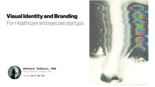
- 1. Petteri Teikari, PhD http://petteri-teikari.com/ version Sat 27 May 2017 VisualIdentityandBranding For Healthcare and eyecare startups https://uk.pinterest.com/pin/495114552754608129/
- 2. VisualIdentity UX vs. UI
- 3. VisualIdentity Introduction 1) DEFINEWHOYOUARE 2) DIFFERENTIATE 3) AVOIDTHEHELICOPTERMOM SYNDROME 4) CRAFTAVISUAL IDENTITY 5) EXISTENTIALANXIETYISNORMAL CRAFT A VISUAL IDENTITY Once you have sorted out the more existential facets of the brand identity, you can start sorting out a visual identity: logo, website, fonts, colors, businesscards,and letterhead. The great thing about design is that if applied correctly it can make your business instantly emit the values you want to communicate— trust, gravitas, innovation, quirkiness, luxury, whatever your brand identity dictates. However, do not attempt to design your own brand. It almost never works. Hire a professional who actually knows what he’sdoing. Itwill pay off. Andwhenyou’re readytoput that style guidetowork, trial it the funway,bydesigningabrandedsocial media graphicin Canva(clickhere).
- 4. VisualIdentity Domain-specific branding | Typography https://fontsinuse.com/in/1/industries/44/health-fitness https://fontsinuse.com/in/1/industries/24/fashion-apparel ’Serious’healthcarebrandingwithfashiontypeset How well would thiswork, and howwould your targetdemographicperceive this?
- 5. VisualIdentity Domain-specific branding | Typography Trends Typographyandvisualidentifyofcoursehavetrendstoo Butin positionare youbeing the trendsetter? Would freshcontemporary typography signal your disruptive take, or would itbe taken aslacking authority? http://dx.doi.org/10.1038/467368b https://paperpile.com/blog/the-beauty-of-scientific-papers-design-tre nds-of-the-past-350-years/ Nature2013Nature1975 NOTE! Color in scientific papers quite a recent thing! Contemporary paper design – lets add some colors New online-only journals in particular have pushed the state of the art. A current PLOS paper features colored text and organizes the page with shaded areas and boxes. Within these sections we have tried, in the redesign of our layouts and key elements, to ensure that a reader easily gains a clear idea of why he or she shouldbereading an article.We've created spacefor more descriptive headlines and other display elements that allow a reader to get a quick sense of what an articlehastosayandwhoitsauthorsare. The new design also emphasizes the use of charts and graphics that offer a quick summary of the key data underlying an opinion pieceor news story. It allowsformore inventive,attractivepagesaswell.
- 6. VisualIdentity Healthcare Branding The perpetual challenge for healthcare manufacturers is to ensure that in the stressful, time-poor environments of clinical practice the correct product will be easily identified. The method to best achieve this is graphical demarcation. This need for utility gives rise to what we might call the ‘clinical aesthetic,’ a visual language that aggregates the myriad of potions and applications but also the processes, regulations, collateral, architecture, vehicles and other material of healthcare. Prior to the 18th century, the common image of healthcare was ramshackle quackery or the brutalism of the barber-surgeon. By the time of the Enlightenment, medicine had emerged as a venerable profession. The paradigm shift necessitated a visualidentity tosupportthisnew authority. https://www.creativereview.co.uk/visual-language-and-healthcare/ http://www.brandaiduae.com/ https://www.nthrive.com/ https://imedicare.com/ http://sanfrancisco.metadesign.com/
- 7. VisualIdentity Early startup branding mostly about the website http://www.creativebloq.com/features/10-top-ui-trends-for-2017 http://www.awwwards.com/web-design-trends-for-2017.html http://www.forbes.com/sites/tomaslaurinavicius/2017/01/25/ web-design-trends-2017/#4690ac894842
- 9. VisualIdentity Subjective preferences vary for website design ‘Scandinavianminimalist’mood board asaseed.Add abitof color with custom illustrationsfor authenticity
- 10. VisualIdentity Healthcare AI Startup Study
- 11. VisualIdentity Moving nodes signify artificial intelligence
- 12. VisualIdentity Eyecare Startup Study #1
- 13. VisualIdentity Eyecare Startup Study #1
- 14. VisualIdentity What about logos? https://doi.org/10.1093/jcr/ucv049 It is theorized and shown that circular- versus angular-logo shapes activate softness and hardness associations, respectively, and these concepts subsequently influence product/company attribute judgments through a resource-demanding imagery-generation processthatutilizesthevisuospatialsketchpadcomponentofworkingmemory. How does a company decide on the shape it will use for its brand logo? Designers are taught that “circles are graceful and their curves are seen as feminine. They are warm, comforting and give a sense of sensuality and love”; and “squares and rectangles represent order, mathematics, rationality, and formality” (http://vanseodesign.com/). These shape associations are widely used in the teaching and practice of visual brand design, but the guidance they provide is very general. Our research contributes more specific guidance, with its results differentiating situations when effects of logo shapes on product attribute judgments are more or less likely to emerge. https://www.entrepreneur.com/article/245972 https://www.entrepreneur.com/author/kim-lachance-shandrow http://dx.doi.org/10.1080/15390942.2010.493365
- 15. VisualIdentity What about logo colors? #1 Green is often associated with the coolness of leaves. People often associate it with nature, health, good luck, and jealousy. Blue is often associated with the coolness of the sea and sky. It has been shown to calm the senses and lower blood pressure. It may stimulate feelings of trust, security, order, and cleanliness. fastcompany.com/3028378 http://dx.doi.org/10.1177/1470593106061263 Thomas J. Madden, Kelly Hewett, Martin S. Roth (2000) Managing Images in Different Cultures: A Cross-National Study of Color Meanings and Preferences. Journal of International Marketing: Winter 2000, Vol. 8, No. 4, pp. 90-107.doi: http://dx.doi.org/10.1509/jimk.8.4.90.19795
- 16. VisualIdentity What about logo colors? #2 https://www.fastcodesign.com/3054339/evidence/how-a-logos-color-shapes-consumers-opinion-of-a-brand In fact, as co-author James Kellaris, UC’s marketing department putsit in a press release, the study suggests that "blue is ‘greener’ than green terms of conveying an impression of eco-friendliness, despite the frequent use of the word ‘green’ to convey thatidea."
- 17. VisualIdentity AI Startup Logos #1
- 18. VisualIdentity AI Startup Logos #2 https://medium.com/project-juno/european-machine-intelligence-landscape-43a22b44e961#.l4ugv3ouk
- 19. VisualIdentity What about healthcare logo colors?
- 21. VisualIdentity Healthcare Startup Logos #1 Stylish‘unique’branding http://www.3scan.com/ Usingwellthe illustration-driven design. https://www.hioscar.com/
- 22. VisualIdentity Healthcare Startup Logos #2
- 23. VisualIdentity Healthcare Startup Logos #3
- 24. DataVisualization part of the visual identity for data-driven companies
- 25. DataVisualizationThe ‘old school’ scientific figures http://www3.nd.edu/~pkamat/pdf/graphs.pdf Tufte,EdwardR.TheVisualDisplayofQuantitativeInformation GraphicsPress:Cheshire,CT,1983; pp1 197‐ Thisisaremake ofafigurethatwasoriginally published in the New York Times (NYT) in 2007. This is a self-contained figure that delivers a clear message on cancer deaths. However, it is not precise. The chosen layout makes it actually difficult to estimate the number of kidney cancer deaths because of its bottom position and the location of the labelled ticks at the top. While this is acceptable for a general-audience publication, it would not be acceptable in a scientific publication if actual numerical values were notgivenelsewhereinthearticle.
- 26. DataVisualizationWho is our audience? Back to personas Survey: EHRs Have Taken Over, Except for Hearts and Minds Robert Lowes, August 30, 2016 Forexample, older clinicians are less tech- savvyonaverageas illustratedby the ‘EHR workload’ by agegroups onright. EHR= ElectronicHealthRecord
- 27. DataVisualization Skills to process the information differ widely http://dx.doi.org/10.1007/978-3-319-20892-3_35 http://dx.doi.org/10.1007/s10209-014-0382-z https://doi.org/10.1109/CIMSim.2015.27 https://doi.org/10.1109/EMBC.2014.6944243 https://doi.org/10.1109/IEMBS.2006.259421 “Over half of the participants had difficulties related to comprehending spoken information (54 per cent). “ “User-centered design evaluations involving older adults can help designers create products and services that are more likely to be adopted by older adult end users.” http://dx.doi.org/10.4018/IJCCP.2016070102 “Usability barriers may differentially affect older adults. The results of the current study suggest that the design of health information websites that take into account age-related changes in cognition can enhance older adults’ access to such information.” http://doi.org/10.2196/jmir.1220 http://dx.doi.org/10.1179/cih.2009.2.2.103 http://dx.doi.org/10.1016/j.apergo.2015.06.012 “Age-related differences in the importance of speed and accuracy in task completion point to the need to consider more strongly the factor user age in usability research and practice.” “Reducing the working memory demand of the task through the use of an environmental supports (ES) can improve decision accuracy, especially when selection criteria is only focused on a single attribute of the insurance plan.” http://doi.org/10.2196/humanfactors.5106 https://doi.org/10.1093/geronb/gbw100 “we call for more senior-friendly online resources and culturally appropriate interventions to bridge the digital health divide for vulnerable older adults.”
- 28. DataVisualizationTowards interactive “data stories” NewlibrariesallowbettervisualizationoflargerdatasetsAtthesame time,the cliniciansare not necessarilyready toabsorbdifferentlyvisualizedinformation,andwould needtobeeducated → tradeoffs have tobe made eds/2/#37633dac672f http://www.informationweek.com/big-data/big-data-analytics/data- storytelling-what-it-is-why-it-matters/a/d-id/1325544 DataanalysisneedstobeaboutengagementandparticipationandI’durgeany businesslookingatadataanalysisprojecttobear thisinmind.Allstoriesneedtobe unpicked,peopleneedtodebate,andtheyneedtobequestionedonreliability! Peoplemightnotbetryingtotrickyouwiththeirnarrative,butyoucouldstillendup lookinglikeafoolifyoublindlyassumewhatthey’retellingyouiscompletelycorrect. http://www.information-age.com/how-technology-can-humanise-brand-123459772/
- 30. DataVisualizationTell a story, even in medical diagnostics? Seetheexcellentinteractivevisualizationofmachinelearningby R2D3. R2D3isanexperimentinexpressingstatisticalthinkingwithinteractivedesign. Findusat @r2d3us. https://www.livestories.com/healthdataplus/ https://curiosity.com/videos/emotional-healt hcare-and-data-storytelling-oreilly/ http://dx.doi.org/10.1097/ACM.0000000000000672 Cited by 5 articles
- 31. Retina Branding Steer away from the “digital futurism” * “All” the AI companies start to look the same “In UK, people emphasize the fact that they are using AI whereas in SF the focus is away from this and everyone just take granted that you use AI.” - said by RichardMuirhead at “Investing in AI:Gettingthe target and the timing right- by CognitionX” when comparing EF7 demo dayto recent Ycombinator demo day https://youtu.be/SOGbe2f-Fj8?t=58m3s *withallthemovingnodes, picturesof brains, etc. boringgenericstartupvisualidentities