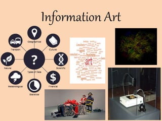
Information Art
•Download as PPTX, PDF•
1 like•32 views

Information Art is a diverse range of human activities in creating visual, auditory or performing artifacts (artworks), expressing the author's imaginative, conceptual ideas, or technical skill, intended to be appreciated for their beauty or emotional power. Other activities related to the production of works of art include the criticism of art, the study of the history of art, and the aesthetic dissemination[clarification needed] of art.

Recommended
Recommended
More Related Content
Similar to Information Art
Similar to Information Art (20)
Recently uploaded
Recently uploaded (20)
Information Art
- 2. Introduction Information art, which is also known as Informatism or data art, is emerging artforms that are inspired by and principally incorporate data, computer science, information technology, artificial intelligence, and related data-driven fields. The information revolution has resulted in over-abundant data that are critical in a wide range of areas, from the Internet to healthcare systems. Related to conceptual art, electronic art and new media art, informatism considers this new technological, economical, and cultural paradigm shift, such that artworks may provide social commentaries, synthesize multiple disciplines, and develop new aesthetics. Realization of information art often take, although not necessarily, interdisciplinary and multidisciplinary approaches incorporating visual, audio, data analysis, performance, and others. Furthermore, physical and virtual installations involving informatism often provide human- computer interaction that generate artistic contents based on the processing of large amounts of data.
- 3. Background Information art has a long history as visualization of qualitative and quantitative data forms a foundation in science, technology, and governance. Information design and informational graphics, which has existed before computing and the Internet, are closely connected with this new emergent art movement. An early example of informatism the 1970 exhibition organized called "Information" at the Museum of Modern Art in New York City (curated by Kynaston McShine). This is the time when conceptual art has emerged as a leading tendency in the United States and internationally. At the same time arose the activities of Experiments in Art and Technology known as E.A.T. Museum of Modern Art
- 4. Contemporary Practices Information art are manifested using a variety of data sources such as photographs, census data, video clips, sear ch engine results, digital painting, network signals, and others.Often, such data are transformed, analyzed, and interpreted in order to convey concepts and develop aesthetics. When dealing with big data, artists may use statistics and machine learning to seek meaningful patterns that drive audio, visual, and other forms of representations. Recently, informatism is used in interactive and generative installations that are often dynamically linked with data and analytical pipelines.
- 5. SOME EXAMPLE OF INFORMATION ART: 1)The Tempestry Project The Tempestry Project is an ongoing collaborative fiber arts project that presents climate change data in visual form through knitted or crocheted artwork. The project is part of a larger "data art" movement and the developing field of climate change art, which seeks to overcome human tendency to value personal experience over data by creating accessible experiential representations of climate change data. Tempestries are produced by knitting or crocheting a single row in a specified color representing the high temperature each day for a year, and multiple works are typically displayed together to show change over time. The project began in 2017 in Anacortes, Washington, US, and has since spread throughout the country and around the world. The word "tempestry" is a portmanteau of "temperature" and "tapestry."
- 6. 2)Warming stripes Warming stripes (sometimes referred to as climate stripes, climate timelines or stripe graphics) are data visualization graphics that use a series of coloured stripes chronologically ordered to visually portray long-term temperature trends. Warming stripes reflect a "minimalist“ style, conceived to use colour alone to intuitively convey global warming trends to non- scientists while avoiding technical distractions. The initial concept of visualizing historical temperature data has been extended to involve animation, to visualize sea level rise and predictive climate data,and to visually juxtapose temperature trends with other data such as atmospheric CO 2 concentration, global glacier retreat and precipitation. Professor Ed Hawkins' warming stripes for 1850 (left side of graphic) to 2018 (right side of graphic). Progression from blue (cooler) to red (warmer) annual readings indicates long-term increase of average global temperature.
- 7. 3)Climate Spiral A climate spiral (sometimes referred to as a temperature spiral) is an animated data visualization graphic designed as a "simple and effective demonstration of the progression of global warming", especially for general audiences. The original climate spiral was published on 9 May 2016 by British climate scientist Ed Hawkins to portray global average temperature anomaly (change) since 1850. The visualization graphic has since been expanded to represent other time- varying quantities such as atmospheric CO2 concentration,carbon budget,and arctic sea ice volume. • Its selection to graph temperature (a quantity that the public feels is relevant and understandable), • Its production by scientists (who tend to be viewed as "trusted messengers"), • Its being intuitive and eye-catching (not a "boring" scientific graph), • Its similarity to a clock (which is normally regular and predictable but which provides a "visual surprise" at the end, portraying the "fortuitous" large temperature increases encountered very recently), • Its animated nature (not a static graph), and • Its short duration (holding viewers' attention).
- 10. Thank You