
Recommended
More Related Content
What's hot
What's hot (20)
Similar to Genre Conventions in Music Media
Similar to Genre Conventions in Music Media (20)
Recently uploaded
Recently uploaded (20)
Genre Conventions in Music Media
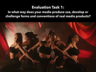
- 1. Evaluation Task 1: In what way does your media produce use, develop or challenge forms and conventions of real media products?
- 2. Genre conventions are details common within particular genres helping establish a target audience based on common appealing factors. These details can be divided into symbolic and technical, symbolic referring to the mise en scene elements such as character positioning, facial expression, set/location, props, costumed and lighting. Technical refers to camera angles, composition and movement as well as editing and sound. The music industry use conventions in order to create and establish certain meanings and entice audiences. Using particular conventions can aid in the development of an artist’s/band’s following as they play to the stereotypes that they know target audiences will ultimately find appealing. Throughout a music campaign, it is easiest to establish a star image and genre by manipulating various conventions but the difficulty comes when you introduce the website and digipak. The conventions have to stay consistent in order to continue to appeal to an audience. Genre Conventions
- 3. Although it is important to adhere to some conventions in order to establish the genre of a media text, an artist must have something unique about them in order to attract an audience. An audience won’t find an artist appealing if they’re are an exact copy of another artist within the same genre. So, artist’s exploit, develop and challenge conventions in order to find their demographic and gain a following. In the music video it is much easier to explore various conventions through editing, camera angles, movement and any additional sound. When it comes to the digipak and website however, the still images making the exploitation of conventions more challenging working more with symbolic conventions such as character positioning, lighting and colour. Using Conventions
- 4. — Lykee Li — Lorde — Maggie Rogers — Lana Del Rey — Grimes — Tov Lo — Halsey — St Vincent — Kimbra — LP — SIA Similar Female Indie Pop Artists:
- 5. Conventions In Our Music Video
- 6. One of the conventions that we felt we had to adhere to in order for our product to comply to the ‘indie pop’ genre were our use of camera work, specifically close ups otherwise know as beauty shot. These shots are very common within our chosen genre and add a personal element making her appear more connected with her audience as a partially organic artist. Media theorist Richard Negus believes that an artist is either a commodity or is… As we were creating a video for a new artist, it is important create an audience to artist relationship, something that close ups enable an artist to do. Close ups can also be used to assist any narrative present within the song allowing the audience to see the depth within the artist’s work. Conventions we USED
- 7. Conventions we USED Another convention that we followed was the inclusion of performance elements. In some genres, the artist isn’t present therefore suggesting that it is the music being sold rather than the star image. However, as indie pop is a sub genre of Pop itself, there are conventions that we have to use such as a performance element essentially aiding us in selling a commodity rather than the music itself. A performance element can help an audience engage and grow close to an artist increasing their interest into their content. This element can also create a similar atmosphere of which the artist would create on a tour performance therefore promoting live events.
- 8. Conventions we DEVELOPED The presence of dancers further establishes the sense of a live performance enticing the audiences as well as allowing them to find the content more engaging. Typically, ‘Indie Pop’ videos incorporate a loose narrative, less so than Pop but still display some sense of the journey. Using the two additional elements involving dancers of different styles creates a slight narrative as well as giving us options for more create camera movement and composition.
- 9. Conventions we DEVELOPED Indie Pop videos tend to have relatively simplistic settings constructed to look like their typical surroundings such as a forest, a city or field. There are however, other videos from the same genre that use elaborate studio sets. We took both ideas and combined the two by creating relatively simplistic sets within a studio. This allowed us to exploit the control that we had over lighting creating sets and developing ideas on lighting designs alone. Location Studio SetsOur Sets
- 10. Conventions we CHALLENGED The main convention that we challenged was the framing and composition of our camera work. In most Indie Pop videos, the artist is framed predominantly in the centre third of the frame, forcing them to be the focus of the video. We explored what connotations would arise by using these shots and although we found that it was important to introduce our artist as the main focus, we wanted there to be a transition, a journey for the artist. With all the low key lighting used throughout the video, there was already an ora of mystery presented by the fact that she wasn’t fully visible consistently. This allowed her to appear both present and absent simultaneously, a paradox theorised by Richard Dyer. However, by also viewing her in certain elements with either extreme close ups or by our use of the cameras composition, we heightened this effect.
- 12. The majority of digipaks that we viewed in our research entail a relatively minimalistic and/or simplistic layout. If the artist is present on the album cover, a technical convention use is a mid shot displaying the artist. In terms of symbolic conventions, their facial expression is frequently quite serious as they stare into the camera creating a sense of intimacy between star and audience. We found it was useful to follow the technical conventions within the cover as it helps instantly establish the genre conventions as well as her strong image. Symbolically, we wanted to use the conventional intensity as it would isolate our artist from other Pop artist’s who play to a ‘pretty’ and synthesised image. Conventions we USED
- 13. Through the use of lighting and camera composition in the music video, we created a sense of presence and absence for our artist because there were moments where she wasn’t entirely visible. This was a feature that we wanted to carry through the campaign as we felt it would entice audiences. This convention is used predominantly on the back cover of an album allowing the audience and artist to connect with the front cover but reveal another trait of the star image with the back cover. Conventions we USED For our back cover, we chose an image where our artist is positioned away from the camera with low key lighting creating the mysterious aesthetic. Other artists approach this in slightly different ways by maybe simply turning their head slightly but the premise stays the same; the aren’t facing the audience like the front cover.
- 14. The very fact that we chose to have our artist present on the front cover is appealing to a genre convention. As a sub genre of Pop, artists are still sold partially as a commodity rather than simply selling their music therefore, the image comes with the music. Her fierce look helps convey the female empowering sense that we wanted whilst also having an unorthodox element in comparison to straight Pop artists. Conventions we CHALLENGED On the other hand, there are other Indie Pop artists that don’t play the the Pop convention and instead force an audience to accept their music without a glamorous face in front of it. We knew that with the characteristics that we wanted our artist to have, she would have to be seen rather than comply with this convention and stay hidden. Conventions we USED
- 16. One of the conventions that we felt we had to adhere to in order for our product to comply to the ‘indie pop’ genre was the presence of the two other products within the campaign; the digipak and the music video. Similarly to other similar artist’s websites, the front cover of the album is present in the centre of the homepage. This draws the viewers directly to the artist’s music for sales. The overall layout of the homepages are very similar with a very simple look. The album is present, there are links to various social media accounts and tabs such as ‘Home’, ‘About’, ‘Music’, ‘Tour’ and ‘Gallery’. Following these conventions enables our site to be easily navigated, a feature than our target would find appealing do to their lack of patience, a change created through the proliferation of hardware and content. By having everything around the artist as simple as we can allows us to use a complicated background whilst not having anything else there to distract from the artist. Conventions we USED
- 17. The website is one of the most important products within the campaign in terms of tying it all together. It is important to keep the star image and colour scheme consistent. This is a convention that we felt was necessary to use so as to avoid not disorient the viewer whilst also aiding the develop of our new artist’s image. As we’re creating a new artist within the genre, it is especially important to keep the campaign consistent. Therefore, the use of the red and black colour scheme in something as bold as the background, instantly reflects the music video as well as the photos used in the digipak. Linking the colours also aids the creation of the artist’s style within the genre suggesting the kind of atmosphere that would be created at these shows with a very similar colour scheme. Conventions we USED
- 18. One of the most significant conventions that we challenged was the background. Nearly every other homepage that we viewed from similar artists is a plain colour reflecting the general campaign. The reason why we wanted to go against this convention is because we wanted there do be a distinct difference between ours and others. Through our process in researching various other albums from some slightly different genres, we found the digipaks and websites that involved a more personal, artwork design to them appealing. We felt that this would add a more organic feeling to our site as well as standing out within the genre. There are multiple conventions that you almost have to apply in order for the campaign to work however, in the industry artist’s often adopt elements of other genres to make their campaign unique in comparison to others in the same genre. Conventions we CHALLENGED
- 19. Conventions we CHALLENGED Due to Indie Pop being a sub genre of Pop itself, there are obviously some distinct similarities particularly with female artists; one of which being a sexual appeal. In order to attract a secondary male audience, some artist’s images are designed and manipulated to meet this demographic, essentially making the artist more successful. For our artist, we wanted to avoid this largely because we don’t want her to appear entirely synthesised but present an image that we find her target audience would find more relatable breaking down the idea that a star is completely extraordinary allowing them to simultaneously be ordinary, a paradox stated by Dyer. We didn’t totally abandon the idea of creating a sexual appeal as it is a way of increasing views however, we didn’t want it to come across as a central feature of our artists largely as it would disrupt the empowering message we wanted to convey.