1. The client wanted a 2100mm x 850mm banner and 10 250mm x 100mm name
cards on 3mm Foamex. Ken emailed the client about the job and made a design
brief to give to me.
The brief said the client wanted the above. The client supplied the background
artwork and wanted text that was in a funky font that stood out from the
background design.
This was the artwork that was supplied for the background. I had to resize to fit
the size of the banner and the name cards.
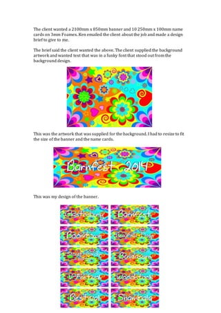
This was my design of the banner.
2. These are my designs for the name cards.
I gave the proofs to Ken to show the client to se what the client though. The client
said that he liked the font that was used but wanted the text to stand out from
the background more. Ken told me the client’s feedback so I refined the design to
respond to it.
These are my 4 new designs of the text. I changed the colour of the text and
removed the drop shadow. I layered the text up so the different colours helped
bring the text out and stand out from the background. I gave 4 different designs
so the client could choose a favourite out of them. Ken emailed the client the new
designs as a low quality PDF proof. The client decided he wanted to use all 4 and
gave us the go ahead that he was happy and we could start printing them.
3. These are the name cards printed
And this was the banner design we printed
My final design meets the brief as I used a ‘funky’ font that the client wanted and
the text also stands out from the background and is easy to read. The technique I
used was to layer up the text using different stroke and fill colours. The changes I
made from my original designs made a big difference, as the text is much clearer
and the use of colours fit in with the background design really well. I don’t think
the final designs could be improved too much as there isn’t that much I could
change other than the colour combinations, but I’m happy with them as they are
and so was the client.