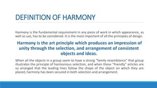
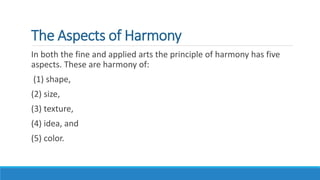
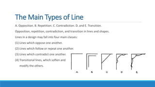
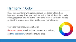
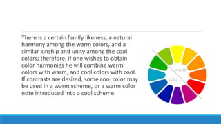
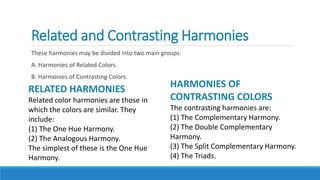
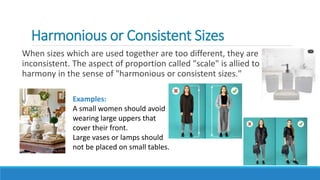
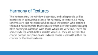
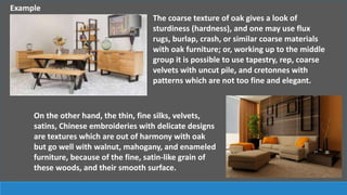
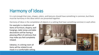
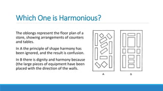
PRINCIPLES OF DESIGN:
HARMONY
COURSE TITLE: APPLIED ART AND DESIGN
DEFINITION OF HARMONY
Harmony is the fundamental requirement in any piece of work in which appearance, as
well as use, has to be considered. It is the most important of all the principles of design.
Harmony is the art principle which produces an impression of
unity through the selection, and arrangement of consistent
objects and ideas.
When all the objects in a group seem to have a strong "family resemblance" that group
illustrates the principle of harmonious selection, and when these "friendly" articles are
so arranged that the leading lines follow the shape of the object on which they are
placed, harmony has been secured in both selection and arrangement.
The Aspects of Harmony
In both the fine and applied arts the principle of harmony has five
aspects. These are harmony of:
(1) shape,
(2) size,
(3) texture,
(4) idea, and
(5) color.
The Main Types of Line
A. Opposition. B. Repetition. C. Contradiction. D. and E. Transition.
Opposition, repetition, contradiction, and transition in lines and shapes.
Lines in a design may fall into four main classes:
(1) Lines which oppose one another.
(2) Lines which follow or repeat one another.
(3) Lines which contradict one another.
(4) Transitional lines, which soften and
modify the others.
Effects of Lines
When a horizontal and a vertical line come together,
as in a right angle or a corner, these lines are in
opposition to each other. (Fig. A)
Another set of lines drawn within that corner,
following its lines, shows repetition. Repetition gives
the simplest kind of harmony. (Fig. B)
Strictly speaking, any line which cuts across a corner
from one opposition line to another is a transitional
line; but a straight line drawn across a corner, as in
Fig. C is so sudden and sharp a connection that it
cuts off the corner harshly, and that type of line is
called contradiction.
Effects of Lines (continued)
Transitional line in its best sense is an easy, graceful line which
leads from one line or shape to another, giving harmony
instead of contradiction. If a curved line were drawn across a,
corner, as in Fig. D the sharpness of the opposition of the
horizontal and vertical lines would be modified, and that,
effect is "Transition.“
It will be found that curved lines make an easy transition from
one straight line to another, and when straight Hues are used
they are made less severe when combined with a suggestion
of curved line. (Fig. E)
Types of Harmony
A. Lines which repeat one another create shapes which show perfect harmony through
uniformity.
B. Lines which contradict one another create shapes which form harsh contrasts.
C. Transitional or modifying lines create shapes which have pleasing variety with unity.
Harmonious Shapes
Shapes which correspond to one another
are in perfect harmony. (Fig. A.)
Lines which oppose or contradict each
other form shapes which are entirely
lacking in harmony. (Fig. B.)
Transitional lines have a graceful,
softening effect, and have the power to
bring together shapes which might, in
themselves be inharmonious. (Fig. C.)
A combination of lines results in shapes. Harmony can be implicated by applying the principles of
Repetition, Contradiction, and Transition to the shape.
Harmony in Color
Color combinations which give pleasure are those which show
harmony or unity. They give the impression that all the colors really
belong together, and yet at the same time there is sufficient variety
so that the arrangement does not become monotonous.
There are two large groups of color,
the warm colors, which include the reds and yellows,
and the cool colors, which lie around blue.
There is a certain family likeness, a natural
harmony among the warm colors, and a
similar kinship and unity among the cool
colors; therefore, if one wishes to obtain
color harmonies he will combine warm
colors with warm, and cool colors with cool.
If contrasts are desired, some cool color may
be used in a warm scheme, or a warm color
note introduced into a cool scheme.
Related and Contrasting Harmonies
These harmonies may be divided into two main groups:
A. Harmonies of Related Colors.
B. Harmonies of Contrasting Colors.
RELATED HARMONIES
Related color harmonies are those in
which the colors are similar. They
include:
(1) The One Hue Harmony.
(2) The Analogous Harmony.
The simplest of these is the One Hue
Harmony.
HARMONIES OF
CONTRASTING COLORS
The contrasting harmonies are:
(1) The Complementary Harmony.
(2) The Double Complementary
Harmony.
(3) The Split Complementary Harmony.
(4) The Triads.
Harmonious or Consistent Sizes
When sizes which are used together are too different, they are
inconsistent. The aspect of proportion called "scale" is allied to
harmony in the sense of "harmonious or consistent sizes."
Examples:
A small women should avoid
wearing large uppers that
cover their front.
Large vases or lamps should
not be placed on small tables.
Harmony of Textures
The homemaker, the window decorator, and salespeople will be
interested in cultivating a sense for harmony in texture. So many
schemes are just not successful because the person who planned
them did not recognize that textures which are very coarse (rough)
have nothing in common with those which are very fine. There are
some textures which hold a middle value i.e. they are neither too
coarse nor too soft/fine. Such textures can be used with either the
coarser or the finer textures.
Example
The coarse texture of oak gives a look of
sturdiness (hardness), and one may use flux
rugs, burlap, crash, or similar coarse materials
with oak furniture; or, working up to the middle
group it is possible to use tapestry, rep, coarse
velvets with uncut pile, and cretonnes with
patterns which are not too fine and elegant.
On the other hand, the thin, fine silks, velvets,
satins, Chinese embroideries with delicate designs
are textures which are out of harmony with oak
but go well with walnut, mahogany, and enameled
furniture, because of the fine, satin-like grain of
these woods, and their smooth surface.
Harmony of Ideas
It is not enough that sizes, shapes, colors, and textures should have something in common, but there
must be harmony in the ideas which are presented together.
Harmony of ideas is the compilation of objects in a setting that have something common in each other.
For example in a bedroom all
items of furniture, drapery, wall
hangings, table lamps and table
decorations will be having a
pleasing effect of calmness that
may make you feel completely
relaxed.
Likewise, in a dining room all
items will be related to eat
meals in a comfortable setting.
Some examples of applied harmony
Which One is Harmonious?
The oblongs represent the floor plan of a
store, showing arrangements of counters
and tables.
In A the principle of shape harmony has
been ignored, and the result is confusion.
In B there is dignity and harmony because
(the large pieces of equipment have been
placed with the direction of the walls.
How to Test Harmony in a Design?
1. Have the objects themselves
anything in common in
a. Size
b. Shape
c. Texture
d. Idea
e. Color
2. Are the decorations on these
articles suited to a. The materials
from which they are made b. The
purpose for which the objects are
to be used?
3. Is the decoration more
prominent than the object which
it decorates or does it show
restraint and refinement,
strengthening and beautifying
the structure?
4. Have the large masses been
placed so that they follow, rather
than contradict, the shape which
encloses them?
5. Have the smaller masses
taken transitional lines
rather than contradictory
lines?

Harmony: Principles of design

  • 1.
    PRINCIPLES OF DESIGN: HARMONY COURSETITLE: APPLIED ART AND DESIGN
  • 2.
    DEFINITION OF HARMONY Harmonyis the fundamental requirement in any piece of work in which appearance, as well as use, has to be considered. It is the most important of all the principles of design. Harmony is the art principle which produces an impression of unity through the selection, and arrangement of consistent objects and ideas. When all the objects in a group seem to have a strong "family resemblance" that group illustrates the principle of harmonious selection, and when these "friendly" articles are so arranged that the leading lines follow the shape of the object on which they are placed, harmony has been secured in both selection and arrangement.
  • 3.
    The Aspects ofHarmony In both the fine and applied arts the principle of harmony has five aspects. These are harmony of: (1) shape, (2) size, (3) texture, (4) idea, and (5) color.
  • 4.
    The Main Typesof Line A. Opposition. B. Repetition. C. Contradiction. D. and E. Transition. Opposition, repetition, contradiction, and transition in lines and shapes. Lines in a design may fall into four main classes: (1) Lines which oppose one another. (2) Lines which follow or repeat one another. (3) Lines which contradict one another. (4) Transitional lines, which soften and modify the others.
  • 5.
    Effects of Lines Whena horizontal and a vertical line come together, as in a right angle or a corner, these lines are in opposition to each other. (Fig. A) Another set of lines drawn within that corner, following its lines, shows repetition. Repetition gives the simplest kind of harmony. (Fig. B) Strictly speaking, any line which cuts across a corner from one opposition line to another is a transitional line; but a straight line drawn across a corner, as in Fig. C is so sudden and sharp a connection that it cuts off the corner harshly, and that type of line is called contradiction.
  • 6.
    Effects of Lines(continued) Transitional line in its best sense is an easy, graceful line which leads from one line or shape to another, giving harmony instead of contradiction. If a curved line were drawn across a, corner, as in Fig. D the sharpness of the opposition of the horizontal and vertical lines would be modified, and that, effect is "Transition.“ It will be found that curved lines make an easy transition from one straight line to another, and when straight Hues are used they are made less severe when combined with a suggestion of curved line. (Fig. E)
  • 7.
    Types of Harmony A.Lines which repeat one another create shapes which show perfect harmony through uniformity. B. Lines which contradict one another create shapes which form harsh contrasts. C. Transitional or modifying lines create shapes which have pleasing variety with unity.
  • 8.
    Harmonious Shapes Shapes whichcorrespond to one another are in perfect harmony. (Fig. A.) Lines which oppose or contradict each other form shapes which are entirely lacking in harmony. (Fig. B.) Transitional lines have a graceful, softening effect, and have the power to bring together shapes which might, in themselves be inharmonious. (Fig. C.) A combination of lines results in shapes. Harmony can be implicated by applying the principles of Repetition, Contradiction, and Transition to the shape.
  • 9.
    Harmony in Color Colorcombinations which give pleasure are those which show harmony or unity. They give the impression that all the colors really belong together, and yet at the same time there is sufficient variety so that the arrangement does not become monotonous. There are two large groups of color, the warm colors, which include the reds and yellows, and the cool colors, which lie around blue.
  • 10.
    There is acertain family likeness, a natural harmony among the warm colors, and a similar kinship and unity among the cool colors; therefore, if one wishes to obtain color harmonies he will combine warm colors with warm, and cool colors with cool. If contrasts are desired, some cool color may be used in a warm scheme, or a warm color note introduced into a cool scheme.
  • 11.
    Related and ContrastingHarmonies These harmonies may be divided into two main groups: A. Harmonies of Related Colors. B. Harmonies of Contrasting Colors. RELATED HARMONIES Related color harmonies are those in which the colors are similar. They include: (1) The One Hue Harmony. (2) The Analogous Harmony. The simplest of these is the One Hue Harmony. HARMONIES OF CONTRASTING COLORS The contrasting harmonies are: (1) The Complementary Harmony. (2) The Double Complementary Harmony. (3) The Split Complementary Harmony. (4) The Triads.
  • 13.
    Harmonious or ConsistentSizes When sizes which are used together are too different, they are inconsistent. The aspect of proportion called "scale" is allied to harmony in the sense of "harmonious or consistent sizes." Examples: A small women should avoid wearing large uppers that cover their front. Large vases or lamps should not be placed on small tables.
  • 14.
    Harmony of Textures Thehomemaker, the window decorator, and salespeople will be interested in cultivating a sense for harmony in texture. So many schemes are just not successful because the person who planned them did not recognize that textures which are very coarse (rough) have nothing in common with those which are very fine. There are some textures which hold a middle value i.e. they are neither too coarse nor too soft/fine. Such textures can be used with either the coarser or the finer textures.
  • 15.
    Example The coarse textureof oak gives a look of sturdiness (hardness), and one may use flux rugs, burlap, crash, or similar coarse materials with oak furniture; or, working up to the middle group it is possible to use tapestry, rep, coarse velvets with uncut pile, and cretonnes with patterns which are not too fine and elegant. On the other hand, the thin, fine silks, velvets, satins, Chinese embroideries with delicate designs are textures which are out of harmony with oak but go well with walnut, mahogany, and enameled furniture, because of the fine, satin-like grain of these woods, and their smooth surface.
  • 16.
    Harmony of Ideas Itis not enough that sizes, shapes, colors, and textures should have something in common, but there must be harmony in the ideas which are presented together. Harmony of ideas is the compilation of objects in a setting that have something common in each other. For example in a bedroom all items of furniture, drapery, wall hangings, table lamps and table decorations will be having a pleasing effect of calmness that may make you feel completely relaxed. Likewise, in a dining room all items will be related to eat meals in a comfortable setting.
  • 17.
    Some examples ofapplied harmony
  • 18.
    Which One isHarmonious? The oblongs represent the floor plan of a store, showing arrangements of counters and tables. In A the principle of shape harmony has been ignored, and the result is confusion. In B there is dignity and harmony because (the large pieces of equipment have been placed with the direction of the walls.
  • 19.
    How to TestHarmony in a Design? 1. Have the objects themselves anything in common in a. Size b. Shape c. Texture d. Idea e. Color 2. Are the decorations on these articles suited to a. The materials from which they are made b. The purpose for which the objects are to be used? 3. Is the decoration more prominent than the object which it decorates or does it show restraint and refinement, strengthening and beautifying the structure? 4. Have the large masses been placed so that they follow, rather than contradict, the shape which encloses them? 5. Have the smaller masses taken transitional lines rather than contradictory lines?