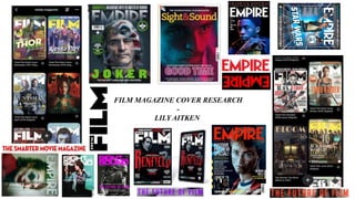
2. Codes and Conventions of Film Magazines.
Masthead (title):
Coverlines:
Strapline/slogans:
Sell Lines:
Model/Celebrity:
Pricing/barcode:
3. Big, sans serif, bold masthead.
Sometimes magazines puts
the subject in front of the
masthead.
Background is a still from the
movie they are promoting.
In order to appeal to their target audience,
which I'm guessing is those interested in the
action/adventure genre, they've gone with a
photo of Harry looking like he's just gotten
into a fight.
His face also takes up a good fraction of
the cover, drawing in the attention of
readers almost immediately.
Section dedicated to the other films
they talk about in the magazine.
Sell lines
More use of image,
photoshopping stills
together.
Seems slightly more
informal.
EMPIRE MAGAZINE
When creating a
cover for an
action packed,
pretty well-
known
upcoming/just
released film this
magazine tend to
go big on colour
and font.
Similar Covers:
4. SIGHT & SOUND MAGAZINE.
barcode/pricing
On this cover, the celebrity is behind the
masthead which may suggest that this
magazine isn't as confident in people knowing
who they are.
(As appose to 'Empire' whose
model's head is in front of their
masthead.)
This magazine has chosen their
model to be posed, rather than
using a still from the movie for
their cover.
The magazine may be more
focused on the actors starring in
the movie rather than the film
itself.
Sight & Sound seems to keep a
simpler front cover, making their
celebrity/model stand out more.
Captivating slogan
The lighting used on the model's face could either be
using the clamshell angle or the flat-out angle to fully
illuminate her face.
5. This magazine is almost a mix of the two
previous ones in the sense that the people are
posed like 'sight & sound', but they are also
in character like 'empire.'
Like Empire with their use of sell lines –
but from looking at other magazines
from total film it seems as though they
may be slightly more informal.
They've positioned Keanu's head
over their masthead, to suggest
confidence in that they are a
popular and well-known magazine
Using a bold colour that
stands out in contrast to the
background.
Barcode/pricing.
TOTAL FILM MAGAZINE
7. Advertisement.
Different sections and categories
to appeal to a bigger demographic.
They've included the opportunity to create
a membership that gives their audience an
opportunity to have more features and
also bring in money for them.
• Empire have chosen a quite simplistic
look for their website. They've stuck to
black, red and white and chosen a sans
serif font.
Logo is in
top left
corner.
Navigation
bar at the top.
The amount of
image used varies
depending on which
page you're on.
All the images are stills from
the movies that they are
reviewing.
8. As soon as you get onto the page it asks
you if you want to become a member or
donate.
Their masthead takes up
almost all of their
background.
All of the images are medium
close ups.
Logo in top-left corner.
Navigation bar.
Easy routes to paying for
something.
They have their own shop.
They seem to follow a
set colour scheme of
black white and
purple, similarly to
Empire magazine.
(medium shot)
Another navigation bar to aid
readers when trying to find
something specific.
9. As soon as you open the website you
get a pop up asking you to sign up.
• Logo in to left corner
• Social media directors
• Search bar
• navigator
Cowboy shot
Headlines going down
the side of the image.
They've decided to use an
advert as their background.
All
medium
close-up
shots.
10. CODES AND CONVENTIONS OF WEBSITES:
• Address bar
• Alt bar
• Banner Ad
• Below the fold
• Blog
• Button
• Navigation bar
• Browser
• External links
11. SIGHT & SOUND CONTENTS PAGE
Includes all of the
features and what pages
they're on.
They've gone with a range of
behind-the-scenes images
rather than stills from movies.
They've chosen for a more
simplistic overall look of their
contents page.
Logo in the top left corner of
the page.
Cut out still image.
• Layout is very full, not
very spacious.
• A lot of information.
12. EMPIRE MAGAZINE CONTENTS PAGE
The word 'contents' takes up a good quarter of the page in red,
upper-case writing.
Dated.
Large page numbers in one column and articles
right next to them. Creates an easy system for
readers to go where they want to.
Cowboy shot of actor, seems like a still from a
movie. Stays with the theme of the magazine.
Title of the magazine at the top.
Seems like they stick with the
same theme for all of their
content's pages.
13. CODES AND CONVENTIONS OF A CONTENTS PAGE:
• Date
• Website link
• Contact details
• Features
• Images
• Title of magazine
• Split columns?