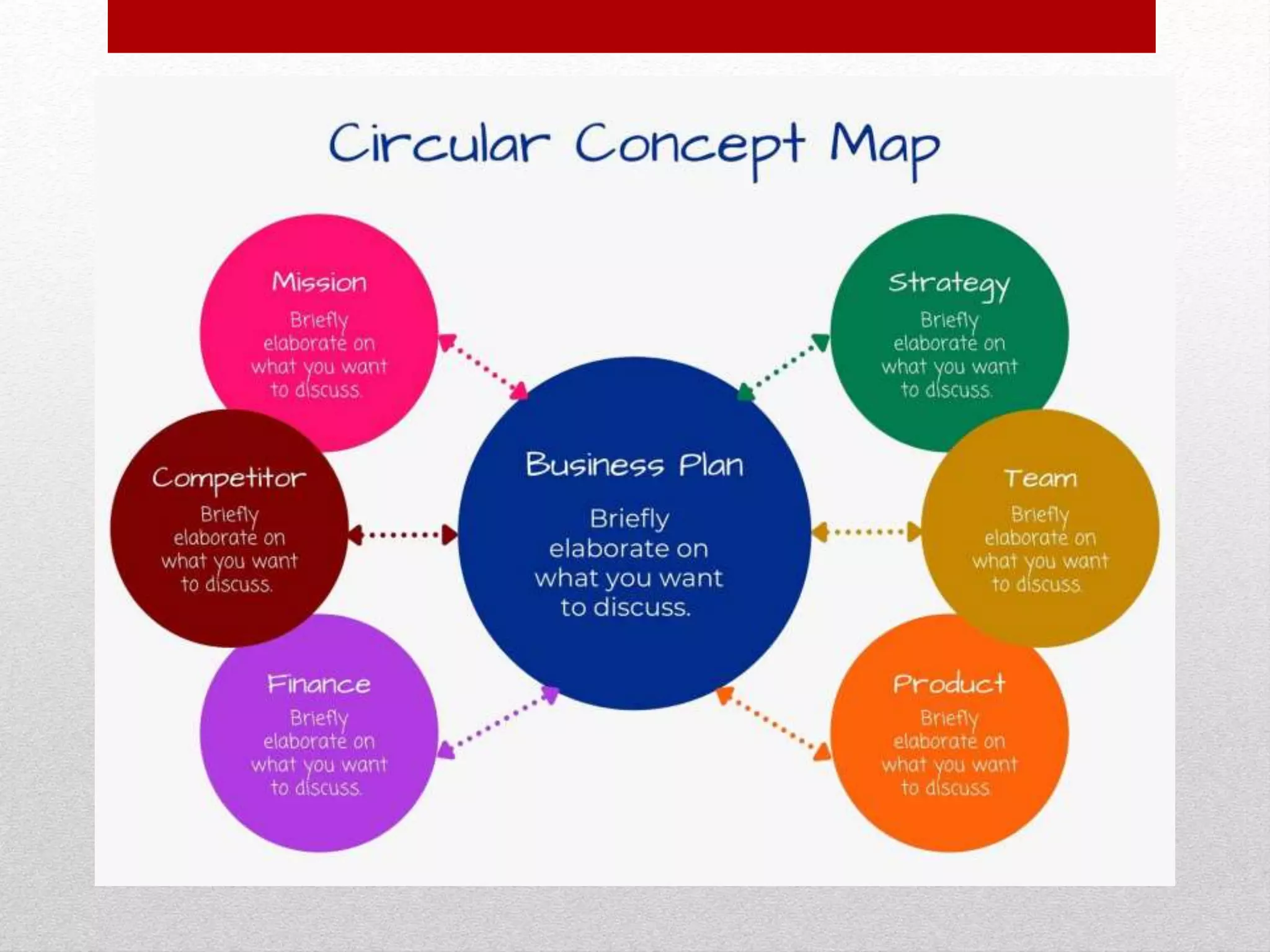
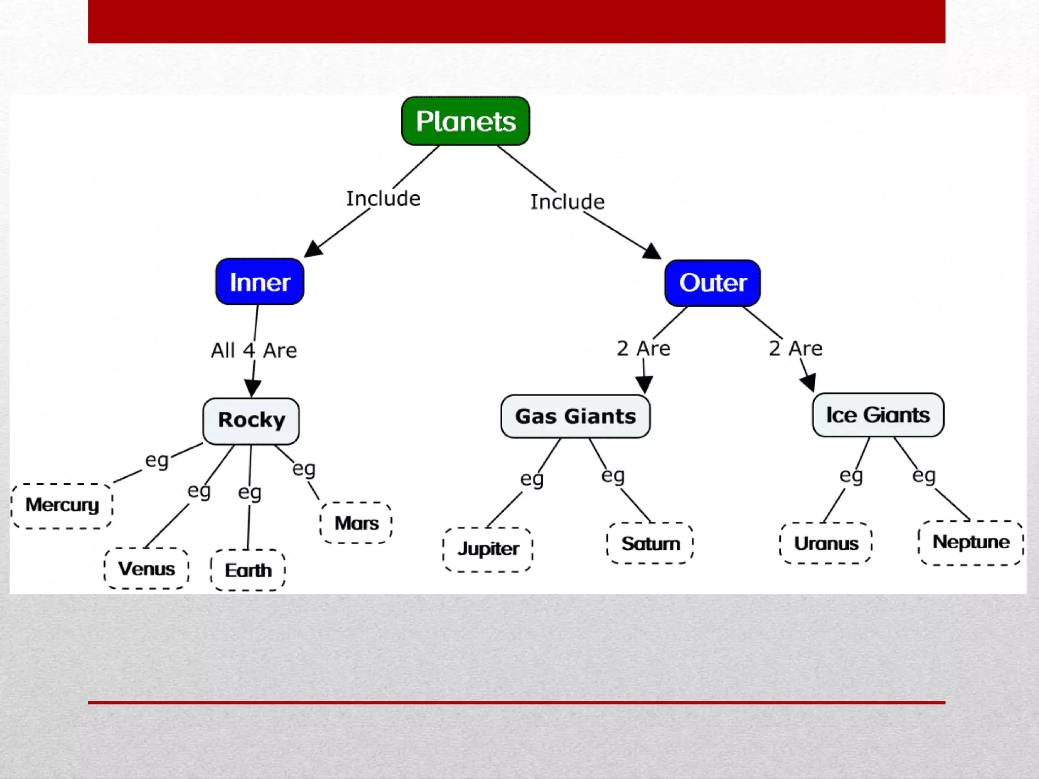
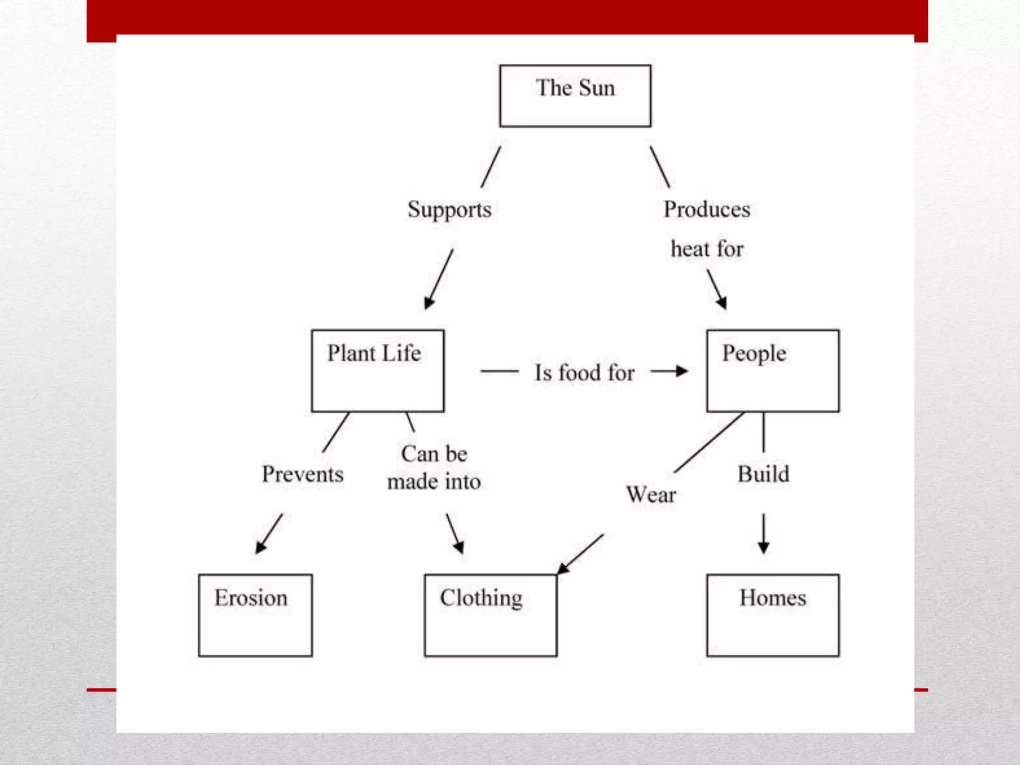
2. OBJECTIVES:
At the end of this lesson, you are expected
to:
• 1. determine the effect of textual aids like
concept map in understanding a text;
• 2. illustrate concepts and ideas using a
concept map; and
• 3. appreciate the importance of textual aids
in understanding a text.
3. Review of the Past Lesson
• In the past, you have learned one of the graphic
organizers which is a timeline. It is where you illustrated
the sequence of events of a text you read.
• You learned that timeline is one of the textual aids or
graphic organizers that shows specific events in
sequence, usually with dates. It is particularly useful for
studying or reviewing history because it visually displays
major events over a period of time. It will help you put
events in chronological order that shows progress or
change.
4. DISCUSSION
A concept map is a visual representation of
knowledge. It shows concepts and ideas and
the relationships among them are usually
connected by arrows. It was developed by
Joseph D. Novak and his research team in the
1970’s as a means of representing the
emerging science knowledge of students.
5. DISCUSSION
Concept map helps visual learners
grasp the material. It helps you to see
relationships between ideas and
concepts. It also helps you doing
memory recall, clarify and structure
ideas.
6. DISCUSSION
Concept map is created by writing
key words enclosed in shapes such as
circles, boxes, triangles, etc. and
drawing arrows between the ideas that
are related then adding short
explanation to concepts that are
related.
11. What is Non-linear Illustration?
There are many definitions of the term
for nonlinear illustration. Most people
consider texts with visuals or graphs along
with it as examples for nonlinear texts. Some
examples include flowcharts, charts, and
graphs (ex: pie chart, bar graphs), graphic
organizers such as knowledge maps and
story maps.
12. What are the types of
Non- linear Illustration?
1. Tables
• A table is an arrangement of
information in rows and columns
containing cells that make comparing
and contrasting information easier.
14. 2. Pie Chart
• A pie chart displays data and
information in an easy-to-read 'pie-
slice' format with varying slice sizes
telling you how much of one data
element exists.
16. 3. Bar Graph
• It is a chart that uses bars to show comparisons
between categories of information. The bars can
be either horizontal or vertical.
• A bar graph will have two axes. One axis will
describe the types of categories being compared,
and the other will have numerical values that
represent the values of the data. It is useful for
comparing facts.
• The bars provide a visual display for comparing
quantities in different categories. Bar graphs help
us to see relationships quickly. Another name for
a bar graph is a bar chart.