FULL NIGHT — 9999894380 Call Girls In Delhi | Delhi
Images to consider for magazine
1. Different Poses....
If I decided to have a guy on the front cover of my magazine,
here are a few poses I could consider...
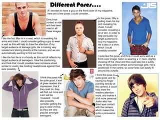
In this pose, Olly is
Direct eye
pulling down his top
contact is vital
and revealing his
and has been
chest. I could
used in all
consider revealing a
these images.
bit of skin in order to
help persuade my
I like the fact Max is in a vest, which is revealing his target audience to
arms and chest. I could consider getting a guy to wear buy my magazine.
a vest as this will help to draw the attention of my He is also in a shirt,
target audience of teenage girls. He is looking very which I could
relaxed and staring directly at the camera, and we are possibly consider.
automatically wanting to find out more.
I quite like this pose, and think it could work well as a
I like the fact he is in a hoody as this sort of reflects my
front cover image. Aston is wearing a ‘v’ neck, slightly
target audience of teenagers. I like the positioning,
showing off his chest and this could also be a subtly
and think that I could possible have someone stood
way of being able to attract some teenage girls. He is
similar to Justin, like holding headphones against their
positioned in the centre, so cover lines can easily fit
ears possibly.
around the outside.
I think this pose is
I think this pose may quite good, and by
be quite good, it sort having his finger
of gives readers the pointing directly at
impression, that if the camera, it could
they read on, they help draw the
will find out more and readers attention
Liam will be more, and makes it
‘revealed’. I could a bit more personal.
also possibly Justin also has
consider getting the direct eye contact
guy to wear chinos, with the camera,
as they are very which makes this
popular amongst quite a persuasive
teenagers. pose.
2. Different Poses....
If I decided to have a girl on the front cover of my
magazine, here are a few poses I could consider...
I like the fact her body is at a slant, with her arms
positioned different places on her body. In this
image, kelly is revealing some of her stomach,
which helps to appeal to guys. I like the
contrasting colour clothing of black and white, and
may consider this for when I come to taking my
images.
I quite like this pose and could possibly do something
I like the pose and like the fact her hand is similar but interpret a microphone into it instead of a
raised to her face. I could possibly have necklace. I would need it to be not as close up, but I
someone doing a similar pose but with a quite like the fact of having her arms raised, it could
microphone in their hand possibly. I also like make it look more symmetrical and organised.
the fact her hair is blowing backwards, and
could experiment with doing something similar
if I decide to have a girl on my front cover.
I like the positioning of tulisa, with her hand on her hips and
think that this could work quite well as a front cover image. Her
dress is very revealing, and if I did something similar it could
help to draw males as well as my target audience to my
magazine.
I like the fact the colour of her clothing, nail varnish, lipstick and
eyes are all matching, and will consider this if I decide to have a
girl on my cover. I think the pose is quite good, however it would
need it to be zoomed out slightly in order to have cover lines
around it.
3. Different Fonts....
Here are some fonts that I found on dafont.com, these are the few that stood out the most to me. I want my masthead to stand out so want
a bold, strong font. I like the sort of ‘curly’ and rounded fonts, and think these would work well with the genre of my magazine being pop. I
quite like the top, right hand side font, this is similar to the masthead on ‘paper’ magazine, I think this one could work quite well. I also
quite like the third one down in the centre, it is very bold and clear, and would be able to stand out against the image and cover lines.
When I come to making my front cover, I am going to experiment with using a variation of these different fonts.
4. Lures....
Here are some of the lures I found on a variation of
different music magazines. Most of which I found
mention ‘free things’, I think this is quite persuasive
and even if readers don’t like the bands featured
they are still able to buy the magazine to get free
gifts/music downloads. I also think that by
mentioning free posters on my cover, it could help
persuade my target audience of teenage girls to
buy the magazine as some of them may wish to
cover their bedroom walls with them. I also think
that by mentioning the word ‘exclusive’ on the
cover, readers automatically know that it is new,
never seen before gossip, which could be helpful in
persuading them to buy it. Finally, by having
competitions where you can win something,
readers are persuaded to buy the magazine to
enter the competitions and win some amazing
prizes.
5. Covers...
I like the colour scheme of
this magazine cover, and am
I like the masthead of this considering using black,
magazine, it is very white and pink on my cover. I
colourful, easy to read and like the fact that the main bits
stands out a lot. I like the of the cover lines have been
fact that there is only a little done in pink, making them
amount of cover lines, stand out more, and showing
making it look organised the audience the main
and not overcrowded. I features. I don’t really like the
don’t want my cover to fact that her head is covering
look crowded and really the masthead, and when I
busy. I also like the fact it’s come to making my cover I
a medium-close-up shot. don’t really want anything
over or under my masthead
as I feel it makes it less eye
catching and harder to read.
I like the colour scheme of
this cover, and could do I think this magazine is quite
something similar for my eye catching, and I like the
magazine cover. I like the fact that the colour of her hair
fact that her clothing is matching the colour of the
matches the colour main cover line. I don’t like
scheme and am going to the fact that the masthead is
consider this when I come over the image though, as it
to making my magazine. I makes it more difficult to read
also quite like the position from a distance. There are
that taylor swift is in, I like only a few cover lines which I
the slanted body position think makes it look more
and if I decide to have a organised and I prefer it to
girl on my cover could there being lots of cover lines
consider a pose similar to all crowded onto a page.
this.
6. Covers... I like how the colour of the
masthead is matching the
colour of the kiss marks
I like the positioning of and think this looks quite
taylor lautner in this good. I like the white
cover, and could background, and the
consider doing contrasting black and white
something similar if I tie. I think the cover lines
were to have a guy on are slightly too long, which
my front cover. I like the makes it seem a bit
fact the masthead crowded. The fact he is
matches the colour of pulling on his tie, helps to
the main cover line. I attract females, so if I have
also quite like the image a guy on my cover, I need
being set at the sea, as to find a way to get them to
it is very unique and appeal to the female target
different, which I could audience.
also consider.
I like how this cover is
I like the colour scheme really simple with only a
of this cover, and think it few cover lines. I also like
looks quite good. I also the fact he is wearing a
like the positioning of the hoody, and could consider
man, it gives the sense this if I choose to have a
that by reading on, more guy on my cover. He is
will be ‘revealed’ as he is revealing his chest which
kind of covering himself helps to appeal to females,
with his arm. I think the so if I get the person on my
fact that he is in a vest cover to reveal a bit of skin
with skin being shown it could be a good way in
makes the cover more attracting people to the
attracting and appeals magazine. I don’t like the
more to the girls, so I fact that in this cover, his
need to consider this if I head is covering the
end up having a guy on masthead as it makes it
my cover. difficult to read.
7. Mastheads...
This masthead is very colourful, reflecting the genre of
pop. It is very bold, however I don’t think it really stands
out that much. I don’t like the fact that there is an image
underneath the masthead and will consider this for when I think that this masthead is okay. I think that
I come to creating my magazine. all the colours work well together, and it is
overall quite eye catching. I like the sort of
bubble writing effect of the masthead and
think it makes it stand out more.
This masthead is very iconic,
and well known. It stands out
and people easily know the I like this masthead, it is very bright and you can easily
magazine name. I want my tell it is reflecting the genre of pop. The font is quite curly
magazine masthead to be and kind of childish. The bright pink helps to highlight the
able to become well known, I like this masthead and think it stands out yellow writing and makes it stand out more. However, on
and want my audience to a lot. I like the fact that the masthead is in most of the totp magazine covers, there are images either
automatically know that it is a a separate box, which divides it from the underneath or on top of the masthead which I don’t like.
pop magazine. image. It is very clear and easily read. It is
in capital letter, is very bold and sharp.
This masthead is very
iconic and it stands out a
This masthead is okay, lot. It is very bold, and
but I do think it looks sharp, reflecting the genre
quite plain and boring. I of rock. The red is very
want my masthead to bright, which is then
be colourful, simple, outlined with a white and
and easy to read. This black which contrast
font is very bold, and against each other and
really easy to read. look quite good.
8. Props/ clothing I could
consider...
If I were to have a guy, I could have them wearing some big
headphones. The audience then will automatically know that it is a
music magazine, and hopefully my colour scheme and masthead
will easily show that its a pop magazine.
If I were to have a girl, I could interpret a microphone in the image
somewhere. I want to make it obvious to the reader that its a music
magazine and I think that by having either headphones or a
microphone, this will easily show that it is a music magazine.
Guy... Girl...
Here is some of the clothing that I could consider if I were to have Here is some of the clothing that I could consider if I were to have a girl
a guy on my front cover. I quite like the ‘fabulous’ cover on the on the front cover. I think that I want my clothing to match my colour
previous slide with harry posing with his hood up and this gave me scheme so could have my model in black shorts or skirt, with a bright
the idea of the hoody. In the first slide, liam is wearing chinos in his crop top, the colour dependant on the colour scheme I decide to
image, and this gave me the idea that I could possibly get my choose. I could possibly have my model in a smart dress. This would
model to wear them. Also, in some of the magazine covers, they also have to match my chosen colour scheme and could help to make
are in white tops/shirts, so I could have my model posing in a shirt. my magazine come across as more realistic and sophisticated.