2. Choice of editorial pillars Page numbers run down the centre of the editorial pillar Separates each item Graphically interesting and the numbers use the same bold type face as the ‘PLUS ‘ at the top Creates contrast and pattern The large plus and the numbers help you find the pillar as in the overall layout its quite a small section.
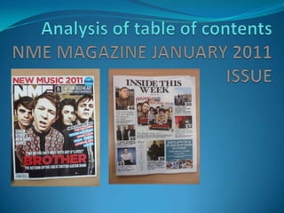
3. Layout The layout divided into three sections. The central sections of the table of contents shows two versions of the cover of the magazine featuring the most important artists. The title highlights this point. Two front covers are centred under this. The secondary stories are given equal size and each a page number and a pull quote on the left hand side column – giving the layout a shape in which you read down the way. In the third section it includes the small editorial pillar, one last content photo and subscription information, which takes up half of the section and is the single biggest block on the page
4. Imagery Images are all in colour Almost all pictures are posed and addressing the camera apart from one pictures of a live gig ( which also follows convention ) It is all about identifying the artists at a glance so imagery is very important Apart from text there is no other imagery used. For example, no background colour and no icons.
5. House styles ( colour scheme, fonts) – in relation to cover NME uses simple bold type faces only uses a couple of colours – for example white, red and blue. Not a wide range of fonts. Sans Serif is mostly sued in the front cover, however the T.O.C uses a Serif type phase which has think and thin parts to the letters. The T.O.C only uses black font apart from using white on a blue background, as does the front cover. The front cover uses blocks of colour to highlight texts and keeps to the red, white and blue colour scheme.
Editor's Notes
The overall layout is really about the images so the don't want to detract from theses by the editorial pillar. It is positioned on the bottom as its of secondary importance, they want the main focus on the images and main articles.
In some ways this contents page breaks the usualconvention by not using the editors notes, compared to Kerrang. NME tend to keep their layouts blocky and its part of their ‘ in your face ‘ style.
They are all posed picture looking directly at the camera – without any narrative or context.
Colour scheme of NME is quite a masculine house style, with bold, san serif type face -Black, red and white.