2. COMP1649 Interaction Design
Page 1 of 18
Contents
1. Introduction ..................................................................................................................................................................2
2. Cognitive Psychology and the User...........................................................................................................................3
2.1. Identifying the User............................................................................................................................................................3
2.2. How will cognitive psychology affect the user?.............................................................................................................3
Cognitive Processes.........................................................................................................................................32.2.1.
Cognitive Frameworks....................................................................................................................................42.2.2.
Conclusion ........................................................................................................................................................52.2.3.
3. Design Principles and Methodology .........................................................................................................................6
3.1. Design Principles ................................................................................................................................................................6
3.2. Methodology Used .............................................................................................................................................................7
4. Using Multimedia Content..........................................................................................................................................8
4.1. Multimedia types used........................................................................................................................................................8
4.2. Multimedia use rationale....................................................................................................................................................8
5. Evaluation......................................................................................................................................................................9
5.1. Evaluation Criteria..............................................................................................................................................................9
5.2. Product Evaluation.............................................................................................................................................................9
6. Conclusion...................................................................................................................................................................14
7. References and Bibliography ................................................................................................................................................15
Appendix A – Prototype Functional Pages / Options..................................................................................................16
Appendix B – Table of Figures .........................................................................................................................................18
3. COMP1649 Interaction Design
Page 2 of 18
1. Introduction
The brief required that a mobile applet needed to be designed based on one of four scenarios. The applet needed
to include multimedia artefacts.
The scenarios were to design a music and/or movie preview applet that could be used as a “try before you buy” e-
commerce solution; A welcome to University of Greenwich for new students, to cover everything they would
need to know; Social networking for current students within the university or a game for 5 to 7 year olds to
promote green environment issues.
The application could be mobile web or a platform specific applet. In either case, this could be on a mobile phone
or a tablet device.
The scenario considered for this report is to design the music and movie preview applet for touch screen devices
(such as Apple iPhone and iPad).
4. COMP1649 Interaction Design
Page 3 of 18
2. Cognitive Psychology and the User
2.1. Identifying the User
According to statistics from a report by YouGov (2011), 54% of smartphone users are male. 18.7 % of users are
18 to 24; 26.7% of users are 25 to 34; 23.5 % are 35 to 44; 13.5% are 45 to 54; 17.6% are 55+. Therefore, the
majority of smartphone users could be considered to be males between the ages of 25 to 34.
The report also states that of the males with smartphones, 19% selected music apps amongst their top 3 most
used apps, whilst shopping apps were only ranked in the top three by 8% of users. Female smartphone users had
similar figures, with 16% using music apps and again, only 8% using shopping apps. From these figures, it would
suggest that the primary focus of the applet should be the multimedia content, rather than focusing on the sale.
2.2. How will cognitive psychology affect the user?
The brain acquires processes and stores various data. Cognitive Psychology is a branch of psychology that looks at
the way the brain handles this data. This includes problem-solving, i.e. how does a user decide what button to
press.
How people process information can be affected by many factors. There are two types of cognition; experiential
and reflective (Norman, 1993, cited in Sharp, et al, 2007). Culture and previous exposure to stimuli are experiential
factors, as the previous experience with various interfaces will determine how they interact, as will their culture, as
they may be expecting information to be represented in a specific manner. The effectiveness of design is a
reflective factor. This is because the user, although they may already have experience of similar interfaces, will be
required to analyse the current interface and decide whether it follows the same usage patterns; Will this icon with
text that looks like a button perform like the buttons I have used before? Will this link take me to the film preview
I was looking for? This is comparing and decision making, key attributes of reflective cognition.
There are six main cognitive processes, which can be interdependent, meaning that several processes may be
required for any given task (Sharp, et al., 2007).
Cognitive Processes2.2.1.
Attention
When the user visits the mobile web application, they will be visiting with a purpose - to preview a multimedia
artefact. In the context of this applet, they will be able to view short videos of films and audio clips of music.
When a user has a specific goal in mind, they will assess the presented information to map it to their goals, such as
“Is the information I want on this page? No, I must follow this link to get to category X.”
It is therefore important that the information provided to the user is relative to the environment and the given
task. It should also be ordered in a logical and useful manner. The screen, particularly being quite small on smart
phones (over larger mobile tablets), should avoid be too cluttered and space used effectively.
Perception
The process of perception follows on from attention, in that it mainly regards how information is presented. To
ensure that users are able to correctly perceive the meaning of the information presented to them, careful
consideration should be given to the following: icons (and other graphical representations) should clearly define
meaning and where the visual representation is abstract, should be clearly labelled; grouped items should be
spaced well and where possible, defined by borders, rather than coloured backgrounds, where on the same page
5. COMP1649 Interaction Design
Page 4 of 18
(Weller, 2004; Galitz, 1997 cited in Sharp et al., 2007); text should be legible, with good text to background colour
contrast.
Within perception, there is also “perceived affordance” (Norman, 2004), the perception that users have of the way
things work or can be used, such as a button that says “next page” is perceived to have the affordance of being
able to be clicked and the action will take the user to the next page. This can be linked to the cognitive framework
of mental models.
Memory
Memory is the recalling of knowledge. This could be through having to provide the answer to a question, or
through recognition, when shown a picture and asked to recall a fact. It has been shown that a change of context
can affect the ability to recall knowledge, despite the information being previously known (Sharp, et al., 2007).
However, the more frequently a task is completed, the easier it becomes to recall.
Therefore, it is necessary to ensure that the user is not required to undertake complicated tasks to achieve their
goal in watching a preview or listening to a sound clip. The use of icons, buttons and links should work in a
familiar way, to promote recognition, rather than recall, which will simplify the tasks for the user and reduce
memory load.
Learning
Learning, in terms of human-computer interaction can be thought of in two ways: learning how to use or using to
learn. Users tend to learn through doing, rather than reading (Caroll, 1990 cited in Sharp et al., 2007), therefore
the interface should encourage exploration, but also guide users into selecting the most appropriate actions. This
could be achieved by using the correct icons to play a video or add a purchase to the shopping cart.
Reading, Speaking, Listening
Language processing is governed by “Reading, Speaking and Listening”. This is how information is actually taken
in by the user. As this will be a mobile web application, the main issue will be regarding the ability to read the text
on screen. This could be thought of as an accessibility consideration, as the main design implication is that text on
screen should be able to be resized by the user. The quality of the audio and video files could also be taken into
consideration, as this is the main reason that visitors will be using the mobile web application.
Problem-solving, Planning, Reasoning, Decision-making
The principle issue surrounding problem-solving and decision-making is that a user of the mobile web application
should be able to make rapid decisions. The interface should not be so complex, that the user must figure out how
to use it, before they proceed. By following some standard and anticipated conventions, the user will be able to
quickly adapt to using the interface. Such conventions would be using familiar icons such as the standard “play”
and “pause” icons when viewing or listening to the media clips.
Cognitive Frameworks2.2.2.
There are several cognitive frameworks that are used to predict and explain human behaviours. There are five
main theories in relation to interaction design; however, the three discussed below will be taken into consideration
for the design.
Mental Models
Mental models are the conceptual ideas that humans have regarding how things work. This can be based on
assumptions or facts. Assumptions are usually based on previous experience. An example cited by Sharp et al
(2007) is the distinction between a running tap and central heating. We assume that because a running tap
6. COMP1649 Interaction Design
Page 5 of 18
increases “flow” when the tap handle is repeatedly turned, that the same is true for the speed at which the
temperature rises with central heating, the higher temperature we set it at. This conceptual model of how a central
heating system works is flawed, yet it persists. The mental model does not have to be correct in its interpretation
to exist.
Therefore, the interface for the mobile web application should aim to follow standard concepts, by providing
intuitive ways to interact, with clear instructions and where necessary, context relevant guidance.
Theory of Action
The theory of action framework is related to the concepts of “gulf of execution” and “gulf of evaluation”. This is
a goal driven framework. A user has a goal, they decide how they will achieve it, they perform actions (this could
be a specific sequence). They then receive feedback from whatever interface they have used to perform the
actions (such as a browser), they interpret the information they receive and evaluate whether the information
received has met the original goal. The aim should be to reduce the cognitive effort of the user.
The main goals of visitors to the mobile web application will be to preview video and music content, with an
underlying possibility to purchase. The aim of the web application should be to easily allow users to view or listen
to the desired content.
External Cognition
External cognition has three main activities / processes. The first is externalising. This reduces the memory load
for the user and relies on visual cues, which could be user generated, such as a to-do list. The second is
computational off-loading, which requires a tool to solve a problem, such as a calculator to answer a mathematical
question. The third is annotating and cognitive tracing, which is the manipulation of external data, such as
crossing off items on a shopping list list (annotation) or re-sequencing items, such as a shopping list, to be more
effective when in store (cognitive tracing).
The interface design can use externalising, by providing visual clues as to what pages have been visited, such as
visited links, or if a product is already in the users basket, highlighting the product in some way. Another cue that
could prompt the user is the use of showing the number of items in the shopping basket, to prompt the user to
complete their transaction.
Conclusion2.2.3.
The interface should aim to take into consideration the following:
Goal of the user.
Information on screen is relevant.
Ordering/sequence of information/options.
Keep the interface simple and uncluttered.
Icons should be clear or labelled where not obvious.
Text should be legible, good foreground to background contrast.
Interface should promote recognition rather than recall.
Obtaining the goal is easy.
Interface should encourage the user to explore.
Interface should prompt the user to take certain actions.
Interface should allow for rapid-decision making.
Interface should be intuitive.
It should reduce cognitive effort.
7. COMP1649 Interaction Design
Page 6 of 18
3. Design Principles and Methodology
3.1. Design Principles
The product will be designed based on the 12 principles of Human-Computer Interaction design, described by
David Benyon (2010), but will take into consideration Fitts’s Law (Göktürk, 2008), as the product will be designed
for mobile devices, particularly touch screen devices like the Apple iPhone, Samsung Galaxy, Apple iPad. This is
because the users finger are not the most precise pointing tool available (Rodríguez, 2012). Some touch screen
devices will have styli to be able to make selections; however, the design should take into consideration users that
do not have this functionality.
Fitts’s Law affects the size of buttons and icons, their placement and their spacing. It will also affect the order
content and options are displayed. This is reflected in the book “Mobile Interaction Design” (Jones & Marsden,
2008), where the design specifications for Microsoft and Symbian are discussed. Microsoft specifies that menu
items should be listed in the order of anticipated frequency of use, while both manufacturers also specify that
commands that are hard to recover from (such as “Delete”) should be placed at the very bottom of the list. This
means that users are less likely to inadvertently select the wrong option.
The principles, as defined by Benyon, are broken into three categories, Learnability of, Effectiveness of and the
Accommodation of the interface design.
Learnability is concerned with how visible things in the interface are; the consistency of the design; whether the
interface will feel familiar to user; the affordance of icons and buttons. Visibility does not relate only to what is
visible on screen, such as buttons and text, but the information that is also communicated back to the user, such
as an error in an action or something as simple as clear indication that an action is taking place. This could be by
use of a loading icon or screen. For the purposes of this product, the interface will be evaluated on the visibility of
text, buttons and instructions. Consistency relates to both performance and visual style. For the purposes of this
product, the interface will be evaluated on the consistency of the visual style. Familiarity relates to both the
language and symbols that the interface uses, as well as the use of appropriate metaphors, where culture or
language may be a barrier. For the purpose of this report, the interface will be evaluated on the familiarity of the
icons and symbols used. Affordance (or perceived affordance, as related to interaction design (Norman, 2004)) is
the inferred use or property of a button, icon or symbol. For the purpose of this report, the perceived affordance
will be evaluated based on how universally accepted the icons and buttons will be received.
Effectiveness is concerned with how easy the system is to use and how well it protects the user from problems
and the ability the user has to recover from issues within the system. In the case of this product, it will relate to
how easy it is for a user to move around the web application and then add or remove items from their shopping
basket.
User accommodation relates to how flexible the system is, the ability to personalise the interface or providing
different methods to achieve the same goal for various levels of skill; how attractive the interface is; the
conviviality of the system - is the feedback polite, appropriate, does it make the user want to join in. This product
will be evaluated on flexibility, concerning the routes/methods to preview content; the conviviality of the product,
through product description and the messages the user will receive; the visual style of the product, including use
of colour.
Benyon’s principles have been chosen for this product development, as they address the main aims identified
through the review of cognitive psychology and how it will affect the users and how they will interact with the
product interface.
8. COMP1649 Interaction Design
Page 7 of 18
3.2. Methodology Used
The product will initially be developed using a Rapid Application Development tool, which uses HTML5, CSS3
and jQueryMobile to develop a basic functioning application framework. This will constrain the elements to what
is feasible for mobile web application development, within a fixed, rather than responsive design.
The styling for the application can be developed and applied using another rapid development tool, supplied by
jQueryMobile, called ThemeRoller. This tool allows the creation of various themes, which can be applied in the
RAD tool. Using this tool, it is possible to see the how the various components will work together, visually, based
on colour contrasts etc.
RAD is an appropriate tool to use in conjunction with the chosen design principles, as it allows for regular re-
evaluation of the product against the evaluation criteria.
9. COMP1649 Interaction Design
Page 8 of 18
4. Using Multimedia Content
4.1. Multimedia types used
The types of media that will be used for this product will be still images, video and audio. Still images will be
JPEGS or PNG; video will be in the MPEG-4 format. Additionally, audio files will be in MP3 and OGG format.
4.2. Multimedia use rationale
As this is an application that is designed to provide previews of audio and video items, the primary content will
need to be video and audio clips. The formats specified previously for these two types of content are defined by
the capabilities of the devices that the users will have to display the content (Google Inc., n.d.) (Sights, 2012). Of
the three main devices/operating systems, iOS5 on iPhone, Android devices and Blackberry, all support the
HTML5 “poster image” attribute of the video element. This means that a static image can be displayed to
advertise the video. Static images will also be used to display the album or single covers for the audio choices. The
use of static images, that will either be album covers or official film/series images (such as a DVD cover or
poster), will help a user more quickly identify that they are navigating to the correct content, as they may have
seen the image before.
10. COMP1649 Interaction Design
Page 9 of 18
5. Evaluation
5.1. Evaluation Criteria
The interface will be evaluated on the following criteria, based on the design principles that informed the interface
design:
Fitt’s Law
1. Are the interactive devices (e.g. buttons) appropriately sized and spaced for touch screen use?
Benyon’s Principles – Learnability
2. Is the design consistent throughout the application?
3. Is the functionality consistent throughout the application?
4. Does the application use familiar icons and terminology?
5. Is there perceived affordance for the interactive elements?
6. Are buttons, text, images suitably visible?
7. Are the instructions clear regarding purchase?
Benyon’s Principles – Effectiveness
8. Is the menu system simple?
9. Can a user easily select an item and add it to the basket?
10. Can a user change their mind and remove an article from the basket?
11. Can a user register quickly?
Benyon’s Principles – Accommodation
12. Are there different routes to viewing the same content available?
13. Is the use of colour within the interface appropriate?
14. Do the instructions/messages provided to the user promote inclusion?
5.2. Product Evaluation
Fitts’s Law
Are the interactive devices (e.g. buttons) appropriately sized and spaced for touch screen use?
The interface takes into consideration the use of Fitt’s Law, by providing users with large buttons which are well-
spaced and well defined menu options. In the following examples, evidence of the main menu system is shown in
each image. In Figure 1 and Figure 2, the user is presented with a list of options. In Figure 1, the list presented is
of the movie categories. This category format is used for all three types of content on offer, movies, TV and
music. In Figure 2, the user is presented with a list of the titles available in a given category, which is the same
format used for all three content types. The final image, Figure 3, is an example of how the content is displayed to
the user. The example provided here is for a music type. The layout order and the button style is the same for
each content type. The images show the well sized buttons and in the case of the content page, the spacing
between buttons, ensuring that the user has less opportunity to select the wrong option.
11. COMP1649 Interaction Design
Page 10 of 18
Figure 1 Choosing a Movie category Figure 2 Choosing a Comedy TV series Figure 3 Previewing an album
Benyon’s Principles – Learnability
Is the design consistent throughout the application?
All of the pages within the web application follow a consist format for navigation. The main navigation choices
are provided at the top of the screen, whilst a search bar (non-functional in the prototype) is provided at the
bottom of the page. The drawback of using a fixed footer means that when viewed on a smaller screen (such as an
iPhone), the footer floats, and occasionally covers content. This was the trade-off required for consistency when
viewed on larger/tablet device, such as an iPad, that the application has been specifically designed for.
The navigation through the various categories for content type and the contents of each category also remains the
same, as per Figure 1 and Figure 2.
Figure 4 A preview of a film Figure 5 A preview of a TV series Figure 6 A preview of an album
All content types are previewed in the same way (Figure 4, Figure 5 Figure 6). The preview pages have the same
format, to ensure that when the visitor navigates between these pages, they know what to expect and what the
buttons do. All buttons, although styled in different colours, depending on category and whether a product
already exists in the basket (Figure 4 and Figure 6), are presented in the same rounded corner format.
12. COMP1649 Interaction Design
Page 11 of 18
Is the functionality consistent throughout the application?
Functionality remains consistent throughout. The play/pause button performs the same action, regardless of
content type.
Does the application use familiar icons and terminology?
Figure 7 The customised
MOVIES icon
Figure 8 The customised TV
icon
Figure 9 The customised
MUSIC icon
Figure 10 The customised
BASKET icon
The icons used follow traditional concepts, such as play/pause. The menu icons are generally quite easy to discern
the content type, when considered in context. The TV (Figure 8) and movie (Figure 7) icons are not as necessarily
immediately identifiable, when viewed without supporting text, or in the context of the menu system. The image
of a TV with an aerial will soon be obsolete, given the digital TV revolution. Some of the terminology could be
reworded, or additional information could be provided, as the options to “rent” or “buy” for movies and TV
series isn’t as descriptive as it could be.
Is there perceived affordance for the interactive elements?
Because the interface uses common forms for both navigation and action (buttons), there is already a perceived
affordance and expectation for the user. Buttons are also clearly distinguished from the background on the
preview pages and all buttons have gradients in their colour, which gives the buttons depth and pushes them out
of the screen.
Are buttons, text, images suitably visible?
There is good foreground to background contrast for text on all pages, as black text has been used for pale
background pages, whilst white text has been used in pages with dark backgrounds. Buttons have been coloured
so as not to blend into the background on preview pages, although the black buttons on the dark blue of the
music pages is less distinctive than when viewed on movie and TV pages. Excluding the images used for video
posters and album covers, the rest of the images are monochrome and stand out well against button backgrounds.
The main issue where buttons may not be as visible is on the login and registration pages, where the buttons are
white, on a white background. The buttons should have been a different colour, like the blue used for the search
or header bar, to be more visible.
Are the instructions clear regarding purchase?
Currently, the preview pages offer the users a chance to Rent or Buy movies and TV series and for music, users
can get Digital or CD copies. Further clarification as to what these terms mean, whether through further
instruction on the preview page, or a pop-up dialogue explaining what these terms mean, is required. The music
purchase is slightly more self-explanatory than for the purchase and renting of video content. The concept behind
“rent” and “buy” was influenced by iTunes, where a user can rent or permanently purchase digital content. Not all
users will have experienced iTunes if they are Android or Blackberry users, therefore, this may not be a purchasing
context that they are familiar with.
Benyon’s Principles – Effectiveness
Is the menu system simple?
The primary menu system for the application is very simple, with only five main sections that a user can visit.
Once the user goes into a specific section, the menu becomes slightly more complex, by breaking content types
13. COMP1649 Interaction Design
Page 12 of 18
into categories. The prototype only offers links from categories and does not enable the user to look through an
A-Z, although this would be presented in the same manner as the category menu.
Can a user easily select an item and add it to the basket?
It is very simple for a user to select an item to enter into their basket. When visiting a preview page, the visitor has
three options, to preview the content and then two buying options. Once an item is in the basket, when they
revisit the page, the purchase type, such as a rental for a movie, is highlighted.
Can a user change their mind and remove an article from the basket?
According to Beynon’s principles of effectiveness, users should be able to easily recover from an error. In the
situation of an online shopping application, this would be amending either the number of an article in their
shopping basket or cart, or simply removing it all together. As per Figure 11, the interface has been designed to
allow the user to remove an article from their basket (in the prototype this is non-functioning). The assumption
has been made that the user will not want to purchase more than one of anything, as the application is designed to
prompt users to buy the digital version – of which they would only require one.
Figure 11 The application basket Figure 12 The registration page
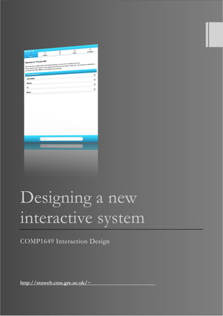
Can a user register quickly?
Registration forms are a contentious issue in many designs, as they are required to obtain information and to be
able to accurately bill someone, or despatch a purchased item. The issue is that people do not like to fill in forms
(Vora, 2009) therefore; the form for the prototype has been designed to obtain the most basic information about
a user, to get them into the registration process. The concept behind this form is that once the user has entered
their details, they will be redirected to a parent site, where the user will verify their purchases and they will then
follow a step-by-step process to enter billing information and, where necessary, delivery information.
Benyon’s Principles – Accommodation
Are there different routes to viewing the same content available?
Benyon suggests that providing users with various methods to obtain the same information makes an application,
or interface, more accommodating – giving the user more agency. The product provides several routes for a user
to see a preview. The prototype has only one working route, which is accessed through the category of each
content type; however, there is also space to provide the alphabetised list and the search functionality.
14. COMP1649 Interaction Design
Page 13 of 18
Is the use of colour within the interface appropriate?
Colour has been used within the application to differentiate between the areas that the user is visiting. The
application uses various shades of blue, as this is thought to be both calming and less strenuous for the eyes.
(Fraser & Banks, 2004). White was used for the non-content specific pages, as this provided the greatest text to
background contrast and was a natural progression from the very pale blue used for the movies section. To tie the
sections together, the non-content specific areas use blue within the navigation system, header and footer.
Do the instructions/messages provided to the user promote inclusion?
Within the application, the user receives very little feedback from the system, although the user is provided with
small snippets of information and instructions. On the preview pages, the users are given the suggestion to “click
here to preview”. The user is not offered very many opportunities to feel “included” by the application, as it is
quite sterile. The user, although not explicitly stated, can determine that they can browse the application and
preview without needing to buy, but are repeatedly told that they will need to sign-in or register to purchase.
These instructions are not repeated within the preview pages, but can be found on the home page, login,
registration and basket pages. This was to ensure that the user would be aware that they would be redirected away
from the application to complete their purchase, although this could potentially be seen as over-bearing and be
off-putting for the user.
15. COMP1649 Interaction Design
Page 14 of 18
6. Conclusion
Overall, the product interface meets the majority of the evaluation criteria, as defined against the design principles
adopted. The primary concerns of usability, in terms of navigation, visibility of buttons for previews and
consistency in design/function have been met through the design.
Further refining of the colour scheme, particularly within the non-content specific pages, should be considered, to
improve the visibility of the buttons on purchase/login/register pages. The user should also receive more
feedback from the system. If the prototype were turned into a full product, the user should receive a prompt
confirming that they have just put something in the basket, with the option to review their basket, or carry on
browsing.
The application could also provide more information as the user browses the pages, such as on the category
pages. These pages currently provide no further information that what is immediately visible in the menu.
Although the intention is clear, the experience is very clinical and so more effort could be made to welcome the
user.
With further development, the product could include further options for the user, such as a “people who liked
this also liked…” further down the preview page, with the potential to include reviews. These could be included
using collapsible content, so that the user is not overwhelmed with content, but knows that it is there if they wish
to view it. This would foster more of a sense of belonging, as the user will see that there are already users with
similar tastes.
The higher level of functionality in the product was limited, but this is because it was designed with the view of
being a prototype and to show the features available within the interface, more than how the product would
function if implemented as a full product. The details of the available functionality and preview content can be
found in Appendix A.
16. COMP1649 Interaction Design
Page 15 of 18
7. References and Bibliography
Adkins, A. & Wilson, D., 2011. Someone Like You. [Sound Recording] (XL).
Alcatraz. 2012. [Film] Directed by Jack Bender, Paul A. Edwards. USA; Canada: Bonanza Productions; Bad Robot.
Benyon, D., 2010. Designing Interactive Systems: a comprehensive guide to HCI and Interaction Design. 2nd ed. Harlow:
Addison-Wesley.
Castle. 2009. [Film] Directed by Rob Bowman, John Terlesky, Bryan Spicer, Bill Roe, Jeff Bleckner, Thomas J.
Wright, David Barrett, Paul Holahan. USA: ABC.
del Rey, L., 2012. Dark Paradise. [Sound Recording].
Fraser, T. & Banks, A., 2004. The Complete Guide to Colour. Lewes: The Ilex Press Limited.
Gleave, E., 2011. Plastic Smile. [Sound Recording] (Ministry of Sound).
Göktürk, M., 2008. Fitts's Law. [Online]
Available at: http://www.interaction-design.org/encyclopedia/fitts_law.html
[Accessed 26 April 2012].
Google Inc., n.d.. Android Supported Media Formats. [Online]
Available at: http://developer.android.com/guide/appendix/media-formats.html
[Accessed 27 April 2012].
Harry Potter and the Deathly Hallows Part 2. 2011. [Film] Directed by David Yates. USA/UK: Warner Bros. Pictures.
How I Met Your Mother. 2005. [Film] Directed by Pamela Fryman, Rob Greenberg, Michael J. Shea. USA: 20th
Century Fox Television; Bays Thomas Productions.
Jones, M. & Marsden, G., 2008. Mobile Interaction Design. Chichester, UK: John Wiley & Sons Ltd.
Norman, D., 2004. Don Norman's jnd.org / Affordances and Design. [Online]
Available at: http://www.jnd.org/dn.mss/affordances_and.html
[Accessed 26 APril 2012].
Rodríguez, P., 2012. Common mobile web design mistakes. [Online]
Available at: http://www.webdesignerdepot.com/2012/02/common-mobile-web-design-mistakes/
[Accessed 26 April 2012].
Sharp, H., Rogers, Y. & Preece, J., 2007. Interaction design: beyond human-computer interaction. 2nd ed. Chichester(West
Sussex): John Wiley & Sons.
Sights, 2012. The HTML5 test - How well does your browser support HTML5?. [Online]
Available at: http://html5test.com/compare/browser/ios50/android40/bb10.html
[Accessed 27 April 2012].
The Adventures of Tintin: The Secret of the Unicorn. 2011. [Film] Directed by Steven Spielberg. USA; New Zealand:
Columbia Pictures.
The Girl Who Played With Fire. 2009. [Film] Directed by Daniel Alfredson. Sweden, Denmark, Germany: Nordisk
Film.
Vora, P., 2009. Web application design patterns. London: Morgan Kaufmann.
YouGov, 2011. Smartphones (Hotwire PR). [Online]
Available at: http://cdn.yougov.com/today_uk_import/yg-omni-hotwireprsmartphones-040411.pdf
[Accessed 27 April 2012].
17. COMP1649 Interaction Design
Page 16 of 18
Appendix A – Prototype Functional Pages / Options
The prototype has been set up with preselected items existing in the basket, which are denoted when visiting the
previews pages. The specific purchase type is indicated by a white button.
Three products available for each content type:
Movies
Harry Potter and the Deathly Hallows Part 2
The Girl Who Played With Fire
The Adventures of Tin-Tin
TV
Castle – Series 1
How I Met Your Mother – Series 7
Alcatraz – Series 1
Music
Adele – 21
Example – Playing in the Shadows
Land del Rey – Born to Die
Page Functionality:
Home Page
Allows navigation to main content type pages and “just added”
Just Added
Allows navigation to content type categories
Movies
Allows navigation to the following categories:
Drama (Tin-Tin, The Girl Who Played With Fire)
Sci-Fi/Fantasy (Harry Potter and the Deathly Hallows Part 2)
TV
Allows navigation to the following categories
Action (Castle – Season 1)
Comedy (Castle – Season 1, How I Met Your Mother – Season 7)
Sci-Fi/Fantasy (Alcatraz – Season 1)
Music
Allows navigation to the following categories
Dance/Urban (Example – Playing in the Shadows)
Rock/Pop (Adele – 21, Lana del Rey – Born to Die)
Basket
Allows action on the following buttons
Check out (login)
18. COMP1649 Interaction Design
Page 17 of 18
Go Back (home)
“Remove” returns user to basket and does not remove the article from basket. For interface
layout purposes only.
Links provided back to basket contents
Login
Allows action on “Register” only
“Login” and text fields provided for interface layout purposes only.
Register
Text fields and button provided for interface layout purposes only.
Preview Pages
Items cannot be added to the basket – purchase buttons for interface layout purposes only.
Play / Pause button functioning for all previews
19. COMP1649 Interaction Design
Page 18 of 18
Appendix B – Table of Figures
Figure 1 Choosing a Movie category......................................................................................................................................10
Figure 2 Choosing a Comedy TV series................................................................................................................................10
Figure 3 Previewing an album.................................................................................................................................................10
Figure 4 A preview of a film....................................................................................................................................................10
Figure 5 A preview of a TV series..........................................................................................................................................10
Figure 6 A preview of an album..............................................................................................................................................10
Figure 7 The customised MOVIES icon...............................................................................................................................11
Figure 8 The customised TV icon..........................................................................................................................................11
Figure 9 The customised MUSIC icon ..................................................................................................................................11
Figure 10 The customised BASKET icon.............................................................................................................................11
Figure 11 The application basket............................................................................................................................................12
Figure 12 The registration page...............................................................................................................................................12