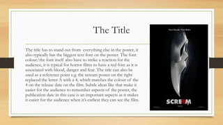
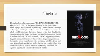
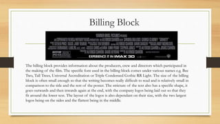
Poster Conventions
By Hubert Osinski
The Title
The title has to stand out from everything else in the poster, it
also typically has the biggest text font on the poster. The font
colour/the font itself also have to strike a reaction for the
audience, it is typical for horror films to have a red font as it is
associated with blood, danger and fear. The title can also be
used as a reference point e.g. the scream poster on the right
replaced the letter A with a 4, which matches the colour of the
4 on the release date on the film. Subtle ideas like that make it
easier for the audience to remember aspects of the poster, the
publication date in this case is an important aspects as it makes
it easier for the audience when it’s earliest they can see the film.
Tagline
The tagline has to be engaging e.g. “FIND YOURSELF, BEFORE
THEY FIND YOU.” in the poster displayed, it uses direct speech
which engages whoever reads it, provoking a sense of threat or danger
as the tagline is telling the audience what to do and how to prevent it,
which possibly reinforces the horror themes of the film. Parallel with
the other poster the colour red is used purposefully in the text, the red
is used on the letter “W” and the word “THEY”, suggesting that the
danger is located in the woods, the aspect of danger being connoted
through the colour red, which is often associated with blood, fire, and
pain. The tagline is also located under the title; the location of the title
varies with different posters but more importantly the size of the
tagline is significantly smaller to the size of the title.
Billing Block
The billing block provides information about the producers, crew and directors which participated in
the making of the film. The specific font used in the billing block comes under various names e.g. Bee
Two, Tall Trees, Universal Accreditation or Triple Condensed Gothic RR Light. The size of the billing
block is often small enough so that the writing becomes really difficult to read and is relatively small in
comparison to the title and the rest of the poster. The stricture of the text also has a specific shape, it
goes outwards and then inwards again at the end, with the company logos being laid out so that they
fit around the lower text. The layout of the logos is also dependant on their size, with the two largest
logos being on the sides and the flattest being in the middle.
Image
Conventional images used in horror posters involve: A medium close up
of one of the characters as displayed on the right, an eye/body part, or a
shot of one of the characters in the film. The backgrounds are also often
very dark with the use of black or red which are colours, black is often
associated with darkness, mystery and death which are recurring themes
in the horror genre. As demonstrated in two of the posters on the right,
alongside images with full characters there is often a natural location, in
the two examples the location is the woods, with moonlight in the
background to make the time of day really clear and bring out the
silhouette of the character.
Cast, Awards, Quotes, Production References
Listing the main cast at the top of the poster can be a great publicity
stunt if the cast members are popular actors with a supportive fan-
base. Listing awards makes it easier for audiences with less knowledge
of the director/production company to see whether the film is worth
watching/is good; awards serve as evidence of successful work by the
people involved in the film. Quotes, whether it’s a quote from a news
agency or a quote which serves a purpose in the actual film, the quote
is always chosen with the purpose of giving meaning or attracting
audiences. “Touch of Evil” speaks for itself in that somebody in the
film legitimately has a touch of evil. Production references are used if
the director has been involved with successful films before, which
make it possible for the audiences attracted by the other films to be
interested in watching the film that the poster is made for.

Poster Conventions

  • 1.
  • 2.
    The Title The titlehas to stand out from everything else in the poster, it also typically has the biggest text font on the poster. The font colour/the font itself also have to strike a reaction for the audience, it is typical for horror films to have a red font as it is associated with blood, danger and fear. The title can also be used as a reference point e.g. the scream poster on the right replaced the letter A with a 4, which matches the colour of the 4 on the release date on the film. Subtle ideas like that make it easier for the audience to remember aspects of the poster, the publication date in this case is an important aspects as it makes it easier for the audience when it’s earliest they can see the film.
  • 3.
    Tagline The tagline hasto be engaging e.g. “FIND YOURSELF, BEFORE THEY FIND YOU.” in the poster displayed, it uses direct speech which engages whoever reads it, provoking a sense of threat or danger as the tagline is telling the audience what to do and how to prevent it, which possibly reinforces the horror themes of the film. Parallel with the other poster the colour red is used purposefully in the text, the red is used on the letter “W” and the word “THEY”, suggesting that the danger is located in the woods, the aspect of danger being connoted through the colour red, which is often associated with blood, fire, and pain. The tagline is also located under the title; the location of the title varies with different posters but more importantly the size of the tagline is significantly smaller to the size of the title.
  • 4.
    Billing Block The billingblock provides information about the producers, crew and directors which participated in the making of the film. The specific font used in the billing block comes under various names e.g. Bee Two, Tall Trees, Universal Accreditation or Triple Condensed Gothic RR Light. The size of the billing block is often small enough so that the writing becomes really difficult to read and is relatively small in comparison to the title and the rest of the poster. The stricture of the text also has a specific shape, it goes outwards and then inwards again at the end, with the company logos being laid out so that they fit around the lower text. The layout of the logos is also dependant on their size, with the two largest logos being on the sides and the flattest being in the middle.
  • 5.
    Image Conventional images usedin horror posters involve: A medium close up of one of the characters as displayed on the right, an eye/body part, or a shot of one of the characters in the film. The backgrounds are also often very dark with the use of black or red which are colours, black is often associated with darkness, mystery and death which are recurring themes in the horror genre. As demonstrated in two of the posters on the right, alongside images with full characters there is often a natural location, in the two examples the location is the woods, with moonlight in the background to make the time of day really clear and bring out the silhouette of the character.
  • 6.
    Cast, Awards, Quotes,Production References Listing the main cast at the top of the poster can be a great publicity stunt if the cast members are popular actors with a supportive fan- base. Listing awards makes it easier for audiences with less knowledge of the director/production company to see whether the film is worth watching/is good; awards serve as evidence of successful work by the people involved in the film. Quotes, whether it’s a quote from a news agency or a quote which serves a purpose in the actual film, the quote is always chosen with the purpose of giving meaning or attracting audiences. “Touch of Evil” speaks for itself in that somebody in the film legitimately has a touch of evil. Production references are used if the director has been involved with successful films before, which make it possible for the audiences attracted by the other films to be interested in watching the film that the poster is made for.