
Recommended
Recommended
More Related Content
Similar to 18 Common Design Mistakes to Avoid
Similar to 18 Common Design Mistakes to Avoid (20)
More from HasanErkaya1
More from HasanErkaya1 (12)
Recently uploaded
Recently uploaded (20)
18 Common Design Mistakes to Avoid
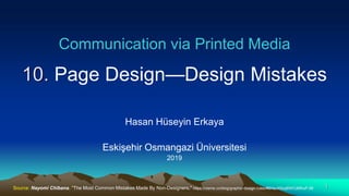
- 1. Communication via Printed Media 10. Page Design—Design Mistakes Hasan Hüseyin Erkaya Eskişehir Osmangazi Üniversitesi 2019 1Source: Nayomi Chibana, "The Most Common Mistakes Made By Non-Designers," https://visme.co/blog/graphic-design-rules/#5HaJX5oqBWCdMhuP.99
- 2. 10. Page Design—Design Mistakes 2 • The visual communication is becoming an important part of our interactions. • In marketing, education, writing or in other fields, people attract attention by visual messages. • When people start creating their own designs, the web becomes flooded with poor visuals that not only irritate professional graphic designers, but also turn off viewers who can differentiate a good design from a bad one. • The following slides have some of the most common design mistakes committed by non-designers and amateur visual artists. 19 of The Most Common design mistakes Made by Non- Designers (by Nayomi Chibana) Nayomi Chibana
- 3. 1. Using words instead of visuals • It turns the audience off to include too much text in a piece of communication that is supposed to be primarily visual. • This is especially true in the case of infographic and presentation design. 10. Page Design—Design Mistakes 3
- 4. 10. Page Design—Design Mistakes 4 1. Using words instead of visuals
- 5. 10. Page Design—Design Mistakes 5 2. Poor readability • Too many words in each line make it very difficult to read and find the next line. • Too few words would make the reader stressed and impatient. • For easy reading, use 50 to 60 characters per line.
- 6. 10. Page Design—Design Mistakes 6 2. Poor readability • For easy reading, use 50 to 60 characters per line.
- 7. 10. Page Design—Design Mistakes 7 3. Mismatching fonts • Combining too many fonts gives the design a disorganized and unprofessional look
- 8. 10. Page Design—Design Mistakes 8 3. Mismatching fonts
- 9. 10. Page Design—Design Mistakes 9 4. Bad kerning • Improper spacing between letters--called kerning-- can ruin your project.
- 10. 10. Page Design—Design Mistakes 10 4. Bad kerning • Improper spacing between letters--called kerning-- can ruin your project.
- 11. 10. Page Design—Design Mistakes 11 5. Not choosing the right colors • Selection of the color combinations is very important for the design project. • A project with good communicative potential can go awry if the right colors are not chosen.
- 12. 10. Page Design—Design Mistakes 12 5. Not choosing the right colors
- 13. 10. Page Design—Design Mistakes 13 6. Lack of negative space • The white space (or negative space) in a visual design is as essential as the other elements. • Lack of white space creates stress.
- 14. 6. Lack of negative space • Consider white space like any other important element of design. 10. Page Design—Design Mistakes 14
- 15. 10. Page Design—Design Mistakes 15 7. Placing elements arbitrarily • Aligning elements in the design can create order and symmetry. • A lack of alignment can lead to a product that looks messy and disorganized.
- 16. 10. Page Design—Design Mistakes 16 7. Placing elements arbitrarily
- 17. 10. Page Design—Design Mistakes 17 8. Failing to create contrast • Insufficient contrast makes the design difficult to read and unattractive.
- 18. 10. Page Design—Design Mistakes 18 8. Failing to create contrast
- 19. 10. Page Design—Design Mistakes 19 9. Not scaling properly • The elements on the page should be with the intended size. • The visuals should not look distorted.
- 20. 9. Not scaling properly 10. Page Design—Design Mistakes 20
- 21. 10. Ignoring visual hierarchy rules • An important principle of graphic design is visual hierarchy. It communicates to the viewer the importance of each element in relation to the rest. 10. Page Design—Design Mistakes 21
- 22. 10. Page Design—Design Mistakes 22 10. Ignoring visual hierarchy rules • In the design above, the largest text is the most important message, followed by the subtitle and then the body text.
- 23. 10. Page Design—Design Mistakes 23 11. Hard-to-read text • The goal of good design is both to be aesthetically pleasing and to effectively communicate a message. • The text part of the design should be easy to read. Placement of text as well as contrast between text and background is important
- 24. 10. Page Design—Design Mistakes 24 11. Hard-to-read text
- 25. 10. Page Design—Design Mistakes 25 12. Inappropriate font combinations • Some fonts communicate elegance and formality, while others have more of an approachable and lighthearted look. • Correctly paired fonts communicate a message well.
- 26. 9. Page Design—Design Mistakes 26 12. Inappropriate font combinations
- 27. 10. Page Design—Design Mistakes 27 13. Inadequate space between lines • Too much space between lines can cause the text to appear disjointed, while too little space can make the blocks appear too tight and crowded.
- 28. 10. Page Design—Design Mistakes 28 13. Inadequate space between lines
- 29. 10. Page Design—Design Mistakes 29 14. Using raster images • Raster (bitmap) graphics become blurry when enlarged.
- 30. 10. Page Design—Design Mistakes 30 14. Using raster images • Vector images are redrawn with formulas when scaled, so they appear crisp after scaling. • Starting with large images and reducing them may improve their resolution.
- 31. 10. Page Design—Design Mistakes 31 15. Striving for complete symmetry • The use of absolute symmetry can make a design appear boring, while trying something not so symmetrical can produce a more eye- catching design.
- 32. 10. Page Design—Design Mistakes 32 15. Striving for complete symmetry • Trying something not so symmetrical can produce a more eye- catching design.
- 33. 16. Failing to communicate effectively • Many times, the designer focuses on aesthetic side of a design so much that the actual needs and content of the visual communication is neglected. 10. Page Design—Design Mistakes 33
- 34. 16. Failing to communicate effectively 10. Page Design—Design Mistakes 34
- 35. 17. Copying others’ work • For ideas and inspiration, we may look at others’ designs. • It is not acceptable to copy someone else’s work and present it as own work. • Also, avoid cliches and overused design elements. 10. Page Design—Design Mistakes 35
- 36. 17. Copying others’ work 10. Page Design—Design Mistakes 36
- 37. 18. Forgetting about the medium • The design may look good on computer screen; however, it may be ruined in the gutter of a book or magazine. • The ink may smear on some kinds of paper more than others. This should be kept in mind. 10. Page Design—Design Mistakes 37
- 38. 18. Forgetting about the medium • Also, if you need to print your design be sure to change to CMYK color mode, not RGB, which is the color mode for projects displayed on mobile devices and computer screens. 10. Page Design—Design Mistakes 38
- 39. 19. Not being consistent • There should be consistency and some repetition in a design so that it will appear unified.. • Some of the same visual elements (such as image filters or types of buttons) and layouts should be used throughout the project. 10. Page Design—Design Mistakes 39
- 40. 19. Not being consistent 10. Page Design—Design Mistakes 40
- 41. Some mistakes with typesetting There are some details that non-designers fail to pay attention. 1) Justifying a narrow-width text that create rivers of white space: 10. Page Design—Design Mistakes 41 When the column width is narrow, justified text formatting may results in really weird spacing between words to make up for the justified text. The excessive white space between words can be disturbing. When the column width is narrow, justified text formatting may results in really weird spacing between words to make up for the justified text. To avoid this problem, you align the text to the left or use hyphenation. To avoid this problem, you align the text to the left or use hyphenation. If no hyphenation dictionary exists, you can hyphenate by hand. If no hyphen- ation dictionary exists, you can hy- phenate by hand. If no hyphenation dictionary exists, you can hyphenate by hand.
- 42. Some mistakes with typesetting 2) Not using a space after punctuation: There should be one space after punctuation. Traditionally two spaces are used after each sentence. 10. Page Design—Design Mistakes 42 Improper typesetting: There are no spaces after the punctuation in this text.The punctuation includes commas,periods,exclamation points,question marks,quotation marks,and alike.Without a space,the computer assumes the two words as one and produces not so looking text. Proper typesetting: There are spaces after the punctuation in this text. The punctuation includes commas, periods, exclamation points, question marks, quotation marks, and alike. Without a space, the computer assumes the two word as one and produces not so looking text.
- 43. Some mistakes with typesetting 3) Using a space after opening a quote or a paranthesis and before closing them: There should not be any space after opening a quote or paranthesis and before closing them. 10. Page Design—Design Mistakes 43 Improper typesetting: This does not look good. The sign ( parantesis sign ) gets separated at the end of the line. “ This quote has additional spaces before and after “ but inside of the quotation marks. “ Smart quotes “ function gets confused. Proper typesetting: This does look good. The sign (parantesis sign) does not get separated at the end of the line. “This quote has no additional spaces before and after” inside of the quotation marks. “Smart quotes” function works properly.
- 44. Some mistakes with typesetting 4) Using “straight” quotes insted of “curly” quotes: The opening and closing quotes are different. “Smart quotes” option in a word processor automatically changes the straight quotes to curly quotes. However, some design applications do not have that option. 10. Page Design—Design Mistakes 44 Improper typesetting: "aaa" 'aaa' Straight quotes are used for inch and foot. Proper typesetting: “aaa” ‘aaa’ Curly quotes look more professional.
- 45. Some mistakes with typesetting 5) Placing the punctuation after closing a quote: Commas and periods stay inside a “quote.” Semicolons and colons stay “outside”; Question marks and exclamation points: “Are they a part of the quote?” If they are not part of the quote, they stay outside. 10. Page Design—Design Mistakes 45 Improper typesetting: … aaa”. Proper typesetting: …aaa.”
- 46. Some mistakes with typesetting 6) Misusing hyphen, N-dash and M-dash: - – — • There is one character “-” on the keyboard which is called “hyphen.” This is the narrowest “dash” character. (Example: hy-phen-ate) (Type a hyphen without any space between words.) • There is also a medium-length dash character called “N-dash” which has the same width as letter N. (Example: Ankara – Istanbul, 9:00 – 12:00) (Leave one space before and after hyphen to get N-dash automatically on Microsoft Office.) • Yet there is one more dash—the longest one—called M-dash. (Type two hyphens without any space between words to get M-dash automatically on Microsoft Office.) 10. Page Design—Design Mistakes 46
- 47. Some mistakes with typesetting 6) Aligning text using space bar instead of tabs: • The width of the space character changes with font size. • Space character does not provide exact alignment. • Changing the size disturbs the alignment if space bar is used for alignment. • Tabs or tables should be used for proper alignment. 10. Page Design—Design Mistakes 47
- 48. Improper typesetting: Title Name Position Prof. H. H. Erkaya Chairman Doç. B. Tamyürek Vice-Chair Dr. K. Keskin Treasurer copied and pasted in smaller size: Title Name Position Prof. H. H. Erkaya Chairman Doç. B. Tamyürek Vice-Chair Dr. K. Keskin Treasurer Some mistakes with typesetting 6) Aligning text using space bar instead of tabs: 10. Page Design—Design Mistakes 48 Proper typesetting: Title Name Position Prof. H. H. Erkaya Chairman Doç. B. Tamyürek Vice-Chair Dr. K. Keskin Treasurer copied and pasted in smaller size Title Name Position Prof. H. H. Erkaya Chairman Doç. B. Tamyürek Vice-Chair Dr. K. Keskin Treasurer
- 49. Improper typesetting: Some mistakes with typesetting 7) Not using “leading tabs” in table of contents: 10. Page Design—Design Mistakes 49 Proper typesetting:
- 50. 50 Thanks for your attention Hasan Hüseyin Erkaya Eskişehir Osmangazi University April 2019 50