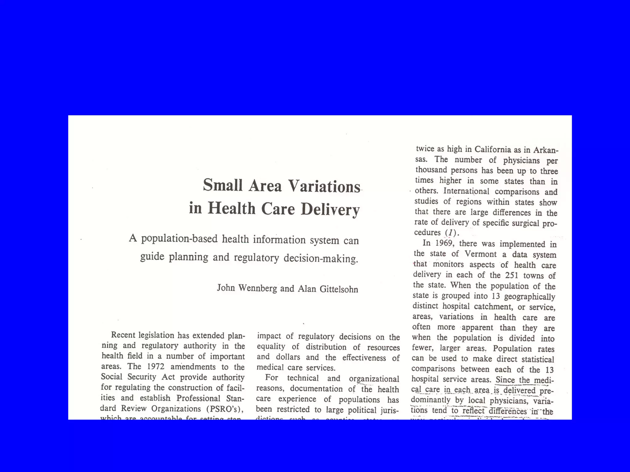
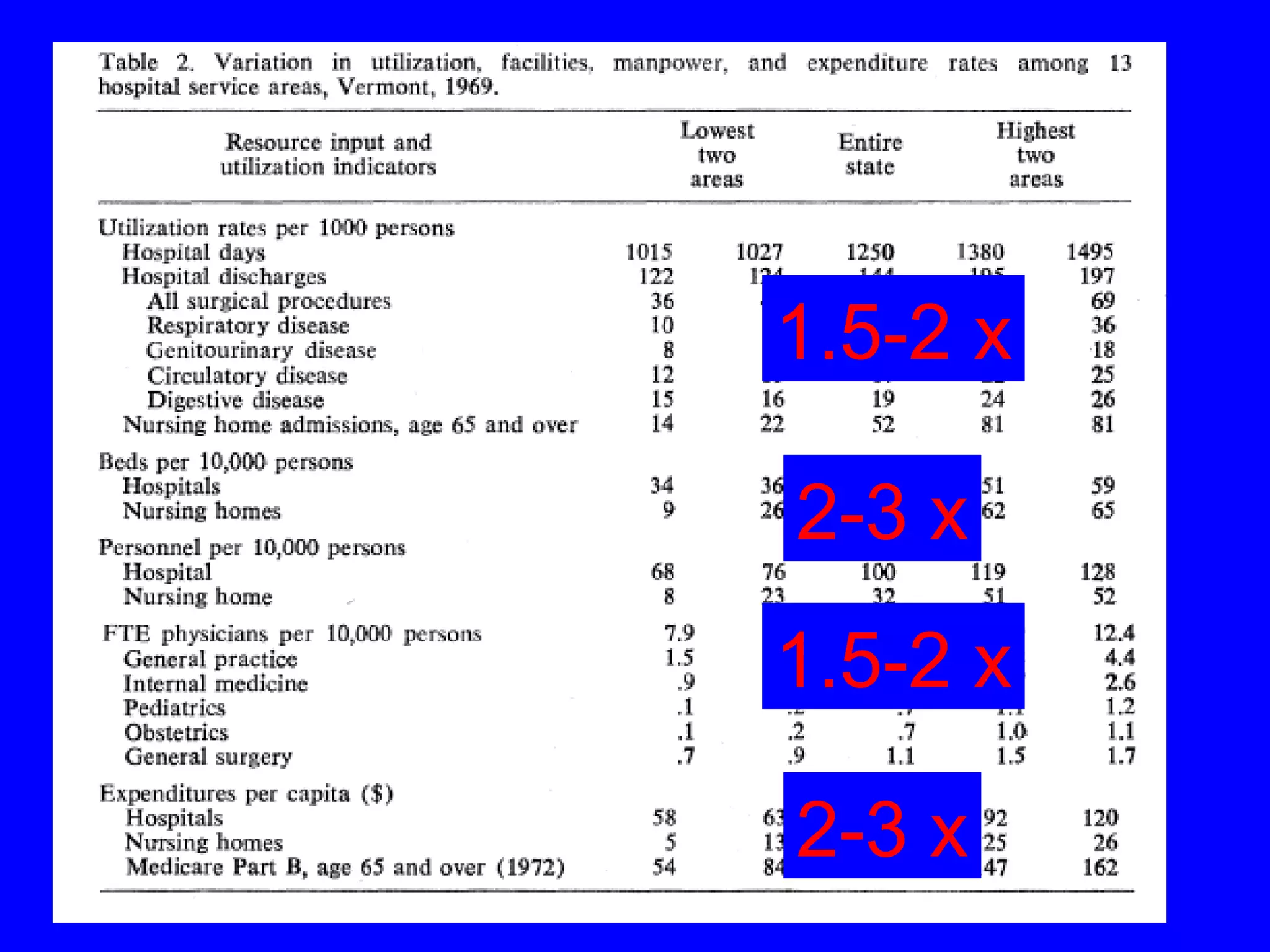
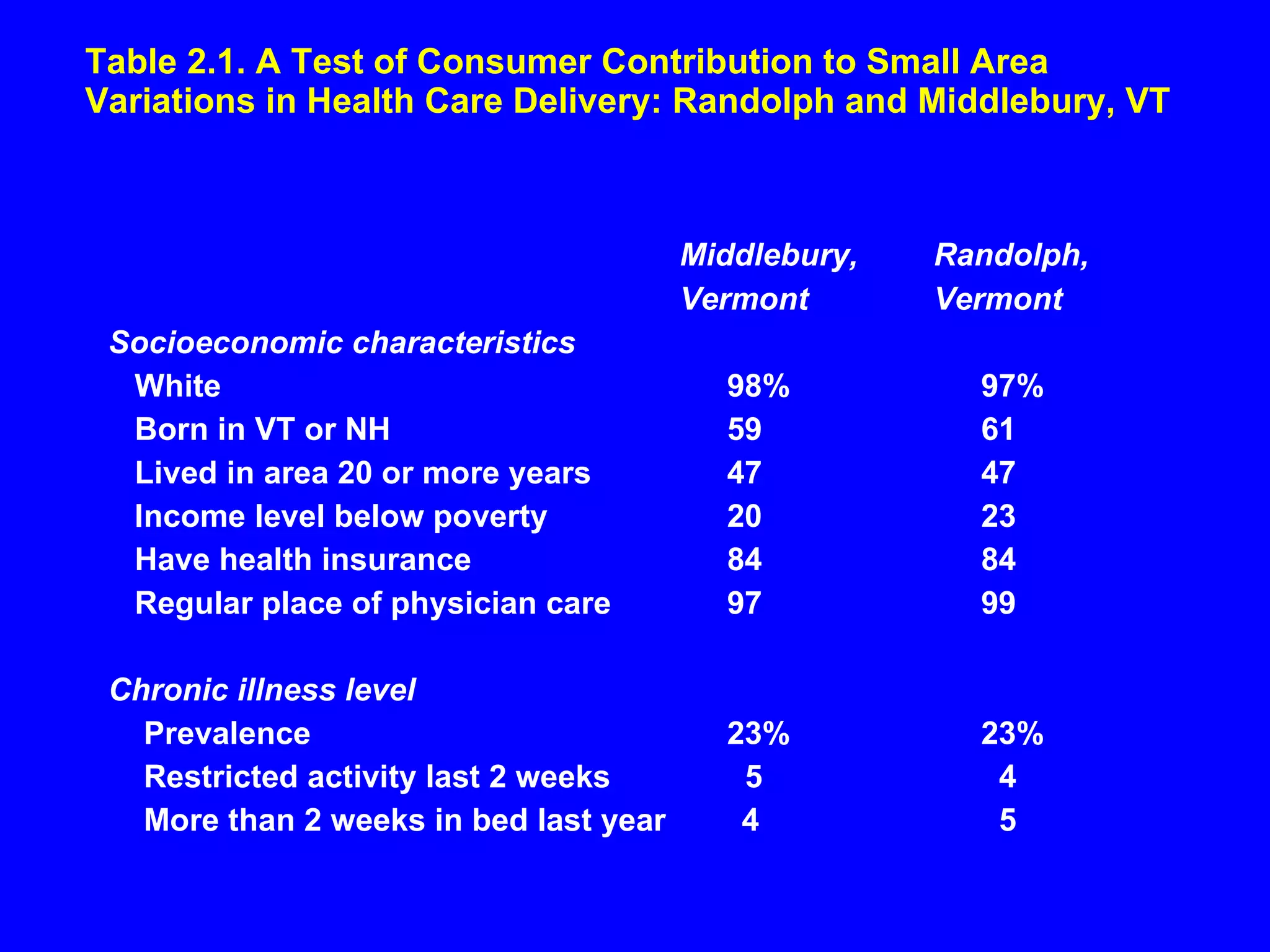
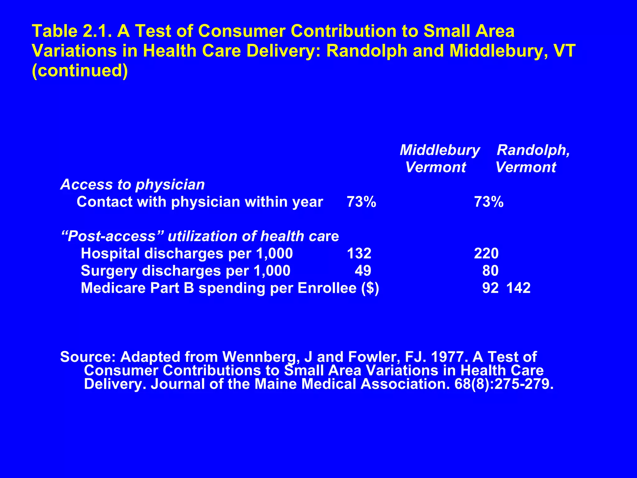
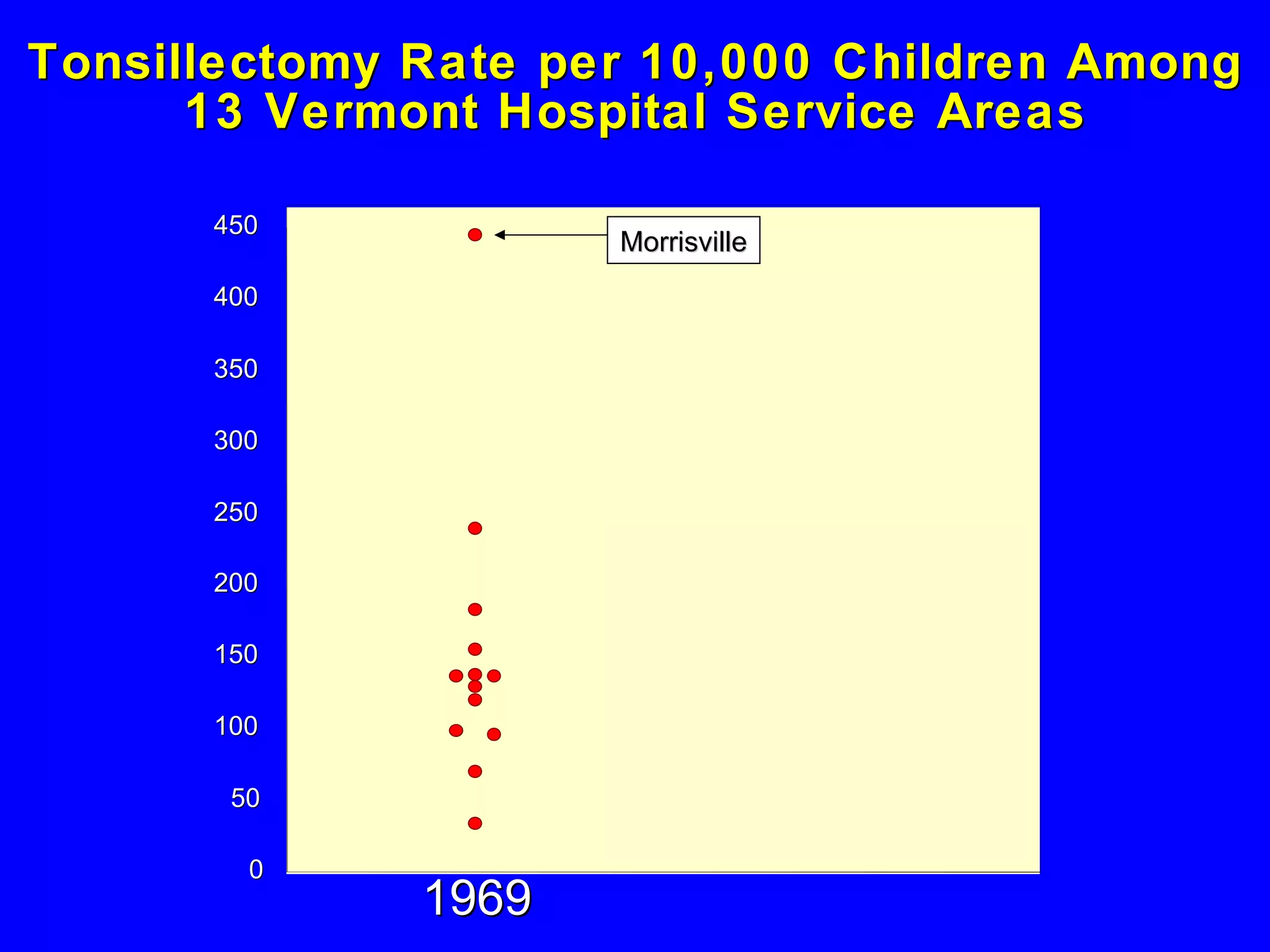
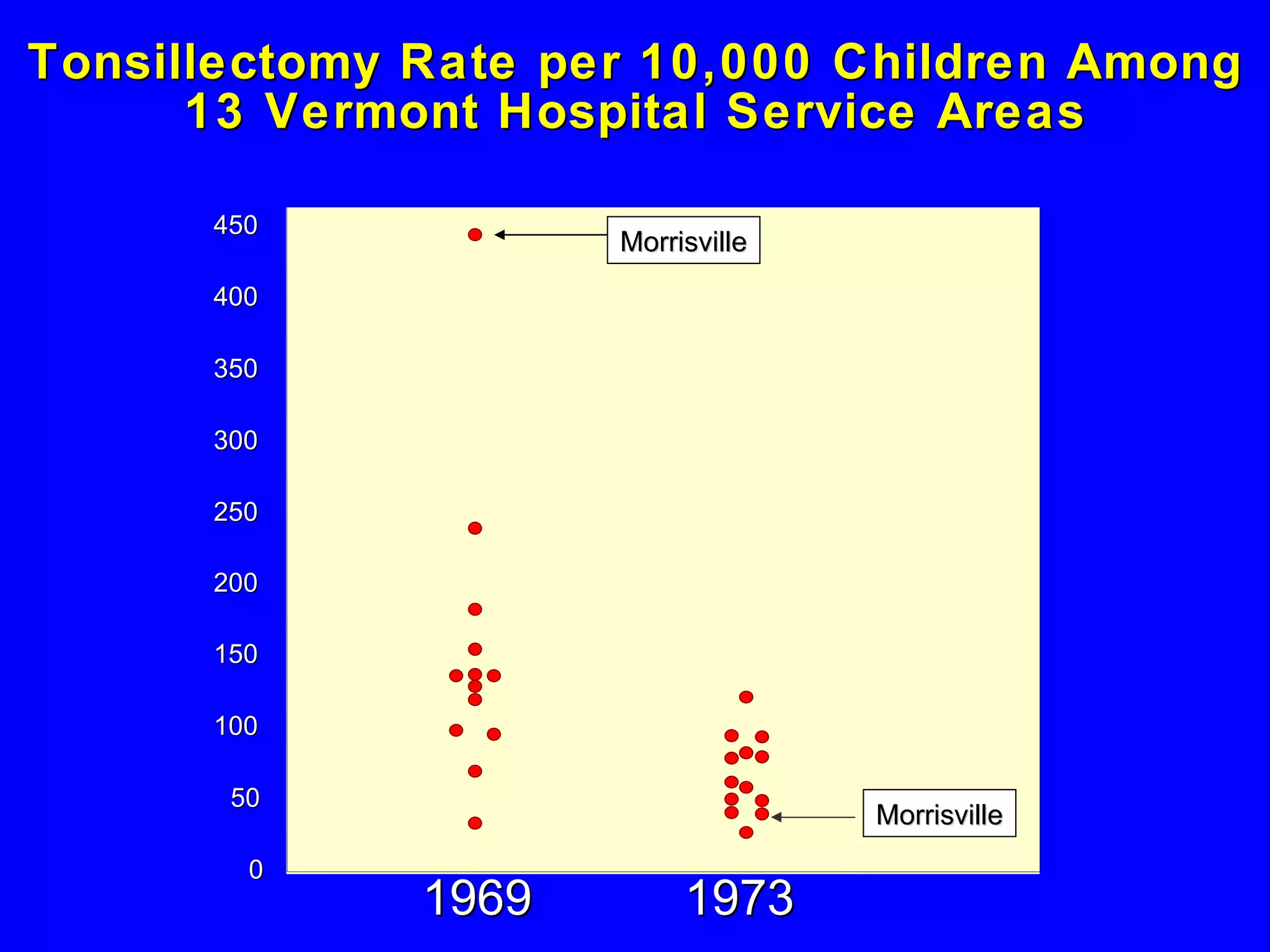
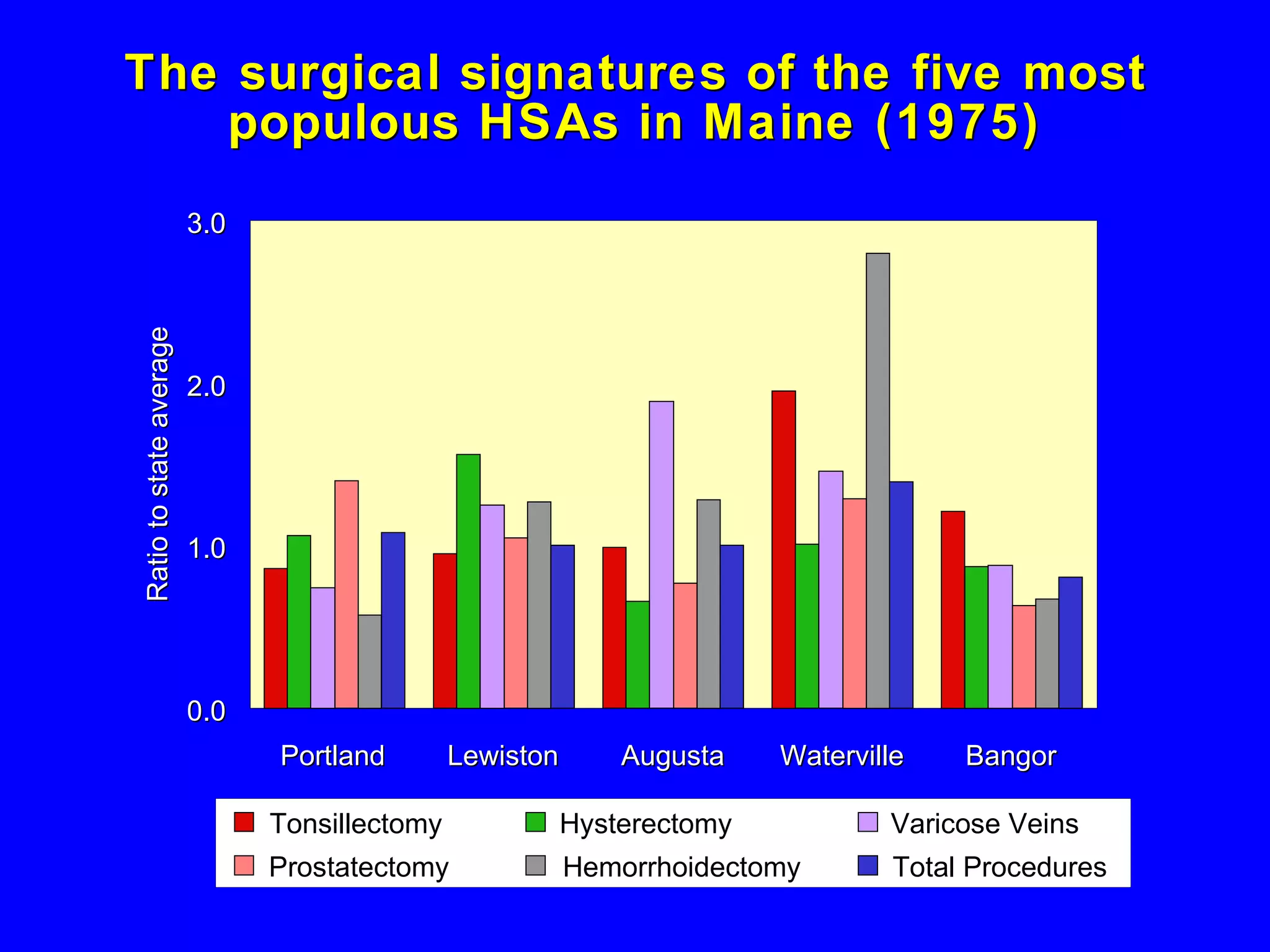
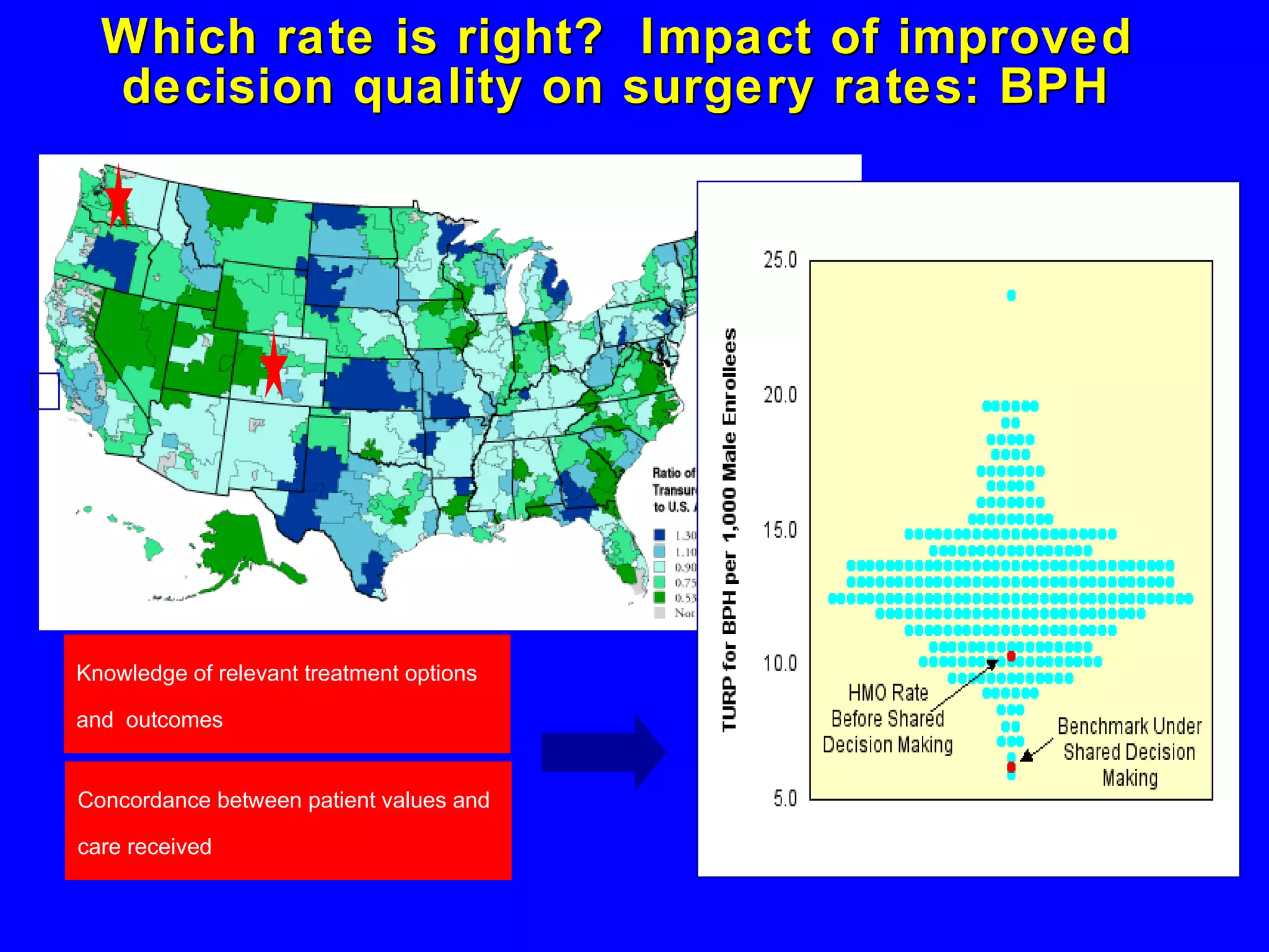
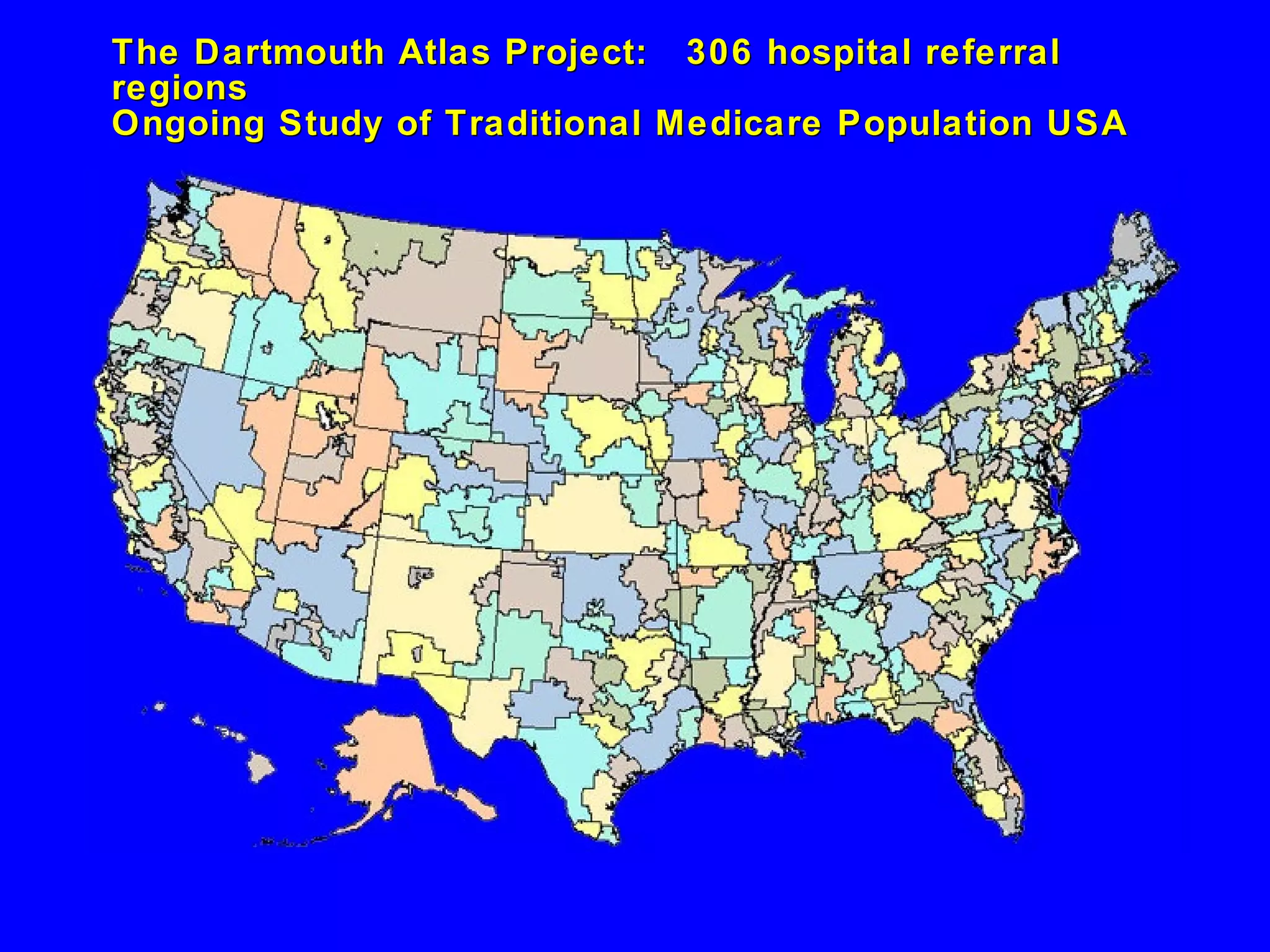
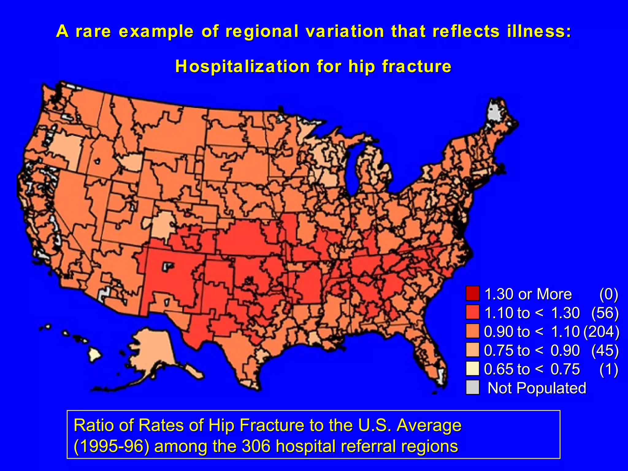
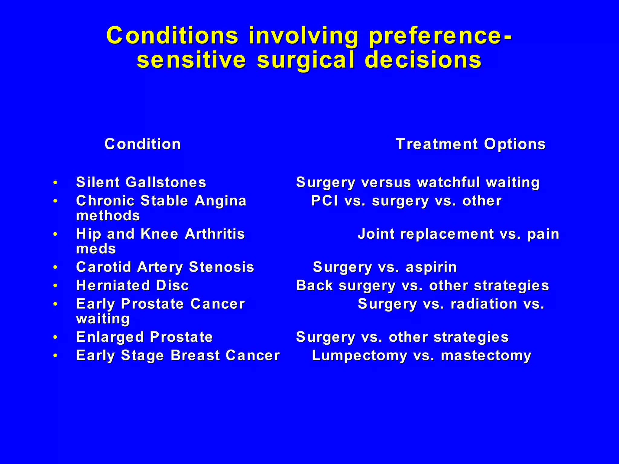
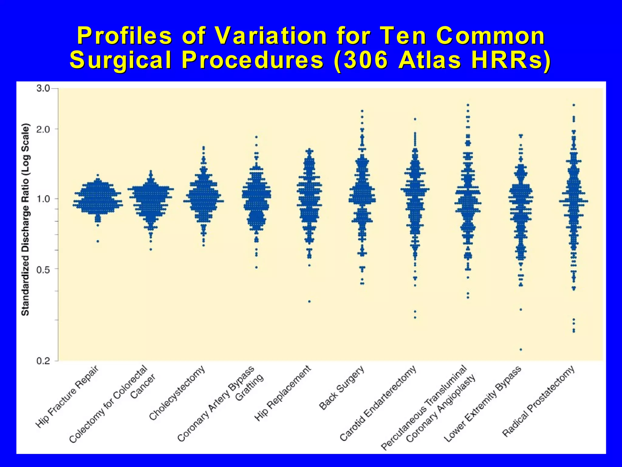
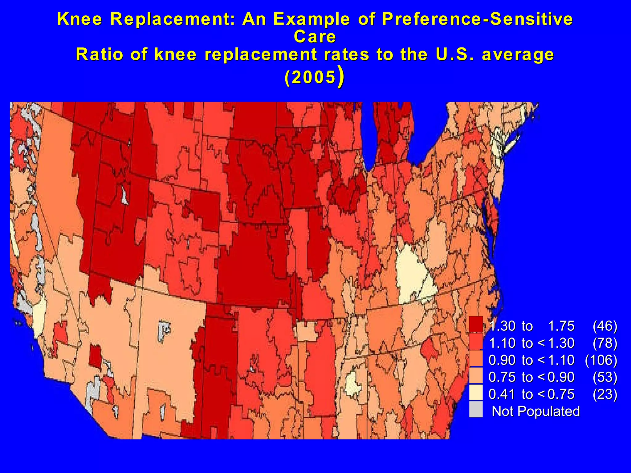
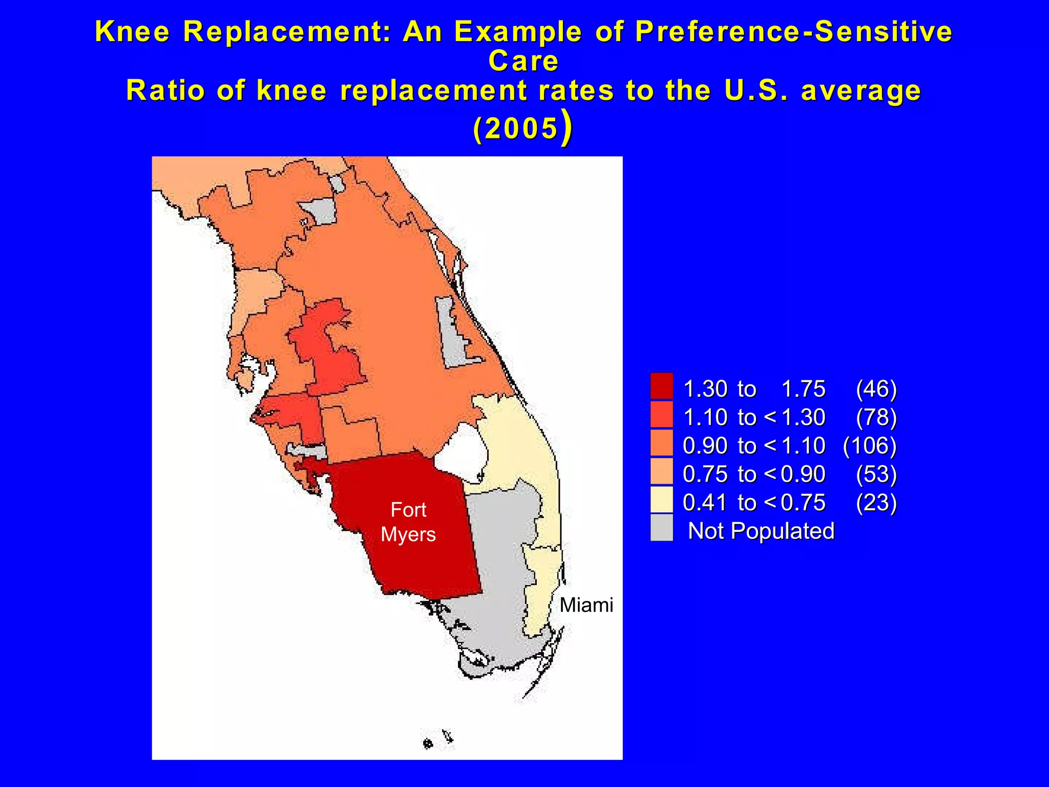
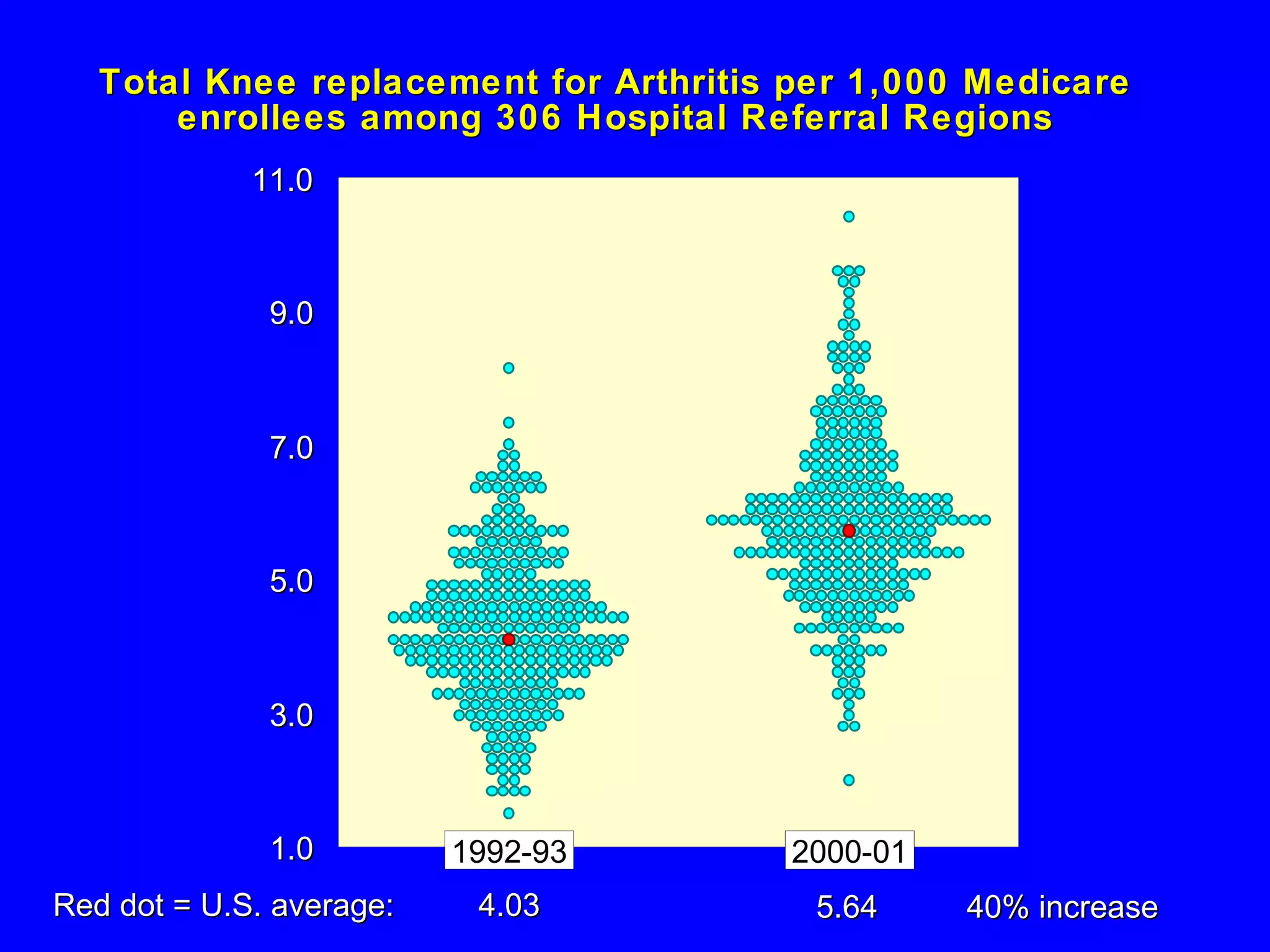
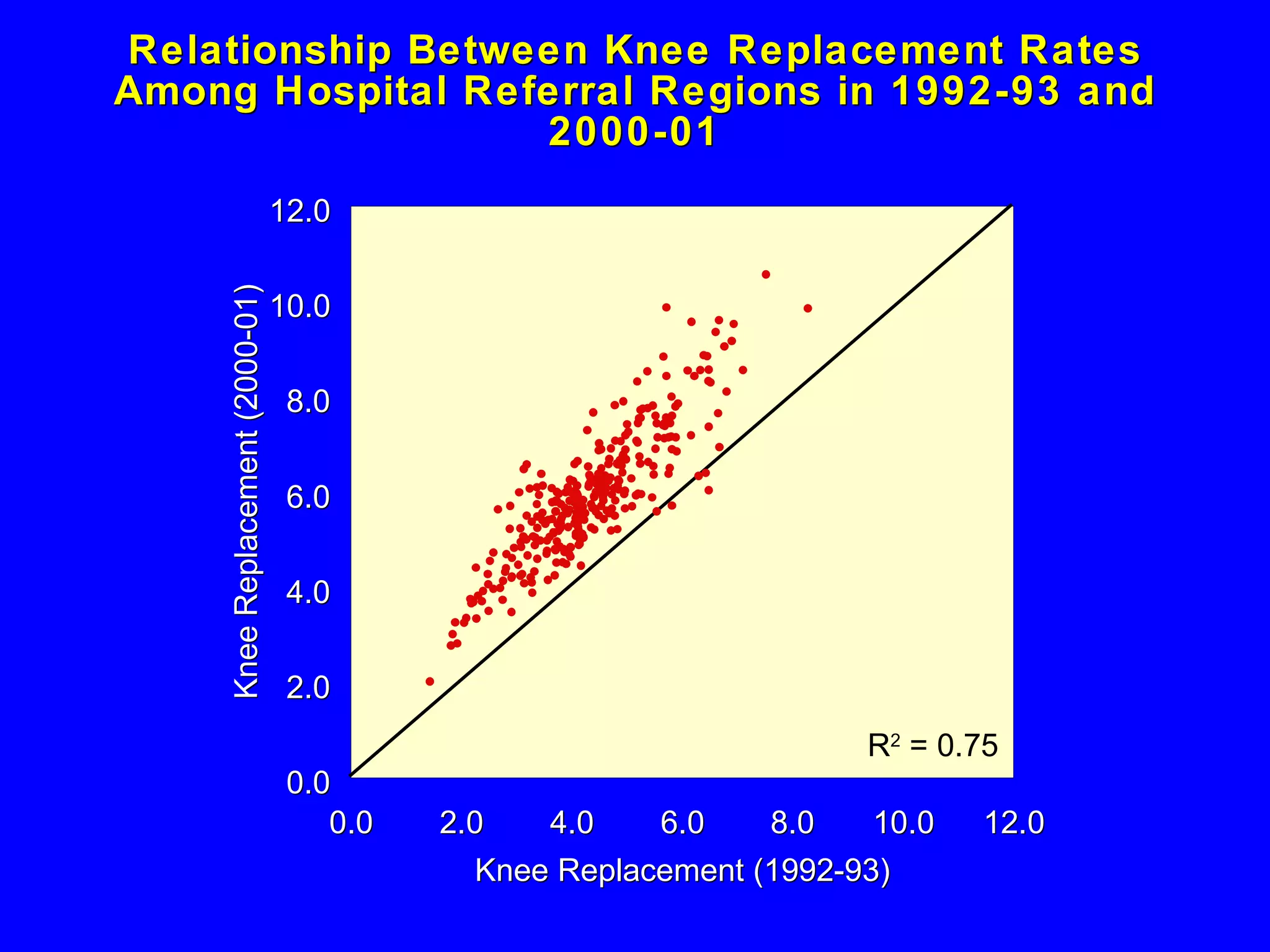
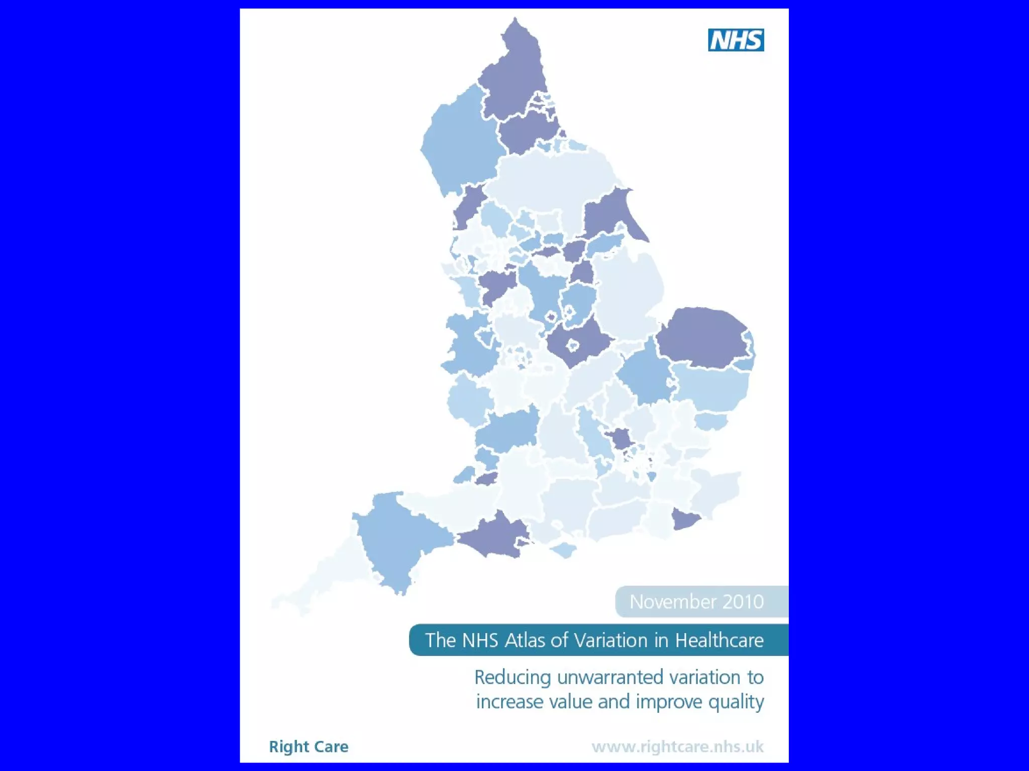
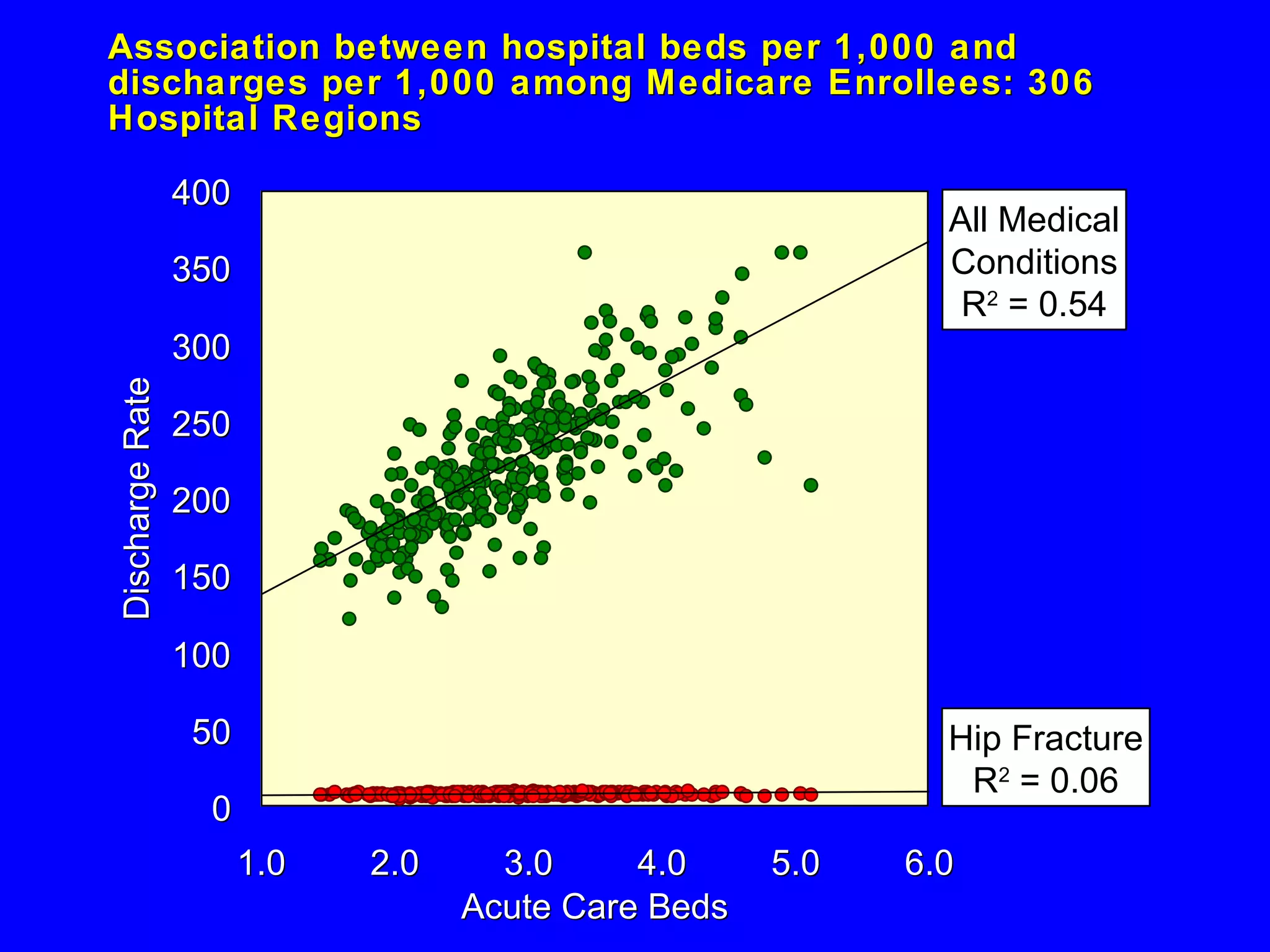
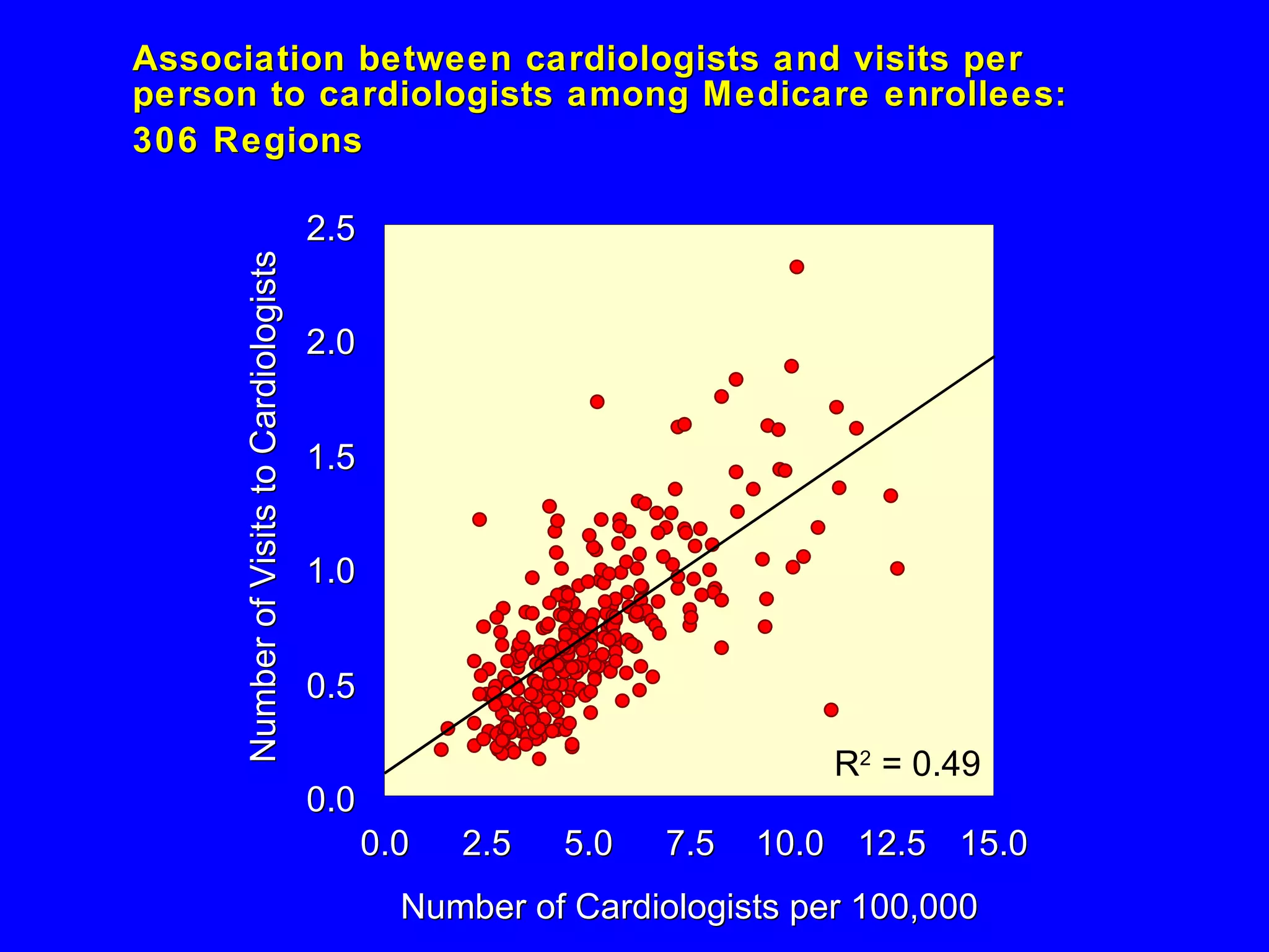
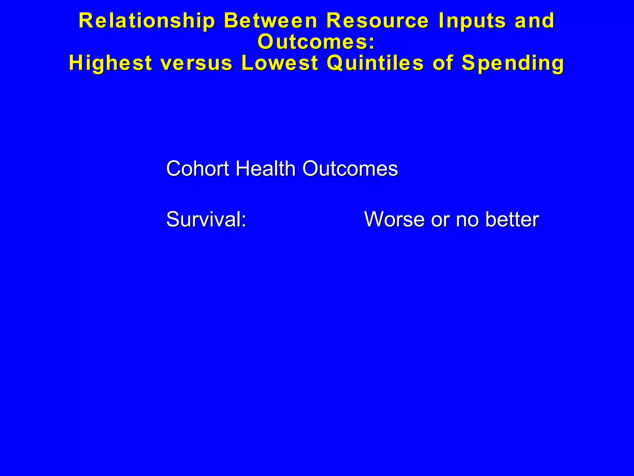
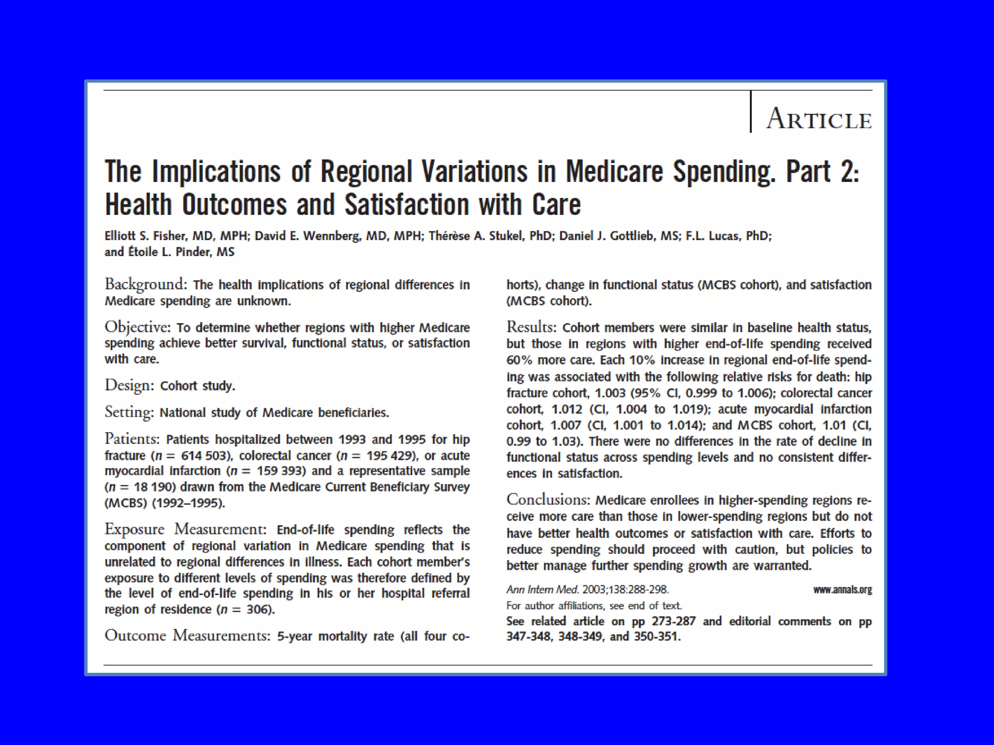
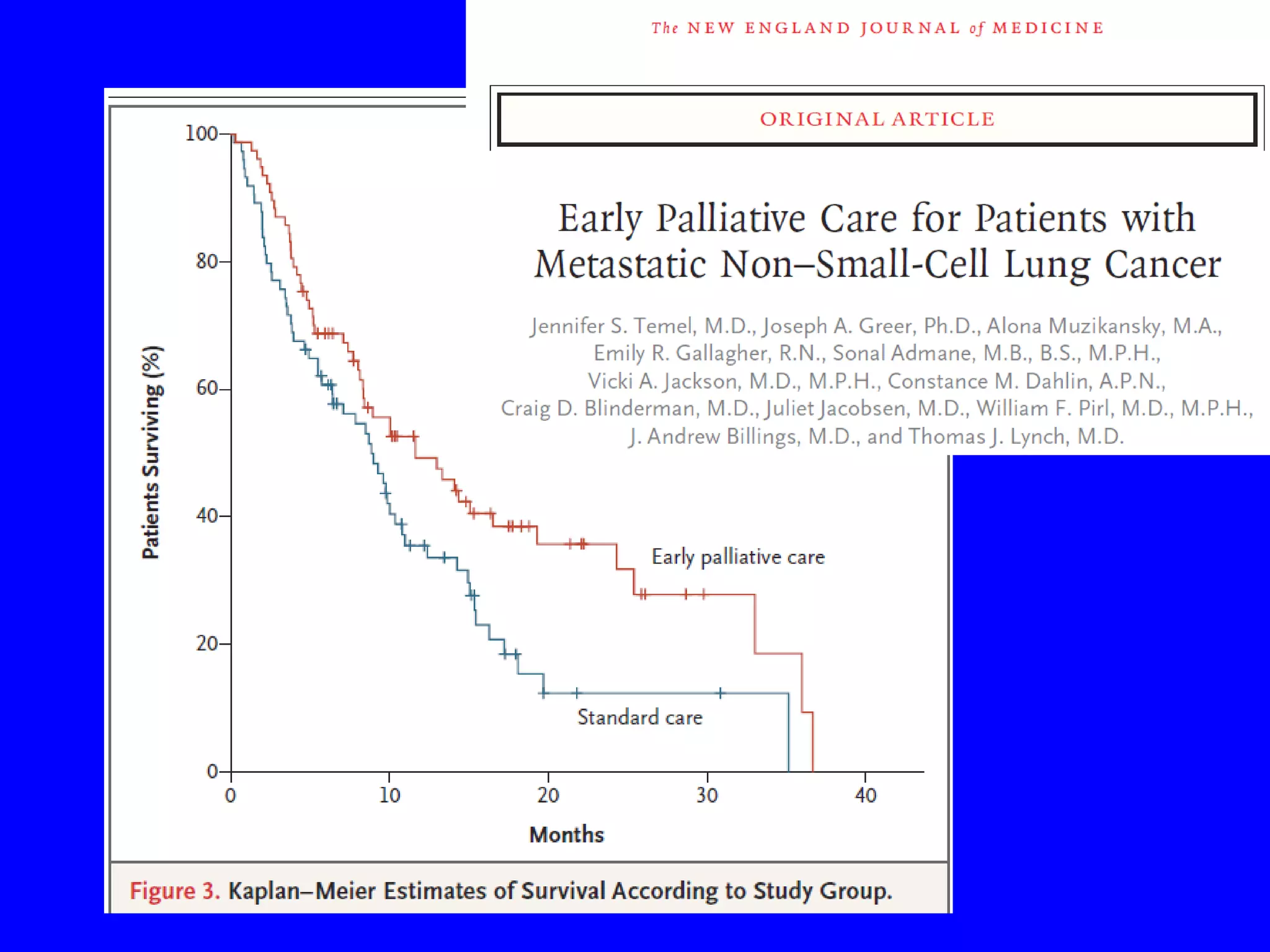
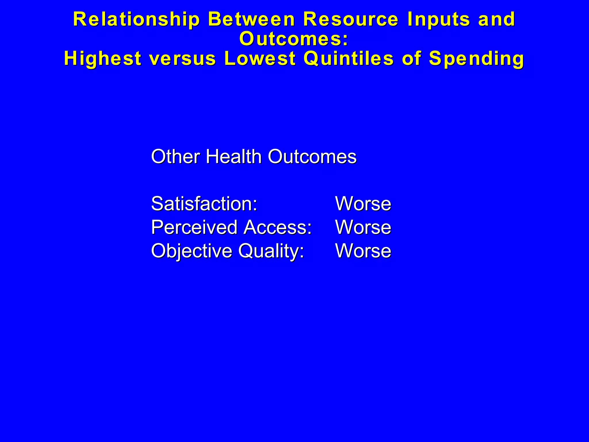
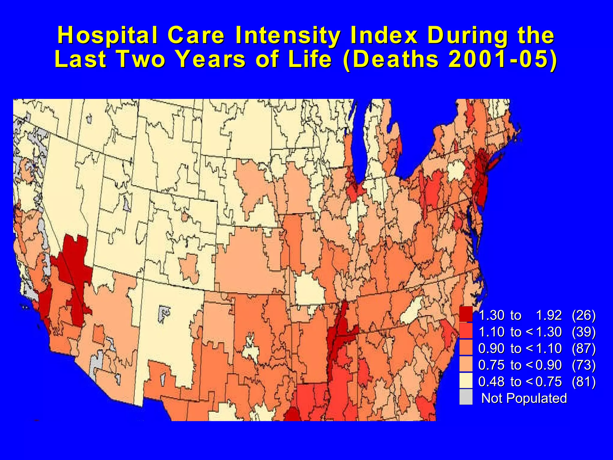
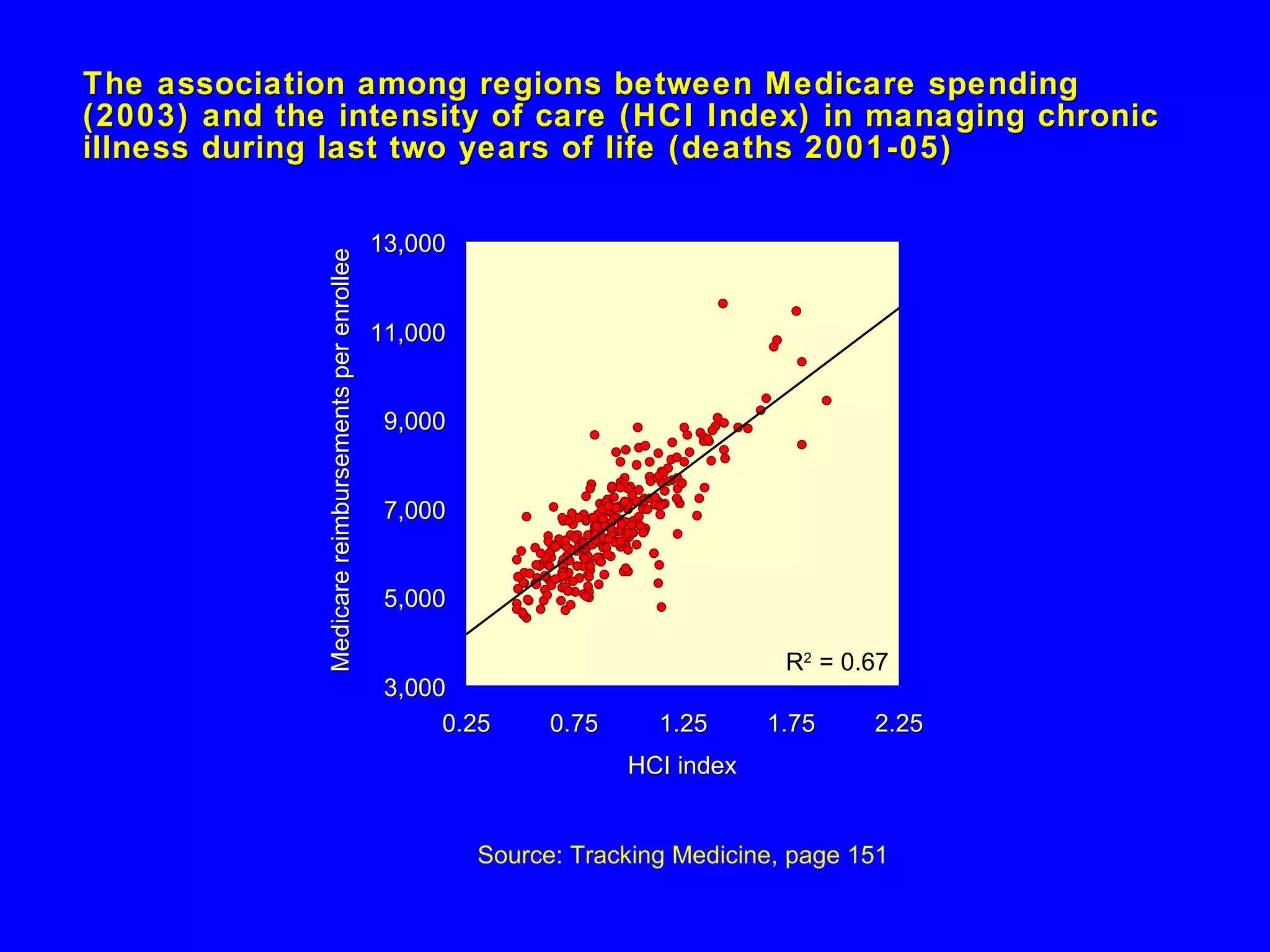
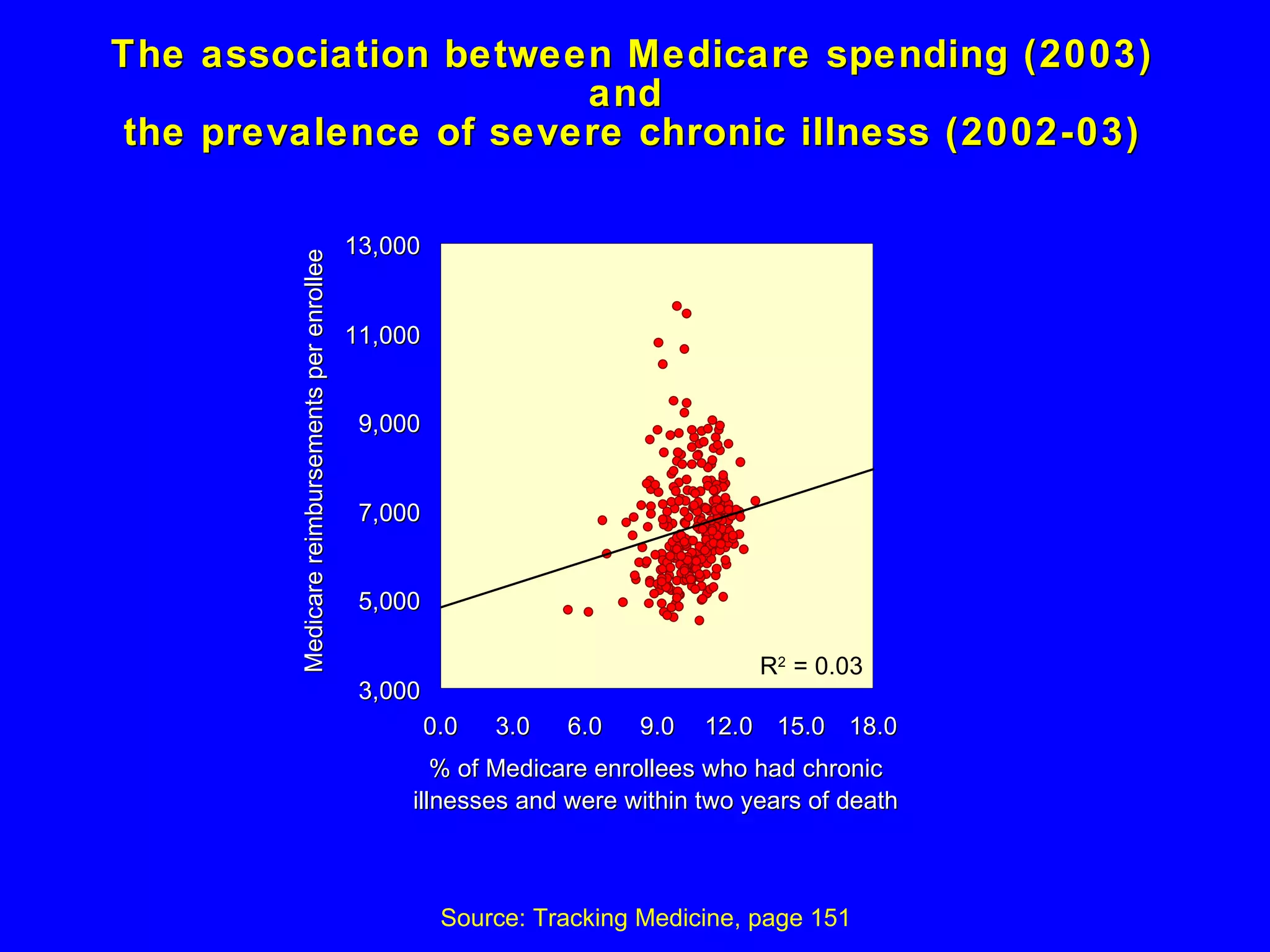
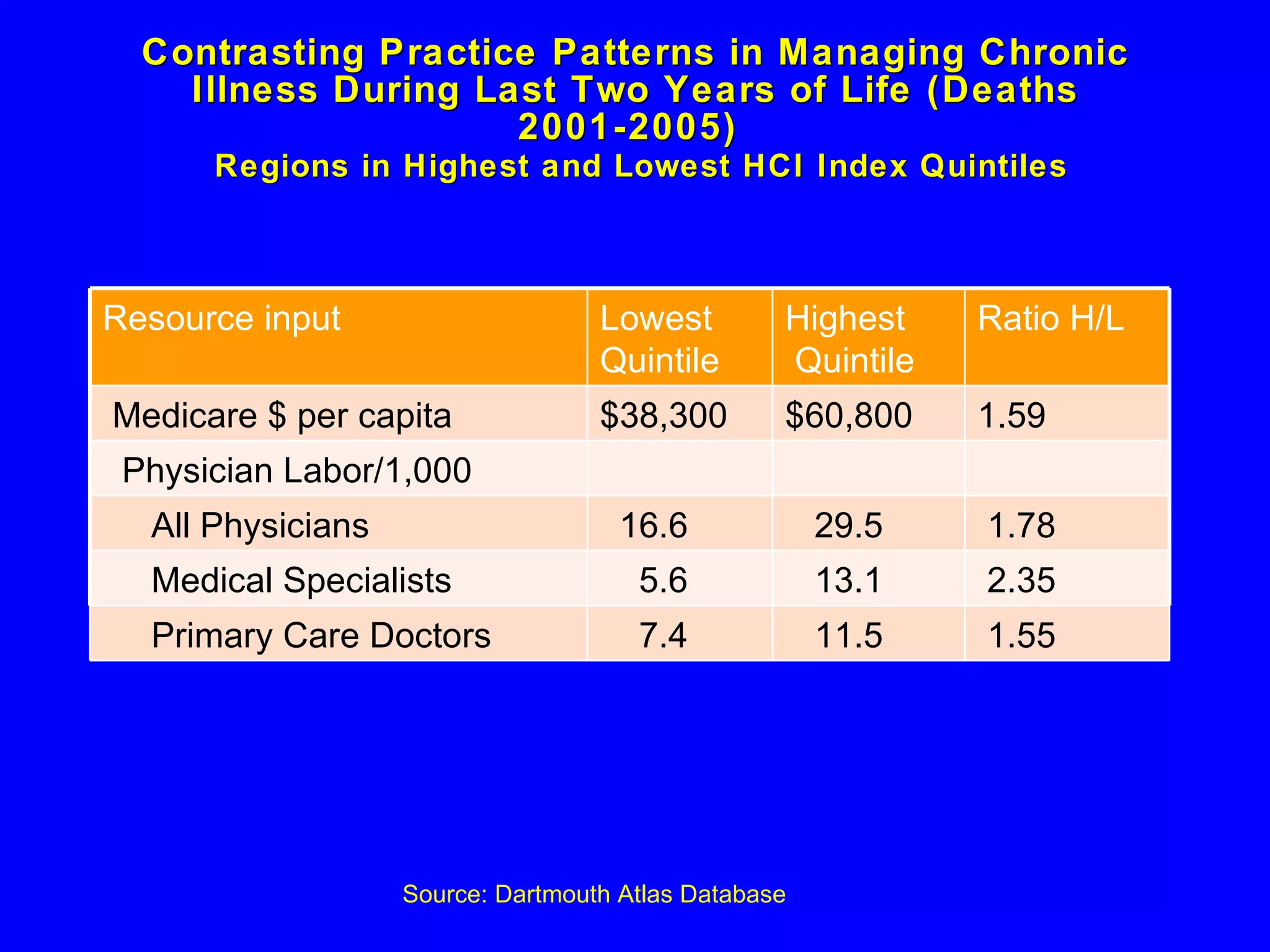
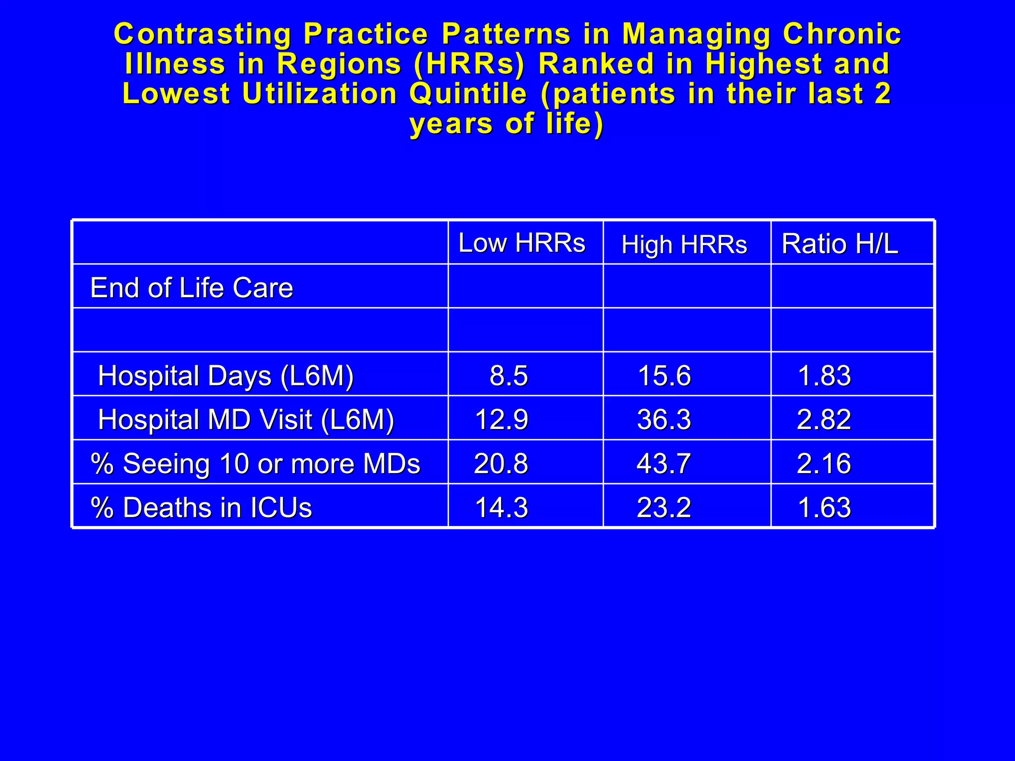
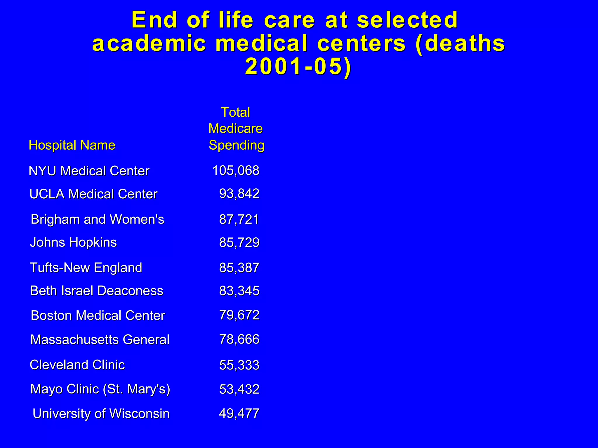
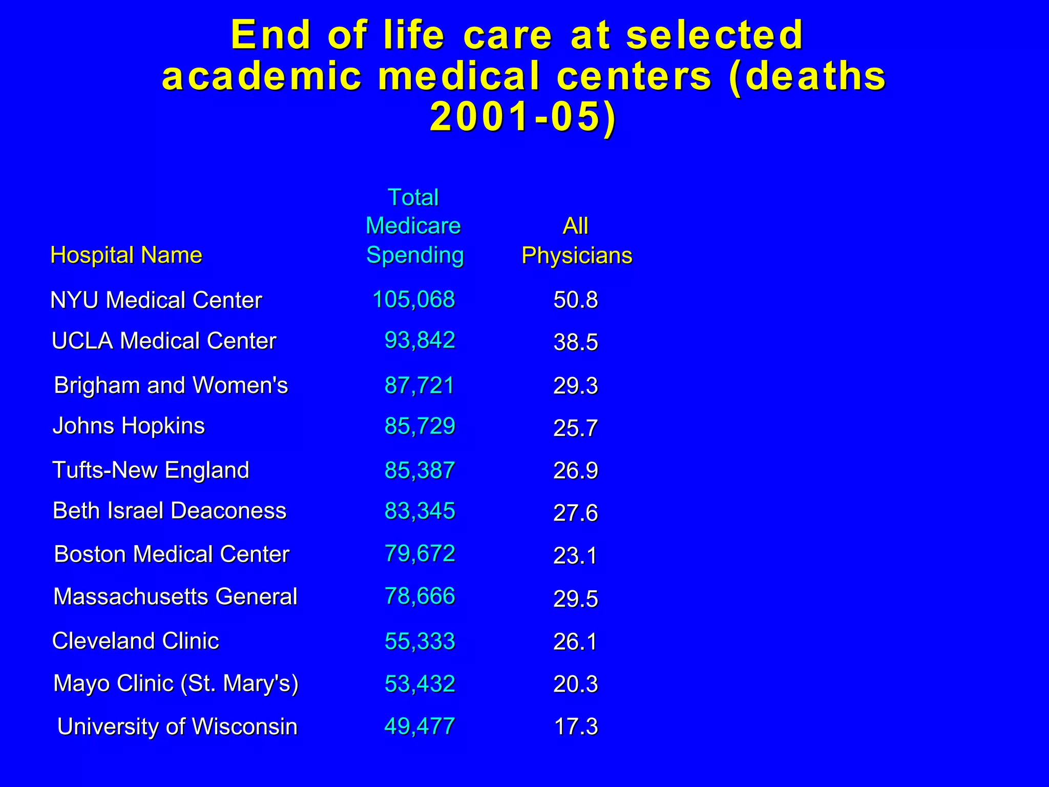
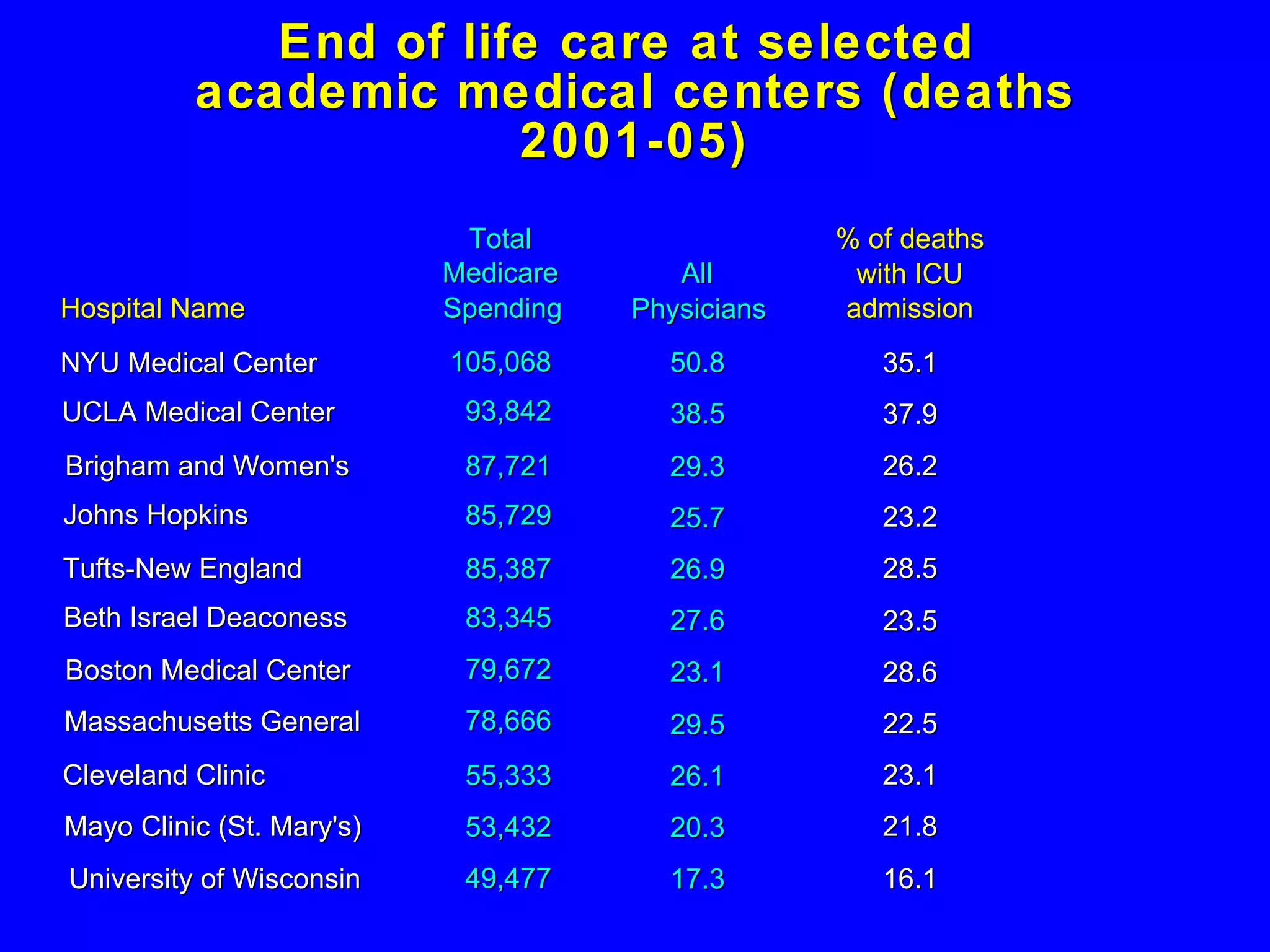
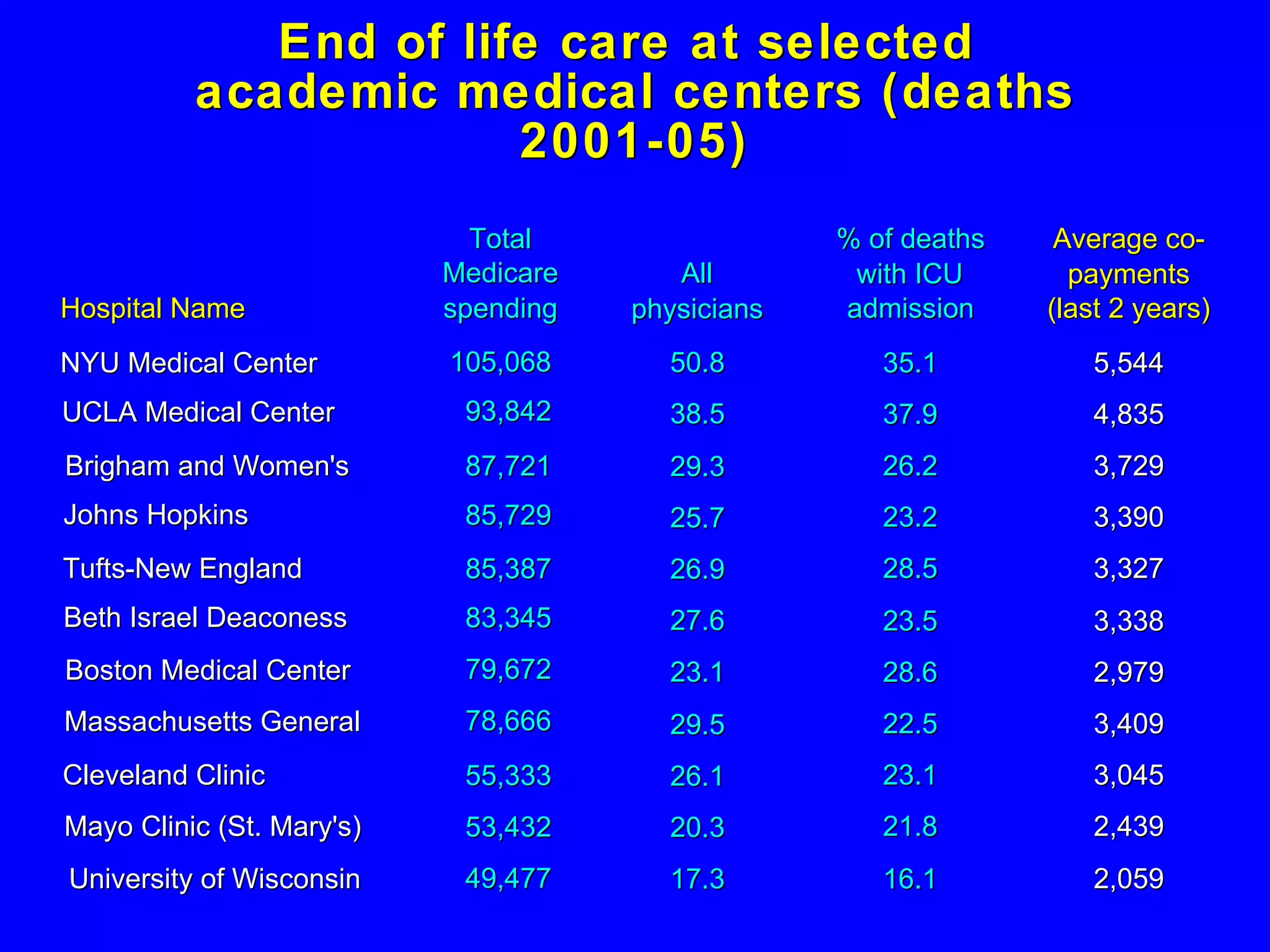
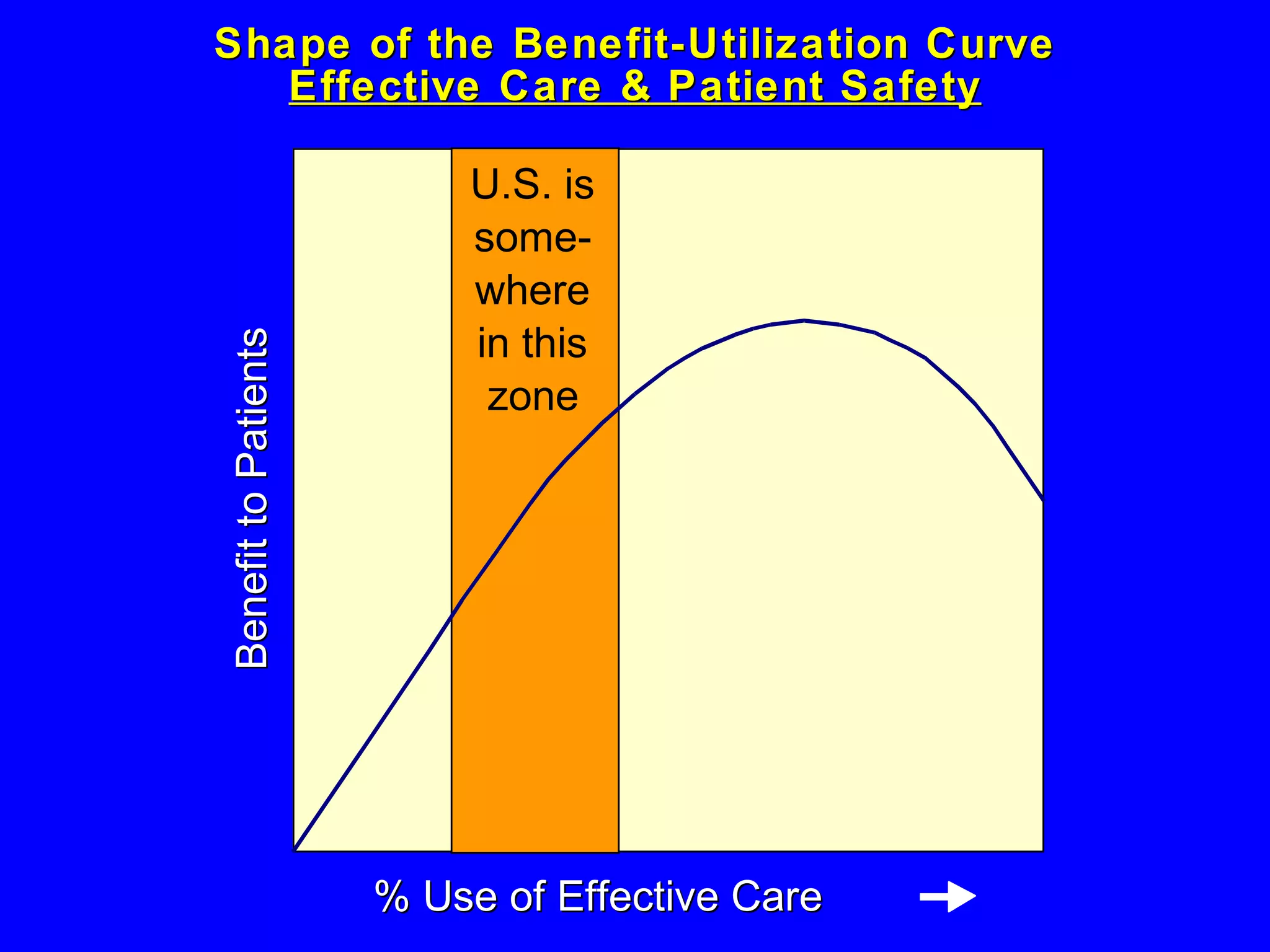
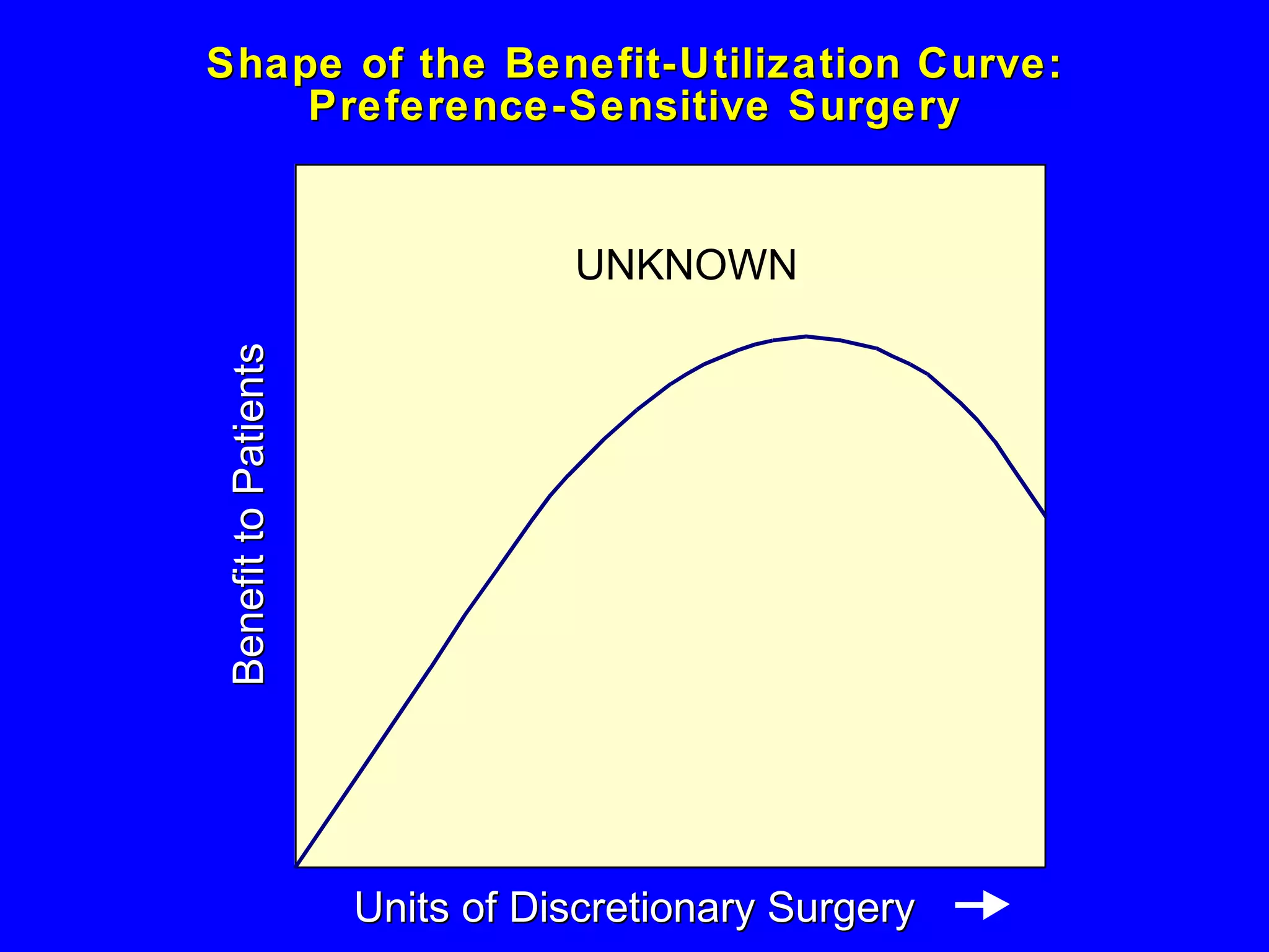
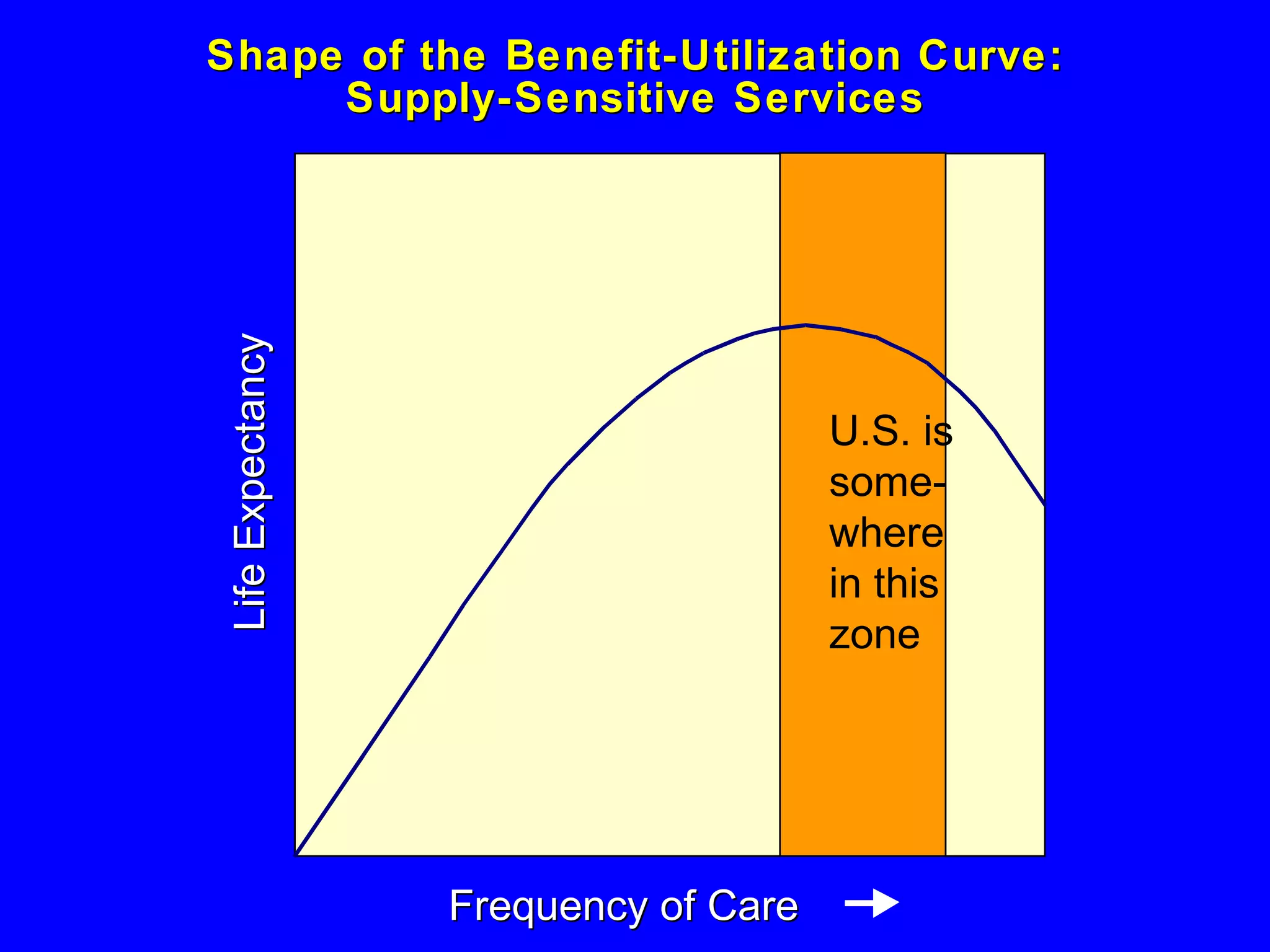
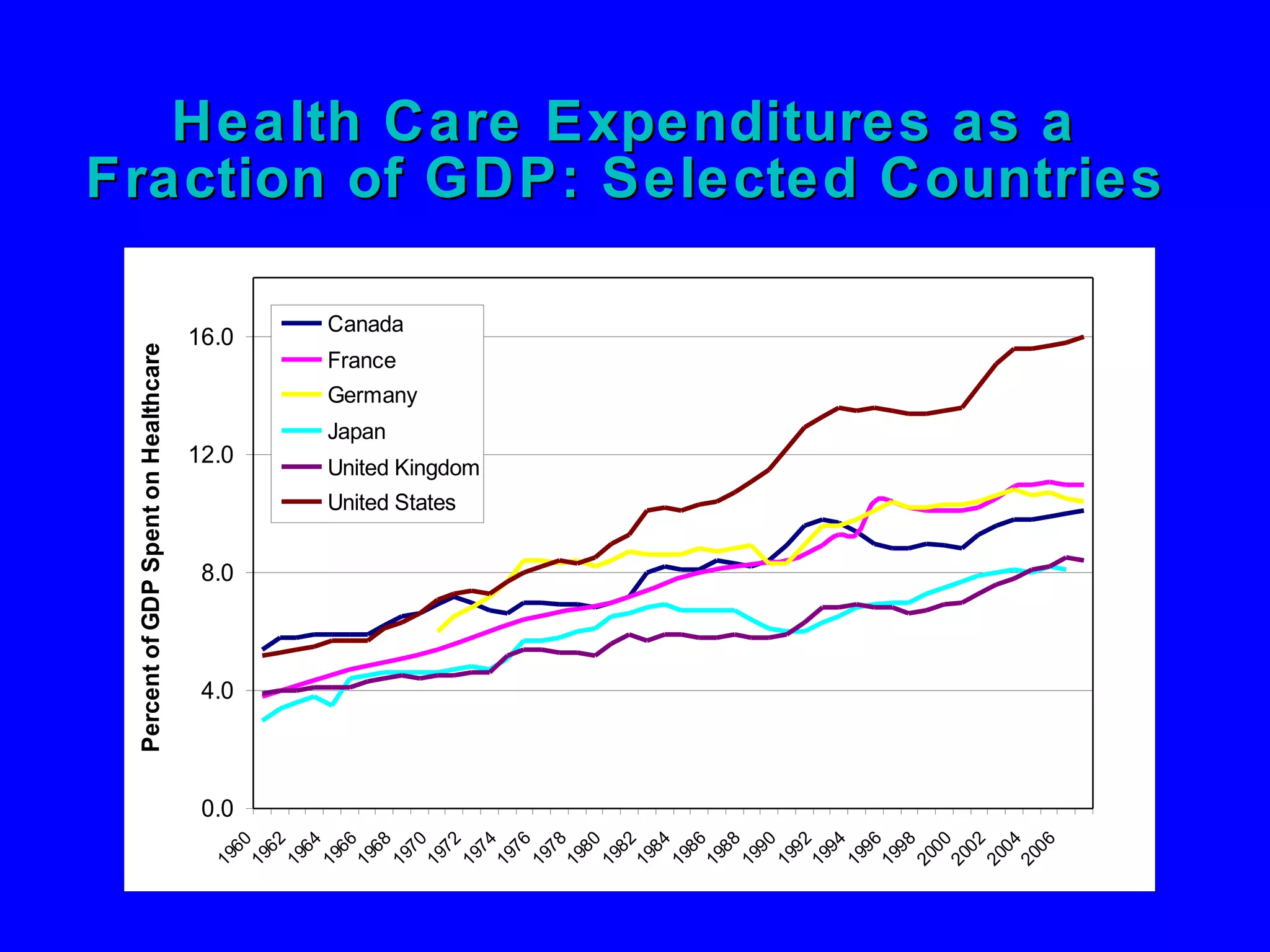
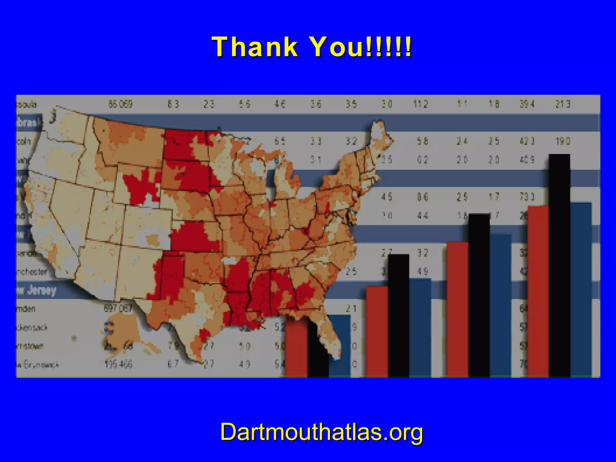
The Challenge of Practice Variations   Health Informatics New Zealand Seminar   February 16 th   2011
Understanding Variations in the Way Medicine is Practiced The Vermont Story The Maine Story The Dartmouth Atlas Project The Challenge to Health Reform
 
Vermont Map from “Science” From  “Science,”   December 14, 1973. New Hampshire Massachusetts New York Quebec
1.5-2 x 2-3 x 1.5-2 x 2-3 x
Table 2.1. A Test of Consumer Contribution to Small Area Variations in Health Care Delivery: Randolph and Middlebury, VT Middlebury, Randolph,  Vermont Vermont Socioeconomic characteristics White 98% 97% Born in VT or NH 59 61 Lived in area 20 or more years 47 47 Income level below poverty 20 23 Have health insurance 84 84 Regular place of physician care 97 99 Chronic illness level  Prevalence 23% 23% Restricted activity last 2 weeks     5   4 More than 2 weeks in bed last year   4   5
Table 2.1. A Test of Consumer Contribution to Small Area Variations in Health Care Delivery: Randolph and Middlebury, VT (continued)   Middlebury  Randolph,    Vermont   Vermont Access to physician Contact with physician within year 73% 73% “ Post-access” utilization of health ca re Hospital discharges per 1,000  132 220 Surgery discharges per 1,000   49   80 Medicare Part B spending per Enrollee ($)   92 142 Source: Adapted from Wennberg, J and Fowler, FJ. 1977. A Test of Consumer Contributions to Small Area Variations in Health Care Delivery. Journal of the Maine Medical Association. 68(8):275-279.
Science,  14 December, 1973 “  Given the Magnitude of these variations, the possiblty of too much medical care and and the attendant likelihood of iatrogenic illness is presumably as strong as the possibilty of not enough services and unattended morbidity and mortality”
Morrisville and Waterbury Center
Tonsillectomy Rate per 10,000 Children Among 13 Vermont Hospital Service Areas 0 50 100 150 200 250 300 350 400 450 Morrisville 1969
Stages of Facing Reality Stage 1. “The data are wrong.” Stage 2. “The data are right, but it’s not a problem.” Stage 3. “The data are right; it is a problem; but it is not my problem.” Stage 4. “I accept the burden of improvement.”
Tonsillectomy Rate per 10,000 Children Among 13 Vermont Hospital Service Areas 0 50 100 150 200 250 300 350 400 450 Morrisville Morrisville 1969 1973
Understanding Variations in the Way Medicine is Practiced The Vermont Story The Maine Story
The surgical signatures of the five most populous HSAs in Maine (1975) 0.0 1.0 2.0 3.0 Portland Lewiston Augusta Waterville Bangor Ratio to state average Tonsillectomy Hysterectomy Varicose Veins Prostatectomy Hemorrhoidectomy Total Procedures
Testing BPH Theories The Preventive Theory of Surgery The Quality of Life Theory of Surgery
Strategies Used For Testing BPH Theories Variations Research Claims Analysis Structured Review Of Literature Decision Analysis Focus Groups Patient Reports Cohort Studies
 
 
Which rate is right?  Impact of improved decision quality on surgery rates: BPH Knowledge of relevant treatment options and  outcomes Concordance between patient values and care received
Understanding Variations in the Way Medicine is Practiced The Vermont Story The Maine Story The Dartmouth Atlas Project
The Dartmouth Atlas Project:  306 hospital referral regions Ongoing Study of Traditional Medicare Population USA
Unwarranted Variation in Health Care Delivery: Variation that can’t be explained by illness  or patient preferences
A rare example of regional variation that reflects illness:  Hospitalization for hip fracture Ratio of Rates of Hip Fracture to the U.S. Average  (1995-96) among the 306 hospital referral regions 1 .30 or More (0) 1 .10 to <  1 .30 (56) 0 .90 to <  1 .10 (204) 0 .75 to <  0 .90 (45) 0 .65 to <  0 .75 (1) Not Populated
The Three Categories of Unwarranted Variation in Health Care Delivery Effective Care Evidence-based care that all with need should receive  Preference-Sensitive Care Supply-Sensitive Care
Highly Cost-Effective: Aspirin Post-MI  Source: Swartz, MN,  NEJM  Oct 28, 2004
Preference-Sensitive Care  Involves tradeoffs -- more than one treatment exists and the outcomes are different Decisions should be based on the patient’s own preferences But Provider Opinion Often Determines Which Treatment is Used
Conditions involving preference-sensitive surgical decisions   Condition   Treatment Options Silent Gallstones   Surgery versus watchful waiting Chronic Stable Angina  PCI vs. surgery vs. other methods Hip and Knee Arthritis   Joint replacement vs. pain meds Carotid Artery Stenosis  Surgery vs. aspirin Herniated Disc   Back surgery vs. other strategies  Early Prostate Cancer    Surgery vs. radiation vs. waiting Enlarged Prostate   Surgery vs. other strategies Early Stage Breast Cancer  Lumpectomy vs. mastectomy
Profiles of Variation for Ten Common Surgical Procedures (306 Atlas HRRs)
Knee Replacement: An Example of Preference-Sensitive Care Ratio of knee replacement rates to the U.S. average (2005 ) 1 .30 to  1 .75 (46) 1 .10 to <  1 .30 (78) 0 .90 to <  1 .10 (106) 0 .75 to <  0 .90 (53) 0 .41 to <  0 .75 (23) Not Populated
Knee Replacement: An Example of Preference-Sensitive Care Ratio of knee replacement rates to the U.S. average (2005 ) 1 .30 to  1 .75 (46) 1 .10 to <  1 .30 (78) 0 .90 to <  1 .10 (106) 0 .75 to <  0 .90 (53) 0 .41 to <  0 .75 (23) Not Populated Fort Myers Miami
Total Knee replacement for Arthritis per 1,000 Medicare enrollees among 306 Hospital Referral Regions Red dot = U.S. average: 4.03 5.64  40% increase 1.0 3.0 5.0 7.0 9.0 11.0 1992-93 2000-01
Relationship Between Knee Replacement Rates Among Hospital Referral Regions in 1992-93 and 2000-01 0.0 2.0 4.0 6.0 8.0 10.0 12.0 0.0 2.0 4.0 6.0 8.0 10.0 12.0 Knee Replacement (1992-93) Knee Replacement (2000-01) R 2  = 0.75
 
Determining the Need for Hip and Knee Arthroplasty:  The Role of Clinical Severity and Patients’ Preferences  .  .  .  Among those with severe arthritis, no more than 15% were definitely willing to undergo (joint replacement), emphasizing the importance of considering both patients’ preference and surgical indications in evaluating need and appropriateness of rates of surgery
 
 
Bottom Line Implication:    Clinical Appropriateness should be based on sound evaluation of treatment options (outcomes research) To Avoid Wrong Patient Surgery, Medical Necessity should be based on Informed Patient Choice among Clinically Appropriate Options
Supply-Sensitive Care  The frequency of use is governed by the assumption that resources should be fully utilized, i.e. that more is better Specific medical theories and medical evidence play little role in governing frequency of use In the absence of evidence, and under the assumption that more is better, available supply governs frequency of use
Association between hospital beds per 1,000 and discharges per 1,000 among Medicare Enrollees: 306 Hospital Regions Hip Fracture R 2  = 0.06 All Medical Conditions R 2  = 0.54 0 50 100 150 200 250 300 350 400 1.0 2.0 3.0 4.0 5.0 6.0 Acute Care Beds Discharge Rate
Association between cardiologists and visits per person to cardiologists among Medicare enrollees: 306 Regions   R 2 = 0.49 Number of Visits to Cardiologists 0.0 0.5 1.0 1.5 2.0 2.5 0.0 2.5 5.0 7.5 10.0 12.5 15.0 Number of Cardiologists per 100,000
Relationship Between Resource Inputs and Outcomes: Highest versus Lowest Quintiles of Spending Cohort Health Outcomes Survival:  Worse or no better
 
 
Relationship Between Resource Inputs and Outcomes: Highest versus Lowest Quintiles of Spending Other Health Outcomes Satisfaction: Worse Perceived Access: Worse Objective Quality: Worse
Hospital Care Intensity Index During the Last Two Years of Life (Deaths 2001-05) 1 .30 to  1 .92 (26) 1 .10 to <  1 .30 (39) 0 .90 to <  1 .10 (87) 0 .75 to <  0 .90 (73) 0 .48 to <  0 .75 (81) Not Populated
The association among regions between Medicare spending (2003) and the intensity of care (HCI Index) in managing chronic illness during last two years of life (deaths 2001-05) Source: Tracking Medicine, page 151 R 2 = 0.67 3,000 5,000 7,000 9,000 11,000 13,000 0.25 0.75 1.25 1.75 2.25 HCI index Medicare reimbursements per enrollee
The association between Medicare spending (2003) and  the prevalence of severe chronic illness (2002-03) Source: Tracking Medicine, page 151 R 2 = 0.03 3,000 5,000 7,000 9,000 11,000 13,000 0.0 3.0 6.0 9.0 12.0 15.0 18.0 % of Medicare enrollees who had chronic illnesses and were within two years of death Medicare reimbursements per enrollee
Contrasting Practice Patterns in Managing Chronic Illness During Last Two Years of Life (Deaths 2001-2005)    Regions in Highest and Lowest HCI Index Quintiles  Source: Dartmouth Atlas Database Resource input Lowest Quintile Highest  Quintile Ratio H/L Medicare $ per capita $38,300 $60,800 1.59 Physician Labor/1,000 All Physicians  16.6 29.5 1.78 Medical Specialists 5.6 13.1 2.35 Primary Care Doctors 7.4 11.5 1.55
Contrasting Practice Patterns in Managing Chronic Illness in Regions (HRRs) Ranked in Highest and Lowest Utilization Quintile (patients in their last 2 years of life) Low HRRs High HRRs Ratio H/L End of Life Care Hospital Days (L6M) 8.5 15.6 1.83 Hospital MD Visit (L6M) 12.9 36.3 2.82 % Seeing 10 or more MDs 20.8 43.7 2.16 % Deaths in ICUs  14.3 23.2 1.63
End of life care at selected  academic medical centers (deaths 2001-05) Hospital Name NYU Medical Center UCLA Medical Center Brigham and Women's Johns Hopkins Tufts-New England Beth Israel Deaconess Boston Medical Center Massachusetts General Cleveland Clinic Mayo Clinic (St. Mary's) University of Wisconsin Total Medicare Spending 105,068 93,842 87,721 85,729 85,387 83,345 79,672 78,666 55,333 53,432 49,477
End of life care at selected  academic medical centers (deaths 2001-05) Hospital Name NYU Medical Center UCLA Medical Center Brigham and Women's Johns Hopkins Tufts-New England Beth Israel Deaconess Boston Medical Center Massachusetts General Cleveland Clinic Mayo Clinic (St. Mary's) University of Wisconsin Total Medicare Spending 105,068 93,842 87,721 85,729 85,387 83,345 79,672 78,666 55,333 53,432 49,477 All Physicians 50.8 38.5 29.3 25.7 26.9 27.6 23.1 29.5 26.1 20.3 17.3
End of life care at selected  academic medical centers (deaths 2001-05) Hospital Name NYU Medical Center UCLA Medical Center Brigham and Women's Johns Hopkins Tufts-New England Beth Israel Deaconess Boston Medical Center Massachusetts General Cleveland Clinic Mayo Clinic (St. Mary's) University of Wisconsin Total Medicare Spending 105,068 93,842 87,721 85,729 85,387 83,345 79,672 78,666 55,333 53,432 49,477 % of deaths with ICU admission 35.1 37.9 26.2 23.2 28.5 23.5 28.6 22.5 23.1 21.8 16.1 All Physicians 50.8 38.5 29.3 25.7 26.9 27.6 23.1 29.5 26.1 20.3 17.3
End of life care at selected  academic medical centers (deaths 2001-05) Hospital Name NYU Medical Center UCLA Medical Center Brigham and Women's Johns Hopkins Tufts-New England Beth Israel Deaconess Boston Medical Center Massachusetts General Cleveland Clinic Mayo Clinic (St. Mary's) University of Wisconsin Total Medicare spending 105,068 93,842 87,721 85,729 85,387 83,345 79,672 78,666 55,333 53,432 49,477 % of deaths with ICU admission 35.1 37.9 26.2 23.2 28.5 23.5 28.6 22.5 23.1 21.8 16.1 Average co- payments (last 2 years) 5,544 4,835 3,729 3,390 3,327 3,338 2,979 3,409 3,045 2,439 2,059 All physicians 50.8 38.5 29.3 25.7 26.9 27.6 23.1 29.5 26.1 20.3 17.3
Understanding Variations in the Way Medicine is Practiced The Vermont Story The Maine Story The Dartmouth Atlas Project The Challenge to Health Reform
Shape of the Benefit-Utilization Curve Effective Care & Patient Safety Benefit to Patients U.S. is some- where in this zone % Use of Effective Care
Shape of the Benefit-Utilization Curve: Preference-Sensitive Surgery Benefit to Patients UNKNOWN Units of Discretionary Surgery
Shape of the Benefit-Utilization Curve: Supply-Sensitive Services U.S. is some- where in this zone Life Expectancy  Frequency of Care
Pathways to Reform Replace disorganized, chaotic “systems” with organized systems Establish shared decision making and informed patient choice Improve the science of health care delivery  Constrain undisciplined growth in capacity and spending
Health Care Expenditures as a Fraction of GDP: Selected Countries
 
New Zealand seems well-situated to lead in learning what works and what patients want Organized Primary Care with strong leadership Organized Hospitals/ Specialty Care Advanced IT Systems Budgeted Care  Tradition of Innovation  and a sociaty conducive to discourse and cooperation
Thank You!!!!! Dartmouthatlas.org
 
And unimpressive  aggregate  survival gains in the U.S. relative to other countries

Challenge of Practice Variations

  • 1.
    The Challenge ofPractice Variations Health Informatics New Zealand Seminar February 16 th 2011
  • 2.
    Understanding Variations inthe Way Medicine is Practiced The Vermont Story The Maine Story The Dartmouth Atlas Project The Challenge to Health Reform
  • 3.
  • 4.
    Vermont Map from“Science” From “Science,” December 14, 1973. New Hampshire Massachusetts New York Quebec
  • 5.
    1.5-2 x 2-3x 1.5-2 x 2-3 x
  • 6.
    Table 2.1. ATest of Consumer Contribution to Small Area Variations in Health Care Delivery: Randolph and Middlebury, VT Middlebury, Randolph, Vermont Vermont Socioeconomic characteristics White 98% 97% Born in VT or NH 59 61 Lived in area 20 or more years 47 47 Income level below poverty 20 23 Have health insurance 84 84 Regular place of physician care 97 99 Chronic illness level Prevalence 23% 23% Restricted activity last 2 weeks 5 4 More than 2 weeks in bed last year 4 5
  • 7.
    Table 2.1. ATest of Consumer Contribution to Small Area Variations in Health Care Delivery: Randolph and Middlebury, VT (continued) Middlebury Randolph, Vermont Vermont Access to physician Contact with physician within year 73% 73% “ Post-access” utilization of health ca re Hospital discharges per 1,000 132 220 Surgery discharges per 1,000 49 80 Medicare Part B spending per Enrollee ($) 92 142 Source: Adapted from Wennberg, J and Fowler, FJ. 1977. A Test of Consumer Contributions to Small Area Variations in Health Care Delivery. Journal of the Maine Medical Association. 68(8):275-279.
  • 8.
    Science, 14December, 1973 “ Given the Magnitude of these variations, the possiblty of too much medical care and and the attendant likelihood of iatrogenic illness is presumably as strong as the possibilty of not enough services and unattended morbidity and mortality”
  • 9.
  • 10.
    Tonsillectomy Rate per10,000 Children Among 13 Vermont Hospital Service Areas 0 50 100 150 200 250 300 350 400 450 Morrisville 1969
  • 11.
    Stages of FacingReality Stage 1. “The data are wrong.” Stage 2. “The data are right, but it’s not a problem.” Stage 3. “The data are right; it is a problem; but it is not my problem.” Stage 4. “I accept the burden of improvement.”
  • 12.
    Tonsillectomy Rate per10,000 Children Among 13 Vermont Hospital Service Areas 0 50 100 150 200 250 300 350 400 450 Morrisville Morrisville 1969 1973
  • 13.
    Understanding Variations inthe Way Medicine is Practiced The Vermont Story The Maine Story
  • 14.
    The surgical signaturesof the five most populous HSAs in Maine (1975) 0.0 1.0 2.0 3.0 Portland Lewiston Augusta Waterville Bangor Ratio to state average Tonsillectomy Hysterectomy Varicose Veins Prostatectomy Hemorrhoidectomy Total Procedures
  • 15.
    Testing BPH TheoriesThe Preventive Theory of Surgery The Quality of Life Theory of Surgery
  • 16.
    Strategies Used ForTesting BPH Theories Variations Research Claims Analysis Structured Review Of Literature Decision Analysis Focus Groups Patient Reports Cohort Studies
  • 17.
  • 18.
  • 19.
    Which rate isright? Impact of improved decision quality on surgery rates: BPH Knowledge of relevant treatment options and outcomes Concordance between patient values and care received
  • 20.
    Understanding Variations inthe Way Medicine is Practiced The Vermont Story The Maine Story The Dartmouth Atlas Project
  • 21.
    The Dartmouth AtlasProject: 306 hospital referral regions Ongoing Study of Traditional Medicare Population USA
  • 22.
    Unwarranted Variation inHealth Care Delivery: Variation that can’t be explained by illness or patient preferences
  • 23.
    A rare exampleof regional variation that reflects illness: Hospitalization for hip fracture Ratio of Rates of Hip Fracture to the U.S. Average (1995-96) among the 306 hospital referral regions 1 .30 or More (0) 1 .10 to < 1 .30 (56) 0 .90 to < 1 .10 (204) 0 .75 to < 0 .90 (45) 0 .65 to < 0 .75 (1) Not Populated
  • 24.
    The Three Categoriesof Unwarranted Variation in Health Care Delivery Effective Care Evidence-based care that all with need should receive Preference-Sensitive Care Supply-Sensitive Care
  • 25.
    Highly Cost-Effective: AspirinPost-MI Source: Swartz, MN, NEJM Oct 28, 2004
  • 26.
    Preference-Sensitive Care Involves tradeoffs -- more than one treatment exists and the outcomes are different Decisions should be based on the patient’s own preferences But Provider Opinion Often Determines Which Treatment is Used
  • 27.
    Conditions involving preference-sensitivesurgical decisions Condition Treatment Options Silent Gallstones Surgery versus watchful waiting Chronic Stable Angina PCI vs. surgery vs. other methods Hip and Knee Arthritis Joint replacement vs. pain meds Carotid Artery Stenosis Surgery vs. aspirin Herniated Disc Back surgery vs. other strategies Early Prostate Cancer Surgery vs. radiation vs. waiting Enlarged Prostate Surgery vs. other strategies Early Stage Breast Cancer Lumpectomy vs. mastectomy
  • 28.
    Profiles of Variationfor Ten Common Surgical Procedures (306 Atlas HRRs)
  • 29.
    Knee Replacement: AnExample of Preference-Sensitive Care Ratio of knee replacement rates to the U.S. average (2005 ) 1 .30 to 1 .75 (46) 1 .10 to < 1 .30 (78) 0 .90 to < 1 .10 (106) 0 .75 to < 0 .90 (53) 0 .41 to < 0 .75 (23) Not Populated
  • 30.
    Knee Replacement: AnExample of Preference-Sensitive Care Ratio of knee replacement rates to the U.S. average (2005 ) 1 .30 to 1 .75 (46) 1 .10 to < 1 .30 (78) 0 .90 to < 1 .10 (106) 0 .75 to < 0 .90 (53) 0 .41 to < 0 .75 (23) Not Populated Fort Myers Miami
  • 31.
    Total Knee replacementfor Arthritis per 1,000 Medicare enrollees among 306 Hospital Referral Regions Red dot = U.S. average: 4.03 5.64 40% increase 1.0 3.0 5.0 7.0 9.0 11.0 1992-93 2000-01
  • 32.
    Relationship Between KneeReplacement Rates Among Hospital Referral Regions in 1992-93 and 2000-01 0.0 2.0 4.0 6.0 8.0 10.0 12.0 0.0 2.0 4.0 6.0 8.0 10.0 12.0 Knee Replacement (1992-93) Knee Replacement (2000-01) R 2 = 0.75
  • 33.
  • 34.
    Determining the Needfor Hip and Knee Arthroplasty: The Role of Clinical Severity and Patients’ Preferences . . . Among those with severe arthritis, no more than 15% were definitely willing to undergo (joint replacement), emphasizing the importance of considering both patients’ preference and surgical indications in evaluating need and appropriateness of rates of surgery
  • 35.
  • 36.
  • 37.
    Bottom Line Implication: Clinical Appropriateness should be based on sound evaluation of treatment options (outcomes research) To Avoid Wrong Patient Surgery, Medical Necessity should be based on Informed Patient Choice among Clinically Appropriate Options
  • 38.
    Supply-Sensitive Care The frequency of use is governed by the assumption that resources should be fully utilized, i.e. that more is better Specific medical theories and medical evidence play little role in governing frequency of use In the absence of evidence, and under the assumption that more is better, available supply governs frequency of use
  • 39.
    Association between hospitalbeds per 1,000 and discharges per 1,000 among Medicare Enrollees: 306 Hospital Regions Hip Fracture R 2 = 0.06 All Medical Conditions R 2 = 0.54 0 50 100 150 200 250 300 350 400 1.0 2.0 3.0 4.0 5.0 6.0 Acute Care Beds Discharge Rate
  • 40.
    Association between cardiologistsand visits per person to cardiologists among Medicare enrollees: 306 Regions R 2 = 0.49 Number of Visits to Cardiologists 0.0 0.5 1.0 1.5 2.0 2.5 0.0 2.5 5.0 7.5 10.0 12.5 15.0 Number of Cardiologists per 100,000
  • 41.
    Relationship Between ResourceInputs and Outcomes: Highest versus Lowest Quintiles of Spending Cohort Health Outcomes Survival: Worse or no better
  • 42.
  • 43.
  • 44.
    Relationship Between ResourceInputs and Outcomes: Highest versus Lowest Quintiles of Spending Other Health Outcomes Satisfaction: Worse Perceived Access: Worse Objective Quality: Worse
  • 45.
    Hospital Care IntensityIndex During the Last Two Years of Life (Deaths 2001-05) 1 .30 to 1 .92 (26) 1 .10 to < 1 .30 (39) 0 .90 to < 1 .10 (87) 0 .75 to < 0 .90 (73) 0 .48 to < 0 .75 (81) Not Populated
  • 46.
    The association amongregions between Medicare spending (2003) and the intensity of care (HCI Index) in managing chronic illness during last two years of life (deaths 2001-05) Source: Tracking Medicine, page 151 R 2 = 0.67 3,000 5,000 7,000 9,000 11,000 13,000 0.25 0.75 1.25 1.75 2.25 HCI index Medicare reimbursements per enrollee
  • 47.
    The association betweenMedicare spending (2003) and the prevalence of severe chronic illness (2002-03) Source: Tracking Medicine, page 151 R 2 = 0.03 3,000 5,000 7,000 9,000 11,000 13,000 0.0 3.0 6.0 9.0 12.0 15.0 18.0 % of Medicare enrollees who had chronic illnesses and were within two years of death Medicare reimbursements per enrollee
  • 48.
    Contrasting Practice Patternsin Managing Chronic Illness During Last Two Years of Life (Deaths 2001-2005) Regions in Highest and Lowest HCI Index Quintiles Source: Dartmouth Atlas Database Resource input Lowest Quintile Highest Quintile Ratio H/L Medicare $ per capita $38,300 $60,800 1.59 Physician Labor/1,000 All Physicians 16.6 29.5 1.78 Medical Specialists 5.6 13.1 2.35 Primary Care Doctors 7.4 11.5 1.55
  • 49.
    Contrasting Practice Patternsin Managing Chronic Illness in Regions (HRRs) Ranked in Highest and Lowest Utilization Quintile (patients in their last 2 years of life) Low HRRs High HRRs Ratio H/L End of Life Care Hospital Days (L6M) 8.5 15.6 1.83 Hospital MD Visit (L6M) 12.9 36.3 2.82 % Seeing 10 or more MDs 20.8 43.7 2.16 % Deaths in ICUs 14.3 23.2 1.63
  • 50.
    End of lifecare at selected academic medical centers (deaths 2001-05) Hospital Name NYU Medical Center UCLA Medical Center Brigham and Women's Johns Hopkins Tufts-New England Beth Israel Deaconess Boston Medical Center Massachusetts General Cleveland Clinic Mayo Clinic (St. Mary's) University of Wisconsin Total Medicare Spending 105,068 93,842 87,721 85,729 85,387 83,345 79,672 78,666 55,333 53,432 49,477
  • 51.
    End of lifecare at selected academic medical centers (deaths 2001-05) Hospital Name NYU Medical Center UCLA Medical Center Brigham and Women's Johns Hopkins Tufts-New England Beth Israel Deaconess Boston Medical Center Massachusetts General Cleveland Clinic Mayo Clinic (St. Mary's) University of Wisconsin Total Medicare Spending 105,068 93,842 87,721 85,729 85,387 83,345 79,672 78,666 55,333 53,432 49,477 All Physicians 50.8 38.5 29.3 25.7 26.9 27.6 23.1 29.5 26.1 20.3 17.3
  • 52.
    End of lifecare at selected academic medical centers (deaths 2001-05) Hospital Name NYU Medical Center UCLA Medical Center Brigham and Women's Johns Hopkins Tufts-New England Beth Israel Deaconess Boston Medical Center Massachusetts General Cleveland Clinic Mayo Clinic (St. Mary's) University of Wisconsin Total Medicare Spending 105,068 93,842 87,721 85,729 85,387 83,345 79,672 78,666 55,333 53,432 49,477 % of deaths with ICU admission 35.1 37.9 26.2 23.2 28.5 23.5 28.6 22.5 23.1 21.8 16.1 All Physicians 50.8 38.5 29.3 25.7 26.9 27.6 23.1 29.5 26.1 20.3 17.3
  • 53.
    End of lifecare at selected academic medical centers (deaths 2001-05) Hospital Name NYU Medical Center UCLA Medical Center Brigham and Women's Johns Hopkins Tufts-New England Beth Israel Deaconess Boston Medical Center Massachusetts General Cleveland Clinic Mayo Clinic (St. Mary's) University of Wisconsin Total Medicare spending 105,068 93,842 87,721 85,729 85,387 83,345 79,672 78,666 55,333 53,432 49,477 % of deaths with ICU admission 35.1 37.9 26.2 23.2 28.5 23.5 28.6 22.5 23.1 21.8 16.1 Average co- payments (last 2 years) 5,544 4,835 3,729 3,390 3,327 3,338 2,979 3,409 3,045 2,439 2,059 All physicians 50.8 38.5 29.3 25.7 26.9 27.6 23.1 29.5 26.1 20.3 17.3
  • 54.
    Understanding Variations inthe Way Medicine is Practiced The Vermont Story The Maine Story The Dartmouth Atlas Project The Challenge to Health Reform
  • 55.
    Shape of theBenefit-Utilization Curve Effective Care & Patient Safety Benefit to Patients U.S. is some- where in this zone % Use of Effective Care
  • 56.
    Shape of theBenefit-Utilization Curve: Preference-Sensitive Surgery Benefit to Patients UNKNOWN Units of Discretionary Surgery
  • 57.
    Shape of theBenefit-Utilization Curve: Supply-Sensitive Services U.S. is some- where in this zone Life Expectancy Frequency of Care
  • 58.
    Pathways to ReformReplace disorganized, chaotic “systems” with organized systems Establish shared decision making and informed patient choice Improve the science of health care delivery Constrain undisciplined growth in capacity and spending
  • 59.
    Health Care Expendituresas a Fraction of GDP: Selected Countries
  • 60.
  • 61.
    New Zealand seemswell-situated to lead in learning what works and what patients want Organized Primary Care with strong leadership Organized Hospitals/ Specialty Care Advanced IT Systems Budgeted Care Tradition of Innovation and a sociaty conducive to discourse and cooperation
  • 62.
  • 63.
  • 64.
    And unimpressive aggregate survival gains in the U.S. relative to other countries

Editor's Notes

  • #20 Under the normative assumption that the “right rate” for a given procedure should be based on the choices made by informed patients (free of undue influence by the practice style preferences of their physicians or other unwarranted influences), the systematic implementation of decision aids among patient populations would offer the opportunity to obtain valid benchmarks for the “true” demand for a given treatment option. Such an opportunity presented itself to our research group in the early 1990’s when a decision aid we had designed to help patients decide between watchful waiting and surgery for their enlarge prostate was introduced in the urologic clinics in 2 pre-paid group practices, Kaiser-Permanente in Denver and Group Health Cooperative in Seattle. After the implementation of shared decision making, the population based rates for prostatectomy fell 40% , providing a benchmark for demand under shared decision making. (Rates in the control group, Group Health Cooperative’s Tacoma site, did not change.) giving us a benchmark for demand under shared decision making. When we compared this benchmark to the rates among the 306 region (blue dots in the above figures), it was of interest that the shared benchmark was at the extreme low end of the national distribution, suggesting that the rates of surgery in most US regions exceeded the amount that informed patients want.
  • #22 The essence of practice variation studies is the comparison of rates of use of medical care among defined populations. Sometimes the “population at risk” is the resident population living in a region. For example, the incidence of Medicare hospitalizations for hip fracture is measured by counting the number of residents who were hospitalized in a given period of time (the numerator of the rate) and dividing by the number of Medicare enrollees living in the same region (the denominator). The rates for discretionary surgery in this lecture are calculated this way as are a few examples supply-sensitive care. Sometimes, the populations selected for comparison are those at the same stage in the course of illness or health care needs.. Most effective care quality measures are calculated this way. For example, the quality of care for diabetic patients measure used in this lecture is based on a numerator that is a count of all diabetic patients who received the needed eye examination at least once over a 2 year period and a denominator is a count of all diabetic patients living in the region. The measures of supply-sensitive care at the end of life are also based on the experience of specific subpopulation. In these cases, the numerator is the number of events experienced by patients during the last six months of their life; the denominator is the number of patients who died. In the lecture, practice variations were viewed two ways: (1) the traditional Atlas strategy which examines variation among Medicare residents living in 306 hospital referral regions across the United States. (2 A newer method which examines variation on a hospital-speciific basis among patients with chronic illness who receive most of their care from well known academic medical centers (selected because they appeared on US News and World Reports 2001 list for the “Best Hospitals” for geriatric care and for treating cancer, heart disease or respiratory disease.)
  • #24 3 The lecture began with an example of care where the utilization rates are driven primarily by the incidence of illness. The behavioral basis for this interpretation is clear to clinicians. Hip fractures are painful, debilitating injuries that motivate every person who has one to seek care. Hip fractures are almost always correctly diagnosed; and all physicians, irrespective of their specialty or geographic location, agree on the need for hospitalization. Medical opinion thus uniformly favors hospitalization. As a consequence of these factors, the rate of hospitalization closely follows the actual incidence of hip fracture in a region’s population is uncorrelated with supply of hospital beds The map shows the rates of hospitalization for hip fracture in each of the 306 hospital referral regions in the United States. The rates are expressed as ratios to the national average. Note that there are no regions where the rates exceed the national average by as much as 30%, and only one with a rate that more than 25% below the average. Note also that the rates for hip fracture are uniformly elevated throughout a broad inland zone extending from the southeast to Texas. To the best of my knowledge, epidemiologists or other scientists interested in the causes of hip fracture have yet to provide as satisfactory explanation for higher rate of incidence though out the inland mid-south. Only a few medical conditions exhibit patterns of variation that closely reflect the underlying illness rates. .
  • #36 1 Further direct evidence of the role of physician opinion or practice style in determining the rates of surgery comes from clinical trials that compare the impact on clinical decisions of patient decision aids. Patient decision aids are clinical interventions designed to improve the quality of patient decision making for “preference-sensitive” treatment choices such as whether to undergo a lumpectomy or mastectomy for early stage breast cancer. to undergo invasive cardiac treatment or more conservative medical management for patients with chest pain due to coronary artery disease or to elect knee replacement or medical management for patients with osteoarthritis of the knee. Clinical trials of decision aids, in which usual practice is the control arm, have helped clarify the value of decision aids and also provide direct evidence that physician opinion sometimes differs in important ways from patient preferences. Compared to those in the control group, patients who use decision aids are better informed about the risks and benefits (and clinical uncertainties) associated with the treatment options; moreover, the outcomes of the decision process, such as the frequency of choice of surgery differs. Patients in the intervention group tend to chose surgery less often and to make decisions that more closely reflect their preferences.
  • #40 21 As the name implies, supply-sensitive services are related to the supply of the resource that provides the service. This figure shows the association between supply of staffed hospital beds per 1,000 residents and the hospitalization rate for medical (non-surgical) condition among Medicare enrollees. More than half of the variation in discharge rates is associated with bed capacity. By contrast, hospitalization for hip fracture--one of the few conditions for which the pattern of variation is determined by the incidence of illness--shows little correlation with resource supply. The denominator for the utilization rates is the Medicare population resident in the region; the denominator for beds per 1,000 is the entire population of the region. The behavioral basis of this association must rest in Roemer’s law--the long- held hypothesis that hospital beds, once built (and staffed), tend to be filled. In my experience, the impact of beds per capita on clinical decision making is subliminal in the sense that clinicians are unaware of differences in practice style associated with the context of bed capacity. I gained this impression from interviews with clinicians practicing in Boston and New Haven and who were not aware of the 60% differences in hospitalization rates for medical conditions, even though some had practiced in both communities.
  • #41 23 This figure illustrates the relationship between the number of cardiologists per 100,000 and the number of visits per person to cardiologists among the 306 regions. About half of the variation is “explained” by supply. The behavioral basis of this association seems clear: The Medicare population comprise a large shared of the patient load for cardiologists. Appointments to see physicians characteristically are fully “booked”--very few hours in the work week go unfilled. Most office visits are for established patients and the interval between revisit is governed by the size of the physician’s panel of patients. On average, regions with twice as many cardiologists per 100,000 will have twice as many available office visit hours. In the absence of evidence-based guidelines on the appropriate interval between revisits, available capacity governs the frequency of revisit. The strength of the association between physician supply and physician visit rates among Medicare population depends on the specialty. The association between internists and visits to internists is similar to that of cardiologists (and, together, these 2 specialties account for N% of visits to primary care and medical specialists). However, for family practice physicians, the association is much weaker with only about X% of visits (R2 = .xx) I believe the likely explanation rests in the much small proportion of their total visits that family practice physicians dedicate to patients 65 years of age and older: XX% of family practice visits are for patients 65 years of age and older, compared to yy% for general internists. The denominator for physician supply is census count for the region; for Medicare visits it is the number of enrollees living in each region.
  • #56 31 The underuse of effective care is a national problem. In a recent publication in the New England Journal of Medicine, Beth McGlynn and her colleagues used a sample of medical records across the United States to examine compliance with practice guidelines. Overall, the researchers examined 439 indicators of quality, most of which were designed to detect underuse. The graph provides an normative interpretation of variation that captures the situation for most examples of effective care. For discrete interventions where benefit far exceeds risk (such as use of beta-blockers, a life saving drugs for heart attack patients) guidelines are not uniformly applied. As a result, a significant percentage of patients are denied necessary care in every region, although more so in some than in others. While more care is better care, having more medical resources or spending more Medicare program dollars is not associated with more effective care. The experience of Kaiser-Permanentee and others involved in the rationalization of care process indicate that Improvement in the organization and efficiency of care systems, particularly those involved in the management of chronic illness, results in less underuse of effective care.
  • #57 32 Which rate is right? Even though the results of clinical trials of decision aids and observation studies of their impact on population based rates suggest that the amount of discretionary surgery performed in the United States exceeds the amount that informed patients want, it is not clear what the steady state demand for discretionary surgery would be over time if shared decision making were fully implemented in primary care as well as specialty practice. Many patients who would want surgery may escape referral because of practice styles of the primary physician. Moreover, patient preferences for discretionary procedures to improve the quality of life such as knee and hip replacement may change overtime as their condition progresses, becoming more painful or limiting of function. What is safe to conclude, however, is that current patterns of practice do not reflect demand based on patient preferences;; and that geographic variations in risk of surgery based on physician practice style will persist until patients are actively involved in decision process.
  • #58 33 The available evidence, weak as it may be, indicates that marginal increments in care intensity in managing chronic illness among regions and academic medical centers do not have a positive effect on population life expectancy and no apparent net increase in quality of life. Under this circumstance, regions and academic medical centers with low intensity of care can be viewed as benchmarks for relative efficiency.
  • #63 1