1. TABLEAU CHEAT SHEET
Relevant videos are linked throughout the document. You must be signed in to your Tableau account in order to view the videos.
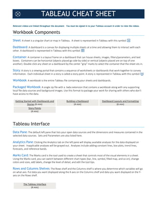
Workbook Components
Sheet: A sheet is a singular chart or map in Tableau. A sheet is represented in Tableau with this symbol:
Dashboard: A dashboard is a canvas for displaying multiple sheets at a time and allowing them to interact with each
other. A dashboard is represented in Tableau with this symbol:
Container: A container is a layout frame on a dashboard that can house sheets, images, filters/parameters, and text
boxes. Containers can be horizontal (objects placed go side-by-side) or vertical (objects placed are on top of one
another). Double-click any sheet on a dashboard by the center “grip” marks to select the container that the sheet sits in.
Story: A story is a viewing portal that contains a sequence of worksheets or dashboards that work together to convey
information. Each individual sheet in a story is called a story point. A story is represented in Tableau with this symbol:
Workbook: A workbook is the entire Tableau file containing your sheets and dashboards.
Packaged Workbook: A single zip file with a .twbx extension that contains a workbook along with any supporting
local file data sources and background images. Use this format to package your work for sharing with others who don’t
have access to the data.
Getting Started with Dashboards and
Stories (6 min)
Building a Dashboard
(4 min)
Dashboard Layouts and Formatting
(6 min)
Story Points
(4 min)
Tableau Interface
Data Pane: The default left pane that lists your open data sources and the dimensions and measures contained in the
selected data sources. Sets and Parameters are also listed here.
Analytics Pane: Clicking the Analytics tab on the left pane will display available analyses for the data displayed on
your sheet. Inapplicable analyses will be grayed out. Analyses include adding constant lines, box plots, trend lines,
forecasts, and reference bands.
Marks Card: The Marks card is the tool used to create a sheet that controls most of the visual elements in a sheet.
Using the Marks card, you can switch between different chart types (bar, line, symbol, filled map, and so on), change
colors and sizes, add labels, change the level of detail, and edit the tool tips.
Rows and Columns Shelves: The Rows shelf and the Columns shelf is where you determine which variables will go
on what axis. Put data you want displayed along the X-axis on the Columns shelf and data you want displayed on the Y-
axis on the Rows shelf.
The Tableau Interface
(4 min)
2. TABLEAU CHEAT SHEET
Data
Dimension: A categorical variable from the dataset that is used to slice and dice the data into different categories.
Dimensions are often discrete data. Examples include country, gender, student ID, and name. When a dimension is
pulled into your sheet, it takes the form of a blue pill.
Measure: A variable from the dataset that is meant to be aggregated. (This means it should be a number that it makes
sense to do math with: sum, average, and so on.) Measures are often continuous data. Examples include GPA, sales,
quantity, quota, height, and salary. When a measure is pulled into your sheet, it takes the form of a green pill.
Pill: The visual representation of a data item brought into your sheet. Pills can sit on the rows and columns shelves, the
marks card, and the filters card.
Data Types: Data fields will have an icon beside them to visually indicate what type of data field they are.
String Integer Geographic Loc. Date Group Set Hierarchy Bin Calculated Field
Getting Started
(4:50 – 7:00)
Filters/Parameters
Filters: A filter is used to limit what data is being displayed on the sheet. Visible controls for a filter on a sheet or
dashboard are called Quick Filters. Each filter is for an individual data field. Both dimensions and measures can be used
as filters.
Parameters: While filters limit the data shown in the view, parameters act as a variable in an equation that can be
controlled by the end user. Parameters only work in conjunction with either filters, sets, reference lines, or calculated
fields. Parameters are workbook-wide and can be used in multiple places (i.e. a single parameter can influence multiple
filters and calculated fields across different data sources in the workbook). Parameters are located separate from
Dimensions and Measures on the data pane.
NOTE: Filters, when layered appropriately, can affect the values displayed in other filters to show only relevant values
(i.e. selecting ENGR division will cause major filter selection to only should ENGR majors). Parameters cannot influence
filters in this manner (i.e. selecting “Undergraduate” through a parameter, will not limit the major filter selection to only
undergraduate majors)
Ways to Filter
(2 min)
Using Filter Shelf
(7 min)
Interactive Filters
(4 min)
Where Tableau Filters
(4 min)
Additional Filtering Topics
(7 min)
Parameters
(5 min)
Dimension
Measure
3. TABLEAU CHEAT SHEET
Data Groupings and Relationships
Groups: Simplifies large numbers of dimension members by combining them into higher level sub-categories. When a
field is grouped, a new dimension node is created and replaces the original dimension in the view. Groups can be made
by:
• Highlighting multiple header names or data points then right clicking will allow you to form on-the-fly groupings
of dimension levels in the view.
• Clicking on the dimension you want to group in the data pane, then selecting Create > Group… will give access
to greater control over your groups.
Sets: A subset of your data that meets certain conditions based on existing dimensions. Unlike a group, sets only have
two values: IN and OUT. A member is either IN your set, or not (OUT). Like parameters, sets can be used throughout a
workbook on multiple sheets. Also like parameters, sets are located separate from Dimensions and Measures on the
data pane. Sets can be created by:
• Highlighting multiple header names or data points then right clicking will give you the option to put those
dimension fields in a set.
• Clicking on the dimension you want to group in the data pane, then selecting Create > Set… will give access to
greater control over your sets and the ability to create computed sets based on conditions.
Bins: Bins are buckets based on a range of values. While groups and sets are used for grouping dimensions, bins are
used for grouping measures. The created bin will set in the Dimensions shelf. Bins can be created by right-clicking on a
measure, then selecting Create > Bins…
Hierarchies: Often data sources have related dimensions that have an inherent hierarchy. For example, a data source
may have fields for Country, State, and City. These fields could be grouped into a hierarchy called Location. In this
example, a user can expand country and breakdown the data into by state and city. Hierarchies can be created by:
• Using the CTRL key, select the dimensions you want to be in your hierarchy, right click and Create Hierarchy.
Once the hierarchy is created it’s simple to put into the correct order, just drag and drop the dimensions in the
hierarchy into the correct position.
• Clicking a field and dragging it on-top of another field will also create a hierarchy.
Grouping
(4 min)
Additional Ways to Group
(4 min)
Creating Sets
(6 min)
Working with Sets
(4 min)
Drill Down and Hierarchies
(5 min)
Other Terminology
Action: An interaction that you can add to your views. There are three types of action: Filter, Highlight, and URL.
Aggregation: A result of a mathematical operation applied to a measure. Predefined aggregations include summation
and average. You can convert dimensions to measures by aggregating them as a count. For relational data sources, all
measures must be either aggregated or disaggregated (unless they appear on the Filters shelf). Tableau aggregates
measures, usually as a summation, when you place them on a shelf.
4. TABLEAU CHEAT SHEET
Aliases: an alternative name assigned to a dimension member, or to a field name. Aliases can be created by:
• Right-clicking on an individual dimension header and selecting Edit alias…
• Right-clicking on a dimension in the data pane and selecting Aliases…
• Clicking opening Data from the top toolbar, going to your data sources, and selecting Edit Aliases…
Calculated Field: A new field that you create by using a formula to modify the existing fields in your data source.
Caption: A description of the current view on the active worksheet. For example, “Sum of Sales for each Market”. You
can automatically generate captions or create your own custom captions. Show and hide the caption by selecting
Worksheet > Show Caption.
Crosstab: A text table view. Use text tables to display the numbers associated with dimension members.
Dropdown Carrot: The small triangle to the right of a selected field.
Sheet Description: A thorough summary of the data used in a worksheet including all dimensions and measures
used, a written description of the view (marks, rows, columns), the formulas for all calculated fields used on the sheet,
and the data source details.
Tooltip: Tooltips are text boxes that appear when hovering over a mark on a sheet in order to give more information.
The text and text formatting in them are easily edited through the Marks card.
5. TABLEAU CHEAT SHEET
Shortcuts
Description Windows Mac
New worksheet Ctrl+M Command-T
New workbook Ctrl+N Command-N
Undo Ctrl+Z Command-Z
Redo Ctrl+Y Command-Shift-Z
Clear the current worksheet Alt+Shift+Backspace Option-Shift-Delete
Describe sheet Ctrl+E Command-E
Adds a field to the view Double-click Double-click
Place selected field on Columns shelf Alt+Shift+C Option-Shift-C
Place selected field on Rows shelf Alt+Shift+R Option-Shift-R
Opens the Drop Field menu Right-click+Drag to shelf Option-Drag to shelf
Copies a field in the view to be placed on another shelf or
card
Ctrl+Drag Command-Drag
Swap rows and columns Ctrl+W Control-Command-W
Open Show Me Ctrl+1 , Ctrl+Shift+1 Command-1
Connect to data source Ctrl+D Command-D
Refreshes the data source F5 Command-R
Clears the selection Esc Esc
Selects the mark Click Click
Selects a group of marks Drag Drag
Adds individual marks to the selection Ctrl+Click Command-Click
Adds a group of marks to the selection Ctrl+Drag Command-Drag
Sources:
http://www.dummies.com/programming/big-data/big-data-visualization/tableau-for-dummies-cheat-sheet/
http://onlinehelp.tableau.com/current/pro/desktop/en-us/glossary.html
https://www.tableau.com/learn/training