SlideShare a Scribd company logo
1 of 43
Download to read offline
GAME UI
DEVELOPMENT
With C# and XNA
1
Chapter 0.......................................................................................................................................................2
Introduction ..............................................................................................................................................2
Tools..........................................................................................................................................................3
Final Word.................................................................................................................................................5
Chapter 1.......................................................................................................................................................6
Introduction ..............................................................................................................................................6
Project.......................................................................................................................................................6
Setup.........................................................................................................................................................7
Ground Work ............................................................................................................................................9
Checkbox.................................................................................................................................................12
Final Word...............................................................................................................................................17
Chapter 2.....................................................................................................................................................18
Introduction ............................................................................................................................................18
Items .......................................................................................................................................................18
CheckboxGroup.......................................................................................................................................19
Final Word...............................................................................................................................................22
Chapter 3.....................................................................................................................................................23
Introduction ............................................................................................................................................23
Dropdown ...............................................................................................................................................23
................................................................................................................................................................24
Final Word...............................................................................................................................................30
Chapter 4.....................................................................................................................................................31
Introduction ............................................................................................................................................31
ProgressBar.............................................................................................................................................31
Last Word................................................................................................................................................34
Chapter 5.....................................................................................................................................................35
Introduction ............................................................................................................................................35
Controls for Game...................................................................................................................................37
Final Word...............................................................................................................................................41
Appendix .....................................................................................................................................................42
Visual Studio 2010...................................................................................................................................42
2
Creating a Solution..............................................................................................................................42
Chapter 0
Programmer Art
Introduction
Unfortunately we are not all provided with artistic talents, that being one of the reasons
the gaming industry consist of many disciplines. Because I am one of those individuals, this
chapter is all about programmer art and the texture created for this book. The following
chapters will concentrate on developing the architecture for creating controls for games and
editors. The controls created will use the following textures or sprite sheets.
The first sprite sheet is used for creating a checkbox control. In Figure 1, you can see a
fairly small image with three states: uncheck, check, and a cross out check.
Figure 1 Checkbox sprite sheet. Container, Checked, and Cross out Check.
The second sprite sheet is used for creating the dropdown in Chapter 3. The dropdown
control is a little more involve than a regular checkbox, and there are also extra sprites for
extending the width without causing pixelation.
Figure 2 Dropdown sprite sheet.
3
The final sprite sheet is used for creating the progress bar control in Chapter 4. The
progress bar is a common control used to indicate health, ammo left in a magazine, and even
the loading progress of the game or application.
Figure 3 Progress bar sprite sheet.
You can use these sprite sheets or create your own to follow the code. The aim of this
eBook is programming the controls; the implementation is not dependent on the art used.
Tools
Before moving onto the main course lets cover some of the most common tools for
creating game assets. For the sprites in this eBook Photoshop was used with less than desirable
results, but let us digress. However, Adobe Photoshop is not the most affordable package for an
indie developer. A couple of options could be to buy an older version, or even try the 30 day
trial before committing to using it.
4
Figure 4 Photoshop CS 6 from Adobe http://www.adobe.com/products/photoshop.html
Other options free options include Gimp and Paint.net. Gimp is the more complete package,
but Paint.net is fast and easy to learn.
Figure 5 Gimp http://www.gimp.org/
5
Figure 6 Paint.net http://www.getpaint.net/
Final Word
In this brief introductory chapter we learn about the assets in this book and about the
tool used to create it. We also learn about some free alternatives ant were to download them.
In the next chapter we will get started with our controls library and make XNA framework work
for us.
6
Chapter	1	
Game UI Controls - Checkbox
Introduction
What are game UI controls? Games are interactive works of art, and aside from similar
components and gameplay almost any game UI is unique. This uniqueness makes using
application for creating UI controls undesirable.
The other reason for creating game UI controls stemmed from not finding these
common controls under the frameworks used for building games. By creating a robust library of
control, we are going to be able to easily change the skin of our controls without changing the
functionality. The controls we will create are going to be easily added and usable in both games
and designer tools.
Project
Before starting let us go over the project and versions used during the writing of this
eBook. The code used in this book was written on Visual Studio 2010 running on Windows 8
because Visual Studio 2012 doesn’t currently support XNA.
In Figure 1 you can see the completed project in Visual Studio. The project consist of
two class libraries, the XNA game project, and its corresponding Content project. Beginning at
the top we have GameDTO, which will keep structures that will be needed by both the GameLib
and Content project. The second project down is the GameLib, were we will be adding all our
new controls. The third is our game project, which will be used as a test project for testing our
controls. Finally, the Content project will store our font, Xml definitions , and sprites.
With the layout of the project in mind let us start by creating a Solution to house all of
our projects. In Figure 1, you can see my solution was named GameLibrary, but any descriptive
name will do.
7
Figure 1 Completed Solution
Setup
After having created a solution project like the one in Figure 2, let us create our test
game project—Figure 3. To complete the project setup, let’s finish by adding the two game
library projects GameDTO and GameLib.
8
Figure 2 Project Solution
9
Figure 3 Game Project
Ground Work
The following steps will lay the ground work for creating all the controls in this book.
Step by step:
1. In GameDTO project, start by adding the definition class. Adding a cs will default the file
declaration to a class.
2. Replace the class modifier with struct.
3. Now we will add the structure fields. ControlName stores the name of the XmlContent
file. The following field AssetName store the sprite sheet asset name for loading with the
Content pipeline. The Font field will store a reference to the default SpriteFont. The List
of AssetRect will store rectangles to all the sprites in the sheet. AssetRect is not defined
yet, but we will be adding it shortly. A quick way to resolve this issue is to right click on
AssetRect and select class under the Generate option—this will generate a class we can
go in later and change into a structure. The last field is a dictionary of AssetRect to speed
lookups; this field is private so that the ContentProcessor doesn’t see it.
10
public string ControlName;
public string AssetName;
public string Font;
public List<AssetRect> Assets;
private Dictionary<string, AssetRect> Lookup;
4. The last step to complete the structure is the function to perform the lookup. In the top
we are going to check if the Lookup field contains the AssetRect we are looking for and
return it. In cases were the item is not found in the dictionary, we will look for it in the
List and add an entry in the lookup dictionary.
public AssetRect Get(string name)
{
if (Lookup == null)
Lookup = new Dictionary<string, AssetRect>(Assets.Count);
if (Lookup.ContainsKey(name))
return Lookup[name];
var asset = Assets.Where(w => w.Name == name).FirstOrDefault();
if (asset.Name == name)
Lookup.Add(name, asset);
return asset;
}
5. We are not done with our DTO structures yet. In the GameDTO project, let’s add
another cs file if it wasn’t generate yet called AssetRect. This is going to be a structure.
6. With our skeleton in place, it is time to add the fields. Like before the private fields are
going to be invisible to the XmlContentProcessor, rect will keep a Rectangle structure
generated from the Rect string, and rectSet will keep a bool indicating that we
generated rect already. The Rect will store the sprite name and Rect the string
representation like so x y width height or 0 0 200 200.
private Rectangle rect;
private bool rectSet;
public string Name;
public string Rect;
7. Finally, the function to get our Rectangle. With this last function we are done with the
GameDTO library.
public Rectangle GetRect()
{
if (rectSet)
return rect;
if (string.IsNullOrEmpty(Rect))
throw new Exception("Invalid Rect definition.");
11
string[] split = Rect.Split(' ');
rect = new Rectangle(Convert.ToInt32(split[0]),
Convert.ToInt32(split[1]),
Convert.ToInt32(split[2]),
Convert.ToInt32(split[3]));
rectSet = true;
return rect;
}
8. Now we are going to add the base class for all the controls. In GameLib project add a
folder name Controls. Next we are going to add an abstract class call BaseControl that
inherits from DrawableGameComponent. Inheriting from GameComponent will only expose
Update function, with DrawableGameComponent we will also get Draw.
public abstract class BaseControl : DrawableGameComponent
9. The first field in BaseControl will keep a reference to SpriteBatch that will add to Game
as a Service. We can also create a SpriteBatch with the GraphicDevice, but we are going
to leverage the one in Game.
protected SpriteBatch spriteBatch = null;
10. Before moving into the constructor and overrides, we are going to add all the properties
in common with the child controls. At the top we have the Definition from GameDTO.
The ControlSprite Texture2D is loaded with the AssetName field from Definition. Font is
also loaded from the Font field in Definition. Last two properties will store screen
position of the controls and previous MouseState.
public Definition ControlDefinition { get; private set; }
public Texture2D ControlSprite { get; private set; }
public SpriteFont Font { get; private set; }
public Vector2 Position { get; set; }
protected MouseState PrevMouseState { get; set; }
11. Next we will add the Constructor were most of the work is done.
public BaseControl(Game game, string controlAsset)
: base(game)
{
// Load all assets
ControlDefinition = game.Content.Load<Definition>(controlAsset);
ControlSprite = game.Content.Load<Texture2D>(ControlDefinition.AssetName);
Font = game.Content.Load<SpriteFont>(ControlDefinition.Font);
PrevMouseState = Mouse.GetState();
// Re-use SpriteBatch from the Game.
spriteBatch = game.Services.GetService(typeof(SpriteBatch)) as SpriteBatch;
}
12
12. Before moving into implementing the Checkbox control, let’s add an abstract function
for all the child’s to implement. The idea here is to called OpenDraw from Draw and make
sure that the SpriteBatch is already ready to draw when OpenDraw is called. Finally, lets
override Draw and called OpenDraw from within the SpriteBatch Begin/End.
public abstract void OpenDraw();
public override void Draw(GameTime gameTime)
{
spriteBatch.Begin();
OpenDraw();
spriteBatch.End();
base.Draw(gameTime);
}
At this point we can build, but have nothing to show on screen. In the next section we are going
to fix that by adding our first control. The code here was necessary for all our controls.
Checkbox
With all our ground work done lets work on creating our first control, the Checkbox. In
this section you can use the assets from the source code or you can create your own.
1. To begin, find the checkbox_sprite.png and add it to the tester Content project.
2. Now we are going to right click on the Content project and add a new Sprite Font. In the
source code, it is named Segoe.spritefont.
3. Before adding our XmlContent, add a reference to GameDTO to the Content project.
The reference is needed for mapping our Xml to the structures.
4. Now we are ready to add the XmlContent. Right click on the Content project and add an
Xml file called Checkbox.xml. The xml should look similar to our structures in GameDTO.
In some cases the Assets node specifies the Type.
<?xml version="1.0" encoding="utf-8" ?>
<XnaContent xmlns:Generic="System.Collections.Generic">
<Asset Type="GameDTO.Definition">
<ControlName>Checkbox</ControlName>
<AssetName>checkbox_sprite</AssetName>
<Font>Segoe</Font>
<Assets Type="Generic:List[GameDTO.AssetRect]">
<Item>
<Name>Unchecked</Name>
13
<Rect>0 0 67 71</Rect>
</Item>
<Item>
<Name>Checked</Name>
<Rect>67 0 67 71</Rect>
</Item>
<Item>
<Name>Checked2</Name>
<Rect>142 0 64 64</Rect>
</Item>
</Assets>
</Asset>
</XnaContent>
5. With all assets ready and definition completed add a new class to the GameLib project.
The class is name Checkbox and it extends the BaseControl.
public class Checkbox : BaseControl
6. Immediately after our opening brackets, let’s add a couple of constants for asset names.
The first is to reference our definition file and the following will be used to lookup
AssetRects.
private const string CONTROL_TYPE = "Checkbox",
UNCHECKED_ID = "Unchecked",
CHECKED_ID = "Checked",
CHECKED2_ID = "Checked2";
7. Before diving into the implementation, lets add a couple of properties. The first will
store text for the control. The second is an enum we haven’t added yet, but it will store
text orientation, and finally a flag to determine when the checkbox is checked.
public string Text { get; set; }
public TextOrientation Orientation { get; set; }
public bool IsChecked { get; private set; }
8. Detour: add a new class name Enums to the controls and remove the generated class.
Add the following:
public enum TextOrientation
{
Left,
Right,
Top,
Bottom
};
9. Now we can continue with our Checkbox control. After the properties add the following
constructors. The first is our generic constructor and the second takes two extra
parameters: text and orientation.
public Checkbox(Game game, Vector2 position)
: base(game, CONTROL_TYPE)
14
{
Position = position;
}
public Checkbox(Game game, Vector2 position, string text, TextOrientation
orientation)
: this(game, position)
{
Text = text;
Orientation = orientation;
}
10. Override the Update to implement all the state tracking logic. At the top we are going to
get the current state and check whether the RightButton was clicked. Here is where the
previous state comes in handy, because the updates happen so fast we need a way to
validate our current state. The logic inside builds a Rectangle for the mouse position
and a Rectangle for our control. If we find they interest, we negate the current
IsChecked value.
public override void Update(GameTime gameTime)
{
MouseState mouseState = Mouse.GetState();
// The right mouse button is used, but it can easily be change.
if (mouseState.RightButton == ButtonState.Pressed &&
PrevMouseState.RightButton != ButtonState.Pressed)
{
Rectangle rect = new Rectangle(mouseState.X, mouseState.Y, 0, 0),
destRect = ControlDefinition.Get(UNCHECKED_ID).GetRect();
Rectangle actualRect = new Rectangle((int)Position.X, (int)Position.Y,
destRect.Width,
destRect.Height);
// If they Interset negate current IsChecked value.
if (actualRect.Intersects(rect))
IsChecked = !IsChecked;
}
PrevMouseState = mouseState;
base.Update(gameTime);
}
11. Finally, let’s add the OpenDraw implementation. The first block is straightforward, if the
control is checked we are going to look up the Rectangle for the container sprite and
draw it. The second draw call looks up the checked sprite. The else block only draws the
container. The bottom portion of the code checks if we have Text and performs a couple
of calculations to draw text to the screen. The logic will calculate control rectangle and
measure string dimensions; once we have those values we can determine the start
position depending on orientation.
15
public override void OpenDraw()
{
if (IsChecked)
{
spriteBatch.Draw(ControlSprite, Position,
ControlDefinition.Get(UNCHECKED_ID).GetRect(), Color.White);
spriteBatch.Draw(ControlSprite, Position,
ControlDefinition.Get(CHECKED_ID).GetRect(), Color.White);
}
else
spriteBatch.Draw(ControlSprite, Position,
ControlDefinition.Get(UNCHECKED_ID).GetRect(), Color.White);
// Most of the code will have to do with the text of the control.
if (!string.IsNullOrEmpty(Text))
{
Rectangle destRect = ControlDefinition.Get(UNCHECKED_ID).GetRect();
Rectangle actualRect = new Rectangle((int)Position.X, (int)Position.Y,
destRect.Width, destRect.Height);
Vector2 textDimensions = Font.MeasureString(Text),
textPosition = Vector2.Zero;
if (Orientation== TextOrientation.Left)
textPosition = new Vector2(Position.X - textDimensions.X, Position.Y
+ textDimensions.Y);
else if (Orientation == TextOrientation.Right)
textPosition = new Vector2(Position.X + actualRect.Width, Position.Y
+ textDimensions.Y);
else
throw new NotSupportedException(string.Format("{0} is not
supported.", Orientation));
spriteBatch.DrawString(Font, Text, textPosition, Color.White);
}
}
12. Our control is ready for testing. Let’s switch to our Library.Tester project or Game
project. In the Game constructor, we need to enable Mouse and change buffer
dimensions. By default the Mouse is not visible in XNA game projects. If you haven’t
done so yet, add a reference to the GameLib project.
graphics = new GraphicsDeviceManager(this);
graphics.PreferredBackBufferHeight = 720;
graphics.PreferredBackBufferWidth = 1080;
graphics.ApplyChanges();
IsMouseVisible = true;
13. At the top of our Game class, create a variable for Checkbox control. So far, I have
assumed that the using statement is there. (using GameLib.Controls;)
Checkbox checkbox;
16
14. In the LoadContent, add the spriteBatch to the Services after it is created.
Services.AddService(typeof(SpriteBatch), spriteBatch);
15. The next step is to create an instance of the checkbox and add it to the Components
collection.
checkbox = new Checkbox(this, new Vector2(200, 300));
Components.Add(checkbox);
16. Running the project will generate a form with a Checkbox control that looks like the
screen capture from below.
17. We have tested the regular control, but we are still missing the text and orientation.
Let’s change the checkbox declaration at the top of Game class.
Checkbox checkbox, checkbox2, checkbox3;
18. Back in LoadContent, lets add the second and third checkbox. The existing code is
written in bold letters.
checkbox = new Checkbox(this, new Vector2(200, 300));
checkbox2 = new Checkbox(this, new Vector2(200, 200), "Test Right",
TextOrientation.Right);
checkbox3 = new Checkbox(this, new Vector2(200, 100), "Test Left",
TextOrientation.Left);
Components.Add(checkbox);
Components.Add(checkbox2);
Components.Add(checkbox3);
19. Run!
17
The Checkbox is done and ready for prime time. In the next chapter we will implement another
control and because of our groundwork, it will be easier and faster to accomplish.
Final Word
We have paved the way for other controls; before moving on try changing the skin and
switching from Checked to Checked2 (X).
18
Chapter 2
CheckboxGroup
Introduction
There are two types of group controls common to Windows and Web application—the first is
the RadioButtonList, and the second is the CheckBoxList. In the following sections we are going to
develop our own brand of group control called CheckboxGroup. The difference is that our control will be
available to our game engine and easily styled.
Items
The type of control we want to create will need to hold more than one item. We want a
structure that represents those items created before proceeding.
1. In our GameLib project and inside the Controls folder, let add a new class called Item.
Once the cs file is created, open it and change it to a struct.
public struct Item
2. The fields follow. The first holds the LastIndex, and it is declared static to hold at the
application level. The next field will hold the Text of the Item. Following is the IsDefault
flag to set whether the Item should be the default. Our last field holds the Item Index;
useful for look ups and as a Key.
public static int LastIndex = -1;
public string Text;
public bool IsDefault;
public int Index;
3. The last thing our Item will need is a quick way to create itself. The first line increments
our LastIndex, and the rest is just creating a new Item and returning it.
public static Item Get(string text)
{
19
LastIndex += 1;
return new Item
{
Text = text,
IsDefault = false,
Index = LastIndex
};
}
The Item created in this section will be used in other controls. Creating a lightweight structure
and flexible will ensure multiple uses.
CheckboxGroup
It is time to get working on the CheckboxGroup control. There is a small detail that will
make implementing this control easier. We will be re-using the same sprite sheet used for our
Checkbox control.
1. Still in the GameLib project and inside the Controls folder, add a new class called
CheckboxGroup.
public class CheckboxGroup : BaseControl
2. Like we did for the Checkbox we will start with the constant fields, and fields, and in the
following step—properties. If the constant look similar, it is because they are the same
constant used in the Checkbox. The class level field bounds is the important difference
here; it will be used to track item Rectangle to check against mouse position during a
click.
private const string CONTROL_TYPE = "Checkbox",
UNCHECKED_ID = "Unchecked",
CHECKED_ID = "Checked",
CHECKED2_ID = "Checked2";
private Dictionary<int, Rectangle> bounds;
3. Onto our properties we go. We will only need two properties, one to hold all items and
another to hold SelectedIndex.
public List<Item> Items { get; set; }
public int SelectedIndex { get; private set; }
20
4. With all the fields and properties we will need, lets add a constructor. The code
initializes the fields and properties.
public CheckboxGroup(Game game, Vector2 position)
: base(game, CONTROL_TYPE)
{
SelectedIndex = -1;
bounds = new Dictionary<int, Rectangle>(5);
Items = new List<Item>(5);
Position = position;
}
5. It is time to add our worker function the override to Update. The Update is similar to the
Checkbox in that we grab current MouseState and check against the previous. The
difference here is the check against bounds and setting of SelectedIndex.
public override void Update(GameTime gameTime)
{
MouseState mouseState = Mouse.GetState();
// The button can be change, or a Input class can be added instead.
if (mouseState.RightButton == ButtonState.Pressed &&
PrevMouseState.RightButton != ButtonState.Pressed)
{
Rectangle rect = new Rectangle(mouseState.X, mouseState.Y, 0, 0);
// Check each item bounds against the current Mouse position. The button
check will make sure we only run this code when the mouse reports a click.
for (int index = 0; index < Items.Count; index++)
if (bounds.ContainsKey(index))
{
if (bounds[index].Intersects(rect))
{
SelectedIndex = index;
break;
}
}
}
PrevMouseState = mouseState;
base.Update(gameTime);
}
6. We are almost done with our control; we just need to implement OpenDraw. Since we
have several items, we need to start with a current position and create a Vector2 we
can increment on each Items iteration. The rest of the code is similar to the Checkbox,
we will draw the container for each item and the checked sprite for matching
SelectedIndex. There is a small difference in the text calculation block—orientation is
not implemented; all text is rendered on the right.
public override void OpenDraw()
{
21
Vector2 lastPosition = Position,
textHeight = Font.MeasureString("T");
Rectangle assetRect = ControlDefinition.Get(UNCHECKED_ID).GetRect();
for (int index = 0; index < Items.Count; index++)
{
Item item = Items[index];
spriteBatch.Draw(ControlSprite, lastPosition, assetRect, Color.White);
// Draw check on selected.
if (SelectedIndex == index)
spriteBatch.Draw(ControlSprite, lastPosition,
ControlDefinition.Get(CHECKED_ID).GetRect(), Color.White);
// Render text, orientation not supported.
if (!string.IsNullOrEmpty(item.Text))
{
Vector2 textDimensions = Font.MeasureString(item.Text),
rightPosition = new Vector2(lastPosition.X + assetRect.Width,
lastPosition.Y + textDimensions.Y);
spriteBatch.DrawString(Font, item.Text, rightPosition, Color.White);
}
// Create the bounds dictionary.
if (!bounds.ContainsKey(index))
bounds.Add(index, new Rectangle((int)lastPosition.X,
(int)lastPosition.Y, assetRect.Width, assetRect.Height));
lastPosition += new Vector2(0, assetRect.Height);
}
}
7. Done with the control, let build and make sure everything compiles. Once everything is
tested, go to the Library.Tester project and add the control to the Game class.
Checkbox checkbox, checkbox2, checkbox3;
CheckboxGroup checkboxGroup;
8. Now in the LoadContent.
checkbox3 = new Checkbox(this, new Vector2(200, 100), "Test Left", TextOrientation.Left);
checkboxGroup = new CheckboxGroup(this, new Vector2(400, 100));
checkboxGroup.Items.Add(Item.Get("1"));
checkboxGroup.Items.Add(Item.Get("2"));
checkboxGroup.Items.Add(Item.Get("3"));
Components.Add(checkbox3);
Components.Add(checkboxGroup);
22
9. Run the Library.Tester. You should see the CheckboxGroup next to the individual
Checkboxes and only allow one to be selected at a time.
Final Word
Implementing the grouping was simple with all the base functionality we implemented
in the previous chapter. The control can use a little work—take some time to play with it and
implement multiple selection and text orientation. In the next chapter we will implement a
tougher control with many different states.
23
Chapter	3	
Dropdown
Introduction
This chapter is going to combine what we have learned so far and extend it to build a
Dropdown control. Dropdown controls are usually used in the web for State selection, in some
cases they are used to select a month, date, and year in age validators. The final application in
this eBooks will use it to change Vertex texture color.
The control we will create will require a bit of work to keep states, and things like hover
index, selected index, tints, and more. Let’s dive right in.
Dropdown
The Dropdown control will not use the same sprite sheet created for the Checkbox. We
have to start in the Content folder of our Test Game project.
1. From the source code add the dropdown_sprite.png to your Content project, or use your
own to follow along.
2. Still in the Content project let’s add an Xml file and name it Dropdown.xml. The following is
the content of the Dropdwn Xml file. The file is similar to the Checkbox; the major
difference is that we have more AssetRect items this time around.
<?xml version="1.0" encoding="utf-8" ?>
<XnaContent xmlns:Generic="System.Collections.Generic">
<Asset Type="GameDTO.Definition">
<ControlName>Dropdown</ControlName>
<AssetName>dropdown_sprite</AssetName>
<Font>Segoe</Font>
<Assets Type="Generic:List[GameDTO.AssetRect]">
<Item>
<Name>Default</Name>
<Rect>0 0 400 36</Rect>
</Item>
<Item>
24
<Name>MidSection</Name>
<Rect>0 36 400 31</Rect>
</Item>
<Item>
<Name>EndSection</Name>
<Rect>0 72 400 33</Rect>
</Item>
<Item>
<Name>Extender</Name>
<Rect>300 0 40 33</Rect>
</Item>
<Item>
<Name>ExtendedIcon</Name>
<Rect>300 111 100 37</Rect>
</Item>
</Assets>
</Asset>
</XnaContent>
3. Let’s review the sprite sheet to see why that is. The first sprite at the top is going to be the
default state, the second below is going to be used for intermediate items. The third sprite
will be used for ending items since it has a border. The last row contains three sprites, first
is to extend an item, the second is to make sure we have the end when extending, and
finally a hovered item with highlight.
4. Now we are ready to go back to the GameLib project and add a new Dropdown class inside
the Controls folder.
public class Dropdown : BaseControl
5. Like before we are going to start at the top with our constants and class fields. We have our
constant ids for look ups and a Dictionary to hold index and bounds of each item. We are
going to use the Dictionary later to check mouse location intersection.
private const string CONTROL_TYPE = "Dropdown",
DEFAULT_ID = "Default",
MIDSECTION_ID = "MidSection",
ENDSECTION_ID = "EndSection",
ICON_ID = "ExtendedIcon",
EXTENDER_ID = "Extender";
25
private Dictionary<int, Rectangle> itemBounds;
6. The properties are next. The two bool properties at the top will keep track of when we are
hovering the Dropdown, and also when the Dropdown is extended. Following are two
indexes for tracking which item is being hovered and which item was selected. We don’t
have to highlight hovered items when the mouse pointer is visible, but it is a nice visual cue.
Finally, we have a string NullText which holds a string to display when no items were
added, and the List to hold our Items.
public bool MouseHovering { get; private set; }
public bool IsExtended { get; private set; }
public int SelectedIndex { get; private set; }
public int HoverIndex { get; private set; }
public string NullText { get; set; }
public List<Item> Items { get; set; }
7. For now we will only add a constructor to initialize the fields and properties.
public Dropdown(Game game, Vector2 position)
: base(game, CONTROL_TYPE)
{
Position = position;
Items = new List<Item>(5);
itemBounds = new Dictionary<int, Rectangle>(5);
NullText = "No items added.";
SelectedIndex = -1;
}
8. We only have to functions left to implement. In this step we are going to start by adding our
Update override. Like we have done before, we will get the MouseState and reset our hover
properties. The following lines declare two rectangles, the first for the Mouse position, and
the second for the Dropdown right triangle sprite section. Our first if block will check
intersection between extender and mouse and set our MouseHovering property. The
following if block checks if the RightButton was clicked on the Mouse, and sets the
IsExtended property by leveraging the already set Hovering property.
The third if check validates IsExtended and the LeftButton click on the mouse to check if
any of our items were selected. If we have a match, we will set IsExtended to false and set
the SelectedIndex.
The last if block sets HoverIndex when the Dropdown is extended. Finally, we will set our
PrevMouseState with the current one.
public override void Update(GameTime gameTime)
{
MouseState mouseState = Mouse.GetState();
MouseHovering = false; // Reset hovering
26
HoverIndex = -1;
Rectangle rect = new Rectangle(mouseState.X, mouseState.Y, 0, 0),
destRect = ControlDefinition.Get(EXTENDER_ID).GetRect();
Rectangle actualRect =
new Rectangle((int)Position.X + (ControlSprite.Width - 44),
(int)Position.Y, destRect.Width, destRect.Height);
// Check for hovering
if (actualRect.Intersects(rect))
MouseHovering = true;
// Check for extended click.
if (mouseState.RightButton == ButtonState.Pressed &&
PrevMouseState.RightButton != ButtonState.Pressed)
{
if (MouseHovering && !IsExtended)
IsExtended = true;
else if (IsExtended)
IsExtended = false;
}
// Check for item selected click.
if (IsExtended && mouseState.LeftButton == ButtonState.Pressed &&
PrevMouseState.LeftButton != ButtonState.Pressed)
{
for (int x = 0; x < Items.Count; x++)
if (itemBounds.ContainsKey(x))
if (itemBounds[x].Intersects(rect))
{
SelectedIndex = x;
IsExtended = false;
break;
}
}
// Finally, check for hover index.
if (IsExtended)
for (int x =0; x<Items.Count;x++)
if (itemBounds.ContainsKey(x))
if (itemBounds[x].Intersects(rect))
{
HoverIndex = x;
break;
}
PrevMouseState = mouseState;
base.Update(gameTime);
}
9. Almost done with the implementation of our Dropdown. We’ve all the properties and fields
we need—it is time to add the drawing code. Starting at the top, we will always render the
default Dropdown sprite. Next we will check the MouseHovering flag and add another Draw
call accordingly.
27
Now we have our biggest if block, rendering extended items. The first line renders the
highlight to the extender even when MouseHovering is false because we want to indicate
extended. The following Vector2 declaration will be used for text and item rendering
positioning.
Iterating our Items List: at the top we have a tint variable to change color for selected,
and highlighted items. The hover check is last to make sure is always used when HoverIndex
and SelectedIndex are the same. The next code determines if it is the last item to add the
sprite with border or intermediate item. Still inside the for loop, we are going to build our
itemBounds dictionary we don’t already have the int, Rectangle pair.
The final if / else statement are in charge of rendering selected item text or NullText.
public override void OpenDraw()
{
spriteBatch.Draw(ControlSprite, Position,
ControlDefinition.Get(DEFAULT_ID).GetRect(), Color.White);
if (MouseHovering)
spriteBatch.Draw(ControlSprite, new Vector2(Position.X + (ControlSprite.Width –
ControlDefinition.Get(ICON_ID).GetRect().Width),
(int)Position.Y + 10),
ControlDefinition.Get(ICON_ID).GetRect(), Color.White);
if (IsExtended)
{
spriteBatch.Draw(ControlSprite,new Vector2(Position.X + (ControlSprite.Width –
ControlDefinition.Get(ICON_ID).GetRect().Width), (int)Position.Y + 10),
ControlDefinition.Get(ICON_ID).GetRect(), Color.White);
Vector2 itemPos = Position;
Vector2 textPos;
for (int x = 0; x < Items.Count; x++)
{
Color tint = Color.White;
if (SelectedIndex == x)
tint = Color.LightGray;
if (HoverIndex == x)
tint = Color.Yellow;
if (Items.Count == (x + 1)) // Last item will need the bottom border.
{
itemPos += new Vector2(0,
ControlDefinition.Get(ENDSECTION_ID).GetRect().Height - x * 4);
textPos = new Vector2(itemPos.X + 8, itemPos.Y + 1);
spriteBatch.Draw(ControlSprite, itemPos,
28
ControlDefinition.Get(ENDSECTION_ID).GetRect(), tint);
spriteBatch.DrawString(Font, Items[x].Text, textPos, Color.Black);
}
else // Items in the middle don't need the bottom border.
{
itemPos += new Vector2(0,
ControlDefinition.Get(MIDSECTION_ID).GetRect().Height - x * 4);
textPos = new Vector2(itemPos.X + 8, itemPos.Y + 1);
spriteBatch.Draw(ControlSprite, itemPos,
ControlDefinition.Get(MIDSECTION_ID).GetRect(), tint);
spriteBatch.DrawString(Font, Items[x].Text, textPos, Color.Black);
}
if (!itemBounds.ContainsKey(x))
{
Rectangle rect = ControlDefinition.Get(MIDSECTION_ID).GetRect();
itemBounds.Add(x, new Rectangle((int)itemPos.X, (int)itemPos.Y,
rect.Width, rect.Height));
}
}
}
if (Items.Count == 0 || SelectedIndex < 0)
{
string text = Items.Count > 0 ? "Select Item" : NullText;
Vector2 textSize = Font.MeasureString(text);
Vector2 textPos = new Vector2(Position.X + 10, Position.Y + 4);
if (textSize.X > ControlSprite.Width - 50)
spriteBatch.DrawString(Font, text.Remove(text.Length –
(int)(text.Length * .15)), textPos, Color.Black);
else
spriteBatch.DrawString(Font, text, textPos, Color.Black);
}
else
{
string text = Items[SelectedIndex].Text;
Vector2 textSize = Font.MeasureString(text);
Vector2 textPos = new Vector2(Position.X + 10, Position.Y + 4);
if (textSize.X > ControlSprite.Width - 50)
spriteBatch.DrawString(Font, text.Remove(text.Length - (int)(text.Length
* .15)), textPos, Color.Black);
else
spriteBatch.DrawString(Font, text, textPos, Color.Black);
}
}
29
10. We are done with our Dropdow implementation. It is time to test the control back in our
Library.Tester. In the Game class at the top we will add our new control. Like before bold
text indicates existing code.
CheckboxGroup checkboxGroup;
Dropdown dropdown;
11. In LoadContent, we will test no items first.
checkboxGroup.Items.Add(Item.Get("3"));
dropdown = new Dropdown(this, new Vector2(400, 400));
Components.Add(checkboxGroup);
Components.Add(dropdown);
12. We can see our default message for now items added. Let’s add a couple of items and check
again.
dropdown = new Dropdown(this, new Vector2(400, 400));
dropdown.Items.Add(Item.Get("Red"));
dropdown.Items.Add(Item.Get("Green"));
dropdown.Items.Add(Item.Get("Blue"));
It is hard to show the complete output in pictures, but now you have a control you can drop in
any project.
30
Final Word
In this chapter we created a Dropdown control by reusing a lot of the existing code and
objects created earlier on. This is a generic Dropdown implementation, but with minimal effort
the Item object can be modified to hold objects instead of a string value alone. An addition
would be to add the Color object to the item instead of just holder the string.
Keep playing with the control, and add your own flavor or even scale and rotation!
31
Chapter	4	
ProgressBar
Introduction
The last control we are going to be implementing is the ProgressBar. As the name
implies, the control will gauge progress of any kind that falls in a given range. We can use our
progress bar to indicate health, ammo left, and loading progress.
The ProgressBar will be fairly simple to implement; without wasting any more time, lets
dive right in.
ProgressBar
The ProgressBar sprite sheet is very simple, containing only two rows. You can follow
along with the ProgressBar used in this chapter or use your own creation.
1. The first step is to add the sprite sheet to the Content project. The companion sprite sheet
is named progressbar_sprite.png.
2. Next we will add the XmlContent for the ProgressBar control. Nothing new here.
<?xml version="1.0" encoding="utf-8" ?>
<XnaContent xmlns:Generic="System.Collections.Generic">
<Asset Type="GameDTO.Definition">
<ControlName>ProgressBar</ControlName>
<AssetName>progressbar_sprite</AssetName>
<Font>Segoe</Font>
<Assets Type="Generic:List[GameDTO.AssetRect]">
<Item>
<Name>Container</Name>
<Rect>0 0 386 66</Rect>
</Item>
<Item>
<Name>Bar</Name>
<Rect>0 67 386 65</Rect>
</Item>
</Assets>
32
</Asset>
</XnaContent>
3. Now that we have our key components, let’s switch back to our GameLib project and create
a new class for ProgressBar.
public class ProgressBar : BaseControl
4. Like we have done in previous controls, we are going to add our constants and fields. We
declared a private field for progress and initialized to a value of 100. We are going to
expose the progress as a property, but instead of using the short declaration we want to
have this field handy for clamping the incoming input.
private const string CONTROL_TYPE = "ProgressBar",
CONTAINER_ID = "Container",
BAR_ID = "Bar";
private int progress = 100;
5. Property and input validation. The setter is going to use the XNA MathHelper to make sure
our value is always between 0 and 100 inclusive.
public int Progress
{
get
{
return progress;
}
set
{
progress = (int)MathHelper.Clamp(value, 0, 100);
}
}
6. The next step is to create a constructor. The constructor can be altered to take in initial
progress, but for now it will remain generic.
public ProgressBar(Game game, Vector2 position)
: base(game, CONTROL_TYPE)
{
Position = position;
}
7. We will skip the update override since external sources will be altering the progress value.
In this step we will implement OpenDraw. In the body we will get the Rectangle for the
33
container and calculate the percentage of progress. Once we have the percentage, we are
going to Draw the progress bar and container.
public override void OpenDraw()
{
Rectangle barRect = ControlDefinition.Get(BAR_ID).GetRect();
Rectangle progressRect = new Rectangle(barRect.X, barRect.Y, (int)(barRect.Width
* (Progress / 100f)), barRect.Height);
spriteBatch.Draw(ControlSprite, Position, progressRect, Color.White);
spriteBatch.Draw(ControlSprite, Position,
ControlDefinition.Get(CONTAINER_ID).GetRect(), Color.White);
}
8. The control is done and ready for testing. Back in our Library.Tester we will add the new
control.
Dropdown dropdown;
ProgressBar progressBar;
9. In LoadContent, we will create an instance and add it to the Components Collection. Run
and we should see a filled ProgressBar.
progressBar = new ProgressBar(this, new Vector2(400, 0));
Components.Add(progressBar);
10. We are not done; the ProgressBar is not doing anything exciting. In the ProgressBar class,
let’s add a couple of Debug section for testing. At the top, after the Progress property. We
are going to add a couple of fields to track elapsed time and max interval value.
#if DEBUG
private float elapsed = 0, step = 2000f/60f;
#endif
11. Now we can override the Update from the base and add the following. We are going to
increment elapsed, and check if it goes over our maximum step value. If it did, we are going
to decrement step from it and decrease Progress. We are also going to a check to Progress
to reset it back to 100 when it reaches 0.
34
public override void Update(GameTime gameTime)
{
#if DEBUG
elapsed += gameTime.ElapsedGameTime.Milliseconds;
if (elapsed >= step)
{
elapsed -= step;
Progress -= 1;
}
if (Progress == 0)
Progress = 100;
#endif
base.Update(gameTime);
}
12. Running the tester now will display a ProgressBar decrementing, and finally resetting to 100
when 0 is reached.
Last Word
We’ve completed another control we can add to our toolbox. The ProgressBar was even
easier to implement than any of the other controls because of the foundation build. We are
done creating controls for now, but in the coming chapter we will integrate the controls to a
final project.
35
Chapter	5	
Final Project
Introduction
In figure one you can see the final project we are going to be altering. You should find this
project included in the source code. The project is a simple scriptable level with regions for click events
to spawn fire animations.
Figure 1 Final Project
36
The final solution should resemble Figure 2.
Figure 2 Complete Solution
37
Controls for Game
1. The first thing we are going to do is reference GameLib from our ScriptManager project. If
we try to add a control right now, we would get an Exception trying to load the assets.
2. Copy all the assets in our TesterContent project into the ScriptManagerContent folder. One
more thing is needed; the ScriptManagerContent project will need to reference GameDTO.
3. If you haven’t done so yet, add the using statement to the top of ScriptedGame.cs in the
ScriptManager project.
using GameLib.Controls;
4. Now we are ready to add our first control. At the top of ScriptedGame.cs
EditorUtil editorUtil;
Checkbox checkbox;
5. In LoadContent, before the commented out lines; add the code to create the control and
add it to the Components collection.
checkbox = new Checkbox(this, Vector2.Zero, "Show Region", TextOrientation.Right);
Components.Add(checkbox);
//foreach (var effect in level.Effects)
// editorUtil.AddSquare(effect.Key.X, effect.Key.Y, effect.Key.Width,
effect.Key.Height);
6. Run the code and the following should show. The control is a bit large, but for now we
won’t concern ourselves with scaling.
38
7. Back in the LoadContent we are going to cut commeted foreach loop lines and move them
to the Update function.
protected override void Update(GameTime gameTime)
{
// Allows the game to exit
if (GamePad.GetState(PlayerIndex.One).Buttons.Back == ButtonState.Pressed)
this.Exit();
level.Update(gameTime);
if (checkbox.IsChecked)
{
editorUtil.Clear();
foreach (var effect in level.Effects)
editorUtil.AddSquare(effect.Key.X, effect.Key.Y, effect.Key.Width,
effect.Key.Height);
}
else
editorUtil.Clear();
base.Update(gameTime);
}
8. Running the project now will yield the following image. Checking the Checkbox will display a
rectangle around the region that triggers the fire animation.
39
9. In the spirit of re-using our controls, we are going to use the ProgressBar to indicate flame
animation duration. Before doing that we are going to make sure changes to our
ProgressBar control. The first thing we need to do is remove the Debug region we added to
test the bar decrementing.
10. Now we are going to add a property to the ProgressBar class for Scale. If we add the
ProgressBar to our demo game, the bars will render too big for our buffer size.
public float Scale { get; set; }
11. We just need to make a final change to the constructor so we can pass in the scale value.
We used an optional constructor so that we don’t affect any existing code.
public ProgressBar(Game game, Vector2 position, float scale = 1f)
: base(game, CONTROL_TYPE)
{
Position = position;
Scale = scale;
}
12. Back in ScriptedGame.cs we are going to add a list of ProgressBars. We want a list to keep
track of more than one animation.
40
Checkbox checkbox;
List<ProgressBar> progressBars;
13. In LoadContent we are going to create our List depending on the amount of effects for each
level. The scale amount is .2 because is almost the size of the region.
Components.Add(checkbox);
progressBars = new List<ProgressBar>();
for (int x = 0; x < level.Effects.Count; x++)
{
progressBars.Add(new ProgressBar(this, new
Vector2(level.Effects.ElementAt(x).Value.Region.X,
level.Effects.ElementAt(x).Value.Region.Y), 0.2f));
Components.Add(progressBars.Last());
}
14. Running the code now will render the following screen shot. The progress indicators are
display in the effect region, but they are not yet updated.
15. To solve our update issue we are going to modify our ScriptedGame.Update function. Above
the code to Update level, add the following loop. Grab the effect at the corresponding index
and check if it is still playing. Still playing, calculate progress—not playing will set progress
to 0.
for (int x = 0; x < progressBars.Count; x++)
{
Scripting.Effect effect = level.Effects.ElementAt(x).Value;
if (effect.IsAlive)
progressBars[x].Progress = 100 - (int)((effect.Elapsed / 1000f) * 100f /
effect.Duration);
41
else
progressBars[x].Progress = 0;
}
level.Update(gameTime);
16. Run! We have our regions showing, and progress bars indicating remaining animation time.
Final Word
We reached the end of this eBook, but not the end of development. There are many
neat controls and features that can be added to make games exciting and easy to play. Keep
coding, and don’t forget to email any questions to support@electronicpaw.com.
42
Appendix
Visual Studio 2010
Creating a Solution
Ctrl+Shift+N

More Related Content

What's hot

Flash File Format Specification
Flash File Format SpecificationFlash File Format Specification
Flash File Format Specificationguest0ebe1e
 
Londroid Android Home Screen Widgets
Londroid Android Home Screen WidgetsLondroid Android Home Screen Widgets
Londroid Android Home Screen WidgetsRichard Hyndman
 
Autocad Mep Gettingstarted
Autocad Mep GettingstartedAutocad Mep Gettingstarted
Autocad Mep Gettingstartedguestedb0170
 
Computer system
Computer systemComputer system
Computer systemRū Sh
 
Microsoft India - Technical Overview on Windows Server 2008 R2 Whitepaper
Microsoft India - Technical Overview on Windows Server 2008 R2 WhitepaperMicrosoft India - Technical Overview on Windows Server 2008 R2 Whitepaper
Microsoft India - Technical Overview on Windows Server 2008 R2 WhitepaperMicrosoft Private Cloud
 
Manual of functions step by step microsoft word 2007
Manual of functions step by step microsoft word 2007Manual of functions step by step microsoft word 2007
Manual of functions step by step microsoft word 2007menteabiertaz4
 
Day 4: Android: UI Widgets
Day 4: Android: UI WidgetsDay 4: Android: UI Widgets
Day 4: Android: UI WidgetsAhsanul Karim
 
Agm diagnostics and_recovery_toolset_(da_rt)_7
Agm diagnostics and_recovery_toolset_(da_rt)_7Agm diagnostics and_recovery_toolset_(da_rt)_7
Agm diagnostics and_recovery_toolset_(da_rt)_7Steve Xu
 
Getting startedwithtallydeveloper9 | Tally Synchronisation | Tally Services |...
Getting startedwithtallydeveloper9 | Tally Synchronisation | Tally Services |...Getting startedwithtallydeveloper9 | Tally Synchronisation | Tally Services |...
Getting startedwithtallydeveloper9 | Tally Synchronisation | Tally Services |...stannventures.Pvt.Ltd
 
Ch12. graphical user interfaces
Ch12. graphical user interfacesCh12. graphical user interfaces
Ch12. graphical user interfacesArslan Karamat
 

What's hot (15)

Php5
Php5Php5
Php5
 
Flash File Format Specification
Flash File Format SpecificationFlash File Format Specification
Flash File Format Specification
 
Londroid Android Home Screen Widgets
Londroid Android Home Screen WidgetsLondroid Android Home Screen Widgets
Londroid Android Home Screen Widgets
 
Ebay News 1998 10 27 Earnings
Ebay News 1998 10 27 EarningsEbay News 1998 10 27 Earnings
Ebay News 1998 10 27 Earnings
 
Autocad Mep Gettingstarted
Autocad Mep GettingstartedAutocad Mep Gettingstarted
Autocad Mep Gettingstarted
 
Computer system
Computer systemComputer system
Computer system
 
Dvba pg
Dvba pgDvba pg
Dvba pg
 
Sg247137
Sg247137Sg247137
Sg247137
 
Microsoft India - Technical Overview on Windows Server 2008 R2 Whitepaper
Microsoft India - Technical Overview on Windows Server 2008 R2 WhitepaperMicrosoft India - Technical Overview on Windows Server 2008 R2 Whitepaper
Microsoft India - Technical Overview on Windows Server 2008 R2 Whitepaper
 
Manual of functions step by step microsoft word 2007
Manual of functions step by step microsoft word 2007Manual of functions step by step microsoft word 2007
Manual of functions step by step microsoft word 2007
 
Day 4: Android: UI Widgets
Day 4: Android: UI WidgetsDay 4: Android: UI Widgets
Day 4: Android: UI Widgets
 
Agm diagnostics and_recovery_toolset_(da_rt)_7
Agm diagnostics and_recovery_toolset_(da_rt)_7Agm diagnostics and_recovery_toolset_(da_rt)_7
Agm diagnostics and_recovery_toolset_(da_rt)_7
 
Getting startedwithtallydeveloper9 | Tally Synchronisation | Tally Services |...
Getting startedwithtallydeveloper9 | Tally Synchronisation | Tally Services |...Getting startedwithtallydeveloper9 | Tally Synchronisation | Tally Services |...
Getting startedwithtallydeveloper9 | Tally Synchronisation | Tally Services |...
 
Autocad 2000 manual
Autocad 2000 manualAutocad 2000 manual
Autocad 2000 manual
 
Ch12. graphical user interfaces
Ch12. graphical user interfacesCh12. graphical user interfaces
Ch12. graphical user interfaces
 

Viewers also liked

Information Architecture + Games
Information Architecture + GamesInformation Architecture + Games
Information Architecture + GamesRicardo Sato
 
Game Design 2: Lecture 4: Game UI Components
Game Design 2: Lecture 4:  Game UI ComponentsGame Design 2: Lecture 4:  Game UI Components
Game Design 2: Lecture 4: Game UI ComponentsDavid Farrell
 
Endless Euphoria Final Presentation
Endless Euphoria Final PresentationEndless Euphoria Final Presentation
Endless Euphoria Final PresentationSean Ryan
 
Mpp komatsu会社紹介②
Mpp komatsu会社紹介②Mpp komatsu会社紹介②
Mpp komatsu会社紹介②yasuharukomatsu
 
Enactus Annual Report 2015 Final
Enactus Annual Report 2015 FinalEnactus Annual Report 2015 Final
Enactus Annual Report 2015 FinalSean Ryan
 
98 374 Lesson 05-slides
98 374 Lesson 05-slides98 374 Lesson 05-slides
98 374 Lesson 05-slidesTracie King
 
Prototyping Game UI with FramerJS
Prototyping Game UI with FramerJSPrototyping Game UI with FramerJS
Prototyping Game UI with FramerJSJohannes Ippen
 

Viewers also liked (20)

Information Architecture + Games
Information Architecture + GamesInformation Architecture + Games
Information Architecture + Games
 
Game Design 2: Lecture 4: Game UI Components
Game Design 2: Lecture 4:  Game UI ComponentsGame Design 2: Lecture 4:  Game UI Components
Game Design 2: Lecture 4: Game UI Components
 
Mpp komatsu会社紹介
Mpp komatsu会社紹介Mpp komatsu会社紹介
Mpp komatsu会社紹介
 
Eleanor's Resume #1
Eleanor's Resume #1Eleanor's Resume #1
Eleanor's Resume #1
 
Mpp komatsu会社紹介
Mpp komatsu会社紹介Mpp komatsu会社紹介
Mpp komatsu会社紹介
 
Mpp komatsu会社紹介
Mpp komatsu会社紹介Mpp komatsu会社紹介
Mpp komatsu会社紹介
 
Mpp komatsu会社紹介
Mpp komatsu会社紹介Mpp komatsu会社紹介
Mpp komatsu会社紹介
 
Mpp komatsu会社紹介
Mpp komatsu会社紹介Mpp komatsu会社紹介
Mpp komatsu会社紹介
 
Endless Euphoria Final Presentation
Endless Euphoria Final PresentationEndless Euphoria Final Presentation
Endless Euphoria Final Presentation
 
Mpp komatsu会社紹介
Mpp komatsu会社紹介Mpp komatsu会社紹介
Mpp komatsu会社紹介
 
Mpp komatsu会社紹介
Mpp komatsu会社紹介Mpp komatsu会社紹介
Mpp komatsu会社紹介
 
Mpp komatsu会社紹介②
Mpp komatsu会社紹介②Mpp komatsu会社紹介②
Mpp komatsu会社紹介②
 
Enactus Annual Report 2015 Final
Enactus Annual Report 2015 FinalEnactus Annual Report 2015 Final
Enactus Annual Report 2015 Final
 
Mpp komatsu会社紹介
Mpp komatsu会社紹介Mpp komatsu会社紹介
Mpp komatsu会社紹介
 
Mpp komatsu会社紹介
Mpp komatsu会社紹介Mpp komatsu会社紹介
Mpp komatsu会社紹介
 
Mpp komatsu会社紹介
Mpp komatsu会社紹介Mpp komatsu会社紹介
Mpp komatsu会社紹介
 
Mpp komatsu会社紹介
Mpp komatsu会社紹介Mpp komatsu会社紹介
Mpp komatsu会社紹介
 
Mpp komatsu会社紹介
Mpp komatsu会社紹介Mpp komatsu会社紹介
Mpp komatsu会社紹介
 
98 374 Lesson 05-slides
98 374 Lesson 05-slides98 374 Lesson 05-slides
98 374 Lesson 05-slides
 
Prototyping Game UI with FramerJS
Prototyping Game UI with FramerJSPrototyping Game UI with FramerJS
Prototyping Game UI with FramerJS
 

Similar to C# XNA Game UI Development

Unity - Essentials of Programming in Unity
Unity - Essentials of Programming in UnityUnity - Essentials of Programming in Unity
Unity - Essentials of Programming in UnityNexusEdgesupport
 
VB.NET programming
VB.NET programmingVB.NET programming
VB.NET programmingElrey Belga
 
Introduction to Box2D Physics Engine
Introduction to Box2D Physics EngineIntroduction to Box2D Physics Engine
Introduction to Box2D Physics Enginefirstthumb
 
Keynote + Next Gen UIs.pptx
Keynote + Next Gen UIs.pptxKeynote + Next Gen UIs.pptx
Keynote + Next Gen UIs.pptxEqraKhattak
 
Introduction to Game Programming: Using C# and Unity 3D - Chapter 2 (Preview)
Introduction to Game Programming: Using C# and Unity 3D - Chapter 2 (Preview)Introduction to Game Programming: Using C# and Unity 3D - Chapter 2 (Preview)
Introduction to Game Programming: Using C# and Unity 3D - Chapter 2 (Preview)noorcon
 
Rocket Editor (Recovered).pptx
Rocket Editor (Recovered).pptxRocket Editor (Recovered).pptx
Rocket Editor (Recovered).pptxSkyknightBeoulve1
 
How tomakea gameinunity3d
How tomakea gameinunity3dHow tomakea gameinunity3d
How tomakea gameinunity3dDao Tung
 
Ball Collecting game report
Ball Collecting game report Ball Collecting game report
Ball Collecting game report Dileep Maurya
 
Y1 gd engine_terminology
Y1 gd engine_terminologyY1 gd engine_terminology
Y1 gd engine_terminologyNeilRogero
 
Creating first project in mikroC PRO for 8051
Creating first project in mikroC PRO for 8051Creating first project in mikroC PRO for 8051
Creating first project in mikroC PRO for 8051inovabrasil
 
Introduction to Game Programming: Using C# and Unity 3D - Chapter 3 (Preview)
Introduction to Game Programming: Using C# and Unity 3D - Chapter 3 (Preview)Introduction to Game Programming: Using C# and Unity 3D - Chapter 3 (Preview)
Introduction to Game Programming: Using C# and Unity 3D - Chapter 3 (Preview)noorcon
 
Y1 gd engine_terminologyhj
Y1 gd engine_terminologyhjY1 gd engine_terminologyhj
Y1 gd engine_terminologyhjShaz Riches
 
Y1 gd engine_terminology
Y1 gd engine_terminologyY1 gd engine_terminology
Y1 gd engine_terminologyShaz Riches
 
Y1 gd engine_terminology
Y1 gd engine_terminologyY1 gd engine_terminology
Y1 gd engine_terminologyShaz Riches
 
mblock_extension_guide.pdf
mblock_extension_guide.pdfmblock_extension_guide.pdf
mblock_extension_guide.pdfDogoMaker
 

Similar to C# XNA Game UI Development (20)

Unity - Essentials of Programming in Unity
Unity - Essentials of Programming in UnityUnity - Essentials of Programming in Unity
Unity - Essentials of Programming in Unity
 
a3.pdf
a3.pdfa3.pdf
a3.pdf
 
VB.NET programming
VB.NET programmingVB.NET programming
VB.NET programming
 
Chapter - 6.pptx
Chapter - 6.pptxChapter - 6.pptx
Chapter - 6.pptx
 
Introduction to Box2D Physics Engine
Introduction to Box2D Physics EngineIntroduction to Box2D Physics Engine
Introduction to Box2D Physics Engine
 
Keynote + Next Gen UIs.pptx
Keynote + Next Gen UIs.pptxKeynote + Next Gen UIs.pptx
Keynote + Next Gen UIs.pptx
 
Introduction to Game Programming: Using C# and Unity 3D - Chapter 2 (Preview)
Introduction to Game Programming: Using C# and Unity 3D - Chapter 2 (Preview)Introduction to Game Programming: Using C# and Unity 3D - Chapter 2 (Preview)
Introduction to Game Programming: Using C# and Unity 3D - Chapter 2 (Preview)
 
Rocket Editor (Recovered).pptx
Rocket Editor (Recovered).pptxRocket Editor (Recovered).pptx
Rocket Editor (Recovered).pptx
 
How tomakea gameinunity3d
How tomakea gameinunity3dHow tomakea gameinunity3d
How tomakea gameinunity3d
 
XCode8.0
XCode8.0XCode8.0
XCode8.0
 
Ball Collecting game report
Ball Collecting game report Ball Collecting game report
Ball Collecting game report
 
Engine Terms
Engine TermsEngine Terms
Engine Terms
 
Y1 gd engine_terminology
Y1 gd engine_terminologyY1 gd engine_terminology
Y1 gd engine_terminology
 
Creating first project in mikroC PRO for 8051
Creating first project in mikroC PRO for 8051Creating first project in mikroC PRO for 8051
Creating first project in mikroC PRO for 8051
 
Introduction to Game Programming: Using C# and Unity 3D - Chapter 3 (Preview)
Introduction to Game Programming: Using C# and Unity 3D - Chapter 3 (Preview)Introduction to Game Programming: Using C# and Unity 3D - Chapter 3 (Preview)
Introduction to Game Programming: Using C# and Unity 3D - Chapter 3 (Preview)
 
Y1 gd engine_terminologyhj
Y1 gd engine_terminologyhjY1 gd engine_terminologyhj
Y1 gd engine_terminologyhj
 
tutorialSCE
tutorialSCEtutorialSCE
tutorialSCE
 
Y1 gd engine_terminology
Y1 gd engine_terminologyY1 gd engine_terminology
Y1 gd engine_terminology
 
Y1 gd engine_terminology
Y1 gd engine_terminologyY1 gd engine_terminology
Y1 gd engine_terminology
 
mblock_extension_guide.pdf
mblock_extension_guide.pdfmblock_extension_guide.pdf
mblock_extension_guide.pdf
 

C# XNA Game UI Development

  • 2. 1 Chapter 0.......................................................................................................................................................2 Introduction ..............................................................................................................................................2 Tools..........................................................................................................................................................3 Final Word.................................................................................................................................................5 Chapter 1.......................................................................................................................................................6 Introduction ..............................................................................................................................................6 Project.......................................................................................................................................................6 Setup.........................................................................................................................................................7 Ground Work ............................................................................................................................................9 Checkbox.................................................................................................................................................12 Final Word...............................................................................................................................................17 Chapter 2.....................................................................................................................................................18 Introduction ............................................................................................................................................18 Items .......................................................................................................................................................18 CheckboxGroup.......................................................................................................................................19 Final Word...............................................................................................................................................22 Chapter 3.....................................................................................................................................................23 Introduction ............................................................................................................................................23 Dropdown ...............................................................................................................................................23 ................................................................................................................................................................24 Final Word...............................................................................................................................................30 Chapter 4.....................................................................................................................................................31 Introduction ............................................................................................................................................31 ProgressBar.............................................................................................................................................31 Last Word................................................................................................................................................34 Chapter 5.....................................................................................................................................................35 Introduction ............................................................................................................................................35 Controls for Game...................................................................................................................................37 Final Word...............................................................................................................................................41 Appendix .....................................................................................................................................................42 Visual Studio 2010...................................................................................................................................42
  • 3. 2 Creating a Solution..............................................................................................................................42 Chapter 0 Programmer Art Introduction Unfortunately we are not all provided with artistic talents, that being one of the reasons the gaming industry consist of many disciplines. Because I am one of those individuals, this chapter is all about programmer art and the texture created for this book. The following chapters will concentrate on developing the architecture for creating controls for games and editors. The controls created will use the following textures or sprite sheets. The first sprite sheet is used for creating a checkbox control. In Figure 1, you can see a fairly small image with three states: uncheck, check, and a cross out check. Figure 1 Checkbox sprite sheet. Container, Checked, and Cross out Check. The second sprite sheet is used for creating the dropdown in Chapter 3. The dropdown control is a little more involve than a regular checkbox, and there are also extra sprites for extending the width without causing pixelation. Figure 2 Dropdown sprite sheet.
  • 4. 3 The final sprite sheet is used for creating the progress bar control in Chapter 4. The progress bar is a common control used to indicate health, ammo left in a magazine, and even the loading progress of the game or application. Figure 3 Progress bar sprite sheet. You can use these sprite sheets or create your own to follow the code. The aim of this eBook is programming the controls; the implementation is not dependent on the art used. Tools Before moving onto the main course lets cover some of the most common tools for creating game assets. For the sprites in this eBook Photoshop was used with less than desirable results, but let us digress. However, Adobe Photoshop is not the most affordable package for an indie developer. A couple of options could be to buy an older version, or even try the 30 day trial before committing to using it.
  • 5. 4 Figure 4 Photoshop CS 6 from Adobe http://www.adobe.com/products/photoshop.html Other options free options include Gimp and Paint.net. Gimp is the more complete package, but Paint.net is fast and easy to learn. Figure 5 Gimp http://www.gimp.org/
  • 6. 5 Figure 6 Paint.net http://www.getpaint.net/ Final Word In this brief introductory chapter we learn about the assets in this book and about the tool used to create it. We also learn about some free alternatives ant were to download them. In the next chapter we will get started with our controls library and make XNA framework work for us.
  • 7. 6 Chapter 1 Game UI Controls - Checkbox Introduction What are game UI controls? Games are interactive works of art, and aside from similar components and gameplay almost any game UI is unique. This uniqueness makes using application for creating UI controls undesirable. The other reason for creating game UI controls stemmed from not finding these common controls under the frameworks used for building games. By creating a robust library of control, we are going to be able to easily change the skin of our controls without changing the functionality. The controls we will create are going to be easily added and usable in both games and designer tools. Project Before starting let us go over the project and versions used during the writing of this eBook. The code used in this book was written on Visual Studio 2010 running on Windows 8 because Visual Studio 2012 doesn’t currently support XNA. In Figure 1 you can see the completed project in Visual Studio. The project consist of two class libraries, the XNA game project, and its corresponding Content project. Beginning at the top we have GameDTO, which will keep structures that will be needed by both the GameLib and Content project. The second project down is the GameLib, were we will be adding all our new controls. The third is our game project, which will be used as a test project for testing our controls. Finally, the Content project will store our font, Xml definitions , and sprites. With the layout of the project in mind let us start by creating a Solution to house all of our projects. In Figure 1, you can see my solution was named GameLibrary, but any descriptive name will do.
  • 8. 7 Figure 1 Completed Solution Setup After having created a solution project like the one in Figure 2, let us create our test game project—Figure 3. To complete the project setup, let’s finish by adding the two game library projects GameDTO and GameLib.
  • 10. 9 Figure 3 Game Project Ground Work The following steps will lay the ground work for creating all the controls in this book. Step by step: 1. In GameDTO project, start by adding the definition class. Adding a cs will default the file declaration to a class. 2. Replace the class modifier with struct. 3. Now we will add the structure fields. ControlName stores the name of the XmlContent file. The following field AssetName store the sprite sheet asset name for loading with the Content pipeline. The Font field will store a reference to the default SpriteFont. The List of AssetRect will store rectangles to all the sprites in the sheet. AssetRect is not defined yet, but we will be adding it shortly. A quick way to resolve this issue is to right click on AssetRect and select class under the Generate option—this will generate a class we can go in later and change into a structure. The last field is a dictionary of AssetRect to speed lookups; this field is private so that the ContentProcessor doesn’t see it.
  • 11. 10 public string ControlName; public string AssetName; public string Font; public List<AssetRect> Assets; private Dictionary<string, AssetRect> Lookup; 4. The last step to complete the structure is the function to perform the lookup. In the top we are going to check if the Lookup field contains the AssetRect we are looking for and return it. In cases were the item is not found in the dictionary, we will look for it in the List and add an entry in the lookup dictionary. public AssetRect Get(string name) { if (Lookup == null) Lookup = new Dictionary<string, AssetRect>(Assets.Count); if (Lookup.ContainsKey(name)) return Lookup[name]; var asset = Assets.Where(w => w.Name == name).FirstOrDefault(); if (asset.Name == name) Lookup.Add(name, asset); return asset; } 5. We are not done with our DTO structures yet. In the GameDTO project, let’s add another cs file if it wasn’t generate yet called AssetRect. This is going to be a structure. 6. With our skeleton in place, it is time to add the fields. Like before the private fields are going to be invisible to the XmlContentProcessor, rect will keep a Rectangle structure generated from the Rect string, and rectSet will keep a bool indicating that we generated rect already. The Rect will store the sprite name and Rect the string representation like so x y width height or 0 0 200 200. private Rectangle rect; private bool rectSet; public string Name; public string Rect; 7. Finally, the function to get our Rectangle. With this last function we are done with the GameDTO library. public Rectangle GetRect() { if (rectSet) return rect; if (string.IsNullOrEmpty(Rect)) throw new Exception("Invalid Rect definition.");
  • 12. 11 string[] split = Rect.Split(' '); rect = new Rectangle(Convert.ToInt32(split[0]), Convert.ToInt32(split[1]), Convert.ToInt32(split[2]), Convert.ToInt32(split[3])); rectSet = true; return rect; } 8. Now we are going to add the base class for all the controls. In GameLib project add a folder name Controls. Next we are going to add an abstract class call BaseControl that inherits from DrawableGameComponent. Inheriting from GameComponent will only expose Update function, with DrawableGameComponent we will also get Draw. public abstract class BaseControl : DrawableGameComponent 9. The first field in BaseControl will keep a reference to SpriteBatch that will add to Game as a Service. We can also create a SpriteBatch with the GraphicDevice, but we are going to leverage the one in Game. protected SpriteBatch spriteBatch = null; 10. Before moving into the constructor and overrides, we are going to add all the properties in common with the child controls. At the top we have the Definition from GameDTO. The ControlSprite Texture2D is loaded with the AssetName field from Definition. Font is also loaded from the Font field in Definition. Last two properties will store screen position of the controls and previous MouseState. public Definition ControlDefinition { get; private set; } public Texture2D ControlSprite { get; private set; } public SpriteFont Font { get; private set; } public Vector2 Position { get; set; } protected MouseState PrevMouseState { get; set; } 11. Next we will add the Constructor were most of the work is done. public BaseControl(Game game, string controlAsset) : base(game) { // Load all assets ControlDefinition = game.Content.Load<Definition>(controlAsset); ControlSprite = game.Content.Load<Texture2D>(ControlDefinition.AssetName); Font = game.Content.Load<SpriteFont>(ControlDefinition.Font); PrevMouseState = Mouse.GetState(); // Re-use SpriteBatch from the Game. spriteBatch = game.Services.GetService(typeof(SpriteBatch)) as SpriteBatch; }
  • 13. 12 12. Before moving into implementing the Checkbox control, let’s add an abstract function for all the child’s to implement. The idea here is to called OpenDraw from Draw and make sure that the SpriteBatch is already ready to draw when OpenDraw is called. Finally, lets override Draw and called OpenDraw from within the SpriteBatch Begin/End. public abstract void OpenDraw(); public override void Draw(GameTime gameTime) { spriteBatch.Begin(); OpenDraw(); spriteBatch.End(); base.Draw(gameTime); } At this point we can build, but have nothing to show on screen. In the next section we are going to fix that by adding our first control. The code here was necessary for all our controls. Checkbox With all our ground work done lets work on creating our first control, the Checkbox. In this section you can use the assets from the source code or you can create your own. 1. To begin, find the checkbox_sprite.png and add it to the tester Content project. 2. Now we are going to right click on the Content project and add a new Sprite Font. In the source code, it is named Segoe.spritefont. 3. Before adding our XmlContent, add a reference to GameDTO to the Content project. The reference is needed for mapping our Xml to the structures. 4. Now we are ready to add the XmlContent. Right click on the Content project and add an Xml file called Checkbox.xml. The xml should look similar to our structures in GameDTO. In some cases the Assets node specifies the Type. <?xml version="1.0" encoding="utf-8" ?> <XnaContent xmlns:Generic="System.Collections.Generic"> <Asset Type="GameDTO.Definition"> <ControlName>Checkbox</ControlName> <AssetName>checkbox_sprite</AssetName> <Font>Segoe</Font> <Assets Type="Generic:List[GameDTO.AssetRect]"> <Item> <Name>Unchecked</Name>
  • 14. 13 <Rect>0 0 67 71</Rect> </Item> <Item> <Name>Checked</Name> <Rect>67 0 67 71</Rect> </Item> <Item> <Name>Checked2</Name> <Rect>142 0 64 64</Rect> </Item> </Assets> </Asset> </XnaContent> 5. With all assets ready and definition completed add a new class to the GameLib project. The class is name Checkbox and it extends the BaseControl. public class Checkbox : BaseControl 6. Immediately after our opening brackets, let’s add a couple of constants for asset names. The first is to reference our definition file and the following will be used to lookup AssetRects. private const string CONTROL_TYPE = "Checkbox", UNCHECKED_ID = "Unchecked", CHECKED_ID = "Checked", CHECKED2_ID = "Checked2"; 7. Before diving into the implementation, lets add a couple of properties. The first will store text for the control. The second is an enum we haven’t added yet, but it will store text orientation, and finally a flag to determine when the checkbox is checked. public string Text { get; set; } public TextOrientation Orientation { get; set; } public bool IsChecked { get; private set; } 8. Detour: add a new class name Enums to the controls and remove the generated class. Add the following: public enum TextOrientation { Left, Right, Top, Bottom }; 9. Now we can continue with our Checkbox control. After the properties add the following constructors. The first is our generic constructor and the second takes two extra parameters: text and orientation. public Checkbox(Game game, Vector2 position) : base(game, CONTROL_TYPE)
  • 15. 14 { Position = position; } public Checkbox(Game game, Vector2 position, string text, TextOrientation orientation) : this(game, position) { Text = text; Orientation = orientation; } 10. Override the Update to implement all the state tracking logic. At the top we are going to get the current state and check whether the RightButton was clicked. Here is where the previous state comes in handy, because the updates happen so fast we need a way to validate our current state. The logic inside builds a Rectangle for the mouse position and a Rectangle for our control. If we find they interest, we negate the current IsChecked value. public override void Update(GameTime gameTime) { MouseState mouseState = Mouse.GetState(); // The right mouse button is used, but it can easily be change. if (mouseState.RightButton == ButtonState.Pressed && PrevMouseState.RightButton != ButtonState.Pressed) { Rectangle rect = new Rectangle(mouseState.X, mouseState.Y, 0, 0), destRect = ControlDefinition.Get(UNCHECKED_ID).GetRect(); Rectangle actualRect = new Rectangle((int)Position.X, (int)Position.Y, destRect.Width, destRect.Height); // If they Interset negate current IsChecked value. if (actualRect.Intersects(rect)) IsChecked = !IsChecked; } PrevMouseState = mouseState; base.Update(gameTime); } 11. Finally, let’s add the OpenDraw implementation. The first block is straightforward, if the control is checked we are going to look up the Rectangle for the container sprite and draw it. The second draw call looks up the checked sprite. The else block only draws the container. The bottom portion of the code checks if we have Text and performs a couple of calculations to draw text to the screen. The logic will calculate control rectangle and measure string dimensions; once we have those values we can determine the start position depending on orientation.
  • 16. 15 public override void OpenDraw() { if (IsChecked) { spriteBatch.Draw(ControlSprite, Position, ControlDefinition.Get(UNCHECKED_ID).GetRect(), Color.White); spriteBatch.Draw(ControlSprite, Position, ControlDefinition.Get(CHECKED_ID).GetRect(), Color.White); } else spriteBatch.Draw(ControlSprite, Position, ControlDefinition.Get(UNCHECKED_ID).GetRect(), Color.White); // Most of the code will have to do with the text of the control. if (!string.IsNullOrEmpty(Text)) { Rectangle destRect = ControlDefinition.Get(UNCHECKED_ID).GetRect(); Rectangle actualRect = new Rectangle((int)Position.X, (int)Position.Y, destRect.Width, destRect.Height); Vector2 textDimensions = Font.MeasureString(Text), textPosition = Vector2.Zero; if (Orientation== TextOrientation.Left) textPosition = new Vector2(Position.X - textDimensions.X, Position.Y + textDimensions.Y); else if (Orientation == TextOrientation.Right) textPosition = new Vector2(Position.X + actualRect.Width, Position.Y + textDimensions.Y); else throw new NotSupportedException(string.Format("{0} is not supported.", Orientation)); spriteBatch.DrawString(Font, Text, textPosition, Color.White); } } 12. Our control is ready for testing. Let’s switch to our Library.Tester project or Game project. In the Game constructor, we need to enable Mouse and change buffer dimensions. By default the Mouse is not visible in XNA game projects. If you haven’t done so yet, add a reference to the GameLib project. graphics = new GraphicsDeviceManager(this); graphics.PreferredBackBufferHeight = 720; graphics.PreferredBackBufferWidth = 1080; graphics.ApplyChanges(); IsMouseVisible = true; 13. At the top of our Game class, create a variable for Checkbox control. So far, I have assumed that the using statement is there. (using GameLib.Controls;) Checkbox checkbox;
  • 17. 16 14. In the LoadContent, add the spriteBatch to the Services after it is created. Services.AddService(typeof(SpriteBatch), spriteBatch); 15. The next step is to create an instance of the checkbox and add it to the Components collection. checkbox = new Checkbox(this, new Vector2(200, 300)); Components.Add(checkbox); 16. Running the project will generate a form with a Checkbox control that looks like the screen capture from below. 17. We have tested the regular control, but we are still missing the text and orientation. Let’s change the checkbox declaration at the top of Game class. Checkbox checkbox, checkbox2, checkbox3; 18. Back in LoadContent, lets add the second and third checkbox. The existing code is written in bold letters. checkbox = new Checkbox(this, new Vector2(200, 300)); checkbox2 = new Checkbox(this, new Vector2(200, 200), "Test Right", TextOrientation.Right); checkbox3 = new Checkbox(this, new Vector2(200, 100), "Test Left", TextOrientation.Left); Components.Add(checkbox); Components.Add(checkbox2); Components.Add(checkbox3); 19. Run!
  • 18. 17 The Checkbox is done and ready for prime time. In the next chapter we will implement another control and because of our groundwork, it will be easier and faster to accomplish. Final Word We have paved the way for other controls; before moving on try changing the skin and switching from Checked to Checked2 (X).
  • 19. 18 Chapter 2 CheckboxGroup Introduction There are two types of group controls common to Windows and Web application—the first is the RadioButtonList, and the second is the CheckBoxList. In the following sections we are going to develop our own brand of group control called CheckboxGroup. The difference is that our control will be available to our game engine and easily styled. Items The type of control we want to create will need to hold more than one item. We want a structure that represents those items created before proceeding. 1. In our GameLib project and inside the Controls folder, let add a new class called Item. Once the cs file is created, open it and change it to a struct. public struct Item 2. The fields follow. The first holds the LastIndex, and it is declared static to hold at the application level. The next field will hold the Text of the Item. Following is the IsDefault flag to set whether the Item should be the default. Our last field holds the Item Index; useful for look ups and as a Key. public static int LastIndex = -1; public string Text; public bool IsDefault; public int Index; 3. The last thing our Item will need is a quick way to create itself. The first line increments our LastIndex, and the rest is just creating a new Item and returning it. public static Item Get(string text) {
  • 20. 19 LastIndex += 1; return new Item { Text = text, IsDefault = false, Index = LastIndex }; } The Item created in this section will be used in other controls. Creating a lightweight structure and flexible will ensure multiple uses. CheckboxGroup It is time to get working on the CheckboxGroup control. There is a small detail that will make implementing this control easier. We will be re-using the same sprite sheet used for our Checkbox control. 1. Still in the GameLib project and inside the Controls folder, add a new class called CheckboxGroup. public class CheckboxGroup : BaseControl 2. Like we did for the Checkbox we will start with the constant fields, and fields, and in the following step—properties. If the constant look similar, it is because they are the same constant used in the Checkbox. The class level field bounds is the important difference here; it will be used to track item Rectangle to check against mouse position during a click. private const string CONTROL_TYPE = "Checkbox", UNCHECKED_ID = "Unchecked", CHECKED_ID = "Checked", CHECKED2_ID = "Checked2"; private Dictionary<int, Rectangle> bounds; 3. Onto our properties we go. We will only need two properties, one to hold all items and another to hold SelectedIndex. public List<Item> Items { get; set; } public int SelectedIndex { get; private set; }
  • 21. 20 4. With all the fields and properties we will need, lets add a constructor. The code initializes the fields and properties. public CheckboxGroup(Game game, Vector2 position) : base(game, CONTROL_TYPE) { SelectedIndex = -1; bounds = new Dictionary<int, Rectangle>(5); Items = new List<Item>(5); Position = position; } 5. It is time to add our worker function the override to Update. The Update is similar to the Checkbox in that we grab current MouseState and check against the previous. The difference here is the check against bounds and setting of SelectedIndex. public override void Update(GameTime gameTime) { MouseState mouseState = Mouse.GetState(); // The button can be change, or a Input class can be added instead. if (mouseState.RightButton == ButtonState.Pressed && PrevMouseState.RightButton != ButtonState.Pressed) { Rectangle rect = new Rectangle(mouseState.X, mouseState.Y, 0, 0); // Check each item bounds against the current Mouse position. The button check will make sure we only run this code when the mouse reports a click. for (int index = 0; index < Items.Count; index++) if (bounds.ContainsKey(index)) { if (bounds[index].Intersects(rect)) { SelectedIndex = index; break; } } } PrevMouseState = mouseState; base.Update(gameTime); } 6. We are almost done with our control; we just need to implement OpenDraw. Since we have several items, we need to start with a current position and create a Vector2 we can increment on each Items iteration. The rest of the code is similar to the Checkbox, we will draw the container for each item and the checked sprite for matching SelectedIndex. There is a small difference in the text calculation block—orientation is not implemented; all text is rendered on the right. public override void OpenDraw() {
  • 22. 21 Vector2 lastPosition = Position, textHeight = Font.MeasureString("T"); Rectangle assetRect = ControlDefinition.Get(UNCHECKED_ID).GetRect(); for (int index = 0; index < Items.Count; index++) { Item item = Items[index]; spriteBatch.Draw(ControlSprite, lastPosition, assetRect, Color.White); // Draw check on selected. if (SelectedIndex == index) spriteBatch.Draw(ControlSprite, lastPosition, ControlDefinition.Get(CHECKED_ID).GetRect(), Color.White); // Render text, orientation not supported. if (!string.IsNullOrEmpty(item.Text)) { Vector2 textDimensions = Font.MeasureString(item.Text), rightPosition = new Vector2(lastPosition.X + assetRect.Width, lastPosition.Y + textDimensions.Y); spriteBatch.DrawString(Font, item.Text, rightPosition, Color.White); } // Create the bounds dictionary. if (!bounds.ContainsKey(index)) bounds.Add(index, new Rectangle((int)lastPosition.X, (int)lastPosition.Y, assetRect.Width, assetRect.Height)); lastPosition += new Vector2(0, assetRect.Height); } } 7. Done with the control, let build and make sure everything compiles. Once everything is tested, go to the Library.Tester project and add the control to the Game class. Checkbox checkbox, checkbox2, checkbox3; CheckboxGroup checkboxGroup; 8. Now in the LoadContent. checkbox3 = new Checkbox(this, new Vector2(200, 100), "Test Left", TextOrientation.Left); checkboxGroup = new CheckboxGroup(this, new Vector2(400, 100)); checkboxGroup.Items.Add(Item.Get("1")); checkboxGroup.Items.Add(Item.Get("2")); checkboxGroup.Items.Add(Item.Get("3")); Components.Add(checkbox3); Components.Add(checkboxGroup);
  • 23. 22 9. Run the Library.Tester. You should see the CheckboxGroup next to the individual Checkboxes and only allow one to be selected at a time. Final Word Implementing the grouping was simple with all the base functionality we implemented in the previous chapter. The control can use a little work—take some time to play with it and implement multiple selection and text orientation. In the next chapter we will implement a tougher control with many different states.
  • 24. 23 Chapter 3 Dropdown Introduction This chapter is going to combine what we have learned so far and extend it to build a Dropdown control. Dropdown controls are usually used in the web for State selection, in some cases they are used to select a month, date, and year in age validators. The final application in this eBooks will use it to change Vertex texture color. The control we will create will require a bit of work to keep states, and things like hover index, selected index, tints, and more. Let’s dive right in. Dropdown The Dropdown control will not use the same sprite sheet created for the Checkbox. We have to start in the Content folder of our Test Game project. 1. From the source code add the dropdown_sprite.png to your Content project, or use your own to follow along. 2. Still in the Content project let’s add an Xml file and name it Dropdown.xml. The following is the content of the Dropdwn Xml file. The file is similar to the Checkbox; the major difference is that we have more AssetRect items this time around. <?xml version="1.0" encoding="utf-8" ?> <XnaContent xmlns:Generic="System.Collections.Generic"> <Asset Type="GameDTO.Definition"> <ControlName>Dropdown</ControlName> <AssetName>dropdown_sprite</AssetName> <Font>Segoe</Font> <Assets Type="Generic:List[GameDTO.AssetRect]"> <Item> <Name>Default</Name> <Rect>0 0 400 36</Rect> </Item> <Item>
  • 25. 24 <Name>MidSection</Name> <Rect>0 36 400 31</Rect> </Item> <Item> <Name>EndSection</Name> <Rect>0 72 400 33</Rect> </Item> <Item> <Name>Extender</Name> <Rect>300 0 40 33</Rect> </Item> <Item> <Name>ExtendedIcon</Name> <Rect>300 111 100 37</Rect> </Item> </Assets> </Asset> </XnaContent> 3. Let’s review the sprite sheet to see why that is. The first sprite at the top is going to be the default state, the second below is going to be used for intermediate items. The third sprite will be used for ending items since it has a border. The last row contains three sprites, first is to extend an item, the second is to make sure we have the end when extending, and finally a hovered item with highlight. 4. Now we are ready to go back to the GameLib project and add a new Dropdown class inside the Controls folder. public class Dropdown : BaseControl 5. Like before we are going to start at the top with our constants and class fields. We have our constant ids for look ups and a Dictionary to hold index and bounds of each item. We are going to use the Dictionary later to check mouse location intersection. private const string CONTROL_TYPE = "Dropdown", DEFAULT_ID = "Default", MIDSECTION_ID = "MidSection", ENDSECTION_ID = "EndSection", ICON_ID = "ExtendedIcon", EXTENDER_ID = "Extender";
  • 26. 25 private Dictionary<int, Rectangle> itemBounds; 6. The properties are next. The two bool properties at the top will keep track of when we are hovering the Dropdown, and also when the Dropdown is extended. Following are two indexes for tracking which item is being hovered and which item was selected. We don’t have to highlight hovered items when the mouse pointer is visible, but it is a nice visual cue. Finally, we have a string NullText which holds a string to display when no items were added, and the List to hold our Items. public bool MouseHovering { get; private set; } public bool IsExtended { get; private set; } public int SelectedIndex { get; private set; } public int HoverIndex { get; private set; } public string NullText { get; set; } public List<Item> Items { get; set; } 7. For now we will only add a constructor to initialize the fields and properties. public Dropdown(Game game, Vector2 position) : base(game, CONTROL_TYPE) { Position = position; Items = new List<Item>(5); itemBounds = new Dictionary<int, Rectangle>(5); NullText = "No items added."; SelectedIndex = -1; } 8. We only have to functions left to implement. In this step we are going to start by adding our Update override. Like we have done before, we will get the MouseState and reset our hover properties. The following lines declare two rectangles, the first for the Mouse position, and the second for the Dropdown right triangle sprite section. Our first if block will check intersection between extender and mouse and set our MouseHovering property. The following if block checks if the RightButton was clicked on the Mouse, and sets the IsExtended property by leveraging the already set Hovering property. The third if check validates IsExtended and the LeftButton click on the mouse to check if any of our items were selected. If we have a match, we will set IsExtended to false and set the SelectedIndex. The last if block sets HoverIndex when the Dropdown is extended. Finally, we will set our PrevMouseState with the current one. public override void Update(GameTime gameTime) { MouseState mouseState = Mouse.GetState(); MouseHovering = false; // Reset hovering
  • 27. 26 HoverIndex = -1; Rectangle rect = new Rectangle(mouseState.X, mouseState.Y, 0, 0), destRect = ControlDefinition.Get(EXTENDER_ID).GetRect(); Rectangle actualRect = new Rectangle((int)Position.X + (ControlSprite.Width - 44), (int)Position.Y, destRect.Width, destRect.Height); // Check for hovering if (actualRect.Intersects(rect)) MouseHovering = true; // Check for extended click. if (mouseState.RightButton == ButtonState.Pressed && PrevMouseState.RightButton != ButtonState.Pressed) { if (MouseHovering && !IsExtended) IsExtended = true; else if (IsExtended) IsExtended = false; } // Check for item selected click. if (IsExtended && mouseState.LeftButton == ButtonState.Pressed && PrevMouseState.LeftButton != ButtonState.Pressed) { for (int x = 0; x < Items.Count; x++) if (itemBounds.ContainsKey(x)) if (itemBounds[x].Intersects(rect)) { SelectedIndex = x; IsExtended = false; break; } } // Finally, check for hover index. if (IsExtended) for (int x =0; x<Items.Count;x++) if (itemBounds.ContainsKey(x)) if (itemBounds[x].Intersects(rect)) { HoverIndex = x; break; } PrevMouseState = mouseState; base.Update(gameTime); } 9. Almost done with the implementation of our Dropdown. We’ve all the properties and fields we need—it is time to add the drawing code. Starting at the top, we will always render the default Dropdown sprite. Next we will check the MouseHovering flag and add another Draw call accordingly.
  • 28. 27 Now we have our biggest if block, rendering extended items. The first line renders the highlight to the extender even when MouseHovering is false because we want to indicate extended. The following Vector2 declaration will be used for text and item rendering positioning. Iterating our Items List: at the top we have a tint variable to change color for selected, and highlighted items. The hover check is last to make sure is always used when HoverIndex and SelectedIndex are the same. The next code determines if it is the last item to add the sprite with border or intermediate item. Still inside the for loop, we are going to build our itemBounds dictionary we don’t already have the int, Rectangle pair. The final if / else statement are in charge of rendering selected item text or NullText. public override void OpenDraw() { spriteBatch.Draw(ControlSprite, Position, ControlDefinition.Get(DEFAULT_ID).GetRect(), Color.White); if (MouseHovering) spriteBatch.Draw(ControlSprite, new Vector2(Position.X + (ControlSprite.Width – ControlDefinition.Get(ICON_ID).GetRect().Width), (int)Position.Y + 10), ControlDefinition.Get(ICON_ID).GetRect(), Color.White); if (IsExtended) { spriteBatch.Draw(ControlSprite,new Vector2(Position.X + (ControlSprite.Width – ControlDefinition.Get(ICON_ID).GetRect().Width), (int)Position.Y + 10), ControlDefinition.Get(ICON_ID).GetRect(), Color.White); Vector2 itemPos = Position; Vector2 textPos; for (int x = 0; x < Items.Count; x++) { Color tint = Color.White; if (SelectedIndex == x) tint = Color.LightGray; if (HoverIndex == x) tint = Color.Yellow; if (Items.Count == (x + 1)) // Last item will need the bottom border. { itemPos += new Vector2(0, ControlDefinition.Get(ENDSECTION_ID).GetRect().Height - x * 4); textPos = new Vector2(itemPos.X + 8, itemPos.Y + 1); spriteBatch.Draw(ControlSprite, itemPos,
  • 29. 28 ControlDefinition.Get(ENDSECTION_ID).GetRect(), tint); spriteBatch.DrawString(Font, Items[x].Text, textPos, Color.Black); } else // Items in the middle don't need the bottom border. { itemPos += new Vector2(0, ControlDefinition.Get(MIDSECTION_ID).GetRect().Height - x * 4); textPos = new Vector2(itemPos.X + 8, itemPos.Y + 1); spriteBatch.Draw(ControlSprite, itemPos, ControlDefinition.Get(MIDSECTION_ID).GetRect(), tint); spriteBatch.DrawString(Font, Items[x].Text, textPos, Color.Black); } if (!itemBounds.ContainsKey(x)) { Rectangle rect = ControlDefinition.Get(MIDSECTION_ID).GetRect(); itemBounds.Add(x, new Rectangle((int)itemPos.X, (int)itemPos.Y, rect.Width, rect.Height)); } } } if (Items.Count == 0 || SelectedIndex < 0) { string text = Items.Count > 0 ? "Select Item" : NullText; Vector2 textSize = Font.MeasureString(text); Vector2 textPos = new Vector2(Position.X + 10, Position.Y + 4); if (textSize.X > ControlSprite.Width - 50) spriteBatch.DrawString(Font, text.Remove(text.Length – (int)(text.Length * .15)), textPos, Color.Black); else spriteBatch.DrawString(Font, text, textPos, Color.Black); } else { string text = Items[SelectedIndex].Text; Vector2 textSize = Font.MeasureString(text); Vector2 textPos = new Vector2(Position.X + 10, Position.Y + 4); if (textSize.X > ControlSprite.Width - 50) spriteBatch.DrawString(Font, text.Remove(text.Length - (int)(text.Length * .15)), textPos, Color.Black); else spriteBatch.DrawString(Font, text, textPos, Color.Black); } }
  • 30. 29 10. We are done with our Dropdow implementation. It is time to test the control back in our Library.Tester. In the Game class at the top we will add our new control. Like before bold text indicates existing code. CheckboxGroup checkboxGroup; Dropdown dropdown; 11. In LoadContent, we will test no items first. checkboxGroup.Items.Add(Item.Get("3")); dropdown = new Dropdown(this, new Vector2(400, 400)); Components.Add(checkboxGroup); Components.Add(dropdown); 12. We can see our default message for now items added. Let’s add a couple of items and check again. dropdown = new Dropdown(this, new Vector2(400, 400)); dropdown.Items.Add(Item.Get("Red")); dropdown.Items.Add(Item.Get("Green")); dropdown.Items.Add(Item.Get("Blue")); It is hard to show the complete output in pictures, but now you have a control you can drop in any project.
  • 31. 30 Final Word In this chapter we created a Dropdown control by reusing a lot of the existing code and objects created earlier on. This is a generic Dropdown implementation, but with minimal effort the Item object can be modified to hold objects instead of a string value alone. An addition would be to add the Color object to the item instead of just holder the string. Keep playing with the control, and add your own flavor or even scale and rotation!
  • 32. 31 Chapter 4 ProgressBar Introduction The last control we are going to be implementing is the ProgressBar. As the name implies, the control will gauge progress of any kind that falls in a given range. We can use our progress bar to indicate health, ammo left, and loading progress. The ProgressBar will be fairly simple to implement; without wasting any more time, lets dive right in. ProgressBar The ProgressBar sprite sheet is very simple, containing only two rows. You can follow along with the ProgressBar used in this chapter or use your own creation. 1. The first step is to add the sprite sheet to the Content project. The companion sprite sheet is named progressbar_sprite.png. 2. Next we will add the XmlContent for the ProgressBar control. Nothing new here. <?xml version="1.0" encoding="utf-8" ?> <XnaContent xmlns:Generic="System.Collections.Generic"> <Asset Type="GameDTO.Definition"> <ControlName>ProgressBar</ControlName> <AssetName>progressbar_sprite</AssetName> <Font>Segoe</Font> <Assets Type="Generic:List[GameDTO.AssetRect]"> <Item> <Name>Container</Name> <Rect>0 0 386 66</Rect> </Item> <Item> <Name>Bar</Name> <Rect>0 67 386 65</Rect> </Item> </Assets>
  • 33. 32 </Asset> </XnaContent> 3. Now that we have our key components, let’s switch back to our GameLib project and create a new class for ProgressBar. public class ProgressBar : BaseControl 4. Like we have done in previous controls, we are going to add our constants and fields. We declared a private field for progress and initialized to a value of 100. We are going to expose the progress as a property, but instead of using the short declaration we want to have this field handy for clamping the incoming input. private const string CONTROL_TYPE = "ProgressBar", CONTAINER_ID = "Container", BAR_ID = "Bar"; private int progress = 100; 5. Property and input validation. The setter is going to use the XNA MathHelper to make sure our value is always between 0 and 100 inclusive. public int Progress { get { return progress; } set { progress = (int)MathHelper.Clamp(value, 0, 100); } } 6. The next step is to create a constructor. The constructor can be altered to take in initial progress, but for now it will remain generic. public ProgressBar(Game game, Vector2 position) : base(game, CONTROL_TYPE) { Position = position; } 7. We will skip the update override since external sources will be altering the progress value. In this step we will implement OpenDraw. In the body we will get the Rectangle for the
  • 34. 33 container and calculate the percentage of progress. Once we have the percentage, we are going to Draw the progress bar and container. public override void OpenDraw() { Rectangle barRect = ControlDefinition.Get(BAR_ID).GetRect(); Rectangle progressRect = new Rectangle(barRect.X, barRect.Y, (int)(barRect.Width * (Progress / 100f)), barRect.Height); spriteBatch.Draw(ControlSprite, Position, progressRect, Color.White); spriteBatch.Draw(ControlSprite, Position, ControlDefinition.Get(CONTAINER_ID).GetRect(), Color.White); } 8. The control is done and ready for testing. Back in our Library.Tester we will add the new control. Dropdown dropdown; ProgressBar progressBar; 9. In LoadContent, we will create an instance and add it to the Components Collection. Run and we should see a filled ProgressBar. progressBar = new ProgressBar(this, new Vector2(400, 0)); Components.Add(progressBar); 10. We are not done; the ProgressBar is not doing anything exciting. In the ProgressBar class, let’s add a couple of Debug section for testing. At the top, after the Progress property. We are going to add a couple of fields to track elapsed time and max interval value. #if DEBUG private float elapsed = 0, step = 2000f/60f; #endif 11. Now we can override the Update from the base and add the following. We are going to increment elapsed, and check if it goes over our maximum step value. If it did, we are going to decrement step from it and decrease Progress. We are also going to a check to Progress to reset it back to 100 when it reaches 0.
  • 35. 34 public override void Update(GameTime gameTime) { #if DEBUG elapsed += gameTime.ElapsedGameTime.Milliseconds; if (elapsed >= step) { elapsed -= step; Progress -= 1; } if (Progress == 0) Progress = 100; #endif base.Update(gameTime); } 12. Running the tester now will display a ProgressBar decrementing, and finally resetting to 100 when 0 is reached. Last Word We’ve completed another control we can add to our toolbox. The ProgressBar was even easier to implement than any of the other controls because of the foundation build. We are done creating controls for now, but in the coming chapter we will integrate the controls to a final project.
  • 36. 35 Chapter 5 Final Project Introduction In figure one you can see the final project we are going to be altering. You should find this project included in the source code. The project is a simple scriptable level with regions for click events to spawn fire animations. Figure 1 Final Project
  • 37. 36 The final solution should resemble Figure 2. Figure 2 Complete Solution
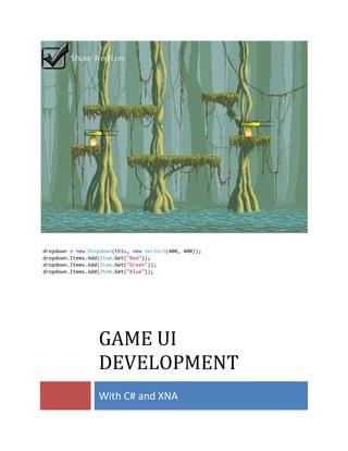
  • 38. 37 Controls for Game 1. The first thing we are going to do is reference GameLib from our ScriptManager project. If we try to add a control right now, we would get an Exception trying to load the assets. 2. Copy all the assets in our TesterContent project into the ScriptManagerContent folder. One more thing is needed; the ScriptManagerContent project will need to reference GameDTO. 3. If you haven’t done so yet, add the using statement to the top of ScriptedGame.cs in the ScriptManager project. using GameLib.Controls; 4. Now we are ready to add our first control. At the top of ScriptedGame.cs EditorUtil editorUtil; Checkbox checkbox; 5. In LoadContent, before the commented out lines; add the code to create the control and add it to the Components collection. checkbox = new Checkbox(this, Vector2.Zero, "Show Region", TextOrientation.Right); Components.Add(checkbox); //foreach (var effect in level.Effects) // editorUtil.AddSquare(effect.Key.X, effect.Key.Y, effect.Key.Width, effect.Key.Height); 6. Run the code and the following should show. The control is a bit large, but for now we won’t concern ourselves with scaling.
  • 39. 38 7. Back in the LoadContent we are going to cut commeted foreach loop lines and move them to the Update function. protected override void Update(GameTime gameTime) { // Allows the game to exit if (GamePad.GetState(PlayerIndex.One).Buttons.Back == ButtonState.Pressed) this.Exit(); level.Update(gameTime); if (checkbox.IsChecked) { editorUtil.Clear(); foreach (var effect in level.Effects) editorUtil.AddSquare(effect.Key.X, effect.Key.Y, effect.Key.Width, effect.Key.Height); } else editorUtil.Clear(); base.Update(gameTime); } 8. Running the project now will yield the following image. Checking the Checkbox will display a rectangle around the region that triggers the fire animation.
  • 40. 39 9. In the spirit of re-using our controls, we are going to use the ProgressBar to indicate flame animation duration. Before doing that we are going to make sure changes to our ProgressBar control. The first thing we need to do is remove the Debug region we added to test the bar decrementing. 10. Now we are going to add a property to the ProgressBar class for Scale. If we add the ProgressBar to our demo game, the bars will render too big for our buffer size. public float Scale { get; set; } 11. We just need to make a final change to the constructor so we can pass in the scale value. We used an optional constructor so that we don’t affect any existing code. public ProgressBar(Game game, Vector2 position, float scale = 1f) : base(game, CONTROL_TYPE) { Position = position; Scale = scale; } 12. Back in ScriptedGame.cs we are going to add a list of ProgressBars. We want a list to keep track of more than one animation.
  • 41. 40 Checkbox checkbox; List<ProgressBar> progressBars; 13. In LoadContent we are going to create our List depending on the amount of effects for each level. The scale amount is .2 because is almost the size of the region. Components.Add(checkbox); progressBars = new List<ProgressBar>(); for (int x = 0; x < level.Effects.Count; x++) { progressBars.Add(new ProgressBar(this, new Vector2(level.Effects.ElementAt(x).Value.Region.X, level.Effects.ElementAt(x).Value.Region.Y), 0.2f)); Components.Add(progressBars.Last()); } 14. Running the code now will render the following screen shot. The progress indicators are display in the effect region, but they are not yet updated. 15. To solve our update issue we are going to modify our ScriptedGame.Update function. Above the code to Update level, add the following loop. Grab the effect at the corresponding index and check if it is still playing. Still playing, calculate progress—not playing will set progress to 0. for (int x = 0; x < progressBars.Count; x++) { Scripting.Effect effect = level.Effects.ElementAt(x).Value; if (effect.IsAlive) progressBars[x].Progress = 100 - (int)((effect.Elapsed / 1000f) * 100f / effect.Duration);
  • 42. 41 else progressBars[x].Progress = 0; } level.Update(gameTime); 16. Run! We have our regions showing, and progress bars indicating remaining animation time. Final Word We reached the end of this eBook, but not the end of development. There are many neat controls and features that can be added to make games exciting and easy to play. Keep coding, and don’t forget to email any questions to support@electronicpaw.com.
  • 43. 42 Appendix Visual Studio 2010 Creating a Solution Ctrl+Shift+N