1. Examining Relationships
We have dealt with data obtained from one variable (categorical or quantitative), and learned how to describe the
distribution of the variable using the appropriate visual displays and numerical measures.
In this section, examining relationships, we will look at two variables at a time and explore the
relationship between them using (as before) 1) visual displays and 2) numerical summaries.
This module starts with general definitions, lays out the framework for the whole module, and lists the different
cases that the module will cover.
The Role-Type Classification
While it is fundamentally important to know how to describe the distribution of a single variable, most studies pose
research questions which involve exploring the relationship between two variables using the collected data.
o Examples of such research questions with the two variables highlighted:
1) Is there a relationship between gender and test scores on a particular standardized test?
(Other ways of phrasing the same research question:
Is performance on the test related to gender?
Is there a gender effect on test scores?
Are there differences in test scores between males and females?)
2) Is there a relationship between the type of light a baby sleeps with (no-light, night-light, lamp) and
whether or not the child develops nearsightedness?
In most studies involving two variables, each of the variables has a role. We distinguish between:
• The response variable - the outcome of the study
• The explanatory variable - the variable that claims to explain, predict or affect the response.
o Typically the explanatory variable is denoted by X, and the response variable by Y
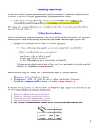
If we further classify each of the two relevant variables according to their type (categorical or quantitative), we get
the following 4 possibilities for "role-type classification"
1. Categorical explanatory and quantitative response
2. Categorical explanatory and categorical response
3. Quantitative explanatory and quantitative response
4. Quantitative explanatory and categorical response.
This role-type classification can be summarized and easily visualized in the following table:
1
2. This role-type classification serves as the infrastructure for this entire section. In each of the 4 cases, different
statistical tools (displays and numerical measures) should be used in order to explore the relationship between
the two variables.
EXAMPLE: 1
Gender is the explanatory variable and it is categorical.
Test score is the response variable and it is quantitative.
Therefore this is an example of case I.
Light Type is the explanatory variable and it is categorical.
Nearsightedness is the response variable and it is categorical.
Therefore this is an example of case II.
The remainder of this section on exploring relationships will be guided by this role-type classification. In the next
three parts we will elaborate on cases I, II, and III. More specifically, we will learn the appropriate statistical
tools (visual display and numerical summaries) that will allow us to explore the relationship between the two
variables in each of the cases.
Case I: Categorical Explanatory Variable and Quantitative Response Variable
Case I, exploring the relationship between two variables, where the explanatory variable is categorical, and the
response variable is quantitative.
o EXAMPLE: Hot Dogs: People who are concerned about their health may prefer hot dogs that are low in
calories. A study was conducted by a concerned health group in which 54 major hot dog brands were
examined, and their calorie contents recorded. In addition, each brand was classified by type: beef, poultry,
and meat (mostly pork and beef, but up to 15% poultry meat). The purpose of the study was to examine
whether the number of calories (Y) a hot dog has is related to (or affected by) its type (X).
• The explanatory variable is Type, and
• The response variable is Calories.
o Here is what the raw data look like:
o The raw data are a list of types and calorie contents and are not very useful in that form. To explore how the
number of calories is related to the type of hot dog, we need an informative visual display of the data
that will compare the three types of hot dogs with respect to their calorie content.
2
3. o The visual display that we'll use is side-by-side boxplots. The side-by-side boxplots will allow us to
compare the distribution of calorie counts within each category of the explanatory variable, hot dog type:
o As before, we supplement the side-by-side boxplots with the descriptive statistics of the calorie
content (response) for each type of hot dog separately (i.e., for each level of the explanatory variable
separately):
o Let's summarize the results we got and interpret them in the context of the question we posed:
[Observation] By examining the three side-by-side boxplots and the numerical summaries, we see at
once that poultry hotdogs as a group contain fewer calories than beef or meat. [Describes the data:
Descriptive stats and boxpolts] The median number of calories in poultry hotdogs (113) is less than
the median (and even the first quartile) of either of the other two distributions (medians 152.5 and
153). The spread of the three distributions is about the same, if IQR is considered (all slightly
above 40), but the (full) ranges vary slightly more (beef: 80, meat:88, poultry 66). [Context of the
question] The general recommendation to the health conscious consumer is to eat poultry hotdogs.
[A suggestion in context of question] It should be noted, though, that since each of the three types of
hotdogs shows quite a large spread among brands, simply buying a poultry hotdog does not
guarantee a low calorie food.
o What we learn from this example is that when exploring the relationship between a categorical
explanatory variable and a quantitative response (Case I), we essentially compare the distributions
of the quantitative response for each category of the explanatory variable using side-by-side
boxplots supplemented by descriptive statistics.
Let's Summarize
• The relationship between a categorical explanatory and a quantitative response variable is summarized
using:
o Data display: side-by-side boxplots
o Numerical summaries: descriptive statistics
3
4. • Exploring the relationship between a categorical explanatory variable and a quantitative response variable
amounts to comparing the distributions of the quantitative response for each category of the
explanatory variable. In particular, we look at how the distribution of the response variable differs
between the values of the explanatory variable.
Case II: Two Categorical Variables
Case II, where we examine the relationship between two categorical variables.
o If we had separated our sample of 1200 U.S. college students by gender and looked at males and females
separately, would we have found a similar distribution across body-image categories? More specifically,
are men and women just as likely to think their weight is about right? Among those students who do not
think their weight is about right, is there a difference between the genders in feelings about body-image?
o
o Answering these questions requires us to examine the relationship between two categorical variables,
Gender and Body-image. Because the question of interest is whether there is a gender effect on body
image,
• The explanatory variable is Gender, and
• The response variable is Body-image.
Once again the raw data is a long list of 1200 genders and responses and thus not very useful in that form.
To start our exploration of how body image is related to gender, we need an informative display that
summarizes the data. In order to summarize the relationship between two categorical variables, we create
a display called a two-way table.
Here is the two-way table for our example:
o The table has the possible genders in the rows, and the possible responses regarding body image in the
columns. At each intersection between row and column, we put the counts for how many times that
combination of gender and body image occurred in the data. We sum across the rows to fill in the
Total column, and we sum across the columns to fill in the Total row.
So far we have organized the raw data in a much more informative display - the two-way table:
o Remember that our primary goal is to explore how body image is related to gender. Exploring the
relationship between two categorical variables (Body-image and Gender) amounts to comparing the
distributions of the response (Body-image) across the different values of the explanatory (males and
females):
4
5. o Note that it doesn't make sense to compare raw counts, because there are more females than
males overall. So for example, it is not very informative to say "there are 560 females who
responded 'About Right' compared to only 295 males," since the 560 females are out of a total of
760, and the 295 males are only out of a total of 440).
o
We need to supplement our display, the two-way table, with some numerical summaries that will allow
us to compare the distributions. These numerical summaries are found by simply converting the counts
to percents within each value of the explanatory variable separately!
o
o In our example: We look at each gender separately, and convert the counts to percents within that
gender. Let's start with females:
Note that each count is converted to percents by dividing by the total number of females, 760. These
numerical summaries are called conditional percents, since we find them by conditioning on one of
the genders.
Comments
1. In our example, we chose to organize the data with the explanatory variable Gender in rows and the
response variable Body-image in columns, and thus our conditional percents were row percents,
calculated within each row separately. Similarly, if the explanatory variable happens to sit in columns and
the response variable in rows, our conditional percents will be column percents, calculated within each
column separately. For an example, see "Did I get this" below.
2. Another way to visualize the conditional percents, instead of a table, is the double bar chart. This display
is quite common in newspapers.
5
6. o The results suggest that the proportion of males who are happy with their body is slightly less than among
female students. Female students who are not happy with their body more often feel they are overweight.
Males who are not happy with their body feel they are overweight about as often as they feel they are
underweight.
Let's Summarize
• The relationship between two categorical variables is summarized using:
o Data display: two-way table, supplemented by
o Numerical summaries: conditional percentages.
• Conditional percentages are calculated for each value of the explanatory variable separately. They can be
row percents if the explanatory variable "sits" in the rows, or column percents if the explanatory variable
"sits" in the columns.
When we try to understand the relationship between two categorical variables, we compare the
distributions of the response variable for values of the explanatory variable. In particular, we look
at how the pattern of conditional percentages differs between the values of the explanatory
variable.
Case III: Two Quantitative Variables: Scatterplot
Case III is different in that both variables (in particular the explanatory variable) are quantitative, and therefore, this
case will require a different kind of treatment and tools.
o EXAMPLE: Highway Signs: A Pennsylvania research firm conducted a study in which 30 drivers (of
ages 18 to 82 years old) were sampled and for each one the maximum distance at which he/she could read a
newly designed sign was determined. The goal of this study was to explore the relationship between
driver's age (x) and the maximum distance (y) at which signs were legible, and then use the study's
findings to improve safety for older drivers.
• The explanatory variable is Age, and
• The response variable is Distance.
6
7. o Note that the data structure is such that for each individual (driver 1....driver 30) we have a pair of
value (in representing the driver's age and distance). We can therefore think about this data as 30
pairs of values: (18,510), (32,410), (55,420)........(82,360).
o
o The first step in exploring the relationship between driver age and sign legibility distance is to create an
appropriate and informative graphical display. The appropriate graphical display for examining the
relationship between two quantitative variables is the scatterplot. Here is how a scatterplot is constructed
for our example:
o
o To create a scatterplot, each pair of values is plotted, so that the value of the explanatory variable (X) is
plotted on the horizontal axis, and the value of the response variable (Y) is plotted on the vertical
axis. In other words, each individual (driver) appears on the scatterplot as a single point whose x-
coordinate is the value of the explanatory for that individual, and the y-coordinate is the value of the
response.
And here is the completed scatterplot:
7
8. Comment
When creating a scatterplot, the explanatory variable should always be plotted on the horizontal, X-axis, and the
response variable should be plotted on the vertical, Y-axis. If in a specific example we do not have a clear
distinction between an explanatory and response, each of the variables can be plotted on either of the axis.
Interpreting the scatterplot
When we described the distribution of a single quantitative variable with a histogram, we described the overall
pattern of the distribution (shape, center, spread) and any deviations from that pattern (outliers). We do the same
thing with the scatterplot!
o As the figure explains, when describing the overall pattern of the relationship we look at its direction,
form and strength.
• The direction of the relationship can be positive, negative, or neither:
8
9. o
o
o A positive (or increasing) relationship means that an increase in one of the variables is associated with an
increase in the other.
A negative (or decreasing) relationship means that an increase in one of the variables is associated with a
decrease in the other.
Not all relationships can be classified as either positive or negative.
o The form of the relationship is its general shape. When identifying the form, we try to find the simplest
way to describe the shape of the scatterplot.
• Relationships with a linear form are most simply described as points scattered about a line:
•
• Relationships a curvilinear form are described as points dispersed around the same curved line:
9
10. • There are many other possible forms for the relationship between two quantitative variables, but
linear and curvilinear forms are quite common and easy to identify. Another form-related pattern
that we should be aware of is clusters in the data:
o The strength of the relationship is determined by how closely the data follow the form of the relationship. Let's
look, for example, at the following two scatterplots displaying a positive, linear relationship:
o
o
o The strength of the relationship is determined by how closely the data points follow the form. We can see
that in the top scatterplot the the data points follow the linear patter quite closely. This is an example of a
strong relationship. In the bottom scatterplot the points also follow the linear pattern but much less
closely, and therefore we can say that the relationship is weaker. In general, though, assessing the strength
of a relationship just by looking at the scatterplot is quite problematic, and we need a numerical measure to
help us with that. We will discuss this later in this section.
o
o Data points that deviate from the pattern of the relationship are called outliers. We will see several
examples of outliers during this section.
10
11. Use the scatterplot to examine the relationship between the age of the driver and the maximum legibility distance.
o The direction of the relationship is negative, which makes sense in context since as you get older your
eyesight weakens, and in particular older drivers tend to be able to read signs only at lesser distances. An
arrow drawn over the scatterplot illustrates the negative direction of this relationship:
o The form of the relationship seems to be linear. Notice how the points tend to be scattered about the line.
Although, it is problematic to assess the strength without a numerical measure, the relationship appears to
be moderately strong, as the data is fairly tightly scattered about the line. Finally, all the data points seem
to "obey" the pattern--there do not appear to be any outliers.
EXAMPLE: Average Gestation Period
The average gestation period, or time of pregnancy, of an animal is closely related to its longevity (the length of its
lifespan.) Data on the average gestation period and longevity (in captivity) of 40 different species of animals have
been examined, with the purpose of examining how the gestation period of an animal is related to (or can be
predicted from) its longevity.
o What can we learn about the relationship from the scatterplot? The direction of the relationship is positive,
which means that animals with longer life spans tend to have longer times of pregnancy (makes
sense....). An arrow drawn over the scatterplot below illustrates this:
11
12. o The form of the relationship is again essentially linear. There appears to be one outlier, indicating an
animal with an exceptionally long longevity and gestation period. (The elephant.) Note that while this
outlier definitely deviates from the rest of the data in term of its magnitude, it does follow the direction of
the data.
Comment: Another feature of the scatterplot that is worthwhile observing is how the variation in
Gestation increases as Longevity increases. This fact is illustrated by the two red vertical lines at the
bottom left part of the graph. Note that gestation period for animal who live 5 years ranges from about 30
days up to about 120 days. On the other hand the gestation period of animals who live 12 years varies
much more, and ranges from about 60 days and up to above 400 days.
EXAMPLE: Fuel Usage
As a third example, consider the relationship between the average fuel usage (in liters) for driving a fixed distance
in a car (100 kilometers), and the speed at which the car drives (in kilometers per hour).
o The data describe a relationship that decreases and then increases - the amount of fuel consumed decreases
rapidly to a minimum for a car driving 60 kilometers per hour, and then increases gradually for speeds
exceeding 60 kilometers per hour. This suggests that the speed at which a car economizes on fuel the most
is about 60 km/h. This forms a curvilinear relationship which seems to be very strong, as the
observations seem to perfectly fit the curve. Finally, there do not appear to be any outliers.
Comment
The example in the last activity provides a great opportunity for interpretation of the form of the relationship in
context. Recall that the example examined how the percentage of participants who completed a survey is affected
by the monetary incentive that researchers promised to participants. Here, again, is the scatterplot which displays
the relationship:
o The positive relationship definitely makes sense in context, but what is the interpretation of the curvilinear
form in the context of the problem? How can we explain (in context) the fact that the relationship seems at
first to be increasing very rapidly, but then slows down? The following graph will help us:
12
13. Note that when the monetary incentive increases from $0 to $10, the percentage of returned surveys
increases sharply - an increase of 27% (from 16% to 43%). However, the same increase of $10 from $30
to $40 doesn't show the same dramatic increase on the percentage of returned surveys - an increase of only
3% (from 54% to 57%). The form displays the phenomenon of "diminishing returns" - a return rate that
after a certain point fails to increase proportionately to additional outlays of investment. $10 is worth more
to people relative to $0 than to $30.
A Labeled Scatterplot
In certain circumstances, it may be reasonable to indicate different subgroups or categories within the data on the
scatterplot, by labeling each subgroup differently. The result is called a labeled scatterplot, and can provide further
insight about the relationship we are exploring. here is an example.
o Recall the hot dog example from case I, in which 54 major hot dog brands were examined. In this study
both the calorie content and the sodium level of each brand was recorded, as well as the type of hot dog:
beef, poultry, and meat (mostly pork and beef, but up to 15% poultry meat). In this example we will
explore the relationship between the sodium level and calorie content of hot dogs, and use the three
different types of hot dogs to create a labeled scatterplot.
Let's Summarize
• The relationship between two quantitative variables is visually displayed using the scatterplot, where each
point represents an individual. We always plot the explanatory variable on the horizontal, X-axis, and the
response variable on the vertical, Y-axis.
• When we explore a relationship using the scatterplot we should describe the overall pattern of the
relationship and any deviations from that pattern. To describe the overall pattern consider the direction,
form and strength of the relationship. Assessing the strength could be problematic.
• Adding labels to the scatterplot, indicating different groups or categories within the data, might help
us get more insight about the relationship we are exploring.
Linear Relationships
We have visualized relationships between two quantitative variables using scatterplots, and described the overall
pattern of the relationship by considering its direction, form, and strength.
o Assessing the strength of a relationship just by looking at the scatterplot is quite hard; therefore, we need to
supplement the scatterplot with a numerical measure helps assess the strength.
We focus only on linear relationships, it is important to remember that not every relationship between two
quantitative variables has a linear form!
13
14. o The statistical tools introduced here are appropriate only for examining linear relationships, when used
in non-linear situations; these tools can lead to errors in reasoning.
Consider the following two scatterplots.
In both cases, the direction of the relationship is positive and the form of the relationship is linear. What about the
strength -- strength of a relationship is the extent to which the data follow its form?
This example illustrates how assessing the strength of the linear relationship from a scatterplot is problematic, since
our judgment might be affected by the range of values that are plotted. This example provides a need to supplement
the scatterplot with a numerical summary that will measure the strength of the linear relationship between two
quantitative variables.
The correlation coefficient – r
The numerical measure which assesses the strength of a linear relationship is called the correlation coefficient,
denoted by r.
We will:
1) give a definition of the correlation r,
2) discuss the calculation of r,
3) explain how to interpret the value of r, and
4) Talk about some of the properties of r.
o
o Definition: The correlation coefficient r is a numerical measure that measures the strength and
direction of a linear relationship between two quantitative variables.
o Calculation: r formula: r = 1 n - 1 ∑ i = 1 n ( x i - x ¯ S x ) ( y i - y ¯ S y )
Emphasis will be on the interpretation of its value.
Interpretation
Once we obtain the value of r, its interpretation is quite simple:
14
15. r is a numerical measure for assessing the direction and strength of linear relationships between quantitative
variables.
EXAMPLE: Highway Sign Visibility
o We used a scatterplot to find a negative linear relationship between the age of a driver and the
maximum distance at which a highway sign was legible.
o What about the strength of the relationship? The correlation between the two variables is r =
-0.793.
• r < 0, confirms that the direction of the relationship is negative.
• Since r is relatively close to -1, it suggests that the relationship is moderately strong.
15
16. • In context, the negative correlation confirms that the maximum distance at which a sign is
legible generally decreases with age. Since the value of r indicates that the linear relationship
is moderately strong but not perfect, we can expect the maximum distance to vary somewhat
even among drivers of the same age.
EXAMPLE: Statistics Courses
A statistics department is interested in tracking the progress of its students from entry until graduation. As part of
the study, they tabulate the performance of ten students in an introductory course and in an upper level course
required for graduation. What is the relationship between the students' course averages in the two courses?
Here is the scatterplot for the data:
• The scatterplot suggests a relationship that is positive in direction, linear in form, and seems quite strong.
The value of the correlation that we find between the two variables is r = 0.931, which is very close to 1,
and thus confirms that indeed the linear relationship is very strong.
Comment
Supplemented the scatterplot with the correlation r. Now that we have the correlation r, why do we still need to
look at a scatterplot when examining the relationship between two quantitative variables?
o The correlation coefficient can only be interpreted as the measure of the strength of a linear
relationship, so we need the scatterplot to verify that the relationship indeed looks linear.
Properties of r
We now discuss several important properties of the correlation coefficient as a numerical measure of the
strength of a linear relationship.
1. The correlation does not change when the units of measurement of either one of the variables change --, if
we change the units of measurement of the explanatory variable and/or the response variable, this has no
effect on the correlation r.
o Two versions of the scatterplot of the relationship between sign legibility distance and driver's age:
16
17. • The top scatterplot displays the relationship measured in feet.
• The bottom scatterplot displays in meters.
• Notice that the Y-values have changed, but the correlations are the same.
• This is an example where changing the units of measurement of the response has no effect on r, the same is
true for both variables.
•
The correlation r is unitless. It is just a number.
•
2) The correlation only measures the strength of a linear relationship between two variables. It ignores
any other type of relationship, no matter how strong it is.
o example, the relationship between the average fuel usage of driving a fixed distance in a car, and the
speed at which the car drives:
•
•
• Data describe a curvilinear relationship: the amount of fuel consumed decreases rapidly to a minimum for a
car driving 60 kilometers per hour, and then increases gradually for speeds exceeding 60 kilometers per
hour.
• The relationship is very strong, as the observations seem to perfectly fit the curve.
17
18. • Although the relationship is strong, the correlation r = -0.172 indicates a weak linear relationship -- makes
sense for the data fails to adhere closely to a linear form:
• The correlation is useless for assessing the strength of any type of relationship that is not linear. Beware,
then, of interpreting "r close to 0" as "weak relationship" rather then "weak linear relationship".
• Always look at the data, since there might be a strong non-linear relationship which r does not pick up.
3) Correlation by itself is not enough to determine whether or not a relationship is linear. Consider the
effect of monetary incentives on the return rate of questionnaires in which we find a strong curvilinear
relationship:
The relationship is curvilinear, yet the correlation r = 0.876 is quite close to 1.
An outlier that is consistent with the direction of a linear relationship, actually strengthens it.
Linear Regression: Summarizing the Pattern of the Data with a Line
A scatterplot describes the relationship between two quantitative variables, and in the a linear relationship, we have
supplemented the scatterplot with the correlation r. The correlation, however, doesn't fully characterize the linear
relationship between two quantitative variables--it only measures the strength and direction. We want to describe
more precisely how one variable changes with the other, or predict the value of the response variable for a given
value of the explanatory. To do that, we need to summarize the linear relationship by a line that best fits the linear
pattern of the data. In this section we will introduce a way to find the line, learn how to interpret it, and use it to do
predictions.
o The linear relationship between the age of a driver and the maximum distance at which a highway sign was
legible -- using a scatterplot and the correlation coefficient. Suppose a government agency wanted to
predict the maximum distance at which the sign would be legible for 60 year old drivers -- sign could be
used safely and effectively.
o How would we make this prediction?
• The age for which an agency wishes to predict the legibility distance, 60, is marked in red. How can we
do this prediction?
18
19. • It is useful to find a line that represents the general pattern of the data because we would simply use this
line to find the distance that corresponds to an age of 60 and predict that 60 year old drivers
could see the sign from just under 400 feet.
The technique that specifies the dependence of the response variable on the explanatory variable is called
regression. When that dependence is linear the technique is called linear regression -- the technique of finding the
line that best fits the pattern of the linear relationship or the line that best describes how the response variable
linearly depends on the explanatory variable.
o How such a line is chosen: "best fits the data"; we want the line to be close to the data points.
o whatever criterion we choose, it had better somehow take into account the vertical deviations of the data
points from the line, which are marked in blue arrows in the plot below:
• The most commonly used criterion is called the least squares criterion – it says: Among all the lines that
look good on your data, choose the one that has the smallest sum of squared vertical deviations. Visually,
each squared deviation is represented by the area of one of the squares in the plot below. Therefore, we
are looking for the line that will have the smallest total yellow area.
• This line is called the least-squares regression line -- it fits the linear pattern of the data very well.
The equation of the least-squares regression line for summarizing the linear relationship between the response Y
and the explanatory X is: Y = a + b X
Calculate the intercept a, and the slope b,
• X ¯ - the mean of the explanatory variable's values
• SX - the standard deviation of the explanatory variable's values
• Y ¯ - the mean of the response variable's values
• SY - the standard deviation of the response variable's values
19
20. • r - the correlation coefficient
o The slope and intercept of the least squares regression line are found using the following formulas:
• b = r S Y S X
• a = Y ¯ − b X ¯
Comments
1. The intercept a depends on the value of the slope, b, -- you need to find b first.
2. The slope of the least squares regression line interpreted as the average change in the response variable
when the explanatory variable increases by 1 unit.
EXAMPLE: Age-Distance
o Find the least-squares regression line. Excel output will give the 5 quantities we need:
• The slope of the line is: b = − 0 . 793 ∗ 82 . 8 21 . 78 = − 3 .
This means that for every 1 unit increase of the explanatory variable, there is, on average a 3
units decrease in the response.
The interpretation in context of the slope being -3 is For every year a driver gets older, the
maximum distance in which he/she can read a sign decreases, on average, by 3 feet.
• The intercept of the line is: a = 423 - (-3) * 51 = 576 the least squares regression
line for this example is: Distance = 576 - 3 * Age
o The regression line plotted on the scatterplot: the regression line fits the linear pattern of the data quite well.
o Example to predict the maximum distance at which a sign is legible for a 60 year old. Now that we have
found the least squares regression line, this prediction becomes quite easy:
20
21. o The figure tells us that in order to find the predicted legibility distance for a 60 year old, we plug Age =
60into the equation of the regression line equation, to find that: Predicted distance =
576 - 3 *60=396
•
• 396 feet is our best prediction for the maximum distance at which a sign is legible for a 60 year old.
Comment About Predictions
Suppose a government agency sought to predict the maximum distance at which the sign is legible for a 90 year
old. Using the least squares regression line as our summary of the linear dependence of the distances upon the
drivers' ages, the agency predicts that 90 year old drivers can see that sign at no more than 576 - 3* 90 = 306 feet:
o The green segment of the line is the region of ages beyond 82, the age of the oldest individual in the study
Question: Is our prediction for 90 year-old drivers reliable?
Answer: Our original age data ranged from 18 (youngest driver) to 82 (oldest driver), and our
regression line is therefore a summary of the linear relationship in that age range only! When we
plug the value 90 into the regression line equation, we are assuming that the same linear
relationship extends beyond the range of our age data (18-82) into the green segment. There is no
justification for such an assumption! It might be the case that the vision of drivers older than 82
falls off more rapidly than it does for younger drivers. (i.e., the slopes changes from -3 to
something more negative). Our prediction for age = 90, is therefore not reliable!
In General
Prediction for ranges of the explanatory variable that are not in the data is called extrapolation. Extrapolation is not
reliable and should be avoided -- can lead to very poor or illogical predictions.
Let's Summarize
• A special case of the relationship between two quantitative variables is the linear relationship. In this case,
a straight line simply and adequately summarizes the relationship.
21
22. • When the scatterplot displays a linear relatiionship, we supplement it by the correlation coefficient r,
which measures the strength and direction of a linear relationship between two quantitative variables. The
correlation ranges between -1 and 1. Values near -1 indicate a strong negative linear relationship, values
near 0 indicate a weak linear relationship, and values near 1 indicate a strong positive linear relationship.
• The correlation is only an appropriate numerical measure for linear relationships, and is sensitive to
outliers. Therefore, the correlation should only be used as a supplement to a scatterplot (after we look at the
data).
• The most commonly used criterion for fitting a line that summarizes the pattern of a linear relationship is
least squares. The least squares regression line has the smallest sum of squared vertical deviations of the
data points from the line.
• The slope of the least squares regression line can be interpreted as the average change in the response
variable when the explanatory variable increase by 1 unit.
• The least square regression line predict the value of the response variable for a given value of the
explanatory variable. Extrapolation is prediction for values of the explanatory variable that fall outside the
range in the data. Since there is no way of knowing whether a relationship holds beyond the range of the
explanatory variable in the data, extrapolation is not reliable, and should be avoided.
Causation & Lurking Variable
There is often a temptation to conclude from the observed relationship that changes in the explanatory variable
cause changes in the response. In other words, interpret the observed association as causation. This kind of
interpretation is often wrong! The most fundamental principles of this course: Association does not imply
causation!
EXAMPLE: Fire Damage
The scatterplot illustrates how the number of firefighters sent to fires (Y) is related to the amount of damage caused
by fires (X) in a certain city.
o The scatterplot displays a fairly strong (slightly curved) positive relationship between the two variables.
Would it be reasonable to conclude that sending more firefighters to the fire causes more damage, or that
the city should send fewer firefighters to a fire, in order to decrease the amount of damage? Of course not!
So what is going on here?
o There is a third variable in the background, the seriousness of the fire, that is responsible for the
observed relationship. More serious fires require more firefighters, and also cause more damage.
22
23. • Seriousness of the fire is called a lurking variable. A lurking variable is a variable that is not among the
explanatory or response variables in a study, but could substantially affect your interpretation of the
relationship among those variables.
• The lurking variable might have an effect on both the explanatory and the response variables. This
common effect creates the observed association between the explanatory and response variables, even
though there is no causal link between them.
• This possibility, that there might be a lurking variable (which we might not be thinking about) that is
responsible for the observed relationship leads to our principle: Association does not imply causation!
Another way in which a lurking variable might interfere, and prevent us from reaching any causal conclusions.
EXAMPLE: SAT Test
The side-by-side boxplots below provide evidence of a relationship between country-of-origin (U.S. or
international) and SAT-Math score.
o The distribution of international students' scores is higher than U.S. students--e.g. the international students'
median score (about 700) exceeds the third quartile of U.S. students' scores.
o Can we conclude that the country of origin is the cause of the difference in SAT Math scores, and that
students in the U.S. are weaker at math compared to students in other countries?
o No. One important lurking variable that might explain the observed relationship is the educational level
of the two populations taking the SAT-Math test. In the US the SAT is a standard test and therefore a broad
cross-section of all U.S. students (in terms of educational level) take this test. Among all international
students, on the other hand, only those who plan on coming to the US to study, which is usually a more
selected subgroup, take the test.
23
24. The explanatory variable (X) may have a causal relationship with the response (Y), but the lurking
variable might be a contributing factor as well, which makes it very hard to isolate the effect of the
explanatory variable and prove its causal link with the response.
In this case we say that the lurking variable is confounded with the explanatory variable since their
effects on the response cannot be distinguished from each other.
In either case the observed association can be at least partially explained by the lurking variable.
Therefore: An observed association between two variables is not enough evidence that there is
a causal relationship between them.
A lurking variable, by definition, is a variable that was not included in the study, but could have a substantial
effect on our understanding of the relationship between the two studied variables
o What if we did include a lurking variable in our study? What kind of effect could that have on our
understanding of the relationship?
EXAMPLE: Hospital Death Rates
o Background: A government study collected data on the death rates in nearly 6000 hospitals in the U.S.
These results were then challenged by researchers who said that the federal analyses failed to take into
account the variation among hospitals in the severity of patients' illness when they were hospitalized. As a
result, said the researchers, some hospitals were treated unfairly in the findings, which named hospitals
with higher-than-expected death rates. What the researchers are saying is that when the federal study
explored the relationship between the two variables: hospital and death rate, it should have also included
in the study (or taken into account) the lurking variable - severity of illness.
o Consider the following two-way table which summarizes the data about the status of patients who were
admitted to two hospitals in a certain city (Hospital A and Hospital B). Note that since the purpose of the
study is to examine whether there is a "hospital effect" on patients' status, the variable Hospital is the
explanatory, and Patient's Status is the response.
o When we supplement the two-way table by the conditional percents within each hospital:
24
25. o We find that Hospital A has a higher death rate (3%) than Hospital B (2%). Should we jump to the
conclusion that a sick patient admitted to Hospital A is 50% more likely to die than if he/she were admitted
to Hospital B? Not so fast...
• Maybe Hospital A gets most of the severe cases, and that explains why there it has a higher death
rate. In order to explore this, we need to include (or account for) the lurking variable "severity of
illness" in our analysis. To do this we go back to the two-way table and and split it up to look
separately at patents who are severely ill, and patients who are not.
• Hospital A did admit many more of severly ill patients compared to Hospital B (1500 vs. 200). In
fact, from the way the totals were split, we see that in Hospital A, severely ill patients were a much
higher proportion of the patients--1500 out of a total of 2100 patients. In contrast, only 200 out of
800 patients at Hospital B were severely ill. To better see the effect of including the lurking variable,
we need to supplement each of the two new two-way tables by its conditional percentages:
• Note that despite our earlier finding that overall Hospital A has a higher death rate (3% vs. 2%), when we
take into account the lurking variable we find that actually it is Hospital B that has the higher death rate
both among the severely ill patients (4% vs 3.8%) and among the not severely ill patients (1.3% vs 1%).
Thus, we see that adding a lurking variable can change the direction of an association.
Whenever including a lurking variable causes us to rethink the direction of an association, this is called an
instance of Simpson's paradox.
The possibility that a lurking variable can have such a dramatic effect is another reason we must adhere to
the principle: Association does not imply causation!
25
26. It is NOT always the case that including a lurking variable makes us rethink the direction of the association.
Including a lurking variable can help us gain a deeper understanding of the observed relationship.
EXAMPLE: College Entrance Exams
o In the U.S., the SAT is the most widely used college entrance examination, required by the most
prestigious schools. In some states, a different college entrance examination is prevalent, the ACT.
Including a Lurking Variable
o The following scatterplot displays the relationship between the percentage of students taking the SAT and
the median SAT-Math scores in each of the 50 US states.
• Each data point on the scatterplot represents one of the states, in Illinois 16% of the students took the SAT-
Math, and their median score was 528.
• There is a negative relationship between the percentage of students who take the SAT in a state, and the
median SAT-Math score in that state! What could the explanation behind this negative trend be? Why
might having more people take the test be associated with lower scores?
• Note that another visible feature of the data is the presence of a gap in the middle of the scatterplot, which
creates two distinct clusters in the data. This suggests that maybe there is a lurking variable that separates
the states into these two clusters, and that including this lurking variable in the study will help us
understand the negative trend.
It turns out that the clusters represent two groups of states:
• The "blue group" on the right represents the states where the SAT is the test of choice for students and
colleges.
• The "red group" on the left represents the states where the ACT college entrance examination is
commonly used.
It makes sense then, that in the "ACT states" on the left, a smaller percentage of students take the
SAT. Moreover, those students who do take the SAT in the ACT states are probably those
students who are applying to more prestigious national colleges, and therefore represent a more
select group of students. This is the reason why we see high SAT-math scores in this group.
On the other hand, in the "SAT states" on the right, larger percentages of students take the test. These
students represent a much broader cross-section of the population, and therefore we see lower (more
average-like) SAT-Math scores.
26
27. To summarize: In this case, including the lurking variable "ACT state" versus "SAT state" helped us better
understand the observed negative relationship in our data.
Including a lurking variable in our exploration may:
• Lead us to rethink the direction of an association (like in the Hospital - Death Rate example) or,
• Help us to gain a deeper understanding of the relationship between variables (like in the SAT/ACT
example).
Let's Summarize
• A lurking variable is a variable that was not included in your analysis, but one that could
substantially change your interpretation of the data had it been included.
• Because of the possibility of lurking variables, we adhere to the principle that association does not
imply causation.
• Including a lurking variable in our exploration may:
o Help us to gain a deeper understanding of the relationship between variables.
o Lead us to rethink the direction of an association.
• Whenever including a lurking variable causes us to rethink the direction of an association, this is an
instance of Simpson's paradox.
27