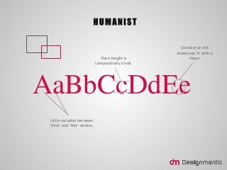
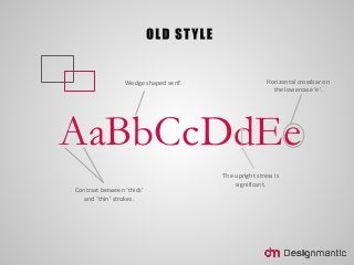
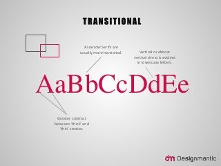

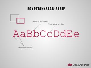
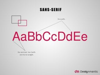


The Type Classification is the nomenclature that defines characteristics of Typeface. The classification system was derived in the 17th century where typography was divided into five broad categories – Humanist, Old Style, Transitional, Modern, Slab Serif or Egyptian and Sans Serif – based on different characteristics. Today, a number of variation of this system exist but the basis remains the same. Let’s dive into the lingua franca of typography and gain greater understanding of what different types entail.


