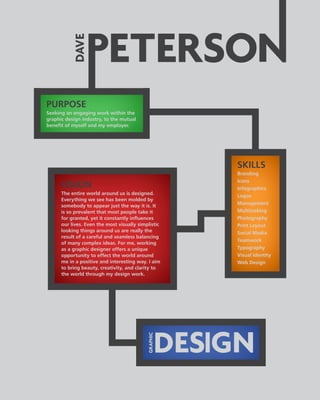
1. PURPOSE
Seeking an engaging work within the
graphic design industry, to the mutual
benefit of myself and my employer.
VISION
The entire world around us is designed.
Everything we see has been molded by
somebody to appear just the way it is. It
is so prevalent that most people take it
for granted, yet it constantly influences
our lives. Even the most visually simplistic
looking things around us are really the
result of a careful and seamless balancing
of many complex ideas. For me, working
as a graphic designer offers a unique
opportunity to effect the world around
me in a positive and interesting way. I aim
to bring beauty, creativity, and clarity to
the world through my design work.
SKILLS
Branding
Icons
Infographics
Logos
Management
Multitasking
Photography
Print Layout
Social Media
Teamwork
Typography
Visual Identity
Web Design
2.
3. ADDITIONAL INFO
Size: 18in by 24in
Media: Printed on Kodak Enhanced Matt Paper @ WSU
Digital Photography Lab
For: AGD-2250 Typography, Fall 2014, WSU
(Professor Dan McCafferty)
Utilizing: Adobe Illustrator, InDesign & Photoshop CC
THE SILENCE
LETTERFORM
GENERATING A FITTING ADDITION
Beginning with an extensive visual study of the existing font, Bodoni, I
created a unique letterform to fit within this font set. The form had to
encapsulate and blend into the preexisting ascetics, as well as have a
unique sound, use, and name associated with it. I chose this letterform,
because it showcases the beauty of the smooth yet large shifts in line
weights of Bodoni letterforms. The sound (of silence) and name actually
came to me before I began my sketches. The form was cut from wood
using a laser plotter and painted black. Lastly, I created a poster to
communicate and showcase the unveiling of my new letterform.
4.
5. A RECORD COLLECTION
DOUBLE BOOK
ADDITIONAL INFO
Size: 10in by 49in (each)
Media: Printed on Heavy Bond Paper @ WSU Student
Center Graphics
For: AGD-6260 Advanced Typography, Winter 2016,
WSU (Professor Dan McCafferty)
Utilizing: Adobe Illustrator & InDesign CC
EXAMINING TYPOGRAPHICAL IMPACT
Part of an advanced study into the function of typographic form, space,
and balance. The intent was to show how typographic choices could alter
the tone of a written work. For this experiment I took an identical piece
of copy that I wrote, and visually arranged into two completely different
accordion books. The result is a completely different take on the identical
text for most readers. Each book recollects the feeling of going to a room
to listen to music; one expressing energy of the music itself, and the
other highlighting the comforting, calming nature of the space within
the room to the reader.
6.
7. A LOOK @ TYPE
PROCESS BOOK & BLOG
ADDITIONAL INFO
Book Size: A5 (approximately 5.268in by 8.2677in)
Media: Printed on Regular Matt Paper @ WSU Graphic
Design Lab
For: AGD-2250 Typography, Fall 2014, WSU (Professor Dan
McCafferty)
Utilizing: Adobe Illustrator, InDesign & Photoshop CC
SHOWCASING TYPOGRAPHY BASICS
When I first began seriously studying typography in depth, I was lucky
enough to have a teacher that required us to keep a detailed blog of our
explorations, projects, and class discussions. By then end of the term I
had amassed a huge amount of information from key word definitions,
to a list of type crimes, and all of the process work along the way in great
detail. From this plentiful source I designed a more condensed printed
book, which highlights in both design and content, the knowledge I had
accrued during my introduction to typography studies. To this day the
blog and book serve to help new WSU typography students.
8.
9. CHOOSE YOUR OWN
ADVENTURE GAME
ADDITIONAL INFO
Size: 1000p by 720p
Media: Digital Online Display (optimized for standard
monitor size, web viewing)
For: AGD-3260 Introduction to Interactivity, Fall 2014,
WSU (Professor Chris Mendoza)
Utilizing: Adobe Dreamweaver, Illustrator & Photoshop CC
CREATING A VIRTUAL ENVIRONMENT
This game is essentially a web based version of the classic Choose Your
Own Adventure style books. The challenge was to build a navigable
web space using a combination of CSS, and HTML. I was a fan of the
C.Y.O.A. books growing up, but always thought that a lot of the death/
loss sequences lacked connectivity to the story, and so I created this space
with that theme in mind. There are multiple rooms to explore, and over a
dozen possible endings. The visual style I set up is an emulation of early
80s computer adventure/exploration games (from the same era as the
books) with manipulated images I collected online.
10.
11. ALTERNATE SPACE
IMAGE COMPOSITES
ADDITIONAL INFO
Size: 6000p by 4800p (digital) & 20in by 16in (print)
Media: Digital Display & Printed on Kodak Premium
Luster Paper @ WSU Digital Photography Lab
For: APH 3420 Digital Imaging 2, Winter 2016, WSU
(Professor Kate Levy)
Utilizing: Adobe InDesign & Photoshop CC
MANIPULATING IMAGE & IMPLICATION
This collection of images comes from a project that challenged me to
alter the images of an existing image library to express a new idea. I
chose to work with NASA’s online image gallery. The final four images
together, explore what modern day NASA images could look like if
they had retained their budget from the Apollo Moon Mission era. I
also redesigned their current website to match. A lot of the ideas came
from reading classic science-fiction from the early Space Race decades
(especially Isaac Asimov). Great detail was given to accurate portrayals,
both visually and scientifically wherever possible.
12.
13. EASTERN MARKET
AFTER DARK POSTER
ADDITIONAL INFO
Size: 24in by 36in
Media: Printed on Kodak Enhanced Matt Paper @ WSU
Digital Photography Lab
For: Eastern Market After Dark Poster Competition 2015
(part of The Detroit Design Festival)
Utilizing: Adobe Illustrator, InDesign & Photoshop CC
VISUAL HIERARCHY & INTEGRATION
This design was for the 2015 Eastern Market After Dark poster
competition, held in conjunction with the Detroit Design Festival. The
restrictions set were; to create a poster design suitable for a bi-color
screen print on either black or white paper using a preset color palette
consisting of a specific selection of blue or pink, to incorporate the
existing 2015 Detroit Design Logo, and list the relevant information. I
chose to highlight the location of the event visually, and let the text and
existing logo speak for the time and association. I also picked the blue
that matched the existing logo along with black, on white paper.
15. OLD MAIN
BRAND IDENTITY
ADDITIONAL INFO
Size: Various & Adjustable
Media: Digital Display & Printed on Regular Matt Paper @
Wayne State University Graphic Design Lab
For: AGD-5250 Graphic Design 3, Fall 2015, Wayne State
University (Professor Danielle Aubert)
Utilizing: Adobe Illustrator, InDesign & Photoshop CC
BUILDING RECOGNITION & CONTINUITY
Re-branding requires a thorough understanding of the existing aesthetics
and connotations of the target. Fellow designer, Jaime Rowland, and I
choose to build a new and more unified identity for one of our favorite
buildings in Detroit, the Old Main building (which has stood countless
changes to both style and purpose). Today it is an integral and highly
recognizable part of the Wayne State University main campus. The results
of extensive on site studies into defining characteristics of the location,
and of the established color scheme helped shape our logo and brand
style. These are but a sampling of the possible uses of said construct.
16.
17. HOME MAP
& ICON SET
ADDITIONAL INFO
Size: 17in by 11in
Media: Printed on Kodak Enhanced Matt Paper @ WSU
Digital Photography Lab
For: AGD-4250 Graphic Design 2, Spring 2015, WSU
(Professor Stephen Schudlich)
Utilizing: Adobe Illustrator, InDesign & Photoshop CC
VISUALLY DEPICTING INFORMATION
The map and corresponding icons presented here are the result of
explorations into map making itself, and functional visual representations
of objects. It features the various rooms and important items within my
own home. I began with a photo of my house, converted it to vector
form, which I then divided into rooms on a flat layout. Each icon was
uniquely crafted to portray the item it represented in the style of the
overall map itself. There is no map key, only design and contextual clues.
The only text is the title, room names, and the location indicator (based
on where it hangs in my actual home).
18.
19. DETOURS
MAP SET & BLOG
ADDITIONAL INFO
Map Size: 20in by 16in (large) & 13.75in by 11in (small)
Media: Printed on Heavy Bond (large) & Semi-gloss
(small) @ WSU Student Center Graphics
For: AGD 5997 Graphic Design 4, Winter 2016, WSU
(Professor Stephen Schudlich)
Utilizing: Adobe Illustrator, InDesign & Photoshop CC
INTRIGUING & INFORMATIVE DELIVERY
This map set and accompanying blog is a team effort between myself and
designer Jaime Rowland originally created for the exhibition, PrettyDirty,
at the renowned Scarab Club (which showcased Graphic Design relating
to the urban atmospheres of Detroit and New York City). Together
we designed a detailed set of unified maps that guide participants
down three beautiful and unique routes around Detroit. The map set
is designed to be simultaneously; eye-catching, highly informative, and
stimulating. The corresponding blog (which aids and enhances user
experience and connectivity) utilizes the same style and organization.