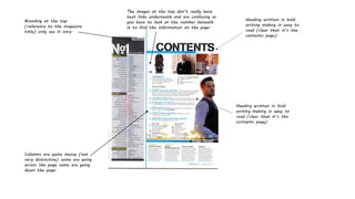
1. Branding at the top
(reference to the magazine
title) only see it once.
Heading written in bold
writing making in easy to
read (clear that it’s the
contents page).
Columns are quite messy (not
very distinctive) some are going
across the page some are going
down the page.
The images at the top don’t really have
text links underneath and are confusing as
you have to look at the number beneath
it to find the information on the page.