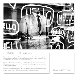
1. I INTRODUCTION I Selected Portfolio Samples I
My love and professional pursuit of Graphic Design stems from my love of the written language
and the power it carries tenfold when paired with equally provocative imagery; therefore, my style
is manifested through exacting yet eloquent typographic displays.
My extensive freelance background sets me apart from other applicants because I have a proven
ability to adapt to various environments and successfully solve the tasks given without the limitation
of being chained to one field.
I now want to transition from freelance into a staff creative or artistic director role and would love
an opportunity to share my expertise in an open, forward thinking environment. BRANDON KIZART-HAYNES
2. Film credits are the inspiration/treatment behind TFI’s brand update. Exposing & experimenting with their direction injects energy into a once staid layout.
I BRANDING, MARKETING & PROMOTION I Tribeca Film Institute I
01of 10
3. I elevated Elle’s iPad edition from editorial facsimile to a Webby™ nominated feature.
I EDITORIAL & DIGITAL I ELLE Magazine iPad Development I
02 of 10
ROCK
GARDEN
EditEd by emily dougherty
more!
(scroll)
big,brighteyes;majorhair;andmore...
I
’m a Gemini, so I tend to fling from one thing
to another,” says Gucci face Abbey Lee Ker-
shaw (seen here backstage at the house’s
spring/summer 2012 show) of her fragrance
preferences. With the launch of Gucci’s Flora
Garden Collection, the supermodel has five
new potions to play with. Gucci creative direc-
tor Frida Giannini built each perfume around
the botanicals—gardenia, magnolia, tuberose,
violet, and mandarin—that star in the iconic
Flora pattern created for Grace Kelly by illus-
trator Vittorio Accornero in 1966. While each
can stand alone, Giannini recommends layer-
ing. “I start in the morning with tuberose and
end the day with violet,” she says. “You can tell
what mood I’m in based on what I’m wearing.”
Pat McGrath, P&G’s global
creative design director,
created a “deco-elegant
’20s smoky eye” with
SmokyShadowBlast in Onyx
Smoke, Eye Enhancers 1-Kit
Shadows in Shimmering
Onyx, and Liquiline Blast
Eyeliner in Black Fire, all
by CoverGirl.
ELLEbehindthecover
1/2
Swipe down for more!
LET’S GET
PHYSICAL
Lively on set in
Isabel Marant
Alexander Wang
4. 03 of 10
I sought to strike a balance with Cosmopolitan.com’s sardonic humor and
the glamour & fashion their magazine equivalent is well known for.
Therefore, emphasis was placed on headlines written in a Millennial voice−
mimicking their female audience’s interesting thoughts over an idealized image.
Clockwise (top to bottom):
YouTube Channel Banner Online guests celebrities are featured here weekly.
YouTube Video Thumbnail
Cats Abs Thumb scene for an original video I art-directed with over 330k views.
Website Video Placeholder
I BRANDING (WEB VIDEO) I Cosmopolitan.com I
5. I ENVIRONMENTAL I I
Herman Miller Traveling Student Day Signage I
04 of 10
Intersecting lines illustrate the scintillating conversation produced
when fresh enthusiastic minds interact with the brand.
This traveling scrim display and materials were first featured
at the NeoCon Design Exposition.
Top to bottom:
Scrim Cad Display Printed on HM space-age, office chair fabric
Welcome Event Board The schedule sheet was alterable
Laminated One-Pocket Folder Located on the Scrim Display
6. Monterey needed a compact, changeable swatch system in lieu of replacing fixed
binders each product release, so I created a custom, flip-down box booklet for
easy access to six carpet swatch cards to be updated or switched at will.
I PACKAGING I Monterey Carpets I
05 of 10
7. ADVERTISEMENT
coming this fall
The new
your voice. your style. your life.
THE DAILY ONLINE DESTINATION FOR BLACK WOMEN
EVERY DAY NEW
MORE WAYS TO CONNECT
Fashion,
beauty
relationship stories
Celebrity
News
Editors’
QA
StealsandDeals
I ADVERTISING I I
Essence.com Magazine Ad I
06 of 10
When Rihanna decided to be the face of
Essence.com’s relaunch, a beautiful and
captivating typographic display was needed
to match the artist’s look and presence.
8. The pairing of the thin, gestural lines in my illustration of golf great Arnold Palmer with the
commanding presence of a slab serif provided tension that was effective in drawing attention
to the invite’s message and a crowd to Cargo Magazine’s club event.
I WEB MARKETING I Cargo Magazine Event E-blast I
07of 10
9. 08 of 10
I EDITORIAL I I
Print Magazine I
Print wanted to breath new life into the
various sections of their magazine without
a complete visual re-haul.
For interviews, I designed colored, dialogue
boxes that excites the eye when littered
throughout the text.
10. Clockwise (top to bottom):
Echo Lounge Martini Bar
CosmoMag.com Rebrand Suggestion
Peg Spicknall Logo reconfigures
throughout stationary
Nick On The Go Mobile Video Service
History Channel Retro TV bars double
as a bookshelf
I BRANDING I I
Select Logo Treatments I
09of 10
11. For 12 years I’ve practiced photography and wanted to share a small aspect of myself and skill set.
What began as a creative hobby has grown into a professional passion that I continue to explore.
Clockwise (left to right):
“Triangles” 2013
“Welcome Sign Home” (Malvern, AR) 2014
“On Display” (Richard Serra) 2014
I PHOTOGRAPHY I Personal Photographic Explorations I
10 of 10
12. Blackberry Farm is an upscale resort in
the mountains of Tennessee.
With such a wealth of information to
display from rates to activities to employ-
ment opportunities, a streamlined frame
was created to unify the website (their
main hub of information) and their news-
letter, its printed equivalent.
I BRANDING I I
Blackberry Farm I
Supplemental Selection
13. I created a binder system to educate SI’s
sale reps about Patternlok, where carpet
panels are aligned to make a seamless
carpet pattern.
BW line illos diagrams referenced this
while simplifying a complicated process.
Clockwise (top to bottom):
Specifier Binder Thermographic imprint
Specifier Guide 2-color to cut cost
Custom Binder Tabs w/ metallic ink
Specifier Guide Inside Spread
I PACKAGING I I
Synthetic Industries I
Supplemental Selection
14. Masters of Design is one of Fast Com-
pany’s flagship editorial packages and
events. I was responsible for expand-
ing upon the logo treatment featured
in the magazine and developing the
marketing and event material’s design.
Given the logotype’s strong features I
sought to mimic the cunning rigid-
ness with my informational hierarchy.
To balance the layout, I paired this
with free flowing curves that I felt
represented the mysterious spark that
is creativity.
Clockwise (left to right):
Printed Invite
Main Stage Backdrop
Cocktail Table Graphics
Bar Sponsor Highlight
I BRANDING EVENT I I
Fast Company I
Join Fast Company and our 2009 Masters of Design at an
exclusive gala reception.
Connect with the luminaries who are making an impact
on the future of architecture, interiors, brand identity, and
product design, as featured in our October issue.
6:00PM Doors open • 6:15PM Conversation
with The Masters • 7:00PM—9:00PM Cocktail
reception and gallery viewings
This invite is non-transferable • Space is limited
Only the first 200 rsvps will be accommodated
Thanks to our partners:
WEDNESDAY, OCTOBER 21 • 6:00PM—9:00PM
CHELSEA ART MUSEUM • 556 W 22ND ST, NYC
CELEBRATE THE BUSINESS OF DESIGN
PLEASE RSVP BY OCTOBER 1 • RSVP@FASTCOMPANY.COM
Supplemental Selection