Download to read offline


![References
source code for this presentation available at https://github.
com/Badger-MEILI/Visualizing-Activity-Sequences
source code for the MEILI family available at
https://github.com/Badger-MEILI
paper on sequential stability of travel behaviour
– A. C. Prelipcean, Y. Susilo, G. Gid´ofalvi. Longest common subsequences:
Identifying the stability of individuals’ travel patterns. Submitted to
Transportation Research Part B.
papers on travel diary data collection with MEILI
– A. C. Prelipcean, G. Gid´ofalvi, and Y. Susilo. 2014. “Mobility Collector”,
in the Journal of Location Based Services, Volume 8, Issue 4, pages
229-255, DOI: 10.1080/17489725.2014.973917
– A. C. Prelipcean, G. Gid´ofalvi, and Y. Susilo. 2016. “Measures of
transport mode segmentation of trajectories”, in the International
Journal of Geographical Information Science, Volume 30, Issue 9, pages
1763-1784, DOI: 10.1080/13658816.2015.1137297. [link]
– A. C. Prelipcean, G. Gid´ofalvi, and Y. Susilo. “MEILI: an activity travel
diary collection, annotation and automation system” submitted to
Journal of Urban Technology
15](https://image.slidesharecdn.com/bostonviz-170409101912/85/Detecting-and-visualizing-the-stability-of-activity-chains-with-longest-common-purpose-subsequences-36-320.jpg)


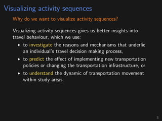
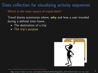
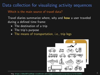
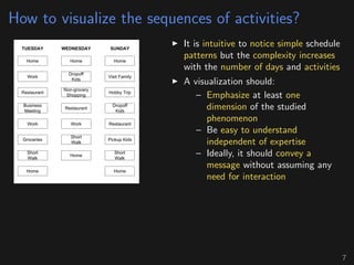
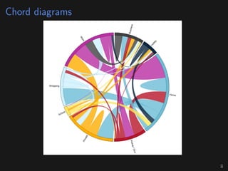
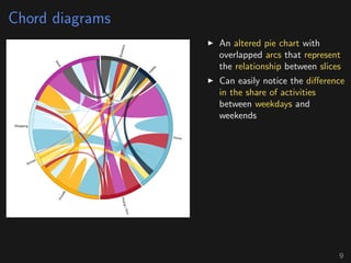
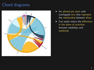
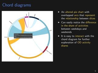
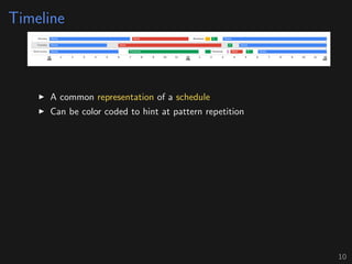
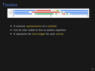
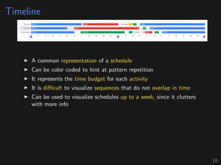
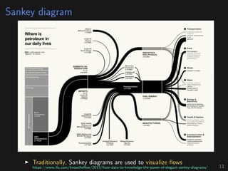
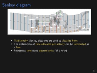
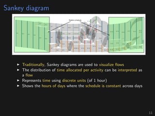
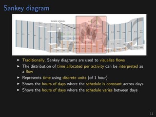
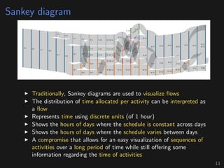
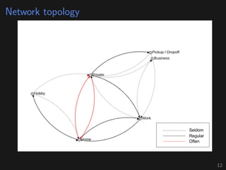
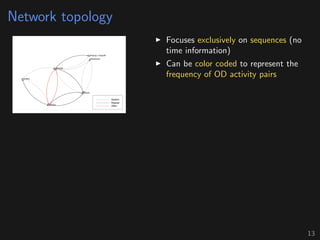
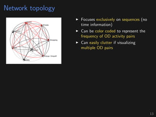
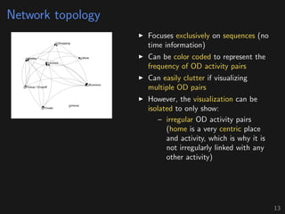
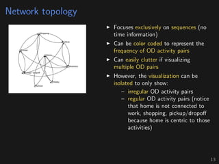
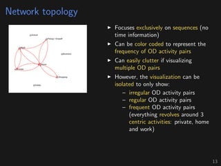
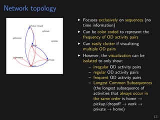
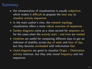
The presentation discusses the visualization of activity sequences to enhance understanding of travel behavior, utilizing travel diaries as the primary data source. Various visualization techniques, including chord diagrams, timelines, Sankey diagrams, and network topologies, are evaluated for their effectiveness in representing activity sequences and their complexities. The author concludes that network topology offers the most comprehensive overview while other methods serve specific purposes depending on the nature of the data being analyzed.


![ANIMAL_CELL_,_TISSUE_AND_ORGAN_CULTURE[1].pptx](https://cdn.slidesharecdn.com/ss_thumbnails/animalcelltissueandorganculture1-260204172026-4462b440-thumbnail.jpg?width=640&height=640&fit=bounds)


