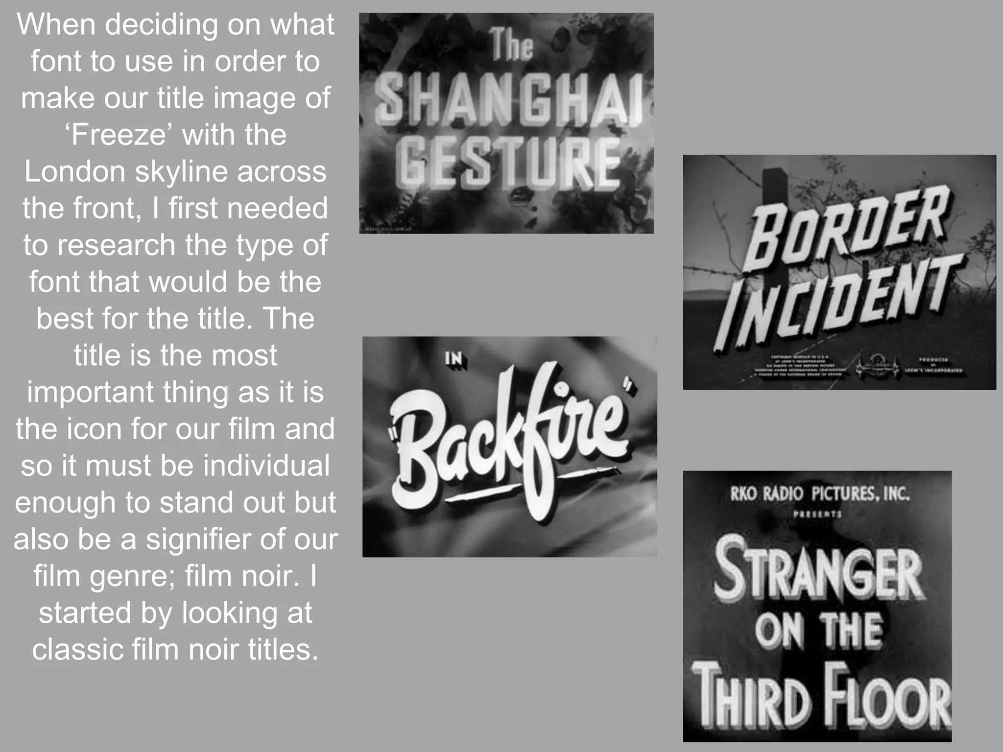
The document discusses typography choices for the title of a neo-noir film called "Freeze." [1] It examines fonts used in classic film noir titles such as serif fonts with decorative edges and titles with backdrops or shadows. [2] It also looks at newer neo-noir titles experimenting more with colors. [3] The summary discusses choosing an uppercase bold font with varying letter sizes and placing the title over an image of the London skyline to reflect the film's setting.