SlideShare a Scribd company logo
1 of 53
Download to read offline
1


WHAT THE FONT?
     volume one
1


                                                                   WHAT THE FONT?
                                                                        volume one


Every two weeks, the Art Directors at TBWAHuntLascaris - Johannesburg get together
    to inspire one another. During one of these sessions, a challenge was put forward.
       Design your own typeface or font. And three weeks later, these were the results.
                                               WHAT THE FONT? volume one. Enjoy.
Name: Choc Star


                        Designer: Justin Wright


Combining Freud’s views on anal retentiveness
  and the Egyptians beliefs that cats are gods,
we naturally arrived at the Chocolate Starfish
 font. It’s natural versatility made it perfect for
    thin italic, textured, bold and bitmapped...
 allowing the user to achieve more expression
                          in their chosen media.
  Even with the controversial banning in some
parts of Germany, we believe it’s a font for all
       to use – the font for the modern family.
Title: ALFAbet
Designer: Jacque Moodley


         The love of Puns
        and Alfa Romeos
Title: White on white
                    Designer: Bruce Harris
   (with the loving help of Jason Murison)


There isn’t any crazy concept here so stop
  looking. All I wanted to do was design
  a typeface that I thought was nice and
 would be proud to show my mother, so I
   showed her last night and she loved it.
    It also helps that white is my favourite
     colour and I like to punish myself by
 sitting for hours on end in the studio and
          on photoshop. Hope you like it.
Title: “Recycle Bitches”
               Designer: Coenraad Grebe


     This particular font is based around the
 thought that everything should be recycled
    / re-used / re-appropiated / re-looked /
    re-engineered. Also it serves as a call to
  action and a rally cry of sorts. This served
   as my inspiration to re-look existing fonts
(both designer and common), with the intent
  of borrowing, stealing and mashing them
 up to create something new, if not original.
   So, thanks to Helvetica, Gill Sans, Times,
   Rockwell and M/M Paris for allowing me
        (not intentionally) to rally the troops.
Title: Zip It
Designer: Erika Spethmann


The client in reception who
  forgot to pull up his zip…
            I saw an ‘O’…
 and the rest just followed.
Title: Clip Art
  Designer: Graeme van Jaarsveld


 Working in an office environment
     I wanted to create a font that
    related to that, and that had a
different touch to the normal bland
   kind of look. The look I went for
   was almost that of a darkroom/
        photographic kind of look.
Title: Pins and Needles
                     Designer: Ilze Venter


       My inspiration was the creation of
  something new out of bits and pieces of
fabric, scraps and anything I could find in
my cupboards. When people talk they cut,
add, pin and mix words together to make
 a sentence. It reflects my love for making
                          things by hand.
Title: Disco
                            Designer: Jacx


      In the light of the festivities and all
   the parties in and around the agency
    I found it fit to do a Disco font. Using
   the mirror ball as my main inspiration,
(taking me back to my bedroom DJ days)
I created a font which represents a bit of
my past. So being the party animal that I
       am it just seemed like a perfect fit.
             I’m a 80’s baby after all. Lol.
Name: Obession
             Designer: Shelley & Nadja


   To show the love-affair women have
with shoes, we turned it into a typeface.
w
Title: A Type of Font
               Designer: Jens Henkel


A font made up of a continuous story.
    Each letter leading onto the next.
           A type making up a type,
                 while telling a story.
Title: Desktop Font
              Designer: Adam Weber


       This typeface is inspired by the
patterns and shapes made by folders
and files that clutter our mac desktops.
 It is based on the Din font family and
        was created using photoshop,
   screen savers and command-shift-3.
Title: Eat Your Words
Designer: Jodi Smith & Laura Grobler


             Say what you mean or
                  eat what you say!
Name: 6MM
                  Designer: Kerry Moralee


My goal whilst creating the 6mm font was
 to turn completely unaesthetic items such
  as 6mm nuts and varied 6mm bolts into
  elegant letters making up a font without
 messing with their original form. So what
   you’re seeing is a font made from only
     6mm bolts and nuts, that you find at
  any hardware store, assembled without
   perversion of their true form into a font.
Name: “PIN-UP”
          Designer: Kursten Meyer


     I pin up all my ideas, layouts,
inspiration, references and scamps
                 on my pin board.
     It’s something I use every day
 and therefore was the inspiration
                   behind my font.
Name: “Pegs”
Designer: Lucas & Sarel


   The font was inspired
      by a lady we saw
hanging clothes onto the
washing line using pegs.
Name: “Marv. The Font”
                     Designer: Marvin Zwambila


        Inspired by my character in terms of the
   properties a wire holds. For starters it can be
    bent to make almost any shape, can handle
    electricity and of course is straight and hard.
 Because of these properties wire is often stolen
off fences, train cables and other areas. So wire
   is an essential part of our society, just like me.
      P Apologies to the passenger trains that
      .S.
       ran late. Find solace in knowing the wire
             was used to uplift a poor individual.
Name: Summoned
               Designer: Melanie Moore


      My font went through many stages
           before reaching the final idea.
         It was inspired by naughty boys
who take the warning label on deodorant
    cans as an instruction manual for fun.
Name: 2D
                               Designer: Natalie le Roux

This typeface was inspired by CMYK and photography. CMYK
       is a layered printing process, which uses four inks (Cyan,
   Magenta, Yellow and Black) to create realistic images onto
  a 2D paper surface. Photography is a way of capturing and
 representing reality on a 2D surface. I have included some of
  my cameras and the overlapping CMYK effect on the board
                                        to depict the inspiration.

       Technically, the font is designed by layering CMYK strips
         across each other to form characters. Because all three
   C, M and Y never intersect with each other to create black,
       I have placed black and grey photographs behind them,
          to give some sense of light and depth to the typeface.
 The photographs used are some of my own and some of my
           favourites. Another element of the typeface is the use
of right triangles, which have been sliced off on one strip and
     replaced somewhere else on each character to add some
                   interest and form serifs and geometric curves.
Name: My Wire Blocks
                                Designer: Pieter Steyn


    This font is based on the 6 fonts most commonly
    used by us in the agency including Arial, Futura
   and Myriad and Trebuchet. I used a 3D effect in
   Illustrator, and made the wire/block shapes. Later
   in InDesign I factorised the letters. I only used the
   block Capitals as they represent the building and
       construction TBWA is undergoing at the new
   building, as well as the indifference between the
nation, there should be no difference between upper
     and lower case or class (in an absolute world).
Name: Rock Art
                      Designer: Tebogo


        Disrupting rock art into a font...
Why because the khoi people used rock
     art to communicate and tell stories,
  so I designed rock art font for people
       to use and communicate and tell
                      interesting stories.
Name: Dirty Words
                 Designer: Thereza Grala


      All the things a person says during
their day that they wish they’d never said.
Name: Scaff
  Designer: Shelley, Nadja & Raff


Inspired by moving into a building
      that’s half-complete and the
     scaffolding that surrounds us.
Name: 1810 Extra Bold
                                                      Designer: Michael Muller


  As creatives we spend many hours brainstorming, writing and crafting thoughts and ideas
      so that they hopefully come to fruition and ultimately a crescendo of inner satisfaction.

    Most of these ideas start out as scamps and thoughts scribed by the hand of the creative
 in bursts of optimism – the belief you could have possibly cracked something that will make
                                               your CD smile and your peers green with envy.

This very handwriting, that is the beginning of the physical formation of ideas is as unique to
   everyone as our fingerprints and through analysis can very accurately reveal who we are.
                         And who we are is predominantly a combination of life experience.

      That being said, life experience and the fingerprint it leaves in the form of handwriting
                         coupled with the love of my work are the inspiration for my typeface

                                                                              1810 Extra Bold.

The brown paper element represents the reams of paper that I consume trying to crack ideas
  and the typeface is an adaption of my handwriting. The name 1810 Extra Bold is made up
 of two parts, my birthday – 18 October and the Extra Bold is a reflection of my personality.
Name: Tape
                            Designer: Wihan Meerholz


          All the best memories and most classic times
        are kept on the most classic thing, video tapes.
They tell a story and could even spell things out for us.
Name: Semiotic Typeface

                                                   Designer: Katleho Mofolo


         My typeface is inspired by contours, semiotics1 human signs and
                                                             ,
    contortionists. Everyday we consciously and subconsciously see signs
wherever we go, in and around cities and towns, on traffic lights, toilets,
gates etc. These street signs or signs are visuals read as text subliminally
      and help communicate a range of commands, warnings, clues and
    sometimes indicate future change. Everyone succumbs to these signs
and whenever one defies them danger occurs e.g. accidents. I see them
   as fascinating signage because even illiterate people can understand
   what they convey unlike the ordinary code of plain wording. I find the
    shapes that contortionists transform themselves into when performing
      as extraordinary exhibitions to demonstrate human body capability.
      I think contortionists literally prove that limits are only as real as the
     mind comprehends them to be. The forms and shapes that they turn
themselves into physically articulate man power in a different dimension
    of body art, and through the contorting of the their bodies I perceive
  art. I decided to name my typeface SEMIOTIC because of the study of
   semiotics which explains the importance of sign conventions and sign
 theory to mankind. I believe the study of symbols, codes, indexes, signs
 and signifiers assists to simplify communication for better understanding
                                about different or foreign behavioral patterns.
Wtf 1

More Related Content

What's hot

Digital Graphics Evaluation Pro Forma
Digital Graphics Evaluation Pro FormaDigital Graphics Evaluation Pro Forma
Digital Graphics Evaluation Pro FormaChris Bailey
 
Evaluation media
Evaluation mediaEvaluation media
Evaluation mediaLauraKatieM
 
Design for non-designers: five visual principles to guide you
Design for non-designers: five visual principles to guide youDesign for non-designers: five visual principles to guide you
Design for non-designers: five visual principles to guide youDavid Hall
 
Surrealism Textual Analysis - Rebecca Lin
Surrealism Textual Analysis - Rebecca LinSurrealism Textual Analysis - Rebecca Lin
Surrealism Textual Analysis - Rebecca LinRebeccaTLin
 
Demo presentaion for odesk job
Demo presentaion for odesk jobDemo presentaion for odesk job
Demo presentaion for odesk jobNazmul Islam
 
Digital graphics evaluation pro forma
Digital graphics evaluation pro formaDigital graphics evaluation pro forma
Digital graphics evaluation pro formagrace kennedy
 
Graphic Design Portfolio
Graphic Design PortfolioGraphic Design Portfolio
Graphic Design PortfolioOliver Morris
 
99 development pro forma
99 development pro forma99 development pro forma
99 development pro formaretroflex
 
Digital graphics evaluation pro forma 3
Digital graphics evaluation pro forma 3Digital graphics evaluation pro forma 3
Digital graphics evaluation pro forma 3Amelia101
 
Development
DevelopmentDevelopment
DevelopmentDemi Jay
 
Question 1 new
Question 1 newQuestion 1 new
Question 1 newColahyp
 
Digital graphics evaluation pro forma 3
Digital graphics evaluation pro forma 3Digital graphics evaluation pro forma 3
Digital graphics evaluation pro forma 3Amelia101
 

What's hot (18)

Digital Graphics Evaluation Pro Forma
Digital Graphics Evaluation Pro FormaDigital Graphics Evaluation Pro Forma
Digital Graphics Evaluation Pro Forma
 
Evaluation media
Evaluation mediaEvaluation media
Evaluation media
 
Design for non-designers: five visual principles to guide you
Design for non-designers: five visual principles to guide youDesign for non-designers: five visual principles to guide you
Design for non-designers: five visual principles to guide you
 
Evaluation q1
Evaluation q1Evaluation q1
Evaluation q1
 
Surrealism Textual Analysis - Rebecca Lin
Surrealism Textual Analysis - Rebecca LinSurrealism Textual Analysis - Rebecca Lin
Surrealism Textual Analysis - Rebecca Lin
 
Demo presentaion for odesk job
Demo presentaion for odesk jobDemo presentaion for odesk job
Demo presentaion for odesk job
 
Digital graphics evaluation pro forma
Digital graphics evaluation pro formaDigital graphics evaluation pro forma
Digital graphics evaluation pro forma
 
Graphic Design Portfolio
Graphic Design PortfolioGraphic Design Portfolio
Graphic Design Portfolio
 
99 development pro forma
99 development pro forma99 development pro forma
99 development pro forma
 
Changed Fmp pre production
Changed Fmp pre productionChanged Fmp pre production
Changed Fmp pre production
 
Changed Fmp pre production
Changed Fmp pre productionChanged Fmp pre production
Changed Fmp pre production
 
FMP Pre Production Refined
FMP Pre Production RefinedFMP Pre Production Refined
FMP Pre Production Refined
 
FMP Pre Production
FMP Pre ProductionFMP Pre Production
FMP Pre Production
 
7. evaluation
7. evaluation7. evaluation
7. evaluation
 
Digital graphics evaluation pro forma 3
Digital graphics evaluation pro forma 3Digital graphics evaluation pro forma 3
Digital graphics evaluation pro forma 3
 
Development
DevelopmentDevelopment
Development
 
Question 1 new
Question 1 newQuestion 1 new
Question 1 new
 
Digital graphics evaluation pro forma 3
Digital graphics evaluation pro forma 3Digital graphics evaluation pro forma 3
Digital graphics evaluation pro forma 3
 

Viewers also liked (13)

ANNIE 2009 Presentation
ANNIE 2009 PresentationANNIE 2009 Presentation
ANNIE 2009 Presentation
 
MWGkansas2009
MWGkansas2009MWGkansas2009
MWGkansas2009
 
teori kematangan
teori kematanganteori kematangan
teori kematangan
 
GoGo Travel
GoGo TravelGoGo Travel
GoGo Travel
 
Family tree pp
Family tree ppFamily tree pp
Family tree pp
 
teori kematangan
teori kematanganteori kematangan
teori kematangan
 
222501255 que-es-la-historia-ahora (1)
222501255 que-es-la-historia-ahora (1)222501255 que-es-la-historia-ahora (1)
222501255 que-es-la-historia-ahora (1)
 
La presión arterial y su salud
La presión arterial y su saludLa presión arterial y su salud
La presión arterial y su salud
 
kurikulum
kurikulumkurikulum
kurikulum
 
Advanced Qtp Book
Advanced Qtp BookAdvanced Qtp Book
Advanced Qtp Book
 
The Baroque Orchestra
The Baroque OrchestraThe Baroque Orchestra
The Baroque Orchestra
 
Eminem
EminemEminem
Eminem
 
TBWA\Hunt\Lascaris Print
TBWA\Hunt\Lascaris PrintTBWA\Hunt\Lascaris Print
TBWA\Hunt\Lascaris Print
 

Similar to Wtf 1

Evaluation 2
Evaluation 2Evaluation 2
Evaluation 2emmaguest
 
Question 1
Question 1Question 1
Question 1Emily852
 
creating my masthead
creating my mastheadcreating my masthead
creating my mastheadtheresakuhn4
 
Introduction to Communication Design
Introduction to Communication DesignIntroduction to Communication Design
Introduction to Communication DesignSarun Pinyarat
 
Greg Dixon Media Evaluation
Greg Dixon Media Evaluation Greg Dixon Media Evaluation
Greg Dixon Media Evaluation GregglesDee
 
What i learnt from my audience feedback
What i learnt from my audience feedbackWhat i learnt from my audience feedback
What i learnt from my audience feedbackjademilnthorpe1997
 
Fontface issue 3
Fontface issue 3Fontface issue 3
Fontface issue 3Gemmalea
 
Question 2
Question 2Question 2
Question 2maudyb
 
Frutiger Talk by Mark Simonson
Frutiger Talk by Mark SimonsonFrutiger Talk by Mark Simonson
Frutiger Talk by Mark SimonsonCigdem Patlak
 
Designing Communication-new5
Designing Communication-new5Designing Communication-new5
Designing Communication-new5Erika Cole
 
Question 1 poster section
Question 1  poster section Question 1  poster section
Question 1 poster section etaylorchs
 
My Media Presentation
My Media PresentationMy Media Presentation
My Media Presentationduschan
 

Similar to Wtf 1 (20)

Evaluation 2
Evaluation 2Evaluation 2
Evaluation 2
 
Question 1
Question 1Question 1
Question 1
 
my creative resume
my creative resume my creative resume
my creative resume
 
creating my masthead
creating my mastheadcreating my masthead
creating my masthead
 
Evaluation q1
Evaluation q1Evaluation q1
Evaluation q1
 
Introduction to Communication Design
Introduction to Communication DesignIntroduction to Communication Design
Introduction to Communication Design
 
Evaluation q1
Evaluation q1Evaluation q1
Evaluation q1
 
Evaluation q1
Evaluation q1Evaluation q1
Evaluation q1
 
Greg Dixon Media Evaluation
Greg Dixon Media Evaluation Greg Dixon Media Evaluation
Greg Dixon Media Evaluation
 
Emilytypography
EmilytypographyEmilytypography
Emilytypography
 
What i learnt from my audience feedback
What i learnt from my audience feedbackWhat i learnt from my audience feedback
What i learnt from my audience feedback
 
Fontface issue 3
Fontface issue 3Fontface issue 3
Fontface issue 3
 
Question 2
Question 2Question 2
Question 2
 
Frutiger talk
Frutiger talkFrutiger talk
Frutiger talk
 
Frutiger Talk by Mark Simonson
Frutiger Talk by Mark SimonsonFrutiger Talk by Mark Simonson
Frutiger Talk by Mark Simonson
 
Designing Communication-new5
Designing Communication-new5Designing Communication-new5
Designing Communication-new5
 
Question 1 poster section
Question 1  poster section Question 1  poster section
Question 1 poster section
 
AOMC Book sample pages
AOMC Book sample pagesAOMC Book sample pages
AOMC Book sample pages
 
Evaluation
EvaluationEvaluation
Evaluation
 
My Media Presentation
My Media PresentationMy Media Presentation
My Media Presentation
 

More from TBWA\South Africa (8)

Consumer Trends in 2011
Consumer Trends in 2011Consumer Trends in 2011
Consumer Trends in 2011
 
2010 TBWA Fact Sheet
2010 TBWA Fact Sheet2010 TBWA Fact Sheet
2010 TBWA Fact Sheet
 
TBWA\ Backslash1
TBWA\ Backslash1TBWA\ Backslash1
TBWA\ Backslash1
 
Backslash vol1
Backslash vol1Backslash vol1
Backslash vol1
 
Mostpowerfulwomen
MostpowerfulwomenMostpowerfulwomen
Mostpowerfulwomen
 
Room 13 billboard
Room 13 billboardRoom 13 billboard
Room 13 billboard
 
Cmyk
CmykCmyk
Cmyk
 
Standard Bank Print work
Standard Bank Print workStandard Bank Print work
Standard Bank Print work
 

Wtf 1

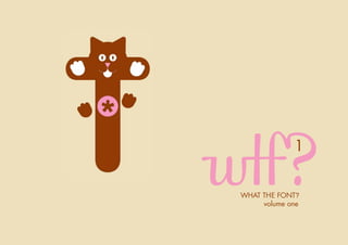
  • 1. 1 WHAT THE FONT? volume one
  • 2. 1 WHAT THE FONT? volume one Every two weeks, the Art Directors at TBWAHuntLascaris - Johannesburg get together to inspire one another. During one of these sessions, a challenge was put forward. Design your own typeface or font. And three weeks later, these were the results. WHAT THE FONT? volume one. Enjoy.
  • 3. Name: Choc Star Designer: Justin Wright Combining Freud’s views on anal retentiveness and the Egyptians beliefs that cats are gods, we naturally arrived at the Chocolate Starfish font. It’s natural versatility made it perfect for thin italic, textured, bold and bitmapped... allowing the user to achieve more expression in their chosen media. Even with the controversial banning in some parts of Germany, we believe it’s a font for all to use – the font for the modern family.
  • 4.
  • 5. Title: ALFAbet Designer: Jacque Moodley The love of Puns and Alfa Romeos
  • 6.
  • 7. Title: White on white Designer: Bruce Harris (with the loving help of Jason Murison) There isn’t any crazy concept here so stop looking. All I wanted to do was design a typeface that I thought was nice and would be proud to show my mother, so I showed her last night and she loved it. It also helps that white is my favourite colour and I like to punish myself by sitting for hours on end in the studio and on photoshop. Hope you like it.
  • 8.
  • 9. Title: “Recycle Bitches” Designer: Coenraad Grebe This particular font is based around the thought that everything should be recycled / re-used / re-appropiated / re-looked / re-engineered. Also it serves as a call to action and a rally cry of sorts. This served as my inspiration to re-look existing fonts (both designer and common), with the intent of borrowing, stealing and mashing them up to create something new, if not original. So, thanks to Helvetica, Gill Sans, Times, Rockwell and M/M Paris for allowing me (not intentionally) to rally the troops.
  • 10.
  • 11. Title: Zip It Designer: Erika Spethmann The client in reception who forgot to pull up his zip… I saw an ‘O’… and the rest just followed.
  • 12.
  • 13. Title: Clip Art Designer: Graeme van Jaarsveld Working in an office environment I wanted to create a font that related to that, and that had a different touch to the normal bland kind of look. The look I went for was almost that of a darkroom/ photographic kind of look.
  • 14.
  • 15. Title: Pins and Needles Designer: Ilze Venter My inspiration was the creation of something new out of bits and pieces of fabric, scraps and anything I could find in my cupboards. When people talk they cut, add, pin and mix words together to make a sentence. It reflects my love for making things by hand.
  • 16.
  • 17. Title: Disco Designer: Jacx In the light of the festivities and all the parties in and around the agency I found it fit to do a Disco font. Using the mirror ball as my main inspiration, (taking me back to my bedroom DJ days) I created a font which represents a bit of my past. So being the party animal that I am it just seemed like a perfect fit. I’m a 80’s baby after all. Lol.
  • 18.
  • 19. Name: Obession Designer: Shelley & Nadja To show the love-affair women have with shoes, we turned it into a typeface. w
  • 20.
  • 21. Title: A Type of Font Designer: Jens Henkel A font made up of a continuous story. Each letter leading onto the next. A type making up a type, while telling a story.
  • 22.
  • 23. Title: Desktop Font Designer: Adam Weber This typeface is inspired by the patterns and shapes made by folders and files that clutter our mac desktops. It is based on the Din font family and was created using photoshop, screen savers and command-shift-3.
  • 24.
  • 25. Title: Eat Your Words Designer: Jodi Smith & Laura Grobler Say what you mean or eat what you say!
  • 26.
  • 27. Name: 6MM Designer: Kerry Moralee My goal whilst creating the 6mm font was to turn completely unaesthetic items such as 6mm nuts and varied 6mm bolts into elegant letters making up a font without messing with their original form. So what you’re seeing is a font made from only 6mm bolts and nuts, that you find at any hardware store, assembled without perversion of their true form into a font.
  • 28.
  • 29. Name: “PIN-UP” Designer: Kursten Meyer I pin up all my ideas, layouts, inspiration, references and scamps on my pin board. It’s something I use every day and therefore was the inspiration behind my font.
  • 30.
  • 31. Name: “Pegs” Designer: Lucas & Sarel The font was inspired by a lady we saw hanging clothes onto the washing line using pegs.
  • 32.
  • 33. Name: “Marv. The Font” Designer: Marvin Zwambila Inspired by my character in terms of the properties a wire holds. For starters it can be bent to make almost any shape, can handle electricity and of course is straight and hard. Because of these properties wire is often stolen off fences, train cables and other areas. So wire is an essential part of our society, just like me. P Apologies to the passenger trains that .S. ran late. Find solace in knowing the wire was used to uplift a poor individual.
  • 34.
  • 35. Name: Summoned Designer: Melanie Moore My font went through many stages before reaching the final idea. It was inspired by naughty boys who take the warning label on deodorant cans as an instruction manual for fun.
  • 36.
  • 37. Name: 2D Designer: Natalie le Roux This typeface was inspired by CMYK and photography. CMYK is a layered printing process, which uses four inks (Cyan, Magenta, Yellow and Black) to create realistic images onto a 2D paper surface. Photography is a way of capturing and representing reality on a 2D surface. I have included some of my cameras and the overlapping CMYK effect on the board to depict the inspiration. Technically, the font is designed by layering CMYK strips across each other to form characters. Because all three C, M and Y never intersect with each other to create black, I have placed black and grey photographs behind them, to give some sense of light and depth to the typeface. The photographs used are some of my own and some of my favourites. Another element of the typeface is the use of right triangles, which have been sliced off on one strip and replaced somewhere else on each character to add some interest and form serifs and geometric curves.
  • 38.
  • 39.
  • 40. Name: My Wire Blocks Designer: Pieter Steyn This font is based on the 6 fonts most commonly used by us in the agency including Arial, Futura and Myriad and Trebuchet. I used a 3D effect in Illustrator, and made the wire/block shapes. Later in InDesign I factorised the letters. I only used the block Capitals as they represent the building and construction TBWA is undergoing at the new building, as well as the indifference between the nation, there should be no difference between upper and lower case or class (in an absolute world).
  • 41.
  • 42. Name: Rock Art Designer: Tebogo Disrupting rock art into a font... Why because the khoi people used rock art to communicate and tell stories, so I designed rock art font for people to use and communicate and tell interesting stories.
  • 43.
  • 44. Name: Dirty Words Designer: Thereza Grala All the things a person says during their day that they wish they’d never said.
  • 45.
  • 46. Name: Scaff Designer: Shelley, Nadja & Raff Inspired by moving into a building that’s half-complete and the scaffolding that surrounds us.
  • 47.
  • 48. Name: 1810 Extra Bold Designer: Michael Muller As creatives we spend many hours brainstorming, writing and crafting thoughts and ideas so that they hopefully come to fruition and ultimately a crescendo of inner satisfaction. Most of these ideas start out as scamps and thoughts scribed by the hand of the creative in bursts of optimism – the belief you could have possibly cracked something that will make your CD smile and your peers green with envy. This very handwriting, that is the beginning of the physical formation of ideas is as unique to everyone as our fingerprints and through analysis can very accurately reveal who we are. And who we are is predominantly a combination of life experience. That being said, life experience and the fingerprint it leaves in the form of handwriting coupled with the love of my work are the inspiration for my typeface 1810 Extra Bold. The brown paper element represents the reams of paper that I consume trying to crack ideas and the typeface is an adaption of my handwriting. The name 1810 Extra Bold is made up of two parts, my birthday – 18 October and the Extra Bold is a reflection of my personality.
  • 49.
  • 50. Name: Tape Designer: Wihan Meerholz All the best memories and most classic times are kept on the most classic thing, video tapes. They tell a story and could even spell things out for us.
  • 51.
  • 52. Name: Semiotic Typeface Designer: Katleho Mofolo My typeface is inspired by contours, semiotics1 human signs and , contortionists. Everyday we consciously and subconsciously see signs wherever we go, in and around cities and towns, on traffic lights, toilets, gates etc. These street signs or signs are visuals read as text subliminally and help communicate a range of commands, warnings, clues and sometimes indicate future change. Everyone succumbs to these signs and whenever one defies them danger occurs e.g. accidents. I see them as fascinating signage because even illiterate people can understand what they convey unlike the ordinary code of plain wording. I find the shapes that contortionists transform themselves into when performing as extraordinary exhibitions to demonstrate human body capability. I think contortionists literally prove that limits are only as real as the mind comprehends them to be. The forms and shapes that they turn themselves into physically articulate man power in a different dimension of body art, and through the contorting of the their bodies I perceive art. I decided to name my typeface SEMIOTIC because of the study of semiotics which explains the importance of sign conventions and sign theory to mankind. I believe the study of symbols, codes, indexes, signs and signifiers assists to simplify communication for better understanding about different or foreign behavioral patterns.