Download as PDF, PPTX


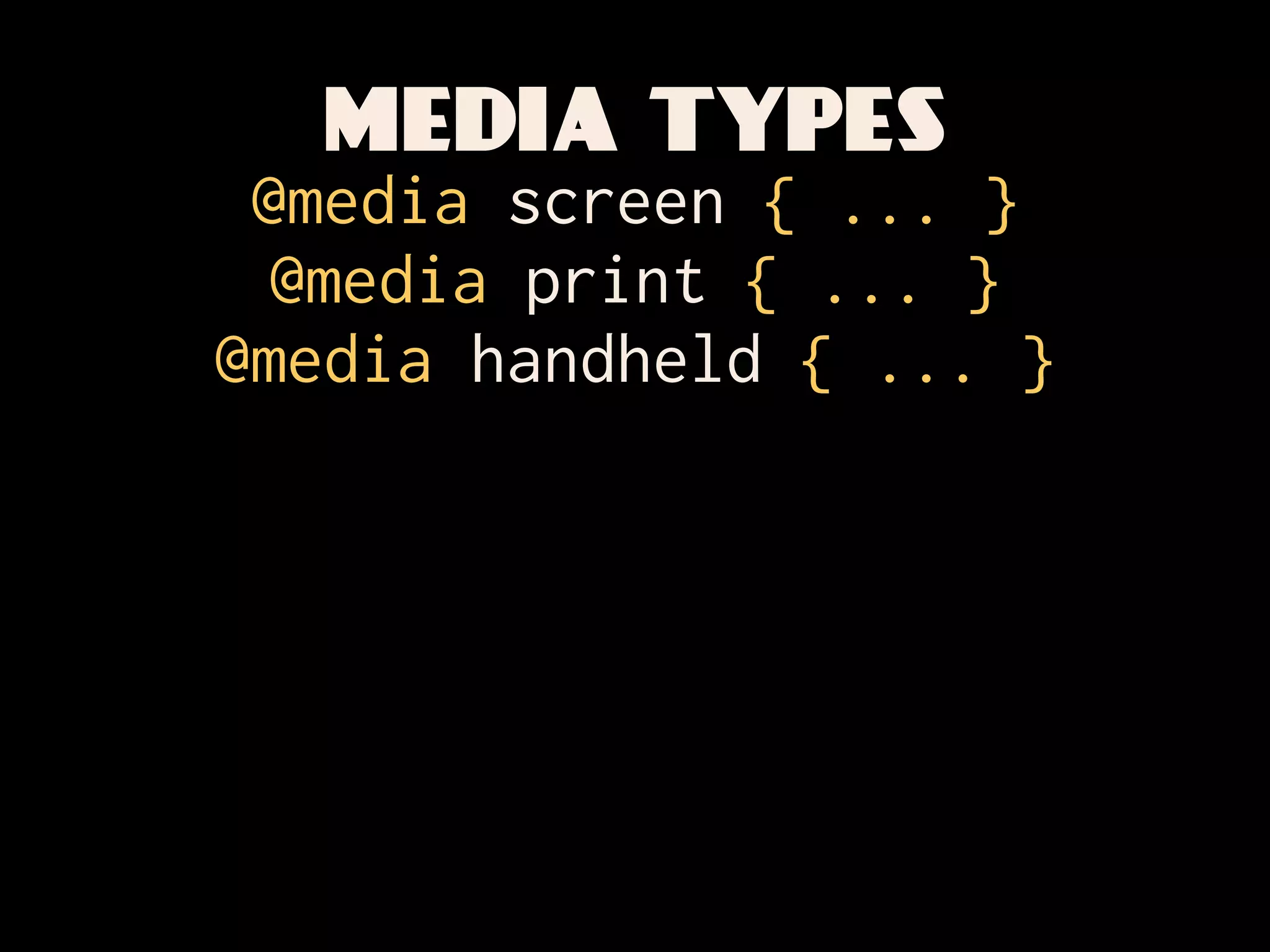
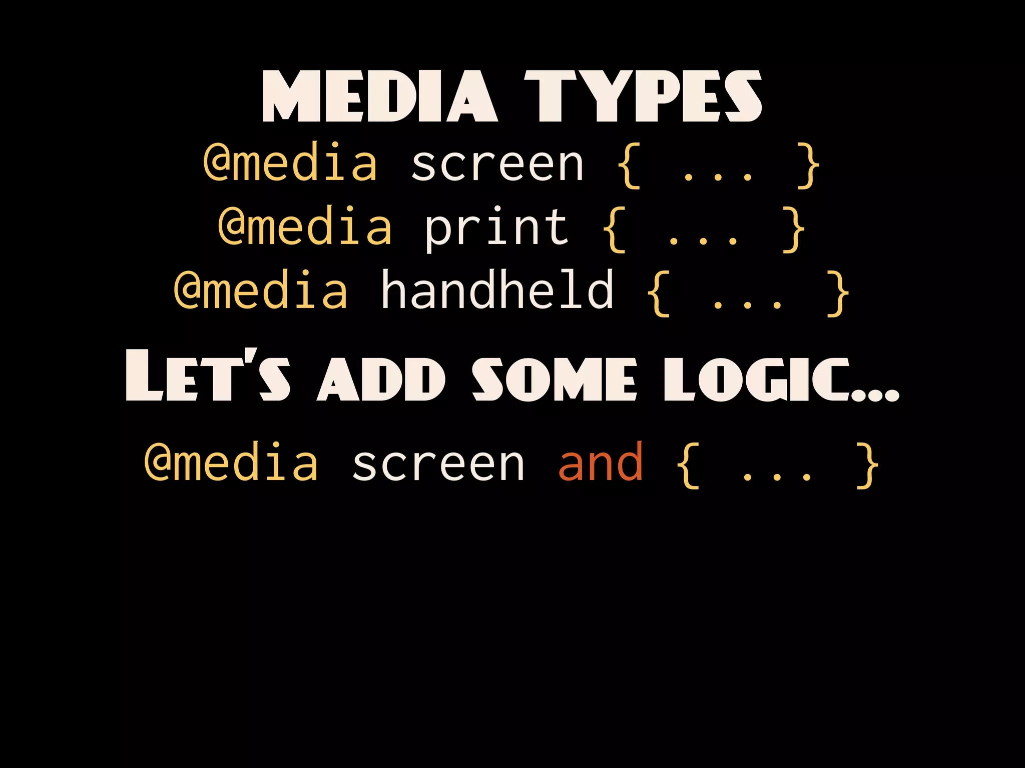
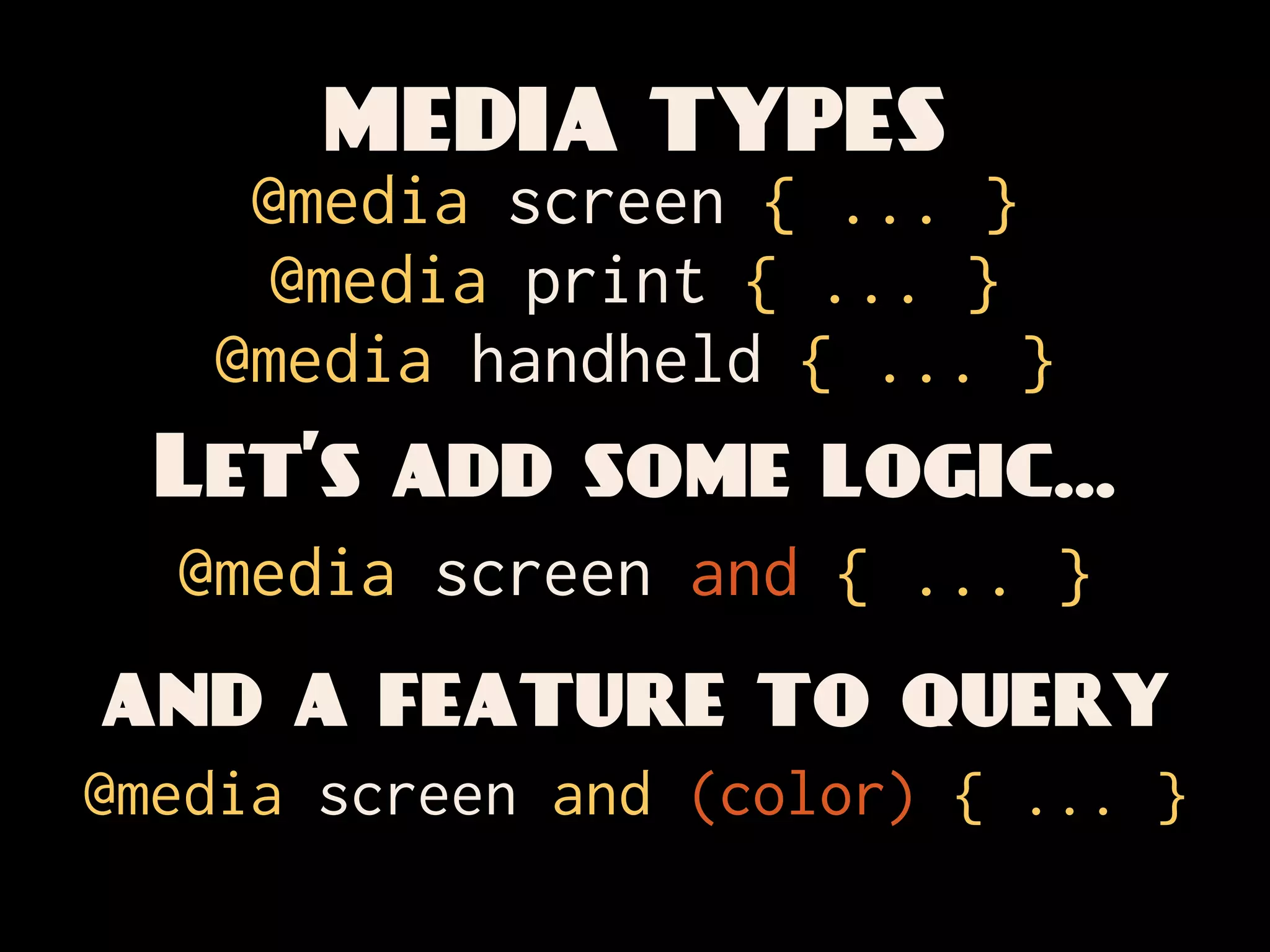
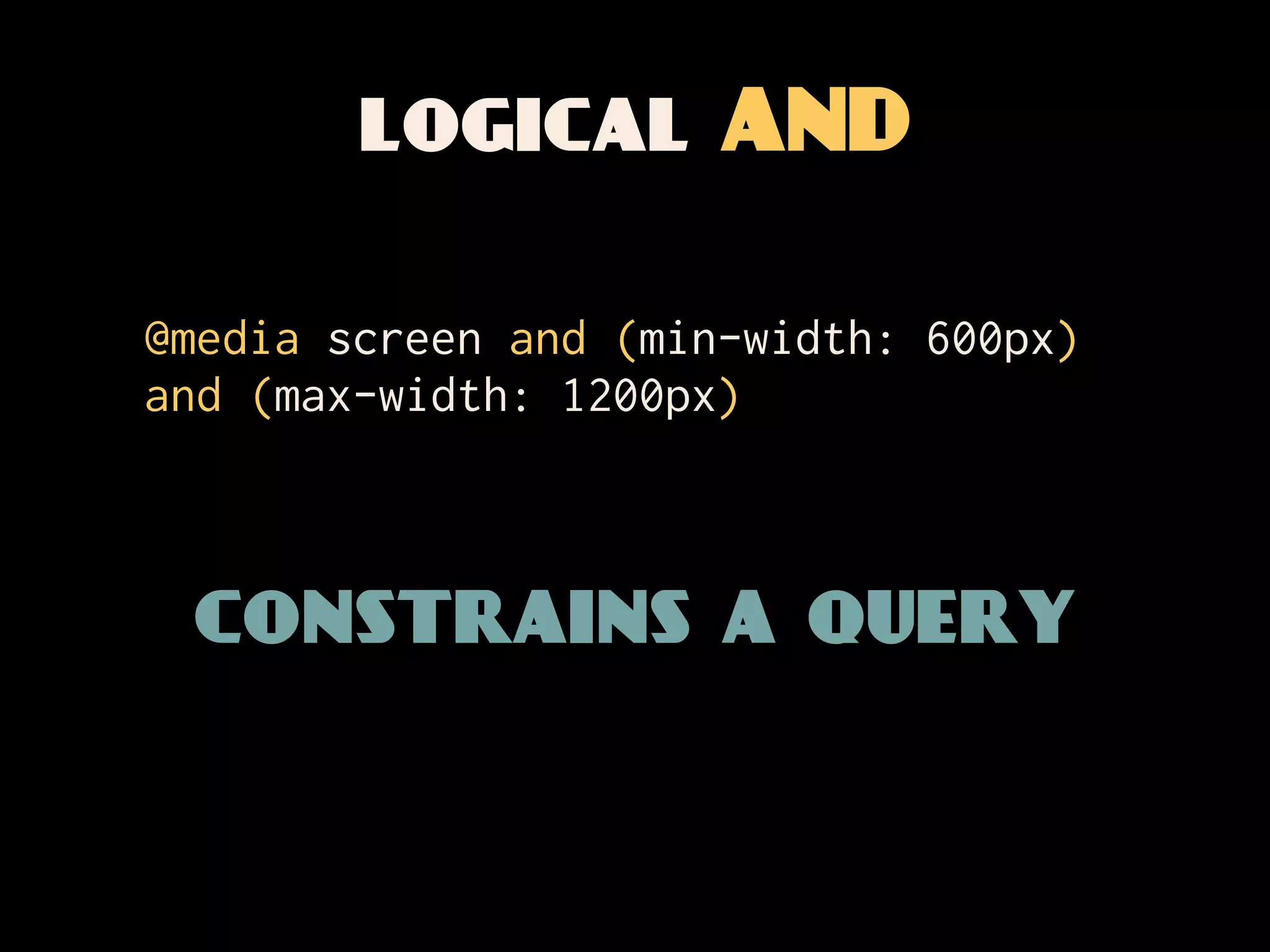
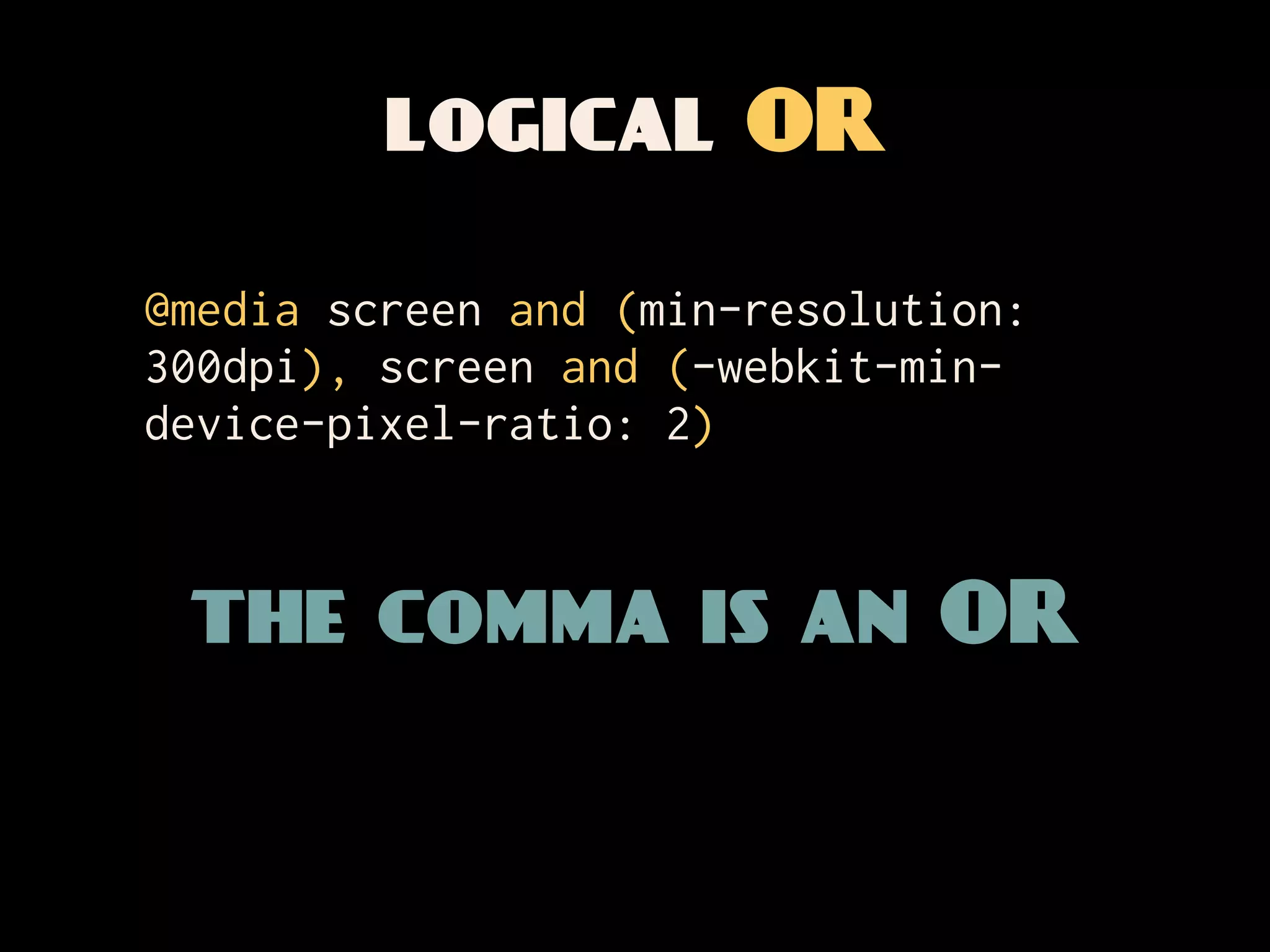
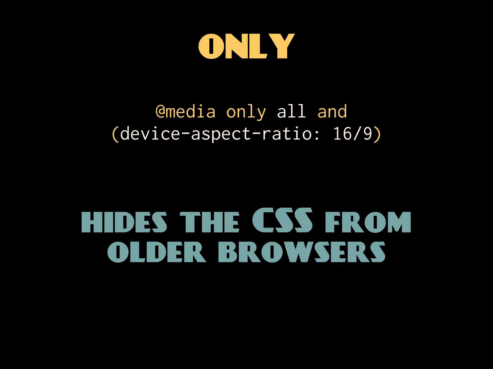
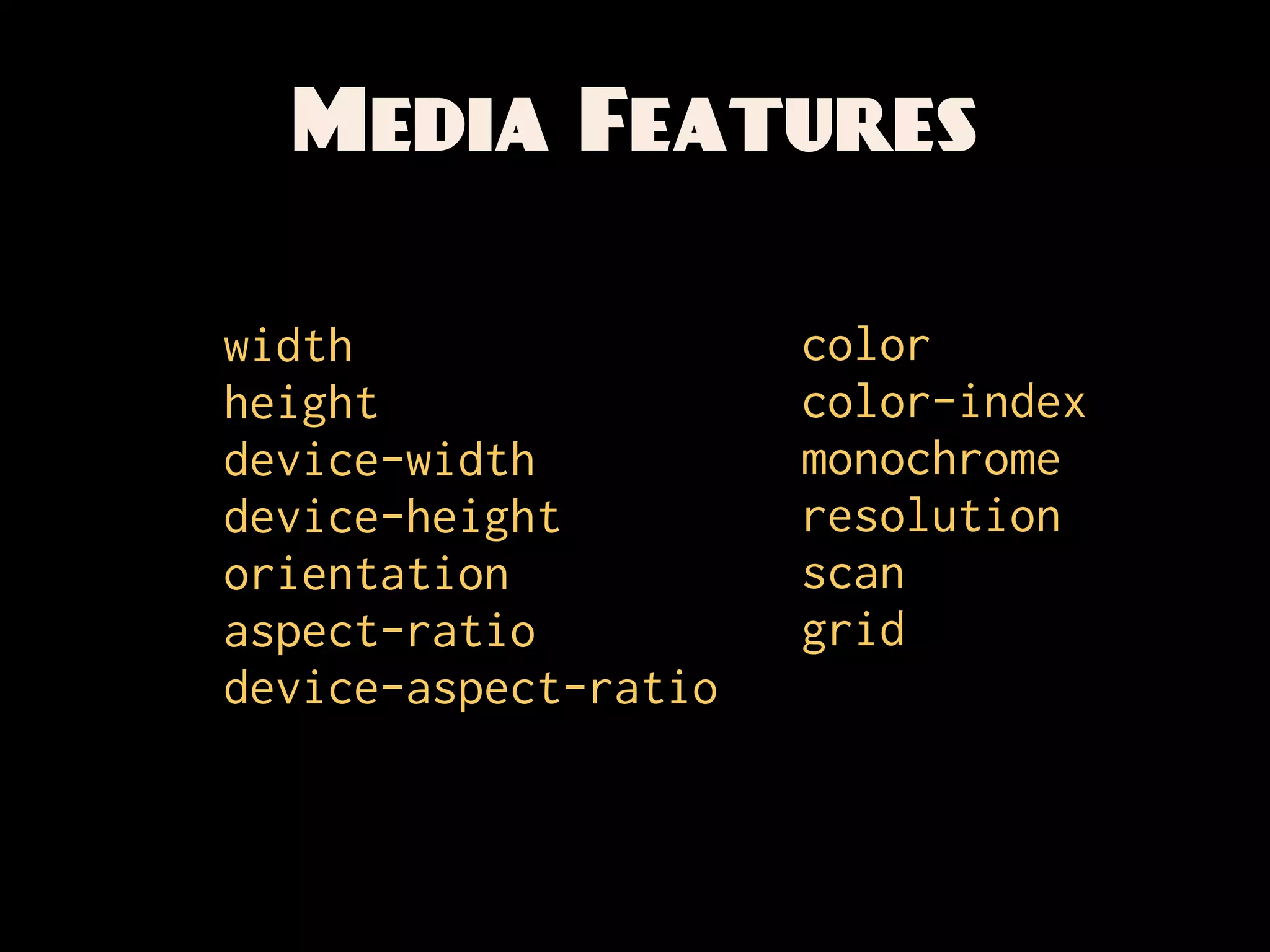
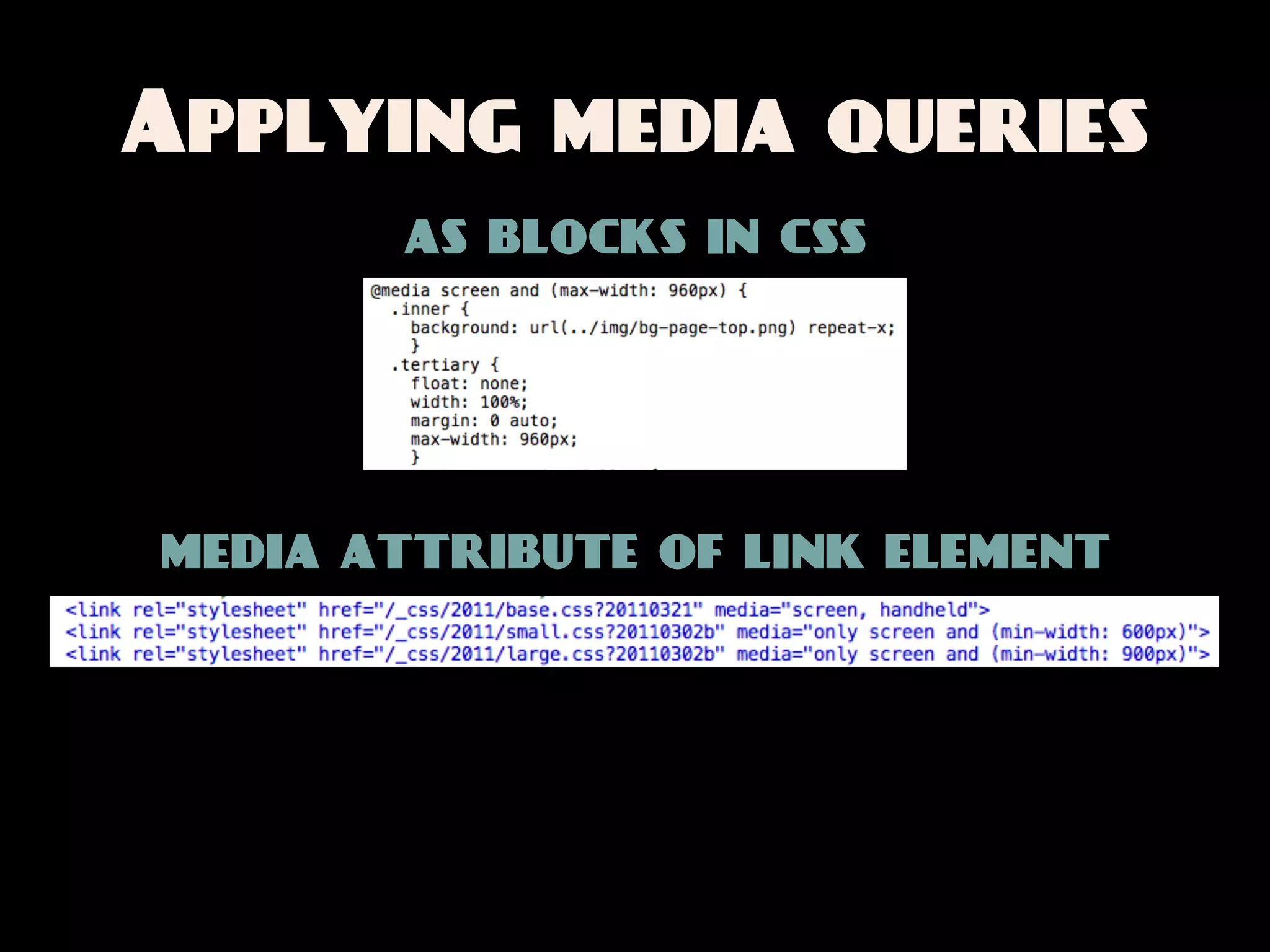
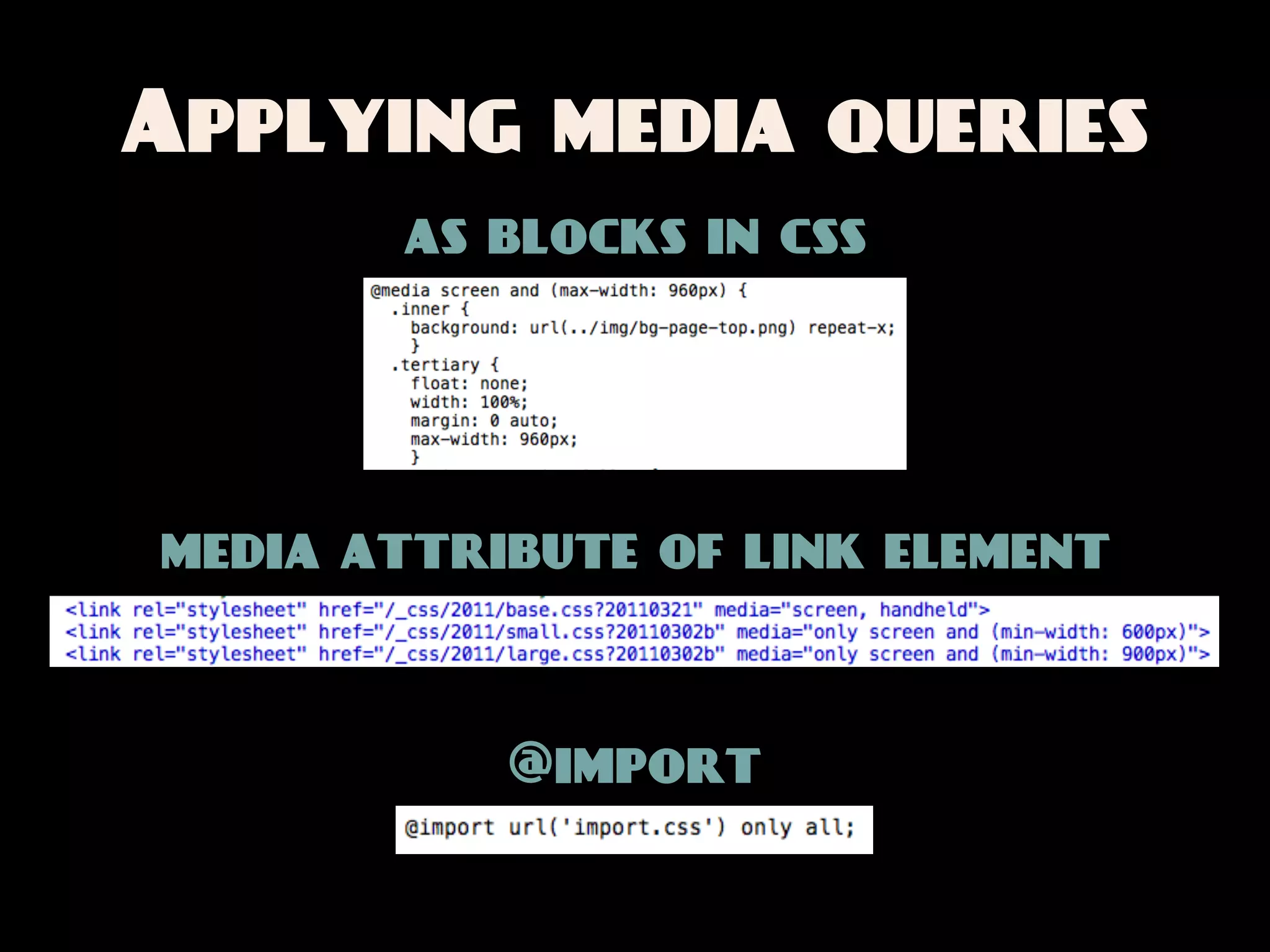
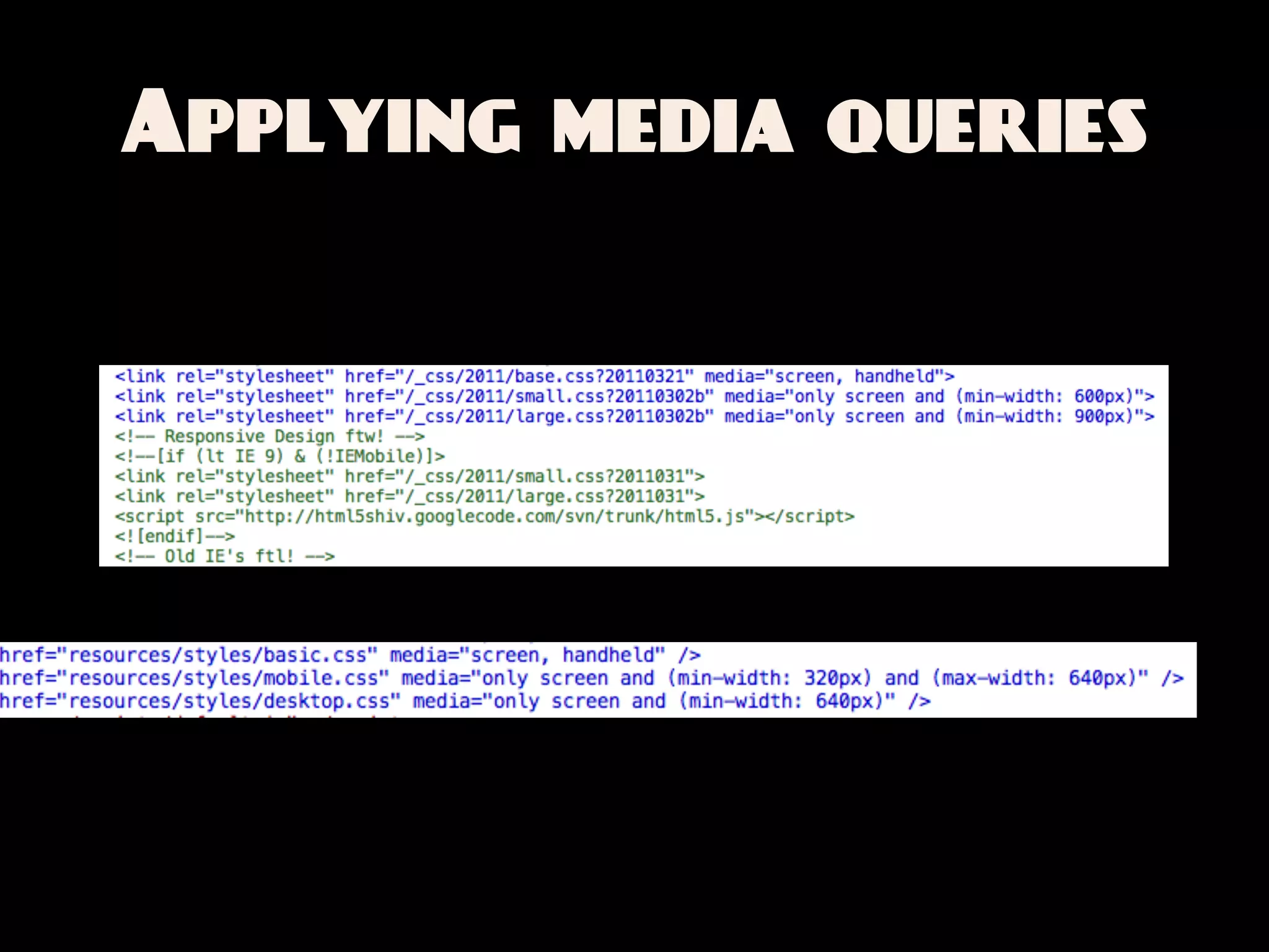
![MEDIA QUERIES
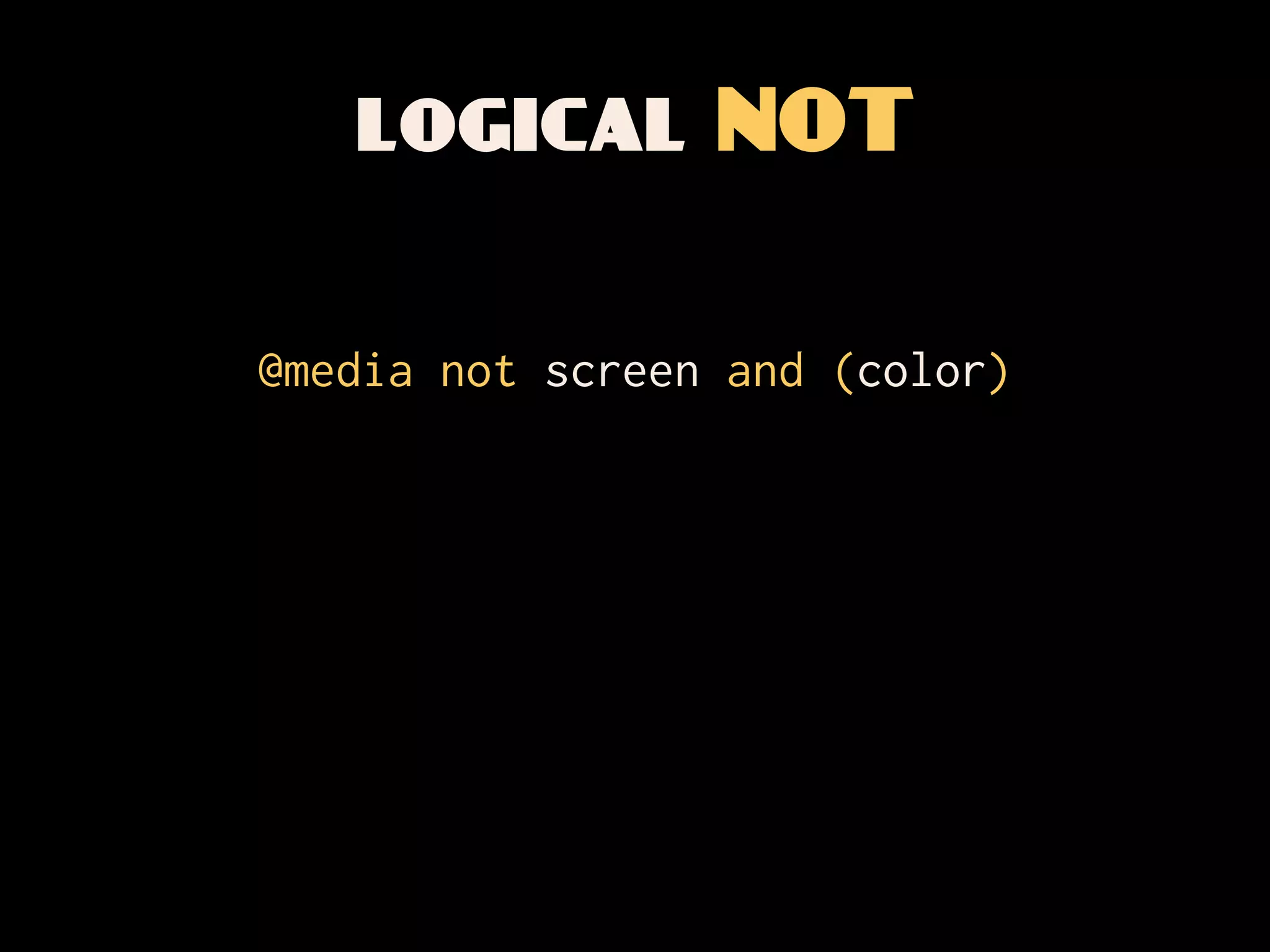
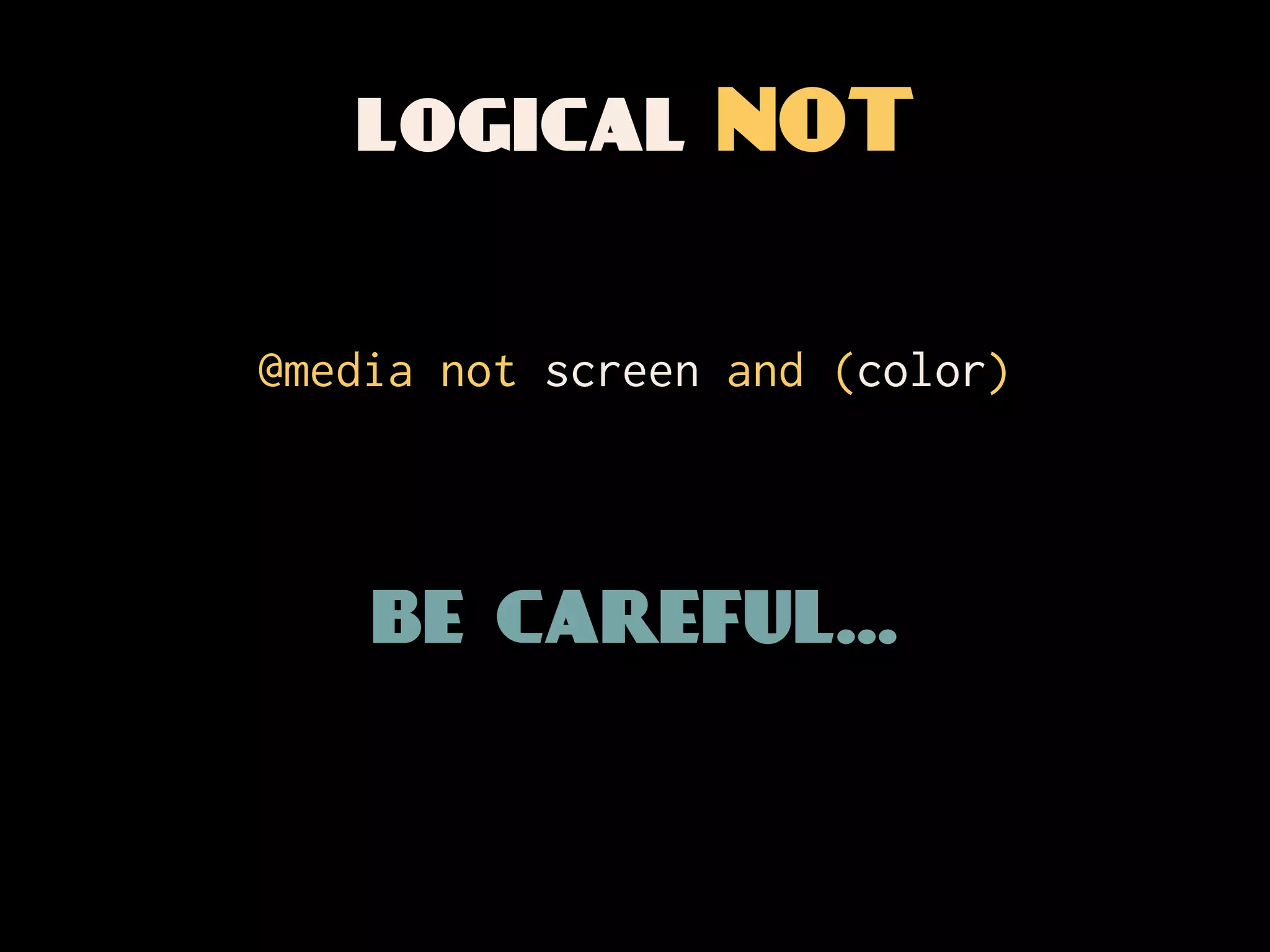
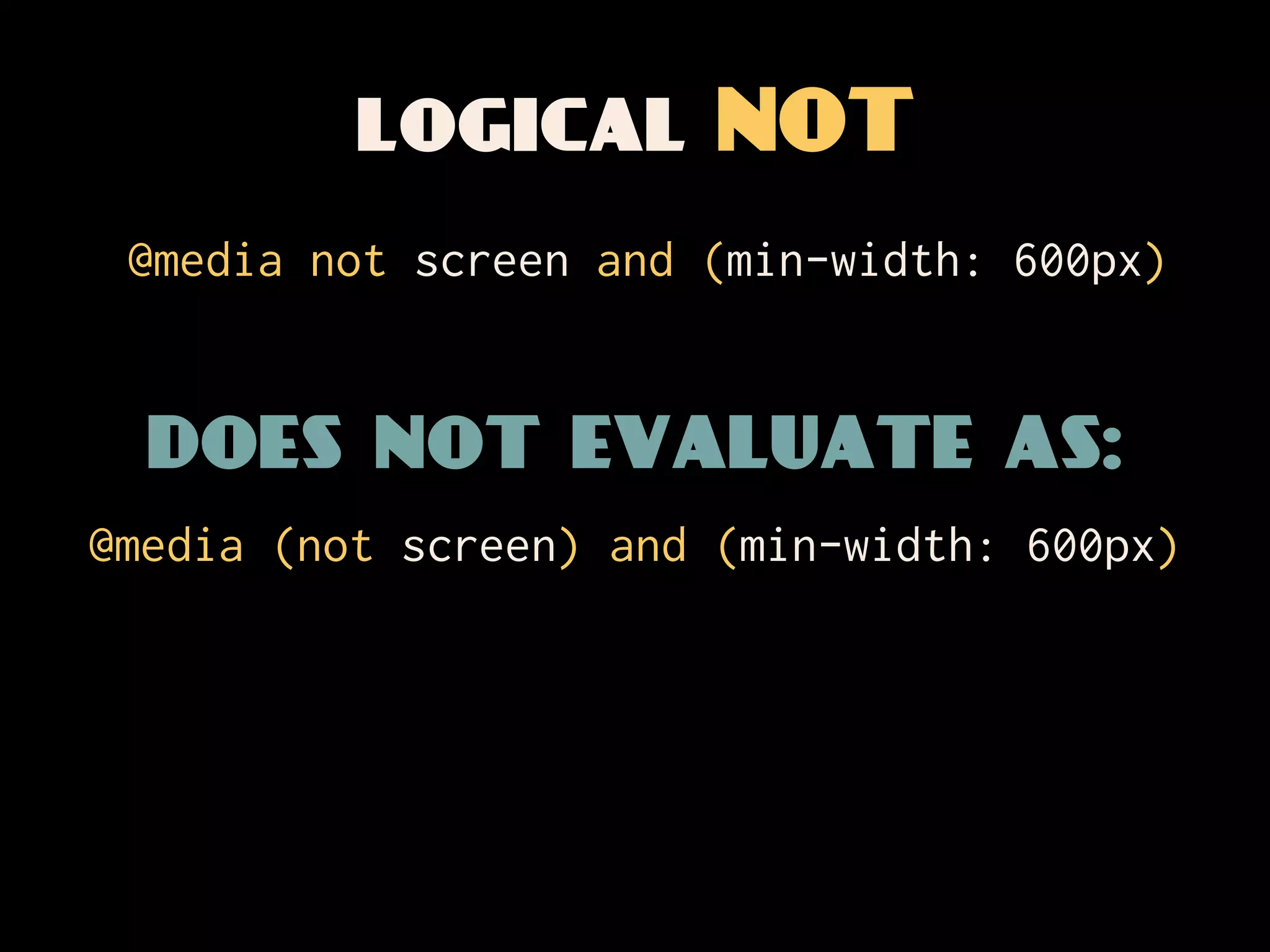
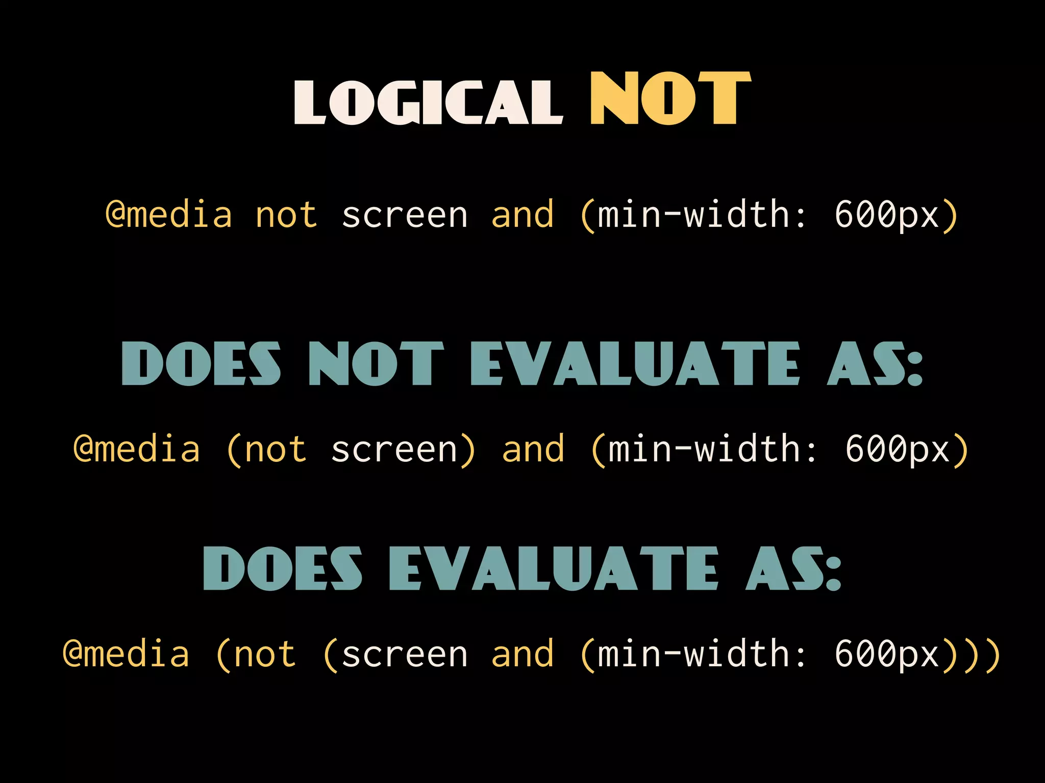
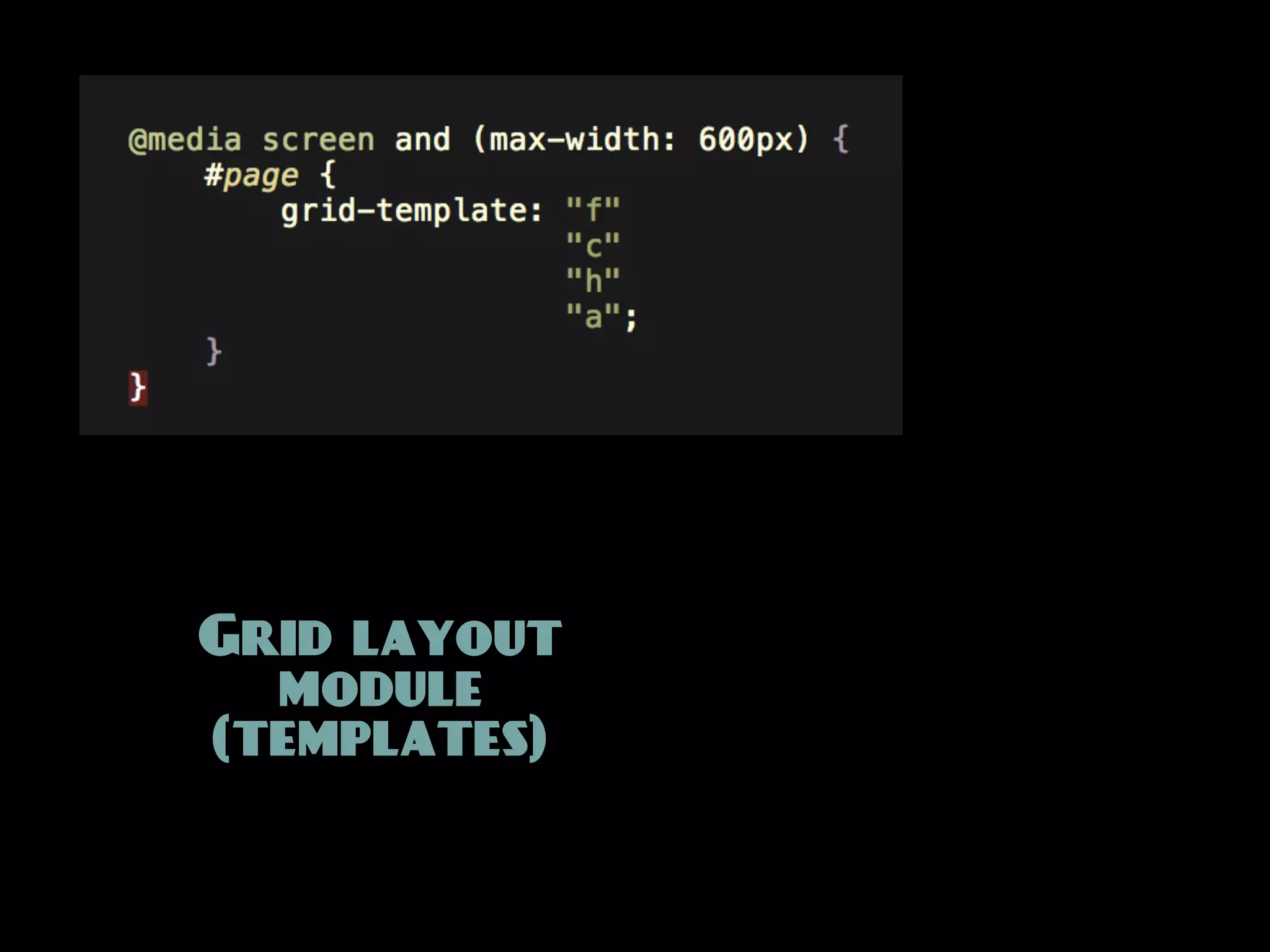
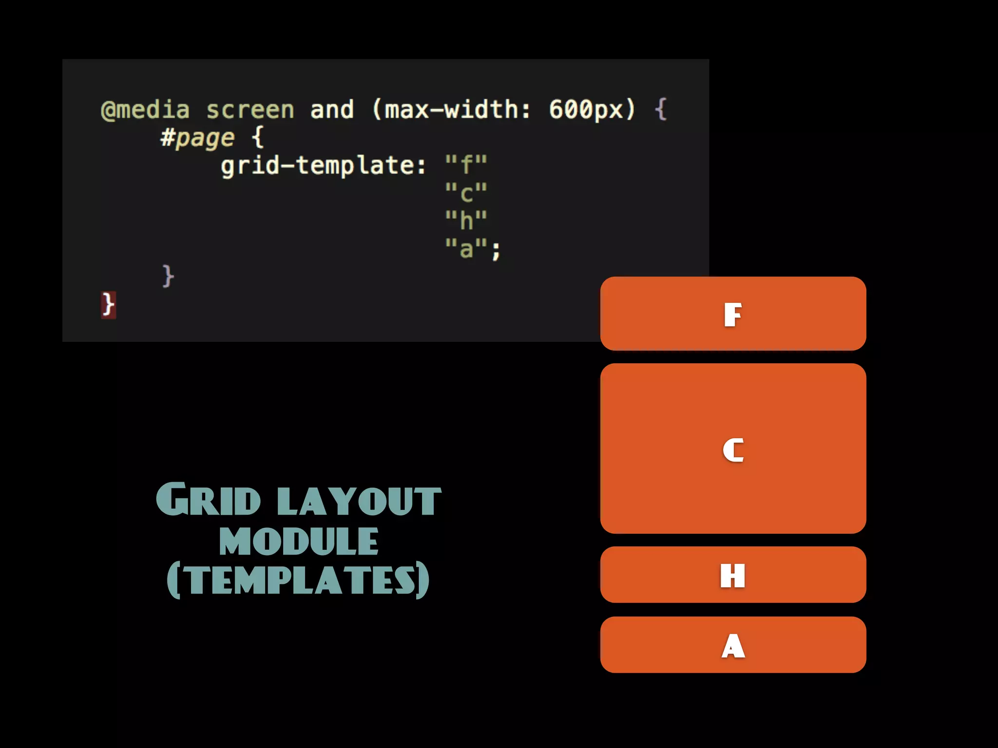
@media [not|only] type [and] (expr) {
rules;
}
== Feature detection](https://image.slidesharecdn.com/mobilism2011-110513064605-phpapp01/75/Meta-layout-a-closer-look-at-media-queries-13-2048.jpg)


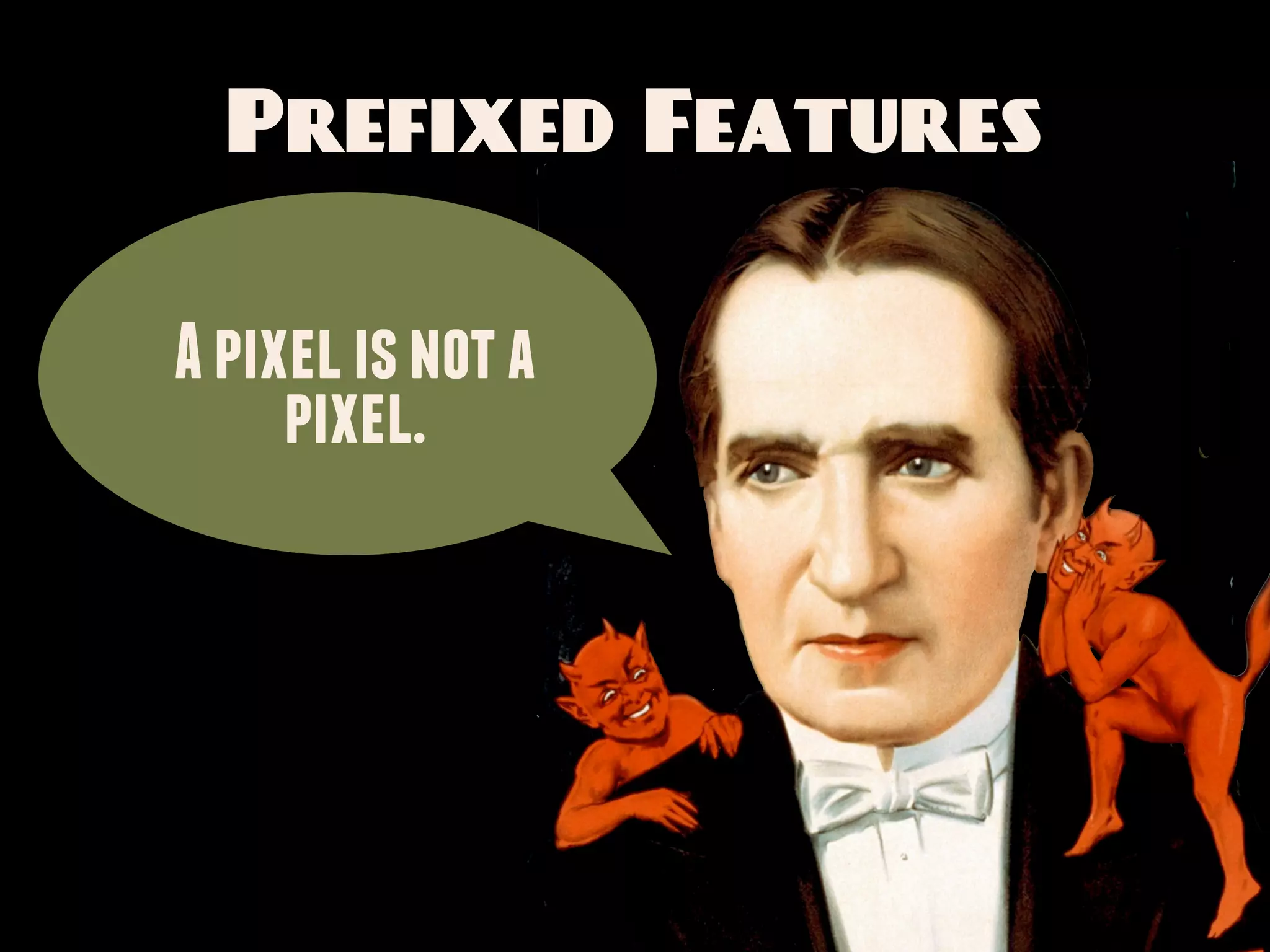
![Prefixed Features
How many device pixels per CSS pixel?
-webkit-[min|max]-device-pixel-ratio
[min|max]--moz-device-pixel-ratio
-o-[min|max]-device-pixel-ratio](https://image.slidesharecdn.com/mobilism2011-110513064605-phpapp01/75/Meta-layout-a-closer-look-at-media-queries-41-2048.jpg)
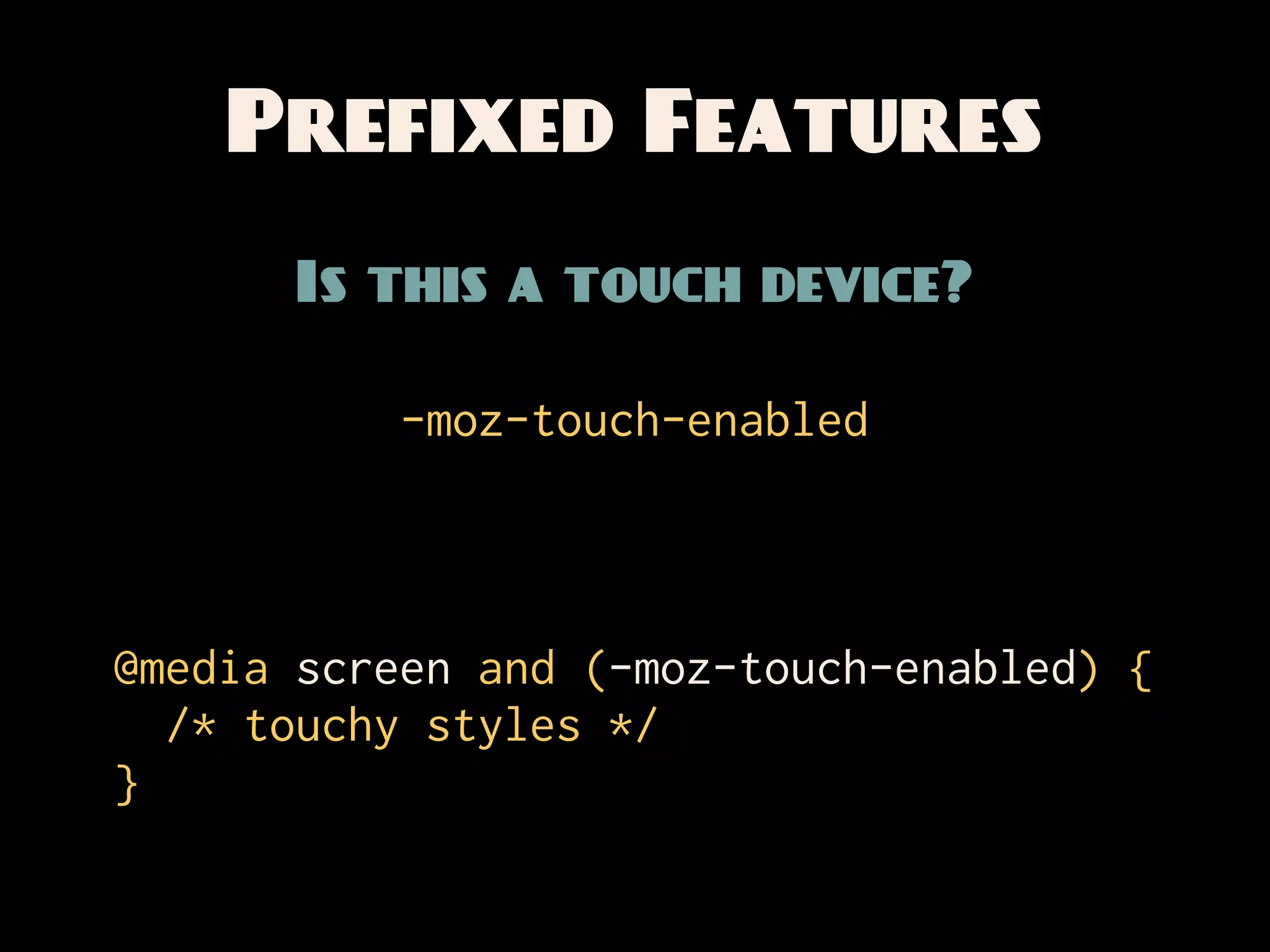
![Prefixed Features
How many device pixels per CSS pixel?
-webkit-[min|max]-device-pixel-ratio
[min|max]--moz-device-pixel-ratio
-o-[min|max]-device-pixel-ratio
-webkit-min-device-pixel-ratio: 1.5
-o-min-device-pixel-ratio: 3/2](https://image.slidesharecdn.com/mobilism2011-110513064605-phpapp01/75/Meta-layout-a-closer-look-at-media-queries-42-2048.jpg)


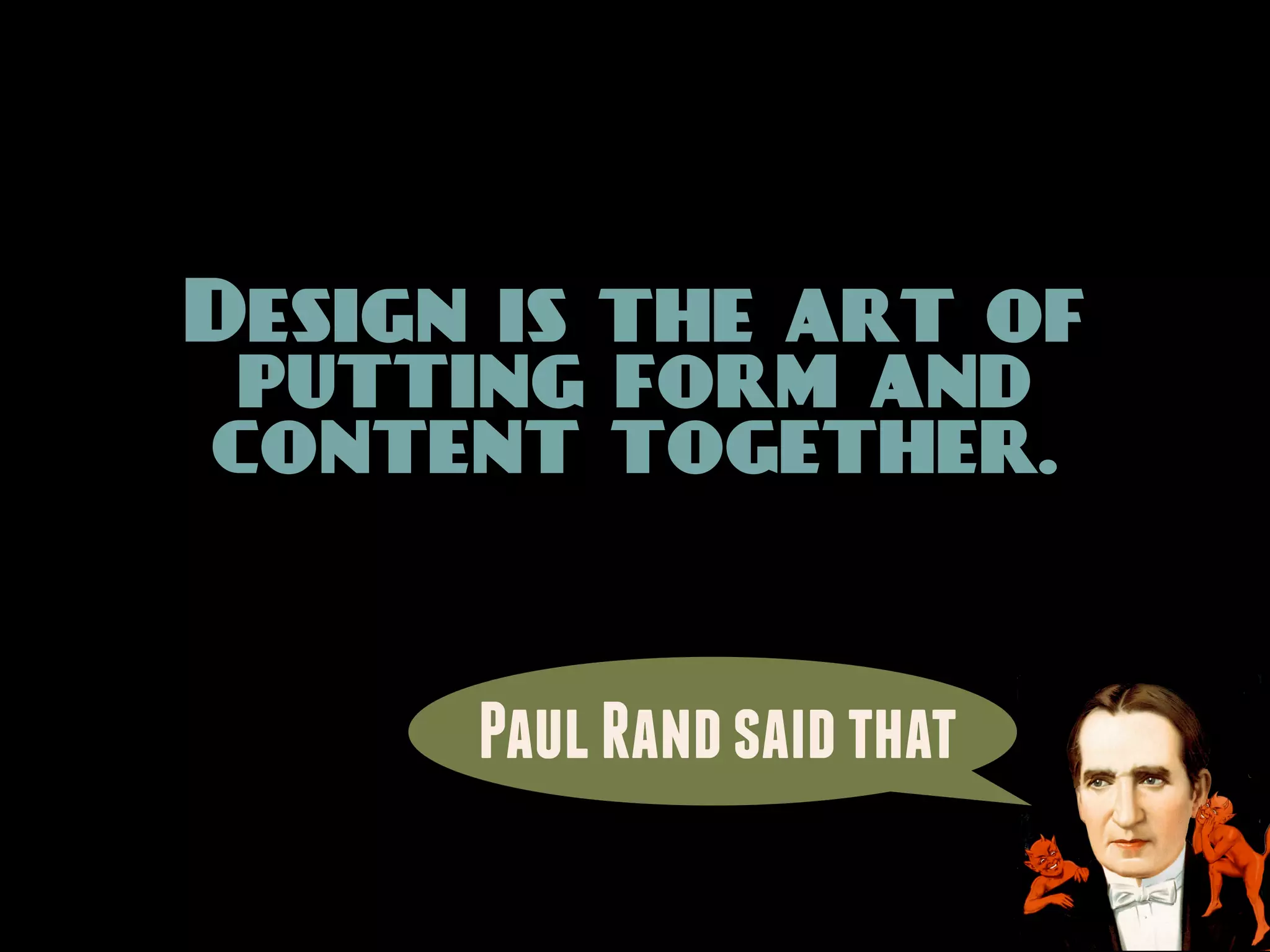
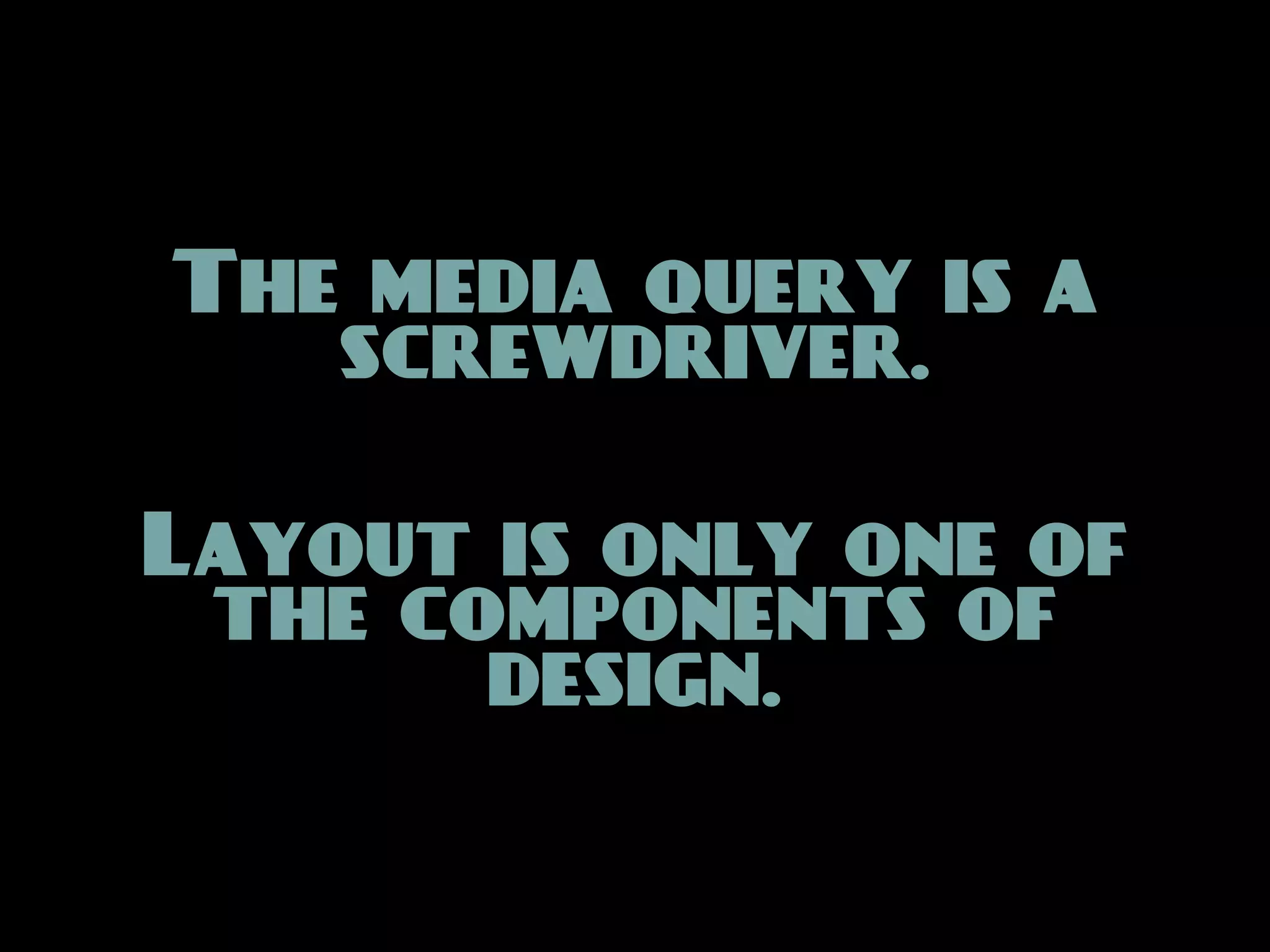

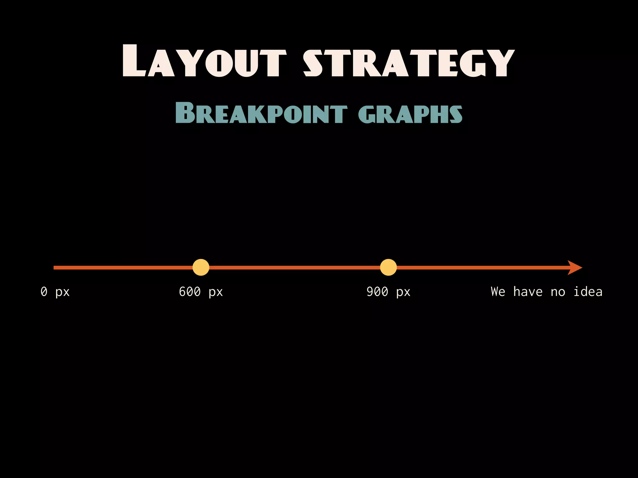
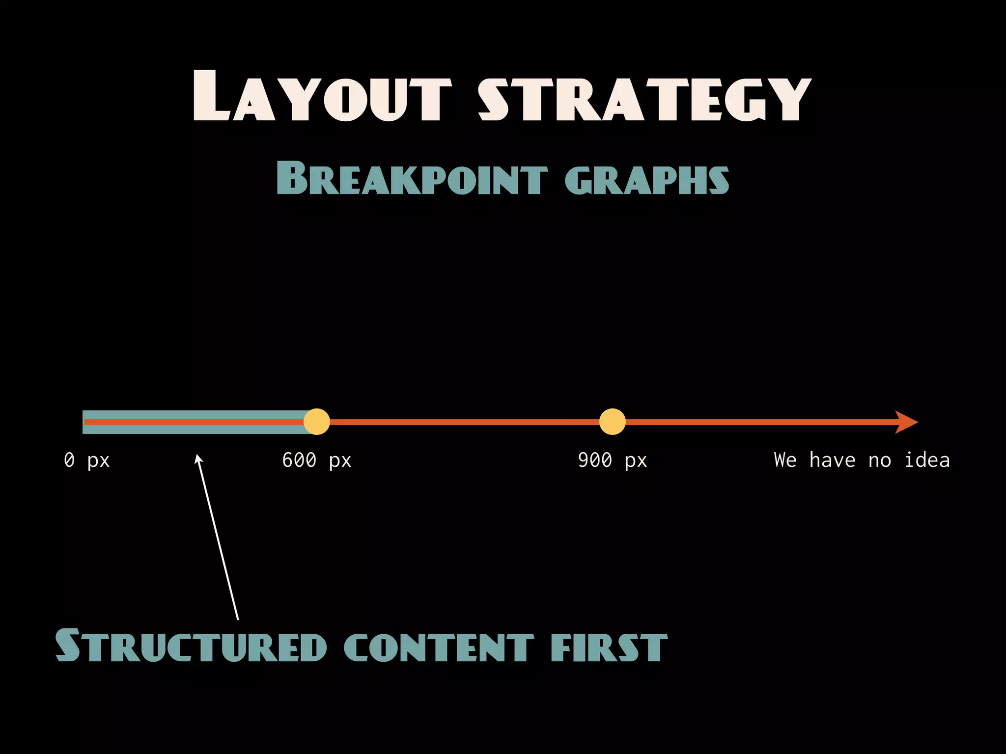
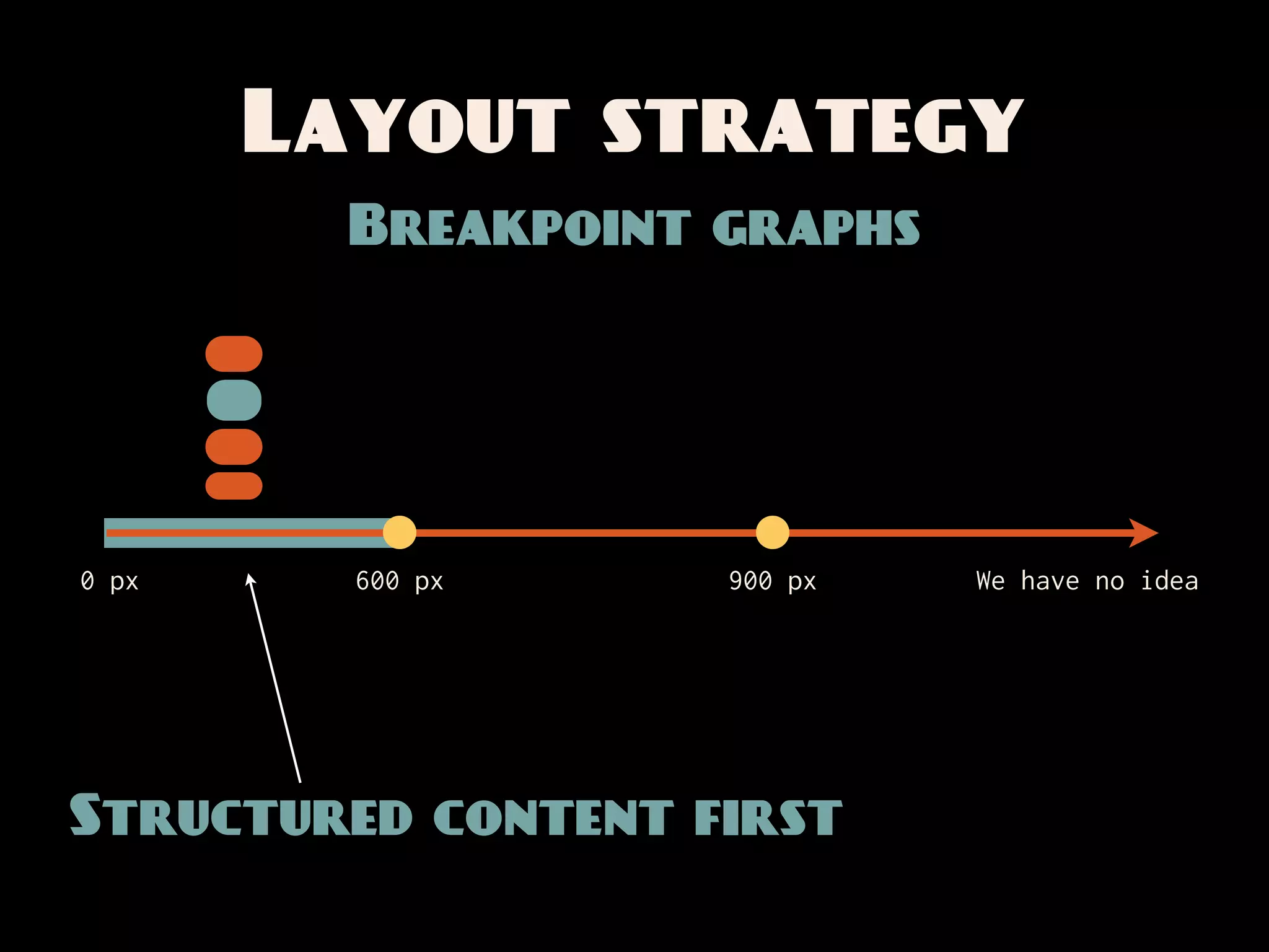
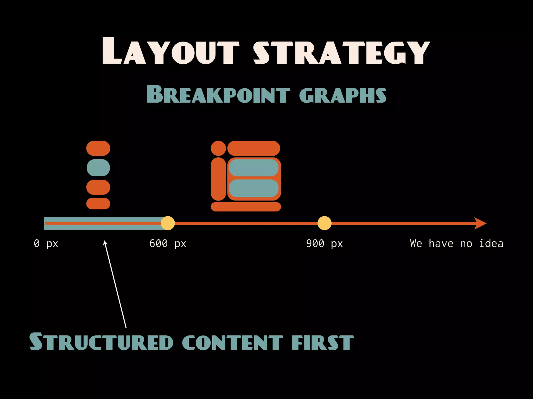
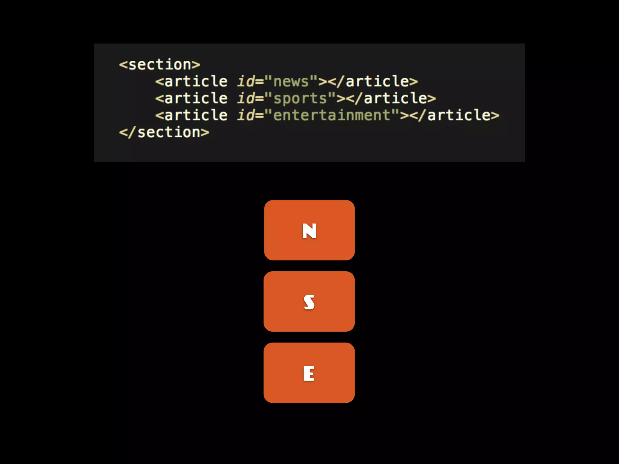
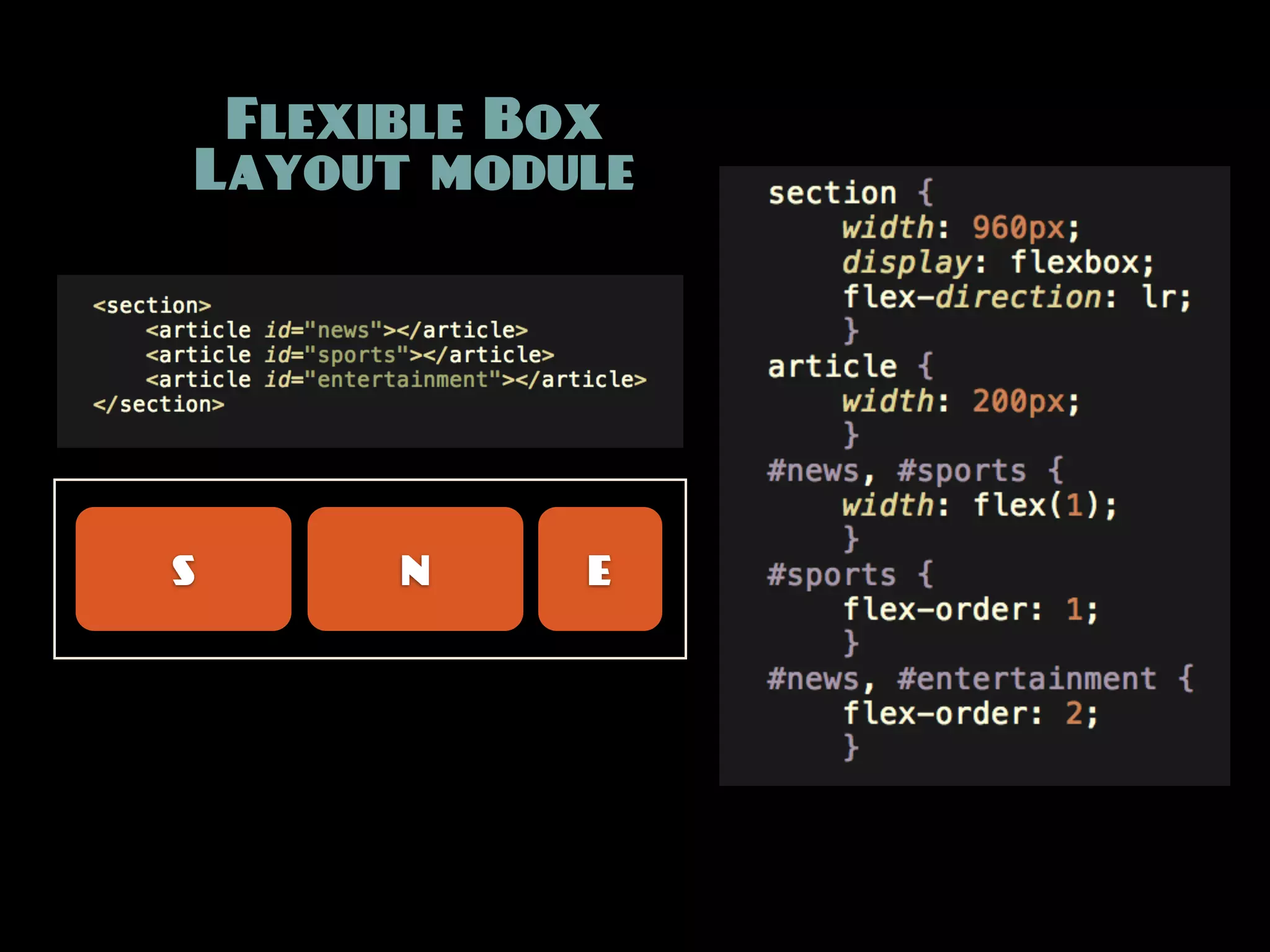
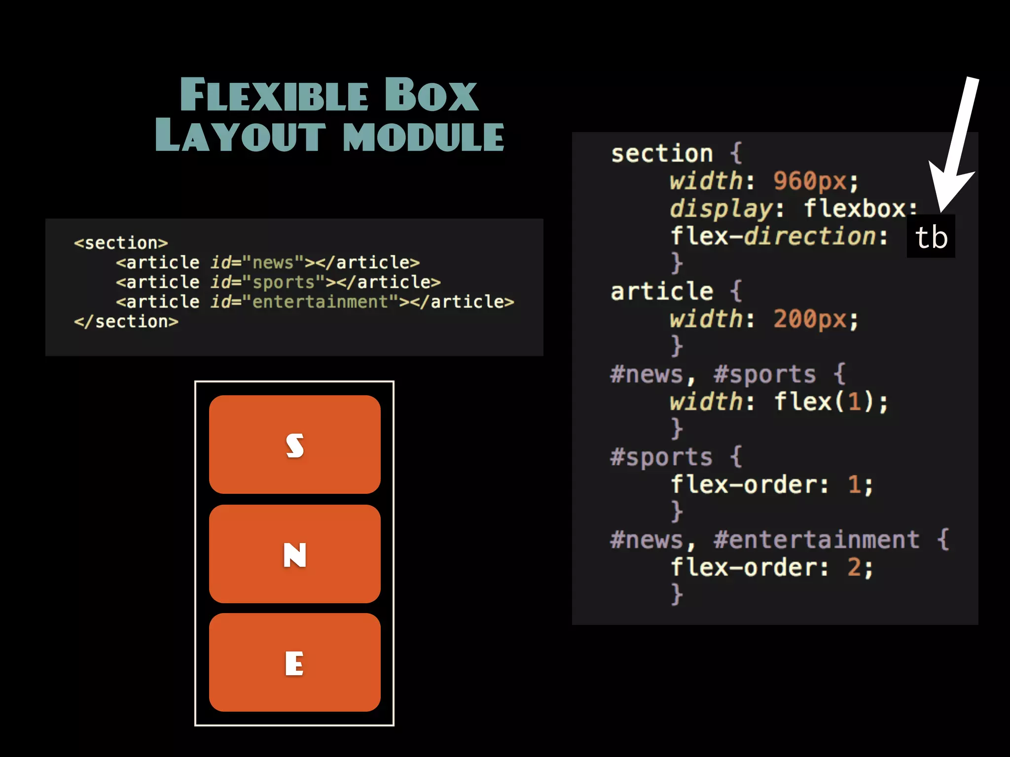
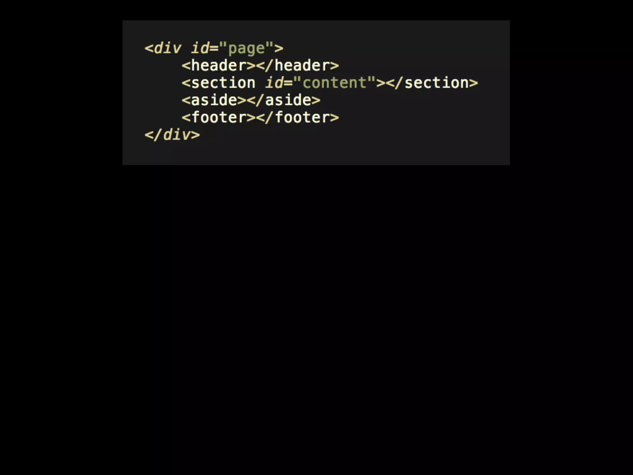


The document discusses media queries and responsive web design. It covers topics such as media types, logical operators, media features, viewports, layout strategies, and new CSS layout mechanisms. Throughout the document, B. Rowser engages in a comedic back-and-forth dialogue to help explain and expand on the concepts around responsive design. In the end, the document emphasizes thinking about design principles and systems rather than specific layouts.