1. Image Layout
Generically, one page reviews An enlarged photograph
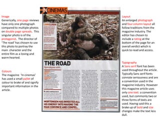
have only one photograph and four column layout all
compared to multiple photos follow traditions from the
on double page spreads. This magazine industry. The
singular photo is of the editor has chosen to
protagonist. The director of include a rating at the
‘The road’ has chosen to use bottom of the page for an
this photo to portray the overall verdict which is
main character and the quick to read and access.
entire film as a loving and
warm hearted.
Typography
A Sans serif font has been
Colours used throughout the article.
The magazine ‘In cinemas’ Typically Sans serif fonts
has used a small pallet of connote seriousness and are
colour to brake of and signify a convention used in the
important information in the magazine industry. However
article. this magazine article uses
only one text: a convention
used, but commonly two or
three forms of texts are
used. Having said this a
brake up of bold and size
changes make the text less
dull.
2. Colours
New films magazine has used colours associated with the film
Spiderman, which bounds the article and film together and makes the
article seem more involved with the film.
Typography Image
With the New films has
exception of the decide to use one
New films name enlarged still image
and other from the film. The
exterior text photograph itself
which is anchors the action
unrelated to the occurrence in the
article, this film and depicts the
review uses only protagonist as
one font type. strong and brave.
This allows the
article to
presented neatly.
Dropped letters
and the title have
been made bold
and an
independent
review is used
mid-article which
uses an enlarged Layout
size text. This review follows a typically three column layout, with
graphs and a verdict at the bottom for quick readers.