How Do Website Colors Impact Conversion?
New research reveals 5 critical horrifying mistakes designers
make with color (special Halloween edition)


                           #webclinic
Join the conversation on Twitter


            #webclinic

                     #webclinic
Today’s team

               Dr. Flint McGlaughlin – Managing Director, MECLABS
               Flint McGlaughlin is the Managing Director of MECLABS Group. The
               organization has partnered with key market leaders including The
               New York Times, Microsoft Corporation, and Reuters Group.

               Dr. McGlaughlin also serves as the Director of Enterprise Research at
               the Transforming Business Institute, University of Cambridge (UK), as
               the Chairman of the Board of Governors for St. Stephen’s University,
               and as a Trustee for Westminster Theological Centre. Dr. McGlaughlin
               originally studied Philosophy and Theology at the University of
               London’s Specialist Jesuit College.

               Today, his primary research is focused on enterprise as transformative
               agent. His work has won multiple awards and has been quoted in
               more than 13,000 online and offline sources.


  #webclinic
Experiment: Background

         Experiment ID: TP1645
         Record Location: MECLABS Research Library
         Research Partner: [Protected]

Research Notes:
   Background: A large sports entertainment provider sought to increase
   conversion on it’s main landing page.

   Goal: To increase premium signups

   Research Question: Which color scheme will result in a higher conversion
   rate?

   Test Design: A/B Single factor split


                                                                 4

                                      #webclinic
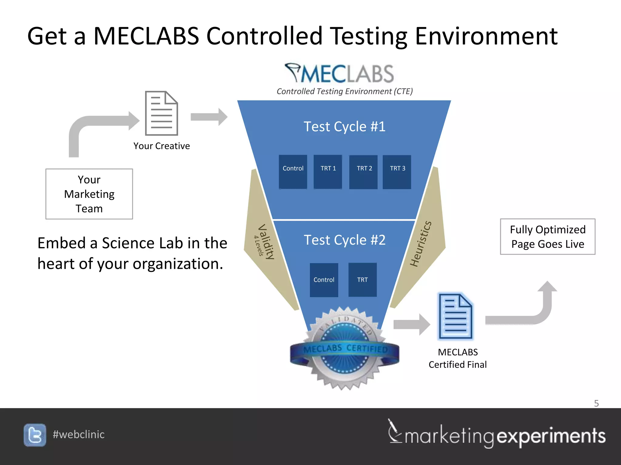
Get a MECLABS Controlled Testing Environment


                2
                               Controlled Testing Environment (CTE)


                                          Test Cycle #1
               Your Creative

                                Control      TRT 1   TRT 2   TRT 3
     Your
   Marketing
    Team
                                                                                        Fully Optimized
Embed a Science Lab in the                Test Cycle #2                                 Page Goes Live
heart of your organization.
                                           Control   TRT


                                                                       2MECLABS
                                                                      Certified Final


                                                                               5

                               #webclinic
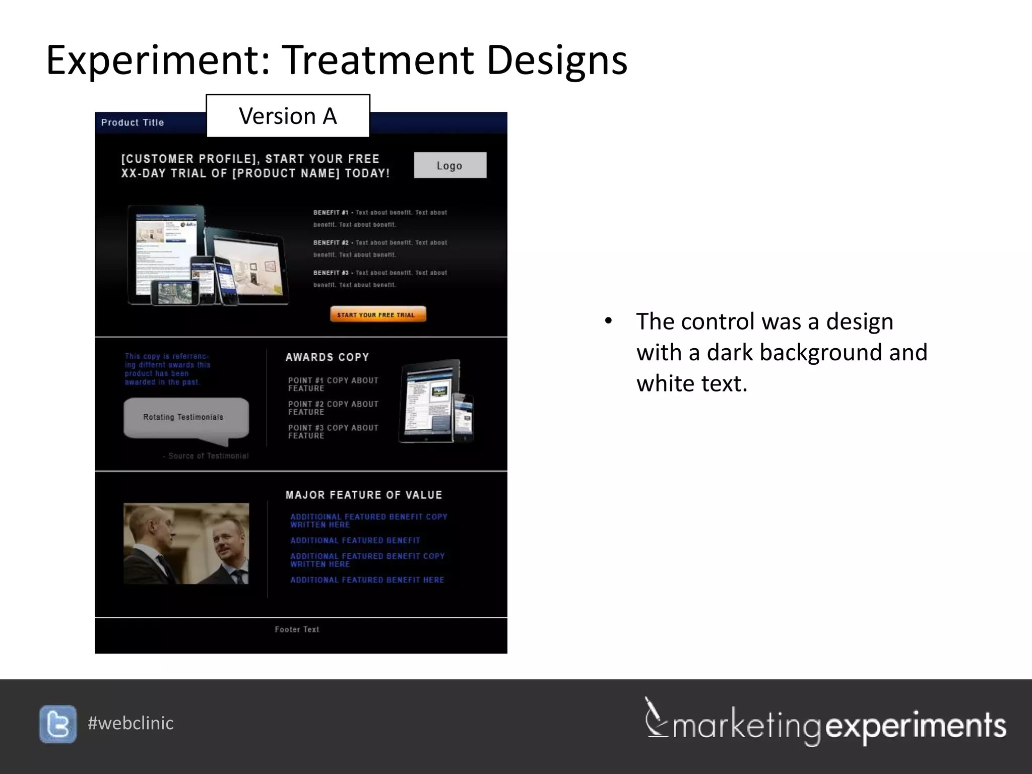
Experiment: Treatment Designs
         Version A


                                  • The control was a design
                                    with a dark background and
                                    white text.


                     #webclinic
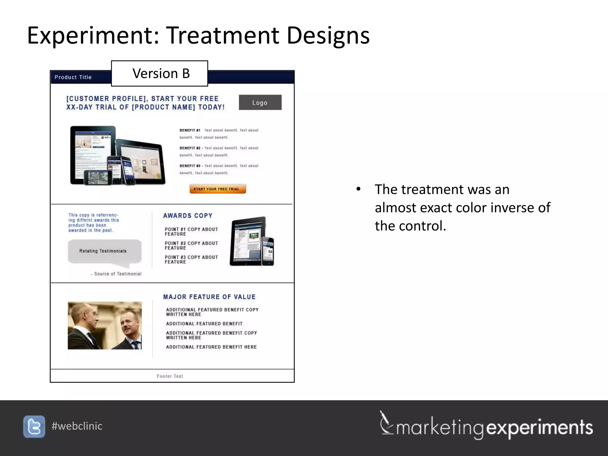
Experiment: Treatment Designs
        Version B


                                 • The treatment was an
                                   almost exact color inverse of
                                   the control.


                    #webclinic
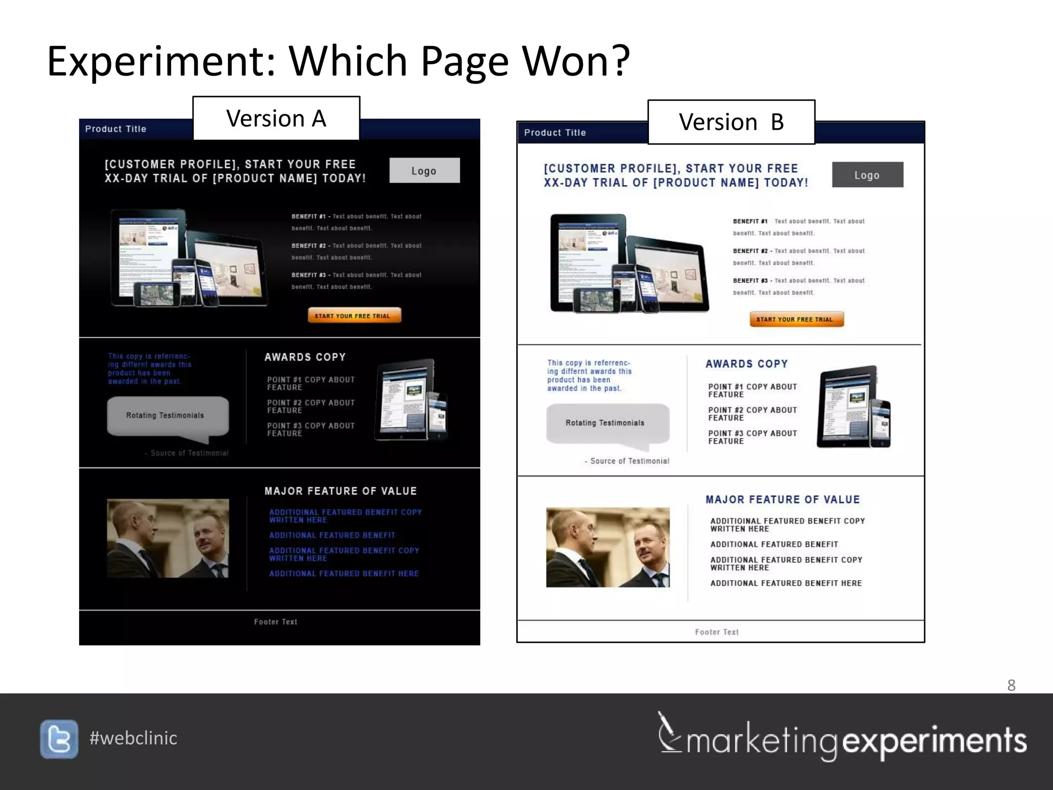
Experiment: Which Page Won?
        Version A                Version B


                                             8

                    #webclinic
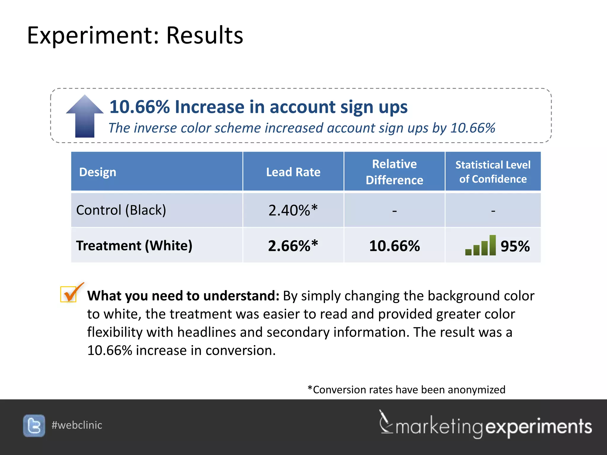
Experiment: Results

          10.66% Increase in account sign ups
          The inverse color scheme increased account sign ups by 10.66%

                                                       Relative        Statistical Level
     Design                        Lead Rate                            of Confidence
                                                      Difference

     Control (Black)               2.40%*                  -                   -

     Treatment (White)             2.66%*             10.66%                       95%


    What youthe treatment was easier simply changing the background color
     to white,
               need to understand: By
                                      to read and provided greater color
      flexibility with headlines and secondary information. The result was a
      10.66% increase in conversion.

                                           *Conversion rates have been anonymized

                                   #webclinic
Why makes colors affect conversion?
F    Key Principles
  1. Marketers do not optimize web designs, they optimize thought sequences.
     Yet often, our web page design is NOT created with the intention of guiding
     the visitor through a clear sequence of thought.

  2. There are primarily 5 design elements that enable a marketer to guide the
     visitor’s through a conversion process:

           1.   Size
           2.   Shape
           3.   Color
           4.   Position
           5.   Motion

  3. Of the five elements, color is likely the most overlooked and misused.

                                                                  10

                                   #webclinic
Today’s Focus


   Today, we are going to learn how to avoid the 5
   most critical horrifying mistakes made with color.


                                            11

                        #webclinic
HORRIFYING
MISTAKE #1: WRONG EMPHASIS


                          12

             #webclinic
MISTAKE #1: WRONG EMPHASIS


        Experiment ID: (Protected)
         Location: MarketingExperiments Research Library
         Test Protocol Number: TP1187

Research Notes:
   Background: Site provides educational resources for health and fitness
   professionals who subscribe to one of their online memberships.

   Goal: To increase the amount of membership sign-ups.

   Primary research question: Which landing page will have the highest
   clickthrough rate?

   Approach: A/B split test (variable cluster)


                                                                  13

                                      #webclinic
MISTAKE #1: WRONG EMPHASIS
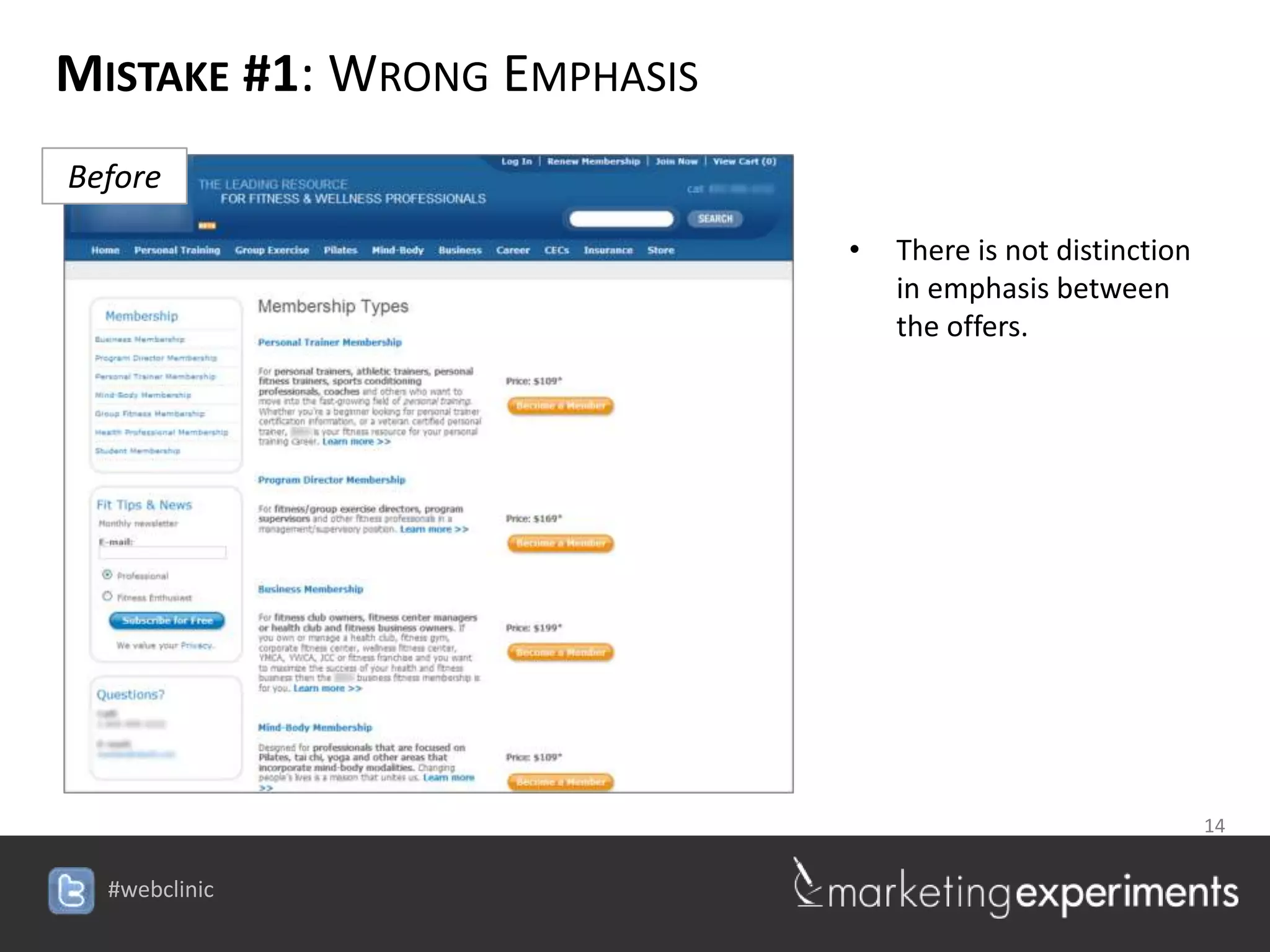
Before

                                 •   There is not distinction
                                     in emphasis between
                                     the offers.


                                         14

                    #webclinic
MISTAKE #1: WRONG EMPHASIS
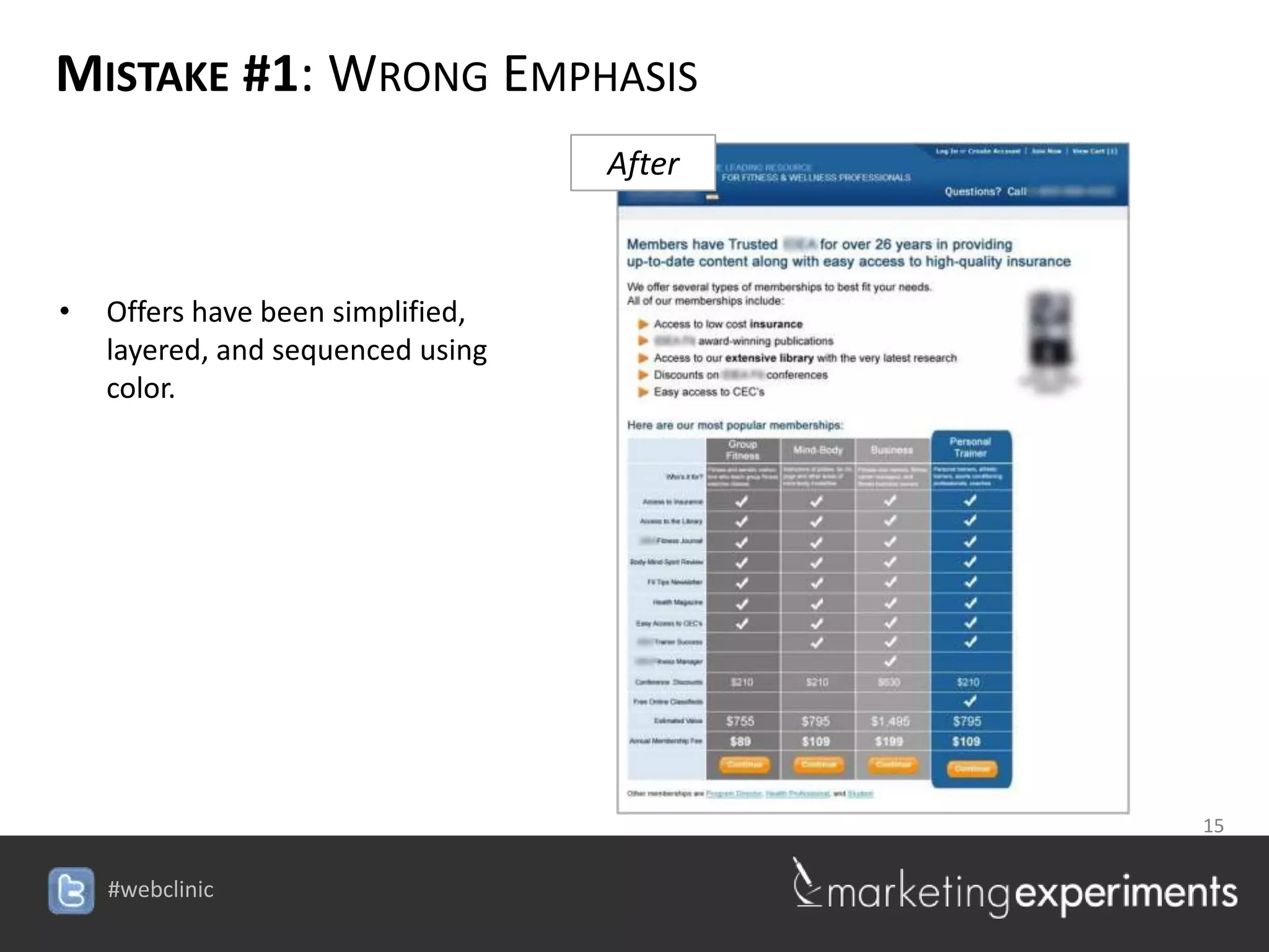
                                       After


•   Offers have been simplified,
    layered, and sequenced using
    color.


                                                15

                                   #webclinic
MISTAKE #1: WRONG EMPHASIS

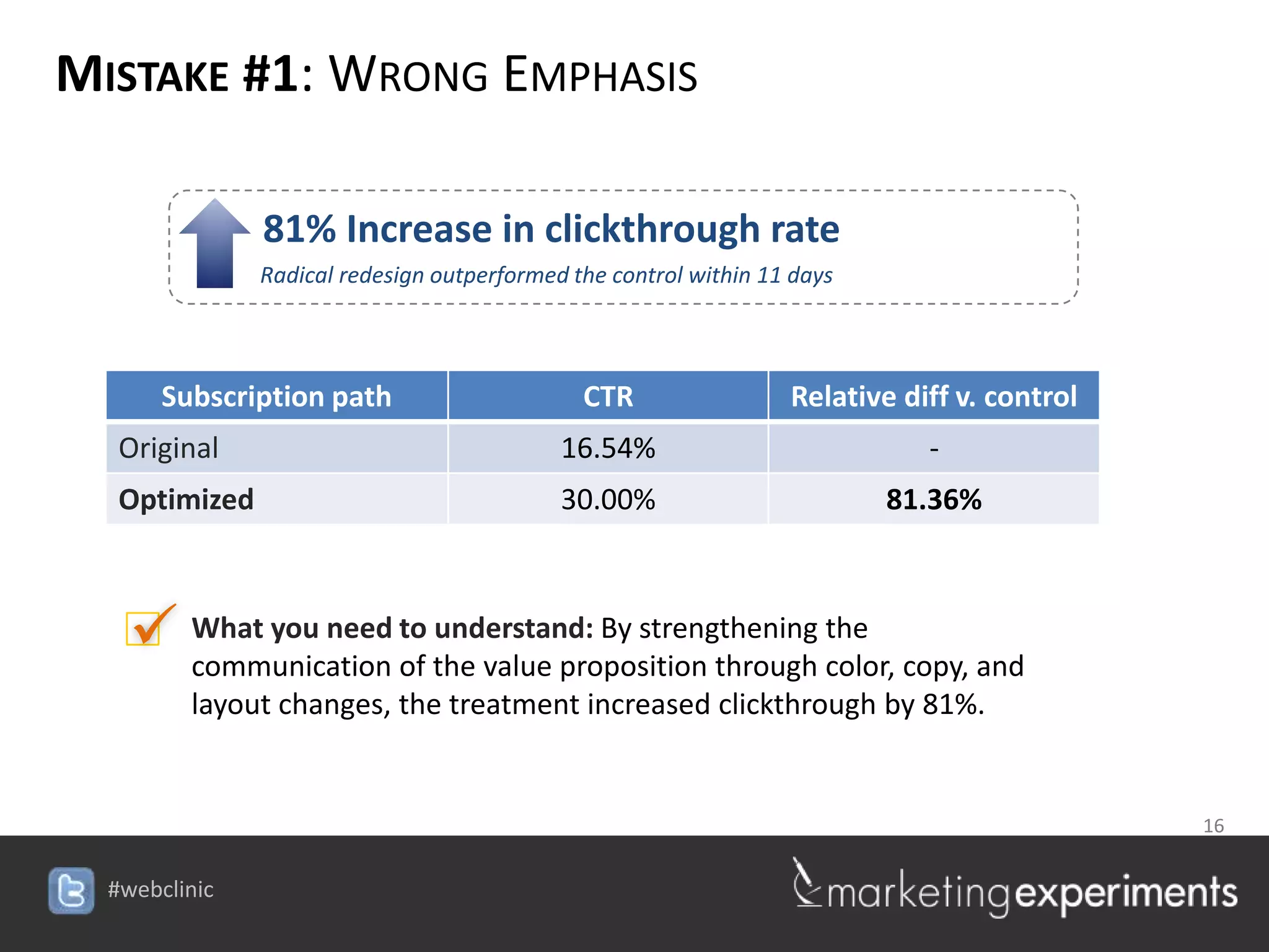
              81% Increase in clickthrough rate
              Radical redesign outperformed the control within 11 days


     Subscription path                       CTR                 Relative diff v. control
  Original                                 16.54%                           -
  Optimized                                30.00%                        81.36%


   What you need to the value proposition through color, copy, and
    communication of
                     understand: By strengthening the

       layout changes, the treatment increased clickthrough by 81%.


                                                                                16

                                           #webclinic
MISTAKE #1: WRONG EMPHASIS
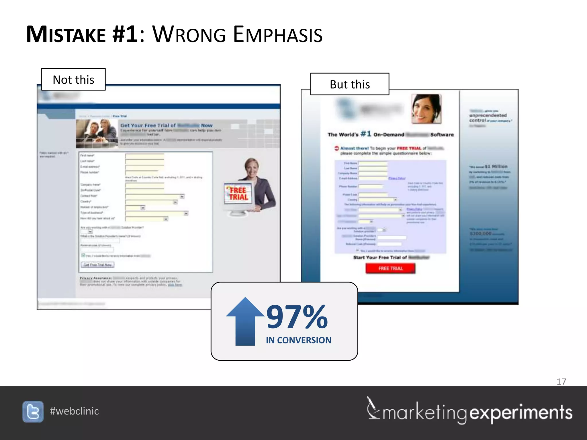
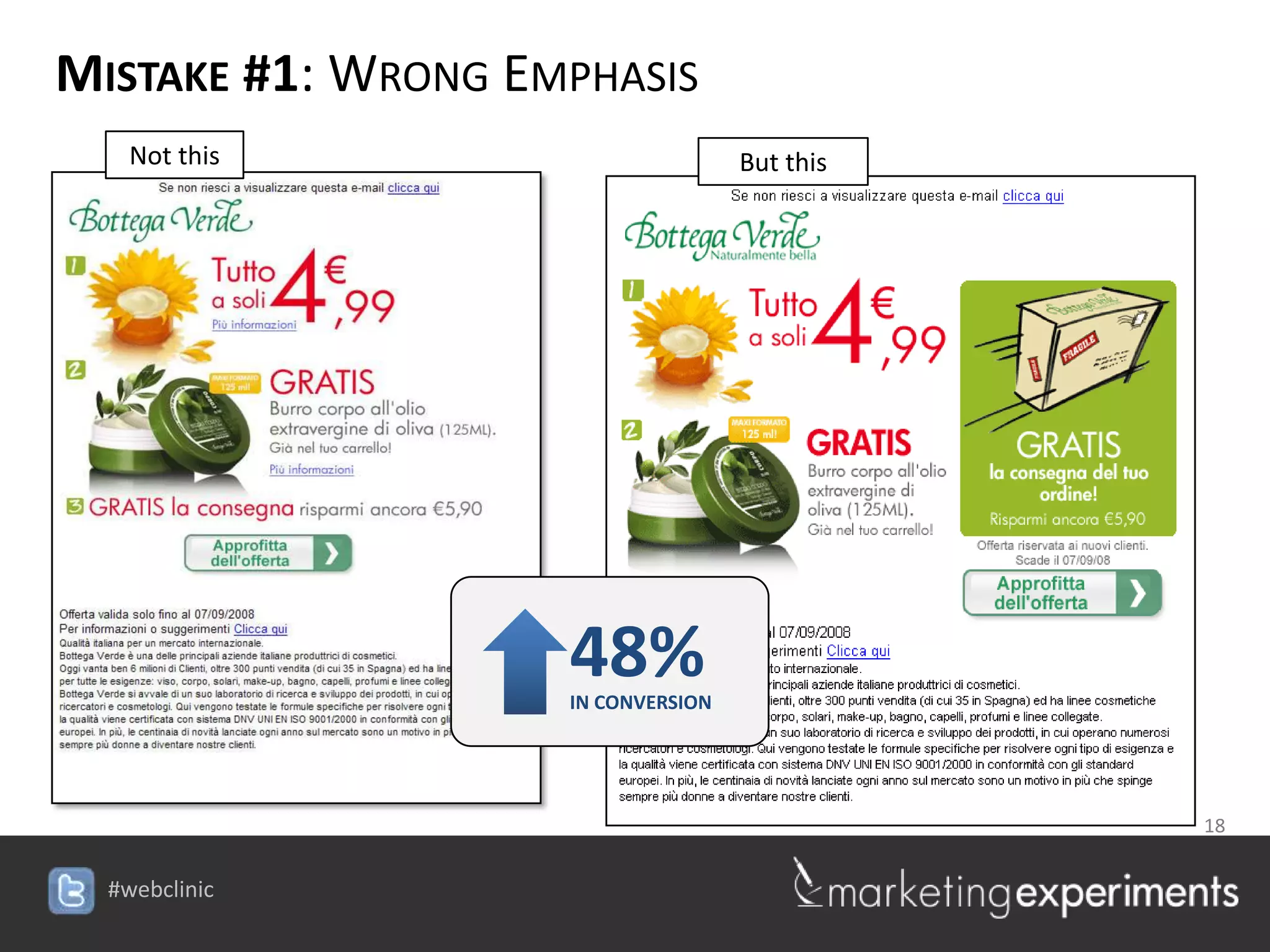
  Not this                       But this


                     97%
                     IN CONVERSION


                                            17

                    #webclinic
MISTAKE #1: WRONG EMPHASIS
   Not this                          But this


                     48%
                     IN CONVERSION


                                                18

                    #webclinic
MISTAKE #1: WRONG EMPHASIS
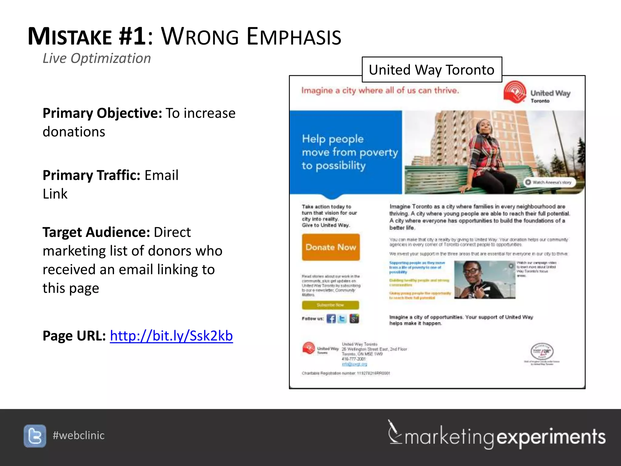
 Live Optimization
                                  United Way Toronto

 Primary Objective: To increase
 donations

 Primary Traffic: Email
 Link

 Target Audience: Direct
 marketing list of donors who
 received an email linking to
 this page


 Page URL: http://bit.ly/Ssk2kb


  #webclinic
HORRIFYING
MISTAKE #2: WRONG AMOUNT


                          20

             #webclinic
MISTAKE #2: WRONG AMOUNT


        Experiment ID: [Protected]
         Location: MarketingExperiments Research Library
         Test Protocol Number: TP1243

Research Notes:
   Background: A consumer credit counseling service offering free debt
   consultation.

   Goal: To increase the amount of free debt consultation sign-ups without
   additional traffic.

   Primary research question: Which page will generate the highest completion
   rate?

   Approach: A/B split test of three different versions of a homepage.
                                                                   21

                                    #webclinic
MISTAKE #2: WRONG AMOUNT
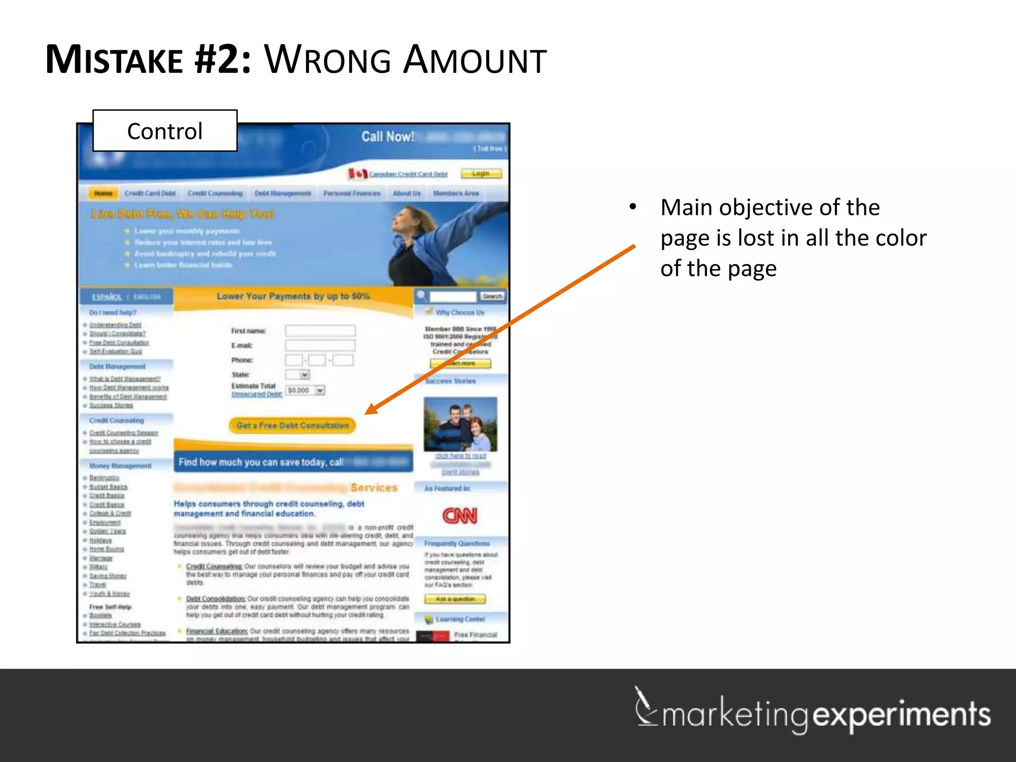
   Control

                           • Main objective of the
                             page is lost in all the color
                             of the page
MISTAKE #2: WRONG AMOUNT
  Treatment


                  Close [x]


                              •   By creating a pop-up, the
                                  treatment effectively
                                  eliminated all color
                                  distractions.
MISTAKE #2: WRONG AMOUNT


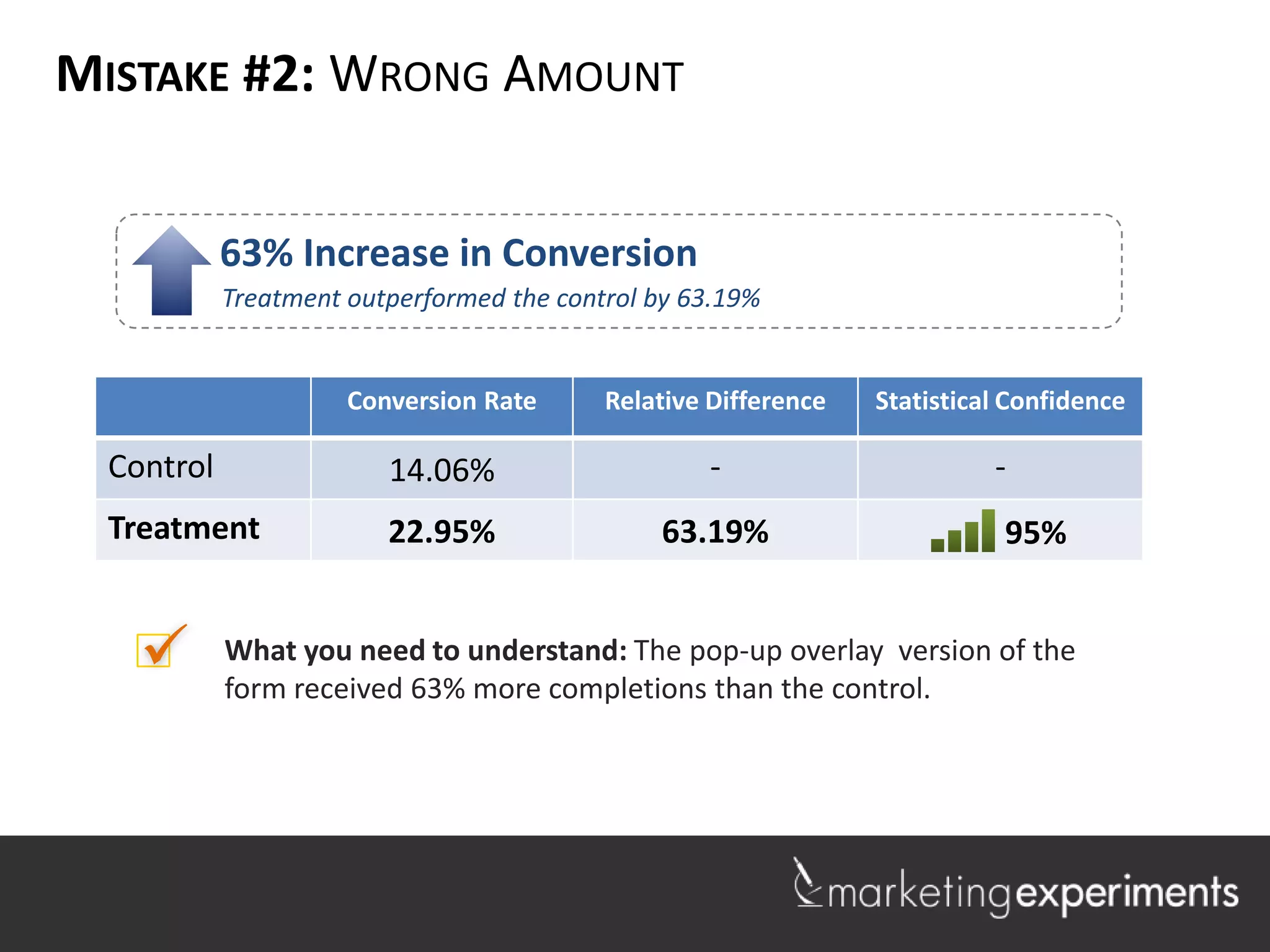
            63% Increase in Conversion
            Treatment outperformed the control by 63.19%


                      Conversion Rate      Relative Difference   Statistical Confidence

  Control                14.06%                     -                      -
  Treatment              22.95%                 63.19%                      95%


           What you need to understand: The pop-up overlay version of the
            form received 63% more completions than the control.
MISTAKE #2: WRONG AMOUNT
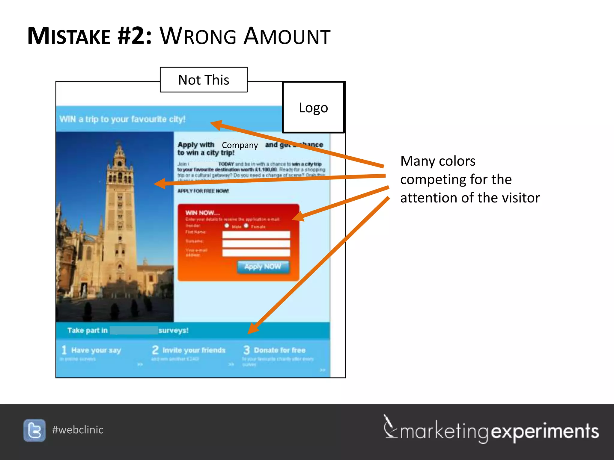
           Not This
                                Logo

                 Company
                                        Many colors
                                        competing for the
                                        attention of the visitor


                           #webclinic
MISTAKE #2: WRONG AMOUNT
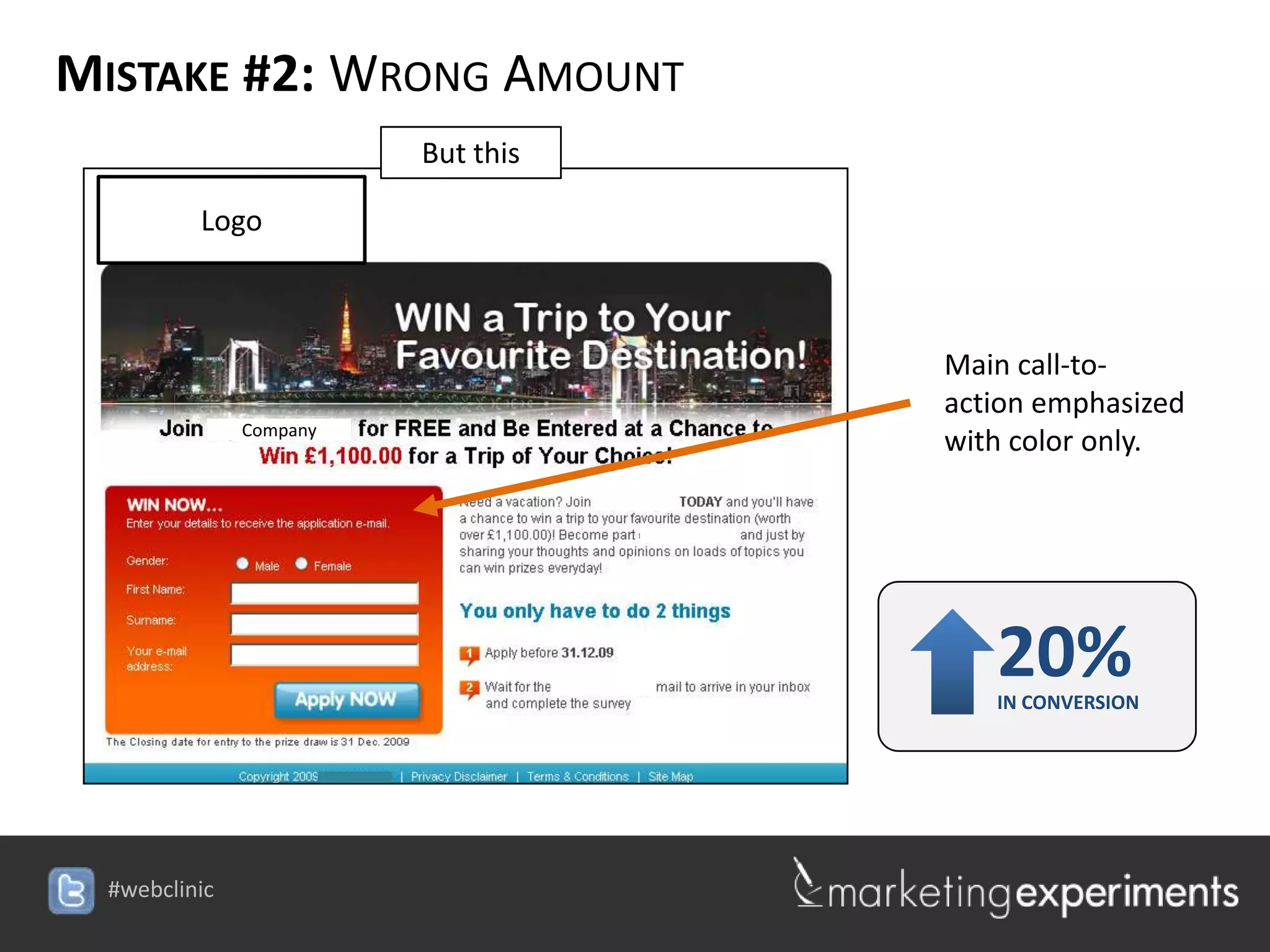
                 But this

     Logo


                                         Main call-to-
                                         action emphasized
       Company
                                         with color only.


                                            20%
                                            IN CONVERSION


                            #webclinic
MISTAKE #2: WRONG AMOUNT
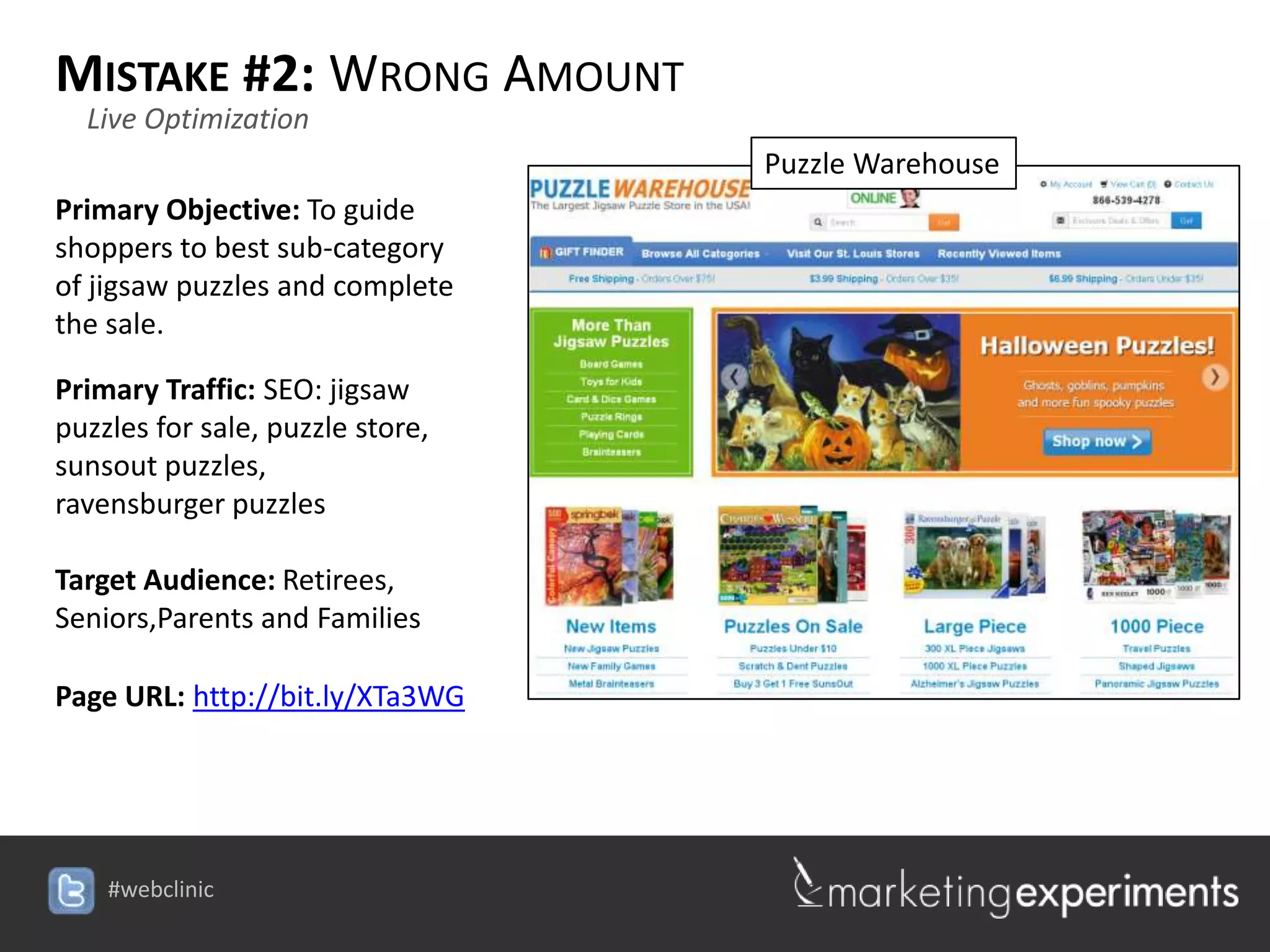
  Live Optimization
                                  Puzzle Warehouse
Primary Objective: To guide
shoppers to best sub-category
of jigsaw puzzles and complete
the sale.

Primary Traffic: SEO: jigsaw
puzzles for sale, puzzle store,
sunsout puzzles,
ravensburger puzzles

Target Audience: Retirees,
Seniors,Parents and Families

Page URL: http://bit.ly/XTa3WG


    #webclinic
HORRIFYING
MISTAKE #3: WRONG COMBINATION


                          28

             #webclinic
MISTAKE #3: WRONG COMBINATION

         Experiment ID: TP1444
         Record Location: MECLABS Research Library
         Research Partner: [Protected]

Research Notes:
   Background: A large artist community that offers paid subscriptions to more
   content.

   Goal: To increase clickthrough on homepage to offer page.

   Research Question: Which color scheme will result in a higher conversion
   rate?

   Test Design: A/B Single factor split


                                                                                 29
MISTAKE #3: WRONG COMBINATION

               Control


                                         The control
                 [Brand]                 featured a
                                         simple form
                                         and a button.


                                        30

                           #webclinic
MISTAKE #3: WRONG COMBINATION
              Treatment


                                          The treatment
                  [Brand]                 was exactly the
                                          same approach
                                          but with a darker
                                          background to
                                          produce a higher
                                          contrast.


                                         31

                            #webclinic
MISTAKE #3: WRONG COMBINATION


                Control                          Treatment

      [Brand]                          [Brand]


                                                        32

                          #webclinic
MISTAKE #3: WRONG COMBINATION


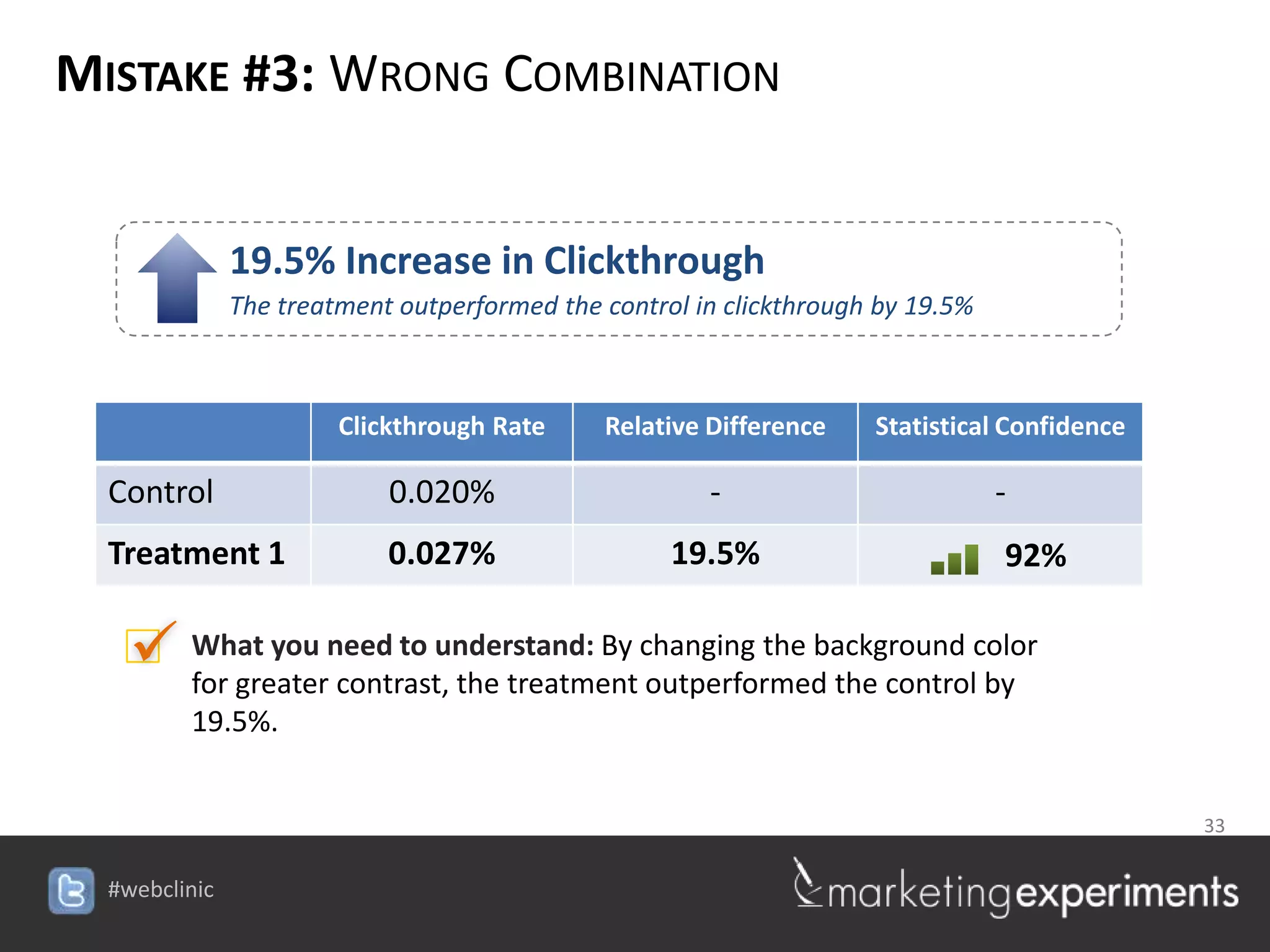
            19.5% Increase in Clickthrough
            The treatment outperformed the control in clickthrough by 19.5%


                     Clickthrough Rate       Relative Difference   Statistical Confidence

  Control                0.020%                         -                     -
  Treatment 1            0.027%                       19.5%                   92%

    What you need to understand: By changing the background color
     for greater contrast, the treatment outperformed the control by
       19.5%.


                                                                         33

                                         #webclinic
MISTAKE #3: WRONG COMBINATION


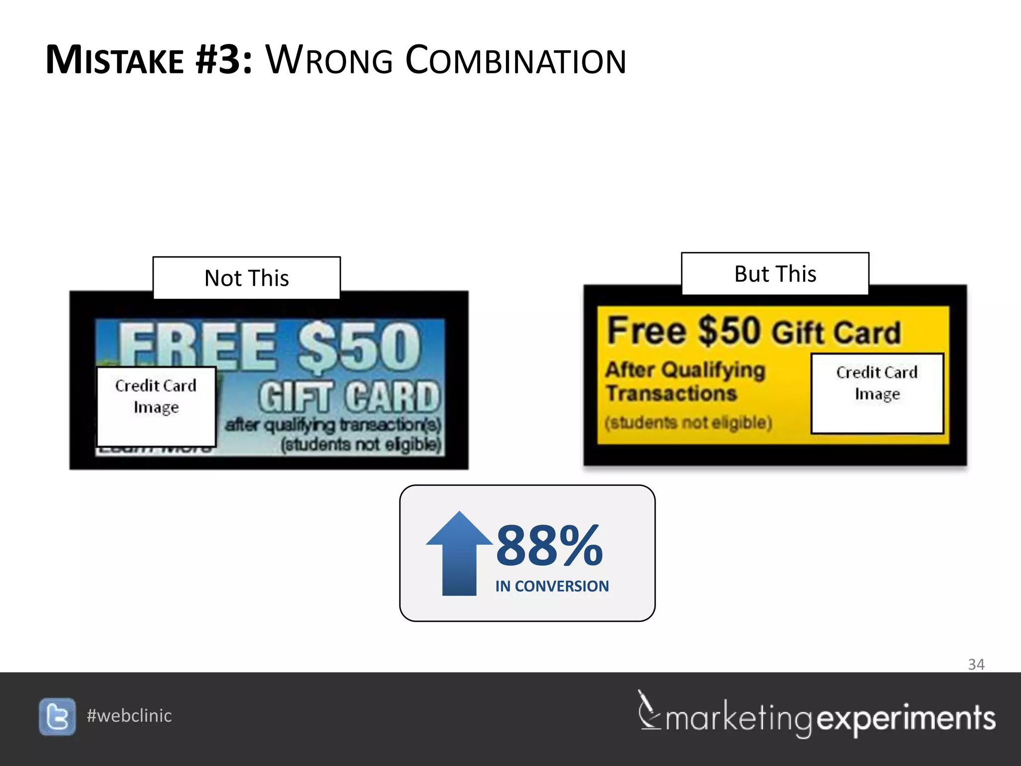
       Not This                          But This


                         88%
                         IN CONVERSION


                                            34

                    #webclinic
MISTAKE #3: WRONG COMBINATION
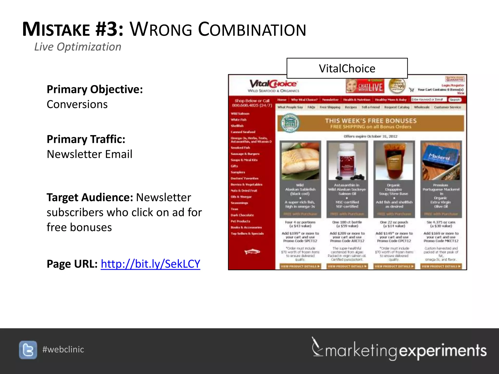
 Live Optimization
                                     VitalChoice
   Primary Objective:
   Conversions

   Primary Traffic:
   Newsletter Email


   Target Audience: Newsletter
   subscribers who click on ad for
   free bonuses

   Page URL: http://bit.ly/SekLCY


  #webclinic
HORRIFYING
MISTAKE #4: WRONG MESSAGE


                          36

             #webclinic
MISTAKE #4: WRONG MESSAGE

         Experiment ID: TP1693
         Record Location: MECLABS Research Library
         Research Partner: [Protected]

Research Notes:
   Background: A large publication seeking to increase home delivery
   subscriptions.

   Goal: To increase home delivery subscriptions

   Research Question: Which color scheme will result in a higher conversion
   rate?

   Test Design: A/B Single factor split


                                                                 37

                                      #webclinic
MISTAKE #4: WRONG MESSAGE

              Version A
     BRAND

                BRAND


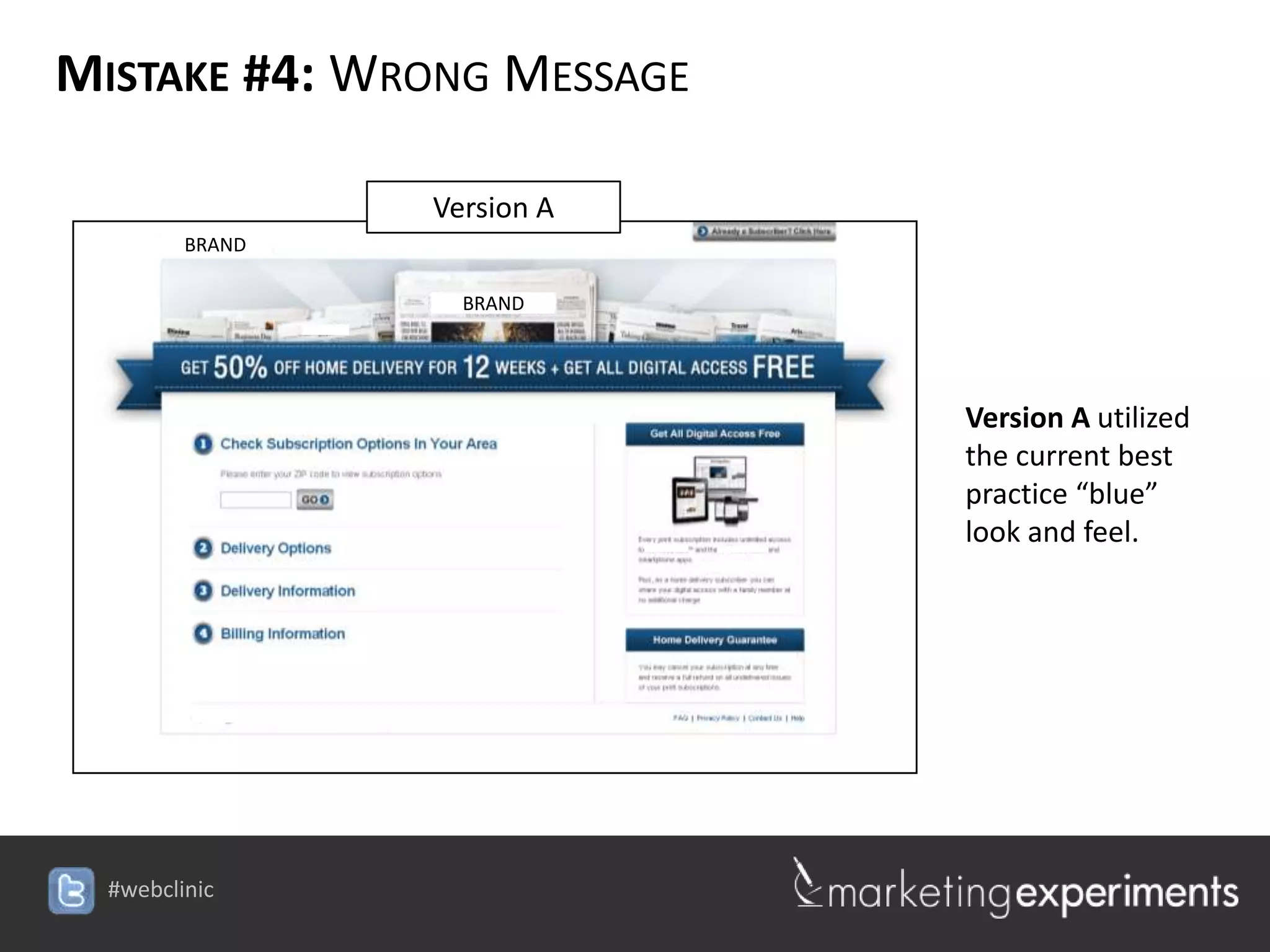
                                       Version A utilized
                                       the current best
                                       practice “blue”
                                       look and feel.


                          #webclinic
MISTAKE #4: WRONG MESSAGE
               Version B
     BRAND

                BRAND


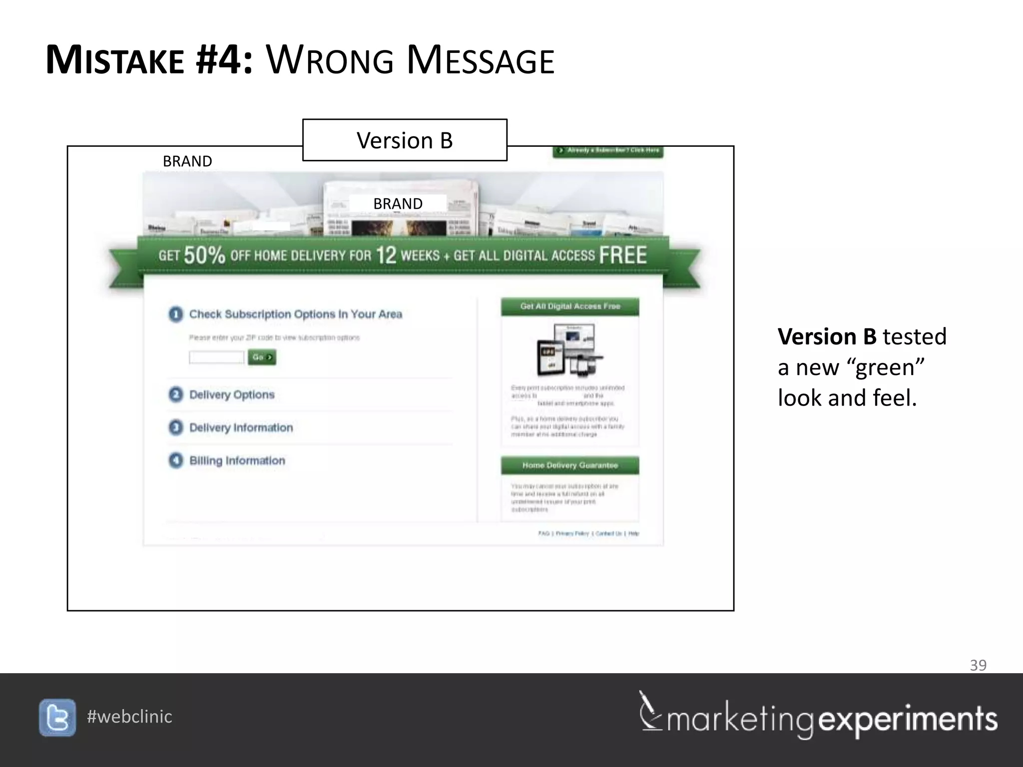
                                     Version B tested
                                     a new “green”
                                     look and feel.


                                     39

                        #webclinic
MISTAKE #4: WRONG MESSAGE


   BRAND                                  BRAND

                                                   BRAND
             BRAND


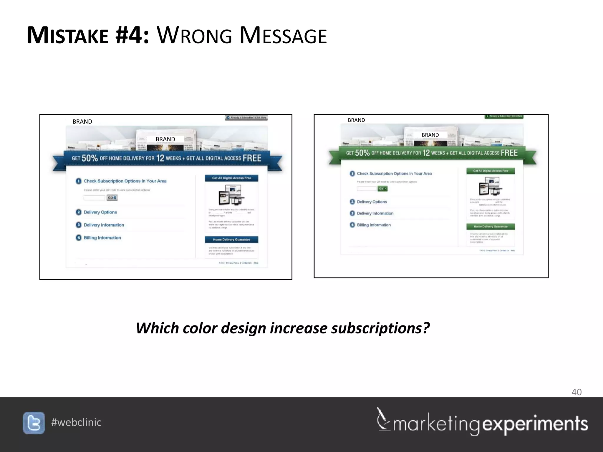
           Which color design increase subscriptions?


                                                           40

                             #webclinic
MISTAKE #4: WRONG MESSAGE


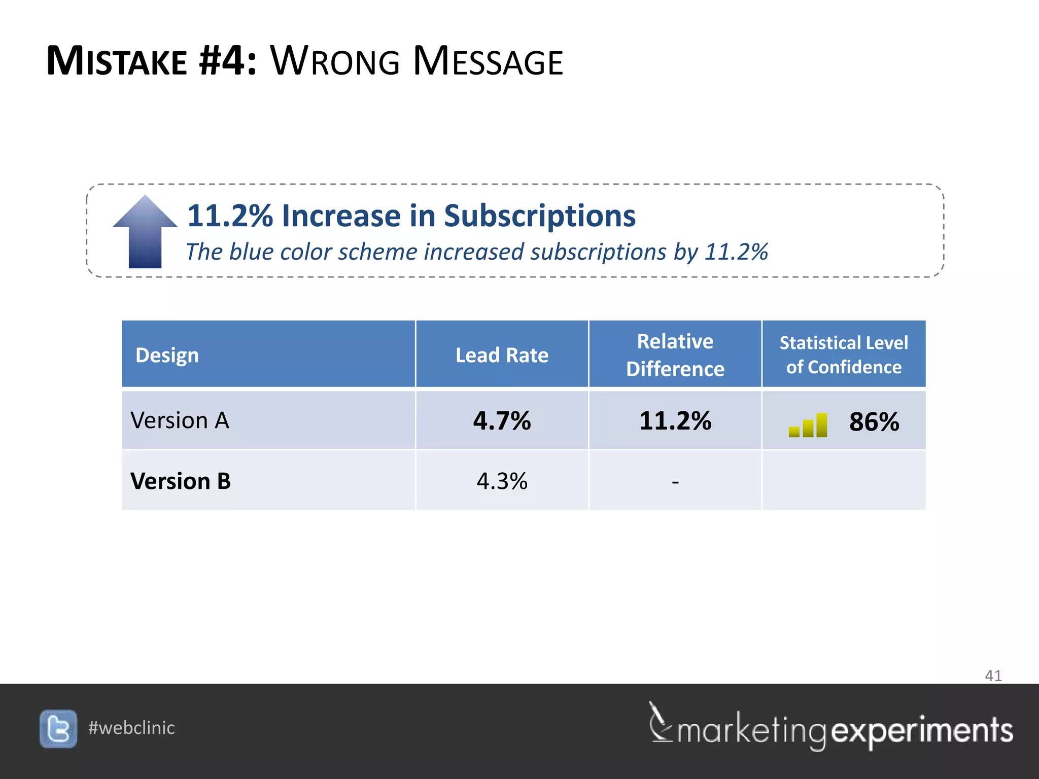
         11.2% Increase in Subscriptions
        The blue color scheme increased subscriptions by 11.2%


                                                 Relative        Statistical Level
    Design                       Lead Rate                        of Confidence
                                                Difference

    Version A                     4.7%           11.2%                    86%

    Version B                      4.3%             -


                                                                 41

                                 #webclinic
MISTAKE #4: WRONG MESSAGE

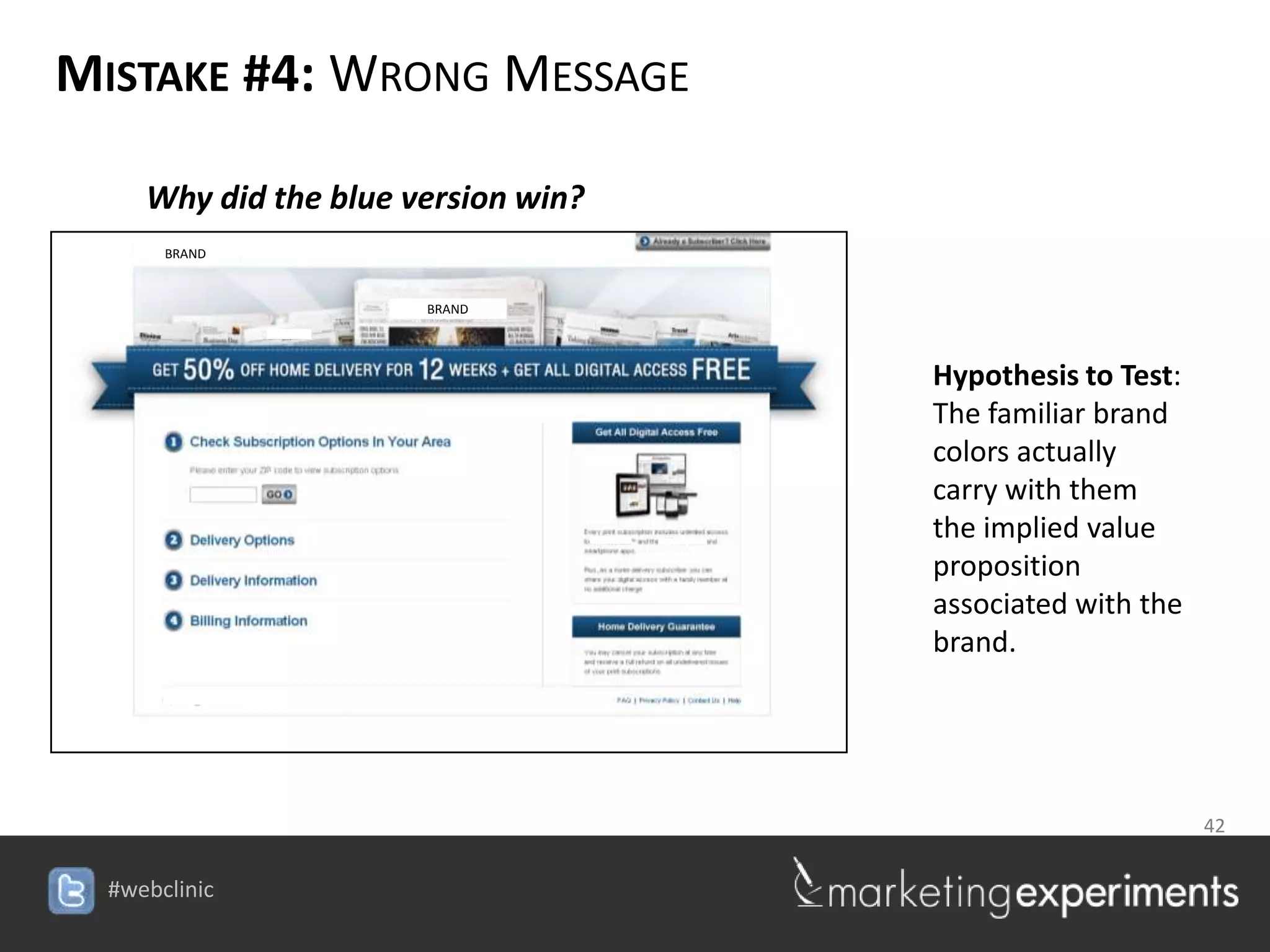
   Why did the blue version win?
    BRAND


                     BRAND


                                           Hypothesis to Test:
                                           The familiar brand
                                           colors actually
                                           carry with them
                                           the implied value
                                           proposition
                                           associated with the
                                           brand.


                                            42

                              #webclinic
MISTAKE #4: WRONG MESSAGE
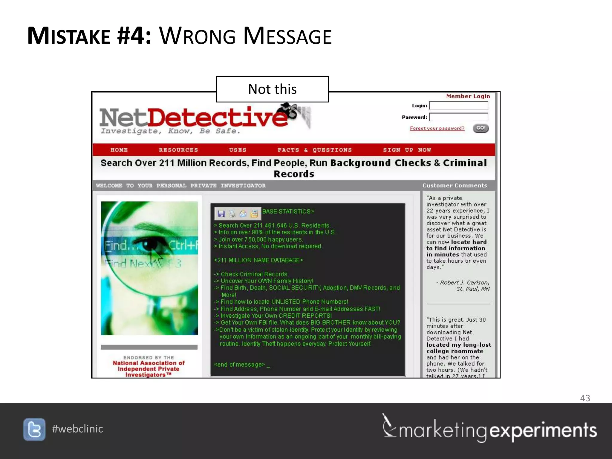
                  Not this


                                  43

                     #webclinic
MISTAKE #4: WRONG MESSAGE
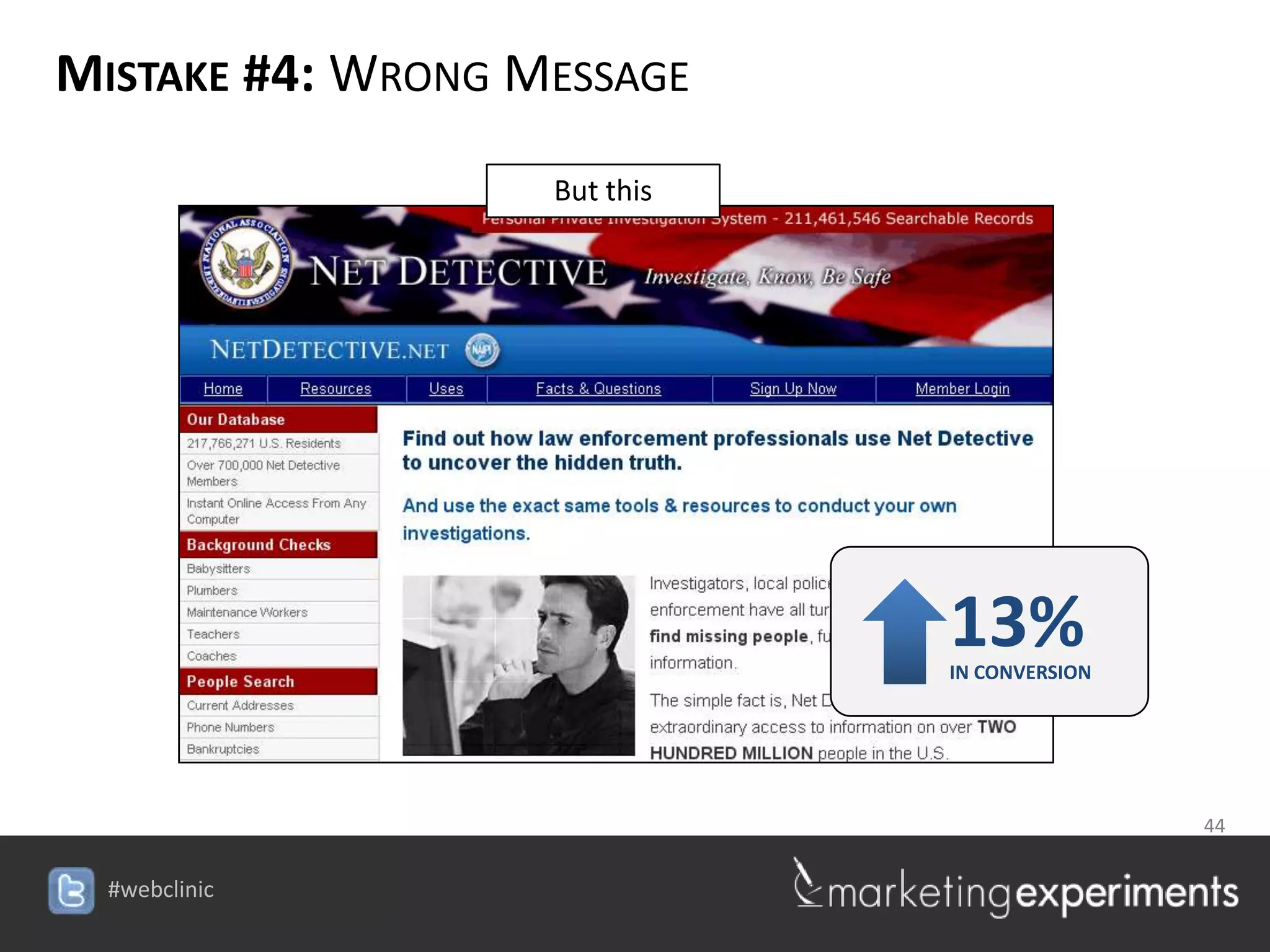
                   But this


                                13%
                                IN CONVERSION


                                44

                   #webclinic
MISTAKE #4: WRONG MESSAGE
 Live Optimization
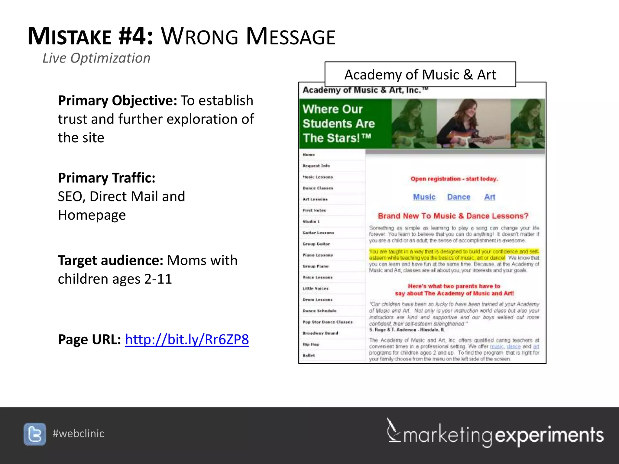
                                      Academy of Music & Art
   Primary Objective: To establish
   trust and further exploration of
   the site

   Primary Traffic:
   SEO, Direct Mail and
   Homepage

   Target audience: Moms with
   children ages 2-11


   Page URL: http://bit.ly/Rr6ZP8


  #webclinic
HORRIFYING
MISTAKE #5: WRONG FLOW


                          46

             #webclinic
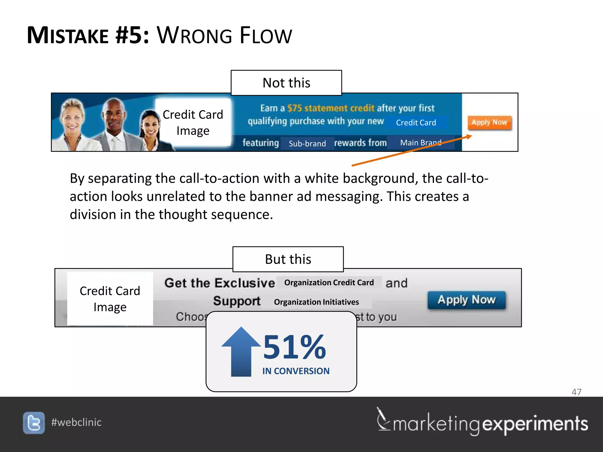
MISTAKE #5: WRONG FLOW
                                   Not this

                  Credit Card                                      Credit Card
                    Image
                                         Sub-brand                  Main Brand


   By separating the call-to-action with a white background, the call-to-
   action looks unrelated to the banner ad messaging. This creates a
   division in the thought sequence.

                                   But this
                                        Organization Credit Card
    Credit Card
                                     Organization Initiatives
      Image


                                   51%
                                   IN CONVERSION

                                                                                 47

                                   #webclinic
MISTAKE #5: WRONG FLOW

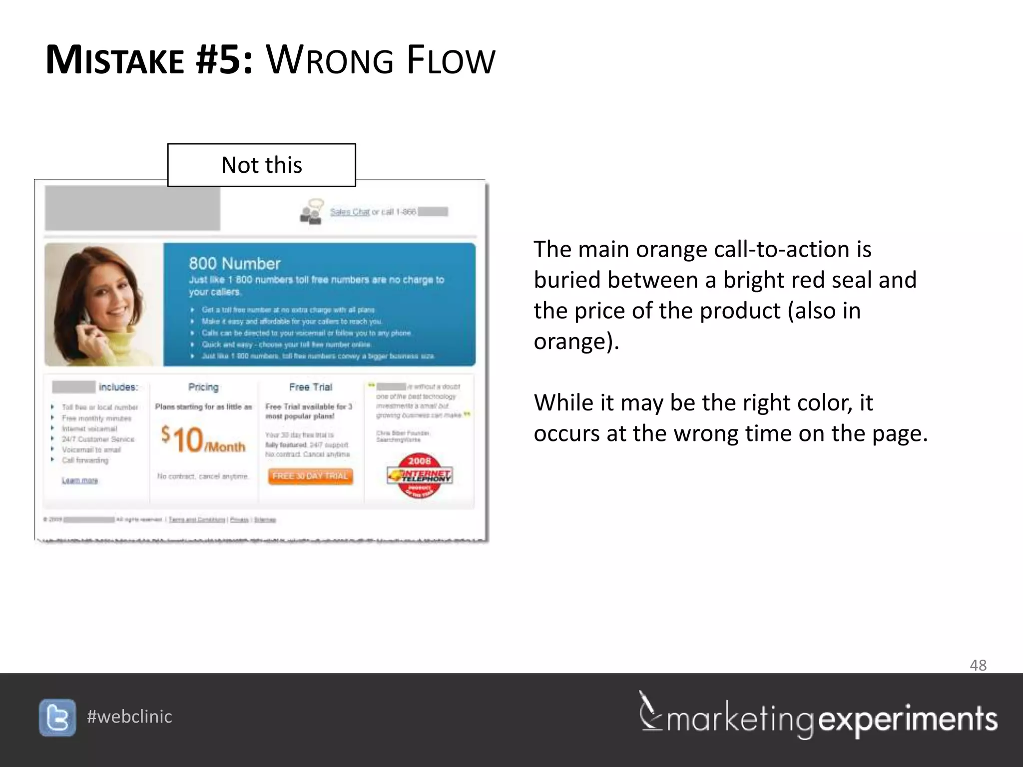
        Not this


                            The main orange call-to-action is
                            buried between a bright red seal and
                            the price of the product (also in
                            orange).

                            While it may be the right color, it
                            occurs at the wrong time on the page.


                                                  48

                   #webclinic
MISTAKE #5: WRONG FLOW

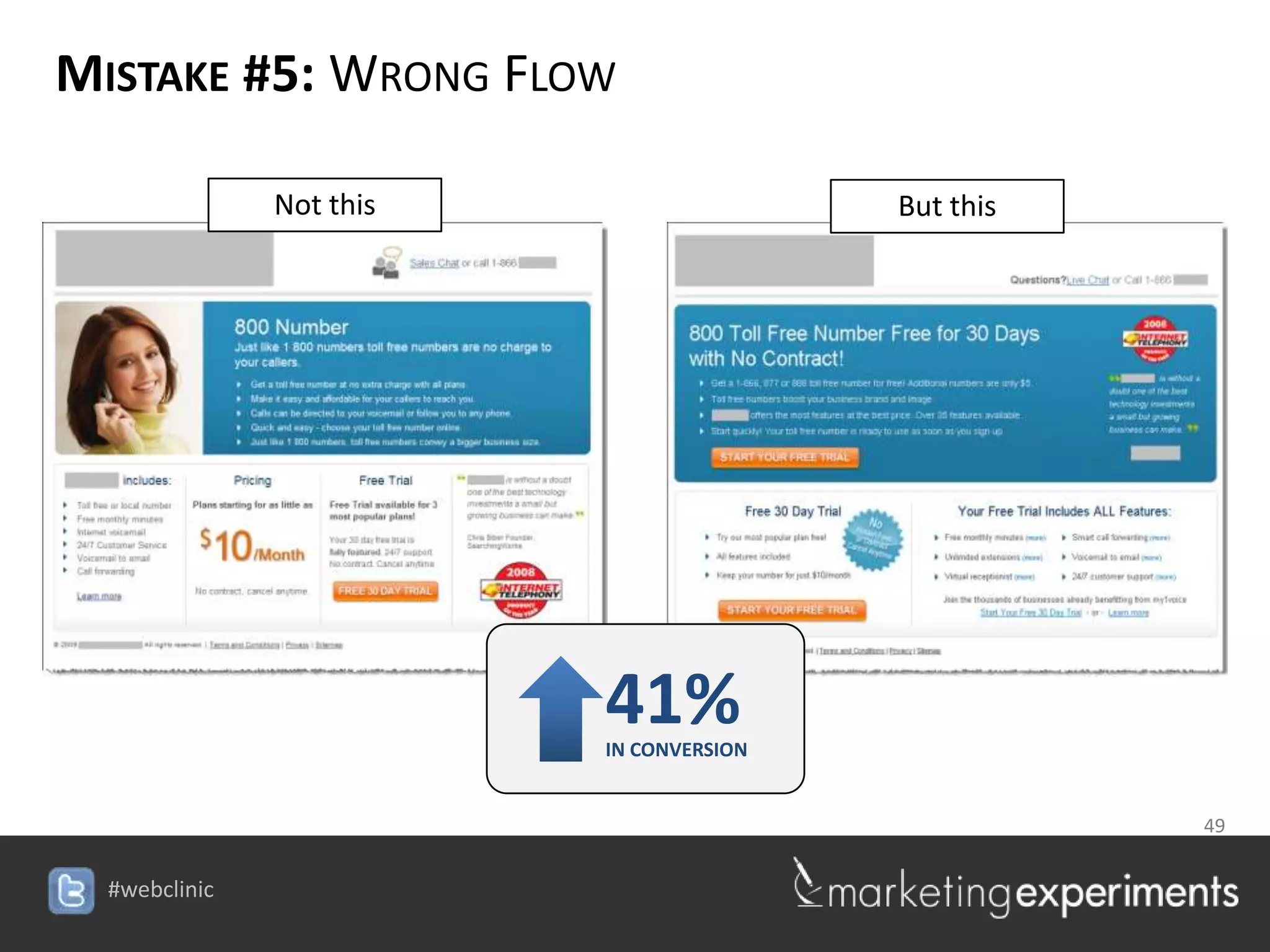
        Not this                       But this


                       41%
                       IN CONVERSION


                                           49

                   #webclinic
MISTAKE #5: WRONG FLOW
 Live Optimization
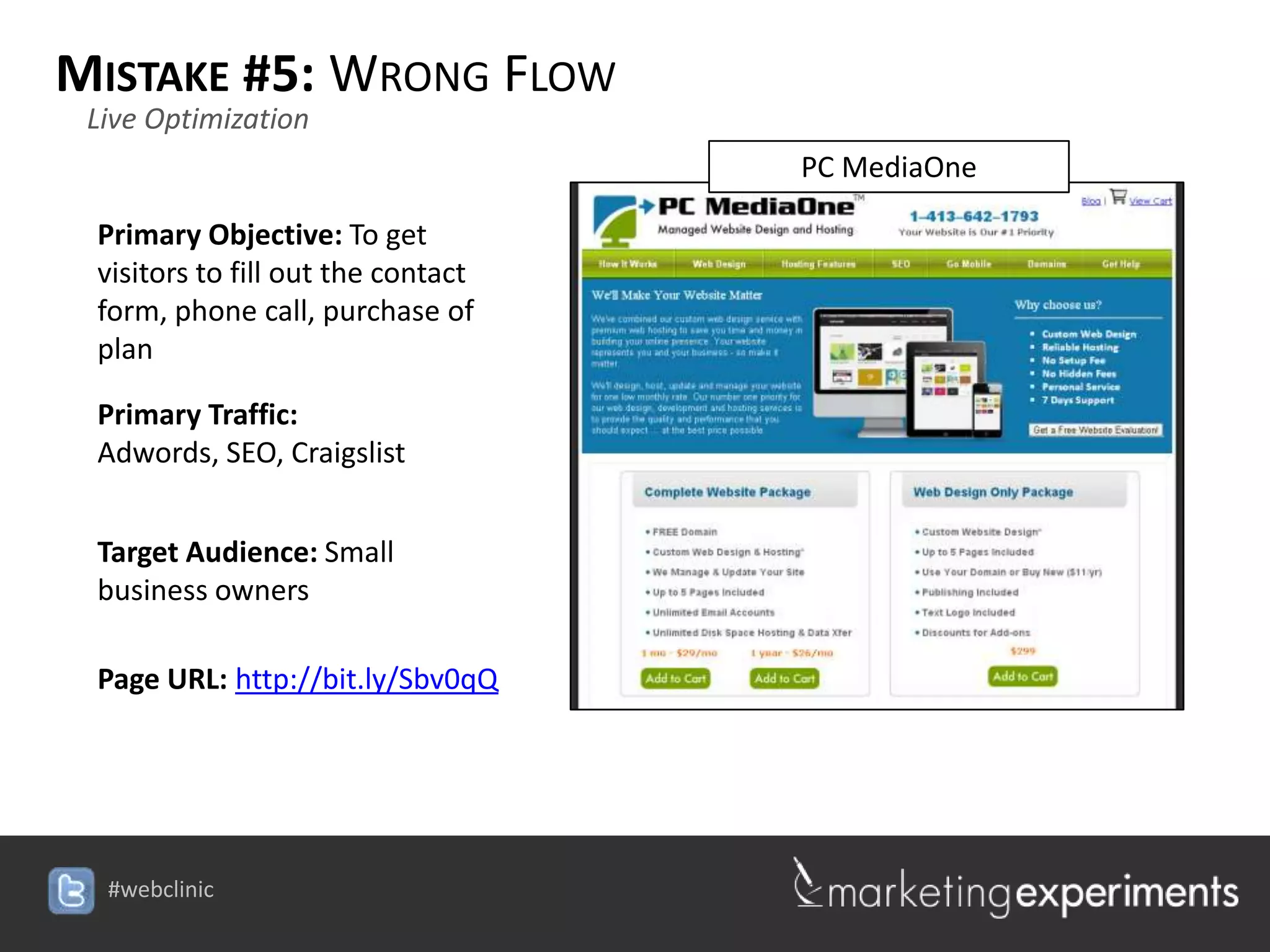
                                                 PC MediaOne

 Primary Objective: To get
 visitors to fill out the contact
 form, phone call, purchase of
 plan

 Primary Traffic:
 Adwords, SEO, Craigslist


 Target Audience: Small
 business owners

 Page URL: http://bit.ly/Sbv0qQ


                                    #webclinic
SUMMARY: PUTTING IT ALL TOGETHER
F    Key Principles

  1. Marketers do not optimize web designs, they optimize thought sequences.
     Yet often, our web page design is NOT created with the intention of guiding
     the visitor through a clear sequence of thought.

  2. There are primarily 5 design elements that enable a marketer to guide the
     visitor’s through a conversion process:

           1.   Size
           2.   Shape
           3.   Color
           4.   Position
           5.   Motion

  1. Of the five elements, color is likely the most overlooked and misused.

                                                                  51

                                   #webclinic
SUMMARY: PUTTING IT ALL TOGETHER
F   Key Principles


       Mistake #1: Wrong Emphasis
       Mistake #2: Wrong Amount
       Mistake #3: Wrong Combination
       Mistake #4: Wrong Message
       Mistake #5: Wrong Flow

                                       52

                      #webclinic
Live Optimization


                                 53

                    #webclinic
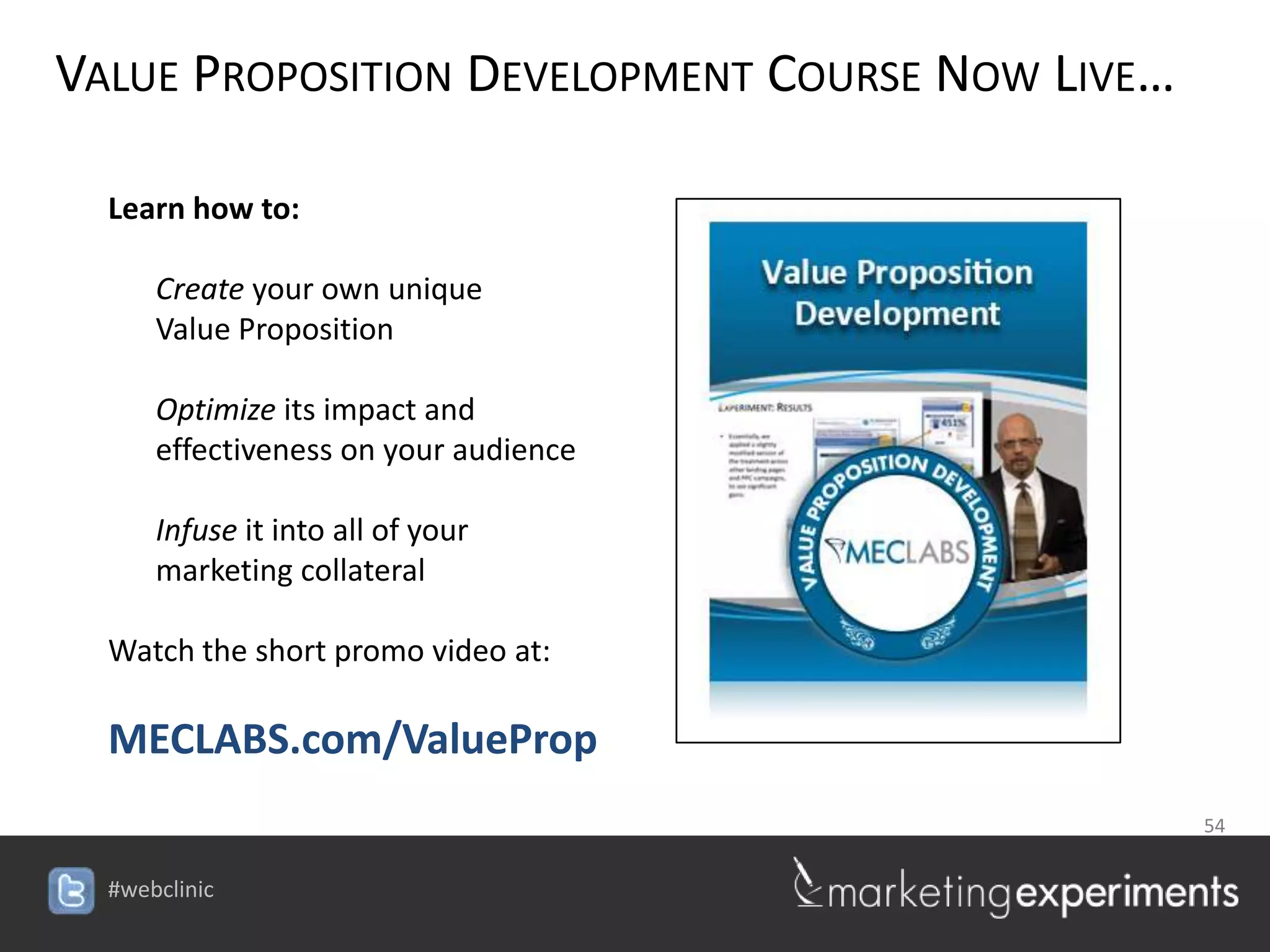
VALUE PROPOSITION DEVELOPMENT COURSE NOW LIVE…

  Learn how to:

     Create your own unique
     Value Proposition

     Optimize its impact and
     effectiveness on your audience

     Infuse it into all of your
     marketing collateral

  Watch the short promo video at:

  MECLABS.com/ValueProp
                                                 54

                                    #webclinic
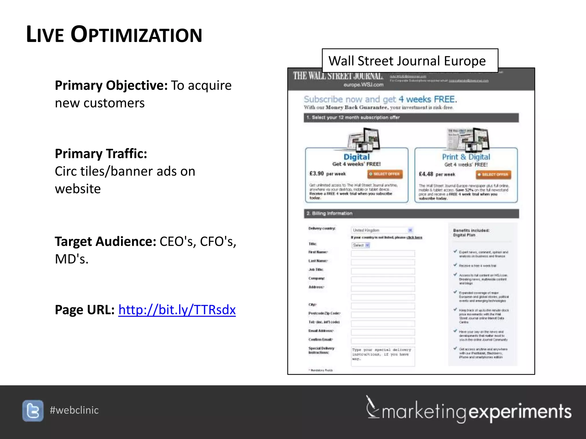
LIVE OPTIMIZATION
                                    Wall Street Journal Europe
   Primary Objective: To acquire
   new customers


   Primary Traffic:
   Circ tiles/banner ads on
   website


   Target Audience: CEO's, CFO's,
   MD's.


   Page URL: http://bit.ly/TTRsdx


  #webclinic
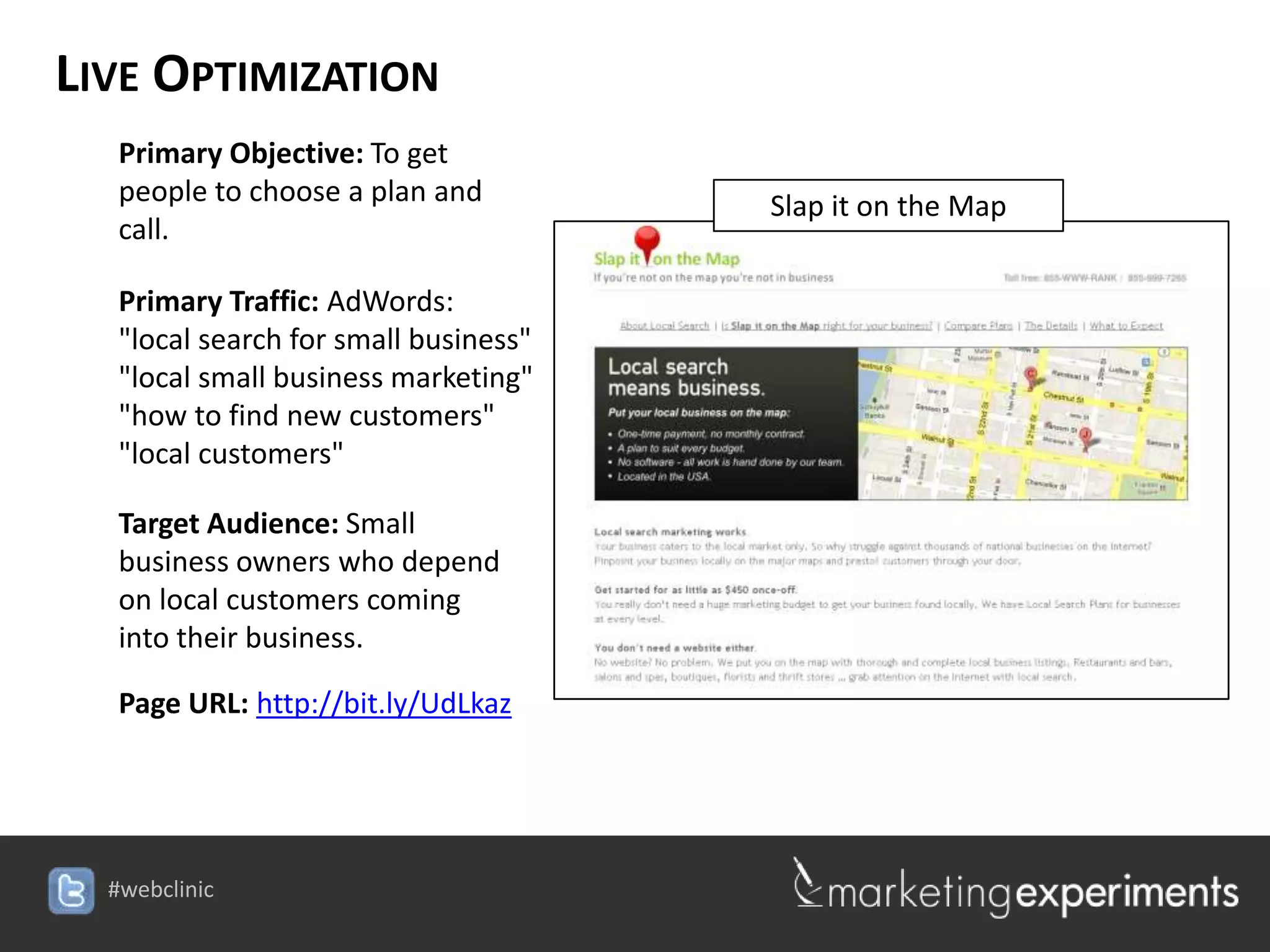
LIVE OPTIMIZATION
   Primary Objective: To get
   people to choose a plan and         Slap it on the Map
   call.

   Primary Traffic: AdWords:
   "local search for small business"
   "local small business marketing"
   "how to find new customers"
   "local customers"

   Target Audience: Small
   business owners who depend
   on local customers coming
   into their business.

   Page URL: http://bit.ly/UdLkaz


  #webclinic
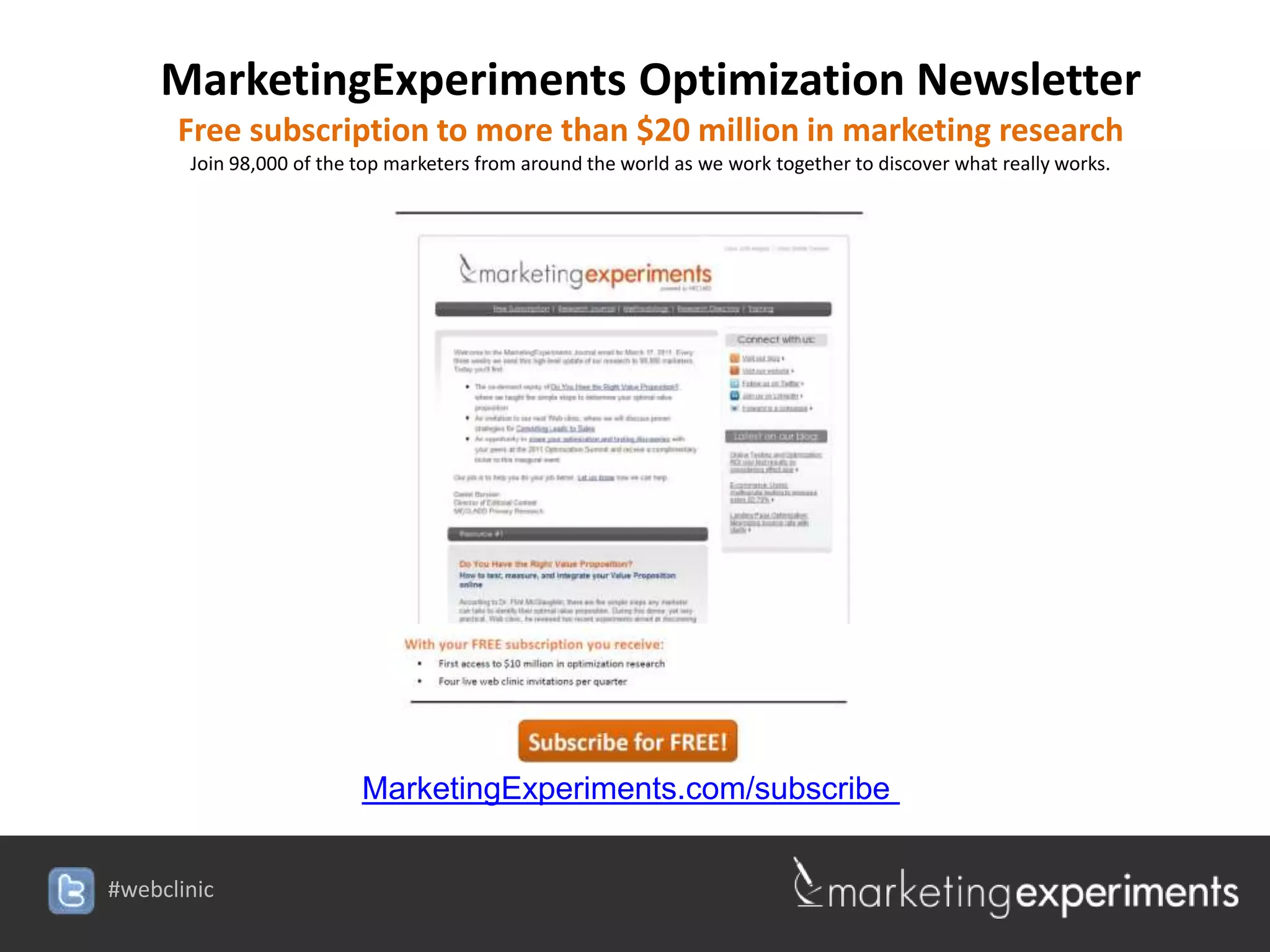
MarketingExperiments Optimization Newsletter
      Free subscription to more than $20 million in marketing research
       Join 98,000 of the top marketers from around the world as we work together to discover what really works.


                          MarketingExperiments.com/subscribe


#webclinic

How Do Website Colors Impact Conversion?

  • 1.
    How Do WebsiteColors Impact Conversion? New research reveals 5 critical horrifying mistakes designers make with color (special Halloween edition) #webclinic
  • 2.
    Join the conversationon Twitter #webclinic #webclinic
  • 3.
    Today’s team Dr. Flint McGlaughlin – Managing Director, MECLABS Flint McGlaughlin is the Managing Director of MECLABS Group. The organization has partnered with key market leaders including The New York Times, Microsoft Corporation, and Reuters Group. Dr. McGlaughlin also serves as the Director of Enterprise Research at the Transforming Business Institute, University of Cambridge (UK), as the Chairman of the Board of Governors for St. Stephen’s University, and as a Trustee for Westminster Theological Centre. Dr. McGlaughlin originally studied Philosophy and Theology at the University of London’s Specialist Jesuit College. Today, his primary research is focused on enterprise as transformative agent. His work has won multiple awards and has been quoted in more than 13,000 online and offline sources. #webclinic
  • 4.
    Experiment: Background Experiment ID: TP1645 Record Location: MECLABS Research Library Research Partner: [Protected] Research Notes: Background: A large sports entertainment provider sought to increase conversion on it’s main landing page. Goal: To increase premium signups Research Question: Which color scheme will result in a higher conversion rate? Test Design: A/B Single factor split 4 #webclinic
  • 5.
    Get a MECLABSControlled Testing Environment 2 Controlled Testing Environment (CTE) Test Cycle #1 Your Creative Control TRT 1 TRT 2 TRT 3 Your Marketing Team Fully Optimized Embed a Science Lab in the Test Cycle #2 Page Goes Live heart of your organization. Control TRT 2MECLABS Certified Final 5 #webclinic
  • 6.
    Experiment: Treatment Designs Version A • The control was a design with a dark background and white text. #webclinic
  • 7.
    Experiment: Treatment Designs Version B • The treatment was an almost exact color inverse of the control. #webclinic
  • 8.
    Experiment: Which PageWon? Version A Version B 8 #webclinic
  • 9.
    Experiment: Results 10.66% Increase in account sign ups The inverse color scheme increased account sign ups by 10.66% Relative Statistical Level Design Lead Rate of Confidence Difference Control (Black) 2.40%* - - Treatment (White) 2.66%* 10.66% 95%  What youthe treatment was easier simply changing the background color to white, need to understand: By to read and provided greater color flexibility with headlines and secondary information. The result was a 10.66% increase in conversion. *Conversion rates have been anonymized #webclinic
  • 10.
    Why makes colorsaffect conversion? F Key Principles 1. Marketers do not optimize web designs, they optimize thought sequences. Yet often, our web page design is NOT created with the intention of guiding the visitor through a clear sequence of thought. 2. There are primarily 5 design elements that enable a marketer to guide the visitor’s through a conversion process: 1. Size 2. Shape 3. Color 4. Position 5. Motion 3. Of the five elements, color is likely the most overlooked and misused. 10 #webclinic
  • 11.
    Today’s Focus Today, we are going to learn how to avoid the 5 most critical horrifying mistakes made with color. 11 #webclinic
  • 12.
    HORRIFYING MISTAKE #1: WRONGEMPHASIS 12 #webclinic
  • 13.
    MISTAKE #1: WRONGEMPHASIS  Experiment ID: (Protected) Location: MarketingExperiments Research Library Test Protocol Number: TP1187 Research Notes: Background: Site provides educational resources for health and fitness professionals who subscribe to one of their online memberships. Goal: To increase the amount of membership sign-ups. Primary research question: Which landing page will have the highest clickthrough rate? Approach: A/B split test (variable cluster) 13 #webclinic
  • 14.
    MISTAKE #1: WRONGEMPHASIS Before • There is not distinction in emphasis between the offers. 14 #webclinic
  • 15.
    MISTAKE #1: WRONGEMPHASIS After • Offers have been simplified, layered, and sequenced using color. 15 #webclinic
  • 16.
    MISTAKE #1: WRONGEMPHASIS 81% Increase in clickthrough rate Radical redesign outperformed the control within 11 days Subscription path CTR Relative diff v. control Original 16.54% - Optimized 30.00% 81.36%  What you need to the value proposition through color, copy, and communication of understand: By strengthening the layout changes, the treatment increased clickthrough by 81%. 16 #webclinic
  • 17.
    MISTAKE #1: WRONGEMPHASIS Not this But this 97% IN CONVERSION 17 #webclinic
  • 18.
    MISTAKE #1: WRONGEMPHASIS Not this But this 48% IN CONVERSION 18 #webclinic
  • 19.
    MISTAKE #1: WRONGEMPHASIS Live Optimization United Way Toronto Primary Objective: To increase donations Primary Traffic: Email Link Target Audience: Direct marketing list of donors who received an email linking to this page Page URL: http://bit.ly/Ssk2kb #webclinic
  • 20.
    HORRIFYING MISTAKE #2: WRONGAMOUNT 20 #webclinic
  • 21.
    MISTAKE #2: WRONGAMOUNT  Experiment ID: [Protected] Location: MarketingExperiments Research Library Test Protocol Number: TP1243 Research Notes: Background: A consumer credit counseling service offering free debt consultation. Goal: To increase the amount of free debt consultation sign-ups without additional traffic. Primary research question: Which page will generate the highest completion rate? Approach: A/B split test of three different versions of a homepage. 21 #webclinic
  • 22.
    MISTAKE #2: WRONGAMOUNT Control • Main objective of the page is lost in all the color of the page
  • 23.
    MISTAKE #2: WRONGAMOUNT Treatment Close [x] • By creating a pop-up, the treatment effectively eliminated all color distractions.
  • 24.
    MISTAKE #2: WRONGAMOUNT 63% Increase in Conversion Treatment outperformed the control by 63.19% Conversion Rate Relative Difference Statistical Confidence Control 14.06% - - Treatment 22.95% 63.19% 95%  What you need to understand: The pop-up overlay version of the form received 63% more completions than the control.
  • 25.
    MISTAKE #2: WRONGAMOUNT Not This Logo Company Many colors competing for the attention of the visitor #webclinic
  • 26.
    MISTAKE #2: WRONGAMOUNT But this Logo Main call-to- action emphasized Company with color only. 20% IN CONVERSION #webclinic
  • 27.
    MISTAKE #2: WRONGAMOUNT Live Optimization Puzzle Warehouse Primary Objective: To guide shoppers to best sub-category of jigsaw puzzles and complete the sale. Primary Traffic: SEO: jigsaw puzzles for sale, puzzle store, sunsout puzzles, ravensburger puzzles Target Audience: Retirees, Seniors,Parents and Families Page URL: http://bit.ly/XTa3WG #webclinic
  • 28.
    HORRIFYING MISTAKE #3: WRONGCOMBINATION 28 #webclinic
  • 29.
    MISTAKE #3: WRONGCOMBINATION Experiment ID: TP1444 Record Location: MECLABS Research Library Research Partner: [Protected] Research Notes: Background: A large artist community that offers paid subscriptions to more content. Goal: To increase clickthrough on homepage to offer page. Research Question: Which color scheme will result in a higher conversion rate? Test Design: A/B Single factor split 29
  • 30.
    MISTAKE #3: WRONGCOMBINATION Control The control [Brand] featured a simple form and a button. 30 #webclinic
  • 31.
    MISTAKE #3: WRONGCOMBINATION Treatment The treatment [Brand] was exactly the same approach but with a darker background to produce a higher contrast. 31 #webclinic
  • 32.
    MISTAKE #3: WRONGCOMBINATION Control Treatment [Brand] [Brand] 32 #webclinic
  • 33.
    MISTAKE #3: WRONGCOMBINATION 19.5% Increase in Clickthrough The treatment outperformed the control in clickthrough by 19.5% Clickthrough Rate Relative Difference Statistical Confidence Control 0.020% - - Treatment 1 0.027% 19.5% 92%  What you need to understand: By changing the background color for greater contrast, the treatment outperformed the control by 19.5%. 33 #webclinic
  • 34.
    MISTAKE #3: WRONGCOMBINATION Not This But This 88% IN CONVERSION 34 #webclinic
  • 35.
    MISTAKE #3: WRONGCOMBINATION Live Optimization VitalChoice Primary Objective: Conversions Primary Traffic: Newsletter Email Target Audience: Newsletter subscribers who click on ad for free bonuses Page URL: http://bit.ly/SekLCY #webclinic
  • 36.
    HORRIFYING MISTAKE #4: WRONGMESSAGE 36 #webclinic
  • 37.
    MISTAKE #4: WRONGMESSAGE Experiment ID: TP1693 Record Location: MECLABS Research Library Research Partner: [Protected] Research Notes: Background: A large publication seeking to increase home delivery subscriptions. Goal: To increase home delivery subscriptions Research Question: Which color scheme will result in a higher conversion rate? Test Design: A/B Single factor split 37 #webclinic
  • 38.
    MISTAKE #4: WRONGMESSAGE Version A BRAND BRAND Version A utilized the current best practice “blue” look and feel. #webclinic
  • 39.
    MISTAKE #4: WRONGMESSAGE Version B BRAND BRAND Version B tested a new “green” look and feel. 39 #webclinic
  • 40.
    MISTAKE #4: WRONGMESSAGE BRAND BRAND BRAND BRAND Which color design increase subscriptions? 40 #webclinic
  • 41.
    MISTAKE #4: WRONGMESSAGE 11.2% Increase in Subscriptions The blue color scheme increased subscriptions by 11.2% Relative Statistical Level Design Lead Rate of Confidence Difference Version A 4.7% 11.2% 86% Version B 4.3% - 41 #webclinic
  • 42.
    MISTAKE #4: WRONGMESSAGE Why did the blue version win? BRAND BRAND Hypothesis to Test: The familiar brand colors actually carry with them the implied value proposition associated with the brand. 42 #webclinic
  • 43.
    MISTAKE #4: WRONGMESSAGE Not this 43 #webclinic
  • 44.
    MISTAKE #4: WRONGMESSAGE But this 13% IN CONVERSION 44 #webclinic
  • 45.
    MISTAKE #4: WRONGMESSAGE Live Optimization Academy of Music & Art Primary Objective: To establish trust and further exploration of the site Primary Traffic: SEO, Direct Mail and Homepage Target audience: Moms with children ages 2-11 Page URL: http://bit.ly/Rr6ZP8 #webclinic
  • 46.
    HORRIFYING MISTAKE #5: WRONGFLOW 46 #webclinic
  • 47.
    MISTAKE #5: WRONGFLOW Not this Credit Card Credit Card Image Sub-brand Main Brand By separating the call-to-action with a white background, the call-to- action looks unrelated to the banner ad messaging. This creates a division in the thought sequence. But this Organization Credit Card Credit Card Organization Initiatives Image 51% IN CONVERSION 47 #webclinic
  • 48.
    MISTAKE #5: WRONGFLOW Not this The main orange call-to-action is buried between a bright red seal and the price of the product (also in orange). While it may be the right color, it occurs at the wrong time on the page. 48 #webclinic
  • 49.
    MISTAKE #5: WRONGFLOW Not this But this 41% IN CONVERSION 49 #webclinic
  • 50.
    MISTAKE #5: WRONGFLOW Live Optimization PC MediaOne Primary Objective: To get visitors to fill out the contact form, phone call, purchase of plan Primary Traffic: Adwords, SEO, Craigslist Target Audience: Small business owners Page URL: http://bit.ly/Sbv0qQ #webclinic
  • 51.
    SUMMARY: PUTTING ITALL TOGETHER F Key Principles 1. Marketers do not optimize web designs, they optimize thought sequences. Yet often, our web page design is NOT created with the intention of guiding the visitor through a clear sequence of thought. 2. There are primarily 5 design elements that enable a marketer to guide the visitor’s through a conversion process: 1. Size 2. Shape 3. Color 4. Position 5. Motion 1. Of the five elements, color is likely the most overlooked and misused. 51 #webclinic
  • 52.
    SUMMARY: PUTTING ITALL TOGETHER F Key Principles Mistake #1: Wrong Emphasis Mistake #2: Wrong Amount Mistake #3: Wrong Combination Mistake #4: Wrong Message Mistake #5: Wrong Flow 52 #webclinic
  • 53.
    Live Optimization 53 #webclinic
  • 54.
    VALUE PROPOSITION DEVELOPMENTCOURSE NOW LIVE… Learn how to: Create your own unique Value Proposition Optimize its impact and effectiveness on your audience Infuse it into all of your marketing collateral Watch the short promo video at: MECLABS.com/ValueProp 54 #webclinic
  • 55.
    LIVE OPTIMIZATION Wall Street Journal Europe Primary Objective: To acquire new customers Primary Traffic: Circ tiles/banner ads on website Target Audience: CEO's, CFO's, MD's. Page URL: http://bit.ly/TTRsdx #webclinic
  • 56.
    LIVE OPTIMIZATION Primary Objective: To get people to choose a plan and Slap it on the Map call. Primary Traffic: AdWords: "local search for small business" "local small business marketing" "how to find new customers" "local customers" Target Audience: Small business owners who depend on local customers coming into their business. Page URL: http://bit.ly/UdLkaz #webclinic
  • 57.
    MarketingExperiments Optimization Newsletter Free subscription to more than $20 million in marketing research Join 98,000 of the top marketers from around the world as we work together to discover what really works. MarketingExperiments.com/subscribe #webclinic

Editor's Notes

  • #20 Submitted by: Linda Additional Comments:N/A
  • #28 Submitted by: AshleyAdditional Comments:N/A
  • #36 Submitted by: Craig Additional Comments:
  • #46 Submitted by: Chris Additional Comments:N/A
  • #51 Submitted by: Todd Additional Comments: N/A
  • #56 Submitted by: Gill Additional Comments: N/A
  • #57 Submitted by: Caro Additional Comments: N/A