VIP Model Call Girls Vijayawada ( Pune ) Call ON 8005736733 Starting From 5K ...
Poster analysis
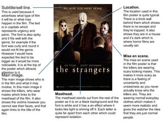
1. Subtitle/sell line. Location.
This is used because it The location used in this
advertises what type of film film poster is quite typical.
it will be or what may There is a brick wall
happen in the film. The text behind them which shows
is in capitals which there is no escape and
represents urgency and they’re trapped. It also
panic. The font is also spiky shows they are in a house
and it fits well with the and it’s dark which is
genre, for example if the where horror films are
font was curly and round it usually set.
would not fit the genre.
However I would have
expected the text to be Mise en scene.
bigger as it would be more The mise en scene used
noticeable. It is at the top of in the film poster is that
the poster which attracts the killers are wearing
attention to it. scary looking masks. This
Main image. makes it more scary as
The main image shows who is there is a feeling of
in the film and what it may uncertainty and
involve. In this main image it uneasiness as you never
shows the killers, who wear actually know who the
masks which links to the Masthead. killers are. They are
masthead of the film. It also The masthead stands out from the rest of the wearing normal everyday
shows the victims however you poster as it is on a black background and the clothes which makes it
cannot see their faces, and that font is white and it has a an effect where it seem more realistic and
again links to the title of the looks like light is shining off it. Each letter is gives the watcher the idea
film. quite far apart from each other which could that they are just normal
represent isolation. people.
2. Colour
Masthead.
The font is in capitals scheme/background
which represents urgency .
and tenseness. It’s in the
The colour scheme is
middle of the poster so it’s
almost a sepia effect which
the centre of attention and
makes the film look quite
the first thing the audience
old fashioned. The
will read. The font is quite
background colour looks
spiky and harsh looking
like an old piece of paper
which again represents
which tells the audience the
the genre of horror. The
film may be set a while
Sell line/slogan.
main words of the
back.
masthead ‘Hills’ and It is underneath the
‘Eyes’ are in capitals to masthead so it would be the
show a small glimpse of second thing the audience
what is included in the would look at. It shows a
film. small glimpse of what may
Main image.
happen in the film, ‘the lucky
The image shows a ones die first’ this suggests
women with a the film will involve a lot of
nervous/scared look on killing and deaths. It is in
her face with a males quite a boring font and it
hand pushing down on doesn’t represent the genre
her face. The male that well, it is not particularly
hand looks very dirty eye catching nor bold.
and he has a cloth
wrapped around his Credits/Release date.
hand, this shows the The release date is in capitals which shows excitement and urgency and is
man may be homeless something that needs to be noticed. The credits are in a bright orange colour which
or feral. is quite noticeable and attracts you to read them.
3. Actors/Actresses
Direct address.
The actors and actresses names The main actors are
are at the top of the film poster in staring directly at the
capitals letters so they stand out. camera which
Well known people are involved attracts audience
with the film so they want to because empathy is
advertise that to attract people to shown and the
watch it. audience feel closer
Main image to the character.
The image shows and tells the
audience what the film involves and Film credits.
that it is a superhero genre. The The audience would
image shows there is chaos and be least interested in
destruction in the film and it will the film credits so
attract the right target audience. It they are in small
also shows all the main characters. fonts and not a bright
colour so they don’t
Logo. stand out a lot.
They include the Marvel logo
on the front of the film poster to
inform the audience, as it will
Release date.
Once again the font
attract the right target market.
is in sci-fi action font
Also, marvel are a well known
and is the same font
superhero comic company and Masthead. as the masthead so it
the film wants to show that they
The masthead is in a bold font and would catch fits in well. It stands
are involved in the production.
the audiences eyes straight away. The font out between the
represents the superhero genre well, as it has a credits so it attracts
slight sci-fi action look to it. attention.
4. Actors names. Main image.
The actors names are in The main image shows
hot pink which is a the two main character
feminine colour and it who are obviously in
tells the audience that it love. They both look
will be a rom com and a content and happy and
chick flick. They stand it shows that they are
out a lot at the top as happily in love. This
they are the only things would appeal to the
that are in a bright target audience, which
colour. are teenage girls, as
they aspire to have a
Masthead. relationship like this, or
The masthead is to look like the main
at the top of the
film poster so it’s character.
the centre of
attention, it’s in
Eye contact.
The male character is
white and the
looking lovingly into the
font is soft and
females eyes which
curly, so it’s not
shows he loves her, and
too in your face
that appeals to the
and bold so
audience as they aspire
again this
to have a relationship like
represents it’s
that.
genre being a
romantic
Advertising social networking. Film credits.
comedy. The film credits are positioned at the very bottom
Doing this shows that the film is recent but it also
shows what target audience it’s aimed at. It would be on the film poster in a light coloured font, this
aimed at teenage girls, and they are the main people shows that they are the least important thing on
that would be using social networking. the poster.
5. Masthead. Main image.
The masthead is The main image is of a
positioned at the bottom of woman, who is obviously
the film poster, however it wearing expensive, flashy
is still quite noticeable. jewelry. She is the centre
The white colour font does of attention as she is in the
stand out against the gold middle of the poster and
jewellery however they she is the only person on
could have used a the poster. She is looking
different colour to just past the camera which
compliment the gold and shows that she may be
stand out even more. thinking about something
Obviously you can tell it’s or someone, which may be
a Bollywood film from the linked to the film. You can
masthead. tell it’s a bolly wood film by
the accessories she is
wearing.
Logos.
The logos are at the bottom of the film poster so they are quite hard to notice
especially against the gold background. They just advertise which companies
are involved with the film etc, maybe which company sponsors the film as