Lucknow 💋 Call Girls in Lucknow ₹7.5k Pick Up & Drop With Cash Payment 892311...
Digipak analysis- Florence and the machine 'Lungs'
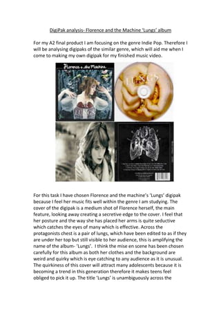
1. DigiPak analysis- Florence and the Machine ‘Lungs’ album
For my A2 final product I am focusing on the genre Indie Pop. Therefore I
will be analysing digipaks of the similar genre, which will aid me when I
come to making my own digipak for my finished music video.
For this task I have chosen Florence and the machine’s ‘Lungs’ digipak
because I feel her music fits well within the genre I am studying. The
cover of the digipak is a medium shot of Florence herself, the main
feature, looking away creating a secretive edge to the cover. I feel that
her posture and the way she has placed her arms is quite seductive
which catches the eyes of many which is effective. Across the
protagonists chest is a pair of lungs, which have been edited to as if they
are under her top but still visible to her audience, this is amplifying the
name of the album- ‘Lungs’. I think the mise en scene has been chosen
carefully for this album as both her clothes and the background are
weird and quirky which is eye catching to any audience as it is unusual.
The quirkiness of this cover will attract many adolescents because it is
becoming a trend in this generation therefore it makes teens feel
obliged to pick it up. The title ‘Lungs’ is unambiguously across the
2. protagonists lungs in medium size white capital letters where ‘Florence +
the machine’ is written across the top over the black border in white
font. The white font is effective over the black border because it is eye
popping and the font goes well with the mise en scene. Taking one
glance of the cover gives the impression that the album is not full of
happy joyous music but is in
fact filled with music that has
passionately came from the
artist herself. You can tell this
by the way she hasn’t looked
directly towards the camera
for the photo, which is
unusual, as artists would
usually do that to embrace
their audience. It also gives
the message that all of her
songs are very personal due to
the way she is keeping herself
to herself.
The image on the CD is also a rather odd and very striking image. I
assume the hands in this image are the main features hands and she is
clasping something which is hard to tell what it is. It could be lungs and
be yet another visual amplification to the name. This image could also
be metaphor for example whatever she is clasping in her hands could be
anything therefore meaning anything could come of this album which
will intrigue her target audience. Then I have noticed that the title of the
album is across the top of the CD in the exact same format as on the
cover which is repetitive yet effective.
The image inside the digipak is very simple however very effective. Again
the artist is looking away from the camera giving that secretive edge but
it also makes you wonder what she may be thinking? Is she sad? Is she
lonely? This photo creates a sort of rhetorical question for the audience
where the only way to find the answer is to listen to the songs and their
meanings. The main feature has a dark kind of facial expression which
goes well with the black and white effect- it gives a gloomy and
mysterious atmosphere.
3. The back of the digipak has
a black background which
could portray what the
album is like such as dark
and perplexing. The songs
are numbered but are
presented side by side
which again is very unusual
for a song line up as others
would list them vertically.
The font is also in white
like the cover which is a good contrast to help it become eye popping to
the audience.