1. Unit 65 – Assignment 2
Website one: YHA Australia
YHA Australia is a travelling website for people who want to backpack and travel around
Australia, it is relevant to my scenario as I am going to design a website which has the same
purpose. The website basically provides information about various hostels or camp sites
around different areas of Australia. The target audience for this site is both male and female,
aged around 18-25 years old, this is the most common age range as after college or
university a lot of students decide to take gap years in order to travel.
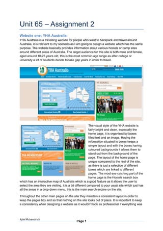
The visual style of the YHA website is
fairly bright and clean, especially the
home page, it is organised by boxes
filled text and an image. Having the
information situated in boxes keeps a
simple layout and with the boxes having
coloured backgrounds it allows them to
stand out from the background of the
page. The layout of the home page is
unique compared to the rest of the site,
as there is just a selection of different
boxes which are linked to different
pages. The most eye catching part of the
home page is the Hostels search box
which has an interactive map of Australia which is a good feature as it allows the user to
select the area they are visiting, it is a bit different compared to your usual site which just has
all the areas in a drop down menu, this is the main search engine on the site.
Throughout the other main pages on the site they maintain a consistent layout in order to
keep the pages tidy and so that nothing on the site looks out of place. It is important to keep
a consistency when designing a website as it wouldn’t look as professional if everything was
Kyle Mckendrick
Page 1
2. just organised randomly. Below are two examples of pages from the Australian Hotels
section:
Northern Territory: New South Wales:
Both pages are in the same category and they both use the same layout, with links and
search boxes down the left hand side, a middle column containing the various search results
and the main content of the page, then they have a small box on the right hand side of the
page containing links and advertisements to partner companies. This layout is kept
throughout the design of the site which makes every page nearly identical apart from the
purpose and the content being displayed.
Colour Palettes:
The site uses quite a bright colour palette for their
design, this colour palette involves baby blue,
orange, green and various light shades of brown for
the backgrounds of the page. The colours contrast
well together as they aren’t anything too bright, yet
they are bright enough to create a positive
atmosphere to the page. The colours used are
almost as if used to represent the colours which you
would encounter whilst travelling Australia, the
orange representing the sun, blue representing the
sky, green representing the grass and the
background shades of brown representing the
ground. Each colour has a role on the page, the orange is used for all the buttons and allows
them to stand out from the blue background, all of the side links and boxes situated down
the left hand and right hand side of the pages have a blue background in order to stand out
from the main content so the user doesn’t just ignore them.
However the home page contains six different boxes which all have a different background
colour inside the colour scheme which creates a nice bright home page to welcome the
users. It is also important to keep a consistency with the colour scheme as if I was to use
any random colours around the site it would become to look very random and
unprofessional. However even if I still used a colour scheme successfully but it was very
Kyle Mckendrick
Page 2
3. dark colours such as black, dark brown and red, it wouldn’t really suite the purpose of the
site as them colours don’t really represent a country which is very hot and sunny, they also
set a really dull atmosphere to the site which doesn’t really persuade the user to want to visit
Australia.
Typography:
The font used on the YHA website is very basic sans serif
typography. However using a basic font is always the best
idea when creating a website as it doesn’t look over the top
and it is very easy for the user to read. If I was to be using a
serif font then the words would be hard to read and the text
would look a little over the top on the site.
Sounds:
There is no sound on this site.
Animations:
On the home page there is an animated section that works as a
slide show consisting of five pages, each page contains an image,
text and a link to navigate to the specific page. Whilst the screen
transitions a fade in and fade out effect is used. The animation is
non linear as it does run automatically however the user can select
which page to look at by clicking on one of the buttons.
Interactivity:
There are various interactivity elements
throughout the site with the use of buttons and
drop down menus. Using a series of drop down
menus is a good idea as it saves space on the
page and looks professional compared to having a
panel full of links to pages taking up unnecessary
space. Another quite unique interactive element
on the site is the map of Australia on the home
page, it is broken up into sections of the different
parts of the country and when rolled over the name of the area appears, also when clicked
on it navigates to a page listing all the accommodation there.
Website two: Oz Intro
Oz Intro is a travelling website for people who want to work, backpack and travel around
Australia, it is relevant to my scenario as I am going to design a website which has the same
purpose. The website basically provides information about various hostels or camp sites
around different areas of Australia; also it provides information on any jobs available in the
different areas. The target audience for this site is both male and female, aged around 18-25
years old, this is the most common age range as after college or university a lot of students
decide to take gap years in order to travel.
Kyle Mckendrick
Page 3
4. The visual style of the Oz Intro website is fairly bright and clean, all of the pages look very
similar with a nice bright blue background with a waved effect to look like water. It is quite
simple due to the text just being positioned around the page and images inside a frame
made to look like a developed photograph. All of the pages have different layouts in terms of
where the information is displayed exactly; however they display the information identically
by using text scattered about around the page with a bold yellow/orange title and a little
collage of images. Every page uses this bright theme which sets a good positive mood for
the site and draws the attention of the audience.
Colour Palettes:
The site uses quite a bright colour palette for their design, this colour palette involves
different shades of blue for the background to create the look of water, and then they use an
orange/yellow gradient colour on the main titles of the pages with white main text. The
colours contrast well together as they aren’t anything too bright, yet they are bright enough
to create a positive atmosphere to the page. The colours used are almost as if used to
Kyle Mckendrick
Page 4
5. represent the colours which you would encounter whilst travelling Australia, the orange
representing the sun, blue representing the sky and the water. Each colour has a role on the
pages, the orange/yellow is the main headers, the blue is the background and the main text
is white.
Typography:
The font used on the Oz Intro website is very basic sans serif typography. However using a
basic font is always the best idea when creating a website as it doesn’t look over the top and
it is very easy for the user to read. If I was to be using a serif font then the words would be
hard to read and the text would look a little over the top on the site.
Sounds:
There is no sound on this site.
Animations:
There is no animation on this site.
Interactivity:
The website contains various buttons in order for the user to navigate around the site, the
main navigation section is at the top of the page to the right of the logo, and there is a series
of text buttons which link to other pages. The booking page contains various buttons which
the user can click on in order to actually book a trip to Australia.
Kyle Mckendrick
Page 5