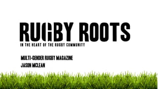
1. IN THE HEART OF THE RUGBY COMMUNITY
MULTI-GENDER RUGBY MAGAZINE
JASON MCLEAN
2. MY BREIF
“You have been commissioned by the Northern Echo to produce a new magazineor newspaper product. Your product could be in any style or genrebut it must be self financed through sales or advertising. You must also produce your magazine for a specified audience segment within the 16 to 25 age group.”
3. HOW I WILL MEET MY BRIEF
•A/B/C1 AUDIENCE
•ESURED THE QUALITY OF MY PRODCT IS HIGH
•RUGBY MAGAZINE FOR BOTH MALE AND FEMALE AUDIENCE
•GAP IN THE MARKET AND IS COMMERCIALLY VIABLE
•SELF FINANCED THROUGH SALES AND ADVERTISING INCOME
4. WHY RUGBY?
Rugby has been a big part of my life since a very early age, its is a sport which I am very passionate about and have a lot of knowledge of.
I share similar interests as my target audience and therefore completely understand their needs.
I regularly read rugby magazines available on the market today, this has given me a good understanding on how to write an effective article, I also know what current magazines are missing.
Over the years I met many important characters in the rugby industry have developed a vast amount of connections which I can use in order to acquire content for my magazine
5. Audience profile
MALE -69% (Primary Audience)
FEMALE-31% (Secondary Audience
SOCIOECONOMIC CLASS-(A/B/C1)
EMPLOYED-72%
STUDENTS-38%
UK TRIBE-SPORTS JUNKIES
6. HOW CAN I TAYLOR TO MY AUDIENCE?
•Use models from my target audience (I.e. similar age)
•Adopt similar techniques which have proven to be successful for magazines that a poplar amongst my Target Audience
•Have a reasonable and affordable cover price
•Make my magazine as active as possible to reflect the active lifestyle of my TA.
•Ensure that the tone of my articles is lively yet casual.
7. SECONDARY AUDIENCE
-Secondary Audience includes –
-Female Rugby Players
In order to appeal to my secondary target audience I need to ensure that;
•Limited taboo language
•No derogatory language towards women
•No inappropriate/sexist content
•Articles and imagery are reflective of females
•Humour is suitable
8. considerations
Constraints-The Press Complaints Commission
The PCC is the current regulator of the magazine and newspaper industry who enforces a number of rules and regulations that journalists must by in order to protect the welfare of other and prevent mistreatment. Moreover, the PCC deals with all complaints made against the two industries under the ‘Editors Code of Practice.’ which places particular concerns on specific subject areas, including; accuracy, harassment, discrimination and the children's rights.
9. considerations
In order to ensure I don’t break any of the codes set by the PCC I have made 5 golden rules…
Rules
1. Always usereliable sources
2. I will personallytake all pictures myself as opposed to obtainingthem off the internet, this ensures that I am not in breach of any copyright laws and have the freedom to edit my photographs freely. That said, I must always ensure I have permission totake photographs.
3. I will be considerate and caring when discussing sensitive topics such as illness, shock and grief.
4. I willalwaysseek the permission of the personholdingcopyrights over any information I gather to use so not to go against copyright laws
5. In orderto ensure accuracy, I will record all interviews and focus groups, so I have a record of everything that was said.
10. Unique selling point (usp)
Rugby Roots will dive deep in to the heart of the rugby community, and produce content that will appeal to both male and female grassroots rugby players.
11. Gap in the market
Although there are already some very popular rugby magazines available for purchase on the current market today, I feel that I have come up with a magazine idea which is completely unique. That said, I am extremely confident that my magazine will be able to compete with established rugby magazines, including; Rugby World and Rugby Club.
Through my research I found out that all current rugby magazines today are predominantly focused on producing articles on professional and international and do not tend to focus on grassroots rugby and the less well-known clubs in the lower divisions. On top of this, I also found out that women’s rugby is another topic which is heavily overlooked by the majority of current rugby magazines on the market.
Unlike other rugby magazines, my magazine will not just focus on one specific type of rugby, my product will cover rugby union, rugby league and rugby 7’s.
Current Rugby magazines aren't personal and interactive like my magazine.
12. BRIEFING MY PRODUCT
Originally I proposed 3 alternative magazine ideas, I then briefed my idea to a focus group which involved discussing the genre, design, imagery, target audience and potential article ideas.
13. Briefing my idea-FOCUS GROUP FEEDBACK
Here is some of the feedback comments which I received for the magazine idea which I chosen to pursue.
“This is a very unique idea and has there is a lot of potential content for this magazine.“
“I can definitely see the potential gap in the market for this idea.”
“You have put forward some very interesting article ideas”
“ Is this article achievable?”
“I suggest that you stick to a 3 or 4 colour pallet in order to keep your article looking professional”
15. Genre research
How has my genre research impacted on my product design?
•Colour Scheme
•Imagery
•Sell Lines (size, length, language)
•Fonts
•Layout
•Visual feature (i.e. banners, splashes, skyline etc.)
Analysis of Front Cover (Key Points)
•Active Layout (lack of white space)
•Vibrant Primary Colours
•Overlapping features and Imagery create field of depth
•Bold Masculine San-serif Fonts
•Short/Catchy Sell lines
•Use of Visual Features; skyline & buttons
•Active Imagery
•Simplistic Language
•Reflective of TA
16. Creates Identity
Memorable
Simplistic
Relatable to the Genre
Enforces style of Magazine
Good Length (10 letters) – Same length as popular
rugby magazine; Rugby World
masthead I have edited the letter ‘G’ to imitate a set of rugby posts. This
Graphological feature should help crate a recognisable identity for
my magazine.
17. House style (fonts)
Masthead Font
headline one
Sell Lines Font
Boris Black Boxx
Header Fonts
NOUVELLE VAUGE
Article Fonts
Rakesly
Gnuolane
Coolvetica
18. House style (colour schemes)
I have not chosen a specific colour scheme to run consistently throughout my magazine, I chose to make this decision as I didn’t feel a consistent colour scheme would suit my magazine genre. Moreover, each double page spread is going to have its own colour scheme which will be completely based on the content of the article and its imagery.
However the majority of colour pallets used for my double page spreads will consist of bright and vibrant primary colours which should give a positive feel to my article.
21. FOCUS GROUP
I decided to conduct a focus group in order to gain feedback on my mock up DPS’ that I created. My focus group was made up by my peers who all fall within the age category of my target audience. Conducting a focus group allowed me to actively get involved in my research, through allowing me to interact first- hand with my target audience. Moreover, during my focus group I had the freedom to ask members specific questions in order to gain the exact feedback which I was looking for.
22. FEEDBACK MOCK UP 1
Positive Feedback
Negative feedback
•“It looks professional”
•“It is busy but it doesn't look too busy because of the way you have used your space.
•“I like the way you have picked up certain colours from the pictures.”
•“The colours are relevant and they work well.”
•“I think 3 images for the whole article work well”
•“You have a good range of active and passive imagery”
•“The image which is overlapping looks out of place.”
•“The kicker is slightly too small, making it hard read”
•“As it is an opinionated article, I feel that you should have included more quote inserts.”
23. FEEDBACK MOCK UP 2
Positive Feedback
Negative feedback
•“There is not enough imagery in relation to the text.”
•“It looks too busy because you haven't go enough imagery and visual features breaking it up.”
•“Although the purple and black work well together, they don’t compliment the imagery.”
•“The connotations of the colours contradict the content of the article.”
•“The fonts down the sides of the images are a bit too bold, and too small.”
•I don’t like the drop shadow on the quote inserts.
•“You have used good appropriate imagery.”
•“I like your use of quote inserts, I like how big they are and where you have positioned them within the text.”
24. Front Cover (0verview)
Imagery –creative, active & passive, emotive, positive, representative
Layout –busy, overlapping imagery/visual features, field of depth
Colours –primary colours, vibrant, active, positive, reflective of imagery
Fonts –Header: headline one
Sell Lines: Boris Black Boxx
25. Contents page (0verview)
Imagery –creative, active, , positive, emotive
Layout –busy, overlapping imagery, field of depth
Colours –primary colours, vibrant, youthful, active, positive, reflective of imagery
Fonts –Header: headline one Sub headers/Main Body: Coolvetica
26. REGULARS
•Editors Note
•Fan Letter Section
•Monthly competition
•Meal Plan
•Workout Plan
27. ARTICLE IDEA 1 (0verview)
Tone –advisory, enthusiastic, conversational, upbeat
Language 1stand 2ndperson, informative, inspiring
Imagery –active, professional, positive,
Layout –balanced text to image ratio
Colours –primary colours, vibrant, positive, chosen from imagery
Fonts –Header: Sans-Serif, bold, powerful, connotes rugby
Main Body: Gnuolane-Sans-serif, simple, easy to read, user friendly
29. ARTICLE IDEA 2(overview)
Tone –motivational, upbeat, punchy, enthusiastic, informative,
Language 1stand 2ndperson, emotive language, shock intro
Imagery –active, positive, motivational, emotive, inspiring
Layout –text heavy, 3 columns
Colours –primary colours, vibrant, positive, chosen from imagery
Fonts –Header: Sans-Serif, masculine, bold, powerful
Main Body: Coolvetica-Sans-serif, simple, easy to read
All men are created equal, some work harder at pre-season
34. DISTRIBUTION
I AIM TO DISRIBUTE AROUND; 10,000 COPIES
IN ATTEMPT TO ACHIEVE MAXIMUM SALES I WILL DISTRIBUTE USING COMPANIES WHICH ARE EASILY ACCESSABLE AND REGULARLY VISITED BY MY TARGET AUDIENCE;
•POPULAR SUPER MARKETS
•WELL-KNOWN CORNER SHOPS
•SPORTS EQUIPTMENT/CLOTHING STORES
•COLLEGE SHOPS
35. DISTRIBUTION costs
The Distributor, which I have chosen to distribute my magazine, is ‘Worldwide Magazine Distribution’.
•Distribute to over 5000 different outlets
•WWMD distributes magazines from a vast number of different genres covering a wide range of market sectors
•On average WWMD’s customers usually stock anywhere between a single title and 300 titles
•Specialize in the distribution of magazines to both independent and multiple retailers in niche markets.
Of my overall predicted income will be eaten up by my Distributor.
42. Personal advertising rates
COVER POSITIONS
BACK COVER: £3500
INSIDE FRONT: £2500
INISIDE BACK: £2200
FULL COLOUR
DOUBLE PAGE SPREAD:£3500
FULL PAGE: £1800
HALF PAGE: £950
QUARTER PAGE: £500
EIGHTH PAGE £300
INSERTS: £100 (PER 100)
43. Advertising sales
1 X BACK COVER
1 X INSIDE FRONT COVER
1 X INSIDE BACK COVER
2 X HALF PAGE
1 X QUARTER PAGE
Total Income: £9875
£475
£3500
£2500
£2200
£1200
44. PREDICTED SALES INCOME
10,000
x
£2.50
=
£25,000
ESTIMATED SALES
COVER PRICE
SALES INCOME