2. Q1. IN WHAT WAYS DOES YOUR MEDIA PRODUCT USE, DEVELOP OR
CHALLENGE FORMS AND CONVENTIONS OF REAL MEDIA PRODUCTS?
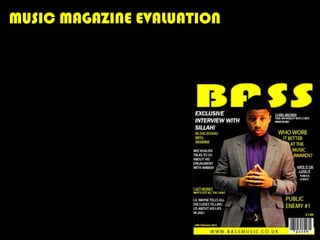
3. FRONT COVER
The front cover image is the most
important image in the magazine as it
is the first thing the reader looks at
when looking at the magazine. I
followed the convention of a normal
R&B magazine, in my research the
majority of shot styles for the front
covers are eye level shots, which is
why so is mine. This connotes the
artist is on the readers level and
creates a sense of interacting with the
reader. My models facial expression is
serious yet sophisticated, this creates
a sense of he knows what he’s doing
and takes his job seriously, and he
likes to look good whilst doing it. This
matches the majority of the R&B
cover pictures I came across during
my research.
4. Masthead
For my masthead I used a font
called Bauhaus 93, I chose this
font as it is bold, different and
it stands out and its thick.
During my research I noticed
R&B mastheads being a sort of
‘chunky’ font which is also why
I thought it was a good idea to
use this font. I made the font
yellow, not only to keep the
consistency of my magazines
colour scheme but also it
stands out and makes a loud
statement against the black
background.
5. Prices And Other Information
Like every magazine I have added a
barcode on the bottom right hand
corner, just above it I’ve added the
price. The reason I’ve placed both of
these in the bottom right hand corner
as it is said that the reader first looks at
the cover of a magazine in a sort of ‘Z’
shape, so this way the price is the last
thing they see, getting them interested
in the titles giving you an insight of
what the magazine includes, then
showing them the price last, this way
they are more likely to buy the
magazine, I also added the magazines
website along the bottom of the cover,
this allows the reader to find out more
on what they would like to know.
6. CONTENTS
My contents page keeps
the consistency of my
colour scheme, it
matches the convention
of my chosen genres’
usual contents pages. It
includes a main image of
the main artist in my
magazine, all the
magazine content and
all other information
that is in the magazine
you can view.
7. DOUBLE PAGE SPREAD
For my double page spread I chose to create an interview with my magazines main artist,
this is because it is the most popular subject for the main article of any magazine out today.
Again it keeps with the colour scheme black and yellow. Another reason why I chose to
create an interview for my main article is that the artists fans would be more likely to buy
the magazine if they read that they’d be able to find more information about the artist.
They’d find this out on the front cover “exclusive interview with sillah!” I didn’t create a
normal title for the article as I thought using a quotation form the interview instead, would
make it easier to draw in the
readers attention as it already
would give them an insight into the
content of the interview.
8. Q2. HOW DOES YOUR MEDIA PRODUCT REPRESENT PARTICULAR SOCIAL
GROUPS?
My target audience are teenage (15-20) boys and girls who enjoy listening to R&B, they’d
also like artists such as Trey Songz, Drake, Lil wayne, Nicki Minaj etc. One way I have shown
the age of my target audience is by using teenaged models. The target audience is a group
which would be called a sub culture, this means they only like R&B, which is why my
magazine only consists of R&B content. I believe people among my target audience will like
my magazine as it appeals to the R&B genre, it will also attract both male and females as all
the artists inside the magazine attract both male and female fans. My magazine is similar to
a very popular R&B magazine, vibe. The cover of my magazine is very useful easy to
understand what the magazine includes, I have tried to put as many article titles on the
cover as possible without making it too much to read as I know a teenager would bother to
look at it if there was a lot to read. I’ve chosen certain fonts for my audience to read easily
and satisfy their eyes. Also I have made the magazine affordable for a student to buy.
9. Q3. WHAT KIND OF MEDIA INSTITUTION MIGHT DISTRIBUTE YOUR MEDIA
PRODUCT AND WHY?
Distribution – is the action of sharing out among a group or spread over an area.
• More than 60 iconic media
• Multinational, headquartered brands.
in Hamburg, Germany. • UK’s leading consumer
• Operates in 15 countries magazine publisher.
world wide. • Award winning portfolio of
• Reaches over 19 million Uk websites reaches over 25
readers every week. million users globally every
• More than 80 influential month.
media brands including; Heat, • Distribute magazines such
Kiss 100, Kerrang, 4music. as; Look, NME, NOW etc.
10. Whilst researching both institutions I think the representation
of my product would be by BAUER as my magazine is very
similar to the Kiss 100 genre and as it’s a multinational media
company so it could promote BASS with ease.
11. Q4. WHO WOULD BE THE AUDIENCE FOR YOUR MEDIA PRODUCT?
My target audience is males and females aged 15-20. Below is a profile of two typical people in
my target audience.
Names: Marina and Chris
Favorite shops: Bank, JD, Size, Misguided
Favorite artists: Trey Songz, Chris Brown, Nicki Minaj,
Tyga
Hobbies: partying, modeling, being successful.
12. Q5. HOW DID YOU ATTRACT/ADDRESS YOUR AUDIENCE?
Before making my magazine I created a questionnaire to find out what my target
audience would want my magazine to include/ what it looks like. After looking through
the results it helped me a lot to take the audiences choice into consideration whilst
creating my magazine and I have tried to create what they wanted to the best I could do.
For example black and yellow was the most popular colour scheme chosen, and so black
and yellow is the consistent colour scheme throughout the magazine. I created an
exclusive interview with the main artist for my double page spread, exactly what my
target audience asked for. My model has the R&B look, his smart casual clothing, his skin
colour his expression of attitude, this all appeals to members of the R&B target audience.
13. Q6. WHAT HAVE YOU LEARNT ABOUT TECHNOLOGIES FROM THE PROCESS
OF CONSTRUCTING THIS PRODUCT?
When creating constructing my magazine I learnt how to use different programmes such as
Photoshop, InDesign, Blogger, DreamWeaver and Google photo editor. I used InDesign to
construct my magazine, it allowed me to use lots of different tools can make the task much
simpler and make your magazine look as professional as the real ones. I learnt how to
change the amount of pixels on my images on Photoshop so when I upload it to InDesign, it
looks professional.
To show my work on my blog I used Google photo editor and SlideShare.net, these can show
some of my computer and editing skills to make my presentation more attractive.
Using a professional camera to take all the images in my magazine, helped make my
magazine look more professional. I used a black backdrop and studio lighting which also
creates a professional look to my pictures. I wouldn’t of been able to make my magazine
without the internet, without the internet I wouldn’t of been able to do as much research as
I did, or even be able to create my blog. I have learnt just how professional you can make
things look using InDesign and Photoshop.
14. Q7. LOOKING BACK AT YOUR PRELEMINARY TASK (THE SCHOOL
MAGAZINE), WHAT DO YOU FEEL YOU HAVE LEARNT IN THE
PROGRESSION FORM IT TO FULL PRODUCT?
Now if I look at my school magazine preliminary task, I can see how my knowledge of the
different software's I can use has expanded. I can see how much more professional my
music magazine looks. I have learnt I need to keep doing my work at a regular pace, as you
can see looking at my school magazine I didn’t do a lot in the time given to me, whereas I
had more time to do my media magazine and it looks much ore improved. Even the quality
of the pictures are so much more defined in my music magazine. Everything has improved,
the colour scheme the layout of the pages, the font.