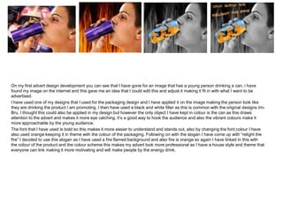
1. On my first advert design development you can see that I have gone for an image that has a young person drinking a can. i have
found my image on the internet and this gave me an idea that I could edit this and adjust it making it fit in with what I want to be
advertised.
I have used one of my designs that I used for the packaging design and I have applied it on the image making the person look like
they are drinking the product I am promoting. I then have used a black and white filter as this is common with the original designs IrnBru, I thought this could also be applied in my design but however the only object I have kept in colour is the can as this draws
attention to the advert and makes it more eye catching, it’s a good way to hook the audience and also the vibrant colours make it
more approachable by the young audience.
The font that I have used is bold so this makes it more easier to understand and stands out, also by changing the font colour I have
also used orange keeping it in theme with the colour of the packaging. Following on with the slogan I have come up with “relight the
fire” I decided to use this slogan as I have used a fire flamed background and also fire is orange so again I have linked in this with
the colour of the product and the colour scheme this makes my advert look more professional as I have a house style and theme that
everyone can link making it more motivating and will make people by the energy drink.
2. 3
1
Here I have decided to use a different design. I have gone for an
animal theme. I have used an image of a tiger roaring at the side.
Another reason why I have used a tiger is, that this sort of animal is
powerful and strong and has super energy and it links in with the
product as Irn-Bru is and energy drink and the advert is promoting
and encouraging people to buy the product as it will make them
feel as powerful and strong as a tiger.
On my next stage of the process I have placed the Irn-bru can inside
the tigers jaw making it look like the can is strong and powerful and
the Irn-Bru has made the tiger bring out the wild side of the drink.
Following on with my development I have decided to place the
image of the tiger on top and have a colour page on the bottom so
it gives me space to place a quote that I would like. Again as you
can see I have used an orange colour scheme as it fits in with the
packaging of the product and the energy drink itself. Another
reason why a tiger fits in with the theme of the advert is that tigers
are known to be orange too.
2
4
4
Finally I have used a quote and placed it on the orange pace with a
blue font using the colour scheme of Irn-Bru as this makes it more
professional by sticking with the same theme throughout the
design. I have used a bold font but slightly less shaper as its more
soft. However I have not used a funny and humorist quote as IrnBru is known for but I have linked it to my image that I have
selected making it more motivating and persuading as again tigers
are wild powerful strong animals that have extreme amount of
energy!
Comparing this design with my first you can see with the first one I
have used an image of a young person drinking the can, as you can
see I have used the same designed can on both designs.
I feel that I have also used similar theme throughout my adverts as I
have used a fire background on my first design and on my second
design I have used a tiger, I have used ideas that link in with the
colour scheme of the product and relating it back and giving it a link
between the layout design and what its asking from you by the
quotes used.