
Recommended
More Related Content
Recently uploaded
Recently uploaded (20)
Featured
Featured (20)
Analysis of contents page
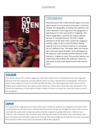
- 1. CONTENTS TYPOGRAPHY Practically every font in this contents page is san-serif, which means it is a lot easier to read and is a lot more relaxed. The typography also keeps the audience a lot more interested in the magazine if the typography is appealing as it is most used within a magazine. This kind of typography is used for the target audience because it is straight forward. The title is typed different to all the other fonts used in this magazine contents page, it’s got a cool and vibrant feeling towards it as it isn’t all been lined up, it’s all spaced out on 3 different lines. The words down the side are abit small and I would like them to be abit bigger so the audience could actually see them because at the moment it’s harder to see it. The way the features are small means that it draws the audience in because they want to read it and would have to look close to see it. COLOUR The colours used in this contents page are rather dark colours, this is conventional for a rap magazine because most rap magazines use very darkish colours as rap is represented as a dark genre. The colours used in this magazine are dark red, white and abit of black. The red background means that are fairly bright colour would have to be used to make it stand out, that is why I think they have used white. The title of the magazine is in black which makes it stand out even more than the rest of the colours used in this magazine. Layout The layout of the magazine is very clear and simple, it helps the audience to recognise certain bits of it if it’s all spaced out and easy to see, I like this layout because it draws you straight into where the picture is so it helps the audience to recognise exactly what the magazine is going to be about. Where it says “Fashion” and “Features”, this would be some of things the audience would be most interested in and that’s why they are on the side right near the image. The layout addresses the left third as quite important because that’s where most of the information is about the magazine.
- 2. CONTENTS IMAGE The image is centred right In the middle of the magazine, this helps the audience to guess what kind of music genre the magazine will be. The magazine doesn’t real use the rule of thirds, this doesn’t take away that the image is the main part of the magazine. The image connotes that celebrity endorsement is being used in this magazine because it is a famous rap artist, the image comes across that the magazine is going to be for an adult and not smaller children, this is conventional for a rap magazine. The target audience is usually 16-30 year olds. The shot type is a mid-shot which is usually used in rap magazines. Language/Modeof address The language used for the headings are very laid-back and simple, this helps to mean the magazine is approachable and easy to see what language is being used. When it says “110 dresses to “impress” women who enjoy listening to rap would probably enjoy this because most women wear dresses. Most of the contents page is informal, because the target audience would rather read something that they wouldn’t usually read in their daily lives.