1. CONTENTS PAGE ANALYSIS: CIARA’VIBE’
How does the contents page follow general and layout conventions?
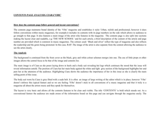
The contents page maintains brand identity of the ‘Vibe’ magazine and establishes it style: Urban, stylish and professional, however it does
follow conventions within music magazines, for example.it includes its contents with its page numbers on the side which allows to audience to
go straight to that page. It also features a main image of the artist who features in the magazine. The contents page is also split into sections
making the layout clear and readable, e.g.‘THE NEW SCHOOL’ and for each article, a brief description of the content of the article and page
number are provided which is common in music magazines. The colours used: ‘Black and silver’ reflect the type of magazine and also reflects
the readership and the genre being promoted. In this case, RAP. The image of the artist is also separate from the content allowing the audience to
see the artist clearly.
The Analysis
The background is continued from the front cover as the black, grey and white colour schemes merges into one. The use of little props or other
images allows the central focus to be that of the image and contents list.
The main image is of Ciara as she poses laying down in heels and a body suit revealing her legs which continues the mood that the issue will
reveal information untold. The position of Ciara has her main body against the white and light grey section of the background highlights her and
puts her at the attention of the audience. Highlighting Ciara shows the audience the importance of her in this issue as she is clearly the main
selling point of this issue.
The body suit worn by Ciara is grey fitted with a nude belt. It is often an image of large writing of the editor which is in place, however ‘Vibe’
doesn’t enforce this typical feature and so we are feeling ‘Vibe’ doesn’t stick to all conventions of a music magazine and that it truly is a
magazine all about the artists music and they speak for themselves.
The layout is very basic and allows all the contents features to be clear and visible. The title ‘CONTENTS’ is bold which stands out. As a
conventional feature the audience are made aware of the information found on this page and can navigate through the magazine easily. The
2. layout of this with the word ‘CONTENTS’ is broken into three lines which adds an edge to the page and is consistent with the sleek style of
‘Vibe’ magazine.
The contents list is very basic and straight to the point with little use of subheadings the contents are separated into two categories. This makes
the magazine easy to navigate around and avoids any complications when reading the features found in the magazine. The two subheadings are
followed by a small list of to which have page numbers as to which have a small caption of information about the specific article. This gives the
audience a list as to what can be found on that given page and so the use of highlighted key words helps highlight who, what and where certain
parts of the texts can be found.
The keywords highlighted in bold is a feature greatly used in magazines because the audience’ s eyes will be attracted to the bold text and so
they have an idea as to what and who the articles will be about and so audience’s looking for specific information will avoid them having to read
the whole text.