
Recommended
Recommended
More Related Content
Recently uploaded
Recently uploaded (20)
Featured
Featured (20)
Inetsoft self learning_kpi_dashboards_june10
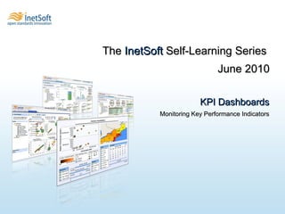
- 1. KPI Dashboards Monitoring Key Performance Indicators The InetSoft Self-Learning Series June 2010
- 2. What is a KPI? A Key Performance Indicator (KPI) is a metric that allows an organization to measure its progress toward a predetermined goal. KPIs provide an overview of an organization’s present state and help to determine the best course of action for the future, and can vary widely according to the size, strategy, nature and niche of an organization.
- 3. Who uses KPIs? Simply put, everyone. Any industry , government agency, or non-profit organization needs to measure its performance on a daily, monthly or quarterly basis, and key performance indicators are those statistics that are deemed important to track in order to meet business goals or organizational objectives.
- 4. What is a KPI Dashboard ? A dashboard is an interactive visualization that allows a user to arrange a visual representation of data in a way that facilitates the recognition of trends and patterns. Thus, a KPI Dashboard enables a user to recognize trends and patterns in key performance measures .
- 5. Where can I get a KPI Dashboard? In general, no business intelligence software is going to provide KPI dashboards that are ready-to-use because KPIs are derived from formulae that are specific to an organization, and in all cases, the data that make a KPI need to be mapped into the software application.
- 6. Which application lets me get the most from KPIs? The most important thing you should look for in your Business Intelligence ( BI ) Software is the ability to create data mashups . Traditional BI draws from data warehouses that can hold large quantities of information, but inflexible to change. This allows users to analyze historical data, but makes it difficult to analyze real-time transactional processes. Other applications can alert users of real-time processes, but lack the analytical capabilities that are necessary to track the course of progress over a sufficient amount of time. Ideally, you want an application that allows the user to create a data mashup from both real-time and historical data simultaneously.
Editor's Notes
- Now on to the specifics of this release. The highlights of this release fall in four main areas which you see here. I’ll list the host of 3 rd party enterprise applications data stores that we now support, on the next slide. Next is a new term, Data Grid Cache, which is the name for the technology we’ve developed in 10.2 that delivers performance improvements as well as builds an architecture for scaling up for very large amounts of data and/or large amounts of usage. Third is monitoring & management where we’ve taken a very large step forward in terms of the performance monitoring that you now have at your disposal. And lastly the geographic mapping of data, where we’ve brought our capabilities there to up to the levels you might only find in specialized business mapping software. We’ll be spending time today demonstrating this functionality.
- Let’s talk about Data Grid Cache. This is the label we are giving to the technology that we’re introducing in this release to deliver performance improvements and establish a path for scaling up for accessing massive databases and or large numbers of simultaneous users.
- For a long time we’ve been dedicated to open standards-based data access, but now we’re able to broaden the use of our dashboard and reporting to some of the more prominent, proprietary application data stores. The first of these was salesforce.com which we introduced in ‘08, but with 10.2 now Style Intelligence can access Siebel, JD Edwards, PeopleSoft and SAP.
- When it comes to management of your InetSoft application we’ve added a lot of functionality. Now our own application includes a performance monitoring dashboard to show you current and recent usage of physical resources. With another console, you can manage users who are actively logged into the application as well as reports or queries that are being executed.
- Now our map charting engine is as sophisticated and powerful as any point solution out there. So you have best-in-breed geographic mapping integrated into a BI solution for dashboards & reports. You can use custom areas, like sales regions. You can do multidimensional analyses like heatmaps by region. You can point and click on an area and see detailed data update in tables or guages alongside the map.
- Now our map charting engine is as sophisticated and powerful as any point solution out there. So you have best-in-breed geographic mapping integrated into a BI solution for dashboards & reports. You can use custom areas, like sales regions. You can do multidimensional analyses like heatmaps by region. You can point and click on an area and see detailed data update in tables or guages alongside the map.