
Recommended
Recommended
More Related Content
What's hot
What's hot (20)
Similar to Use, develop & challenge conventions
Similar to Use, develop & challenge conventions (20)
More from Matthew Dunk
More from Matthew Dunk (15)
Recently uploaded
Recently uploaded (20)
Use, develop & challenge conventions
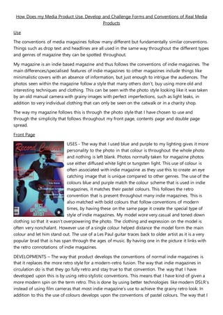
- 1. How Does my Media Product Use, Develop and Challenge Forms and Conventions of Real Media Products Use The conventions of media magazines follow many different but fundamentally similar conventions. Things such as drop text and headlines are all used in the same way throughout the different types and genres of magazine they can be spotted throughout. My magazine is an indie based magazine and thus follows the conventions of indie magazines. The main differences/specialised features of indie magazines to other magazines include things like minimalistic covers with an absence of information, but just enough to intrigue the audiences. The photos seen within the magazine follow a style that many others don’t, buy using more old and interesting techniques and clothing. This can be seen with the photo style looking like it was taken by an old manual camera with grainy images with perfect imperfections, such as light leaks, in addition to very individual clothing that can only be seen on the catwalk or in a charity shop. The way my magazine follows this is through the photo style that I have chosen to use and through the simplicity that follows throughout my front page, contents page and double page spread. Front Page USES - The way that I used blue and purple to my lighting gives it more personality to the photo in that colour is throughout the whole photo and nothing is left blank. Photos normally taken for magazine photos use either diffused white light or tungsten light. This use of colour is often associated with indie magazine as they use this to create an eye catching image that is unique compared to other genres. The use of the colours blue and purple match the colour scheme that is used in indie magazines, it matches their pastel colours. This follows the retro convention that is present throughout many indie magazines. This is also matched with bold colours that follow conventions of modern times, by having these on the same page it create the special type of style of indie magazines. My model wore very casual and toned down clothing so that it wasn’t overpowering the photo. The clothing and expression on the model is often very nonchalant. However use of a single colour helped distance the model form the main colour and let him stand out. The use of a Les Paul guitar traces back to older artist as it is a very popular brad that is has span through the ages of music. By having one in the picture it links with the retro connotations of indie magazines. DEVELOPMENTS – The way that product develops the conventions of normal indie magazines is that it replaces the more retro style for a modern-retro fusion. The way that indie magazines in circulation do is that they go fully retro and stay true to that convention. The way that I have developed upon this is by using retro stylistic conventions. This means that I have kind of given a more modern spin on the term retro. This is done by using better technologies like modern DSLR’s instead of using film cameras that most indie magazine’s use to achieve the grainy retro look. In addition to this the use of colours develops upon the conventions of pastel colours. The way that I
- 2. have used pastel colours, but upped saturation and implemented block colour gives it a more modern and stylised to me feel. In doing so this helps my audience research. In my research I found that lots of young people read the magazine genre. By giving a modern twist this will appeal to the younger generations that my magazine is targeted at. DIFFERENCES – The way that my product challenges the conventions is trough how modern I made the cover. Indie magazine front covers have very bare and minimalistic covers, with hardly any writing and graphics. For my cover I filled the page with information. Following the conventions of rock magazines I added two graphics and filled the sides of the page with information like what is inside and special additions. However by doing this I feel like it appeals to my target audience better. Contents Page USES – The similarities of my contents page is that is uses extra pictures and has a picture and information separation. The conventions of contents pages carry things like the separation of information and the picture. This is used as the contents page is meant to provide you with the contents of the magazine, if the information is scattered it will be hard to read and understand and that is the opposite of what a contents page is. By following the connotation of the clear separation it allow the readers to know what is in the magazine and this informs the reader if they want to buy the magazine if they think the content is interesting. In addition the information includes a separate photo that correlates to the information often provided above or next to it. This picture included often links to the main image on the contents page. DEVELOPMENTS – The development that I have made is that the main photo is quite artistic and “glammed up”. This is shown through the use of editing to the theme of the magazine, a desaturated gritty feel, with obvious work put into the models look and obvious post production work on the image. This is development upon the normal conventions as indie magazines use very raw photos of the artists included with little to no editing. By adding to my photo apart from what was provided in camera then it adds to the feel and theme that is throughout my magazine, the more artistic and post produced images. DIFFERENCES – The differences that challenge normal magazine conventions of a contents page are what gives the different style that I wanted. This includes things like the whole page being more spaced. Contents pages often fill the space with as much information as possible, as this is what is looked at for a guide through the magazine. By spacing it out more and including just a little less information it adds an air of mystery to the magazine, which can attract some of the more niche audiences that indie magazines target. In addition to less information I have used less graphics on my page. Graphics are used in spades on the contents page to fill it as much as possible, but to keep the feel and to present the page as better looking I remained with the one graphic. I tried adding more but it clogged up the page and made it feel overwhelming.
- 3. Double Page Spread USES – My DPS is the most accurate when it comes to following indie music magazine conventions. The whole spread looks similar to spreads in “Q” and “Indie”. The spacing of the article confides on the rule of thirds. The article box resides on the far right third which is common with many band articles. Placing it here allows for the picture to be viewed while also allowing for a decent amount of space to have a reasonable sized text for the article. The type of picture that is found in indie magazines is the typical band photo. These photos are taken of the whole band and carry loads of connotations. These are things like desaturated or grainy imagery, of which I have done, and very individual clothing that express the “independency” of the genre. In addition to including these connotations i have made the models have blank expression which link towards sadness, this can be linked to the fact that indie bands are considered underdogs and in which the underdog is usually sad or angry due to the pressure on the higher ups. DPS’s have little graphics that “spice” up the image. This is to bring attention towards the article while also not stealing the limelight away from the photograph. On mine I have included lines next to the master head of the band’s name. The most common article that is included in the DPS is an interview with the band that is the special for the magazine. This interview is often about a new single, album or tour. I followed the conventions and decided to go for an interview about a new album DEVELOPMENTS – In articles they start with a big drop text that is a different colour, this is not only a connotation of indie magazines but throughout every magazine produced. The drop text is only used once or twice and maybe three times to separate points of interest in the article. However I used drop text to distinguish the questions by the interviewer and the responses of the band. This is as the drop texts allow for a more spaced and disguisable points of interest. DIFFERENCES – The differences from a normal DPS is that I included wording in the picture. Most indie DPS’s follow the connotation of minimalistic looks and thus have no information on the pictures. I included information on the picture as I felt that it would break the feel the interview had to include it in the middle or as part of the interview. By having it of to the side on the picture it offers the information needed while also keeping all the information on the spread flowing.