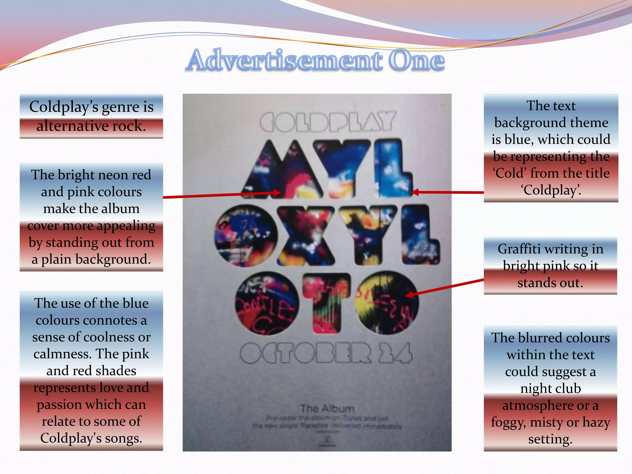
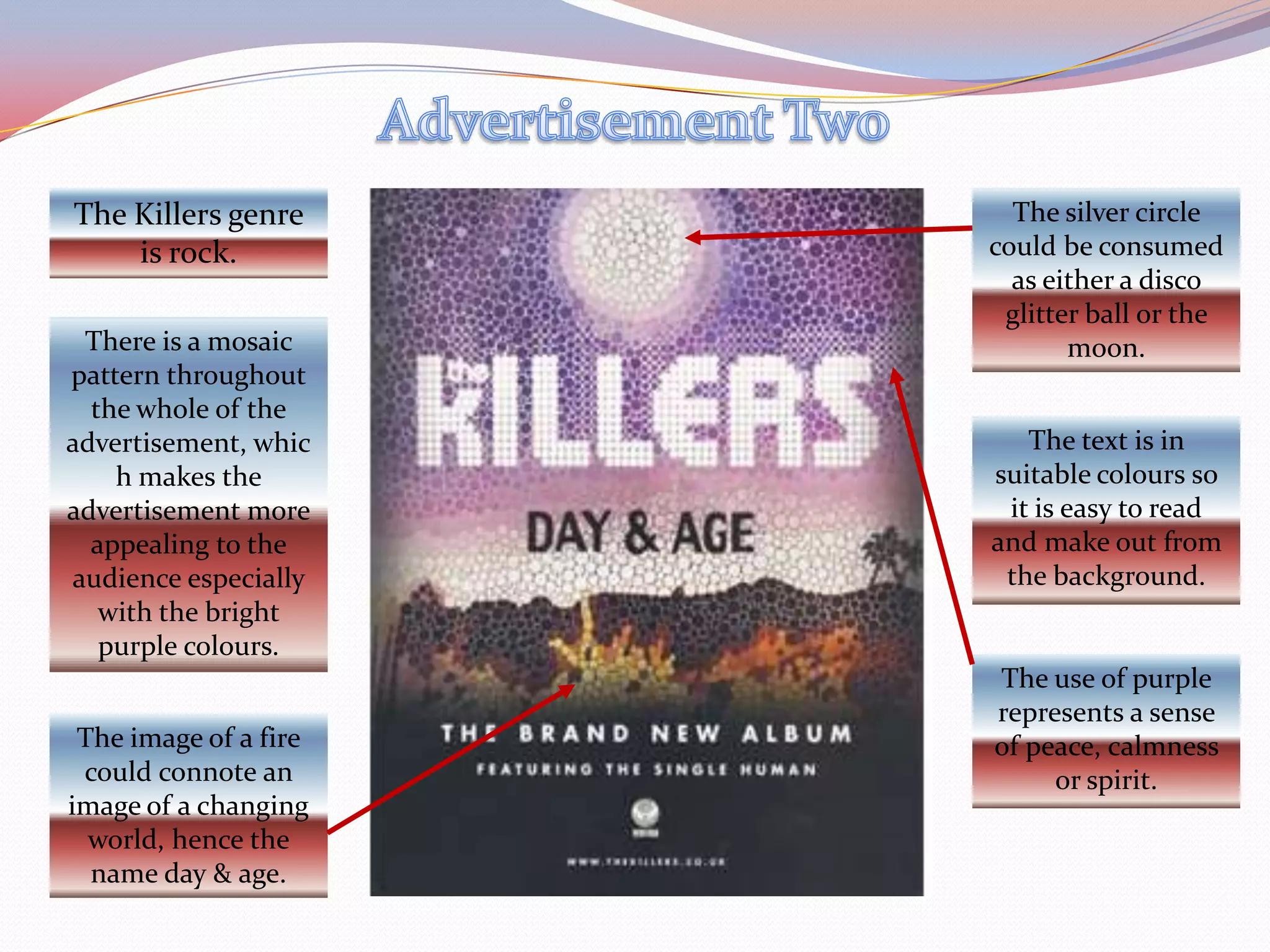
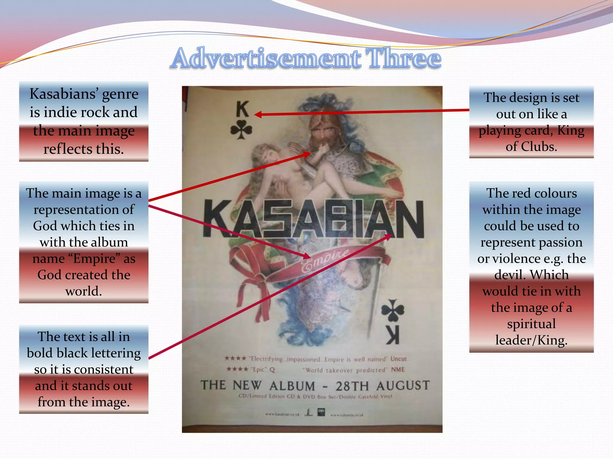
Textual Analysis of Music Advertisements
Advertisement OneThe text background theme is blue, which could be representing the ‘Cold’ from the title ‘Coldplay’.Coldplay’s genre is alternative rock.The bright neon red and pink colours make the album cover more appealing by standing out from a plain background.Graffiti writing in bright pink so it stands out.The use of the blue colours connotes a sense of coolness or calmness. The pink and red shades represents love and passion which can relate to some of Coldplay's songs.The blurred colours within the text could suggest a night club atmosphere or a foggy, misty or hazy setting.
Advertisement TwoThe Killers genre is rock.The silver circle could be consumed as either a disco glitter ball or the moon.There is a mosaic pattern throughout the whole of the advertisement, which makes the advertisement more appealing to the audience especially with the bright purple colours.The text is in suitable colours so it is easy to read and make out from the background.The use of purple represents a sense of peace, calmness or spirit.The image of a fire could connote an image of a changing world, hence the name day & age.
Advertisement ThreeKasabians’ genre is indie rock and the main image reflects this.The design is set out on like a playing card, King of Clubs.The main image is a representation of God which ties in with the album name “Empire” as God created the world.The red colours within the image could be used to represent passion or violence e.g. the devil. Which would tie in with the image of a spiritual leader/King.The text is all in bold black lettering so it is consistent and it stands out from the image.

Media textual analysis

  • 1.
    Textual Analysis ofMusic Advertisements
  • 2.
    Advertisement OneThe textbackground theme is blue, which could be representing the ‘Cold’ from the title ‘Coldplay’.Coldplay’s genre is alternative rock.The bright neon red and pink colours make the album cover more appealing by standing out from a plain background.Graffiti writing in bright pink so it stands out.The use of the blue colours connotes a sense of coolness or calmness. The pink and red shades represents love and passion which can relate to some of Coldplay's songs.The blurred colours within the text could suggest a night club atmosphere or a foggy, misty or hazy setting.
  • 3.
    Advertisement TwoThe Killersgenre is rock.The silver circle could be consumed as either a disco glitter ball or the moon.There is a mosaic pattern throughout the whole of the advertisement, which makes the advertisement more appealing to the audience especially with the bright purple colours.The text is in suitable colours so it is easy to read and make out from the background.The use of purple represents a sense of peace, calmness or spirit.The image of a fire could connote an image of a changing world, hence the name day & age.
  • 4.
    Advertisement ThreeKasabians’ genreis indie rock and the main image reflects this.The design is set out on like a playing card, King of Clubs.The main image is a representation of God which ties in with the album name “Empire” as God created the world.The red colours within the image could be used to represent passion or violence e.g. the devil. Which would tie in with the image of a spiritual leader/King.The text is all in bold black lettering so it is consistent and it stands out from the image.